Sử dụng bộ sưu tập để sắp xếp ngăn nắp các trang
Lưu và phân loại nội dung dựa trên lựa chọn ưu tiên của bạn.
Tạo thanh ứng dụng dưới cùng để giúp người dùng điều hướng và truy cập vào các chức năng trong ứng dụng. Hãy làm theo hướng dẫn này để thêm thanh ứng dụng dưới cùng vào ứng dụng bằng cách sử dụng thành phần kết hợp BottomAppBar.
Khả năng tương thích của phiên bản
Phương thức triển khai này yêu cầu bạn phải đặt minSDK của dự án thành API cấp 21 trở lên.
Phần phụ thuộc
Tạo thanh ứng dụng ở dưới cùng
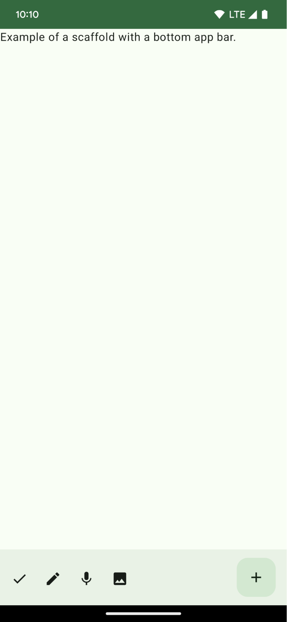
Sử dụng mã sau để tạo một thanh ứng dụng ở dưới cùng chứa 4 nút biểu tượng và một nút hành động nổi:
@ComposablefunBottomAppBarExample(){Scaffold(bottomBar={BottomAppBar(actions={IconButton(onClick={/* do something */}){Icon(Icons.Filled.Check,contentDescription="Localized description")}IconButton(onClick={/* do something */}){Icon(Icons.Filled.Edit,contentDescription="Localized description",)}IconButton(onClick={/* do something */}){Icon(Icons.Filled.Mic,contentDescription="Localized description",)}IconButton(onClick={/* do something */}){Icon(Icons.Filled.Image,contentDescription="Localized description",)}},floatingActionButton={FloatingActionButton(onClick={/* do something */},containerColor=BottomAppBarDefaults.bottomAppBarFabColor,elevation=FloatingActionButtonDefaults.bottomAppBarFabElevation()){Icon(Icons.Filled.Add,"Localized description")}})},){innerPadding->
Text(modifier=Modifier.padding(innerPadding),text="Example of a scaffold with a bottom app bar.")}}
Cách triển khai bottomBar chứa danh sách các hành động.
Các hành động là cách triển khai IconButton chứa
Icon cho văn bản mô tả hình ảnh và nội dung, mỗi hành động có một lambda onClick
để thực hiện các hành động này.
Bạn có thể truyền các thành phần kết hợp cho các tham số chính sau:
actions: một loạt biểu tượng xuất hiện ở bên trái của thanh. Đây thường là các thao tác chính cho màn hình nhất định hoặc các mục điều hướng.
Hướng dẫn này là một phần của các bộ sưu tập Hướng dẫn nhanh được tuyển chọn này, bao gồm các mục tiêu phát triển Android rộng hơn:
Tạo một giàn đỡ màn hình chính
Tìm hiểu cách sử dụng một nền tảng chuẩn hoá để xây dựng giao diện người dùng phức tạp. Khung này kết hợp các phần khác nhau của giao diện người dùng, mang đến cho ứng dụng một giao diện nhất quán.
Nội dung và mã mẫu trên trang này phải tuân thủ các giấy phép như mô tả trong phần Giấy phép nội dung. Java và OpenJDK là nhãn hiệu hoặc nhãn hiệu đã đăng ký của Oracle và/hoặc đơn vị liên kết của Oracle.
Cập nhật lần gần đây nhất: 2025-06-04 UTC.
[[["Dễ hiểu","easyToUnderstand","thumb-up"],["Giúp tôi giải quyết được vấn đề","solvedMyProblem","thumb-up"],["Khác","otherUp","thumb-up"]],[["Thiếu thông tin tôi cần","missingTheInformationINeed","thumb-down"],["Quá phức tạp/quá nhiều bước","tooComplicatedTooManySteps","thumb-down"],["Đã lỗi thời","outOfDate","thumb-down"],["Vấn đề về bản dịch","translationIssue","thumb-down"],["Vấn đề về mẫu/mã","samplesCodeIssue","thumb-down"],["Khác","otherDown","thumb-down"]],["Cập nhật lần gần đây nhất: 2025-06-04 UTC."],[],[],null,["\u003cbr /\u003e\n\nCreate a bottom app bar to help users navigate and access functions in your app.\nFollow this guidance to add a bottom app bar to your app by using the\n[`BottomAppBar`](/reference/com/google/android/material/bottomappbar/BottomAppBar) composable.\n\nVersion compatibility\n\nThis implementation requires that your project minSDK be set to API level 21 or\nhigher.\n\nDependencies\n\nCreate a bottom app bar\n\nUse the following code to create a bottom app bar containing four icon buttons,\nand a floating action button:\n\n\n```kotlin\n@Composable\nfun BottomAppBarExample() {\n Scaffold(\n bottomBar = {\n BottomAppBar(\n actions = {\n IconButton(onClick = { /* do something */ }) {\n Icon(Icons.Filled.Check, contentDescription = \"Localized description\")\n }\n IconButton(onClick = { /* do something */ }) {\n Icon(\n Icons.Filled.Edit,\n contentDescription = \"Localized description\",\n )\n }\n IconButton(onClick = { /* do something */ }) {\n Icon(\n Icons.Filled.Mic,\n contentDescription = \"Localized description\",\n )\n }\n IconButton(onClick = { /* do something */ }) {\n Icon(\n Icons.Filled.Image,\n contentDescription = \"Localized description\",\n )\n }\n },\n floatingActionButton = {\n FloatingActionButton(\n onClick = { /* do something */ },\n containerColor = BottomAppBarDefaults.bottomAppBarFabColor,\n elevation = FloatingActionButtonDefaults.bottomAppBarFabElevation()\n ) {\n Icon(Icons.Filled.Add, \"Localized description\")\n }\n }\n )\n },\n ) { innerPadding -\u003e\n Text(\n modifier = Modifier.padding(innerPadding),\n text = \"Example of a scaffold with a bottom app bar.\"\n )\n }\n}https://github.com/android/snippets/blob/7a0ebbee11495f628cf9d574f6b6069c2867232a/compose/snippets/src/main/java/com/example/compose/snippets/components/AppBar.kt#L138-L183\n```\n\n\u003cbr /\u003e\n\nKey points about the code\n\n- An outer [`Scaffold`](/reference/kotlin/androidx/compose/material/package-summary#Scaffold(androidx.compose.foundation.layout.WindowInsets,androidx.compose.ui.Modifier,androidx.compose.material.ScaffoldState,kotlin.Function0,kotlin.Function0,kotlin.Function1,kotlin.Function0,androidx.compose.material.FabPosition,kotlin.Boolean,kotlin.Function1,kotlin.Boolean,androidx.compose.ui.graphics.Shape,androidx.compose.ui.unit.Dp,androidx.compose.ui.graphics.Color,androidx.compose.ui.graphics.Color,androidx.compose.ui.graphics.Color,androidx.compose.ui.graphics.Color,androidx.compose.ui.graphics.Color,kotlin.Function1)) that has a `bottomBar` set.\n- A `bottomBar` implementation that contains a list of actions.\n- Actions that are implementations of [`IconButton`](/reference/kotlin/androidx/compose/material/package-summary#IconButton(kotlin.Function0,androidx.compose.ui.Modifier,kotlin.Boolean,androidx.compose.foundation.interaction.MutableInteractionSource,kotlin.Function0)) that contain [`Icon`](/reference/kotlin/androidx/compose/material3/package-summary#Icon(androidx.compose.ui.graphics.ImageBitmap,kotlin.String,androidx.compose.ui.Modifier,androidx.compose.ui.graphics.Color)) for image and content description text, each with an `onClick` lambda to perform these actions.\n\nYou can pass composables for the following key parameters:\n\n- `actions`: a series of icons that appear on the left side of the bar. These are commonly either key actions for the given screen, or navigation items.\n- [`floatingActionButton`](/reference/com/google/android/material/floatingactionbutton/FloatingActionButton): the floating action button that appears on the right side of the bar.\n\n| **Note:** After you add the bottom app bar, you can customize it with content as you do with other containers by filling the `BottomAppBar` composable with other content. You can also use `BottomAppBar` without passing a value for `actions` or `floatingActionButton`.\n\nResults **Figure 1.** An example of a bottom app bar.\n\nCollections that contain this guide\n\nThis guide is part of these curated Quick Guide collections that cover\nbroader Android development goals: \n\nCreate a home screen scaffold \nFind out how to use a standardized platform to build complex user interfaces. The scaffold holds together different parts of the UI, giving apps a coherent look and feel. \n[Quick guide collection](/develop/ui/compose/quick-guides/collections/create-a-home-screen-scaffold) \n\nDisplay interactive components \nLearn how composable functions can enable you to easily create beautiful UI components based on the Material Design design system. \n[Quick guide collection](/develop/ui/compose/quick-guides/collections/display-interactive-components) \n\nHave questions or feedback \nGo to our frequently asked questions page and learn about quick guides or reach out and let us know your thoughts. \n[Go to FAQ](/quick-guides/faq) [Leave feedback](https://issuetracker.google.com/issues/new?component=1573691&template=1993320)"]]