Koleksiyonlar ile düzeninizi koruyun
İçeriği tercihlerinize göre kaydedin ve kategorilere ayırın.
Chip bileşeni, kompakt ve etkileşimli bir kullanıcı arayüzü öğesidir. Genellikle simge ve etiketle birlikte kişi veya etiket gibi karmaşık öğeleri temsil eder. Bu düğmeler işaretlenebilir, kapatılabilir veya tıklanabilir olabilir.
Beş çip türü ve bunları kullanabileceğiniz yerler aşağıda verilmiştir:
Yardım: Kullanıcıya görev sırasında rehberlik eder. Genellikle kullanıcı girişine yanıt olarak geçici bir kullanıcı arayüzü öğesi olarak görünür.
Filtre: Kullanıcıların bir dizi seçenekten içeriği hassaslaştırmalarına olanak tanır. Bu öğeler seçilebilir veya seçimi kaldırılabilir. Seçildiğinde onay işareti simgesi içerebilir.
Giriş: Kullanıcı tarafından sağlanan bilgileri (ör. menüdeki seçimler) temsil eder. Simge ve metin içerebilir ve kaldırmak için bir "X" sunabilir.
Öneri: Kullanıcıya son etkinliğine veya girişine göre öneriler sunar. Genellikle kullanıcı işlemlerini istemek için bir giriş alanının altında görünür.
Yükseltilmiş: Düz yerine yükseltilmiş bir görünüme sahiptir.
Sürüm uyumluluğu
Bu uygulama için projenizin minSDK değerinin API düzeyi 21 veya üstü olarak ayarlanması gerekir.
Bağımlılıklar
Yardım çipi oluşturma
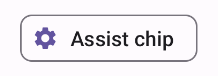
AssistChip bileşeni, kullanıcıyı belirli bir yöne yönlendiren bir yardım çipi oluşturmanın basit bir yolunu sunar. Bu işlevin ayırt edici özelliklerinden biri, Şekil 1'de gösterildiği gibi çipin sol tarafında bir simge göstermenize olanak tanıyan leadingIcon parametresidir. Aşağıdaki örnekte bu özelliği nasıl uygulayabileceğiniz gösterilmektedir:
Şekil 1. Yardım çipi.
Filtre çipi oluşturma
FilterChip bileşeni, çipin seçilip seçilmediğini izlemenizi gerektirir. Aşağıdaki örnekte, yalnızca kullanıcı çipi seçtiğinde önceden işaretlenmiş bir simgeyi nasıl gösterebileceğiniz gösterilmektedir:
Sonuçlar
Şekil 2. Seçilmemiş filtre çipi.Şekil 3. Seçilen filtre çipi.
Giriş çipi oluşturma
Kullanıcı etkileşiminden kaynaklanan çipler oluşturmak için InputChip bileşenini kullanabilirsiniz. Örneğin, bir e-posta istemcisinde kullanıcı e-posta yazarken giriş çipi, kullanıcının "kime:" alanına girdiği adresi temsil edebilir.
Aşağıdaki uygulamada, seçili durumdaki bir giriş çipi gösterilmektedir. Kullanıcı, çipe bastığında çipi kapatır.
Sonuçlar
Şekil 4. Çipi girin.
Öneri çipi oluşturma
SuggestionChip bileşeni, hem API tanımı hem de yaygın kullanım alanları açısından bu sayfada listelenen bileşenler arasında en temel olanıdır. Öneri çipleri, dinamik olarak oluşturulmuş ipuçlarını gösterir. Örneğin, bir yapay zeka sohbet uygulamasında, en son mesaja verilecek olası yanıtları sunmak için öneri çiplerini kullanabilirsiniz.
SuggestionChip için aşağıdaki uygulamayı düşünün:
Sonuçlar
Şekil 5. Yardım çipi.
Yükseltilmiş çip oluşturma
Bu dokümandaki tüm örneklerde, düz bir görünüme sahip temel bileşenler kullanılmaktadır. Gelişmiş bir görünüme sahip bir çip istiyorsanız aşağıdaki üç bileşenden birini kullanın:
Bu kılavuz, daha geniş Android geliştirme hedeflerini kapsayan, özel olarak seçilmiş Hızlı Kılavuz koleksiyonlarından biridir:
Etkileşimli bileşenleri görüntüleme
Birleştirilebilir işlevlerin, Materyal Tasarım tasarım sistemine dayalı güzel kullanıcı arayüzü bileşenleri oluşturmanızı nasıl kolaylaştırabileceğini öğrenin.
Bu sayfadaki içerik ve kod örnekleri, İçerik Lisansı sayfasında açıklanan lisanslara tabidir. Java ve OpenJDK, Oracle ve/veya satış ortaklarının tescilli ticari markasıdır.
Son güncelleme tarihi: 2025-02-06 UTC.
[[["Anlaması kolay","easyToUnderstand","thumb-up"],["Sorunumu çözdü","solvedMyProblem","thumb-up"],["Diğer","otherUp","thumb-up"]],[["İhtiyacım olan bilgiler yok","missingTheInformationINeed","thumb-down"],["Çok karmaşık / çok fazla adım var","tooComplicatedTooManySteps","thumb-down"],["Güncel değil","outOfDate","thumb-down"],["Çeviri sorunu","translationIssue","thumb-down"],["Örnek veya kod sorunu","samplesCodeIssue","thumb-down"],["Diğer","otherDown","thumb-down"]],["Son güncelleme tarihi: 2025-02-06 UTC."],[],[],null,["\u003cbr /\u003e\n\nThe `Chip` component is a compact, interactive UI element. It represents complex\nentities like a contact or tag, often with an icon and label. It can be\ncheckable, dismissible, or clickable.\n\nThe five types of chips and where you might use them are as follows:\n\n- [Assist](#assist): Guides the user during a task. Often appears as a temporary UI element in response to user input.\n- [Filter](#filter): Lets users refine content from a set of options. They can be selected or deselected, and may include a checkmark icon when selected.\n- [Input](#input): Represents user-provided information, such as selections in a menu. They can contain an icon and text, and provide an 'X' for removal.\n- [Suggestion](#suggestion): Provides recommendations to the user based on their recent activity or input. Typically appear beneath an input field to prompt user actions.\n- [Elevated](#elevated): Has an elevated appearance instead of looking flat.\n\nVersion compatibility\n\nThis implementation requires that your project minSDK be set to API level 21 or\nhigher.\n\nDependencies\n\nCreate an assist chip\n\nThe [`AssistChip`](/reference/kotlin/androidx/compose/material3/package-summary#AssistChip(kotlin.Function0,kotlin.Function0,androidx.compose.ui.Modifier,kotlin.Boolean,kotlin.Function0,kotlin.Function0,androidx.compose.ui.graphics.Shape,androidx.compose.material3.ChipColors,androidx.compose.material3.ChipElevation,androidx.compose.foundation.BorderStroke,androidx.compose.foundation.interaction.MutableInteractionSource)) composable provides a straightforward way to create an\nassist chip that nudges the user in a particular direction. One distinguishing\nfeature is its `leadingIcon` parameter that lets you display an icon on the left\nside of the chip, as shown in figure 1. The following example demonstrates how\nyou can implement it:\n**Figure 1.** Assist chip.\n\nCreate a filter chip\n\nThe [`FilterChip`](/reference/kotlin/androidx/compose/material3/package-summary#FilterChip(kotlin.Boolean,kotlin.Function0,kotlin.Function0,androidx.compose.ui.Modifier,kotlin.Boolean,kotlin.Function0,kotlin.Function0,androidx.compose.ui.graphics.Shape,androidx.compose.material3.SelectableChipColors,androidx.compose.material3.SelectableChipElevation,androidx.compose.foundation.BorderStroke,androidx.compose.foundation.interaction.MutableInteractionSource)) composable requires you to track whether or not the chip\nis selected. The following example demonstrates how you can show a leading\nchecked icon only when the user has selected the chip:\n\nResults **Figure 2.** Unselected filter chip. **Figure 3.** Selected filter chip.\n\nCreate an input chip\n\nYou can use the [`InputChip`](/reference/kotlin/androidx/compose/material3/package-summary#InputChip(kotlin.Boolean,kotlin.Function0,kotlin.Function0,androidx.compose.ui.Modifier,kotlin.Boolean,kotlin.Function0,kotlin.Function0,kotlin.Function0,androidx.compose.ui.graphics.Shape,androidx.compose.material3.SelectableChipColors,androidx.compose.material3.SelectableChipElevation,androidx.compose.foundation.BorderStroke,androidx.compose.foundation.interaction.MutableInteractionSource)) composable to create chips that result from\nuser interaction. For example, in an email client, when the user is writing an\nemail, an input chip might represent a person whose address the user has entered\ninto the \"to:\" field.\n\nThe following implementation demonstrates an input chip that is in a selected\nstate. The user dismisses the chip when they press it.\n| **Note:** Consider how you might use a chip like this in the preceding email use case, with a name passed in for the `text` parameter, and a function that performs the necessary network calls for `onDismiss`.\n\nResults **Figure 4.** Input chip.\n\nCreate a suggestion chip\n\nThe [`SuggestionChip`](/reference/kotlin/androidx/compose/material3/package-summary#SuggestionChip(kotlin.Function0,kotlin.Function0,androidx.compose.ui.Modifier,kotlin.Boolean,kotlin.Function0,androidx.compose.ui.graphics.Shape,androidx.compose.material3.ChipColors,androidx.compose.material3.ChipElevation,androidx.compose.foundation.BorderStroke,androidx.compose.foundation.interaction.MutableInteractionSource)) composable is the most basic of the composables listed\non this page, both in its API definition and its common use cases. Suggestion\nchips present dynamically generated hints. For example, in an AI chat app, you\nmight use suggestion chips to present possible responses to the most recent\nmessage.\n\nConsider this implementation of `SuggestionChip`:\n\nResults **Figure 5.** Assist chip. **Note:** Although the suggestion chip component is intended for informational purposes, it does still take an `onClick` lambda that you can use to create interactivity.\n\nCreate an elevated chip\n\nAll the examples in this document use the base composables that take a flat\nappearance. If you want a chip that has an elevated appearance, use one of the\nthree following composables:\n\n- [`ElevatedAssistChip`](/reference/kotlin/androidx/compose/material3/package-summary#ElevatedAssistChip(kotlin.Function0,kotlin.Function0,androidx.compose.ui.Modifier,kotlin.Boolean,kotlin.Function0,kotlin.Function0,androidx.compose.ui.graphics.Shape,androidx.compose.material3.ChipColors,androidx.compose.material3.ChipElevation,androidx.compose.foundation.BorderStroke,androidx.compose.foundation.interaction.MutableInteractionSource))\n- [`ElevatedFilterChip`](/reference/kotlin/androidx/compose/material3/package-summary#ElevatedFilterChip(kotlin.Boolean,kotlin.Function0,kotlin.Function0,androidx.compose.ui.Modifier,kotlin.Boolean,kotlin.Function0,kotlin.Function0,androidx.compose.ui.graphics.Shape,androidx.compose.material3.SelectableChipColors,androidx.compose.material3.SelectableChipElevation,androidx.compose.foundation.BorderStroke,androidx.compose.foundation.interaction.MutableInteractionSource))\n- [`ElevatedSuggestionChip`](/reference/kotlin/androidx/compose/material3/package-summary#ElevatedSuggestionChip(kotlin.Function0,kotlin.Function0,androidx.compose.ui.Modifier,kotlin.Boolean,kotlin.Function0,androidx.compose.ui.graphics.Shape,androidx.compose.material3.ChipColors,androidx.compose.material3.ChipElevation,androidx.compose.foundation.BorderStroke,androidx.compose.foundation.interaction.MutableInteractionSource))\n\nKey points\n\nFour composables correspond to the four types of chips, and they share the\nfollowing parameters:\n\n- **`label`**: The string that appears on the chip.\n- **`icon`** : The icon displayed at the start of the chip. Some composables have a separate `leadingIcon` and `trailingIcon` parameter.\n- **`onClick`**: The lambda that the chip calls when the user clicks it.\n\nCollections that contain this guide\n\nThis guide is part of these curated Quick Guide collections that cover\nbroader Android development goals: \n\nDisplay interactive components \nLearn how composable functions can enable you to easily create beautiful UI components based on the Material Design design system. \n[Quick guide collection](/develop/ui/compose/quick-guides/collections/display-interactive-components) \n\nHave questions or feedback \nGo to our frequently asked questions page and learn about quick guides or reach out and let us know your thoughts. \n[Go to FAQ](/quick-guides/faq) [Leave feedback](https://issuetracker.google.com/issues/new?component=1573691&template=1993320)"]]