Birincil veya önemli işlemler için. Doldurulmamış düğmeler görsel ağırlık sağlar ve "Alışveriş sepetine ekle" ve "Giriş yap" gibi işlemler için uygundur.
Önemli ancak birincil olmayan işlemler için. Dış çizgili düğmeler, "İptal" veya "Geri" gibi alternatif, ikincil işlemleri belirtmek için diğer düğmelerle iyi bir şekilde eşlenir.
Gezinme bağlantıları gibi daha az kritik işlemler veya "Daha fazla bilgi" ya da "Ayrıntıları göster" gibi ikincil işlemler için.
Sürüm uyumluluğu
Bu uygulama için projenizin minSDK değerinin API düzeyi 21 veya üstü olarak ayarlanması gerekir.
Bağımlılıklar
Doldurulmuş bir düğme oluşturma
Doldurulmuş düğme bileşeni, temel Button bileşenini kullanır. Varsayılan olarak düz renkle doldurulur.
Sonuçlar
Şekil 1. Doldurulmuş bir düğme.
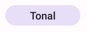
Doldurulmuş tonlu düğme oluşturma
Doldurulmuş tonlu düğme bileşeni, FilledTonalButton kompozisyonunu kullanır.
Varsayılan olarak tonlu bir renkle doldurulur.
Sonuçlar
Şekil 2. Tonlu düğme.
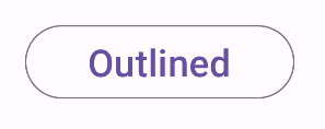
Dış çizgili düğme oluşturma
Ana hatlarıyla belirtilen düğme bileşeni, OutlinedButton bileşenini kullanır. Varsayılan olarak bir dış çizgiyle gösterilir.
Sonuçlar
Şekil 3. Dış çizgili bir düğme.
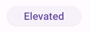
Üst düzey bir düğme oluşturma
Yükseltilmiş düğme bileşeni, ElevatedButton bileşenini kullanır. Varsayılan olarak yükseklik efektini temsil eden bir gölgeye sahiptir ve gölgeli bir dış çizgiye sahip düğme olarak görünür.
Sonuçlar
Şekil 4. Yükseltilmiş bir düğme.
Metin düğmesi oluşturma
Metin düğmesi bileşeni, TextButton bileşenini kullanır. Tıklanana kadar yalnızca metin olarak görünür. Varsayılan olarak katı bir dolgu veya dış çizgisi yoktur.
enabled: Yanlış olduğunda bu parametre, düğmenin kullanılamadığını ve etkin olmadığını gösterir.
colors: Düğmede kullanılan renkleri belirleyen bir ButtonColors örneği.
contentPadding: Düğmedeki dolgu.
Bu kılavuzu içeren koleksiyonlar
Bu kılavuz, daha geniş Android geliştirme hedeflerini kapsayan, özel olarak seçilmiş Hızlı Kılavuz koleksiyonlarından biridir:
Etkileşimli bileşenleri görüntüleme
Birleştirilebilir işlevlerin, Materyal Tasarım tasarım sistemine dayalı güzel kullanıcı arayüzü bileşenleri oluşturmanızı nasıl kolaylaştırabileceğini öğrenin.
Bu sayfadaki içerik ve kod örnekleri, İçerik Lisansı sayfasında açıklanan lisanslara tabidir. Java ve OpenJDK, Oracle ve/veya satış ortaklarının tescilli ticari markasıdır.
Son güncelleme tarihi: 2025-02-06 UTC.
[[["Anlaması kolay","easyToUnderstand","thumb-up"],["Sorunumu çözdü","solvedMyProblem","thumb-up"],["Diğer","otherUp","thumb-up"]],[["İhtiyacım olan bilgiler yok","missingTheInformationINeed","thumb-down"],["Çok karmaşık / çok fazla adım var","tooComplicatedTooManySteps","thumb-down"],["Güncel değil","outOfDate","thumb-down"],["Çeviri sorunu","translationIssue","thumb-down"],["Örnek veya kod sorunu","samplesCodeIssue","thumb-down"],["Diğer","otherDown","thumb-down"]],["Son güncelleme tarihi: 2025-02-06 UTC."],[],[],null,["\u003cbr /\u003e\n\nButtons let the user trigger a defined action. There are five types of\nbutton:\n\n| Type | Appearance | Purpose |\n|-------------------------------|-----------------------------------------------|-------------------------------------------------------------------------------------------------------------------------------------------------------------------|\n| [Filled](#create-filled) | Solid background with contrasting text. | For primary actions, such as \"Submit\" and \"Save.\" The shadow effect emphasizes the button's importance. |\n| [Tonal](#create-filled-tonal) | Background color varies to match the surface. | For primary or significant actions. Filled buttons provide visual weight and are appropriate for actions like \"Add to cart\" and \"Sign in.\" |\n| [Elevated](#create-elevated) | Shadow makes it stand out. | For primary or significant actions. Increase elevation to make the button more prominent. |\n| [Outlined](#create-outlined) | Features a border with no fill. | For actions that are important but not primary. Outlined buttons pair well with other buttons to indicate alternative, secondary actions like \"Cancel\" or \"Back.\" |\n| [Text](#create-text) | Text with no background or border. | For less critical actions such as navigational links, or secondary actions like \"Learn more\" or \"View details.\" |\n\nVersion compatibility\n\nThis implementation requires that your project minSDK be set to API level 21 or\nhigher.\n\nDependencies\n\nCreate a filled button\n\nThe filled button component uses the basic [`Button`](/reference/kotlin/androidx/compose/material3/package-summary?#Button(kotlin.Function0,androidx.compose.ui.Modifier,kotlin.Boolean,androidx.compose.ui.graphics.Shape,androidx.compose.material3.ButtonColors,androidx.compose.material3.ButtonElevation,androidx.compose.foundation.BorderStroke,androidx.compose.foundation.layout.PaddingValues,androidx.compose.foundation.interaction.MutableInteractionSource,kotlin.Function1)) composable. It is\nfilled with a solid color by default.\n\nResults **Figure 1.** A filled button.\n\nCreate a filled tonal button\n\nThe filled tonal button component uses the [`FilledTonalButton`](/reference/kotlin/androidx/compose/material3/package-summary#FilledTonalButton(kotlin.Function0,androidx.compose.ui.Modifier,kotlin.Boolean,androidx.compose.ui.graphics.Shape,androidx.compose.material3.ButtonColors,androidx.compose.material3.ButtonElevation,androidx.compose.foundation.BorderStroke,androidx.compose.foundation.layout.PaddingValues,androidx.compose.foundation.interaction.MutableInteractionSource,kotlin.Function1)) composable.\nIt is filled with a tonal color by default.\n\nResults **Figure 2.** A tonal button.\n\nCreate an outlined button\n\nThe outlined button component uses the [`OutlinedButton`](/reference/kotlin/androidx/compose/material3/package-summary#OutlinedButton(kotlin.Function0,androidx.compose.ui.Modifier,kotlin.Boolean,androidx.compose.ui.graphics.Shape,androidx.compose.material3.ButtonColors,androidx.compose.material3.ButtonElevation,androidx.compose.foundation.BorderStroke,androidx.compose.foundation.layout.PaddingValues,androidx.compose.foundation.interaction.MutableInteractionSource,kotlin.Function1)) composable. It\nappears with an outline by default.\n\nResults **Figure 3.** An outlined button.\n\nCreate an elevated button\n\nThe elevated button component uses the [`ElevatedButton`](/reference/kotlin/androidx/compose/material3/package-summary#ElevatedButton(kotlin.Function0,androidx.compose.ui.Modifier,kotlin.Boolean,androidx.compose.ui.graphics.Shape,androidx.compose.material3.ButtonColors,androidx.compose.material3.ButtonElevation,androidx.compose.foundation.BorderStroke,androidx.compose.foundation.layout.PaddingValues,androidx.compose.foundation.interaction.MutableInteractionSource,kotlin.Function1)) composable. It has\na shadow that represents the elevation effect by default and appears as\nan outlined button with a shadow.\n\nResults **Figure 4.** An elevated button.\n\nCreate a text button\n\nThe text button component uses the [`TextButton`](/reference/kotlin/androidx/compose/material3/package-summary#TextButton(kotlin.Function0,androidx.compose.ui.Modifier,kotlin.Boolean,androidx.compose.ui.graphics.Shape,androidx.compose.material3.ButtonColors,androidx.compose.material3.ButtonElevation,androidx.compose.foundation.BorderStroke,androidx.compose.foundation.layout.PaddingValues,androidx.compose.foundation.interaction.MutableInteractionSource,kotlin.Function1)) composable. Until clicked,\nit appears only as text. It does not have a solid fill or outline by default.\n\nResults **Figure 5.** A text button.\n\nKey points\n\n- `onClick`: The function called when the user presses the button.\n- `enabled`: When false, this parameter causes the button to appear unavailable and inactive.\n- `colors`: An instance of `ButtonColors` that determines the colors used in the button.\n- `contentPadding`: The padding within the button.\n\nCollections that contain this guide\n\nThis guide is part of these curated Quick Guide collections that cover\nbroader Android development goals: \n\nDisplay interactive components \nLearn how composable functions can enable you to easily create beautiful UI components based on the Material Design design system. \n[Quick guide collection](/develop/ui/compose/quick-guides/collections/display-interactive-components) \n\nHave questions or feedback \nGo to our frequently asked questions page and learn about quick guides or reach out and let us know your thoughts. \n[Go to FAQ](/quick-guides/faq) [Leave feedback](https://issuetracker.google.com/issues/new?component=1573691&template=1993320)"]]