透過大螢幕順暢享受喜愛的電影、電視節目、音樂和其他內容。
資源
| 類型 | 連結 | 狀態 |
|---|---|---|
| 設計 | 設計來源 (Figma) | 可使用 |
| Inter (Google Fonts) | 可使用 | |
| 導入作業 | Jetpack Compose (GitHub) | 可使用 |
主題
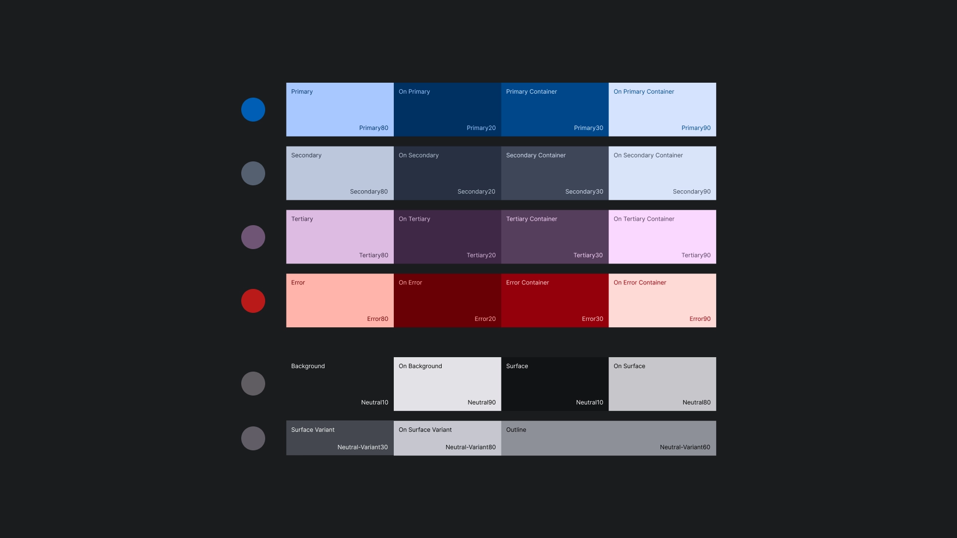
色彩主題
顏色主題是使用 Material Design 3 主題產生器產生。
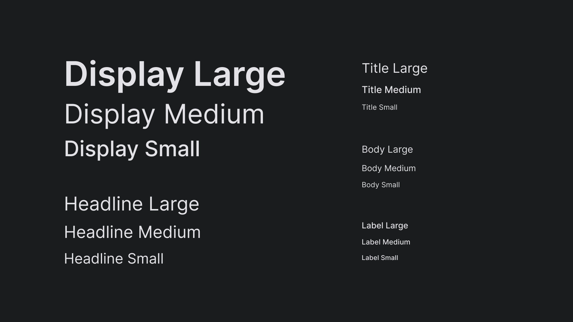
Typography
JetStream 的輸入比例使用介面類型,打造簡單明瞭的電視螢幕外觀。
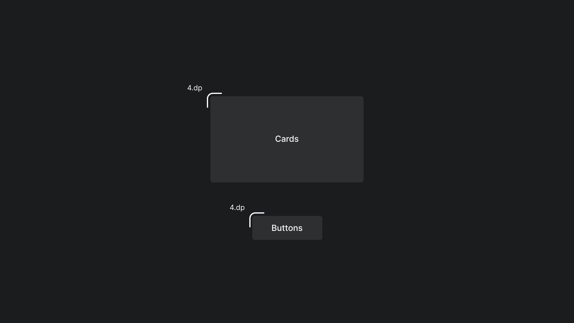
形狀
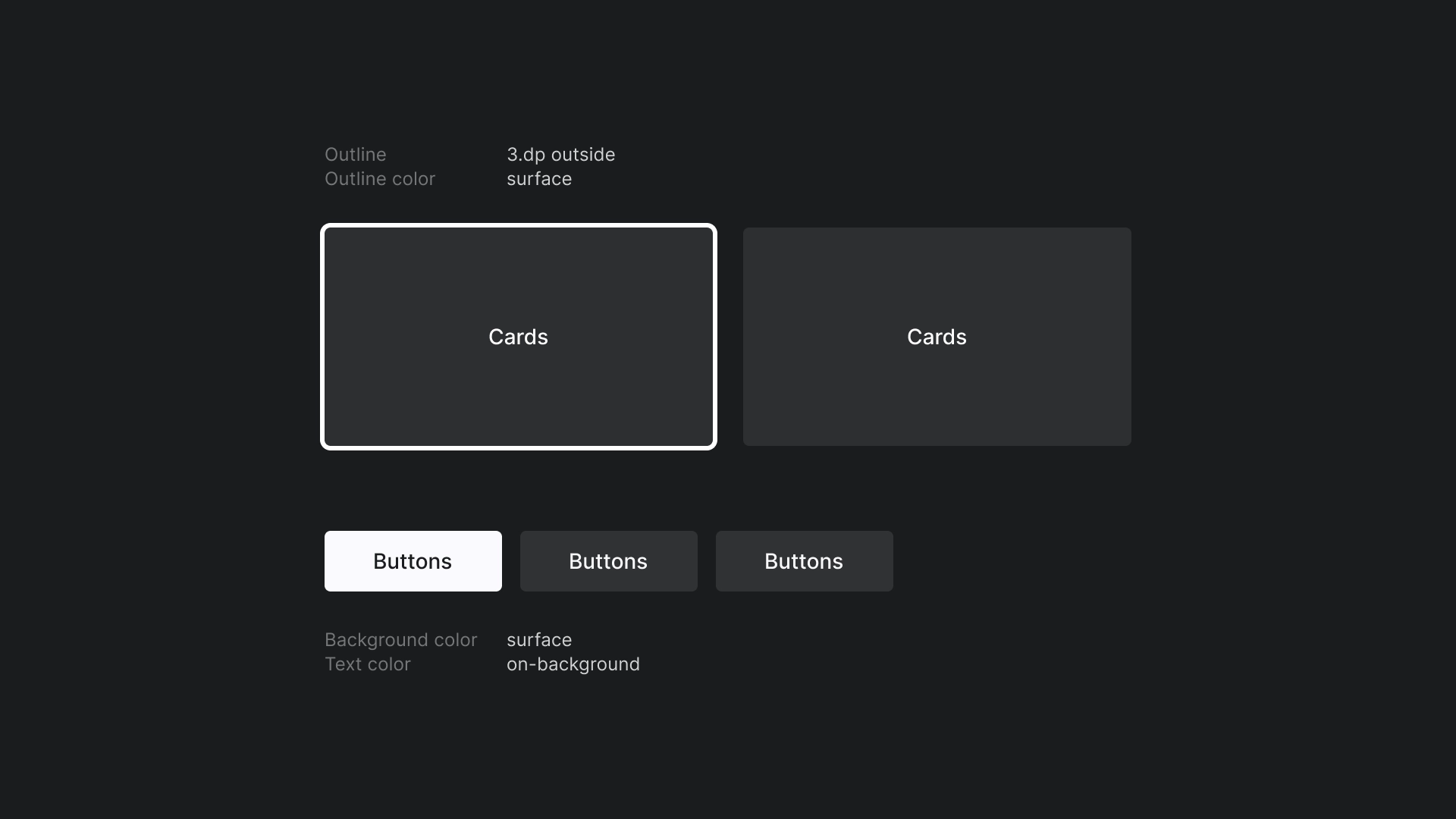
資訊卡和按鈕會套用微小的半徑,創造親切便利且平易近人的邊緣。
對焦
JetStream 中會使用帶有外框顏色的 3dp 外框顏色。
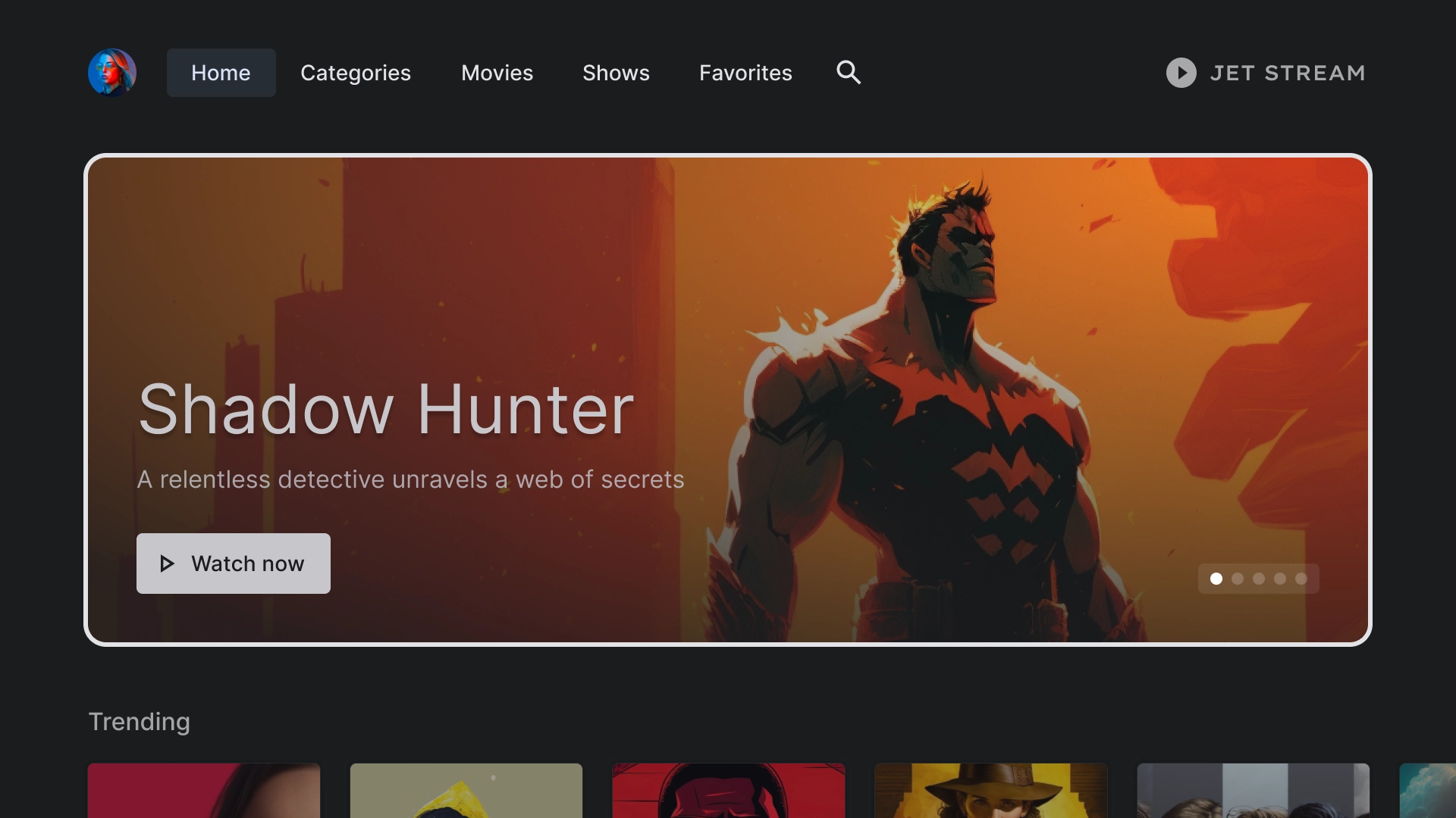
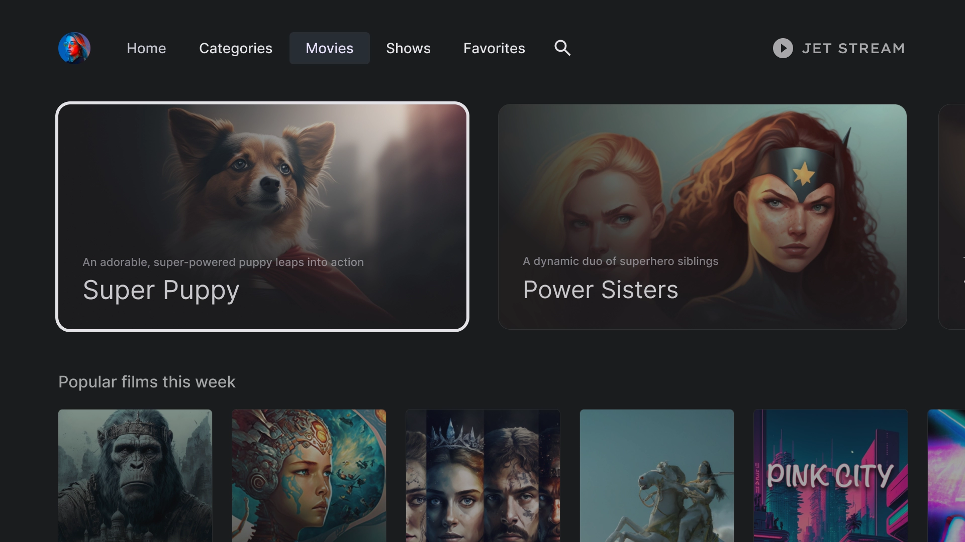
首頁
住家
JetStream 應用程式的到達網頁。
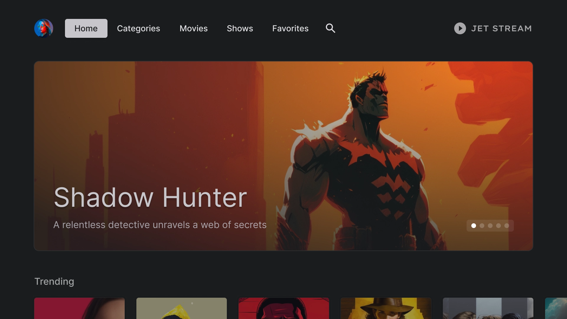
精選輪轉介面
採用資訊卡樣式版面配置的輪轉介面。
內容列
JetStream 使用顯示比例 2:3 的標準卡片樣式,並套用 5 欄版面配置。
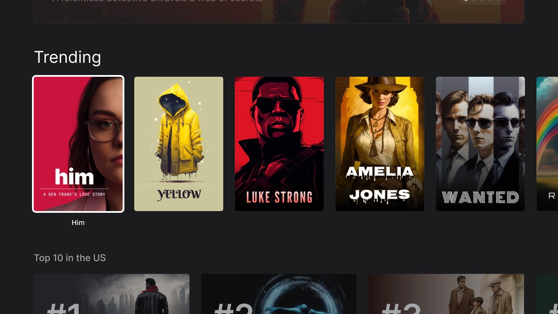
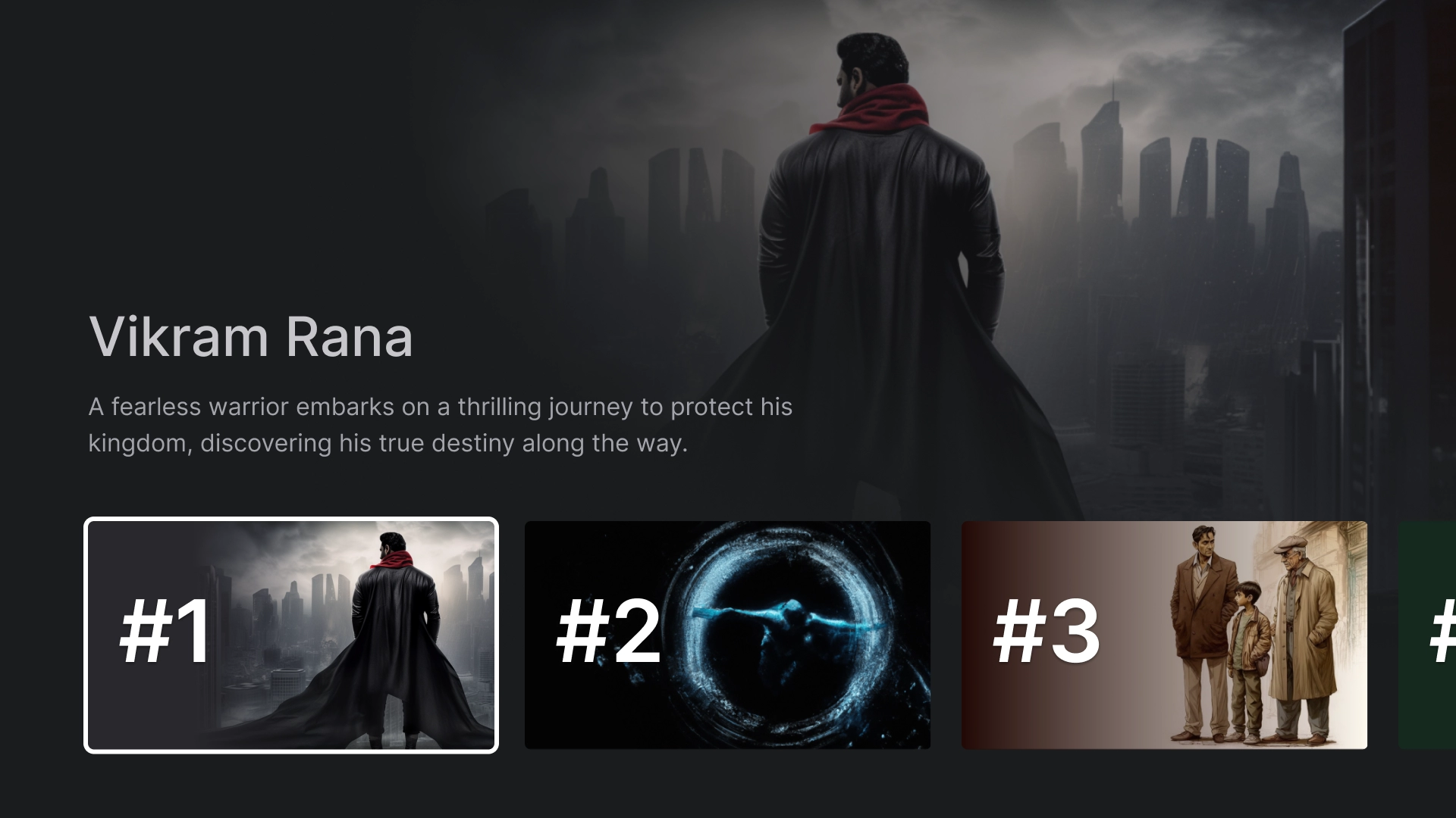
沉浸式清單
使用沉浸式清單元件醒目顯示應用程式中的特殊內容,例如前 10 大熱門電影。
類別
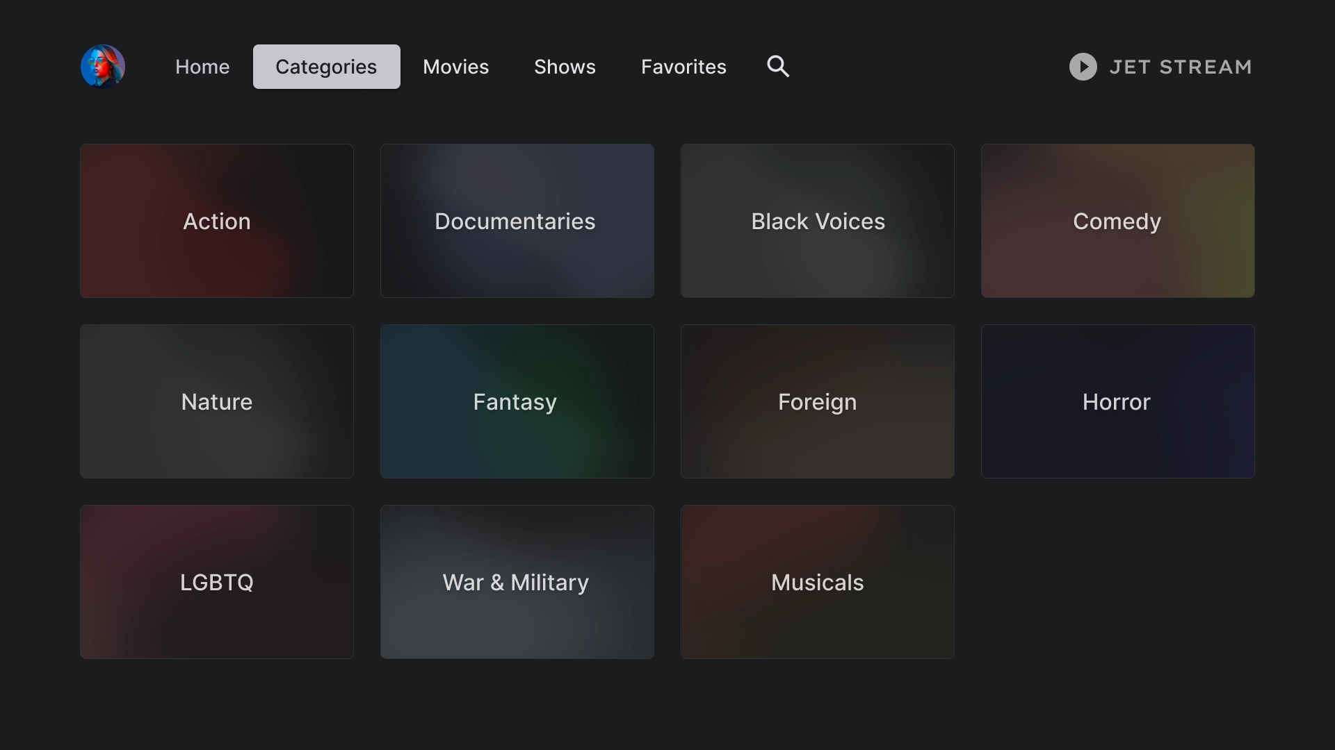
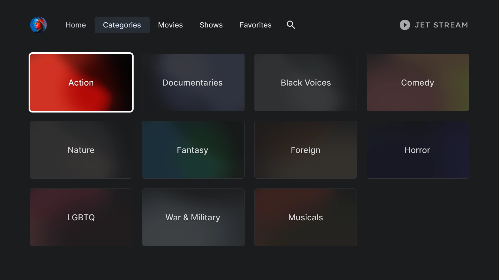
類別
「類別」頁面會以格線格式顯示類型,方便使用者瀏覽及存取。
類別資訊卡
類別詳情
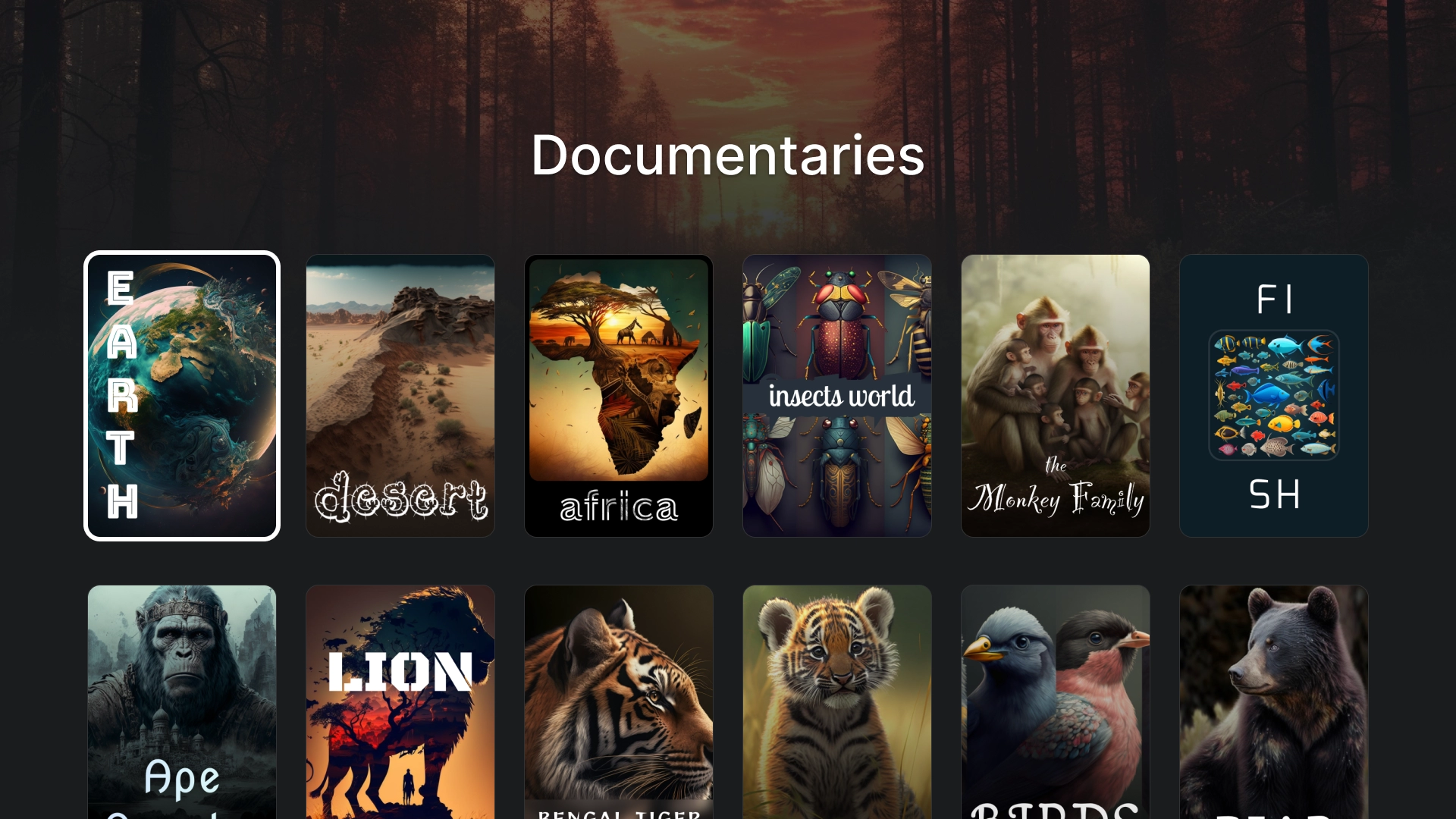
含有標頭的 2:3 資訊卡格線可用來建立「類別詳細資料」頁面。
媒體
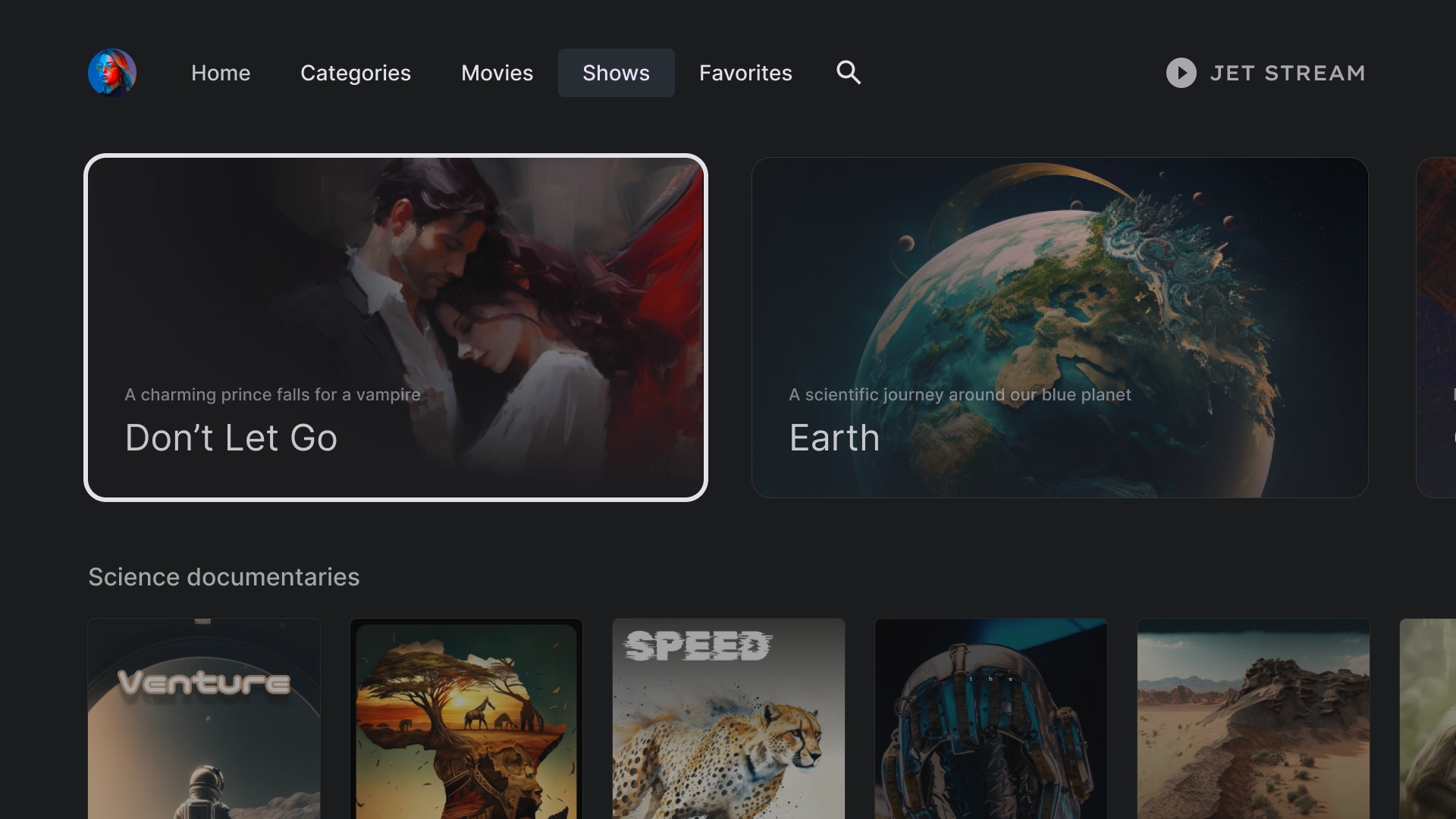
電影
標準電影分頁,頂端有 16:9 精選資訊卡,底部有內容格線。
節目
媒體庫
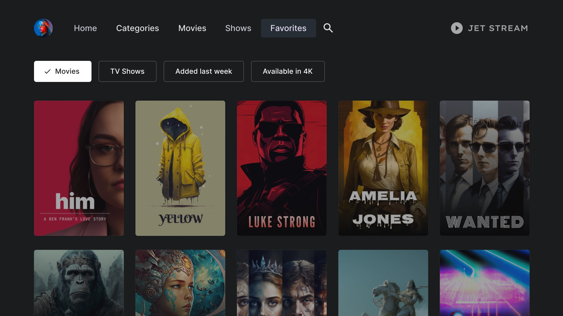
常用項目
「常用項目」分頁會在畫面頂端提供篩選器方塊,方便你快速搜尋內容。
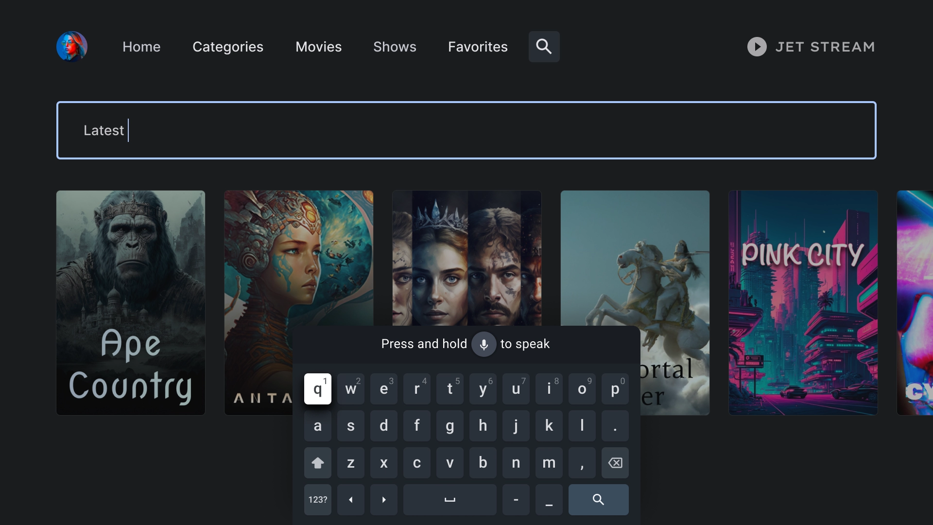
搜尋
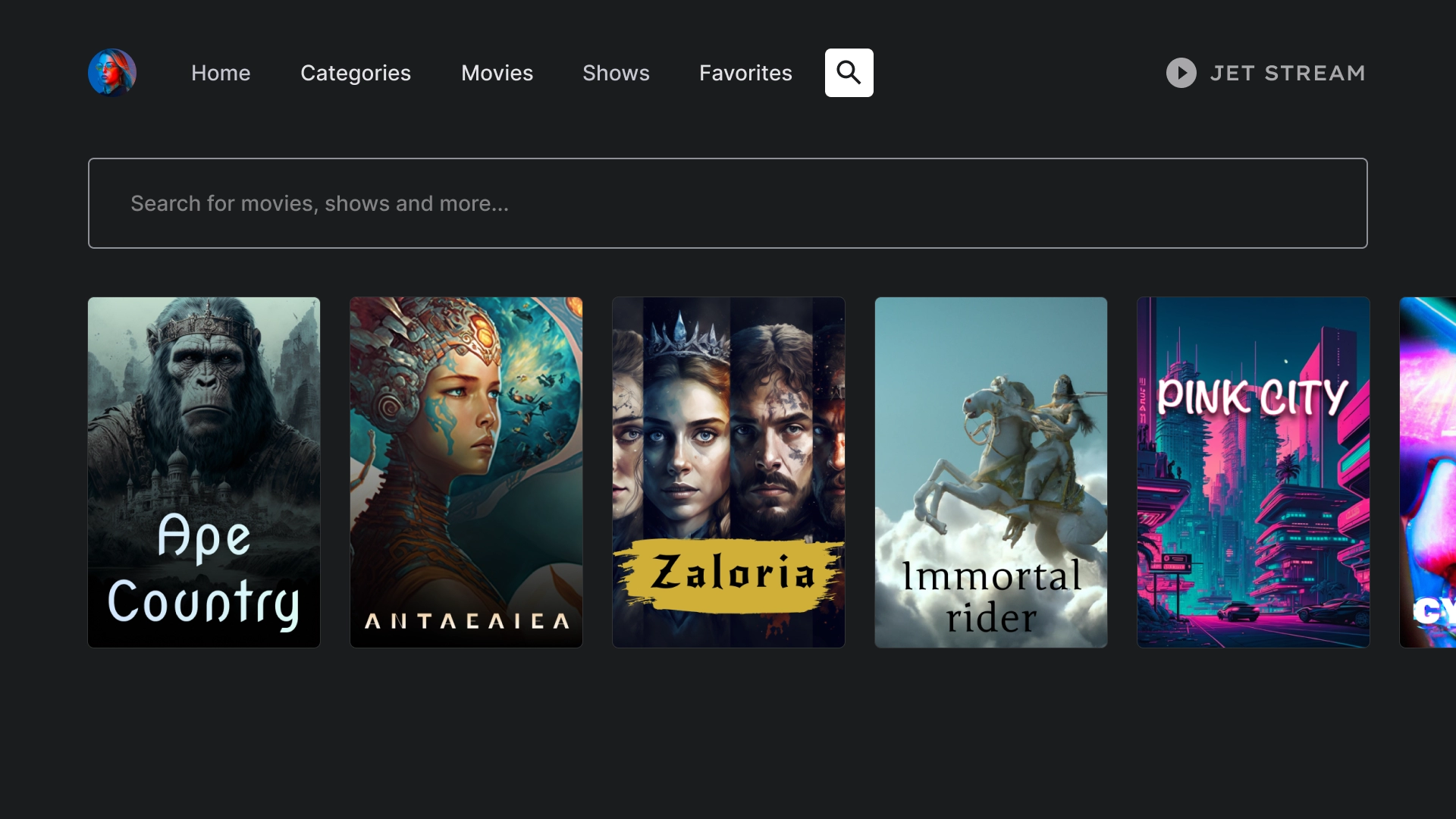
搜尋到達網頁
搜尋頁面會顯示搜尋列,其中包含最近的搜尋建議搜尋查詢。
主動搜尋
當使用者將焦點放在搜尋列時,鍵盤會彈出,而下方的結果會根據使用者輸入內容動態更新。
實體詳細資料
詳細資訊到達網頁
詳細資料頁面呈現電影動態效果,帶有簡短劇情摘要,以及可用來觀看電影的醒目行動號召按鈕。
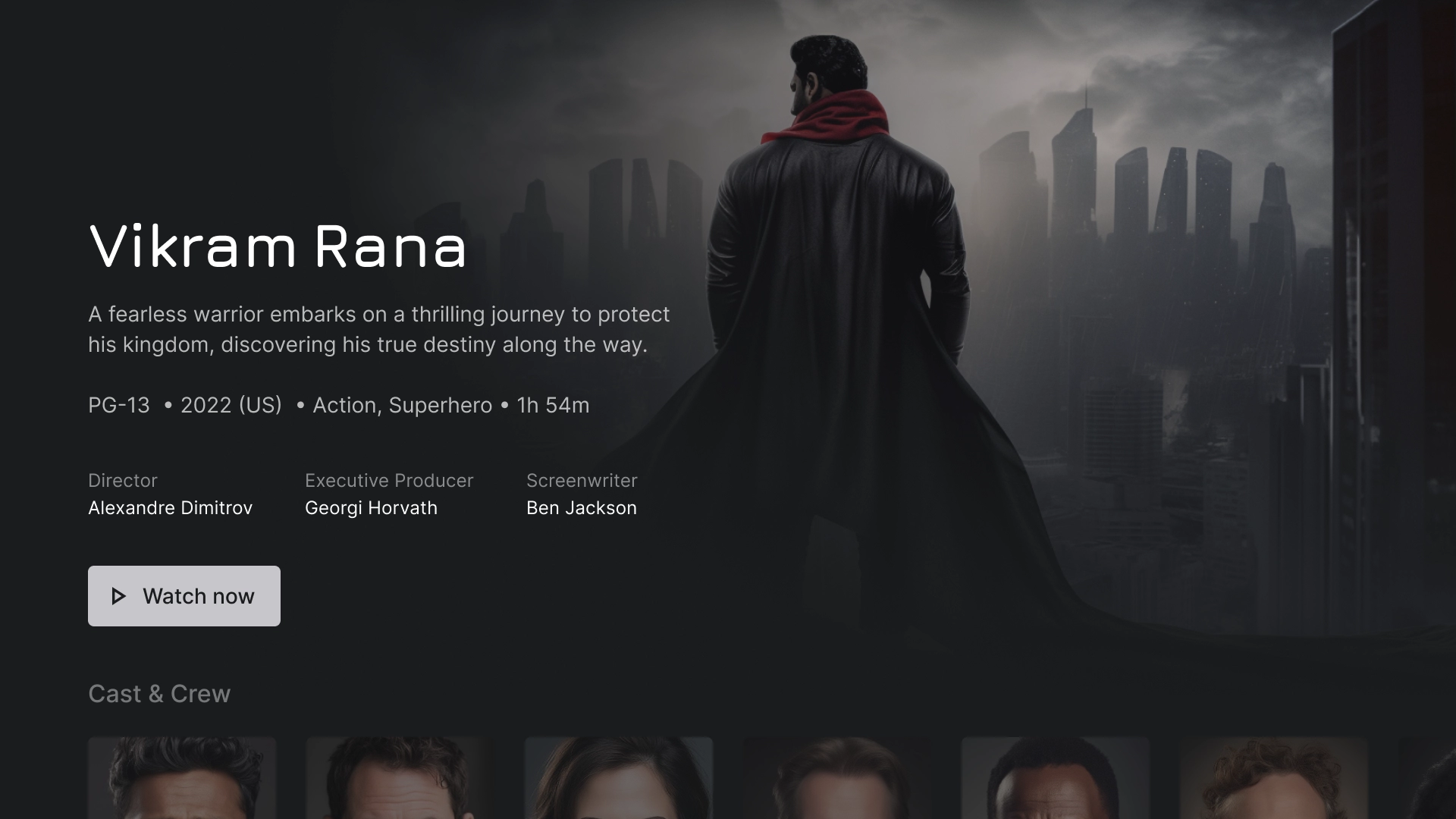
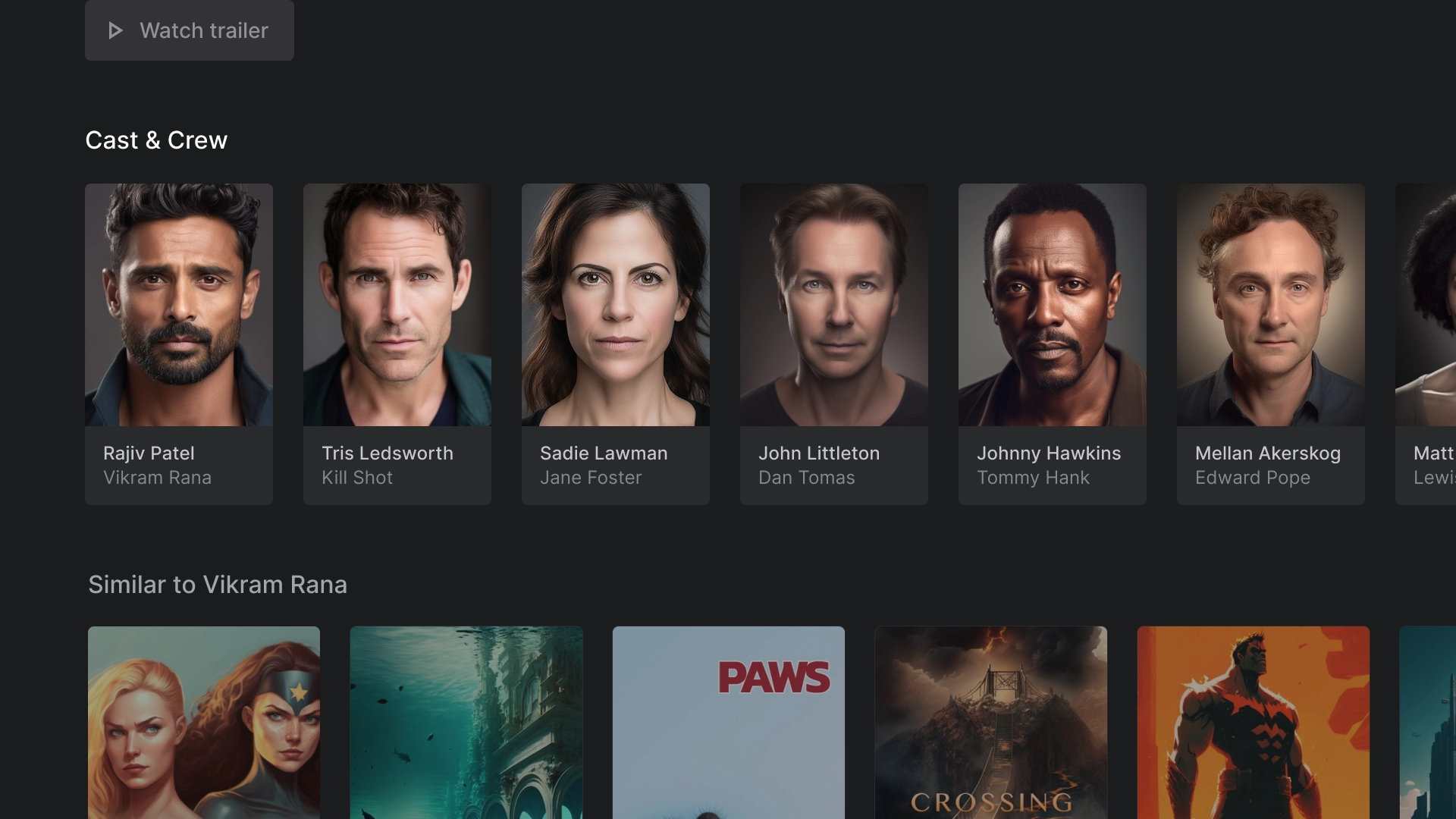
演員和工作人員
「演員與工作人員」部分有一列經典資訊卡,提供標題和說明,每張資訊卡旁還會有一個 2:3 的圖片素材資源。
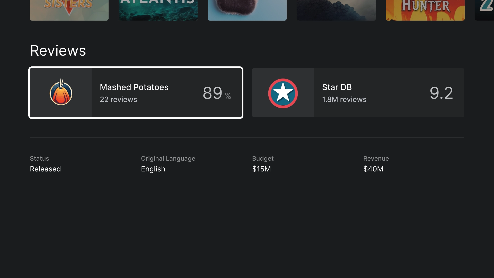
評分
「評分」專區提供自訂的經典寬資訊卡,其中含有額外資訊。
播放
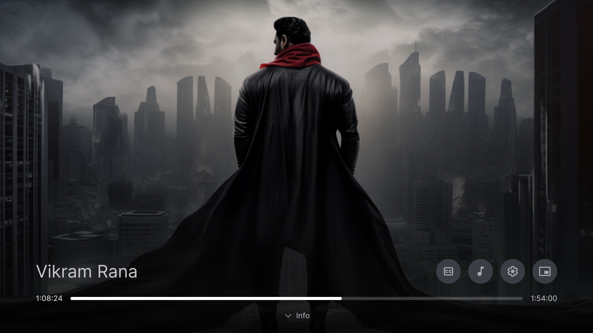
影片播放器
採用最佳做法的標準影片播放器。
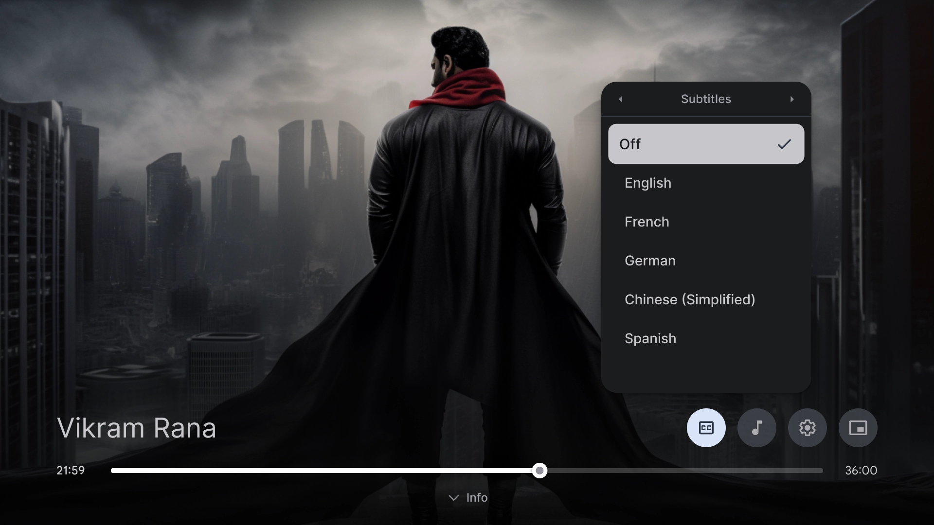
影片播放器設定
影片播放器上的隱藏式輔助字幕彈出式圖示。
設定
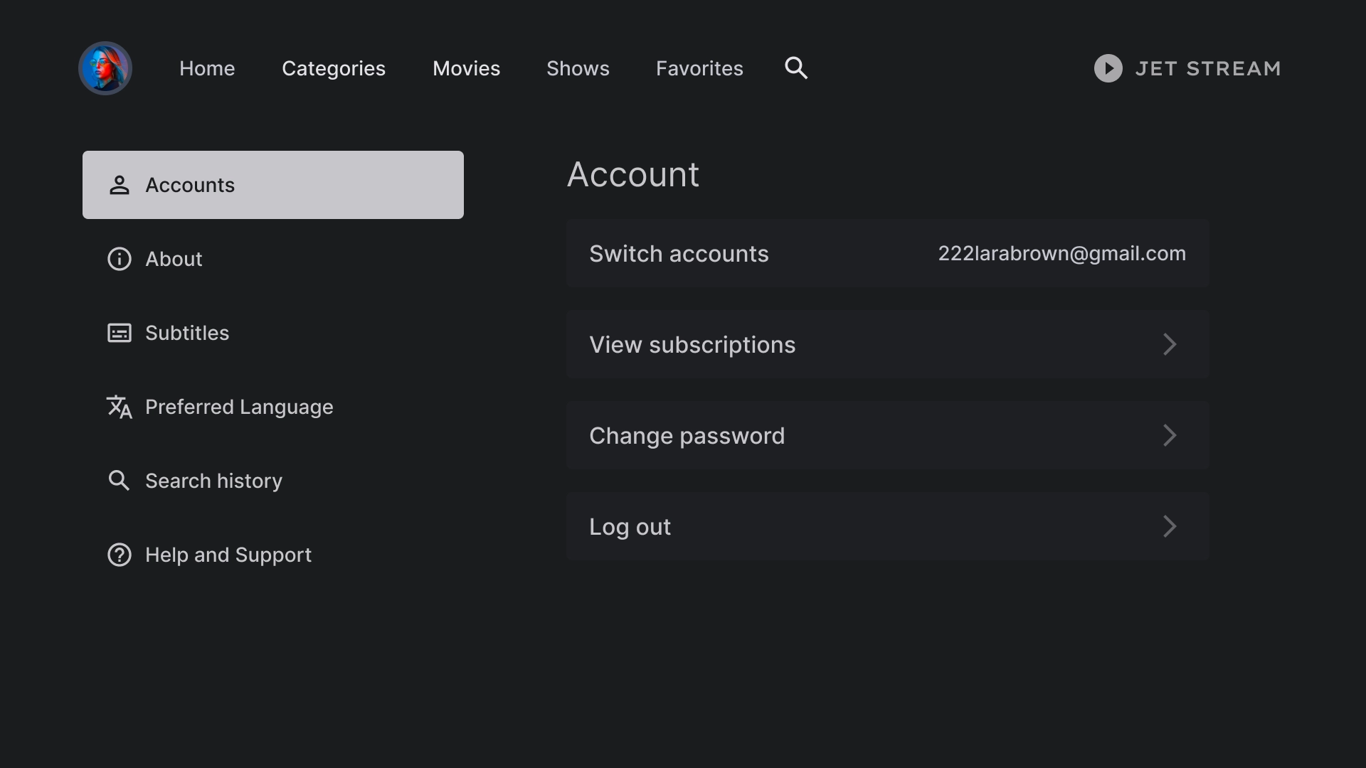
帳戶設定
帳戶頁面版面配置採用雙欄設計,左側有清單元件,右側為自訂資訊卡元件,以格狀格式排列。
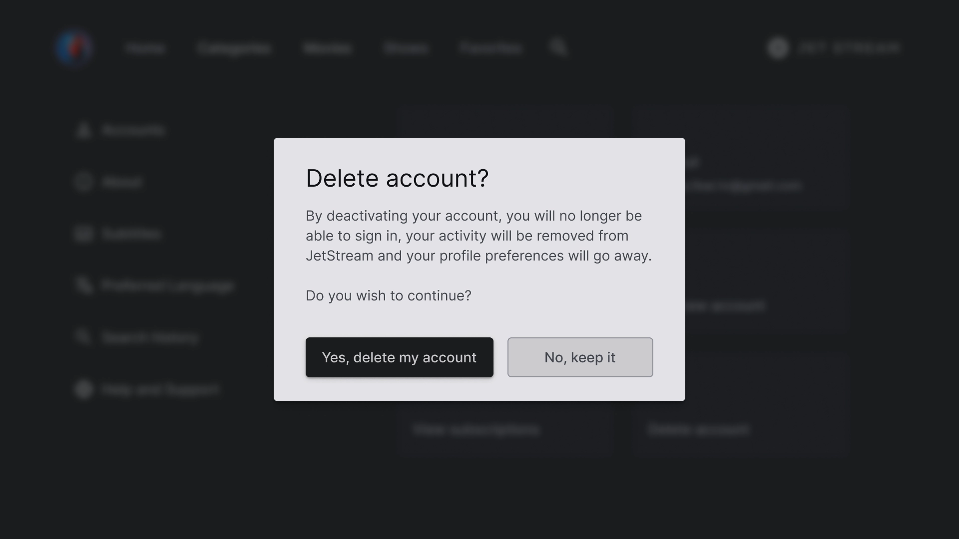
「刪除帳戶」對話方塊
對話方塊設計採用對比鮮明的背景,使其從畫面的其他部分脫穎而出。對話方塊中的兩個按鈕靠左對齊,呈現簡潔有條理的外觀。
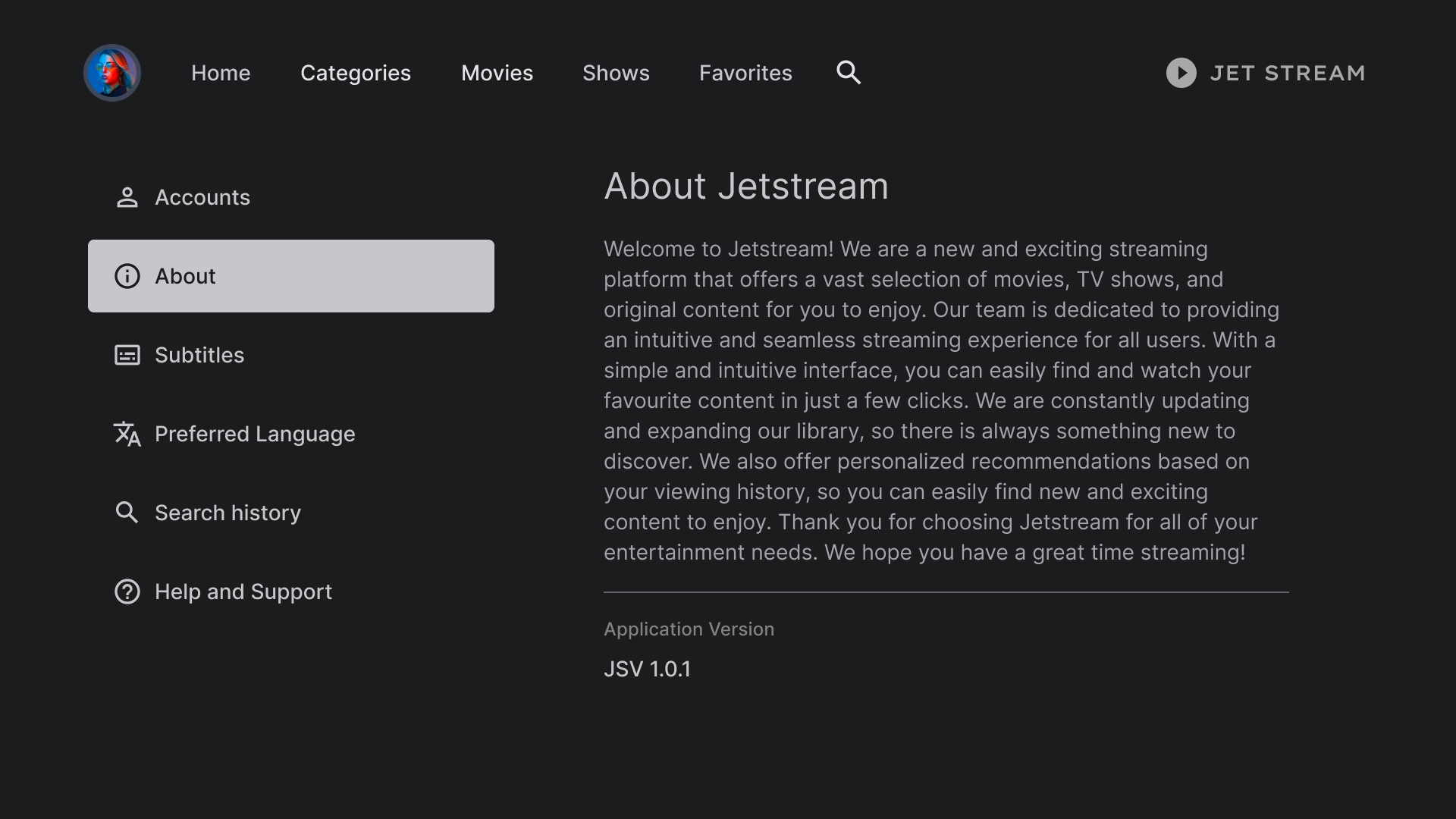
簡介
「關於」部分提供右側面板和可捲動的文字檢視畫面。
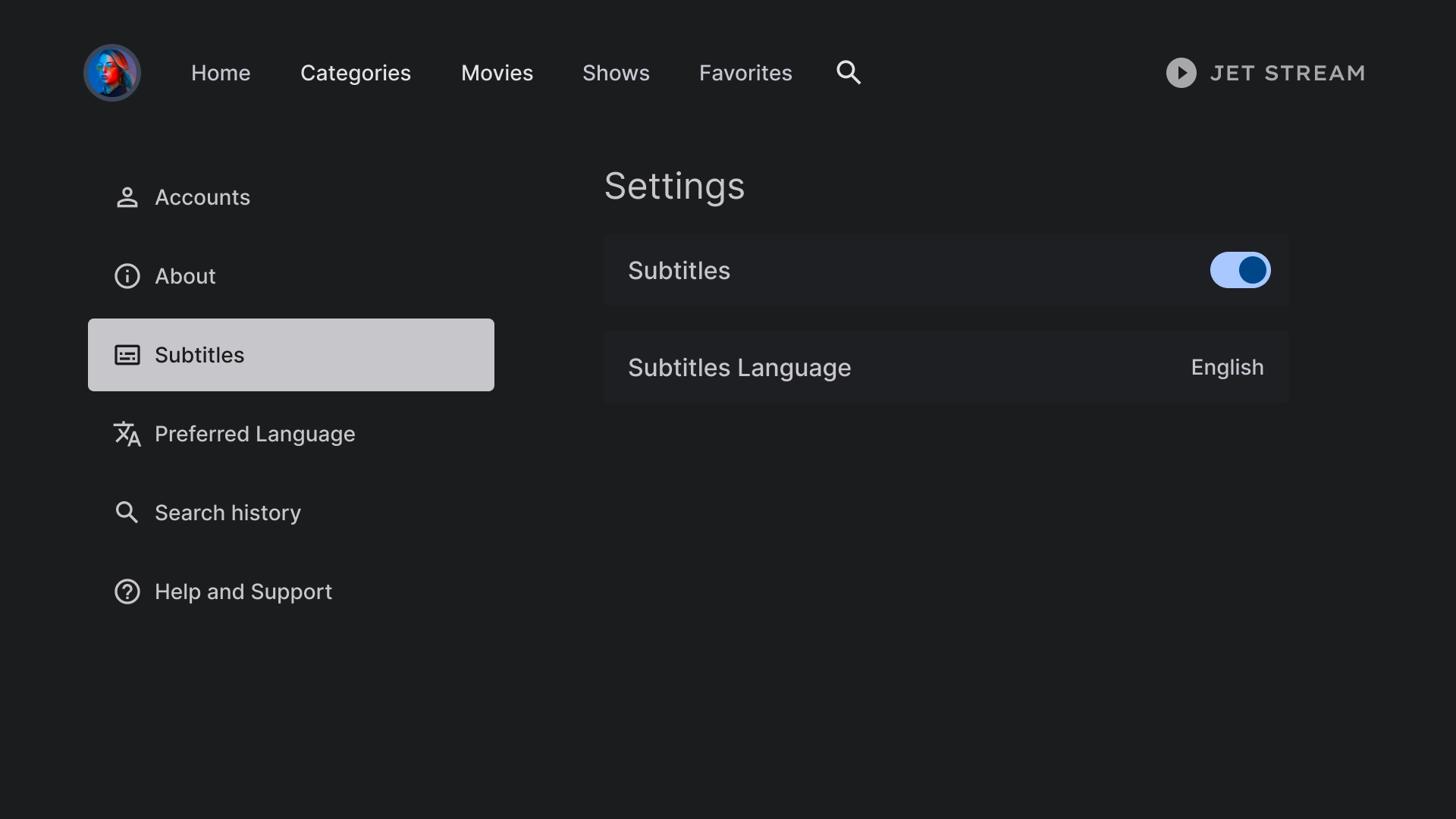
字幕設定
清單元件可用來在副標題下顯示各種設定,且會使用切換按鈕或標籤等動作。
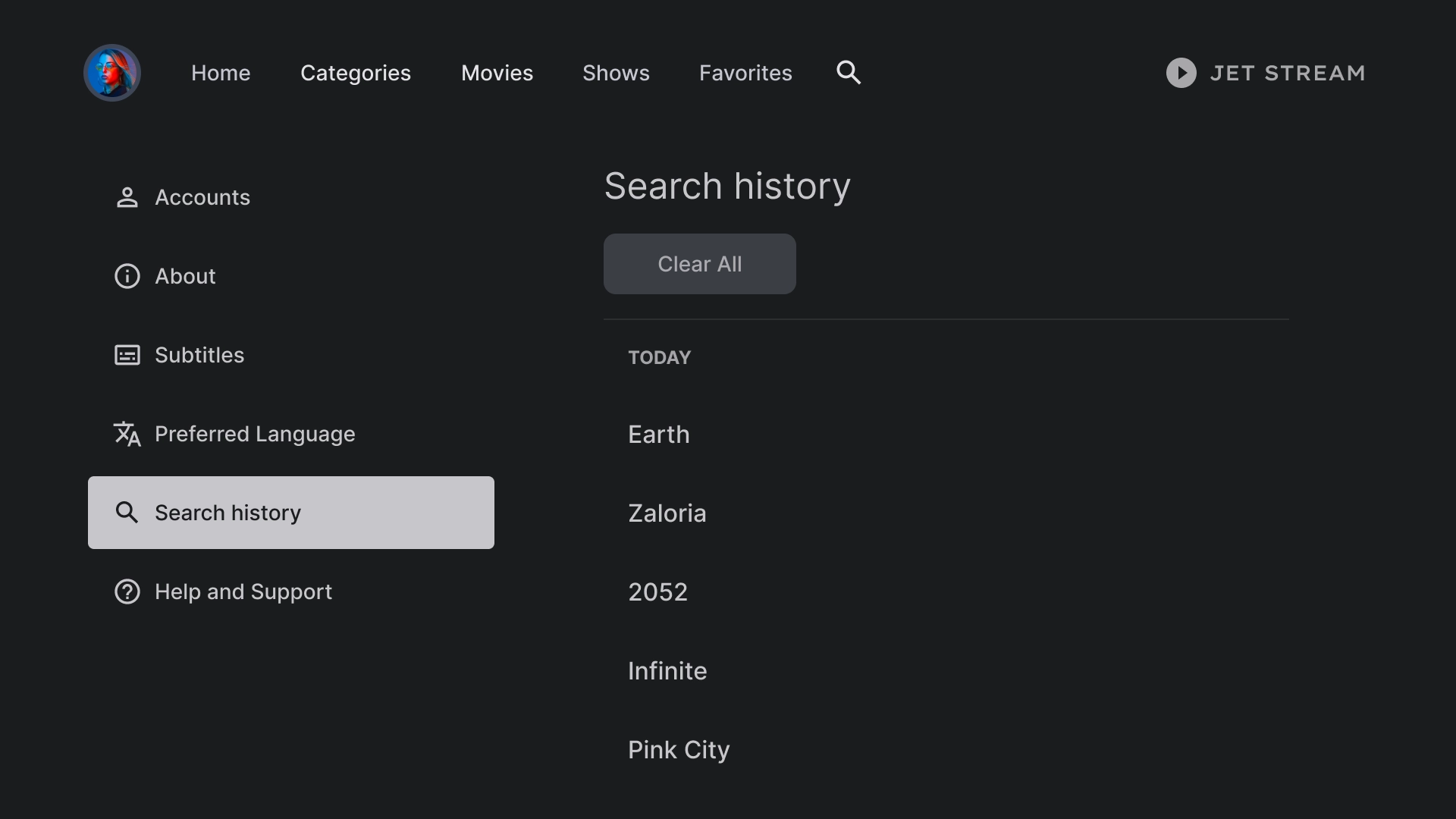
記錄
搜尋記錄採用的版面配置會顯示先前搜尋過的查詢清單,並提供清除所有搜尋記錄的選項。
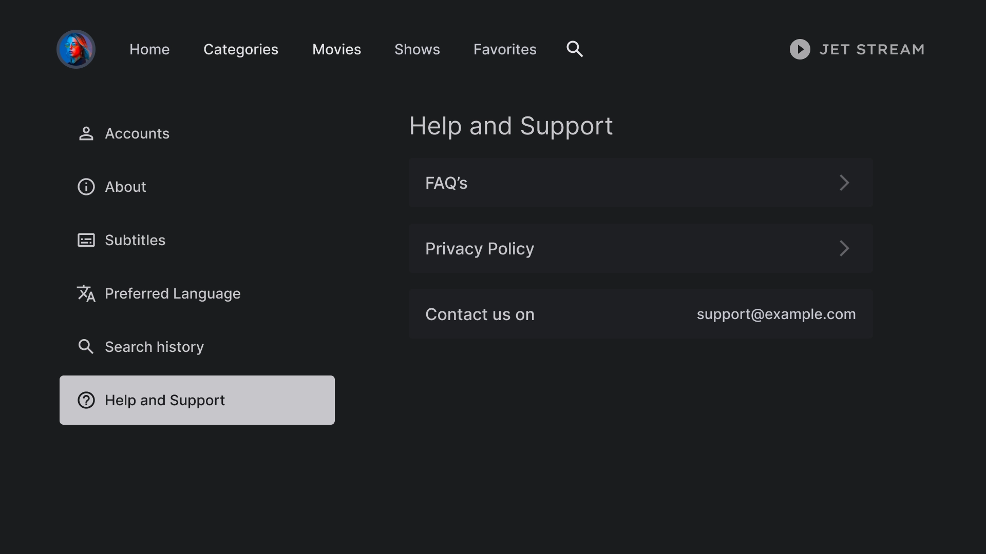
說明
「說明與支援」部分使用自訂清單元件來顯示聯絡資訊和常見問題等各種選項。