घर पर कभी भी बड़ी स्क्रीन पर, अपनी पसंदीदा फ़िल्मों, टीवी शो, संगीत वगैरह का आनंद लें.
संसाधन
| टाइप | लिंक | स्थिति |
|---|---|---|
| डिज़ाइन | डिज़ाइन सोर्स (Figma) | उपलब्ध है |
| Inter (Google Fonts) | उपलब्ध है | |
| लागू करना | Jetpack Compose (Github) | उपलब्ध है |
थीम
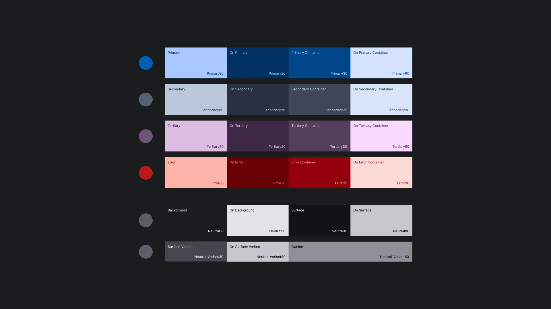
कलर थीम
कलर थीम, Material Design 3 के थीम जनरेटर का इस्तेमाल करके जनरेट की जाती है.
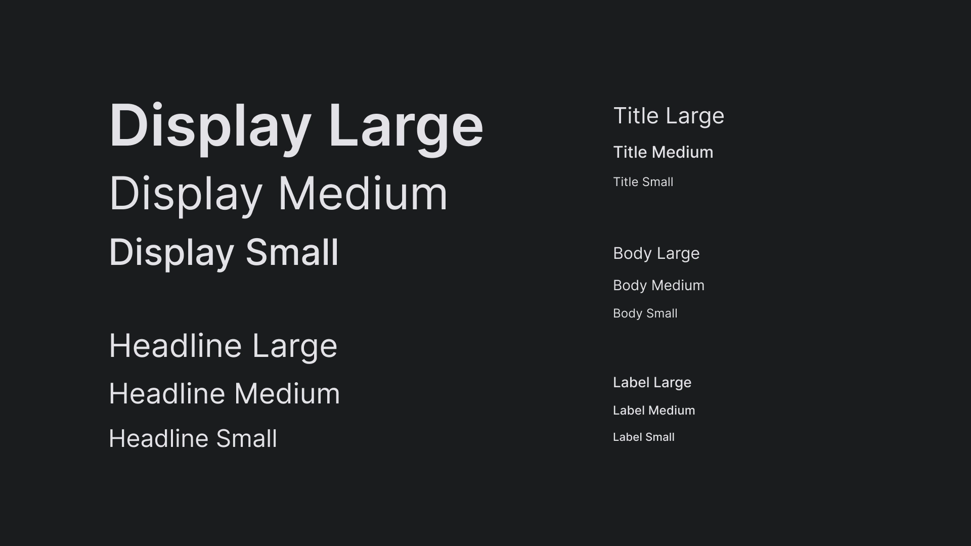
टाइपोग्राफ़ी
JetStream के टाइप स्केल में Inter टाइपफ़ेस का इस्तेमाल किया जाता है. इससे टीवी स्क्रीन पर टेक्स्ट साफ़ तौर पर दिखता है.
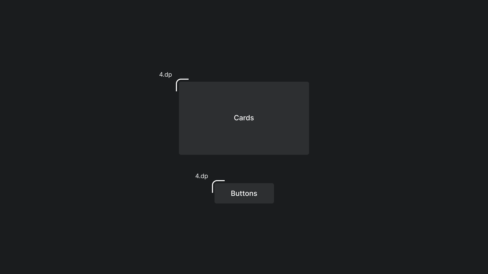
आकार
कार्ड और बटन पर हल्का सा रेडियस लागू किया गया है, ताकि उनके किनारे अच्छे और आसानी से इस्तेमाल किए जा सकें.
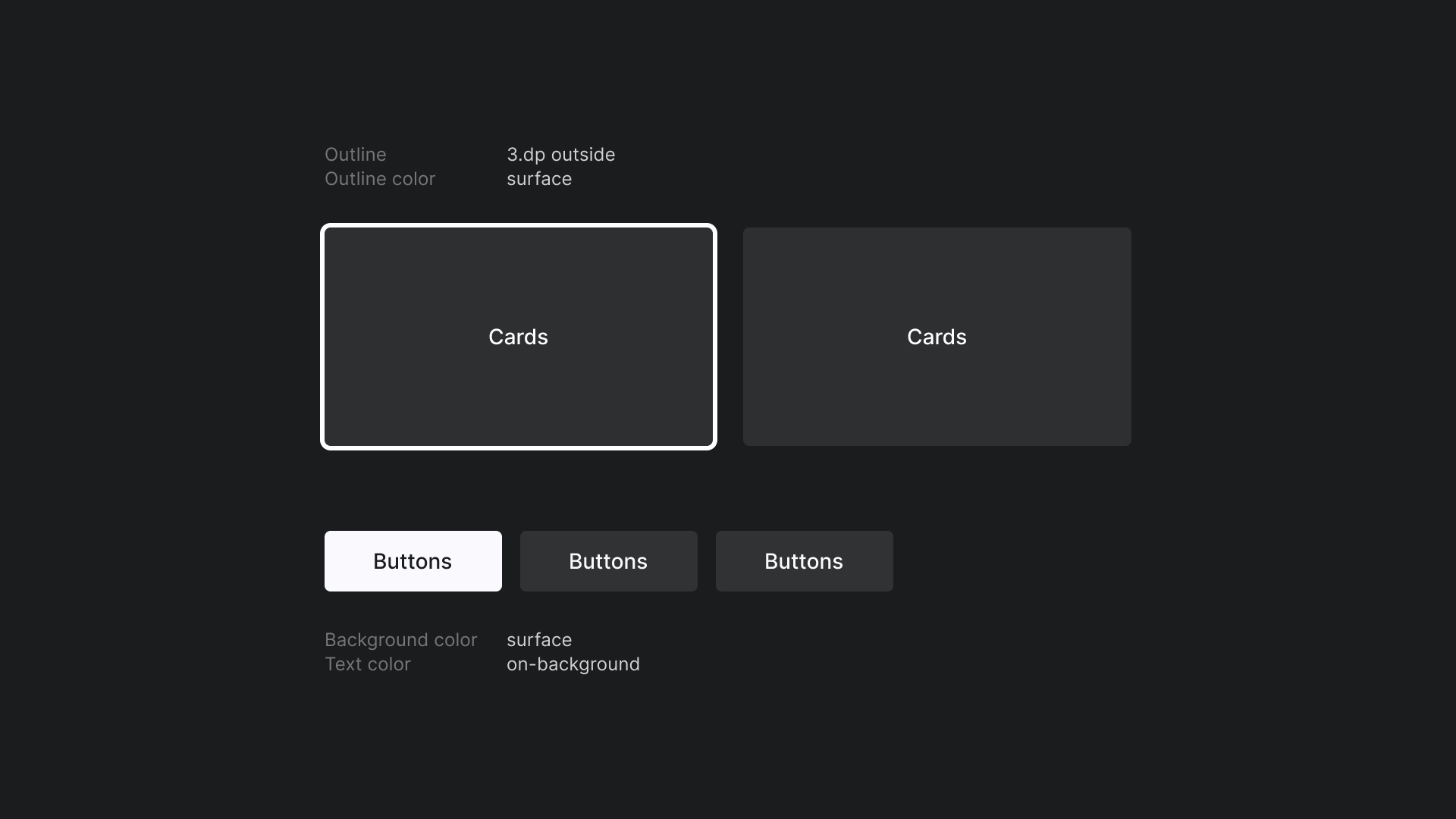
फ़ोकस
JetStream में, आउटलाइन के रंग वाली 3dp आउटलाइन का इस्तेमाल किया जाता है.
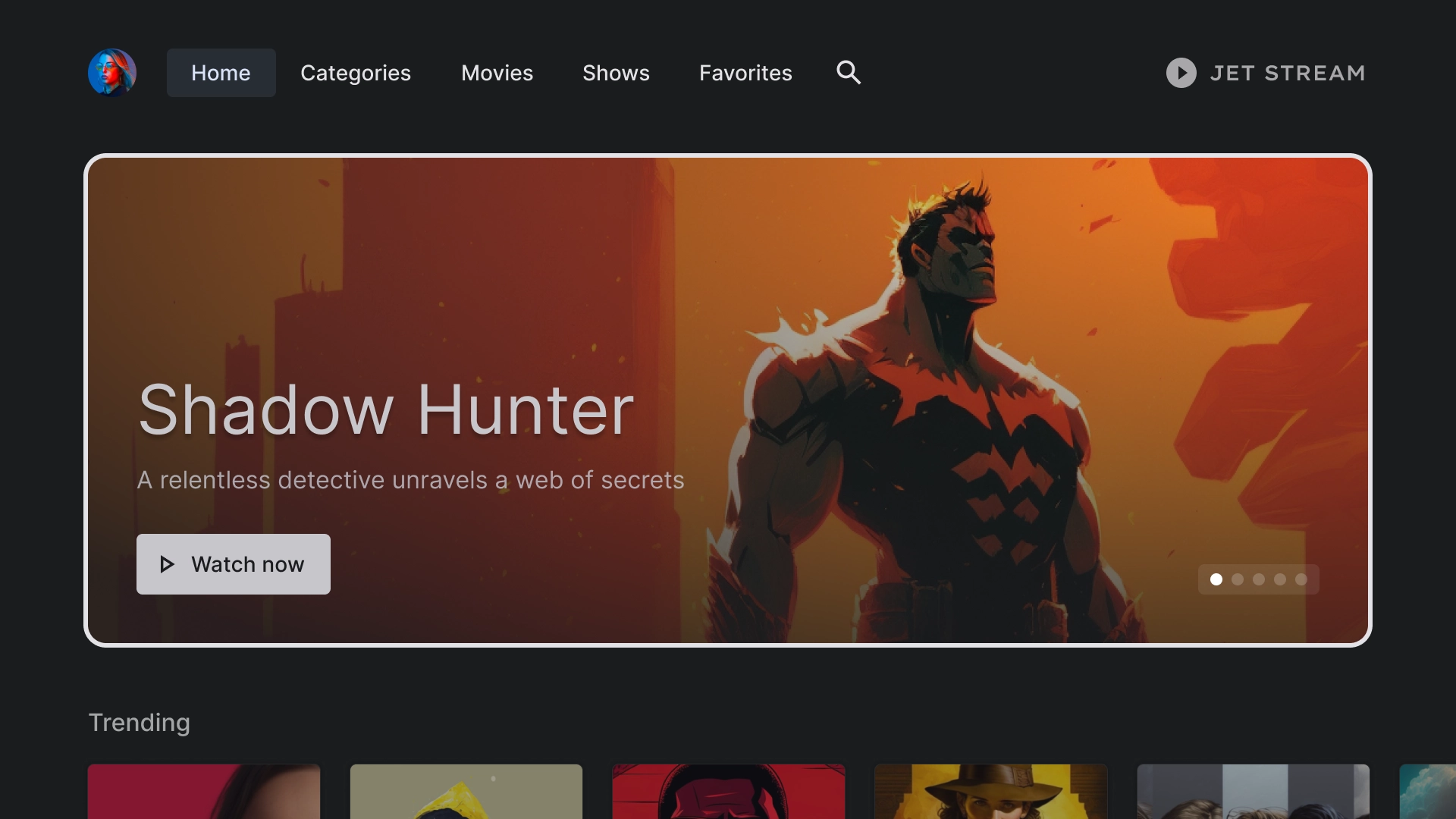
होम
होम
JetStream ऐप्लिकेशन का लैंडिंग पेज.
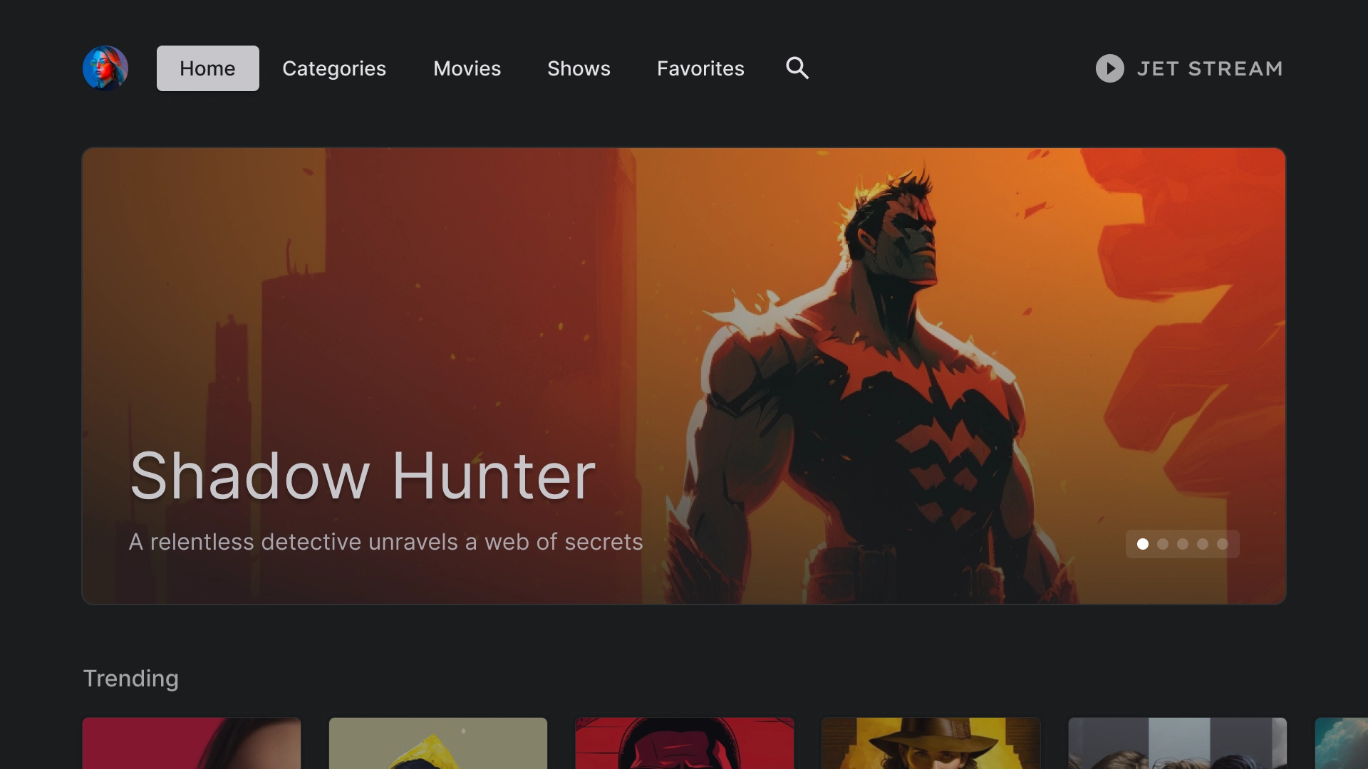
चुनिंदा कैरसेल
कार्ड स्टाइल लेआउट वाला कैरसेल.
कॉन्टेंट की लाइन
JetStream, पांच कॉलम वाले लेआउट में 2:3 आसपेक्ट रेशियो (लंबाई-चौड़ाई का अनुपात) के साथ स्टैंडर्ड कार्ड स्टाइल का इस्तेमाल करता है.
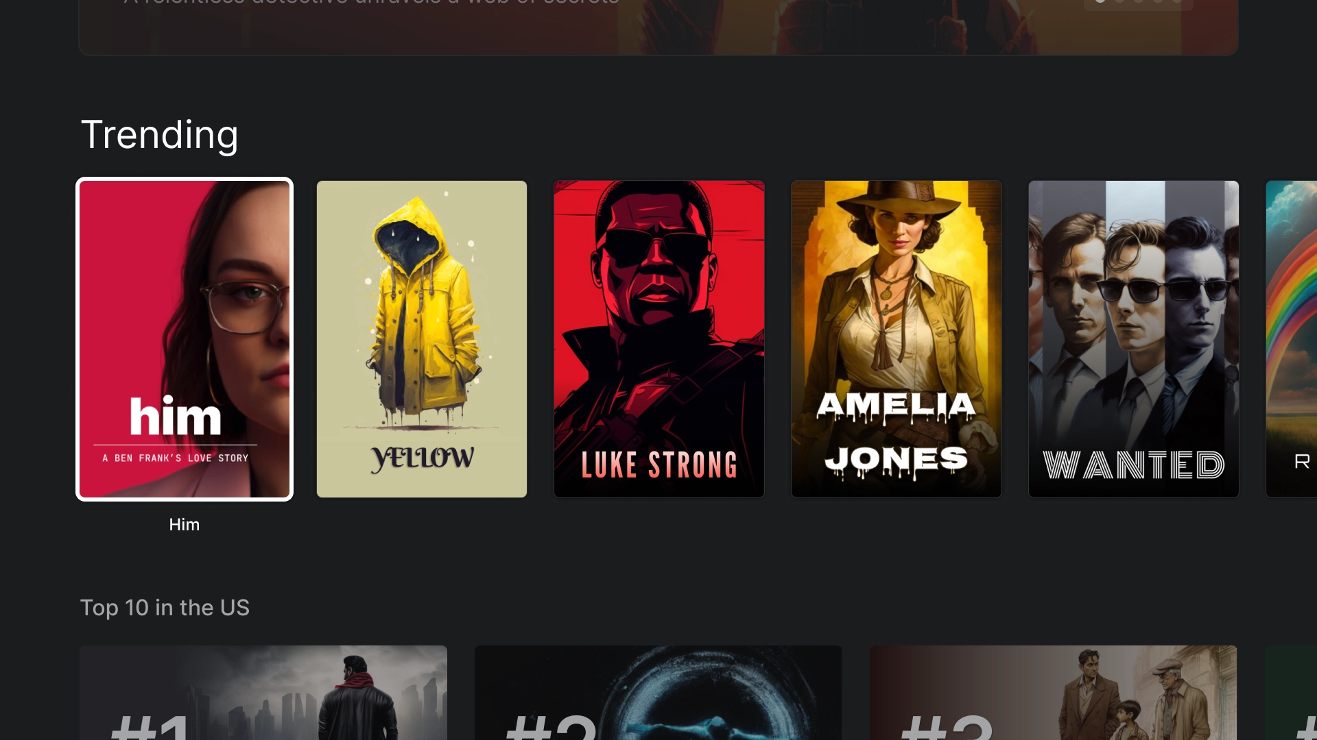
इमर्सिव लिस्ट
इमर्सिव लिस्ट कॉम्पोनेंट का इस्तेमाल करके, ऐप्लिकेशन में खास कॉन्टेंट हाइलाइट करें. जैसे, सबसे ज़्यादा ट्रेंड करने वाली 10 फ़िल्में.
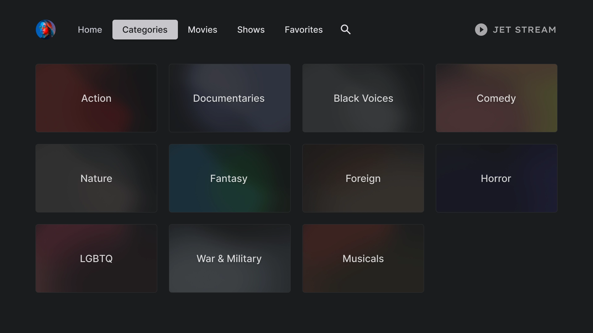
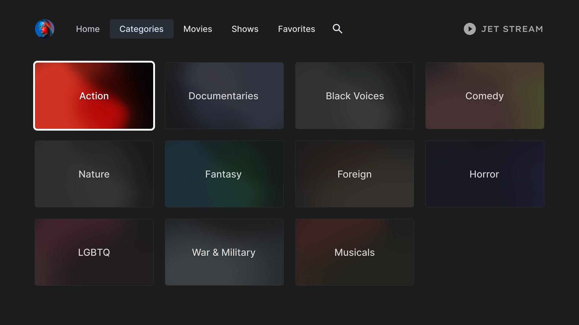
कैटगरी
कैटगरी
कैटेगरी पेज पर, शैलियों को ग्रिड फ़ॉर्मैट में दिखाया जाता है, ताकि उन्हें आसानी से ऐक्सेस किया जा सके और उन पर नेविगेट किया जा सके.
कैटगरी कार्ड
कैटगरी की जानकारी
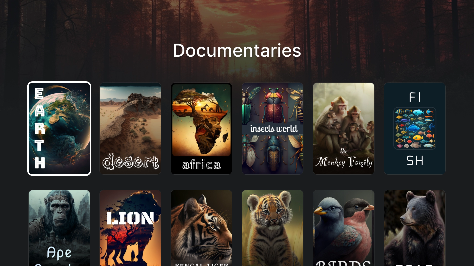
कैटेगरी के बारे में जानकारी देने वाला पेज बनाने के लिए, हेडर के साथ 2:3 कार्ड ग्रिड का इस्तेमाल किया जाता है.
मीडिया
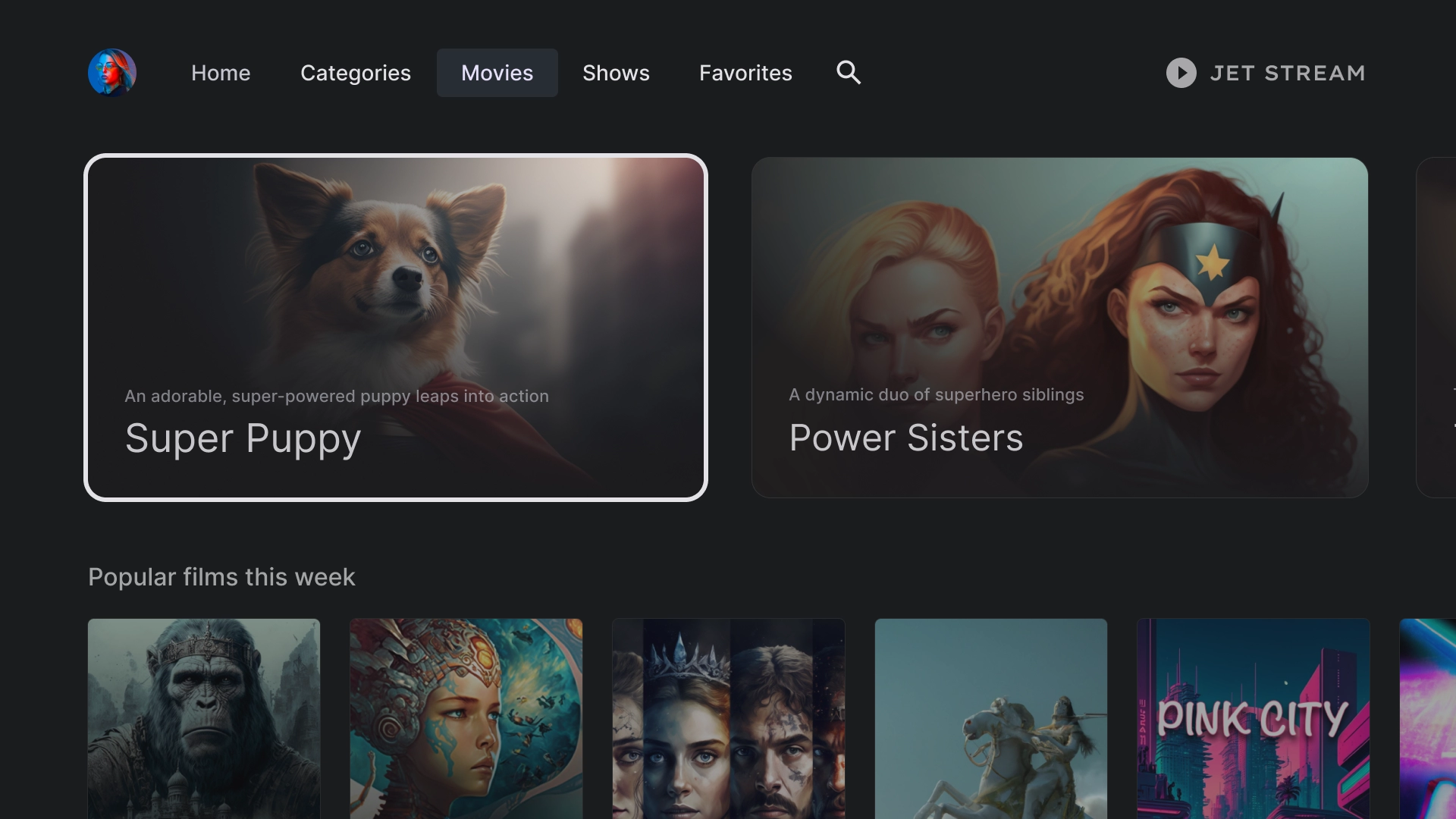
फ़िल्में
यह फ़िल्मों का स्टैंडर्ड टैब है. इसमें सबसे ऊपर 16:9 आसपेक्ट रेशियो वाले फ़ीचर्ड कार्ड और सबसे नीचे कॉन्टेंट ग्रिड दिख रही है.
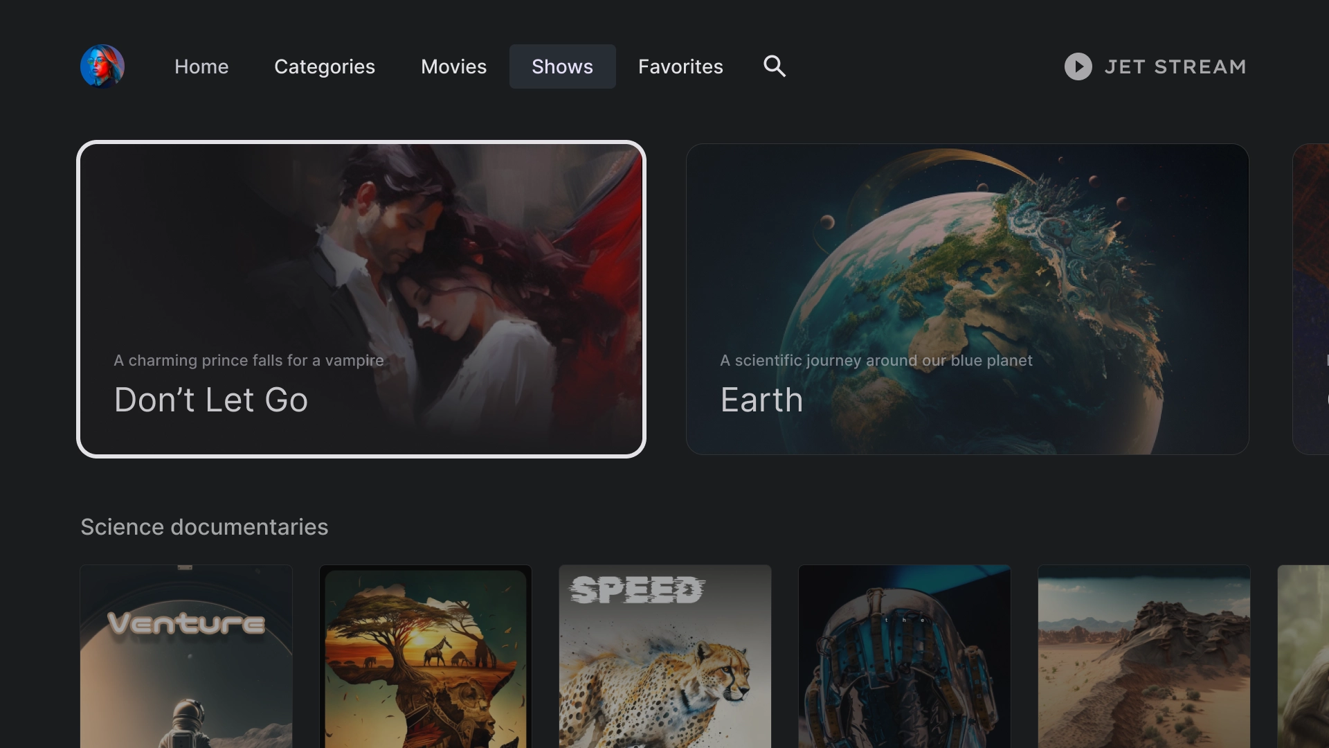
शो
लाइब्रेरी
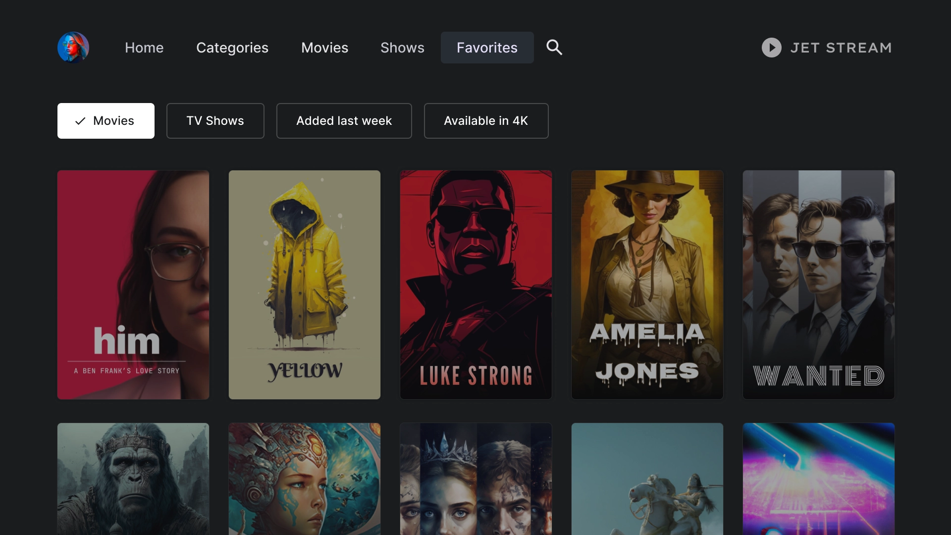
पसंदीदा
'पसंदीदा' टैब में, स्क्रीन पर सबसे ऊपर फ़िल्टर चिप शामिल होती हैं. इनकी मदद से, कॉन्टेंट को तुरंत खोजा जा सकता है.
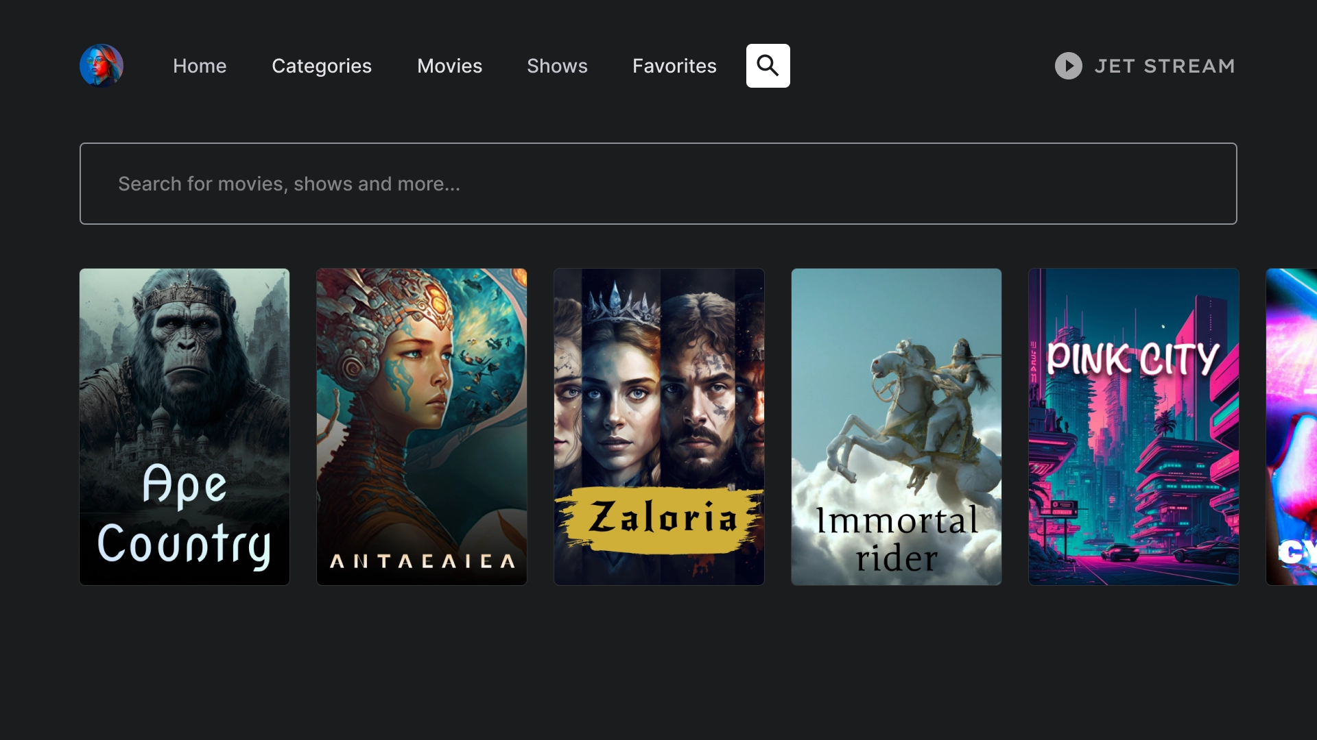
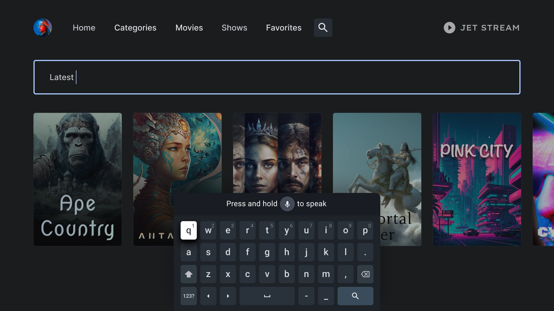
खोजें
खोज नतीजों में दिखने वाले विज्ञापन के लिए लैंडिंग पेज
खोज पेज पर, एक खोज बार होता है. इसमें हाल की खोजों के आधार पर, खोज क्वेरी के सुझाव दिए जाते हैं.
ऐक्टिव सर्च
जब उपयोगकर्ता खोज बार पर फ़ोकस करता है, तब कीबोर्ड पॉप-अप होता है. साथ ही, उपयोगकर्ता के टाइप करते समय, नीचे दिए गए नतीजे डाइनैमिक रूप से अपडेट होते हैं.
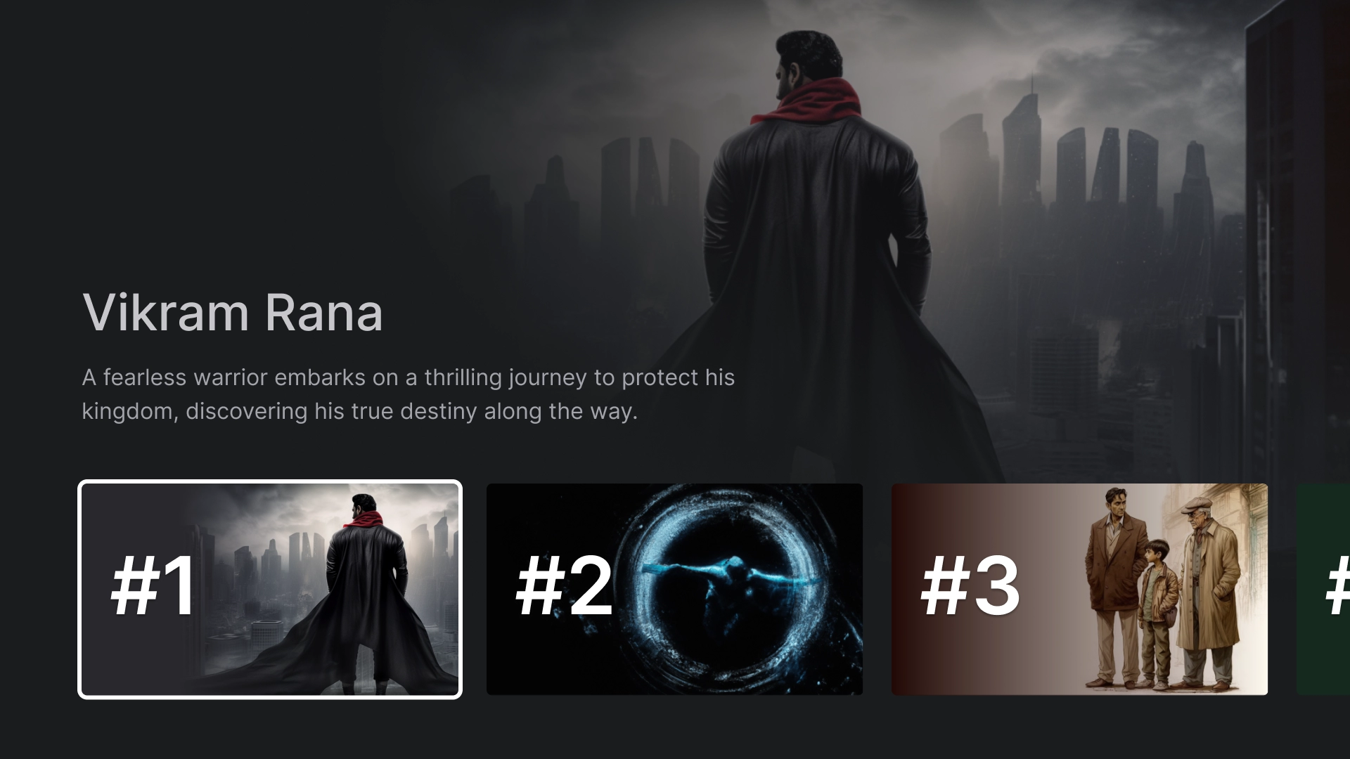
इकाई की जानकारी
ज़्यादा जानकारी वाला लैंडिंग पेज
ज़्यादा जानकारी वाले पेज पर, फ़िल्म का एक छोटा सा ट्रेलर दिखता है. साथ ही, फ़िल्म देखने के लिए एक कॉल-टू-ऐक्शन बटन भी दिखता है.
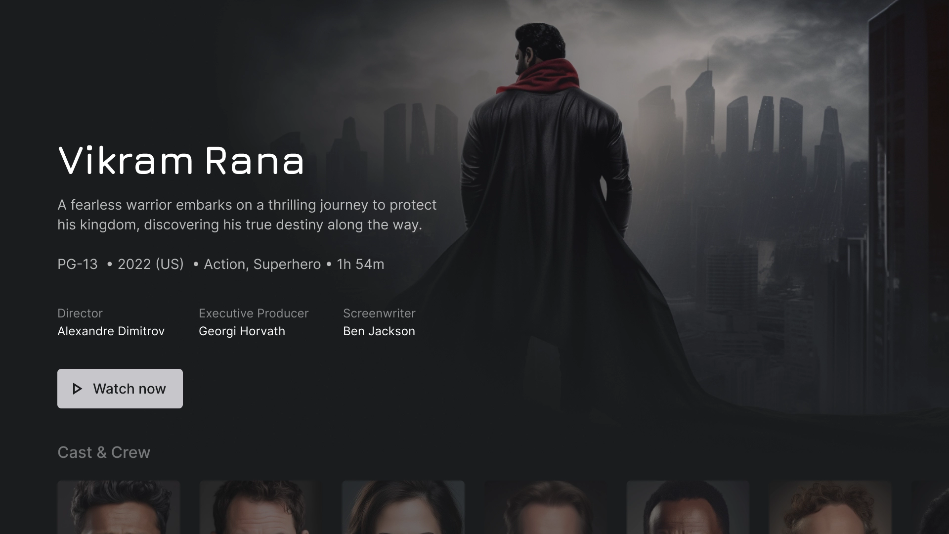
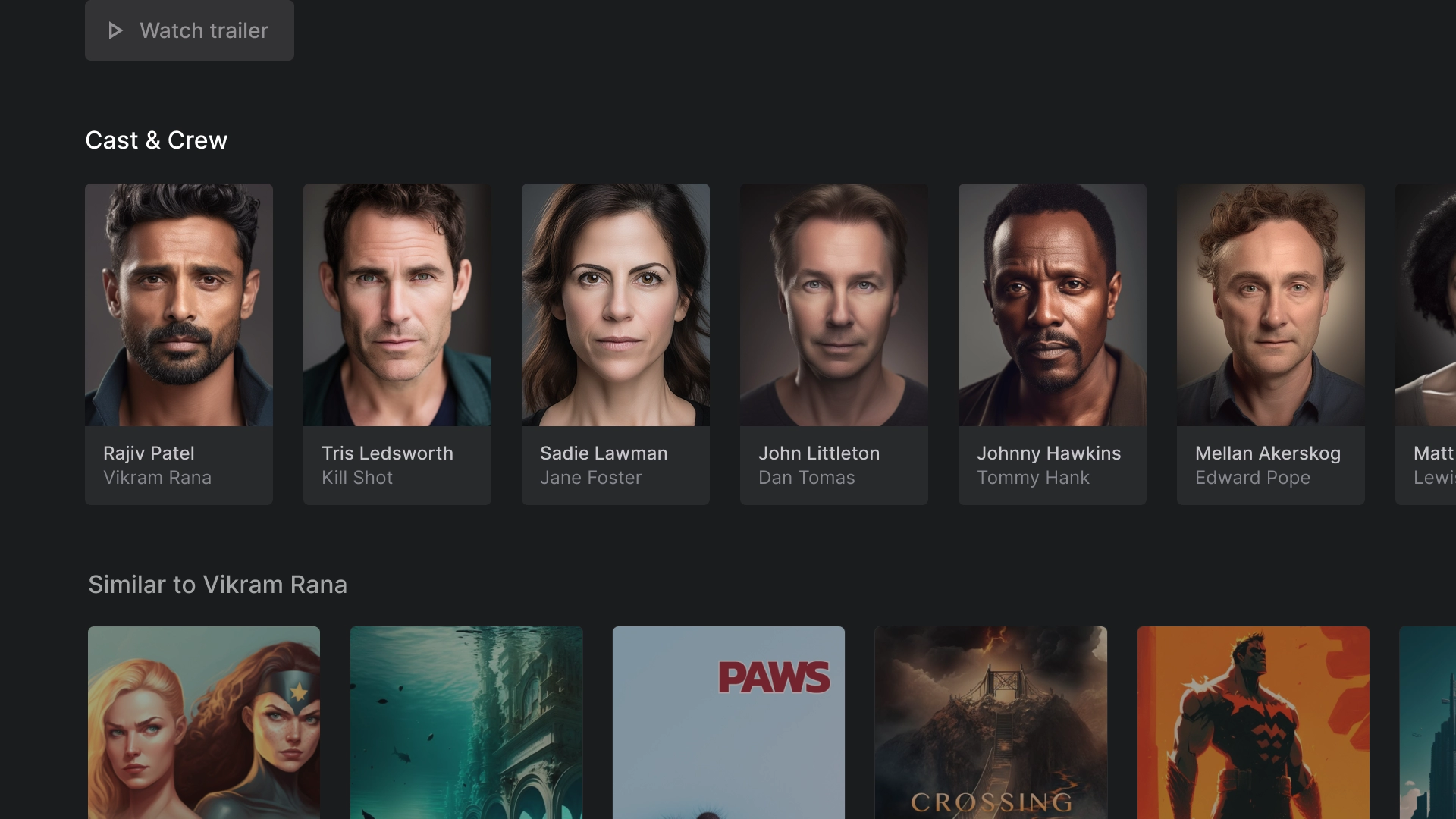
कलाकार और सहायक दल
'कलाकार और क्रू' सेक्शन में, टाइटल और जानकारी वाले क्लासिक कार्ड की एक लाइन दिखती है. हर कार्ड के साथ 2:3 इमेज ऐसेट होती है.
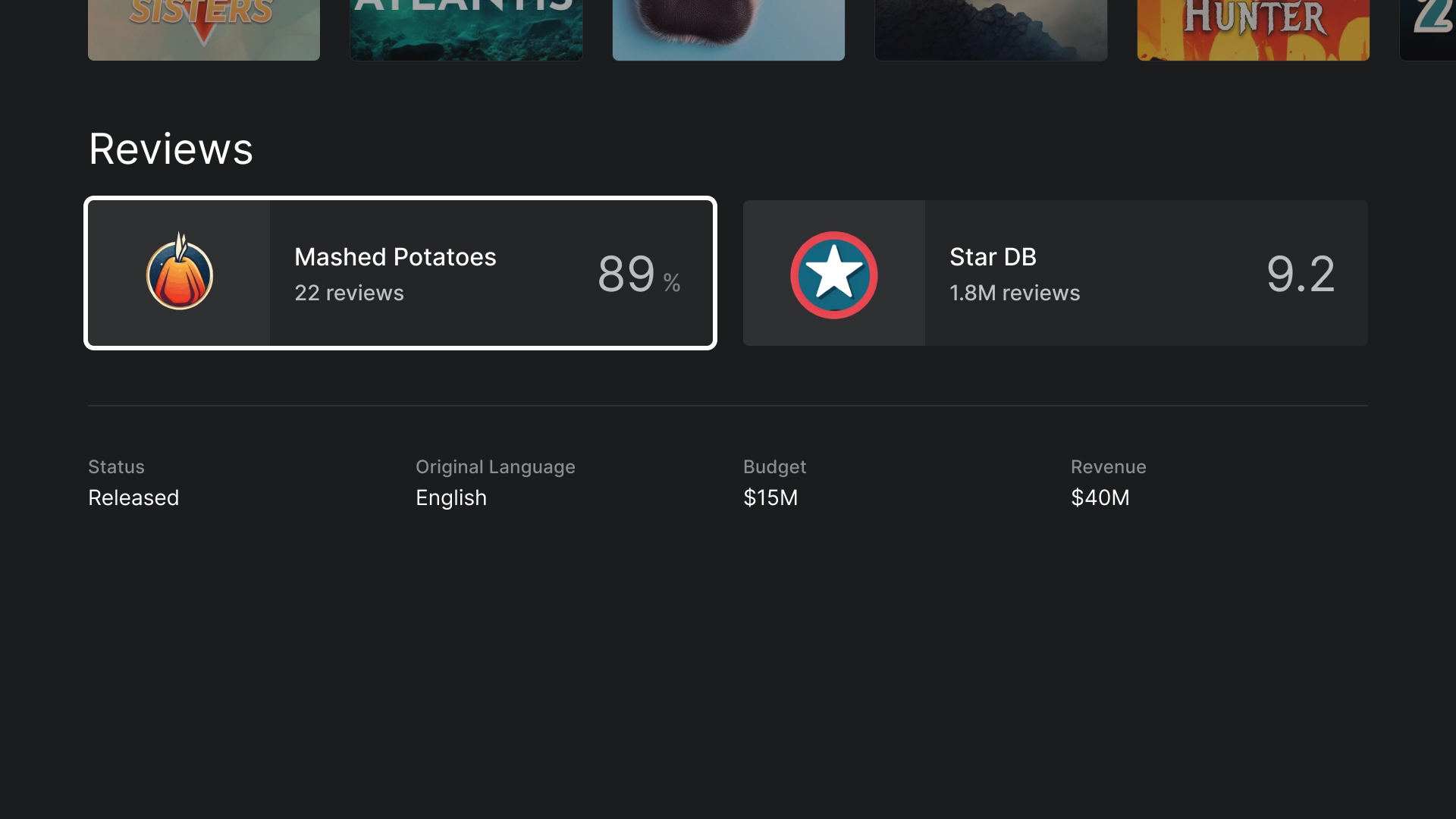
रेटिंग
रेटिंग सेक्शन में, कस्टम क्लासिक वाइड कार्ड दिखता है. इसमें अन्य जानकारी भी शामिल होती है.
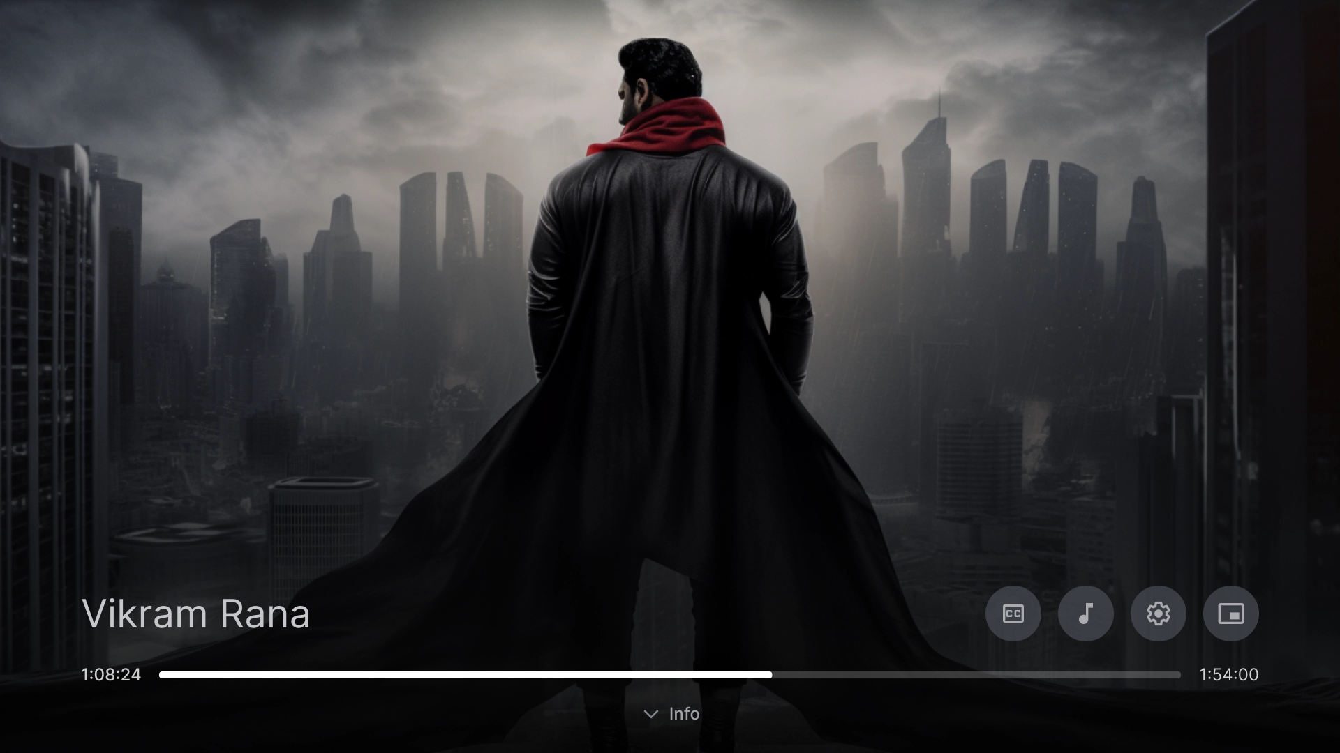
वीडियो चलाएं
वीडियो प्लेयर
सबसे सही तरीकों के साथ एक स्टैंडर्ड वीडियो प्लेयर.
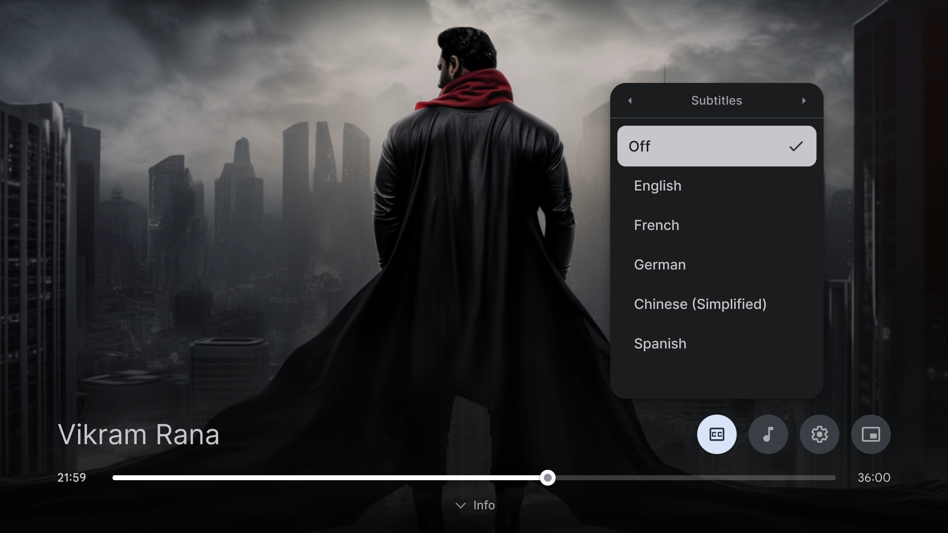
वीडियो प्लेयर की सेटिंग
वीडियो प्लेयर पर सबटाइटल का पॉप-ओवर.
सेटिंग
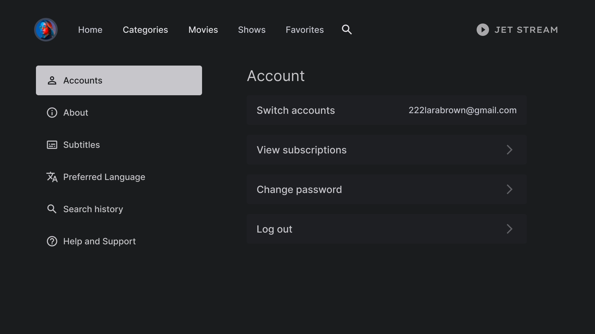
खाता सेटिंग
खातों के पेज का लेआउट, दो कॉलम वाला डिज़ाइन है. इसमें बाईं ओर सूची वाला कॉम्पोनेंट और दाईं ओर कस्टम कार्ड कॉम्पोनेंट मौजूद हैं. इन्हें ग्रिड फ़ॉर्मैट में व्यवस्थित किया गया है.
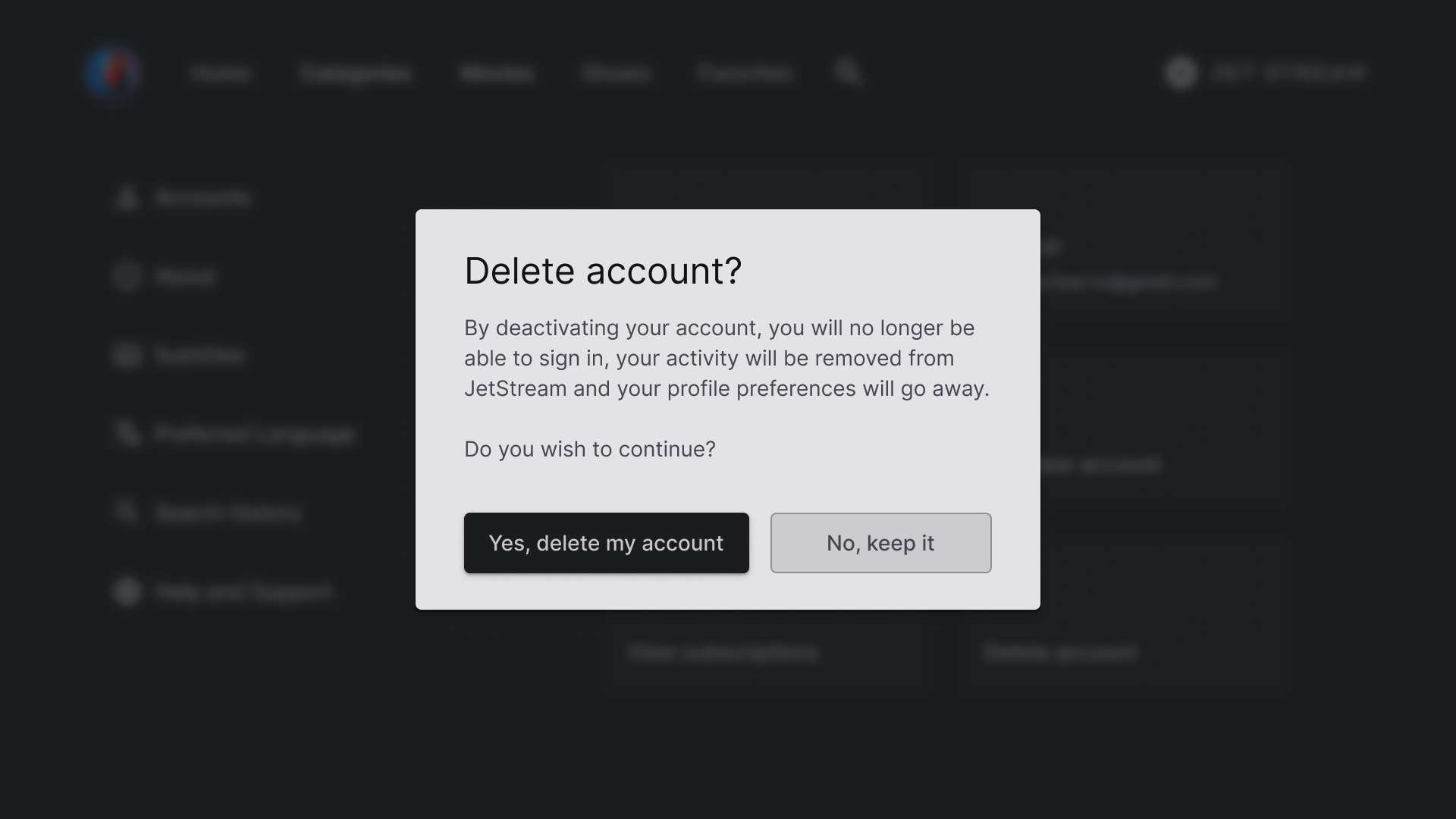
खाता मिटाने का डायलॉग
डायलॉग बॉक्स को कंट्रास्ट वाले बैकग्राउंड के साथ डिज़ाइन किया गया है, ताकि यह स्क्रीन के बाकी हिस्से से अलग दिखे. डायलॉग बॉक्स में मौजूद दोनों बटन, बाईं ओर अलाइन किए गए हैं, ताकि यह साफ़-सुथरा और व्यवस्थित दिखे.
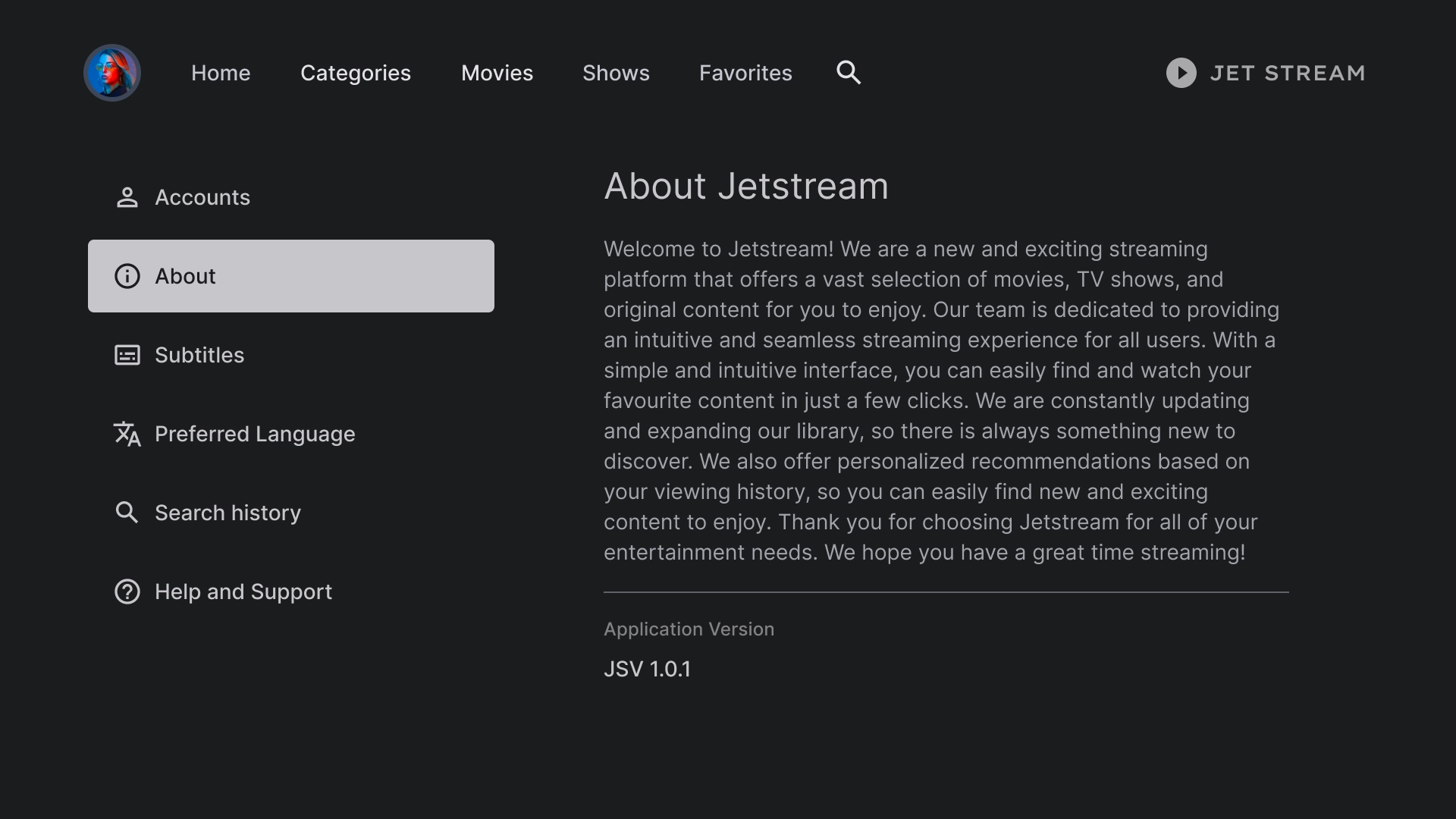
About
'जानकारी' सेक्शन में, दाईं ओर एक पैनल होता है. इसमें स्क्रोल किया जा सकने वाला टेक्स्ट व्यू होता है.
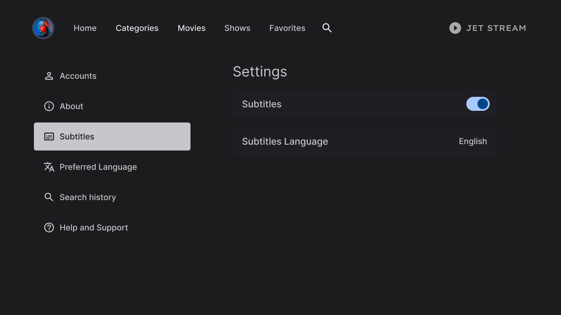
सबटाइटल की सेटिंग
सूची कॉम्पोनेंट का इस्तेमाल, सबटाइटल में अलग-अलग सेटिंग दिखाने के लिए किया जाता है. यह स्विच या लेबल जैसे ऐक्शन का इस्तेमाल करता है.
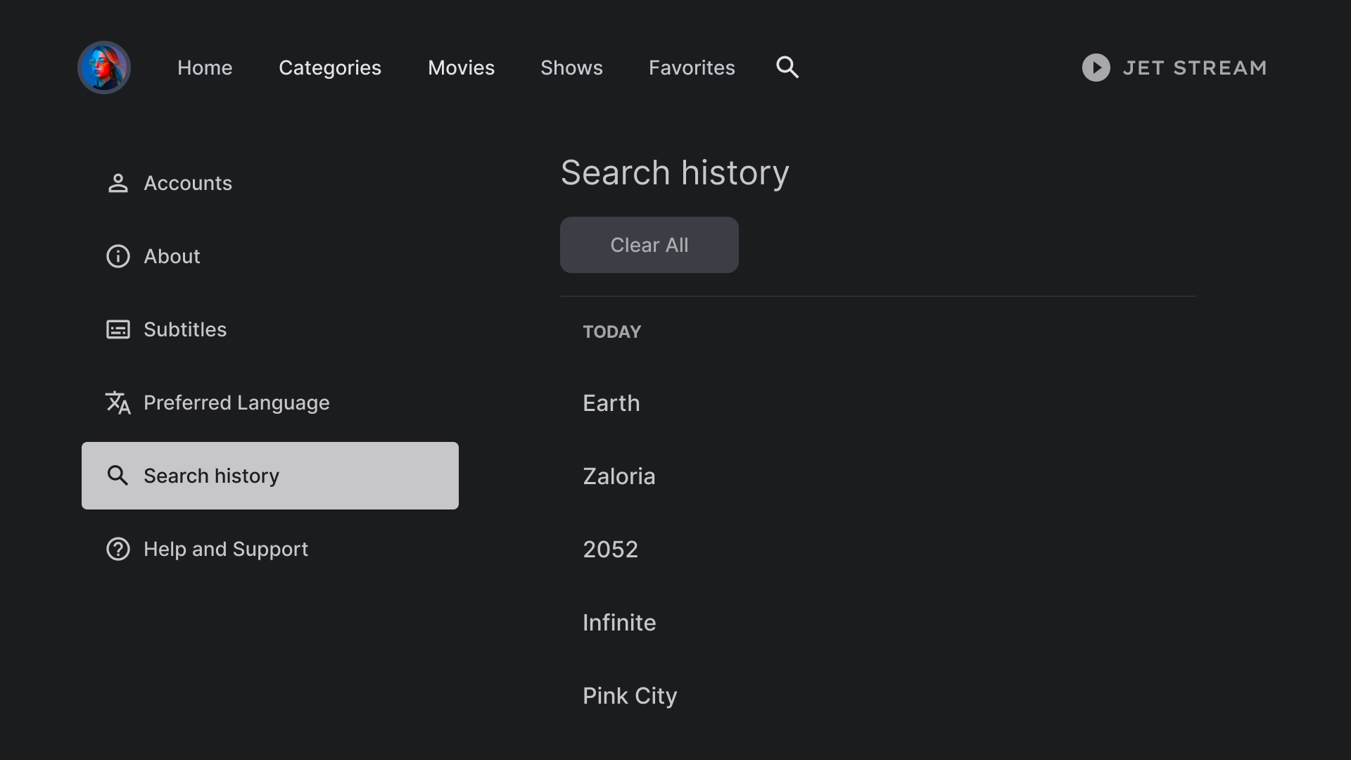
इतिहास
खोज के इतिहास में एक ऐसा लेआउट इस्तेमाल किया जाता है जिसमें पहले खोजी गई क्वेरी की सूची दिखती है. साथ ही, खोज के पूरे इतिहास को मिटाने का विकल्प भी होता है.
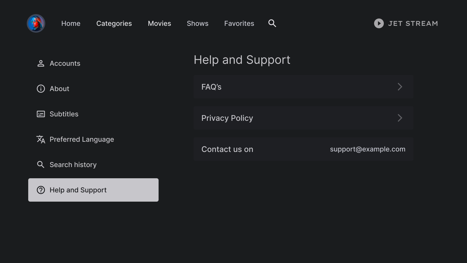
सहायता
'सहायता और सुझाव' सेक्शन में, कस्टम लिस्ट कॉम्पोनेंट का इस्तेमाल किया जाता है. इससे संपर्क जानकारी और अक्सर पूछे जाने वाले सवालों के साथ-साथ अन्य विकल्प भी दिखाए जाते हैं.