
Jetpack Compose เป็นชุดเครื่องมือสมัยใหม่สำหรับการสร้าง UI ที่ใช้กับ Android โดยเฉพาะ Jetpack Compose ลดความซับซ้อนและเร่งการพัฒนา UI บน Android โดยใช้โค้ดที่น้อยลงและเครื่องมือที่มีประสิทธิภาพ และ Kotlin API ที่ใช้งานง่าย
ในบทแนะนำนี้ คุณจะสร้างคอมโพเนนต์ UI แบบง่ายด้วยฟังก์ชันการประกาศ คุณจะไม่ แก้ไขการออกแบบ XML หรือใช้เครื่องมือแก้ไขการออกแบบ แต่จะใช้ Composable แทน เพื่อกำหนดองค์ประกอบที่คุณต้องการ และคอมไพเลอร์ของ Compose จะทำงานส่วนที่เหลือให้

-
4 บทเรียน
บทที่ 1: ฟังก์ชันที่ประกอบกันได้
Jetpack Compose สร้างขึ้นจากฟังก์ชันที่ประกอบกันได้ ฟังก์ชันเหล่านี้ช่วยให้คุณกำหนด
UI ของแอปโดยอัตโนมัติด้วยการอธิบายลักษณะหน้าตาของแอปและมอบทรัพยากร Dependency ต่างๆ
แทนที่จะไปมุ่งเน้นที่กระบวนการสร้าง UI (การเริ่มต้นองค์ประกอบ
แนบกับผู้ปกครอง ฯลฯ) หากต้องการสร้างฟังก์ชัน Composable เพียงเพิ่มเมธอด
@Composable ต่อท้ายชื่อฟังก์ชัน

เพิ่มองค์ประกอบของข้อความ
ในการเริ่มต้น ให้ดาวน์โหลด เวอร์ชันล่าสุด Android Studio และสร้างแอปโดยเลือกโปรเจ็กต์ใหม่ และใต้ หมวดหมู่โทรศัพท์และแท็บเล็ต ให้เลือกกิจกรรมที่ว่างเปล่า ตั้งชื่อแอปว่า ComposeTutorial แล้วคลิก Finish ค่าเริ่มต้น เทมเพลตมีองค์ประกอบการเขียนบางรายการอยู่แล้ว แต่คุณจะสร้างขั้นตอนในบทแนะนำนี้ ตามลำดับขั้น
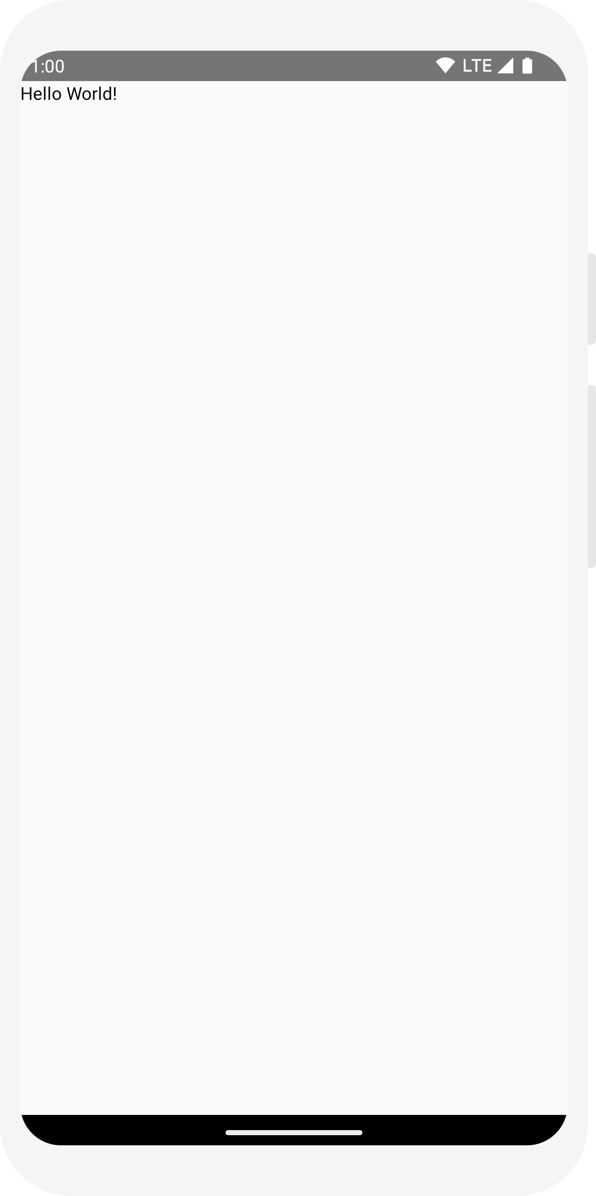
ขั้นแรก แสดงข้อความ "สวัสดีทุกคน" โดยเพิ่มองค์ประกอบข้อความไว้ภายใน
onCreate วิธี ซึ่งทำได้โดยกำหนดเนื้อหา
บล็อก และเรียกเมธอด
Text ฟังก์ชันที่ประกอบกันได้
บล็อก setContent กำหนดเลย์เอาต์ของกิจกรรมโดย
จะถูกเรียกฟังก์ชันที่ประกอบกันได้ ฟังก์ชันที่ประกอบกันได้จะเรียกใช้ได้จาก Composable อื่นเท่านั้น
Jetpack Compose ใช้ปลั๊กอินคอมไพเลอร์ Kotlin เพื่อเปลี่ยนฟังก์ชัน Composable เหล่านี้เป็น
องค์ประกอบ UI ของแอป เช่น Text Composable
ฟังก์ชันที่กำหนดโดยไลบรารี UI ของการเขียนจะแสดงป้ายกำกับข้อความบนหน้าจอ
import android.os.Bundle
import androidx.activity.ComponentActivity
import androidx.activity.compose.setContent
import androidx.compose.material3.Text

class MainActivity : ComponentActivity() {
    override fun onCreate(savedInstanceState: Bundle?) {
        super.onCreate(savedInstanceState)
        setContent {
            Text("Hello world!")
        }
    }
}
กำหนดฟังก์ชันที่ประกอบกันได้
ในการทำให้ฟังก์ชัน Composable ได้เพิ่มคำอธิบายประกอบ @Composable
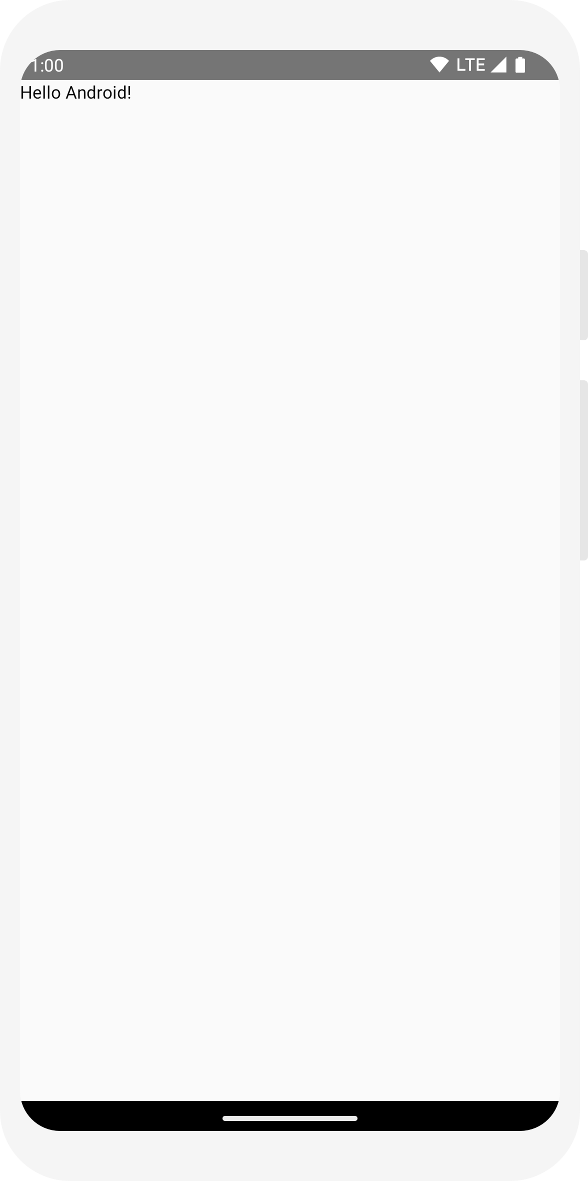
หากต้องการลองใช้ ให้กำหนดฟังก์ชัน MessageCard ที่
ส่งผ่านชื่อ และใช้เพื่อกำหนดค่าองค์ประกอบของข้อความ
// ...
import androidx.compose.runtime.Composable

class MainActivity : ComponentActivity() {
    override fun onCreate(savedInstanceState: Bundle?) {
        super.onCreate(savedInstanceState)
        setContent {
            MessageCard("Android")
        }
    }
}

@Composable
fun MessageCard(name: String) {
    Text(text = "Hello $name!")
}
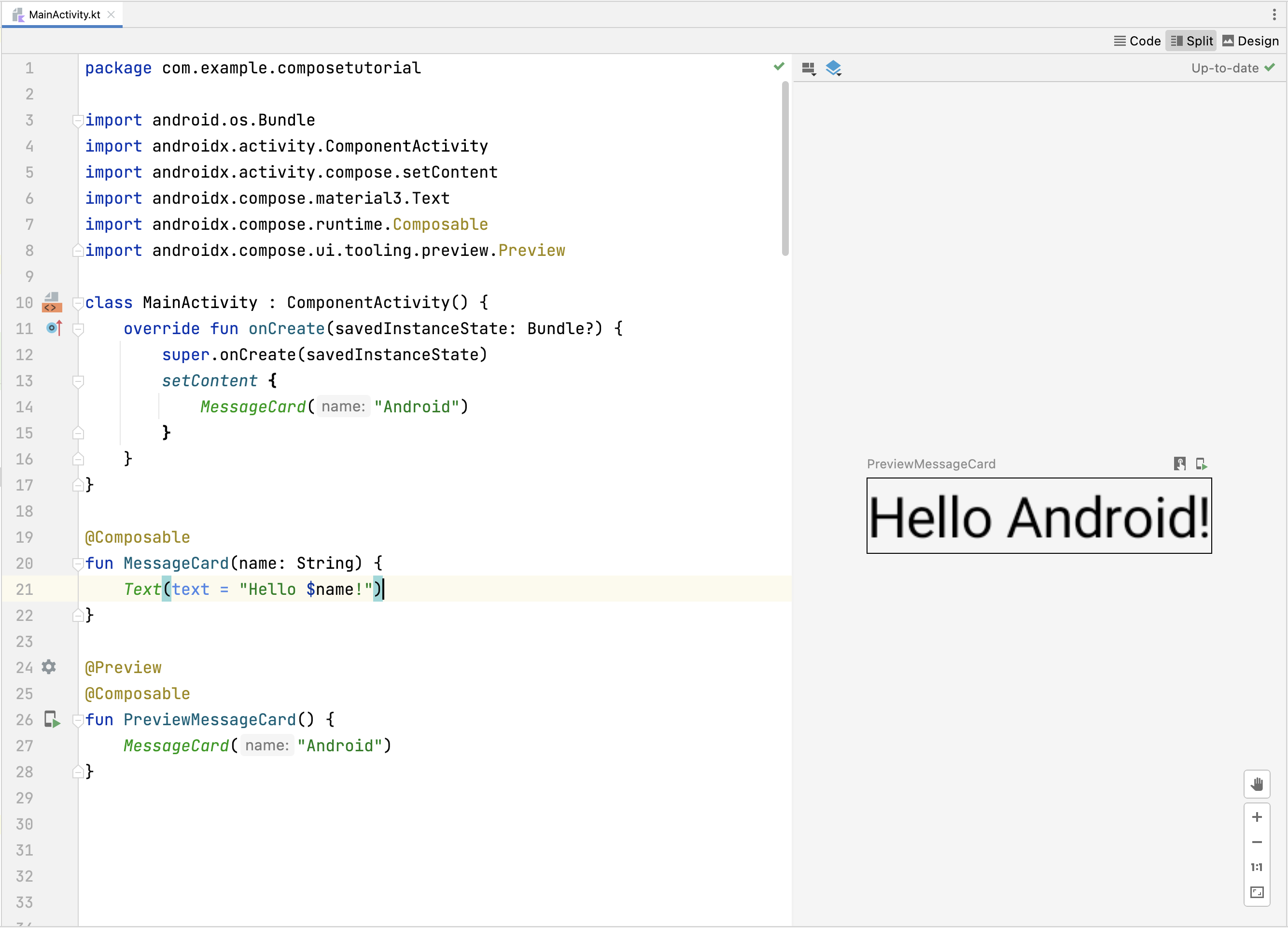
ดูตัวอย่างฟังก์ชันใน Android Studio
คำอธิบายประกอบ @Preview ให้คุณดูตัวอย่างฟังก์ชันที่ประกอบกันได้ภายใน Android
Studio โดยไม่ต้องสร้างและติดตั้งแอปในอุปกรณ์ Android หรือโปรแกรมจำลอง
ต้องใช้ในฟังก์ชัน Composable ที่ไม่มีพารามิเตอร์ สำหรับกรณีนี้
ด้วยเหตุผล คุณจะดูตัวอย่างฟังก์ชัน MessageCard ไม่ได้
โดยตรง แต่ให้ตั้งชื่อฟังก์ชันที่ 2 แทน
PreviewMessageCard ซึ่งโทร
MessageCard ด้วยพารามิเตอร์ที่เหมาะสม เพิ่ม
คำอธิบายประกอบ @Preview รายการก่อนหน้า
@Composable
// ...
import androidx.compose.ui.tooling.preview.Preview

@Composable
fun MessageCard(name: String) {
    Text(text = "Hello $name!")
}

@Preview
@Composable
fun PreviewMessageCard() {
    MessageCard("Android")
}
สร้างโปรเจ็กต์อีกครั้ง ตัวแอปเองก็ไม่มีการเปลี่ยนแปลง เนื่องจาก
ไม่ได้เรียกฟังก์ชัน PreviewMessageCard ที่ไหนเลย
แต่ Android Studio จะเพิ่มหน้าต่างแสดงตัวอย่าง
ซึ่งขยายได้โดยการคลิกที่ตัวแบ่ง
(การออกแบบ/โค้ด) หน้าต่างนี้แสดงตัวอย่างองค์ประกอบ UI ที่สร้างโดย Composable
ฟังก์ชันที่ถูกทำเครื่องหมายด้วยคำอธิบายประกอบ @Preview เพื่ออัปเดต
คลิกปุ่มรีเฟรชที่ด้านบนของหน้าต่างแสดงตัวอย่างได้ทุกเมื่อ
import android.os.Bundle
import androidx.activity.ComponentActivity
import androidx.activity.compose.setContent
import androidx.compose.material3.Text

class MainActivity : ComponentActivity() {
    override fun onCreate(savedInstanceState: Bundle?) {
        super.onCreate(savedInstanceState)
        setContent {
            Text("Hello world!")
        }
    }
}
// ...
import androidx.compose.runtime.Composable

class MainActivity : ComponentActivity() {
    override fun onCreate(savedInstanceState: Bundle?) {
        super.onCreate(savedInstanceState)
        setContent {
            MessageCard("Android")
        }
    }
}

@Composable
fun MessageCard(name: String) {
    Text(text = "Hello $name!")
}
// ...
import androidx.compose.ui.tooling.preview.Preview

@Composable
fun MessageCard(name: String) {
    Text(text = "Hello $name!")
}

@Preview
@Composable
fun PreviewMessageCard() {
    MessageCard("Android")
}
บทที่ 2: เลย์เอาต์
องค์ประกอบ UI จะเป็นแบบลำดับชั้น และมีองค์ประกอบที่มีอยู่ในองค์ประกอบอื่นๆ ใน Compose คุณจะ สร้างลำดับชั้น UI โดยการเรียกใช้ฟังก์ชันที่ประกอบกันได้จากฟังก์ชันที่ประกอบกันได้อื่นๆ

เพิ่มข้อความหลายรายการ
คุณได้สร้างฟังก์ชัน Composable และตัวอย่างแรกแล้ว สำรวจ Jetpack Compose เพิ่มเติม คุณจะสร้างหน้าจอข้อความที่เรียบง่าย ซึ่งประกอบด้วยรายการข้อความที่ อาจขยายได้ด้วยภาพเคลื่อนไหวบางรายการ
เริ่มจากการทำให้ข้อความประกอบได้สมบูรณ์ยิ่งขึ้นโดยแสดงชื่อผู้เขียนและ
เนื้อหาข้อความ ก่อนอื่นคุณต้องเปลี่ยนพารามิเตอร์ Composable เพื่อยอมรับ
Message แทนที่จะเป็น
String และเพิ่มอีก
Text Composable ภายใน
MessageCard Composable อย่าลืมอัปเดตตัวอย่าง
ได้เป็นอย่างดี
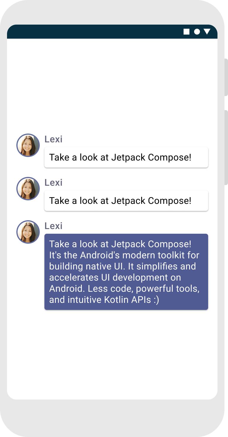
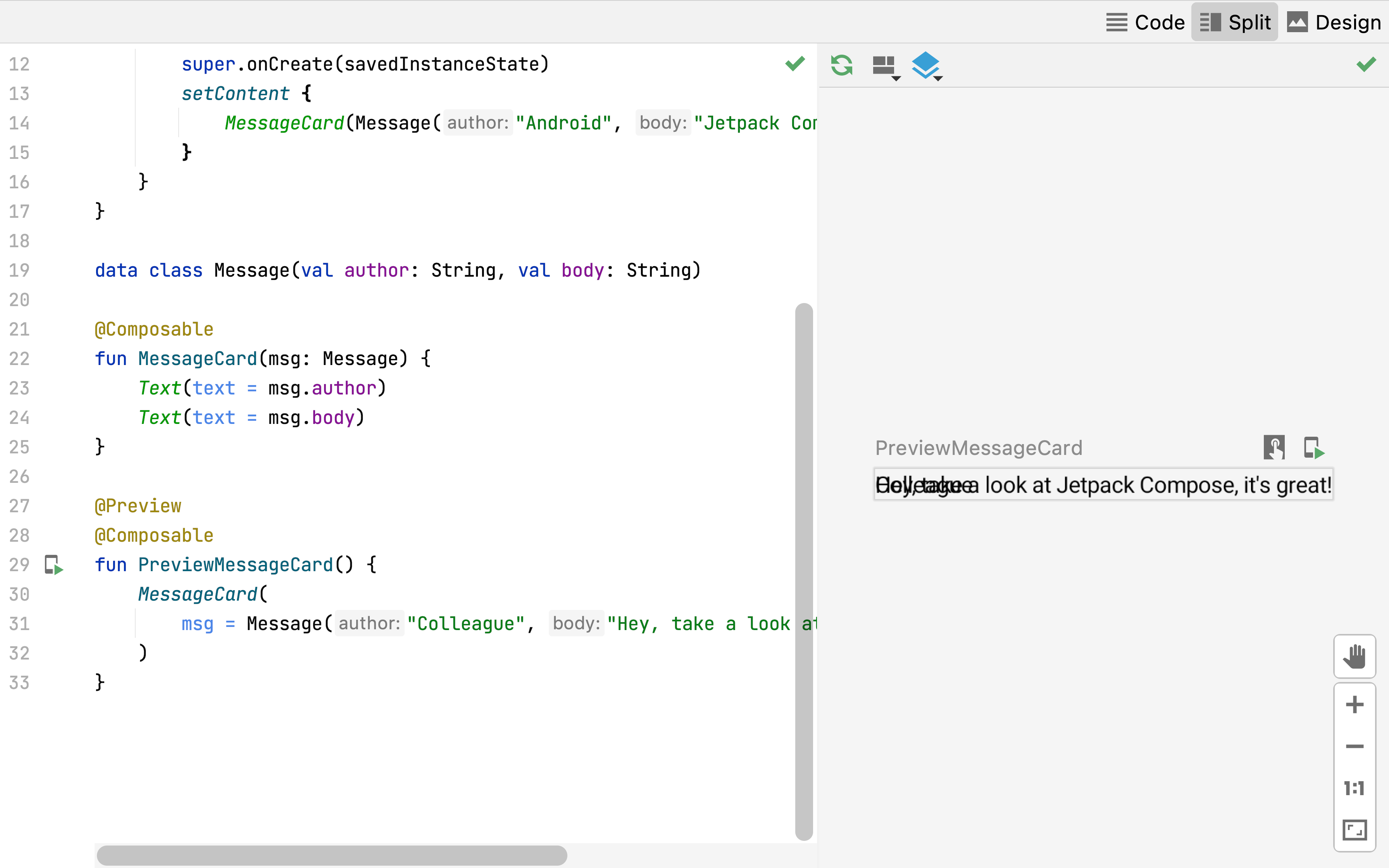
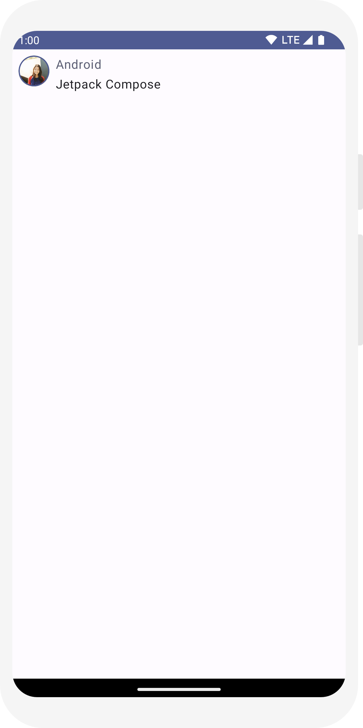
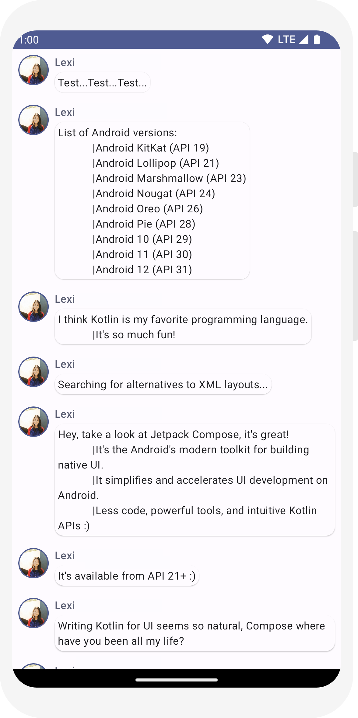
// ...

class MainActivity : ComponentActivity() {
    override fun onCreate(savedInstanceState: Bundle?) {
        super.onCreate(savedInstanceState)
        setContent {
            MessageCard(Message("Android", "Jetpack Compose"))
        }
    }
}

data class Message(val author: String, val body: String)

@Composable
fun MessageCard(msg: Message) {
    Text(text = msg.author)
    Text(text = msg.body)
}

@Preview
@Composable
fun PreviewMessageCard() {
    MessageCard(
        msg = Message("Lexi", "Hey, take a look at Jetpack Compose, it's great!")
    )
}

โค้ดนี้จะสร้างองค์ประกอบข้อความ 2 รายการภายในมุมมองเนื้อหา แต่เนื่องจากคุณไม่ได้ระบุ ข้อมูลเกี่ยวกับวิธีการจัดเรียง องค์ประกอบข้อความจะวางทับกัน ทำให้ข้อความอ่านไม่ได้
การใช้คอลัมน์
ฟังก์ชัน Column ช่วยให้คุณจัดเรียงองค์ประกอบในแนวตั้งได้
เพิ่ม Column ไปยัง
MessageCard
คุณสามารถใช้
Row เพื่อจัดเรียงรายการในแนวนอน
Box เพื่อกองซ้อนองค์ประกอบ
// ...
import androidx.compose.foundation.layout.Column

@Composable
fun MessageCard(msg: Message) {
    Column {
        Text(text = msg.author)
        Text(text = msg.body)
    }
}
เพิ่มองค์ประกอบรูปภาพ
เสริมการ์ดข้อความของคุณด้วยการเพิ่มรูปโปรไฟล์ของผู้ส่ง ใช้เมนู
ผู้จัดการทรัพยากร
เพื่อนำเข้ารูปภาพจากห้องสมุดรูปภาพ หรือใช้รูปภาพนี้ เพิ่ม
Row เขียนได้ด้วยการออกแบบที่มีโครงสร้างที่ดีและ
Image ที่เขียนได้ด้วย Compose อยู่ภายใน
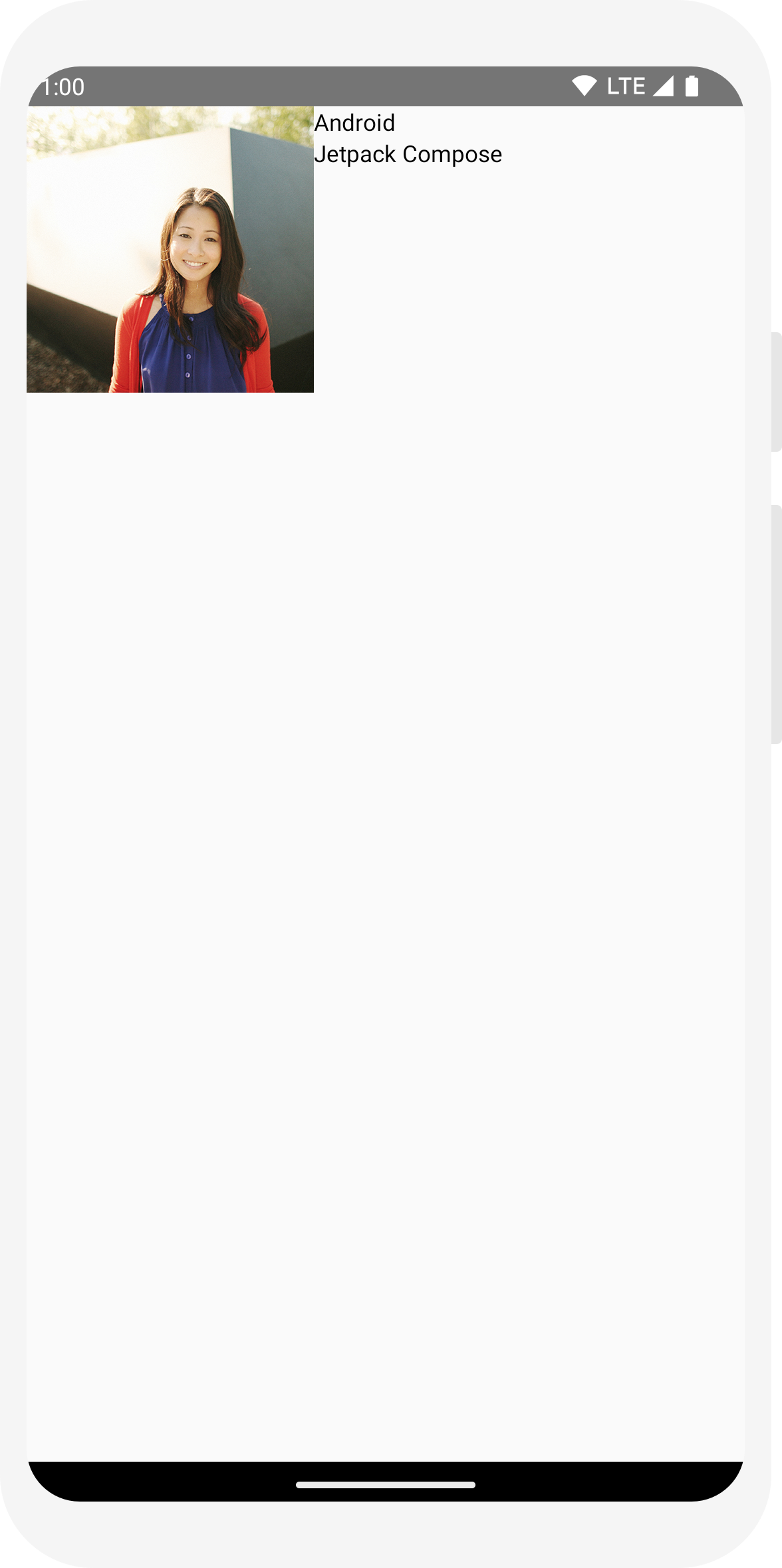
// ...
import androidx.compose.foundation.Image
import androidx.compose.foundation.layout.Row
import androidx.compose.ui.res.painterResource

@Composable
fun MessageCard(msg: Message) {
    Row {
        Image(
            painter = painterResource(R.drawable.profile_picture),
            contentDescription = "Contact profile picture",
        )

       Column {
            Text(text = msg.author)
            Text(text = msg.body)
        }

    }

}
กำหนดค่าเลย์เอาต์
การจัดวางข้อความมีโครงสร้างที่ถูกต้อง แต่องค์ประกอบจัดวางได้ไม่ดี และรูปภาพ ใหญ่เกินไป Compose จะใช้ตัวแก้ไขเพื่อตกแต่งหรือกำหนดค่า Composable โฆษณาเหล่านี้ ช่วยให้คุณเปลี่ยนขนาด เลย์เอาต์ รูปลักษณ์ของ Composable หรือเพิ่มการโต้ตอบระดับสูง เช่น ทำให้องค์ประกอบคลิกได้ คุณสามารถผูกหลายคอมโพเนนต์เพื่อสร้าง Composable ที่สมบูรณ์ยิ่งขึ้นได้ คุณจะใช้ บางส่วนเพื่อปรับปรุงเลย์เอาต์ได้
// ...
import androidx.compose.foundation.layout.Spacer
import androidx.compose.foundation.layout.height
import androidx.compose.foundation.layout.padding
import androidx.compose.foundation.layout.size
import androidx.compose.foundation.layout.width
import androidx.compose.foundation.shape.CircleShape
import androidx.compose.ui.Modifier
import androidx.compose.ui.draw.clip
import androidx.compose.ui.unit.dp

@Composable
fun MessageCard(msg: Message) {
    // Add padding around our message
    Row(modifier = Modifier.padding(all = 8.dp)) {
        Image(
            painter = painterResource(R.drawable.profile_picture),
            contentDescription = "Contact profile picture",
            modifier = Modifier
                // Set image size to 40 dp
                .size(40.dp)
                // Clip image to be shaped as a circle
                .clip(CircleShape)
        )

        // Add a horizontal space between the image and the column
        Spacer(modifier = Modifier.width(8.dp))

        Column {
            Text(text = msg.author)
            // Add a vertical space between the author and message texts
            Spacer(modifier = Modifier.height(4.dp))
            Text(text = msg.body)
        }
    }
}
// ...

class MainActivity : ComponentActivity() {
    override fun onCreate(savedInstanceState: Bundle?) {
        super.onCreate(savedInstanceState)
        setContent {
            MessageCard(Message("Android", "Jetpack Compose"))
        }
    }
}

data class Message(val author: String, val body: String)

@Composable
fun MessageCard(msg: Message) {
    Text(text = msg.author)
    Text(text = msg.body)
}

@Preview
@Composable
fun PreviewMessageCard() {
    MessageCard(
        msg = Message("Lexi", "Hey, take a look at Jetpack Compose, it's great!")
    )
}
// ...
import androidx.compose.foundation.layout.Column

@Composable
fun MessageCard(msg: Message) {
    Column {
        Text(text = msg.author)
        Text(text = msg.body)
    }
}
// ...
import androidx.compose.foundation.Image
import androidx.compose.foundation.layout.Row
import androidx.compose.ui.res.painterResource

@Composable
fun MessageCard(msg: Message) {
    Row {
        Image(
            painter = painterResource(R.drawable.profile_picture),
            contentDescription = "Contact profile picture",
        )

       Column {
            Text(text = msg.author)
            Text(text = msg.body)
        }

    }

}
// ...
import androidx.compose.foundation.layout.Spacer
import androidx.compose.foundation.layout.height
import androidx.compose.foundation.layout.padding
import androidx.compose.foundation.layout.size
import androidx.compose.foundation.layout.width
import androidx.compose.foundation.shape.CircleShape
import androidx.compose.ui.Modifier
import androidx.compose.ui.draw.clip
import androidx.compose.ui.unit.dp

@Composable
fun MessageCard(msg: Message) {
    // Add padding around our message
    Row(modifier = Modifier.padding(all = 8.dp)) {
        Image(
            painter = painterResource(R.drawable.profile_picture),
            contentDescription = "Contact profile picture",
            modifier = Modifier
                // Set image size to 40 dp
                .size(40.dp)
                // Clip image to be shaped as a circle
                .clip(CircleShape)
        )

        // Add a horizontal space between the image and the column
        Spacer(modifier = Modifier.width(8.dp))

        Column {
            Text(text = msg.author)
            // Add a vertical space between the author and message texts
            Spacer(modifier = Modifier.height(4.dp))
            Text(text = msg.body)
        }
    }
}
บทที่ 3: ดีไซน์ Material
การเขียนสร้างขึ้นเพื่อสนับสนุนหลักการของดีไซน์ Material องค์ประกอบ UI หลายรายการมีการใช้งาน ดีไซน์ Material ในตัว ในบทเรียนนี้ คุณจะได้ออกแบบแอปด้วยดีไซน์ Material วิดเจ็ต

ใช้ดีไซน์ Material
ตอนนี้การออกแบบข้อความมีเลย์เอาต์แล้ว แต่ก็ยังดูไม่ดีเท่าไร
Jetpack Compose มีการใช้ดีไซน์ Material 3 และองค์ประกอบ UI จาก
คุณจะช่วยปรับปรุงรูปลักษณ์ของ MessageCard ของเรา
Composable โดยใช้การจัดรูปแบบดีไซน์ Material
ในการเริ่มต้น ให้รวมฟังก์ชัน MessageCard ด้วยฟังก์ชัน
สร้างธีม Material ในโปรเจ็กต์ ComposeTutorialTheme แล้ว
และ Surface
ดำเนินการทั้งใน @Preview และใน
setContent การทำเช่นนี้จะทำให้ Composable
เพื่อรับรูปแบบตามที่กำหนดไว้ในธีมของแอปเพื่อให้มีความสอดคล้องกันในแอป
ดีไซน์ Material สร้างขึ้นจากเสาหลัก 3 ต้น ได้แก่ Color
Typography และ Shape
คุณจะเพิ่มได้ทีละรายการ
หมายเหตุ: เทมเพลตกิจกรรมการเขียนที่ว่างเปล่าจะสร้างธีมเริ่มต้นสำหรับโปรเจ็กต์ที่
ช่วยให้คุณสามารถกำหนดค่า
MaterialTheme
หากตั้งชื่อโครงการที่แตกต่างจาก
ComposeTutorial คุณจะเห็นธีมที่กำหนดเองใน
Theme.kt ใน
แพ็กเกจย่อย ui.theme
// ...

class MainActivity : ComponentActivity() {
    override fun onCreate(savedInstanceState: Bundle?) {
        super.onCreate(savedInstanceState)
        setContent {
            ComposeTutorialTheme {
                Surface(modifier = Modifier.fillMaxSize()) {
                    MessageCard(Message("Android", "Jetpack Compose"))
                }
            }
        }
    }
}

@Preview
@Composable
fun PreviewMessageCard() {
    ComposeTutorialTheme {
        Surface {
            MessageCard(
                msg = Message("Lexi", "Take a look at Jetpack Compose, it's great!")
            )
        }
    }
}

สี
ใช้ MaterialTheme.colorScheme เพื่อจัดรูปแบบด้วยสีจาก
ธีมที่รวม คุณจะใช้ค่าเหล่านี้จากธีมได้ในทุกที่ที่ต้องการสี ตัวอย่างนี้ใช้สีธีมแบบไดนามิก (กำหนดโดยค่ากำหนดอุปกรณ์)
คุณสามารถตั้งค่า dynamicColor เป็น false ในไฟล์ MaterialTheme.kt เพื่อเปลี่ยนแปลงการตั้งค่านี้
จัดรูปแบบชื่อและเพิ่มเส้นขอบให้กับรูปภาพ
// ...
import androidx.compose.foundation.border
import androidx.compose.material3.MaterialTheme

@Composable
fun MessageCard(msg: Message) {
   Row(modifier = Modifier.padding(all = 8.dp)) {
       Image(
           painter = painterResource(R.drawable.profile_picture),
           contentDescription = null,
           modifier = Modifier
               .size(40.dp)
               .clip(CircleShape)
               .border(1.5.dp, MaterialTheme.colorScheme.primary, CircleShape)
       )

       Spacer(modifier = Modifier.width(8.dp))

       Column {
           Text(
               text = msg.author,
               color = MaterialTheme.colorScheme.secondary
           )

           Spacer(modifier = Modifier.height(4.dp))
           Text(text = msg.body)
       }
   }
}
การพิมพ์
รูปแบบตัวอักษรของ Material มีให้ใช้งานใน MaterialTheme
ให้เพิ่มใน Composable Text
// ...

@Composable
fun MessageCard(msg: Message) {
   Row(modifier = Modifier.padding(all = 8.dp)) {
       Image(
           painter = painterResource(R.drawable.profile_picture),
           contentDescription = null,
           modifier = Modifier
               .size(40.dp)
               .clip(CircleShape)
               .border(1.5.dp, MaterialTheme.colorScheme.primary, CircleShape)
       )
       Spacer(modifier = Modifier.width(8.dp))

       Column {
           Text(
               text = msg.author,
               color = MaterialTheme.colorScheme.secondary,
               style = MaterialTheme.typography.titleSmall
           )

           Spacer(modifier = Modifier.height(4.dp))

           Text(
               text = msg.body,
               style = MaterialTheme.typography.bodyMedium
           )
       }
   }
}

รูปทรง
Shapeช่วยให้คุณเพิ่มสัมผัสขั้นสุดท้ายได้ ก่อนอื่น ให้รวมพารามิเตอร์
เนื้อหาข้อความรอบๆ
Surface Composable เพราะช่วยให้ปรับแต่ง
รูปร่างและความสูงของเนื้อหาข้อความ นอกจากนี้ยังมีการเพิ่มระยะห่างจากขอบในข้อความเพื่อเลย์เอาต์ที่ดียิ่งขึ้น
// ...
import androidx.compose.material3.Surface

@Composable
fun MessageCard(msg: Message) {
   Row(modifier = Modifier.padding(all = 8.dp)) {
       Image(
           painter = painterResource(R.drawable.profile_picture),
           contentDescription = null,
           modifier = Modifier
               .size(40.dp)
               .clip(CircleShape)
               .border(1.5.dp, MaterialTheme.colorScheme.primary, CircleShape)
       )
       Spacer(modifier = Modifier.width(8.dp))

       Column {
           Text(
               text = msg.author,
               color = MaterialTheme.colorScheme.secondary,
               style = MaterialTheme.typography.titleSmall
           )

           Spacer(modifier = Modifier.height(4.dp))

           Surface(shape = MaterialTheme.shapes.medium, shadowElevation = 1.dp) {
               Text(
                   text = msg.body,
                   modifier = Modifier.padding(all = 4.dp),
                   style = MaterialTheme.typography.bodyMedium
               )
           }
       }
   }
}

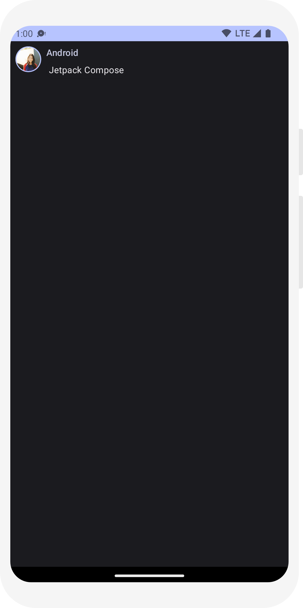
เปิดใช้ธีมมืด
ธีมมืด (หรือโหมดกลางคืน) สามารถเปิดใช้เพื่อหลีกเลี่ยงการแสดงผลแสงจ้าโดยเฉพาะในเวลากลางคืน หรือเพื่อประหยัดเงิน แบตเตอรี่ของอุปกรณ์ Jetpack Compose สามารถรับมือกับความมืดได้เพราะการรองรับดีไซน์ Material โดยค่าเริ่มต้น การใช้สี ข้อความ และพื้นหลังของดีไซน์ Material แล้ว ให้เข้ากับพื้นหลังสีเข้ม
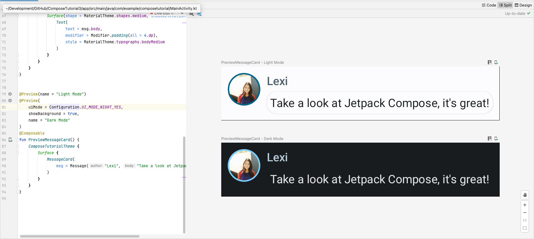
คุณสามารถสร้างการแสดงตัวอย่างหลายรายการในไฟล์เป็นฟังก์ชันแยกต่างหาก หรือเพิ่มหลายรายการ คำอธิบายประกอบไปยังฟังก์ชันเดียวกัน
เพิ่มคำอธิบายประกอบตัวอย่างใหม่และเปิดใช้โหมดกลางคืน
// ...
import android.content.res.Configuration

@Preview(name = "Light Mode")
@Preview(
    uiMode = Configuration.UI_MODE_NIGHT_YES,
    showBackground = true,
    name = "Dark Mode"
)
@Composable
fun PreviewMessageCard() {
   ComposeTutorialTheme {
    Surface {
      MessageCard(
        msg = Message("Lexi", "Hey, take a look at Jetpack Compose, it's great!")
      )
    }
   }
}
ตัวเลือกสีสำหรับธีมสว่างและธีมมืดจะกำหนดไว้ใน IDE ที่สร้างขึ้น
Theme.kt ไฟล์
ถึงตอนนี้ คุณได้สร้างองค์ประกอบ UI ข้อความที่แสดงรูปภาพและข้อความ 2 รายการที่มี และดูดีทั้งในธีมสว่างและมืด
// ...
import android.content.res.Configuration

@Preview(name = "Light Mode")
@Preview(
    uiMode = Configuration.UI_MODE_NIGHT_YES,
    showBackground = true,
    name = "Dark Mode"
)
@Composable
fun PreviewMessageCard() {
   ComposeTutorialTheme {
    Surface {
      MessageCard(
        msg = Message("Lexi", "Hey, take a look at Jetpack Compose, it's great!")
      )
    }
   }
}
// ...

class MainActivity : ComponentActivity() {
    override fun onCreate(savedInstanceState: Bundle?) {
        super.onCreate(savedInstanceState)
        setContent {
            ComposeTutorialTheme {
                Surface(modifier = Modifier.fillMaxSize()) {
                    MessageCard(Message("Android", "Jetpack Compose"))
                }
            }
        }
    }
}

@Preview
@Composable
fun PreviewMessageCard() {
    ComposeTutorialTheme {
        Surface {
            MessageCard(
                msg = Message("Lexi", "Take a look at Jetpack Compose, it's great!")
            )
        }
    }
}
// ...
import androidx.compose.foundation.border
import androidx.compose.material3.MaterialTheme

@Composable
fun MessageCard(msg: Message) {
   Row(modifier = Modifier.padding(all = 8.dp)) {
       Image(
           painter = painterResource(R.drawable.profile_picture),
           contentDescription = null,
           modifier = Modifier
               .size(40.dp)
               .clip(CircleShape)
               .border(1.5.dp, MaterialTheme.colorScheme.primary, CircleShape)
       )

       Spacer(modifier = Modifier.width(8.dp))

       Column {
           Text(
               text = msg.author,
               color = MaterialTheme.colorScheme.secondary
           )

           Spacer(modifier = Modifier.height(4.dp))
           Text(text = msg.body)
       }
   }
}
// ...

@Composable
fun MessageCard(msg: Message) {
   Row(modifier = Modifier.padding(all = 8.dp)) {
       Image(
           painter = painterResource(R.drawable.profile_picture),
           contentDescription = null,
           modifier = Modifier
               .size(40.dp)
               .clip(CircleShape)
               .border(1.5.dp, MaterialTheme.colorScheme.primary, CircleShape)
       )
       Spacer(modifier = Modifier.width(8.dp))

       Column {
           Text(
               text = msg.author,
               color = MaterialTheme.colorScheme.secondary,
               style = MaterialTheme.typography.titleSmall
           )

           Spacer(modifier = Modifier.height(4.dp))

           Text(
               text = msg.body,
               style = MaterialTheme.typography.bodyMedium
           )
       }
   }
}
// ...
import androidx.compose.material3.Surface

@Composable
fun MessageCard(msg: Message) {
   Row(modifier = Modifier.padding(all = 8.dp)) {
       Image(
           painter = painterResource(R.drawable.profile_picture),
           contentDescription = null,
           modifier = Modifier
               .size(40.dp)
               .clip(CircleShape)
               .border(1.5.dp, MaterialTheme.colorScheme.primary, CircleShape)
       )
       Spacer(modifier = Modifier.width(8.dp))

       Column {
           Text(
               text = msg.author,
               color = MaterialTheme.colorScheme.secondary,
               style = MaterialTheme.typography.titleSmall
           )

           Spacer(modifier = Modifier.height(4.dp))

           Surface(shape = MaterialTheme.shapes.medium, shadowElevation = 1.dp) {
               Text(
                   text = msg.body,
                   modifier = Modifier.padding(all = 4.dp),
                   style = MaterialTheme.typography.bodyMedium
               )
           }
       }
   }
}
// ...
import android.content.res.Configuration

@Preview(name = "Light Mode")
@Preview(
    uiMode = Configuration.UI_MODE_NIGHT_YES,
    showBackground = true,
    name = "Dark Mode"
)
@Composable
fun PreviewMessageCard() {
   ComposeTutorialTheme {
    Surface {
      MessageCard(
        msg = Message("Lexi", "Hey, take a look at Jetpack Compose, it's great!")
      )
    }
   }
}
บทเรียนที่ 4: รายการและภาพเคลื่อนไหว
รายการและภาพเคลื่อนไหวมีอยู่ในทุกที่ในแอป ในบทเรียนนี้ คุณจะได้เรียนรู้วิธีการ "เขียน" ทำให้สร้างรายการได้ง่ายๆ และสนุกกับการเพิ่มภาพเคลื่อนไหว

สร้างรายการข้อความ
การแชทด้วยข้อความเดียวทำให้รู้สึกเหงาจัง เราจึงเปลี่ยนการสนทนาให้มีเนื้อหามากกว่า
หนึ่งข้อความ คุณจะต้องสร้างฟังก์ชัน Conversation
ที่จะแสดงหลายข้อความ สำหรับกรณีการใช้งานนี้ ให้ใช้ Compose
LazyColumn และ
LazyRow Composable เหล่านี้แสดงผลเฉพาะเอลิเมนต์
ปรากฏบนหน้าจอ ออกแบบมาให้มีประสิทธิภาพอย่างยิ่งสำหรับรายการยาวๆ
ในข้อมูลโค้ดนี้ คุณจะเห็นว่า LazyColumn มีพารามิเตอร์
เด็ก items คน ใช้เวลา
List เป็นพารามิเตอร์และ lambda
ได้รับพารามิเตอร์ที่เราตั้งชื่อว่า message (เราอาจ
ตั้งชื่ออะไรก็ได้ตามที่เราต้องการ) ซึ่งเป็นอินสแตนซ์ของ Message
กล่าวโดยสรุปคือ lambda นี้จะเรียกใช้สำหรับแต่ละรายการที่ให้ไว้
List คัดลอก
ชุดข้อมูลตัวอย่าง
ในโปรเจ็กต์ของคุณ เพื่อช่วยให้เริ่มบทสนทนาได้อย่างรวดเร็ว
// ...
import androidx.compose.foundation.lazy.LazyColumn
import androidx.compose.foundation.lazy.items

@Composable
fun Conversation(messages: List<Message>) {
    LazyColumn {
        items(messages) { message ->
            MessageCard(message)
        }
    }
}

@Preview
@Composable
fun PreviewConversation() {
    ComposeTutorialTheme {
        Conversation(SampleData.conversationSample)
    }
}
ทำให้ข้อความเคลื่อนไหวขณะขยาย
บทสนทนามีความน่าสนใจมากขึ้น ได้เวลาเล่นภาพเคลื่อนไหวแล้ว คุณจะเพิ่ม
ความสามารถในการขยายข้อความเพื่อแสดงข้อความที่ยาวขึ้น ทำให้ทั้งขนาดของเนื้อหาและ
สีพื้นหลัง ในการจัดเก็บสถานะ UI ในเครื่อง คุณต้องติดตามว่าข้อความ
ถูกขยายหรือไม่ คุณต้องใช้ฟังก์ชันต่างๆ เพื่อติดตามการเปลี่ยนแปลงสถานะนี้
remember และ
mutableStateOf
ฟังก์ชันที่ประกอบกันได้สามารถจัดเก็บสถานะในเครื่องไว้ในหน่วยความจำโดยใช้
remember แล้วติดตามการเปลี่ยนแปลงของค่าที่ส่งไปยัง
mutableStateOf Composable (และบุตรหลาน) โดยใช้
ระบบจะวาดสถานะนี้ใหม่โดยอัตโนมัติเมื่อมีการอัปเดตค่า ซึ่งเรียกว่า
การจัดองค์ประกอบใหม่
ใช้ API สถานะของ Compose เช่น remember และ
mutableStateOf การเปลี่ยนแปลงสถานะจะอัปเดต UI โดยอัตโนมัติ
หมายเหตุ: คุณต้องเพิ่มการนำเข้าต่อไปนี้เพื่อใช้ Kotlin อย่างถูกต้อง
ไวยากรณ์พร็อพเพอร์ตี้ที่รับมอบสิทธิ์ (คีย์เวิร์ด by) Alt+Enter หรือ Option+Enter เพิ่มรายการเหล่านี้
สำหรับคุณ
      import androidx.compose.runtime.getValue
      import androidx.compose.runtime.setValue
// ...
import androidx.compose.foundation.clickable
import androidx.compose.runtime.getValue
import androidx.compose.runtime.mutableStateOf
import androidx.compose.runtime.remember
import androidx.compose.runtime.setValue

class MainActivity : ComponentActivity() {
   override fun onCreate(savedInstanceState: Bundle?) {
       super.onCreate(savedInstanceState)
       setContent {
           ComposeTutorialTheme {
               Conversation(SampleData.conversationSample)
           }
       }
   }
}

@Composable
fun MessageCard(msg: Message) {
    Row(modifier = Modifier.padding(all = 8.dp)) {
        Image(
            painter = painterResource(R.drawable.profile_picture),
            contentDescription = null,
            modifier = Modifier
                .size(40.dp)
                .clip(CircleShape)
                .border(1.5.dp, MaterialTheme.colorScheme.primary, CircleShape)
        )
        Spacer(modifier = Modifier.width(8.dp))

        // We keep track if the message is expanded or not in this
        // variable
        var isExpanded by remember { mutableStateOf(false) }

        // We toggle the isExpanded variable when we click on this Column
        Column(modifier = Modifier.clickable { isExpanded = !isExpanded }) {
            Text(
                text = msg.author,
                color = MaterialTheme.colorScheme.secondary,
                style = MaterialTheme.typography.titleSmall
            )

            Spacer(modifier = Modifier.height(4.dp))

            Surface(
                shape = MaterialTheme.shapes.medium,
                shadowElevation = 1.dp,
            ) {
                Text(
                    text = msg.body,
                    modifier = Modifier.padding(all = 4.dp),
                    // If the message is expanded, we display all its content
                    // otherwise we only display the first line
                    maxLines = if (isExpanded) Int.MAX_VALUE else 1,
                    style = MaterialTheme.typography.bodyMedium
                )
            }
        }
    }
}
คุณสามารถเปลี่ยนพื้นหลังของเนื้อหาข้อความตาม
isExpanded เมื่อเราคลิกที่ข้อความ คุณจะต้องใช้
ตัวปรับแต่ง clickable สำหรับจัดการกิจกรรมการคลิกใน
Composable แทนที่จะสลับสีพื้นหลัง
Surface คุณจะทำให้สีพื้นหลังเคลื่อนไหวได้โดย
ค่อยๆ ปรับเปลี่ยนค่าจาก
MaterialTheme.colorScheme.surface ถึง
MaterialTheme.colorScheme.primary และในทางกลับกันด้วย โดยดำเนินการดังนี้
คุณจะใช้ฟังก์ชัน animateColorAsState สุดท้าย คุณ
จะใช้ตัวแก้ไข animateContentSize เพื่อทำให้
ทำให้คอนเทนเนอร์ข้อความมีขนาดราบรื่น:
// ...
import androidx.compose.animation.animateColorAsState
import androidx.compose.animation.animateContentSize

@Composable
fun MessageCard(msg: Message) {
    Row(modifier = Modifier.padding(all = 8.dp)) {
        Image(
            painter = painterResource(R.drawable.profile_picture),
            contentDescription = null,
            modifier = Modifier
                .size(40.dp)
                .clip(CircleShape)
                .border(1.5.dp, MaterialTheme.colorScheme.secondary, CircleShape)
        )
        Spacer(modifier = Modifier.width(8.dp))

        // We keep track if the message is expanded or not in this
        // variable
        var isExpanded by remember { mutableStateOf(false) }
        // surfaceColor will be updated gradually from one color to the other
        val surfaceColor by animateColorAsState(
            if (isExpanded) MaterialTheme.colorScheme.primary else MaterialTheme.colorScheme.surface,
        )

        // We toggle the isExpanded variable when we click on this Column
        Column(modifier = Modifier.clickable { isExpanded = !isExpanded }) {
            Text(
                text = msg.author,
                color = MaterialTheme.colorScheme.secondary,
                style = MaterialTheme.typography.titleSmall
            )

            Spacer(modifier = Modifier.height(4.dp))

            Surface(
                shape = MaterialTheme.shapes.medium,
                shadowElevation = 1.dp,
                // surfaceColor color will be changing gradually from primary to surface
                color = surfaceColor,
                // animateContentSize will change the Surface size gradually
                modifier = Modifier.animateContentSize().padding(1.dp)
            ) {
                Text(
                    text = msg.body,
                    modifier = Modifier.padding(all = 4.dp),
                    // If the message is expanded, we display all its content
                    // otherwise we only display the first line
                    maxLines = if (isExpanded) Int.MAX_VALUE else 1,
                    style = MaterialTheme.typography.bodyMedium
                )
            }
        }
    }
}
// ...
import androidx.compose.foundation.lazy.LazyColumn
import androidx.compose.foundation.lazy.items

@Composable
fun Conversation(messages: List<Message>) {
    LazyColumn {
        items(messages) { message ->
            MessageCard(message)
        }
    }
}

@Preview
@Composable
fun PreviewConversation() {
    ComposeTutorialTheme {
        Conversation(SampleData.conversationSample)
    }
}
// ...
import androidx.compose.foundation.clickable
import androidx.compose.runtime.getValue
import androidx.compose.runtime.mutableStateOf
import androidx.compose.runtime.remember
import androidx.compose.runtime.setValue

class MainActivity : ComponentActivity() {
   override fun onCreate(savedInstanceState: Bundle?) {
       super.onCreate(savedInstanceState)
       setContent {
           ComposeTutorialTheme {
               Conversation(SampleData.conversationSample)
           }
       }
   }
}

@Composable
fun MessageCard(msg: Message) {
    Row(modifier = Modifier.padding(all = 8.dp)) {
        Image(
            painter = painterResource(R.drawable.profile_picture),
            contentDescription = null,
            modifier = Modifier
                .size(40.dp)
                .clip(CircleShape)
                .border(1.5.dp, MaterialTheme.colorScheme.primary, CircleShape)
        )
        Spacer(modifier = Modifier.width(8.dp))

        // We keep track if the message is expanded or not in this
        // variable
        var isExpanded by remember { mutableStateOf(false) }

        // We toggle the isExpanded variable when we click on this Column
        Column(modifier = Modifier.clickable { isExpanded = !isExpanded }) {
            Text(
                text = msg.author,
                color = MaterialTheme.colorScheme.secondary,
                style = MaterialTheme.typography.titleSmall
            )

            Spacer(modifier = Modifier.height(4.dp))

            Surface(
                shape = MaterialTheme.shapes.medium,
                shadowElevation = 1.dp,
            ) {
                Text(
                    text = msg.body,
                    modifier = Modifier.padding(all = 4.dp),
                    // If the message is expanded, we display all its content
                    // otherwise we only display the first line
                    maxLines = if (isExpanded) Int.MAX_VALUE else 1,
                    style = MaterialTheme.typography.bodyMedium
                )
            }
        }
    }
}
// ...
import androidx.compose.animation.animateColorAsState
import androidx.compose.animation.animateContentSize

@Composable
fun MessageCard(msg: Message) {
    Row(modifier = Modifier.padding(all = 8.dp)) {
        Image(
            painter = painterResource(R.drawable.profile_picture),
            contentDescription = null,
            modifier = Modifier
                .size(40.dp)
                .clip(CircleShape)
                .border(1.5.dp, MaterialTheme.colorScheme.secondary, CircleShape)
        )
        Spacer(modifier = Modifier.width(8.dp))

        // We keep track if the message is expanded or not in this
        // variable
        var isExpanded by remember { mutableStateOf(false) }
        // surfaceColor will be updated gradually from one color to the other
        val surfaceColor by animateColorAsState(
            if (isExpanded) MaterialTheme.colorScheme.primary else MaterialTheme.colorScheme.surface,
        )

        // We toggle the isExpanded variable when we click on this Column
        Column(modifier = Modifier.clickable { isExpanded = !isExpanded }) {
            Text(
                text = msg.author,
                color = MaterialTheme.colorScheme.secondary,
                style = MaterialTheme.typography.titleSmall
            )

            Spacer(modifier = Modifier.height(4.dp))

            Surface(
                shape = MaterialTheme.shapes.medium,
                shadowElevation = 1.dp,
                // surfaceColor color will be changing gradually from primary to surface
                color = surfaceColor,
                // animateContentSize will change the Surface size gradually
                modifier = Modifier.animateContentSize().padding(1.dp)
            ) {
                Text(
                    text = msg.body,
                    modifier = Modifier.padding(all = 4.dp),
                    // If the message is expanded, we display all its content
                    // otherwise we only display the first line
                    maxLines = if (isExpanded) Int.MAX_VALUE else 1,
                    style = MaterialTheme.typography.bodyMedium
                )
            }
        }
    }
}
ขั้นตอนถัดไป
ขอแสดงความยินดี คุณทำตามบทแนะนำการเขียนสำเร็จแล้ว คุณได้สร้างหน้าจอแชทที่เรียบง่ายแล้ว อย่างมีประสิทธิภาพแสดงรายการของ สามารถขยายได้และ ข้อความภาพเคลื่อนไหวที่มีรูปภาพและ ข้อความที่ออกแบบโดยใช้หลักการของดีไซน์ Material โดยมีธีมสีเข้มและ แสดงตัวอย่างได้ทั้งหมดในโค้ดไม่เกิน 100 บรรทัด
สิ่งที่คุณได้เรียนรู้จนถึงตอนนี้มีดังนี้
- การกำหนดฟังก์ชันที่ประกอบกันได้
- การเพิ่มเอลิเมนต์ต่างๆ ใน Composable
- การจัดโครงสร้างคอมโพเนนต์ UI โดยใช้ Composable ของเลย์เอาต์
- การขยาย Composable โดยใช้คีย์ตัวปรับแต่ง
- การสร้างรายการที่มีประสิทธิภาพ
- ติดตามสถานะและแก้ไขสถานะ
- การเพิ่มการโต้ตอบของผู้ใช้ใน Composable
- ทำให้ข้อความเคลื่อนไหวขณะขยายข้อความ
หากคุณต้องการเจาะลึกรายละเอียดของขั้นตอนเหล่านี้ โปรดสำรวจแหล่งข้อมูลด้านล่าง