Отображение всплывающих сообщений или запросов на ввод данных пользователем
Оптимизируйте свои подборки
Сохраняйте и классифицируйте контент в соответствии со своими настройками.
Компонент Dialog отображает всплывающие сообщения или запрашивает ввод пользователя на уровне над основным содержимым приложения. Он создает прерывающийся пользовательский интерфейс, чтобы привлечь внимание пользователя.
Среди вариантов использования диалога можно выделить следующие:
Подтверждение действия пользователя, например, при удалении файла.
Запрос пользовательского ввода, например, в приложении списка дел.
Представление списка вариантов выбора пользователя, например, выбора страны в настройке профиля.
Для этой реализации требуется, чтобы для minSDK вашего проекта был установлен уровень API 21 или выше.
Зависимости
Создать диалоговое окно оповещения
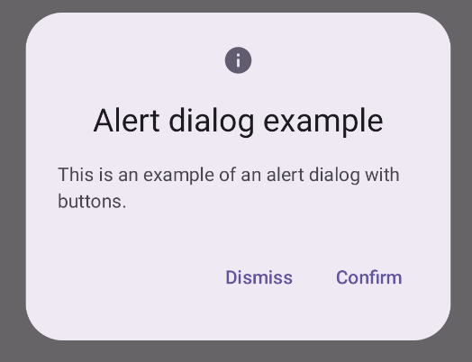
Составной компонент AlertDialog предоставляет удобный API для создания тематического диалогового окна Material Design. В следующем примере в диалоговом окне предупреждения реализованы две кнопки: одна закрывает диалоговое окно, а другая подтверждает его запрос:
Эта реализация подразумевает родительский составной объект, который передает аргументы дочернему составному объекту следующим образом:
Результаты
Рисунок 1. Диалоговое окно оповещения с кнопками.
Ключевые моменты
AlertDialog имеет специальные параметры для обработки определенных элементов диалога. Среди них следующие:
title : текст, который появляется в верхней части диалогового окна.
text : текст, который отображается по центру диалогового окна.
icon : рисунок, который появляется в верхней части диалогового окна.
onDismissRequest : функция, вызываемая, когда пользователь закрывает диалоговое окно, например, нажав за его пределами.
dismissButton : составной объект, который служит кнопкой закрытия.
confirmButton : составной элемент, который служит кнопкой подтверждения.
Когда пользователь нажимает любую из кнопок, диалоговое окно закрывается. Когда пользователь нажимает «Подтвердить», он вызывает функцию, которая также обрабатывает подтверждение. В этом примере это функции onDismissRequest() и onConfirmRequest() .
В тех случаях, когда для вашего диалогового окна требуется более сложный набор кнопок, вы можете использовать составной элемент Dialog и заполнить его более произвольной формой.
Создать диалог
Dialog — это базовый компонент, который не предоставляет никаких стилей или предопределенных слотов для контента. Это простой контейнер, который вам следует заполнить контейнером, например Card . Ниже приведены некоторые ключевые параметры диалога:
onDismissRequest : лямбда, вызываемая, когда пользователь закрывает диалог.
properties : экземпляр DialogProperties , который предоставляет некоторые дополнительные возможности для настройки.
Создайте базовый диалог
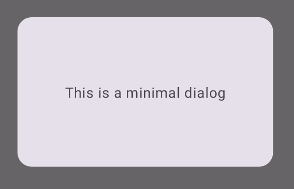
Следующий пример представляет собой базовую реализацию составного Dialog . Обратите внимание, что в качестве вторичного контейнера используется Card . Без Card компонент Text отображался бы отдельно над основным содержимым приложения.
Результат
Обратите внимание, что когда диалоговое окно открыто, основной контент приложения под ним отображается затемненным и выделенным серым цветом:
Рисунок 2. Минимальный диалог.
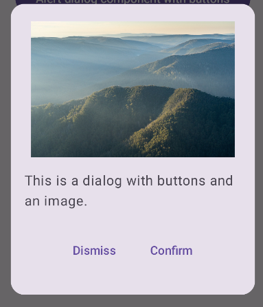
Создать расширенный диалог
Ниже приведена более продвинутая реализация составного Dialog . В этом случае компонент вручную реализует интерфейс, аналогичный предыдущему примеру AlertDialog .
Результат
Рисунок 3. Диалоговое окно с изображением.
Коллекции, содержащие это руководство
Это руководство является частью тщательно подобранной коллекции быстрых руководств, охватывающих более широкие цели разработки Android:
Отображать текст
Текст — это центральная часть любого пользовательского интерфейса. Узнайте, как можно представить текст в своем приложении, чтобы обеспечить приятный пользовательский опыт.
Контент и образцы кода на этой странице предоставлены по лицензиям. Java и OpenJDK – это зарегистрированные товарные знаки корпорации Oracle и ее аффилированных лиц.
Последнее обновление: 2025-02-06 UTC.
[[["Прост для понимания","easyToUnderstand","thumb-up"],["Помог мне решить мою проблему","solvedMyProblem","thumb-up"],["Другое","otherUp","thumb-up"]],[["Отсутствует нужная мне информация","missingTheInformationINeed","thumb-down"],["Слишком сложен/слишком много шагов","tooComplicatedTooManySteps","thumb-down"],["Устарел","outOfDate","thumb-down"],["Проблема с переводом текста","translationIssue","thumb-down"],["Проблемы образцов/кода","samplesCodeIssue","thumb-down"],["Другое","otherDown","thumb-down"]],["Последнее обновление: 2025-02-06 UTC."],[],[],null,["\u003cbr /\u003e\n\nThe [`Dialog`](/reference/kotlin/androidx/compose/ui/window/package-summary#Dialog(kotlin.Function0,androidx.compose.ui.window.DialogProperties,kotlin.Function0)) component displays pop-up messages or requests user input on a\nlayer above the main app content. It creates an interruptive UI experience to\ncapture user attention.\n\nAmong the use cases for a dialog are the following:\n\n- Confirming user action, such as when deleting a file.\n- Requesting user input, such as in a to-do list app.\n- Presenting a list of options for user selection, like choosing a country in a profile setup.\n\nThis topic provides the following implementations:\n\n- [Alert](#alert)\n- [Basic dialog](#basic)\n- [Advanced dialog](#advanced)\n\nVersion compatibility\n\nThis implementation requires that your project minSDK be set to API level 21 or\nhigher.\n\nDependencies\n\nCreate an Alert dialog\n\nThe [`AlertDialog`](/reference/kotlin/androidx/compose/material3/package-summary#AlertDialog(kotlin.Function0,kotlin.Function0,androidx.compose.ui.Modifier,kotlin.Function0,kotlin.Function0,kotlin.Function0,kotlin.Function0,androidx.compose.ui.graphics.Shape,androidx.compose.ui.graphics.Color,androidx.compose.ui.graphics.Color,androidx.compose.ui.graphics.Color,androidx.compose.ui.graphics.Color,androidx.compose.ui.unit.Dp,androidx.compose.ui.window.DialogProperties)) composable provides a convenient API for creating a\nMaterial Design themed dialog. The following example implements two buttons in\nan alert dialog, one that dismisses the dialog, and another that confirms its\nrequest:\n\nThis implementation implies a parent composable that passes arguments to the\nchild composable in this way:\n\nResults **Figure 1.** An alert dialog with buttons.\n\nKey points\n\n`AlertDialog` has specific parameters for handling particular elements of the\ndialog. Among them are the following:\n\n- `title`: The text that appears along the top of the dialog.\n- `text`: The text that appears centered within the dialog.\n- `icon`: The graphic that appears at the top of the dialog.\n- `onDismissRequest`: The function called when the user dismisses the dialog, such as by tapping outside of it.\n- `dismissButton`: A composable that serves as the dismiss button.\n- `confirmButton`: A composable that serves as the confirm button.\n\n- When the user clicks either of the buttons, the dialog closes. When the user\n clicks confirm, it calls a function that also handles the confirmation. In\n this example, those functions are `onDismissRequest()` and\n `onConfirmRequest()`.\n\n In cases where your dialog requires a more complex set of buttons, you may\n benefit from using the `Dialog` composable and populating it in a more\n freeform manner.\n\nCreate a dialog\n\n[`Dialog`](/reference/kotlin/androidx/compose/ui/window/package-summary#Dialog(kotlin.Function0,androidx.compose.ui.window.DialogProperties,kotlin.Function0)) is a basic composable that doesn't provide any styling or\npredefined slots for content. It is a straightforward container that you should\npopulate with a container such as `Card`. The following are some of the key\nparameters of a dialog:\n\n- **`onDismissRequest`**: The lambda called when the user closes the dialog.\n- **`properties`** : An instance of [`DialogProperties`](/reference/kotlin/androidx/compose/ui/window/DialogProperties) that provides some additional scope for customization.\n\n| **Caution:** You must manually specify the size and shape of `Dialog`. You also must provide an inner container.\n\nCreate a basic dialog\n\nThe following example is a basic implementation of the `Dialog` composable. Note\nthat it uses a `Card` as the secondary container. Without the `Card`, the `Text`\ncomponent would appear alone above the main app content.\n\nResult\n\nNote that when the dialog is open, the main app content beneath it appears\ndarkened and grayed out:\n**Figure 2.** Minimal dialog.\n\nCreate an advanced dialog\n\nThe following is a more advanced implemented of the `Dialog` composable. In this\ncase, the component manually implements a similar interface to the preceding\n`AlertDialog` example.\n| **Caution:** If you only need to display a two-button dialog as in this example, you should use `AlertDialog` and its more convenient API. However, if you want to create a more complex dialog, perhaps with forms and multiple buttons, you should use `Dialog` with custom content, as in the following example.\n\nResult **Figure 3.** A dialog that includes an image.\n\nCollections that contain this guide\n\nThis guide is part of these curated Quick Guide collections that cover\nbroader Android development goals: \n\nDisplay text \nText is a central piece of any UI. Find out different ways you can present text in your app to provide a delightful user experience. \n[Quick guide collection](/develop/ui/compose/quick-guides/collections/display-text) \n\nRequest user input \nLearn how to implement ways for users to interact with your app by entering text and using other means of input. \n[Quick guide collection](/develop/ui/compose/quick-guides/collections/request-user-input) \n\nDisplay interactive components \nLearn how composable functions can enable you to easily create beautiful UI components based on the Material Design design system. \n[Quick guide collection](/develop/ui/compose/quick-guides/collections/display-interactive-components) \n\nHave questions or feedback \nGo to our frequently asked questions page and learn about quick guides or reach out and let us know your thoughts. \n[Go to FAQ](/quick-guides/faq) [Leave feedback](https://issuetracker.google.com/issues/new?component=1573691&template=1993320)"]]