Menampilkan pesan pop-up atau permintaan input pengguna
Tetap teratur dengan koleksi
Simpan dan kategorikan konten berdasarkan preferensi Anda.
Komponen Dialog menampilkan pesan pop-up atau meminta input pengguna di
lapisan di atas konten aplikasi utama. Hal ini menciptakan pengalaman UI yang mengganggu untuk
menarik perhatian pengguna.
Di antara kasus penggunaan untuk dialog adalah sebagai berikut:
Mengonfirmasi tindakan pengguna, seperti saat menghapus file.
Meminta input pengguna, seperti di aplikasi daftar tugas.
Menampilkan daftar opsi untuk pemilihan pengguna, seperti memilih negara dalam
penyiapan profil.
Implementasi ini mengharuskan minSDK project Anda ditetapkan ke API level 21 atau
yang lebih tinggi.
Dependensi
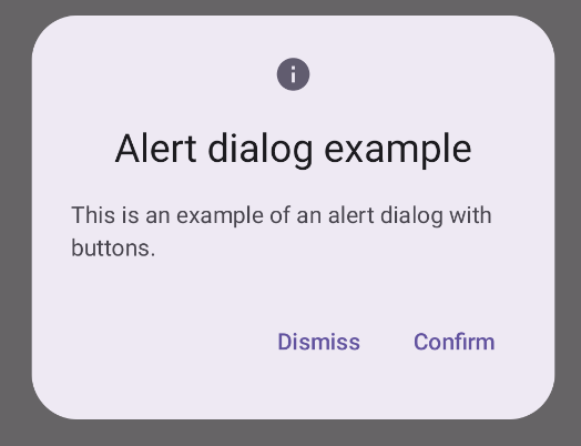
Membuat dialog Pemberitahuan
Composable AlertDialog menyediakan API yang mudah digunakan untuk membuat
dialog bertema Desain Material. Contoh berikut menerapkan dua tombol dalam
dialog pemberitahuan, satu tombol yang menutup dialog, dan tombol lain yang mengonfirmasi
permintaannya:
Implementasi ini menyiratkan composable induk yang meneruskan argumen ke
composable turunan dengan cara ini:
Hasil
Gambar 1. Dialog pemberitahuan dengan tombol.
Poin utama
AlertDialog memiliki parameter khusus untuk menangani elemen dialog tertentu. Di antaranya adalah:
title: Teks yang muncul di sepanjang bagian atas dialog.
text: Teks yang muncul di tengah dialog.
icon: Grafik yang muncul di bagian atas dialog.
onDismissRequest: Fungsi yang dipanggil saat pengguna menutup dialog,
seperti dengan mengetuk di luarnya.
dismissButton: Composable yang berfungsi sebagai tombol tutup.
confirmButton: Composable yang berfungsi sebagai tombol konfirmasi.
Saat pengguna mengklik salah satu tombol, dialog akan ditutup. Saat pengguna
mengklik konfirmasi, tindakan ini akan memanggil fungsi yang juga menangani konfirmasi. Dalam
contoh ini, fungsi tersebut adalah
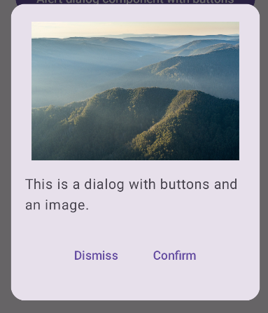
 onDismissRequest() dan
onConfirmRequest().
Jika dialog Anda memerlukan kumpulan tombol yang lebih kompleks, Anda dapat
mendapatkan manfaat dari penggunaan composable Dialog dan mengisinya dengan cara
yang lebih bebas.
Membuat dialog
Dialog adalah composable dasar yang tidak menyediakan gaya visual atau
slot standar untuk konten. Ini adalah penampung sederhana yang harus Anda
isi dengan penampung seperti Card. Berikut adalah beberapa parameter utama dialog:
onDismissRequest: Lambda yang dipanggil saat pengguna menutup dialog.
properties: Instance DialogProperties yang menyediakan beberapa
cakupan tambahan untuk penyesuaian.
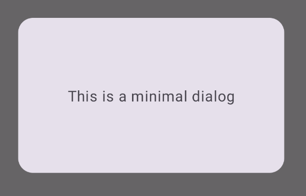
Membuat dialog dasar
Contoh berikut adalah implementasi dasar composable Dialog. Perhatikan bahwa kode ini menggunakan Card sebagai penampung sekunder. Tanpa Card, komponen Text
akan muncul sendiri di atas konten aplikasi utama.
Hasil
Perhatikan bahwa saat dialog terbuka, konten aplikasi utama di bawahnya akan
menjadi gelap dan berwarna abu-abu:
Gambar 2. Dialog minimal.
Membuat dialog lanjutan
Berikut adalah implementasi composable Dialog yang lebih canggih. Dalam
hal ini, komponen secara manual menerapkan antarmuka yang serupa dengan contoh
AlertDialog sebelumnya.
Hasil
Gambar 3. Dialog yang menyertakan gambar.
Koleksi yang berisi panduan ini
Panduan ini adalah bagian dari koleksi Panduan Cepat pilihan yang membahas
sasaran pengembangan Android yang lebih luas:
Teks tampilan
Teks adalah bagian utama dari setiap UI. Cari tahu berbagai cara
untuk menyajikan teks di aplikasi Anda guna memberikan pengalaman pengguna yang menyenangkan.
Konten dan contoh kode di halaman ini tunduk kepada lisensi yang dijelaskan dalam Lisensi Konten. Java dan OpenJDK adalah merek dagang atau merek dagang terdaftar dari Oracle dan/atau afiliasinya.
Terakhir diperbarui pada 2025-02-06 UTC.
[[["Mudah dipahami","easyToUnderstand","thumb-up"],["Memecahkan masalah saya","solvedMyProblem","thumb-up"],["Lainnya","otherUp","thumb-up"]],[["Informasi yang saya butuhkan tidak ada","missingTheInformationINeed","thumb-down"],["Terlalu rumit/langkahnya terlalu banyak","tooComplicatedTooManySteps","thumb-down"],["Sudah usang","outOfDate","thumb-down"],["Masalah terjemahan","translationIssue","thumb-down"],["Masalah kode / contoh","samplesCodeIssue","thumb-down"],["Lainnya","otherDown","thumb-down"]],["Terakhir diperbarui pada 2025-02-06 UTC."],[],[],null,["\u003cbr /\u003e\n\nThe [`Dialog`](/reference/kotlin/androidx/compose/ui/window/package-summary#Dialog(kotlin.Function0,androidx.compose.ui.window.DialogProperties,kotlin.Function0)) component displays pop-up messages or requests user input on a\nlayer above the main app content. It creates an interruptive UI experience to\ncapture user attention.\n\nAmong the use cases for a dialog are the following:\n\n- Confirming user action, such as when deleting a file.\n- Requesting user input, such as in a to-do list app.\n- Presenting a list of options for user selection, like choosing a country in a profile setup.\n\nThis topic provides the following implementations:\n\n- [Alert](#alert)\n- [Basic dialog](#basic)\n- [Advanced dialog](#advanced)\n\nVersion compatibility\n\nThis implementation requires that your project minSDK be set to API level 21 or\nhigher.\n\nDependencies\n\nCreate an Alert dialog\n\nThe [`AlertDialog`](/reference/kotlin/androidx/compose/material3/package-summary#AlertDialog(kotlin.Function0,kotlin.Function0,androidx.compose.ui.Modifier,kotlin.Function0,kotlin.Function0,kotlin.Function0,kotlin.Function0,androidx.compose.ui.graphics.Shape,androidx.compose.ui.graphics.Color,androidx.compose.ui.graphics.Color,androidx.compose.ui.graphics.Color,androidx.compose.ui.graphics.Color,androidx.compose.ui.unit.Dp,androidx.compose.ui.window.DialogProperties)) composable provides a convenient API for creating a\nMaterial Design themed dialog. The following example implements two buttons in\nan alert dialog, one that dismisses the dialog, and another that confirms its\nrequest:\n\nThis implementation implies a parent composable that passes arguments to the\nchild composable in this way:\n\nResults **Figure 1.** An alert dialog with buttons.\n\nKey points\n\n`AlertDialog` has specific parameters for handling particular elements of the\ndialog. Among them are the following:\n\n- `title`: The text that appears along the top of the dialog.\n- `text`: The text that appears centered within the dialog.\n- `icon`: The graphic that appears at the top of the dialog.\n- `onDismissRequest`: The function called when the user dismisses the dialog, such as by tapping outside of it.\n- `dismissButton`: A composable that serves as the dismiss button.\n- `confirmButton`: A composable that serves as the confirm button.\n\n- When the user clicks either of the buttons, the dialog closes. When the user\n clicks confirm, it calls a function that also handles the confirmation. In\n this example, those functions are `onDismissRequest()` and\n `onConfirmRequest()`.\n\n In cases where your dialog requires a more complex set of buttons, you may\n benefit from using the `Dialog` composable and populating it in a more\n freeform manner.\n\nCreate a dialog\n\n[`Dialog`](/reference/kotlin/androidx/compose/ui/window/package-summary#Dialog(kotlin.Function0,androidx.compose.ui.window.DialogProperties,kotlin.Function0)) is a basic composable that doesn't provide any styling or\npredefined slots for content. It is a straightforward container that you should\npopulate with a container such as `Card`. The following are some of the key\nparameters of a dialog:\n\n- **`onDismissRequest`**: The lambda called when the user closes the dialog.\n- **`properties`** : An instance of [`DialogProperties`](/reference/kotlin/androidx/compose/ui/window/DialogProperties) that provides some additional scope for customization.\n\n| **Caution:** You must manually specify the size and shape of `Dialog`. You also must provide an inner container.\n\nCreate a basic dialog\n\nThe following example is a basic implementation of the `Dialog` composable. Note\nthat it uses a `Card` as the secondary container. Without the `Card`, the `Text`\ncomponent would appear alone above the main app content.\n\nResult\n\nNote that when the dialog is open, the main app content beneath it appears\ndarkened and grayed out:\n**Figure 2.** Minimal dialog.\n\nCreate an advanced dialog\n\nThe following is a more advanced implemented of the `Dialog` composable. In this\ncase, the component manually implements a similar interface to the preceding\n`AlertDialog` example.\n| **Caution:** If you only need to display a two-button dialog as in this example, you should use `AlertDialog` and its more convenient API. However, if you want to create a more complex dialog, perhaps with forms and multiple buttons, you should use `Dialog` with custom content, as in the following example.\n\nResult **Figure 3.** A dialog that includes an image.\n\nCollections that contain this guide\n\nThis guide is part of these curated Quick Guide collections that cover\nbroader Android development goals: \n\nDisplay text \nText is a central piece of any UI. Find out different ways you can present text in your app to provide a delightful user experience. \n[Quick guide collection](/develop/ui/compose/quick-guides/collections/display-text) \n\nRequest user input \nLearn how to implement ways for users to interact with your app by entering text and using other means of input. \n[Quick guide collection](/develop/ui/compose/quick-guides/collections/request-user-input) \n\nDisplay interactive components \nLearn how composable functions can enable you to easily create beautiful UI components based on the Material Design design system. \n[Quick guide collection](/develop/ui/compose/quick-guides/collections/display-interactive-components) \n\nHave questions or feedback \nGo to our frequently asked questions page and learn about quick guides or reach out and let us know your thoughts. \n[Go to FAQ](/quick-guides/faq) [Leave feedback](https://issuetracker.google.com/issues/new?component=1573691&template=1993320)"]]