পপ আপ বার্তা বা ব্যবহারকারীর ইনপুট জন্য অনুরোধ প্রদর্শন
সেভ করা পৃষ্ঠা গুছিয়ে রাখতে 'সংগ্রহ' ব্যবহার করুন
আপনার পছন্দ অনুযায়ী কন্টেন্ট সেভ করুন ও সঠিক বিভাগে রাখুন।
Dialog উপাদানটি পপ-আপ বার্তা প্রদর্শন করে বা মূল অ্যাপের বিষয়বস্তুর উপরে একটি স্তরে ব্যবহারকারীর ইনপুট অনুরোধ করে। এটি ব্যবহারকারীর দৃষ্টি আকর্ষণ করার জন্য একটি বাধামূলক UI অভিজ্ঞতা তৈরি করে।
একটি ডায়ালগের জন্য ব্যবহারের ক্ষেত্রে নিম্নলিখিতগুলি হল:
ব্যবহারকারীর ক্রিয়া নিশ্চিত করা, যেমন একটি ফাইল মুছে ফেলার সময়।
ব্যবহারকারীর ইনপুট অনুরোধ করা, যেমন একটি করণীয় তালিকা অ্যাপে।
ব্যবহারকারী নির্বাচনের জন্য বিকল্পগুলির একটি তালিকা উপস্থাপন করা, যেমন একটি প্রোফাইল সেটআপে একটি দেশ বেছে নেওয়া।
এই বাস্তবায়নের জন্য আপনার প্রজেক্ট minSDK এপিআই লেভেল 21 বা তার উপরে সেট করা প্রয়োজন।
নির্ভরতা
একটি সতর্কতা ডায়ালগ তৈরি করুন
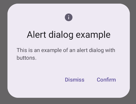
AlertDialog composable একটি মেটেরিয়াল ডিজাইন থিমযুক্ত ডায়ালগ তৈরি করার জন্য একটি সুবিধাজনক API প্রদান করে। নিম্নলিখিত উদাহরণটি একটি সতর্কতা ডায়ালগে দুটি বোতাম প্রয়োগ করে, একটি যা ডায়ালগ খারিজ করে এবং অন্যটি এটির অনুরোধ নিশ্চিত করে:
এই বাস্তবায়নটি একটি অভিভাবক কম্পোজেবলকে বোঝায় যা এইভাবে শিশুর কাছে কম্পোজেবল আর্গুমেন্ট পাস করে:
ফলাফল
চিত্র 1. বোতাম সহ একটি সতর্ক সংলাপ।
মূল পয়েন্ট
AlertDialog ডায়ালগের নির্দিষ্ট উপাদানগুলি পরিচালনা করার জন্য নির্দিষ্ট পরামিতি রয়েছে। তাদের মধ্যে নিম্নলিখিত:
title : ডায়ালগের শীর্ষ বরাবর প্রদর্শিত পাঠ্য।
text : ডায়ালগের মধ্যে কেন্দ্রীভূত পাঠ্য।
icon : ডায়ালগের শীর্ষে প্রদর্শিত গ্রাফিক।
onDismissRequest : ব্যবহারকারী যখন ডায়ালগটি খারিজ করে, যেমন এর বাইরে ট্যাপ করে তখন ফাংশনটিকে বলা হয়।
dismissButton : একটি সংমিশ্রণযোগ্য যা খারিজ বোতাম হিসাবে কাজ করে।
confirmButton : একটি সংমিশ্রণযোগ্য যা নিশ্চিত বোতাম হিসাবে কাজ করে।
ব্যবহারকারী যখন যেকোন একটি বোতামে ক্লিক করেন, ডায়ালগটি বন্ধ হয়ে যায়। যখন ব্যবহারকারী নিশ্চিত ক্লিক করে, তখন এটি একটি ফাংশনকে কল করে যা নিশ্চিতকরণ পরিচালনা করে। এই উদাহরণে, সেই ফাংশনগুলি হল onDismissRequest() এবং onConfirmRequest() ।
যে ক্ষেত্রে আপনার ডায়ালগের জন্য আরও জটিল সেটের বোতাম প্রয়োজন, আপনি Dialog কম্পোজেবল ব্যবহার করে এবং এটিকে আরও ফ্রিফর্ম পদ্ধতিতে পপুলেট করে উপকৃত হতে পারেন।
একটি ডায়ালগ তৈরি করুন
Dialog হল একটি মৌলিক রচনা যা সামগ্রীর জন্য কোনো স্টাইলিং বা পূর্বনির্ধারিত স্লট প্রদান করে না। এটি একটি সহজবোধ্য ধারক যা আপনার Card মতো একটি ধারক দিয়ে তৈরি করা উচিত। একটি ডায়ালগের কিছু মূল পরামিতি নিচে দেওয়া হল:
onDismissRequest : যখন ব্যবহারকারী ডায়ালগ বন্ধ করে তখন ল্যাম্বডা বলা হয়।
properties : DialogProperties একটি উদাহরণ যা কাস্টমাইজেশনের জন্য কিছু অতিরিক্ত সুযোগ প্রদান করে।
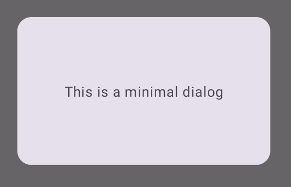
একটি মৌলিক ডায়ালগ তৈরি করুন
নিম্নলিখিত উদাহরণটি Dialog কম্পোজেবলের একটি মৌলিক বাস্তবায়ন। নোট করুন যে এটি একটি Card সেকেন্ডারি ধারক হিসাবে ব্যবহার করে। Card ছাড়া, মূল অ্যাপের বিষয়বস্তুর উপরে Text উপাদানটি একা প্রদর্শিত হবে।
ফলাফল
মনে রাখবেন যে ডায়ালগ খোলা থাকলে, এর নীচের প্রধান অ্যাপের বিষয়বস্তু অন্ধকার এবং ধূসর দেখায়:
চিত্র 2. ন্যূনতম ডায়ালগ।
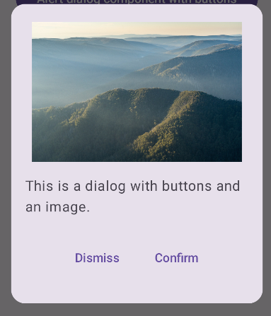
একটি উন্নত ডায়ালগ তৈরি করুন
নিম্নলিখিতটি Dialog কম্পোজেবলের আরও উন্নত প্রয়োগ করা হয়েছে। এই ক্ষেত্রে, উপাদানটি ম্যানুয়ালি পূর্ববর্তী AlertDialog উদাহরণের অনুরূপ ইন্টারফেস প্রয়োগ করে।
ফলাফল
চিত্র 3. একটি ডায়ালগ যা একটি চিত্র অন্তর্ভুক্ত করে।
এই নির্দেশিকা ধারণকারী সংগ্রহ
এই নির্দেশিকাটি এই কিউরেট করা কুইক গাইড সংগ্রহের অংশ যা বৃহত্তর অ্যান্ড্রয়েড উন্নয়ন লক্ষ্যগুলি কভার করে:
পাঠ্য প্রদর্শন করুন
টেক্সট হল যেকোনো UI এর কেন্দ্রীয় অংশ। একটি আনন্দদায়ক ব্যবহারকারীর অভিজ্ঞতা প্রদানের জন্য আপনি আপনার অ্যাপে পাঠ্য উপস্থাপন করতে পারেন এমন বিভিন্ন উপায় খুঁজুন।
টেক্সট এন্ট্রি করে এবং ইনপুটের অন্যান্য উপায় ব্যবহার করে ব্যবহারকারীদের আপনার অ্যাপের সাথে ইন্টারঅ্যাক্ট করার উপায়গুলি কীভাবে বাস্তবায়ন করবেন তা শিখুন।
এই পৃষ্ঠার কন্টেন্ট ও কোডের নমুনাগুলি Content License-এ বর্ণিত লাইসেন্সের অধীনস্থ। Java এবং OpenJDK হল Oracle এবং/অথবা তার অ্যাফিলিয়েট সংস্থার রেজিস্টার্ড ট্রেডমার্ক।
2025-02-06 UTC-তে শেষবার আপডেট করা হয়েছে।
[[["সহজে বোঝা যায়","easyToUnderstand","thumb-up"],["আমার সমস্যার সমাধান হয়েছে","solvedMyProblem","thumb-up"],["অন্যান্য","otherUp","thumb-up"]],[["এতে আমার প্রয়োজনীয় তথ্য নেই","missingTheInformationINeed","thumb-down"],["খুব জটিল / অনেক ধাপ","tooComplicatedTooManySteps","thumb-down"],["পুরনো","outOfDate","thumb-down"],["অনুবাদ সংক্রান্ত সমস্যা","translationIssue","thumb-down"],["নমুনা / কোড সংক্রান্ত সমস্যা","samplesCodeIssue","thumb-down"],["অন্যান্য","otherDown","thumb-down"]],["2025-02-06 UTC-তে শেষবার আপডেট করা হয়েছে।"],[],[],null,["\u003cbr /\u003e\n\nThe [`Dialog`](/reference/kotlin/androidx/compose/ui/window/package-summary#Dialog(kotlin.Function0,androidx.compose.ui.window.DialogProperties,kotlin.Function0)) component displays pop-up messages or requests user input on a\nlayer above the main app content. It creates an interruptive UI experience to\ncapture user attention.\n\nAmong the use cases for a dialog are the following:\n\n- Confirming user action, such as when deleting a file.\n- Requesting user input, such as in a to-do list app.\n- Presenting a list of options for user selection, like choosing a country in a profile setup.\n\nThis topic provides the following implementations:\n\n- [Alert](#alert)\n- [Basic dialog](#basic)\n- [Advanced dialog](#advanced)\n\nVersion compatibility\n\nThis implementation requires that your project minSDK be set to API level 21 or\nhigher.\n\nDependencies\n\nCreate an Alert dialog\n\nThe [`AlertDialog`](/reference/kotlin/androidx/compose/material3/package-summary#AlertDialog(kotlin.Function0,kotlin.Function0,androidx.compose.ui.Modifier,kotlin.Function0,kotlin.Function0,kotlin.Function0,kotlin.Function0,androidx.compose.ui.graphics.Shape,androidx.compose.ui.graphics.Color,androidx.compose.ui.graphics.Color,androidx.compose.ui.graphics.Color,androidx.compose.ui.graphics.Color,androidx.compose.ui.unit.Dp,androidx.compose.ui.window.DialogProperties)) composable provides a convenient API for creating a\nMaterial Design themed dialog. The following example implements two buttons in\nan alert dialog, one that dismisses the dialog, and another that confirms its\nrequest:\n\nThis implementation implies a parent composable that passes arguments to the\nchild composable in this way:\n\nResults **Figure 1.** An alert dialog with buttons.\n\nKey points\n\n`AlertDialog` has specific parameters for handling particular elements of the\ndialog. Among them are the following:\n\n- `title`: The text that appears along the top of the dialog.\n- `text`: The text that appears centered within the dialog.\n- `icon`: The graphic that appears at the top of the dialog.\n- `onDismissRequest`: The function called when the user dismisses the dialog, such as by tapping outside of it.\n- `dismissButton`: A composable that serves as the dismiss button.\n- `confirmButton`: A composable that serves as the confirm button.\n\n- When the user clicks either of the buttons, the dialog closes. When the user\n clicks confirm, it calls a function that also handles the confirmation. In\n this example, those functions are `onDismissRequest()` and\n `onConfirmRequest()`.\n\n In cases where your dialog requires a more complex set of buttons, you may\n benefit from using the `Dialog` composable and populating it in a more\n freeform manner.\n\nCreate a dialog\n\n[`Dialog`](/reference/kotlin/androidx/compose/ui/window/package-summary#Dialog(kotlin.Function0,androidx.compose.ui.window.DialogProperties,kotlin.Function0)) is a basic composable that doesn't provide any styling or\npredefined slots for content. It is a straightforward container that you should\npopulate with a container such as `Card`. The following are some of the key\nparameters of a dialog:\n\n- **`onDismissRequest`**: The lambda called when the user closes the dialog.\n- **`properties`** : An instance of [`DialogProperties`](/reference/kotlin/androidx/compose/ui/window/DialogProperties) that provides some additional scope for customization.\n\n| **Caution:** You must manually specify the size and shape of `Dialog`. You also must provide an inner container.\n\nCreate a basic dialog\n\nThe following example is a basic implementation of the `Dialog` composable. Note\nthat it uses a `Card` as the secondary container. Without the `Card`, the `Text`\ncomponent would appear alone above the main app content.\n\nResult\n\nNote that when the dialog is open, the main app content beneath it appears\ndarkened and grayed out:\n**Figure 2.** Minimal dialog.\n\nCreate an advanced dialog\n\nThe following is a more advanced implemented of the `Dialog` composable. In this\ncase, the component manually implements a similar interface to the preceding\n`AlertDialog` example.\n| **Caution:** If you only need to display a two-button dialog as in this example, you should use `AlertDialog` and its more convenient API. However, if you want to create a more complex dialog, perhaps with forms and multiple buttons, you should use `Dialog` with custom content, as in the following example.\n\nResult **Figure 3.** A dialog that includes an image.\n\nCollections that contain this guide\n\nThis guide is part of these curated Quick Guide collections that cover\nbroader Android development goals: \n\nDisplay text \nText is a central piece of any UI. Find out different ways you can present text in your app to provide a delightful user experience. \n[Quick guide collection](/develop/ui/compose/quick-guides/collections/display-text) \n\nRequest user input \nLearn how to implement ways for users to interact with your app by entering text and using other means of input. \n[Quick guide collection](/develop/ui/compose/quick-guides/collections/request-user-input) \n\nDisplay interactive components \nLearn how composable functions can enable you to easily create beautiful UI components based on the Material Design design system. \n[Quick guide collection](/develop/ui/compose/quick-guides/collections/display-interactive-components) \n\nHave questions or feedback \nGo to our frequently asked questions page and learn about quick guides or reach out and let us know your thoughts. \n[Go to FAQ](/quick-guides/faq) [Leave feedback](https://issuetracker.google.com/issues/new?component=1573691&template=1993320)"]]