
Thanh ứng dụng là vùng chứa ở đầu hoặc cuối màn hình, cho phép người dùng truy cập vào các tính năng chính và mục điều hướng:
Loại |
Diện mạo |
Mục đích |
|---|---|---|
| Thanh ứng dụng trên cùng | Ở đầu màn hình. |
Cung cấp quyền truy cập vào các tác vụ và thông tin chính. Thường lưu trữ tiêu đề, các mục hành động cốt lõi và một số mục điều hướng nhất định. |
| Thanh ứng dụng ở dưới cùng | Ở cuối màn hình. |
Thường bao gồm các mục điều hướng chính. Có thể cấp quyền truy cập vào các thao tác khác, chẳng hạn như bằng cách sử dụng nút hành động nổi. |
Khả năng tương thích của phiên bản
Phương thức triển khai này yêu cầu bạn phải đặt minSDK của dự án thành API cấp 21 trở lên.
Phần phụ thuộc
Triển khai thanh ứng dụng trên cùng
Mã sau đây cho thấy cách triển khai cho 4 loại thanh ứng dụng trên cùng, bao gồm nhiều ví dụ về cách bạn có thể kiểm soát hành vi cuộn.
- Thanh ứng dụng trên cùng nhỏ
- Thanh ứng dụng trên cùng căn giữa
- Thanh ứng dụng trên cùng cỡ trung bình
- Thanh ứng dụng trên cùng lớn
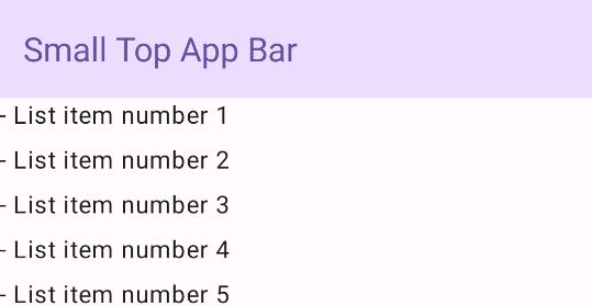
Thanh ứng dụng trên cùng nhỏ
Để tạo một thanh ứng dụng nhỏ ở trên cùng, hãy sử dụng thành phần kết hợp TopAppBar. Đây là thanh ứng dụng trên cùng đơn giản nhất có thể và trong ví dụ này chỉ chứa một tiêu đề.
Ví dụ sau đây không truyền TopAppBar một giá trị cho scrollBehavior, vì vậy, thanh ứng dụng trên cùng không phản ứng với thao tác cuộn nội dung bên trong.
Kết quả
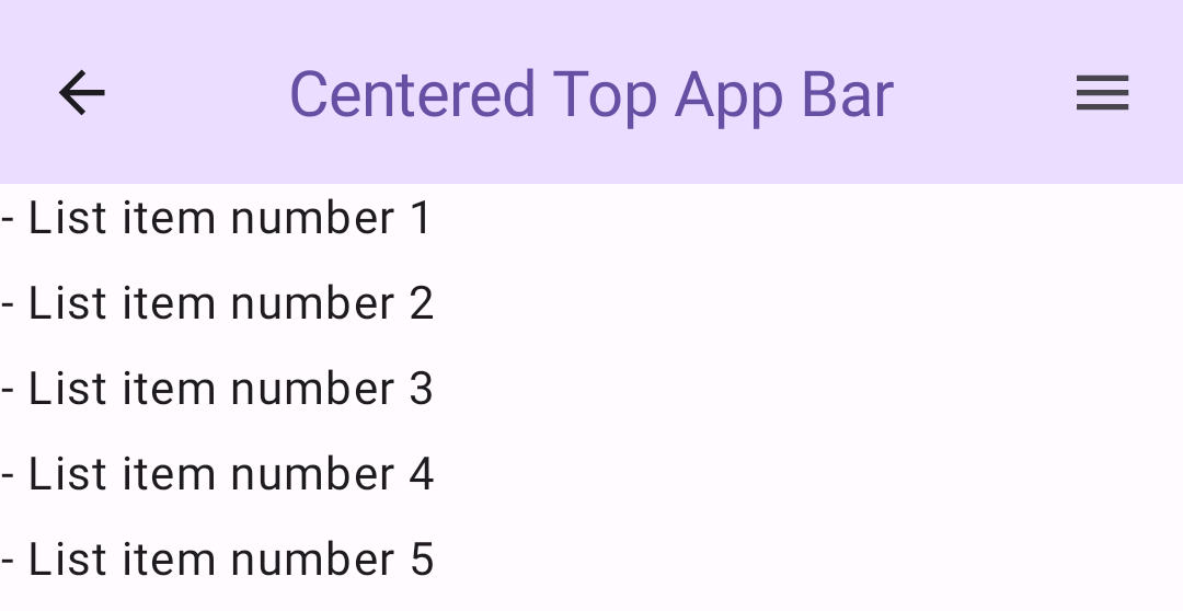
Thanh ứng dụng trên cùng căn giữa
Thanh ứng dụng trên cùng căn giữa giống với thanh ứng dụng nhỏ, ngoại trừ tiêu đề được căn giữa trong thành phần. Để triển khai tính năng này, hãy sử dụng thành phần kết hợp CenterAlignedTopAppBar dành riêng.
Ví dụ này sử dụng enterAlwaysScrollBehavior() để lấy giá trị mà nó truyền cho scrollBehavior. Thanh này thu gọn khi người dùng cuộn nội dung bên trong của giàn giáo.
Kết quả
Thanh ứng dụng trên cùng cỡ trung bình
Thanh ứng dụng trên cùng cỡ trung đặt tiêu đề bên dưới mọi biểu tượng bổ sung. Để tạo một thành phần kết hợp, hãy sử dụng thành phần kết hợp MediumTopAppBar.
Giống như mã trước, ví dụ này sử dụng enterAlwaysScrollBehavior() để lấy giá trị mà nó truyền cho scrollBehavior.
Kết quả
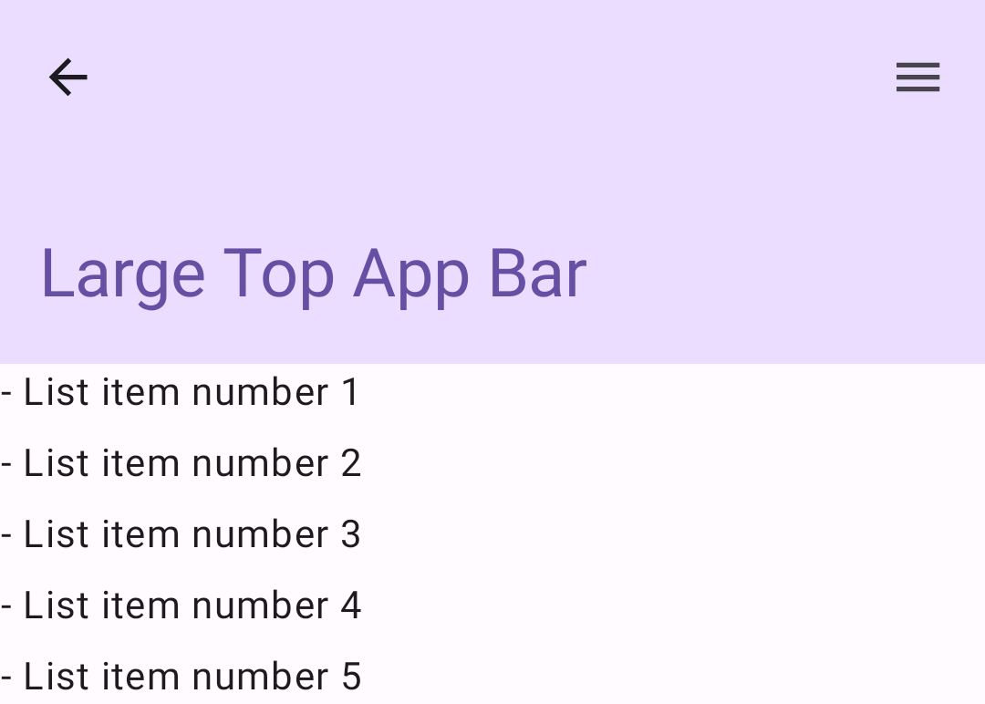
enterAlwaysScrollBehavior.Thanh ứng dụng trên cùng có kích thước lớn
Thanh ứng dụng trên cùng lớn tương tự như thanh ứng dụng trung bình, mặc dù khoảng đệm giữa tiêu đề và các biểu tượng lớn hơn và chiếm nhiều không gian hơn trên màn hình. Để tạo một thành phần kết hợp, hãy sử dụng thành phần kết hợp LargeTopAppBar.
Ví dụ này sử dụng exitUntilCollapsedScrollBehavior() để lấy giá trị mà nó truyền cho scrollBehavior. Thanh này thu gọn khi người dùng cuộn nội dung bên trong của giàn giáo, nhưng sau đó mở rộng khi người dùng cuộn đến cuối nội dung bên trong.
Kết quả
Triển khai thanh ứng dụng ở dưới cùng
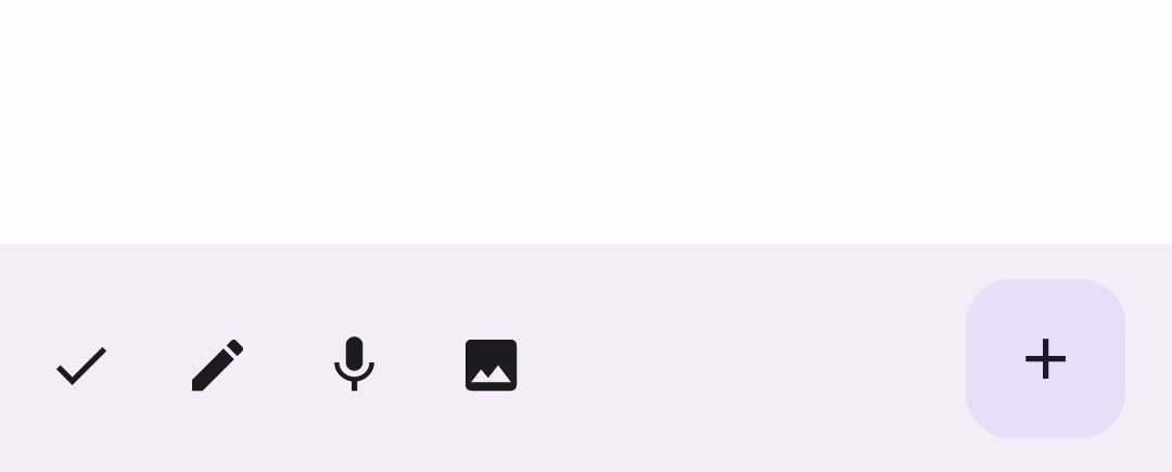
Để tạo thanh ứng dụng dưới cùng, hãy sử dụng thành phần kết hợp BottomAppBar. Thành phần này tương tự như thành phần kết hợp thanh ứng dụng trên cùng.
Bạn truyền các thành phần kết hợp cho các tham số chính sau:
actions: Một loạt biểu tượng xuất hiện ở bên trái của thanh. Đây thường là các thao tác chính cho màn hình nhất định hoặc các mục điều hướng.floatingActionButton: Nút hành động nổi xuất hiện ở bên phải của thanh.
Kết quả
Điểm chính
- Bạn thường truyền thanh ứng dụng đến thành phần kết hợp
Scaffold. Thành phần này có các tham số cụ thể để nhận thanh ứng dụng. Các thành phần kết hợp mà bạn sử dụng để triển khai thanh ứng dụng trên cùng có chung các tham số chính:
title: Văn bản xuất hiện trên thanh ứng dụng.navigationIcon: Biểu tượng chính để điều hướng, xuất hiện ở bên trái thanh ứng dụng.actions: Các biểu tượng cung cấp cho người dùng quyền truy cập vào các thao tác chính, xuất hiện ở bên phải thanh ứng dụng.scrollBehavior: Xác định cách thanh ứng dụng trên cùng phản hồi thao tác cuộn nội dung bên trong của Scaffold.colors: Xác định cách thanh ứng dụng xuất hiện.
Bạn có thể kiểm soát cách thanh ứng dụng phản hồi khi người dùng cuộn nội dung bên trong của giàn giáo. Để thực hiện việc này, hãy tạo một thực thể của
TopAppBarScrollBehaviorvà truyền thực thể đó đến thanh ứng dụng trên cùng cho tham sốscrollBehavior. Có ba loạiTopAppBarScrollBehavior:enterAlwaysScrollBehavior: Khi người dùng kéo nội dung bên trong của ngăn xếp lên, thanh ứng dụng trên cùng sẽ thu gọn. Thanh ứng dụng sẽ mở rộng khi người dùng kéo nội dung bên trong xuống.exitUntilCollapsedScrollBehavior: Tương tự nhưenterAlwaysScrollBehavior, mặc dù thanh ứng dụng cũng mở rộng khi người dùng đến cuối nội dung bên trong của ngăn xếp.pinnedScrollBehavior: Thanh ứng dụng vẫn ở nguyên vị trí và không phản ứng với thao tác cuộn.
Các bộ sưu tập chứa hướng dẫn này
Hướng dẫn này là một phần của các bộ sưu tập Hướng dẫn nhanh được tuyển chọn này, bao gồm các mục tiêu phát triển Android rộng hơn:

Hiển thị các thành phần tương tác