
Paski aplikacji to kontenery u góry lub u dołu ekranu, które zapewniają użytkownikom dostęp do najważniejszych funkcji i elementów nawigacji:
Typ |
Wygląd |
Cel |
|---|---|---|
| Pasek aplikacji u góry | u góry ekranu, |
Zapewnia dostęp do najważniejszych zadań i informacji. Zwykle zawiera tytuł, podstawowe elementy działania i niektóre elementy nawigacji. |
| Dolny pasek aplikacji | U dołu ekranu. |
Zwykle zawiera podstawowe elementy nawigacji. Może zapewniać dostęp do innych działań, na przykład za pomocą pływającego przycisku polecenia. |
Zgodność wersji
Ta implementacja wymaga, aby minimalna wersja pakietu SDK projektu była ustawiona na poziom API 21 lub wyższy.
Zależności
Wdrażanie paska aplikacji na górze
Poniższy kod pokazuje implementacje 4 typów górnych pasków aplikacji, w tym różne przykłady kontrolowania zachowania przewijania.
- Mały pasek aplikacji u góry
- Pasek aplikacji u góry wyśrodkowany
- Średni pasek górny aplikacji
- Duży pasek aplikacji u góry
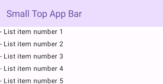
Mały górny pasek aplikacji
Aby utworzyć mały górny pasek aplikacji, użyj komponentu TopAppBar. To najprostszy możliwy górny pasek aplikacji. W tym przykładzie zawiera tylko tytuł.
W tym przykładzie nie przekazuje się do TopAppBar wartości scrollBehavior, więc górny pasek aplikacji nie reaguje na przewijanie wewnętrznych treści.
Wynik
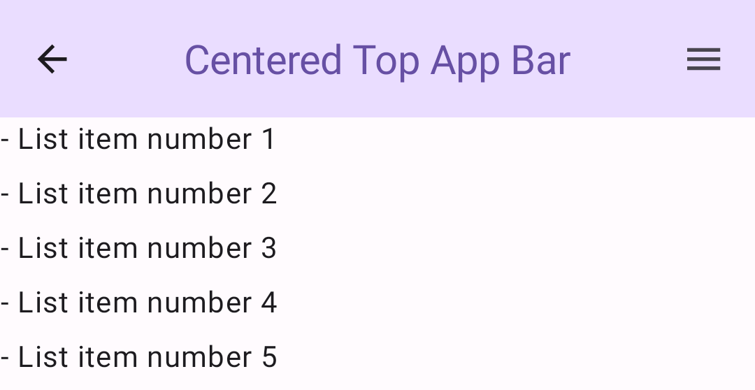
Górny pasek aplikacji wyśrodkowany
Górny pasek aplikacji wyśrodkowany na środku jest taki sam jak mały pasek aplikacji, z tym że tytuł jest wyśrodkowany w komponencie. Aby go wdrożyć, użyj dedykowanego komponentu CenterAlignedTopAppBar.
W tym przykładzie zmienna enterAlwaysScrollBehavior() służy do pobierania wartości przekazywanej do zmiennej scrollBehavior. Pasek zwija się, gdy użytkownik przewija zawartość rusztowania.
Wynik
Średni pasek aplikacji u góry
Na środkowym pasku aplikacji u góry tytuł znajduje się pod dodatkowymi ikonami. Aby utworzyć taki komponent, użyj komponentu MediumTopAppBar.
Podobnie jak w poprzednim kodzie, w tym przykładzie funkcja enterAlwaysScrollBehavior() służy do pobierania wartości przekazywanej do funkcji scrollBehavior.
Wynik
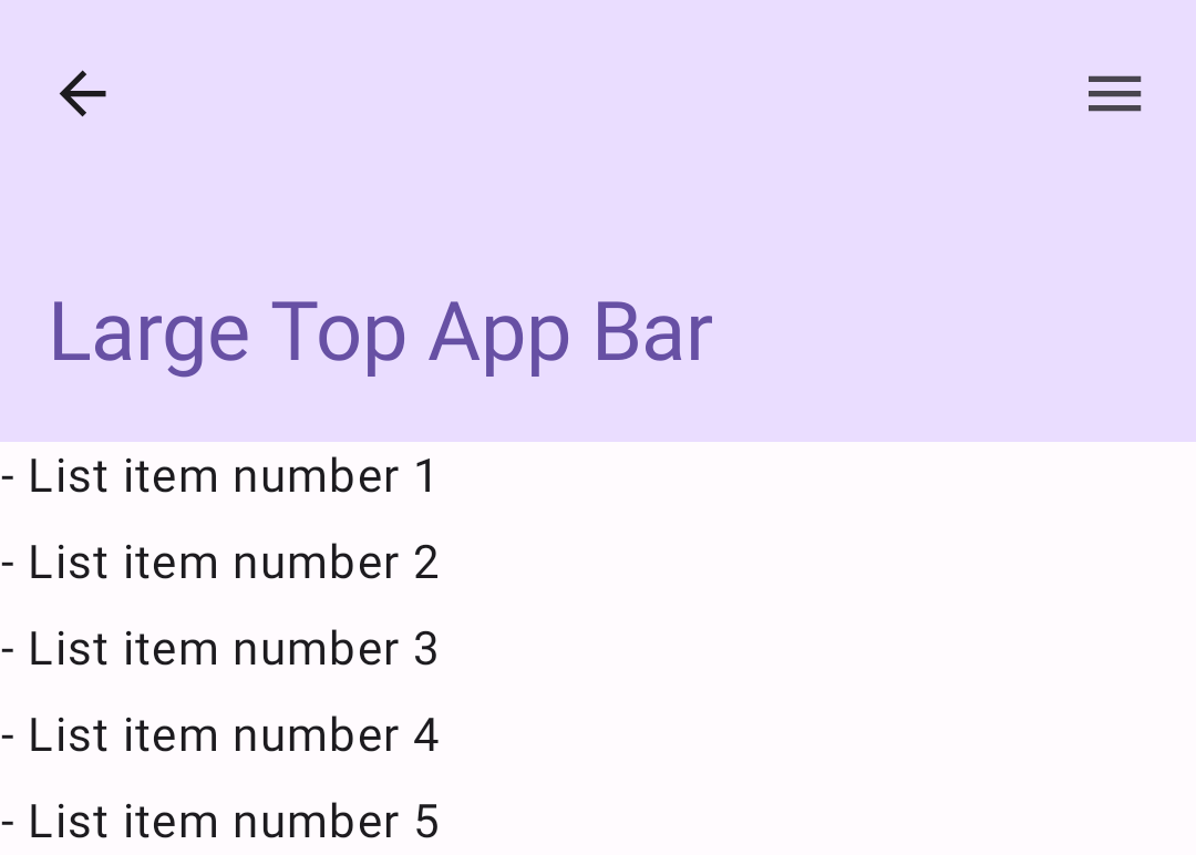
enterAlwaysScrollBehavior.Duży górny pasek aplikacji
Duża górna belka aplikacji jest podobna do średniej, ale odstęp między tytułem a ikonami jest większy i zajmuje więcej miejsca na ekranie. Aby utworzyć taki komponent, użyj komponentu LargeTopAppBar.
W tym przykładzie użyto parametru exitUntilCollapsedScrollBehavior(), aby uzyskać wartość przekazywaną parametrowi scrollBehavior. Pasek zwija się, gdy użytkownik przewija zawartość szkieletu, ale rozszerza się, gdy użytkownik przewinie do końca zawartości.
Wynik
Wdrażanie dolnego paska aplikacji
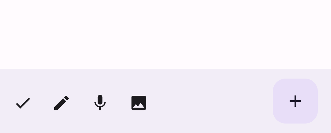
Aby utworzyć dolny pasek aplikacji, użyj komponentu BottomAppBar, który jest podobny do komponentu górnego paska aplikacji.
Przekazujesz komponenty dla tych kluczowych parametrów:
actions: seria ikon widocznych po lewej stronie paska. Zwykle są to kluczowe działania na danym ekranie lub elementy nawigacji.floatingActionButton: pływający przycisk polecenia, który pojawia się po prawej stronie paska.
Wynik
Najważniejsze punkty
- Zazwyczaj przekazujesz paski aplikacji do modułu
Scaffold, który ma określone parametry do ich odbioru. Składniki, których używasz do implementowania pasków aplikacji, mają wspólne kluczowe parametry:
title: tekst wyświetlany na pasku aplikacji.navigationIcon: główna ikona nawigacji, która pojawia się po lewej stronie paska aplikacji.actions: ikony, które zapewniają użytkownikowi dostęp do kluczowych działań. Pojawiają się po prawej stronie paska aplikacji.scrollBehavior: określa, jak górny pasek aplikacji reaguje na przewijanie zawartości w ramach szablonu.colors: określa sposób wyświetlania paska aplikacji.
Możesz kontrolować, jak pasek aplikacji reaguje, gdy użytkownik przewija zawartość szablonu. Aby to zrobić, utwórz instancję parametru
TopAppBarScrollBehaviori przekaż ją do górnego paska aplikacji dla parametruscrollBehavior. Istnieją 3 rodzajeTopAppBarScrollBehavior:enterAlwaysScrollBehavior: gdy użytkownik przeciągnie w górę zawartość szablonu, górny pasek aplikacji zwija się. Pasek aplikacji rozszerza się, gdy użytkownik przeciągnie w dół zawartość wewnętrzną.exitUntilCollapsedScrollBehavior: podobnie jak w przypadkuenterAlwaysScrollBehavior, jednak pasek aplikacji rozszerza się również, gdy użytkownik dotrze do końca treści w szkielecie.pinnedScrollBehavior: pasek aplikacji pozostaje na swoim miejscu i nie reaguje na przewijanie.
Kolekcje zawierające ten przewodnik
Ten przewodnik należy do tych kolekcji krótkich przewodników, które obejmują szersze zagadnienia związane z tworzeniem aplikacji na Androida:
Wyświetlanie komponentów interaktywnych