
앱 바는 화면 상단이나 하단에 있는 컨테이너로, 사용자가 주요 기능과 탐색 항목에 액세스할 수 있도록 합니다.
유형 |
디자인 |
목적 |
|---|---|---|
| 상단 앱 바 | 화면 상단에 표시됩니다. |
주요 작업 및 정보에 대한 액세스 권한을 제공합니다. 일반적으로 제목, 핵심 작업 항목, 특정 탐색 항목을 호스팅합니다. |
| 하단 앱 바 | 화면 하단에 표시됩니다. |
일반적으로 핵심 탐색 항목이 포함됩니다. 플로팅 작업 버튼을 사용하여 다른 작업에 액세스할 수 있습니다. |
버전 호환성
이 구현을 사용하려면 프로젝트 minSDK를 API 수준 21 이상으로 설정해야 합니다.
종속 항목
상단 앱 바 구현
다음 코드는 스크롤 동작을 제어하는 다양한 예를 포함하여 네 가지 유형의 상단 앱 바 구현을 보여줍니다.
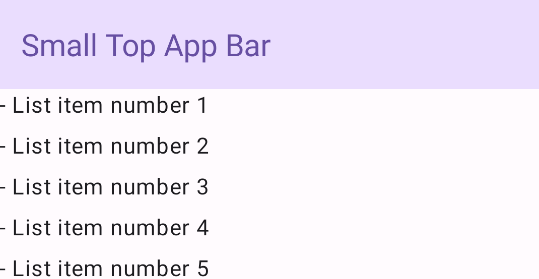
작은 상단 앱 바
작은 상단 앱 바를 만들려면 TopAppBar 컴포저블을 사용하세요. 이는 가능한 가장 간단한 상단 앱 바이며 이 예에서는 제목만 포함되어 있습니다.
다음 예에서는 TopAppBar에 scrollBehavior 값을 전달하지 않으므로 상단 앱 바가 내부 콘텐츠 스크롤에 반응하지 않습니다.
결과
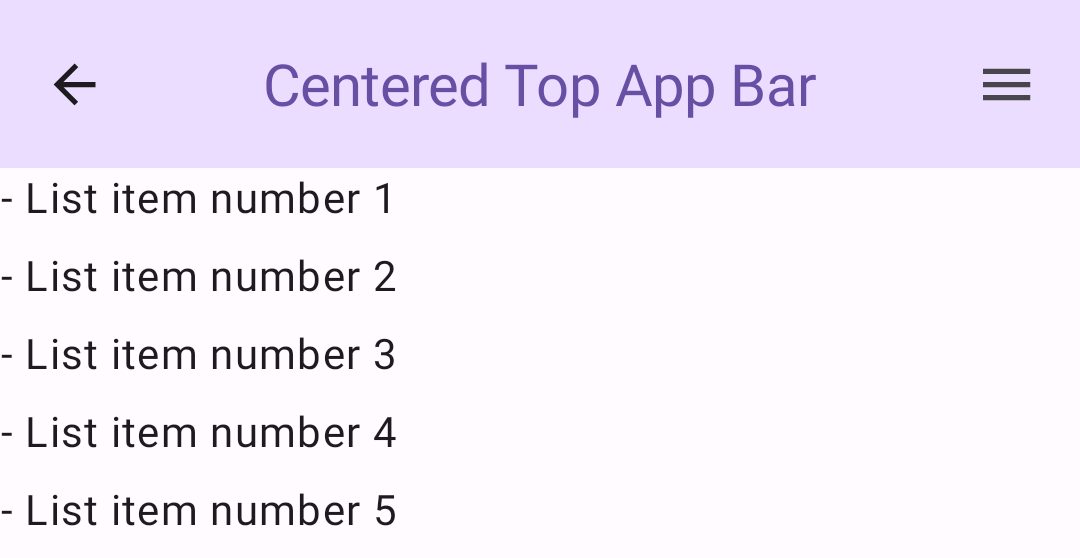
가운데 정렬된 상단 앱 바
가운데 정렬된 상단 앱 바는 제목이 구성요소 중앙에 배치된다는 점을 제외하고 작은 앱 바와 동일합니다. 이를 구현하려면 전용 CenterAlignedTopAppBar 컴포저블을 사용하세요.
이 예에서는 enterAlwaysScrollBehavior()를 사용하여 scrollBehavior에 전달할 값을 가져옵니다. 사용자가 스켈레톤의 내부 콘텐츠를 스크롤하면 막대가 접힙니다.
결과
중간 상단 앱 바
중형 상단 앱 바는 제목을 추가 아이콘 아래에 배치합니다. 컴포저블을 만들려면 MediumTopAppBar 컴포저블을 사용합니다.
이전 코드와 마찬가지로 이 예에서는 enterAlwaysScrollBehavior()를 사용하여 scrollBehavior에 전달할 값을 가져옵니다.
결과
enterAlwaysScrollBehavior의 스크롤 동작을 보여주는 중형 상단 앱 바큰 상단 앱 바
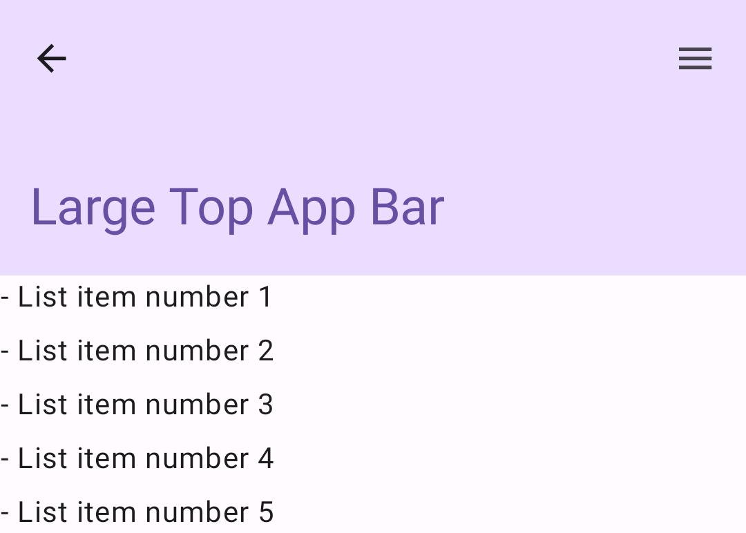
대형 상단 앱 바는 중형과 유사하지만 제목과 아이콘 간의 패딩이 더 크고 전체적으로 화면에서 더 많은 공간을 차지합니다. 뷰를 만들려면 LargeTopAppBar 컴포저블을 사용하세요.
이 예에서는 exitUntilCollapsedScrollBehavior()를 사용하여 scrollBehavior에 전달하는 값을 가져옵니다. 사용자가 스켈레톤의 내부 콘텐츠를 스크롤하면 막대가 접히지만 사용자가 내부 콘텐츠의 끝까지 스크롤하면 막대가 확장됩니다.
결과
하단 앱 바 구현
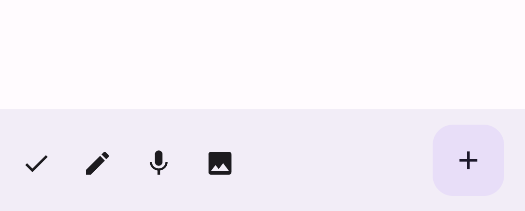
하단 앱 바를 만들려면 상단 앱 바 컴포저블과 유사한 BottomAppBar 컴포저블을 사용하세요.
다음과 같은 주요 매개변수에 컴포저블을 전달합니다.
actions: 막대 왼쪽에 표시되는 일련의 아이콘입니다. 일반적으로 이러한 작업은 특정 화면의 주요 작업 또는 탐색 항목입니다.floatingActionButton: 막대의 오른쪽에 표시되는 플로팅 작업 버튼입니다.
결과
핵심사항
- 일반적으로 앱 바를 수신할 특정 매개변수가 있는
Scaffold컴포저블에 전달합니다. 상단 앱 바를 구현하는 데 사용하는 컴포저블은 다음과 같은 주요 매개변수를 공유합니다.
title: 앱 바에 표시되는 텍스트입니다.navigationIcon: 앱 바 왼쪽에 표시되는 기본 탐색 아이콘입니다.actions: 사용자에게 핵심 작업에 대한 액세스 권한을 제공하는 아이콘으로 앱 바의 오른쪽에 표시됩니다.scrollBehavior: 상단 앱 바가 스캐폴드의 내부 콘텐츠 스크롤에 응답하는 방식을 결정합니다.colors: 앱 바가 표시되는 방식을 결정합니다.
사용자가 스켈레톤의 내부 콘텐츠를 스크롤할 때 앱 바가 응답하는 방식을 제어할 수 있습니다. 이렇게 하려면
TopAppBarScrollBehavior인스턴스를 만들고scrollBehavior매개변수의 상단 앱 바에 전달합니다.TopAppBarScrollBehavior에는 다음과 같은 세 가지 유형이 있습니다.enterAlwaysScrollBehavior: 사용자가 스캐폴드의 내부 콘텐츠를 위로 당기면 상단 앱 바가 접힙니다. 사용자가 내부 콘텐츠를 아래로 당기면 앱 바가 확장됩니다.exitUntilCollapsedScrollBehavior:enterAlwaysScrollBehavior와 유사하지만 사용자가 스캐폴드의 내부 콘텐츠 끝에 도달할 때도 앱 바가 확장됩니다.pinnedScrollBehavior: 앱 바가 제자리에 유지되고 스크롤에 반응하지 않습니다.
이 가이드가 포함된 컬렉션
이 가이드는 더 광범위한 Android 개발 목표를 다루는 선별된 빠른 가이드 모음의 일부입니다.
대화형 구성요소 표시