
Panel aplikasi adalah penampung di bagian atas atau bawah layar yang memberi pengguna akses ke fitur utama dan item navigasi:
Jenis |
Tampilan |
Tujuan |
|---|---|---|
| Panel aplikasi atas | Di bagian atas layar. |
Memberikan akses ke tugas dan informasi utama. Biasanya menghosting judul, item tindakan inti, dan item navigasi tertentu. |
| Panel aplikasi bawah | Di bagian bawah layar. |
Biasanya menyertakan item navigasi inti. Dapat memberikan akses ke tindakan lain, misalnya, dengan menggunakan tombol tindakan mengambang. |
Kompatibilitas versi
Implementasi ini mengharuskan minSDK project Anda ditetapkan ke API level 21 atau yang lebih tinggi.
Dependensi
Mengimplementasikan panel aplikasi atas
Kode berikut menunjukkan implementasi untuk empat jenis panel aplikasi atas, termasuk berbagai contoh cara mengontrol perilaku scroll.
- Panel aplikasi atas kecil
- Panel aplikasi atas yang dipusatkan
- Panel aplikasi atas sedang
- Panel aplikasi atas besar
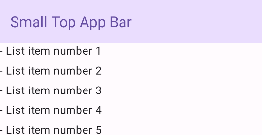
Panel aplikasi atas kecil
Untuk membuat panel aplikasi atas kecil, gunakan composable TopAppBar. Ini adalah
panel aplikasi atas yang paling sederhana dan dalam contoh ini hanya berisi judul.
Contoh berikut tidak meneruskan nilai TopAppBar untuk
scrollBehavior, sehingga panel aplikasi atas tidak bereaksi terhadap scroll konten
dalam.
Hasil
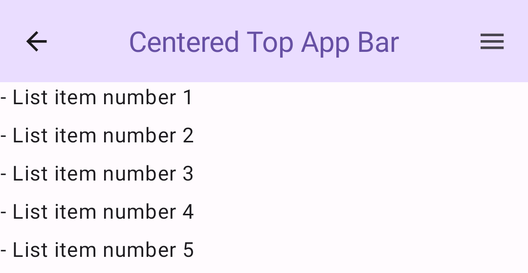
Panel aplikasi atas yang dipusatkan
Panel aplikasi atas yang sejajar dengan tengah sama dengan panel aplikasi kecil,
kecuali judulnya berada di tengah dalam komponen. Untuk menerapkannya, gunakan
composable CenterAlignedTopAppBar khusus.
Contoh ini menggunakan enterAlwaysScrollBehavior() untuk mendapatkan nilai yang diteruskan
untuk scrollBehavior. Panel diciutkan saat pengguna men-scroll
konten dalam scaffold.
Hasil
Panel aplikasi atas sedang
Panel aplikasi atas sedang menempatkan judul di bawah ikon tambahan. Untuk membuatnya, gunakan composable MediumTopAppBar.
Seperti kode sebelumnya, contoh ini menggunakan enterAlwaysScrollBehavior() untuk
mendapatkan nilai yang diteruskan untuk scrollBehavior.
Hasil
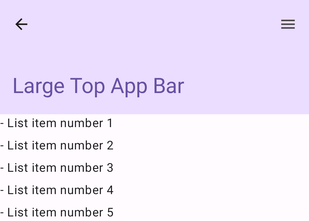
enterAlwaysScrollBehavior.Panel aplikasi atas besar
Panel aplikasi atas besar mirip dengan panel aplikasi sedang, meskipun padding antara
judul dan ikon lebih besar dan menempati lebih banyak ruang di layar secara keseluruhan. Untuk
membuatnya, gunakan composable LargeTopAppBar).
Contoh ini menggunakan
exitUntilCollapsedScrollBehavior() untuk mendapatkan nilai yang diteruskan untuk
scrollBehavior. Panel diciutkan saat pengguna men-scroll
konten dalam scaffold, tetapi kemudian diperluas saat pengguna men-scroll ke akhir
konten dalam.
Hasil
Mengimplementasikan panel aplikasi bawah
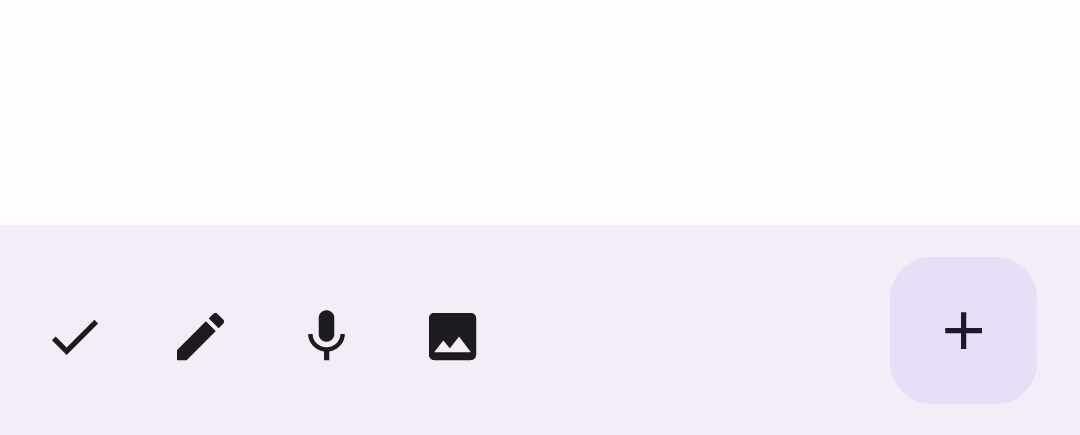
Untuk membuat panel aplikasi bawah, gunakan composable BottomAppBar, yang
mirip dengan composable panel aplikasi atas.
Anda meneruskan composable untuk parameter utama berikut:
actions: Serangkaian ikon yang muncul di sisi kiri panel. Tindakan ini biasanya berupa tindakan utama untuk layar tertentu, atau item navigasi.floatingActionButton: Tombol tindakan mengambang yang muncul di sisi kanan panel.
Hasil
Poin utama
- Anda biasanya meneruskan panel aplikasi ke composable
Scaffold, yang memiliki parameter tertentu untuk menerimanya. Composable yang Anda gunakan untuk menerapkan panel aplikasi atas memiliki parameter utama yang sama:
title: Teks yang muncul di seluruh panel aplikasi.navigationIcon: Ikon utama untuk navigasi, yang muncul di sisi kiri panel aplikasi.actions: Ikon yang memberi pengguna akses ke tindakan utama, yang muncul di sebelah kanan panel aplikasi.scrollBehavior: Menentukan respons panel aplikasi atas terhadap scroll konten dalam scaffold.colors: Menentukan tampilan panel aplikasi.
Anda dapat mengontrol respons panel aplikasi saat pengguna men-scroll konten dalam scaffold. Untuk melakukannya, buat instance
TopAppBarScrollBehaviordan teruskan ke panel aplikasi atas untuk parameterscrollBehavior. Ada tiga jenisTopAppBarScrollBehavior:enterAlwaysScrollBehavior: Saat pengguna menarik konten bagian dalam scaffold, panel aplikasi atas akan diciutkan. Panel aplikasi akan diperluas saat pengguna menarik konten bagian dalam ke bawah.exitUntilCollapsedScrollBehavior: Serupa denganenterAlwaysScrollBehavior, meskipun panel aplikasi juga diperluas saat pengguna mencapai akhir konten dalam scaffold.pinnedScrollBehavior: Panel aplikasi tetap berada di tempatnya dan tidak bereaksi terhadap scroll.
Koleksi yang berisi panduan ini
Panduan ini adalah bagian dari koleksi Panduan Cepat pilihan yang membahas sasaran pengembangan Android yang lebih luas:

Menampilkan komponen interaktif