
অ্যাপ বারগুলি হল স্ক্রিনের উপরের বা নীচের পাত্রে যা আপনার ব্যবহারকারীদের মূল বৈশিষ্ট্য এবং নেভিগেশন আইটেমগুলিতে অ্যাক্সেস দেয়:
টাইপ | চেহারা | উদ্দেশ্য |
|---|---|---|
| শীর্ষ অ্যাপ বার | পর্দার শীর্ষ জুড়ে। | মূল কাজ এবং তথ্য অ্যাক্সেস প্রদান করে. সাধারণত একটি শিরোনাম, মূল অ্যাকশন আইটেম এবং নির্দিষ্ট নেভিগেশন আইটেম হোস্ট করে। |
| নিচের অ্যাপ বার | পর্দার নিচ জুড়ে। | সাধারণত মূল নেভিগেশন আইটেম অন্তর্ভুক্ত। অন্যান্য অ্যাকশনে অ্যাক্সেস দিতে পারে, উদাহরণস্বরূপ, একটি ভাসমান অ্যাকশন বোতাম ব্যবহার করে। |
সংস্করণ সামঞ্জস্য
এই বাস্তবায়নের জন্য আপনার প্রজেক্ট minSDK এপিআই লেভেল 21 বা তার উপরে সেট করা প্রয়োজন।
নির্ভরতা
একটি শীর্ষ অ্যাপ বার প্রয়োগ করুন
নিচের কোডটি চার ধরনের শীর্ষ অ্যাপ বারের বাস্তবায়ন দেখায়, যার মধ্যে আপনি কীভাবে স্ক্রোল আচরণ নিয়ন্ত্রণ করতে পারেন তার বিভিন্ন উদাহরণ সহ।
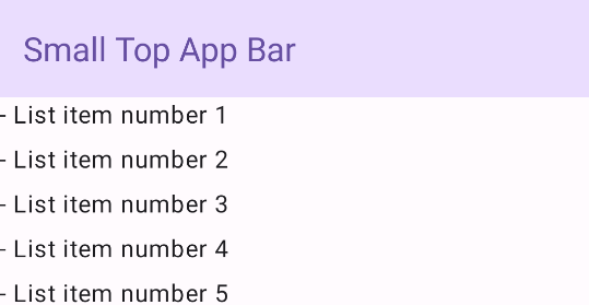
ছোট শীর্ষ অ্যাপ বার
একটি ছোট টপ অ্যাপ বার তৈরি করতে, TopAppBar কম্পোজেবল ব্যবহার করুন। এটি সবচেয়ে সহজ সম্ভাব্য শীর্ষ অ্যাপ বার এবং এই উদাহরণে শুধু একটি শিরোনাম রয়েছে।
নিম্নলিখিত উদাহরণটি TopAppBar scrollBehavior জন্য একটি মান পাস করে না, তাই উপরের অ্যাপ বারটি ভিতরের বিষয়বস্তু স্ক্রল করার জন্য প্রতিক্রিয়া দেখায় না।
ফলাফল
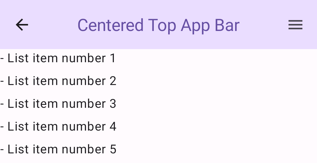
কেন্দ্রে সারিবদ্ধ শীর্ষ অ্যাপ বার
কেন্দ্র-সারিবদ্ধ শীর্ষ অ্যাপ বারটি ছোট অ্যাপ বারের মতোই, শিরোনামটি উপাদানটির মধ্যে কেন্দ্রীভূত না হলে। এটি বাস্তবায়ন করতে, ডেডিকেটেড CenterAlignedTopAppBar কম্পোজেবল ব্যবহার করুন।
এই উদাহরণটি enterAlwaysScrollBehavior() ব্যবহার করে scrollBehavior জন্য যে মানটি পাস করে তা পেতে। যখন ব্যবহারকারী স্ক্যাফোল্ডের ভিতরের বিষয়বস্তু স্ক্রোল করে তখন বারটি ভেঙে পড়ে।
ফলাফল
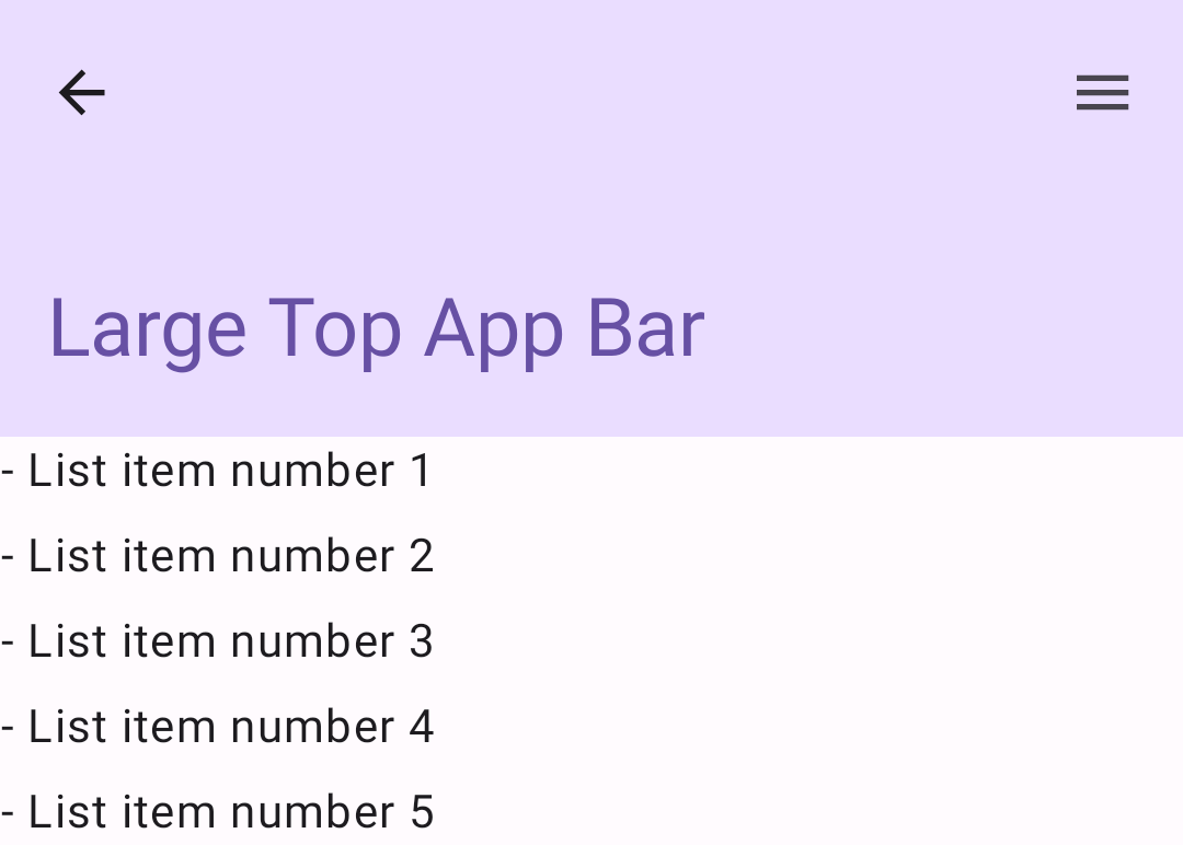
মাঝারি শীর্ষ অ্যাপ বার
মিডিয়াম টপ অ্যাপ বার যেকোন অতিরিক্ত আইকনের নিচে শিরোনাম রাখে। একটি তৈরি করতে, MediumTopAppBar কম্পোজেবল ব্যবহার করুন।
পূর্ববর্তী কোডের মতো, এই উদাহরণটি scrollBehavior জন্য পাস করা মান পেতে enterAlwaysScrollBehavior() ব্যবহার করে।
ফলাফল
enterAlwaysScrollBehavior থেকে স্ক্রোল আচরণ প্রদর্শন করে।বড় টপ অ্যাপ বার
একটি বড় টপ অ্যাপ বার মিডিয়ামের মতোই, যদিও শিরোনাম এবং আইকনগুলির মধ্যে প্যাডিং বেশি এবং এটি সামগ্রিকভাবে স্ক্রিনে আরও বেশি জায়গা দখল করে। একটি তৈরি করতে, LargeTopAppBar ) কম্পোজেবল ব্যবহার করুন।
এই উদাহরণটি exitUntilCollapsedScrollBehavior() ব্যবহার করে এটি scrollBehavior জন্য যে মানটি পাস করে তা পেতে। যখন ব্যবহারকারী স্ক্যাফোল্ডের অভ্যন্তরীণ বিষয়বস্তু স্ক্রোল করে তখন বারটি ভেঙে যায়, কিন্তু তারপর যখন ব্যবহারকারী অভ্যন্তরীণ সামগ্রীর শেষ পর্যন্ত স্ক্রোল করে তখন প্রসারিত হয়।
ফলাফল
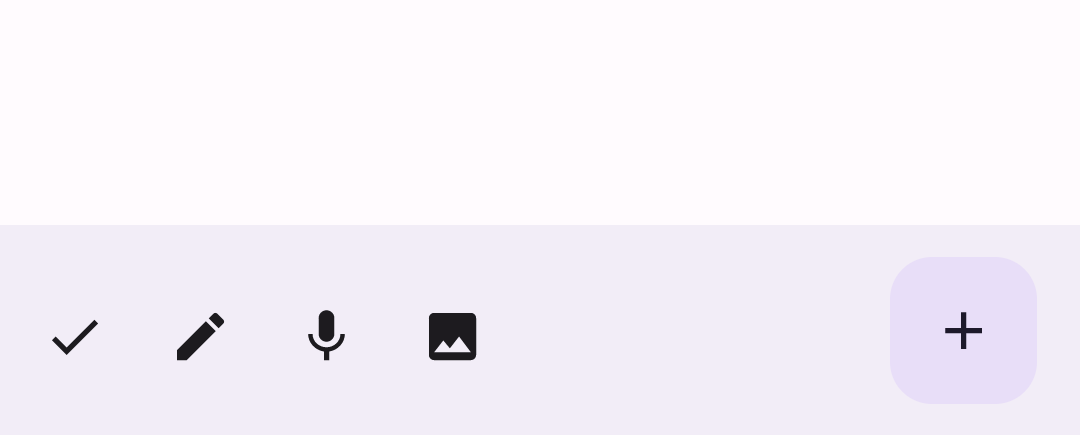
একটি নীচের অ্যাপ বার প্রয়োগ করুন
একটি নিচের অ্যাপ বার তৈরি করতে, BottomAppBar কম্পোজেবল ব্যবহার করুন, যা টপ অ্যাপ বার কম্পোজেবলের মতো।
আপনি নিম্নলিখিত কী প্যারামিটারের জন্য কম্পোজেবল পাস করেন:
-
actions: আইকনগুলির একটি সিরিজ যা বারের বাম দিকে প্রদর্শিত হয়। এগুলি সাধারণত প্রদত্ত স্ক্রিনের জন্য বা নেভিগেশন আইটেমগুলির জন্য মূল ক্রিয়া। -
floatingActionButton: ভাসমান অ্যাকশন বোতামটি বারের ডানদিকে প্রদর্শিত হয়।
ফলাফল
মূল পয়েন্ট
- আপনি সাধারণত অ্যাপ্লিকেশান বারগুলিকে
Scaffoldকম্পোজেবলে পাস করেন, যাতে সেগুলি পাওয়ার জন্য নির্দিষ্ট পরামিতি থাকে৷ আপনি শীর্ষ অ্যাপ বারগুলি প্রয়োগ করতে যে কম্পোজেবলগুলি ব্যবহার করেন সেগুলি কী প্যারামিটারগুলি ভাগ করে:
-
title: অ্যাপ বার জুড়ে প্রদর্শিত পাঠ্য। -
navigationIcon: নেভিগেশনের জন্য প্রাথমিক আইকন, যা অ্যাপ বারের বাম দিকে প্রদর্শিত হয়। -
actions: আইকন যা ব্যবহারকারীকে কী অ্যাকশনে অ্যাক্সেস দেয়, যা অ্যাপ বারের ডানদিকে দেখা যায়। -
scrollBehavior: স্ক্যাফোল্ডের অভ্যন্তরীণ বিষয়বস্তু স্ক্রল করার ক্ষেত্রে শীর্ষ অ্যাপ বারটি কীভাবে সাড়া দেয় তা নির্ধারণ করে। -
colors: অ্যাপ বার কিভাবে প্রদর্শিত হবে তা নির্ধারণ করে।
-
ব্যবহারকারী যখন স্ক্যাফোল্ডের ভিতরের বিষয়বস্তু স্ক্রোল করে তখন অ্যাপ বার কীভাবে প্রতিক্রিয়া জানায় তা আপনি নিয়ন্ত্রণ করতে পারেন। এটি করতে,
TopAppBarScrollBehaviorএর একটি উদাহরণ তৈরি করুন এবংscrollBehaviorপ্যারামিটারের জন্য এটি আপনার শীর্ষ অ্যাপ বারে পাস করুন।TopAppBarScrollBehaviorতিন ধরনের আছে:-
enterAlwaysScrollBehavior: যখন ব্যবহারকারী স্ক্যাফোল্ডের ভেতরের বিষয়বস্তু তুলে ধরেন, তখন উপরের অ্যাপ বারটি ভেঙে পড়ে। ব্যবহারকারী অভ্যন্তরীণ বিষয়বস্তু নিচে টানলে অ্যাপ বার প্রসারিত হয়। -
exitUntilCollapsedScrollBehavior:enterAlwaysScrollBehaviorএর অনুরূপ, যদিও ব্যবহারকারী যখন স্ক্যাফোল্ডের অভ্যন্তরীণ বিষয়বস্তুর শেষে পৌঁছায় তখন অ্যাপ বারটিও প্রসারিত হয়। -
pinnedScrollBehavior: অ্যাপ বারটি যথাস্থানে থাকে এবং স্ক্রল করার ক্ষেত্রে প্রতিক্রিয়া দেখায় না।
-
এই নির্দেশিকা ধারণকারী সংগ্রহ
এই নির্দেশিকাটি এই কিউরেট করা কুইক গাইড সংগ্রহের অংশ যা বৃহত্তর অ্যান্ড্রয়েড উন্নয়ন লক্ষ্যগুলি কভার করে:
ইন্টারেক্টিভ উপাদান প্রদর্শন