Créer un composant de structure pour maintenir l'UI
Restez organisé à l'aide des collections
Enregistrez et classez les contenus selon vos préférences.
Dans Material Design, un échafaudage est une structure fondamentale qui fournit une plate-forme standardisée pour les interfaces utilisateur complexes. Il rassemble différentes parties de l'interface utilisateur, telles que les barres d'application et les boutons d'action flottants, ce qui donne aux applications un aspect cohérent.
Compatibilité des versions
Cette implémentation nécessite que la version minimale du SDK de votre projet soit définie sur le niveau d'API 21 ou version ultérieure.
Dépendances
Créer un échafaudage
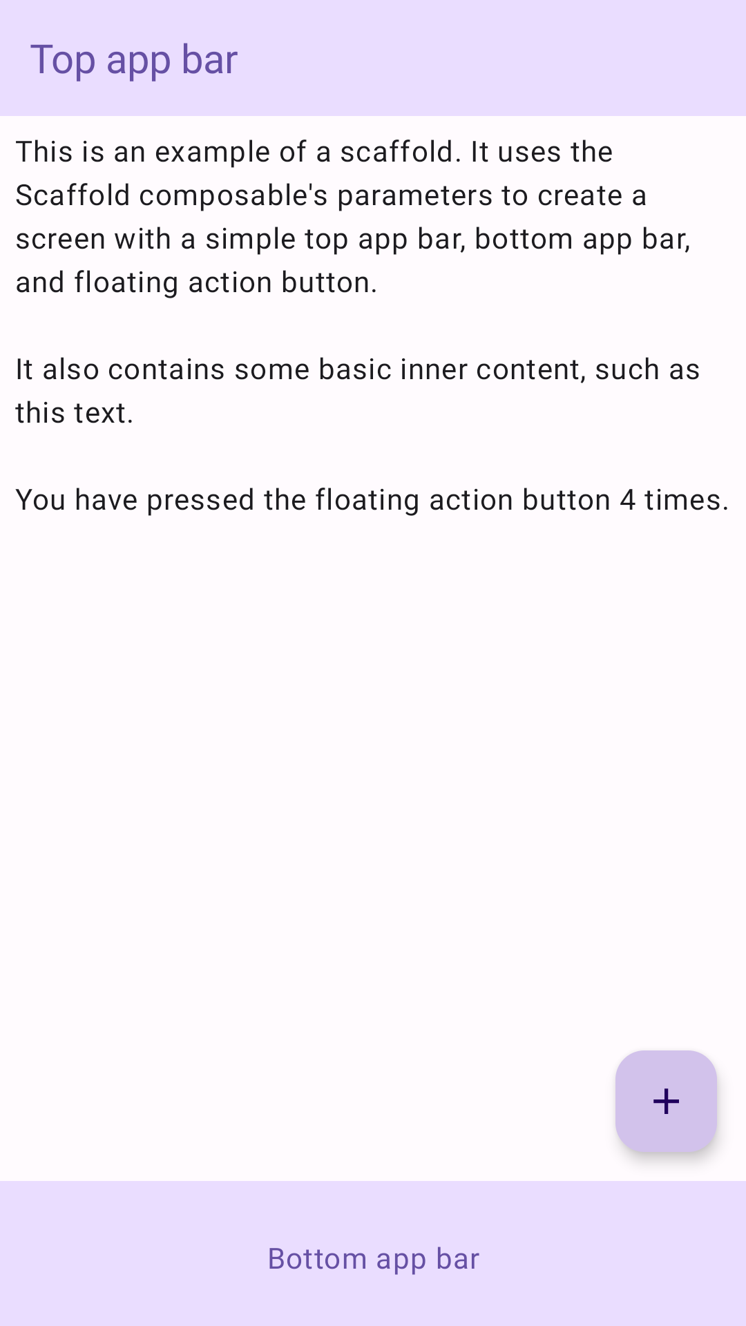
L'exemple suivant fournit un exemple complet de la façon dont vous pouvez implémenter Scaffold. Il contient une barre d'application supérieure, une barre d'application inférieure et un bouton d'action flottant qui interagit avec l'état interne de Scaffold.
Résultats
Figure 1. Implémentation de l'échafaudage.
Points essentiels
Le composable Scaffold fournit une API simple que vous pouvez utiliser pour assembler rapidement la structure de votre application conformément aux consignes Material Design.
Scaffold accepte plusieurs composables comme paramètres. En voici quelques-uns:
topBar: barre d'application en haut de l'écran.
bottomBar: barre d'application en bas de l'écran.
floatingActionButton: bouton qui flotte dans le coin inférieur droit de l'écran et que vous pouvez utiliser pour afficher des actions clés.
Pour obtenir des exemples plus détaillés sur l'implémentation des barres d'application en haut et en bas, consultez la page sur les barres d'application.
Vous pouvez également transmettre du contenu Scaffold comme vous le feriez pour d'autres conteneurs. Il transmet une valeur innerPadding au lambda content que vous pouvez ensuite utiliser dans les composables enfants.
Collections contenant ce guide
Ce guide fait partie de ces collections de guides rapides sélectionnées qui couvrent des objectifs de développement Android plus larges:
Créer un échafaudage d'écran d'accueil
Découvrez comment utiliser une plate-forme standardisée pour créer des interfaces utilisateur complexes. La structure en échafaudage maintient les différentes parties de l'UI, ce qui donne aux applications une apparence cohérente.
Découvrez comment les fonctions composables peuvent vous permettre de créer facilement de beaux composants d'interface utilisateur basés sur le système de conception Material Design.
Le contenu et les exemples de code de cette page sont soumis aux licences décrites dans la Licence de contenu. Java et OpenJDK sont des marques ou des marques déposées d'Oracle et/ou de ses sociétés affiliées.
Dernière mise à jour le 2025/02/06 (UTC).
[[["Facile à comprendre","easyToUnderstand","thumb-up"],["J'ai pu résoudre mon problème","solvedMyProblem","thumb-up"],["Autre","otherUp","thumb-up"]],[["Il n'y a pas l'information dont j'ai besoin","missingTheInformationINeed","thumb-down"],["Trop compliqué/Trop d'étapes","tooComplicatedTooManySteps","thumb-down"],["Obsolète","outOfDate","thumb-down"],["Problème de traduction","translationIssue","thumb-down"],["Mauvais exemple/Erreur de code","samplesCodeIssue","thumb-down"],["Autre","otherDown","thumb-down"]],["Dernière mise à jour le 2025/02/06 (UTC)."],[],[],null,["# Create a scaffold component to hold the UI together\n\n\u003cbr /\u003e\n\nIn Material Design, a scaffold is a fundamental structure that provides a\nstandardized platform for complex user interfaces. It holds together different\nparts of the UI, such as app bars and floating action buttons, giving apps a\ncoherent look and feel.\n\nVersion compatibility\n---------------------\n\nThis implementation requires that your project minSDK be set to API level 21\nor higher.\n\n### Dependencies\n\n### Kotlin\n\n\u003cbr /\u003e\n\n```kotlin\n implementation(platform(\"androidx.compose:compose-bom:2025.08.00\"))\n \n```\n\n\u003cbr /\u003e\n\n### Groovy\n\n\u003cbr /\u003e\n\n```groovy\n implementation platform('androidx.compose:compose-bom:2025.08.00')\n \n```\n\n\u003cbr /\u003e\n\nCreate a scaffold\n-----------------\n\nThe following example provides a full example of how you might implement\n[`Scaffold`](/reference/kotlin/androidx/compose/material/package-summary#Scaffold(androidx.compose.foundation.layout.WindowInsets,androidx.compose.ui.Modifier,androidx.compose.material.ScaffoldState,kotlin.Function0,kotlin.Function0,kotlin.Function1,kotlin.Function0,androidx.compose.material.FabPosition,kotlin.Boolean,kotlin.Function1,kotlin.Boolean,androidx.compose.ui.graphics.Shape,androidx.compose.ui.unit.Dp,androidx.compose.ui.graphics.Color,androidx.compose.ui.graphics.Color,androidx.compose.ui.graphics.Color,androidx.compose.ui.graphics.Color,androidx.compose.ui.graphics.Color,kotlin.Function1)). It contains a top app bar, bottom app bar, and a floating action\nbutton that interacts with `Scaffold`'s internal state.\n\n\u003cbr /\u003e\n\n```kotlin\n@Composable\nfun ScaffoldExample() {\n var presses by remember { mutableIntStateOf(0) }\n\n Scaffold(\n topBar = {\n TopAppBar(\n colors = topAppBarColors(\n containerColor = MaterialTheme.colorScheme.primaryContainer,\n titleContentColor = MaterialTheme.colorScheme.primary,\n ),\n title = {\n Text(\"Top app bar\")\n }\n )\n },\n bottomBar = {\n BottomAppBar(\n containerColor = MaterialTheme.colorScheme.primaryContainer,\n contentColor = MaterialTheme.colorScheme.primary,\n ) {\n Text(\n modifier = Modifier\n .fillMaxWidth(),\n textAlign = TextAlign.Center,\n text = \"Bottom app bar\",\n )\n }\n },\n floatingActionButton = {\n FloatingActionButton(onClick = { presses++ }) {\n Icon(Icons.Default.Add, contentDescription = \"Add\")\n }\n }\n ) { innerPadding -\u003e\n Column(\n modifier = Modifier\n .padding(innerPadding),\n verticalArrangement = Arrangement.spacedBy(16.dp),\n ) {\n Text(\n modifier = Modifier.padding(8.dp),\n text =\n \"\"\"\n This is an example of a scaffold. It uses the Scaffold composable's parameters to create a screen with a simple top app bar, bottom app bar, and floating action button.\n\n It also contains some basic inner content, such as this text.\n\n You have pressed the floating action button $presses times.\n \"\"\".trimIndent(),\n )\n }\n }\n}\n \n https://github.com/android/snippets/blob/dd30aee903e8c247786c064faab1a9ca8d10b46e/compose/snippets/src/main/java/com/example/compose/snippets/components/Scaffold.kt#L47-L100\n \n```\n\n\u003cbr /\u003e\n\nResults\n-------\n\n**Figure 1.** An implementation of scaffold.\n\nKey points\n----------\n\nThe [`Scaffold`](/reference/kotlin/androidx/compose/material/ScaffoldState) composable provides a straightforward API you can use to\nquickly assemble your app's structure according to Material Design guidelines.\n`Scaffold` accepts several composables as parameters. Among these are the\nfollowing:\n\n- `topBar`: The app bar across the top of the screen.\n- `bottomBar`: The app bar across the bottom of the screen.\n- `floatingActionButton`: A button that hovers over the bottom-right corner of the screen that you can use to expose key actions.\n\nFor more detailed examples on how you can implement both top and bottom\napp bars, see the app bars page.\n\nYou can also pass `Scaffold` content as you would to other containers. It passes\nan `innerPadding` value to the `content` lambda that you can then use in child\ncomposables.\n\nCollections that contain this guide\n-----------------------------------\n\nThis guide is part of these curated Quick Guide collections that cover\nbroader Android development goals: \n\n### Create a home screen scaffold\n\nFind out how to use a standardized platform to build complex user interfaces. The scaffold holds together different parts of the UI, giving apps a coherent look and feel. \n[Quick guide collection](/develop/ui/compose/quick-guides/collections/create-a-home-screen-scaffold) \n\n### Display interactive components\n\nLearn how composable functions can enable you to easily create beautiful UI components based on the Material Design design system. \n[Quick guide collection](/develop/ui/compose/quick-guides/collections/display-interactive-components) \n\nHave questions or feedback\n--------------------------\n\nGo to our frequently asked questions page and learn about quick guides or reach out and let us know your thoughts. \n[Go to FAQ](/quick-guides/faq) [Leave feedback](https://issuetracker.google.com/issues/new?component=1573691&template=1993320)"]]