یک منوی کشویی با جزء کشوی ناوبری ایجاد کنید
با مجموعهها، منظم بمانید
ذخیره و طبقهبندی محتوا براساس اولویتهای شما.
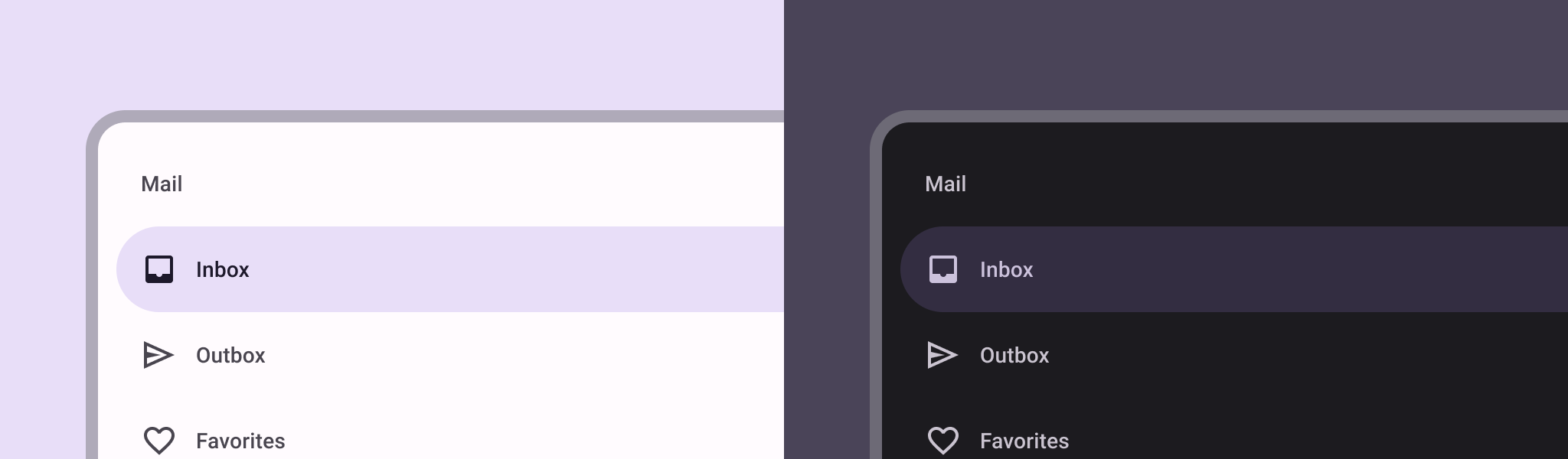
جزء کشوی ناوبری یک منوی کشویی است که به کاربران امکان می دهد به بخش های مختلف برنامه شما پیمایش کنند. کاربران می توانند با کشیدن انگشت از کناره یا ضربه زدن روی نماد منو، آن را فعال کنند.
این سه مورد استفاده را برای اجرای یک کشوی ناوبری در نظر بگیرید:
- سازماندهی محتوا: کاربران را قادر می سازد تا بین دسته های مختلف جابجا شوند، مانند برنامه های اخبار یا وبلاگ نویسی.
- مدیریت حساب: پیوندهای سریعی به تنظیمات حساب و بخشهای نمایه در برنامههای دارای حساب کاربری ارائه دهید.
- کشف ویژگی: چندین ویژگی و تنظیمات را در یک منو سازماندهی کنید تا کشف و دسترسی کاربر در برنامه های پیچیده را تسهیل کند.
در طراحی متریال، دو نوع کشو ناوبری وجود دارد:
- استاندارد: فضای داخل صفحه را با محتوای دیگر به اشتراک بگذارید.
- Modal: در بالای محتوای دیگر در یک صفحه ظاهر می شود.
سازگاری نسخه
این پیاده سازی مستلزم آن است که minSDK پروژه شما روی سطح API 21 یا بالاتر تنظیم شود.
وابستگی ها
یک کشوی ناوبری پیاده سازی کنید
می توانید از ModalNavigationDrawer
composable برای پیاده سازی کشوی ناوبری استفاده کنید:
نکات کلیدی
برای تهیه ModalDrawerSheet
و ارائه محتویات کشو از شکاف drawerContent
استفاده کنید.
ModalNavigationDrawer
تعدادی پارامتر کشو اضافی را می پذیرد. برای مثال، میتوانید تغییر دهید که آیا کشو به درگها با پارامتر gesturesEnabled
پاسخ میدهد یا خیر، مانند مثال زیر:
رفتار کشوی ناوبری را کنترل کنید
برای کنترل نحوه باز و بسته شدن کشو، از DrawerState
استفاده کنید:
نکات کلیدی
- با استفاده از پارامتر
drawerState
یک DrawerState
به ModalNavigationDrawer
منتقل کنید. -
DrawerState
دسترسی به عملکردهای open
و close
و همچنین ویژگی های مربوط به وضعیت کشو فعلی را فراهم می کند. این توابع تعلیق نیاز به یک CoroutineScope
دارند که می توانید با استفاده از rememberCoroutineScope
آن را نمونه سازی کنید. همچنین میتوانید توابع تعلیق را در پاسخ به رویدادهای رابط کاربری فراخوانی کنید.
نتایج
شکل 1. یک کشوی ناوبری استاندارد (سمت چپ) و یک کشوی ناوبری معین (راست).
مجموعه هایی که حاوی این راهنما هستند
این راهنما بخشی از مجموعههای راهنمای Quick Guide است که اهداف توسعه Android گستردهتری را پوشش میدهد:
نمایش اجزای تعاملی
بیاموزید که چگونه توابع ترکیبپذیر میتوانند به شما کمک کنند تا به راحتی اجزای رابط کاربری زیبا را بر اساس سیستم طراحی مواد طراحی کنید.
محتوا و نمونه کدها در این صفحه مشمول پروانههای توصیفشده در پروانه محتوا هستند. جاوا و OpenJDK علامتهای تجاری یا علامتهای تجاری ثبتشده Oracle و/یا وابستههای آن هستند.
تاریخ آخرین بهروزرسانی 2025-02-06 بهوقت ساعت هماهنگ جهانی.
[[["درک آسان","easyToUnderstand","thumb-up"],["مشکلم را برطرف کرد","solvedMyProblem","thumb-up"],["غیره","otherUp","thumb-up"]],[["اطلاعاتی که نیاز دارم وجود ندارد","missingTheInformationINeed","thumb-down"],["بیشازحد پیچیده/ مراحل بسیار زیاد","tooComplicatedTooManySteps","thumb-down"],["قدیمی","outOfDate","thumb-down"],["مشکل ترجمه","translationIssue","thumb-down"],["مشکل کد / نمونهها","samplesCodeIssue","thumb-down"],["غیره","otherDown","thumb-down"]],["تاریخ آخرین بهروزرسانی 2025-02-06 بهوقت ساعت هماهنگ جهانی."],[],[],null,["\u003cbr /\u003e\n\nThe [navigation drawer](https://material.io/components/navigation-drawer) component is a slide-in menu that lets users navigate\nto various sections of your app. Users can activate it by swiping from the side\nor tapping a menu icon.\n\nConsider these three use cases for implementing a navigation drawer:\n\n- **Content organization:** Enable users to switch between different categories, such as in news or blogging apps.\n- **Account management:** Provide quick links to account settings and profile sections in apps with user accounts.\n- **Feature discovery:** Organize multiple features and settings in a single menu to facilitate user discovery and access in complex apps.\n\nIn Material Design, there are two types of navigation drawers:\n\n- **Standard:** Share space within a screen with other content.\n- **Modal:** Appears over the top of other content within a screen.\n\nVersion compatibility\n\nThis implementation requires that your project minSDK be set to API level 21 or\nhigher.\n\nDependencies\n\nImplement a navigation drawer\n\nYou can use the [`ModalNavigationDrawer`](/reference/kotlin/androidx/compose/material3/package-summary#ModalNavigationDrawer(kotlin.Function0,androidx.compose.ui.Modifier,androidx.compose.material3.DrawerState,kotlin.Boolean,androidx.compose.ui.graphics.Color,kotlin.Function0)) composable to implement a\nnavigation drawer:\n\nKey points\n\n- Use the `drawerContent` slot to provide a [`ModalDrawerSheet`](/reference/kotlin/androidx/compose/material3/package-summary#ModalDrawerSheet(androidx.compose.ui.Modifier,androidx.compose.ui.graphics.Shape,androidx.compose.ui.graphics.Color,androidx.compose.ui.graphics.Color,androidx.compose.ui.unit.Dp,androidx.compose.foundation.layout.WindowInsets,kotlin.Function1)) and\n provide the drawer's contents.\n\n- `ModalNavigationDrawer` accepts a number of additional drawer parameters.\n For example, you can toggle whether or not the drawer responds to drags with\n the `gesturesEnabled` parameter as in the following example:\n\nControl navigation drawer behavior\n\nTo control how the drawer opens and closes, use [`DrawerState`](/reference/kotlin/androidx/compose/material3/DrawerState):\n\nKey points\n\n- Pass a `DrawerState` to `ModalNavigationDrawer` using the `drawerState` parameter.\n- `DrawerState` provides access to the [`open`](/reference/kotlin/androidx/compose/material3/DrawerState#open) and [`close`](/reference/kotlin/androidx/compose/material3/DrawerState#close) functions, as well as properties related to the current drawer state. These suspending functions require a `CoroutineScope`, which you can instantiate using [`rememberCoroutineScope`](/reference/kotlin/androidx/compose/runtime/package-summary#remembercoroutinescope). You can also call the suspending functions in response to UI events.\n\nResults\n\n\n**Figure 1.** A standard navigation drawer (left) and a modal navigation drawer (right).\n\n\u003cbr /\u003e\n\nCollections that contain this guide\n\nThis guide is part of these curated Quick Guide collections that cover\nbroader Android development goals: \n\nDisplay interactive components \nLearn how composable functions can enable you to easily create beautiful UI components based on the Material Design design system. \n[Quick guide collection](/develop/ui/compose/quick-guides/collections/display-interactive-components) \n\nHave questions or feedback \nGo to our frequently asked questions page and learn about quick guides or reach out and let us know your thoughts. \n[Go to FAQ](/quick-guides/faq) [Leave feedback](https://issuetracker.google.com/issues/new?component=1573691&template=1993320)"]]