Оптимизируйте свои подборки
Сохраняйте и классифицируйте контент в соответствии со своими настройками.
Компонент Chip — это компактный интерактивный элемент пользовательского интерфейса. Он представляет собой сложные объекты, такие как контакт или тег, часто со значком и меткой. Его можно отметить, отклонить или кликнуть.
Ниже перечислены пять типов фишек и места их использования:
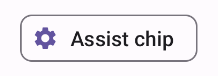
Помощь : направляет пользователя во время выполнения задачи. Часто появляется как временный элемент пользовательского интерфейса в ответ на ввод пользователя.
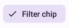
Фильтр : позволяет пользователям уточнять контент с помощью набора параметров. Их можно выбрать или отменить выбор, и при выборе они могут содержать значок галочки.
Ввод : представляет предоставленную пользователем информацию, например, выбор в меню. Они могут содержать значок и текст, а также иметь знак «X» для удаления.
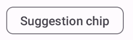
Предложение : предоставляет пользователю рекомендации на основе его недавних действий или вводимых данных. Обычно отображается под полем ввода, чтобы подсказать действия пользователя.
Приподнятый : имеет приподнятый вид, а не плоский.
Совместимость версий
Для этой реализации требуется, чтобы в minSDK вашего проекта был установлен уровень API 21 или выше.
Зависимости
Создать вспомогательный чип
Сборный AssistChip обеспечивает простой способ создания вспомогательного чипа, который подталкивает пользователя в определенном направлении. Одной из отличительных особенностей является параметр leadingIcon , который позволяет отображать значок на левой стороне чипа, как показано на рисунке 1. Следующий пример демонстрирует, как это можно реализовать:
Рисунок 1. Вспомогательный чип.
Создать чип фильтра
Компоновка FilterChip требует, чтобы вы отслеживали, выбран ли чип. В следующем примере показано, как можно отображать ведущий значок с галочкой только тогда, когда пользователь выбрал чип:
Вы можете использовать составной элемент InputChip для создания чипов, возникающих в результате взаимодействия с пользователем. Например, в почтовом клиенте, когда пользователь пишет электронное письмо, входной чип может представлять человека, адрес которого пользователь ввел в поле «Кому:».
Следующая реализация демонстрирует входной чип, находящийся в выбранном состоянии. Пользователь убирает чип, когда нажимает на него.
Результаты
Рисунок 4. Входной чип.
Создайте фишку предложения
Компонуемый объект SuggestionChip — самый простой из компонуемых объектов, перечисленных на этой странице, как по определению API, так и по общим сценариям использования. Чипы предложений представляют собой динамически генерируемые подсказки. Например, в приложении чата с искусственным интеллектом вы можете использовать чипы предложений, чтобы представить возможные ответы на самое последнее сообщение.
Рассмотрим следующую реализацию SuggestionChip :
Результаты
Рисунок 5. Вспомогательный чип.
Создать повышенный чип
Во всех примерах в этом документе используются базовые составные элементы, которые имеют плоский вид. Если вам нужен чип, который имеет привлекательный внешний вид, используйте один из трех следующих составных элементов:
Контент и образцы кода на этой странице предоставлены по лицензиям. Java и OpenJDK – это зарегистрированные товарные знаки корпорации Oracle и ее аффилированных лиц.
Последнее обновление: 2025-02-06 UTC.
[[["Прост для понимания","easyToUnderstand","thumb-up"],["Помог мне решить мою проблему","solvedMyProblem","thumb-up"],["Другое","otherUp","thumb-up"]],[["Отсутствует нужная мне информация","missingTheInformationINeed","thumb-down"],["Слишком сложен/слишком много шагов","tooComplicatedTooManySteps","thumb-down"],["Устарел","outOfDate","thumb-down"],["Проблема с переводом текста","translationIssue","thumb-down"],["Проблемы образцов/кода","samplesCodeIssue","thumb-down"],["Другое","otherDown","thumb-down"]],["Последнее обновление: 2025-02-06 UTC."],[],[],null,["\u003cbr /\u003e\n\nThe `Chip` component is a compact, interactive UI element. It represents complex\nentities like a contact or tag, often with an icon and label. It can be\ncheckable, dismissible, or clickable.\n\nThe five types of chips and where you might use them are as follows:\n\n- [Assist](#assist): Guides the user during a task. Often appears as a temporary UI element in response to user input.\n- [Filter](#filter): Lets users refine content from a set of options. They can be selected or deselected, and may include a checkmark icon when selected.\n- [Input](#input): Represents user-provided information, such as selections in a menu. They can contain an icon and text, and provide an 'X' for removal.\n- [Suggestion](#suggestion): Provides recommendations to the user based on their recent activity or input. Typically appear beneath an input field to prompt user actions.\n- [Elevated](#elevated): Has an elevated appearance instead of looking flat.\n\nVersion compatibility\n\nThis implementation requires that your project minSDK be set to API level 21 or\nhigher.\n\nDependencies\n\nCreate an assist chip\n\nThe [`AssistChip`](/reference/kotlin/androidx/compose/material3/package-summary#AssistChip(kotlin.Function0,kotlin.Function0,androidx.compose.ui.Modifier,kotlin.Boolean,kotlin.Function0,kotlin.Function0,androidx.compose.ui.graphics.Shape,androidx.compose.material3.ChipColors,androidx.compose.material3.ChipElevation,androidx.compose.foundation.BorderStroke,androidx.compose.foundation.interaction.MutableInteractionSource)) composable provides a straightforward way to create an\nassist chip that nudges the user in a particular direction. One distinguishing\nfeature is its `leadingIcon` parameter that lets you display an icon on the left\nside of the chip, as shown in figure 1. The following example demonstrates how\nyou can implement it:\n**Figure 1.** Assist chip.\n\nCreate a filter chip\n\nThe [`FilterChip`](/reference/kotlin/androidx/compose/material3/package-summary#FilterChip(kotlin.Boolean,kotlin.Function0,kotlin.Function0,androidx.compose.ui.Modifier,kotlin.Boolean,kotlin.Function0,kotlin.Function0,androidx.compose.ui.graphics.Shape,androidx.compose.material3.SelectableChipColors,androidx.compose.material3.SelectableChipElevation,androidx.compose.foundation.BorderStroke,androidx.compose.foundation.interaction.MutableInteractionSource)) composable requires you to track whether or not the chip\nis selected. The following example demonstrates how you can show a leading\nchecked icon only when the user has selected the chip:\n\nResults **Figure 2.** Unselected filter chip. **Figure 3.** Selected filter chip.\n\nCreate an input chip\n\nYou can use the [`InputChip`](/reference/kotlin/androidx/compose/material3/package-summary#InputChip(kotlin.Boolean,kotlin.Function0,kotlin.Function0,androidx.compose.ui.Modifier,kotlin.Boolean,kotlin.Function0,kotlin.Function0,kotlin.Function0,androidx.compose.ui.graphics.Shape,androidx.compose.material3.SelectableChipColors,androidx.compose.material3.SelectableChipElevation,androidx.compose.foundation.BorderStroke,androidx.compose.foundation.interaction.MutableInteractionSource)) composable to create chips that result from\nuser interaction. For example, in an email client, when the user is writing an\nemail, an input chip might represent a person whose address the user has entered\ninto the \"to:\" field.\n\nThe following implementation demonstrates an input chip that is in a selected\nstate. The user dismisses the chip when they press it.\n| **Note:** Consider how you might use a chip like this in the preceding email use case, with a name passed in for the `text` parameter, and a function that performs the necessary network calls for `onDismiss`.\n\nResults **Figure 4.** Input chip.\n\nCreate a suggestion chip\n\nThe [`SuggestionChip`](/reference/kotlin/androidx/compose/material3/package-summary#SuggestionChip(kotlin.Function0,kotlin.Function0,androidx.compose.ui.Modifier,kotlin.Boolean,kotlin.Function0,androidx.compose.ui.graphics.Shape,androidx.compose.material3.ChipColors,androidx.compose.material3.ChipElevation,androidx.compose.foundation.BorderStroke,androidx.compose.foundation.interaction.MutableInteractionSource)) composable is the most basic of the composables listed\non this page, both in its API definition and its common use cases. Suggestion\nchips present dynamically generated hints. For example, in an AI chat app, you\nmight use suggestion chips to present possible responses to the most recent\nmessage.\n\nConsider this implementation of `SuggestionChip`:\n\nResults **Figure 5.** Assist chip. **Note:** Although the suggestion chip component is intended for informational purposes, it does still take an `onClick` lambda that you can use to create interactivity.\n\nCreate an elevated chip\n\nAll the examples in this document use the base composables that take a flat\nappearance. If you want a chip that has an elevated appearance, use one of the\nthree following composables:\n\n- [`ElevatedAssistChip`](/reference/kotlin/androidx/compose/material3/package-summary#ElevatedAssistChip(kotlin.Function0,kotlin.Function0,androidx.compose.ui.Modifier,kotlin.Boolean,kotlin.Function0,kotlin.Function0,androidx.compose.ui.graphics.Shape,androidx.compose.material3.ChipColors,androidx.compose.material3.ChipElevation,androidx.compose.foundation.BorderStroke,androidx.compose.foundation.interaction.MutableInteractionSource))\n- [`ElevatedFilterChip`](/reference/kotlin/androidx/compose/material3/package-summary#ElevatedFilterChip(kotlin.Boolean,kotlin.Function0,kotlin.Function0,androidx.compose.ui.Modifier,kotlin.Boolean,kotlin.Function0,kotlin.Function0,androidx.compose.ui.graphics.Shape,androidx.compose.material3.SelectableChipColors,androidx.compose.material3.SelectableChipElevation,androidx.compose.foundation.BorderStroke,androidx.compose.foundation.interaction.MutableInteractionSource))\n- [`ElevatedSuggestionChip`](/reference/kotlin/androidx/compose/material3/package-summary#ElevatedSuggestionChip(kotlin.Function0,kotlin.Function0,androidx.compose.ui.Modifier,kotlin.Boolean,kotlin.Function0,androidx.compose.ui.graphics.Shape,androidx.compose.material3.ChipColors,androidx.compose.material3.ChipElevation,androidx.compose.foundation.BorderStroke,androidx.compose.foundation.interaction.MutableInteractionSource))\n\nKey points\n\nFour composables correspond to the four types of chips, and they share the\nfollowing parameters:\n\n- **`label`**: The string that appears on the chip.\n- **`icon`** : The icon displayed at the start of the chip. Some composables have a separate `leadingIcon` and `trailingIcon` parameter.\n- **`onClick`**: The lambda that the chip calls when the user clicks it.\n\nCollections that contain this guide\n\nThis guide is part of these curated Quick Guide collections that cover\nbroader Android development goals: \n\nDisplay interactive components \nLearn how composable functions can enable you to easily create beautiful UI components based on the Material Design design system. \n[Quick guide collection](/develop/ui/compose/quick-guides/collections/display-interactive-components) \n\nHave questions or feedback \nGo to our frequently asked questions page and learn about quick guides or reach out and let us know your thoughts. \n[Go to FAQ](/quick-guides/faq) [Leave feedback](https://issuetracker.google.com/issues/new?component=1573691&template=1993320)"]]