
Chip 구성요소는 컴팩트한 대화형 UI 요소입니다. 연락처나 태그와 같은 복잡한 항목을 나타내며, 아이콘과 라벨이 함께 표시되는 경우가 많습니다. 체크 가능, 닫기 가능 또는 클릭 가능일 수 있습니다.
다음은 5가지 유형의 칩과 사용 가능한 위치입니다.
- 지원: 작업 중에 사용자를 안내합니다. 사용자 입력에 대한 응답으로 임시 UI 요소로 표시되는 경우가 많습니다.
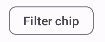
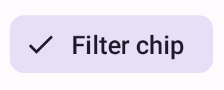
- 필터: 사용자가 일련의 옵션에서 콘텐츠를 세분화할 수 있습니다. 선택하거나 선택 해제할 수 있으며 선택된 경우 체크표시 아이콘이 포함될 수 있습니다.
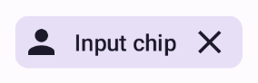
- 입력: 메뉴의 선택사항과 같은 사용자가 제공한 정보를 나타냅니다. 아이콘과 텍스트를 포함할 수 있으며 삭제를 위한 'X'를 제공할 수 있습니다.
- 추천: 사용자의 최근 활동 또는 입력을 기반으로 사용자에게 추천을 제공합니다. 일반적으로 입력란 아래에 표시되어 사용자 작업을 유도합니다.
- 고양: 평평하지 않고 고양된 느낌을 줍니다.
버전 호환성
이 구현을 사용하려면 프로젝트 minSDK를 API 수준 21 이상으로 설정해야 합니다.
종속 항목
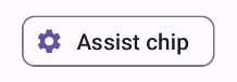
지원 칩 만들기
AssistChip 컴포저블은 사용자를 특정 방향으로 유도하는 지원 칩을 간단하게 만드는 방법을 제공합니다. 한 가지 구별되는 특징은 그림 1과 같이 칩 왼쪽에 아이콘을 표시할 수 있는 leadingIcon 매개변수입니다. 다음 예는 이를 구현하는 방법을 보여줍니다.
필터 칩 만들기
FilterChip 컴포저블을 사용하려면 칩이 선택되었는지 여부를 추적해야 합니다. 다음 예는 사용자가 칩을 선택한 경우에만 체크된 아이콘을 표시하는 방법을 보여줍니다.
결과
입력 칩 만들기
InputChip 컴포저블을 사용하여 사용자 상호작용의 결과로 생성되는 칩을 만들 수 있습니다. 예를 들어 이메일 클라이언트에서 사용자가 이메일을 작성할 때 입력 칩은 사용자가 '받는사람:' 입력란에 입력한 주소를 가진 사람을 나타낼 수 있습니다.
다음 구현은 선택된 상태에 있는 입력 칩을 보여줍니다. 사용자가 칩을 누르면 칩이 닫힙니다.
결과
추천 칩 만들기
SuggestionChip 컴포저블은 API 정의와 일반적인 사용 사례 모두에서 이 페이지에 나열된 컴포저블 중 가장 기본적인 컴포저블입니다. 추천 칩은 동적으로 생성된 힌트를 표시합니다. 예를 들어 AI 채팅 앱에서는 추천 칩을 사용하여 최근 메시지에 대한 가능한 대답을 표시할 수 있습니다.
다음 SuggestionChip 구현을 고려해 보세요.
결과
상단 칩 만들기
이 문서의 모든 예에서는 평면 모양을 사용하는 기본 컴포저블을 사용합니다. 고급스러운 모양의 칩을 만들려면 다음 세 가지 컴포저블 중 하나를 사용하세요.
핵심사항
4개의 컴포저블은 4가지 유형의 칩에 해당하며 다음 매개변수를 공유합니다.
label: 칩에 표시되는 문자열입니다.icon: 칩 시작 부분에 표시되는 아이콘입니다. 일부 컴포저블에는 별도의leadingIcon및trailingIcon매개변수가 있습니다.onClick: 사용자가 칩을 클릭할 때 칩이 호출하는 람다입니다.
이 가이드가 포함된 컬렉션
이 가이드는 더 광범위한 Android 개발 목표를 다루는 선별된 빠른 가이드 모음의 일부입니다.
대화형 구성요소 표시