Tetap teratur dengan koleksi
Simpan dan kategorikan konten berdasarkan preferensi Anda.
Komponen Chip adalah elemen UI interaktif yang ringkas. Elemen ini mewakili entity
kompleks seperti kontak atau tag, sering kali dengan ikon dan label. Item ini dapat
dipilih, ditutup, atau diklik.
Lima jenis chip dan tempat Anda dapat menggunakannya adalah sebagai berikut:
Membantu: Memandu pengguna selama tugas. Sering kali muncul sebagai elemen UI sementara
sebagai respons terhadap input pengguna.
Filter: Memungkinkan pengguna menyaring konten dari serangkaian opsi. Kolom ini dapat
dipilih atau dibatalkan pilihannya, dan dapat menyertakan ikon centang saat dipilih.
Input: Mewakili informasi yang diberikan pengguna, seperti pilihan dalam
menu. Tombol dapat berisi ikon dan teks, serta memberikan 'X' untuk penghapusan.
Saran: Memberikan rekomendasi kepada pengguna berdasarkan aktivitas atau input terbaru mereka. Biasanya muncul di bawah kolom input untuk meminta tindakan
pengguna.
Tinggi: Memiliki tampilan yang tinggi, bukan terlihat datar.
Kompatibilitas versi
Implementasi ini mengharuskan minSDK project Anda ditetapkan ke API level 21 atau
yang lebih tinggi.
Dependensi
Membuat chip bantuan
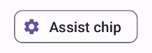
Composable AssistChip menyediakan cara mudah untuk membuat
chip bantuan yang mendorong pengguna ke arah tertentu. Salah satu fitur
yang membedakan adalah parameter leadingIcon yang memungkinkan Anda menampilkan ikon di sisi
kiri chip, seperti yang ditunjukkan pada gambar 1. Contoh berikut menunjukkan cara
Anda dapat menerapkannya:
Gambar 1. Chip bantuan.
Membuat chip filter
Composable FilterChip mengharuskan Anda melacak apakah chip
dipilih atau tidak. Contoh berikut menunjukkan cara menampilkan ikon centang
utama hanya saat pengguna memilih chip:
Hasil
Gambar 2. Chip filter yang tidak dipilih.Gambar 3. Chip filter yang dipilih.
Membuat chip input
Anda dapat menggunakan composable InputChip untuk membuat chip yang dihasilkan dari
interaksi pengguna. Misalnya, di klien email, saat pengguna menulis
email, chip input mungkin mewakili orang yang alamatnya telah dimasukkan
pengguna ke kolom "ke:".
Implementasi berikut menunjukkan chip input yang berada dalam status
yang dipilih. Pengguna menutup chip saat menekannya.
Hasil
Gambar 4. Masukkan chip.
Membuat chip saran
Composable SuggestionChip adalah composable paling dasar yang tercantum
di halaman ini, baik dalam definisi API-nya maupun kasus penggunaan umumnya. Chip
saran menampilkan petunjuk yang dibuat secara dinamis. Misalnya, di aplikasi chat AI, Anda
dapat menggunakan chip saran untuk menampilkan kemungkinan respons terhadap pesan
terbaru.
Pertimbangkan implementasi SuggestionChip ini:
Hasil
Gambar 5. Chip bantuan.
Membuat chip yang ditinggikan
Semua contoh dalam dokumen ini menggunakan composable dasar yang memiliki tampilan
datar. Jika Anda menginginkan chip yang memiliki tampilan yang lebih tinggi, gunakan salah satu
dari tiga composable berikut:
Konten dan contoh kode di halaman ini tunduk kepada lisensi yang dijelaskan dalam Lisensi Konten. Java dan OpenJDK adalah merek dagang atau merek dagang terdaftar dari Oracle dan/atau afiliasinya.
Terakhir diperbarui pada 2025-02-06 UTC.
[[["Mudah dipahami","easyToUnderstand","thumb-up"],["Memecahkan masalah saya","solvedMyProblem","thumb-up"],["Lainnya","otherUp","thumb-up"]],[["Informasi yang saya butuhkan tidak ada","missingTheInformationINeed","thumb-down"],["Terlalu rumit/langkahnya terlalu banyak","tooComplicatedTooManySteps","thumb-down"],["Sudah usang","outOfDate","thumb-down"],["Masalah terjemahan","translationIssue","thumb-down"],["Masalah kode / contoh","samplesCodeIssue","thumb-down"],["Lainnya","otherDown","thumb-down"]],["Terakhir diperbarui pada 2025-02-06 UTC."],[],[],null,["\u003cbr /\u003e\n\nThe `Chip` component is a compact, interactive UI element. It represents complex\nentities like a contact or tag, often with an icon and label. It can be\ncheckable, dismissible, or clickable.\n\nThe five types of chips and where you might use them are as follows:\n\n- [Assist](#assist): Guides the user during a task. Often appears as a temporary UI element in response to user input.\n- [Filter](#filter): Lets users refine content from a set of options. They can be selected or deselected, and may include a checkmark icon when selected.\n- [Input](#input): Represents user-provided information, such as selections in a menu. They can contain an icon and text, and provide an 'X' for removal.\n- [Suggestion](#suggestion): Provides recommendations to the user based on their recent activity or input. Typically appear beneath an input field to prompt user actions.\n- [Elevated](#elevated): Has an elevated appearance instead of looking flat.\n\nVersion compatibility\n\nThis implementation requires that your project minSDK be set to API level 21 or\nhigher.\n\nDependencies\n\nCreate an assist chip\n\nThe [`AssistChip`](/reference/kotlin/androidx/compose/material3/package-summary#AssistChip(kotlin.Function0,kotlin.Function0,androidx.compose.ui.Modifier,kotlin.Boolean,kotlin.Function0,kotlin.Function0,androidx.compose.ui.graphics.Shape,androidx.compose.material3.ChipColors,androidx.compose.material3.ChipElevation,androidx.compose.foundation.BorderStroke,androidx.compose.foundation.interaction.MutableInteractionSource)) composable provides a straightforward way to create an\nassist chip that nudges the user in a particular direction. One distinguishing\nfeature is its `leadingIcon` parameter that lets you display an icon on the left\nside of the chip, as shown in figure 1. The following example demonstrates how\nyou can implement it:\n**Figure 1.** Assist chip.\n\nCreate a filter chip\n\nThe [`FilterChip`](/reference/kotlin/androidx/compose/material3/package-summary#FilterChip(kotlin.Boolean,kotlin.Function0,kotlin.Function0,androidx.compose.ui.Modifier,kotlin.Boolean,kotlin.Function0,kotlin.Function0,androidx.compose.ui.graphics.Shape,androidx.compose.material3.SelectableChipColors,androidx.compose.material3.SelectableChipElevation,androidx.compose.foundation.BorderStroke,androidx.compose.foundation.interaction.MutableInteractionSource)) composable requires you to track whether or not the chip\nis selected. The following example demonstrates how you can show a leading\nchecked icon only when the user has selected the chip:\n\nResults **Figure 2.** Unselected filter chip. **Figure 3.** Selected filter chip.\n\nCreate an input chip\n\nYou can use the [`InputChip`](/reference/kotlin/androidx/compose/material3/package-summary#InputChip(kotlin.Boolean,kotlin.Function0,kotlin.Function0,androidx.compose.ui.Modifier,kotlin.Boolean,kotlin.Function0,kotlin.Function0,kotlin.Function0,androidx.compose.ui.graphics.Shape,androidx.compose.material3.SelectableChipColors,androidx.compose.material3.SelectableChipElevation,androidx.compose.foundation.BorderStroke,androidx.compose.foundation.interaction.MutableInteractionSource)) composable to create chips that result from\nuser interaction. For example, in an email client, when the user is writing an\nemail, an input chip might represent a person whose address the user has entered\ninto the \"to:\" field.\n\nThe following implementation demonstrates an input chip that is in a selected\nstate. The user dismisses the chip when they press it.\n| **Note:** Consider how you might use a chip like this in the preceding email use case, with a name passed in for the `text` parameter, and a function that performs the necessary network calls for `onDismiss`.\n\nResults **Figure 4.** Input chip.\n\nCreate a suggestion chip\n\nThe [`SuggestionChip`](/reference/kotlin/androidx/compose/material3/package-summary#SuggestionChip(kotlin.Function0,kotlin.Function0,androidx.compose.ui.Modifier,kotlin.Boolean,kotlin.Function0,androidx.compose.ui.graphics.Shape,androidx.compose.material3.ChipColors,androidx.compose.material3.ChipElevation,androidx.compose.foundation.BorderStroke,androidx.compose.foundation.interaction.MutableInteractionSource)) composable is the most basic of the composables listed\non this page, both in its API definition and its common use cases. Suggestion\nchips present dynamically generated hints. For example, in an AI chat app, you\nmight use suggestion chips to present possible responses to the most recent\nmessage.\n\nConsider this implementation of `SuggestionChip`:\n\nResults **Figure 5.** Assist chip. **Note:** Although the suggestion chip component is intended for informational purposes, it does still take an `onClick` lambda that you can use to create interactivity.\n\nCreate an elevated chip\n\nAll the examples in this document use the base composables that take a flat\nappearance. If you want a chip that has an elevated appearance, use one of the\nthree following composables:\n\n- [`ElevatedAssistChip`](/reference/kotlin/androidx/compose/material3/package-summary#ElevatedAssistChip(kotlin.Function0,kotlin.Function0,androidx.compose.ui.Modifier,kotlin.Boolean,kotlin.Function0,kotlin.Function0,androidx.compose.ui.graphics.Shape,androidx.compose.material3.ChipColors,androidx.compose.material3.ChipElevation,androidx.compose.foundation.BorderStroke,androidx.compose.foundation.interaction.MutableInteractionSource))\n- [`ElevatedFilterChip`](/reference/kotlin/androidx/compose/material3/package-summary#ElevatedFilterChip(kotlin.Boolean,kotlin.Function0,kotlin.Function0,androidx.compose.ui.Modifier,kotlin.Boolean,kotlin.Function0,kotlin.Function0,androidx.compose.ui.graphics.Shape,androidx.compose.material3.SelectableChipColors,androidx.compose.material3.SelectableChipElevation,androidx.compose.foundation.BorderStroke,androidx.compose.foundation.interaction.MutableInteractionSource))\n- [`ElevatedSuggestionChip`](/reference/kotlin/androidx/compose/material3/package-summary#ElevatedSuggestionChip(kotlin.Function0,kotlin.Function0,androidx.compose.ui.Modifier,kotlin.Boolean,kotlin.Function0,androidx.compose.ui.graphics.Shape,androidx.compose.material3.ChipColors,androidx.compose.material3.ChipElevation,androidx.compose.foundation.BorderStroke,androidx.compose.foundation.interaction.MutableInteractionSource))\n\nKey points\n\nFour composables correspond to the four types of chips, and they share the\nfollowing parameters:\n\n- **`label`**: The string that appears on the chip.\n- **`icon`** : The icon displayed at the start of the chip. Some composables have a separate `leadingIcon` and `trailingIcon` parameter.\n- **`onClick`**: The lambda that the chip calls when the user clicks it.\n\nCollections that contain this guide\n\nThis guide is part of these curated Quick Guide collections that cover\nbroader Android development goals: \n\nDisplay interactive components \nLearn how composable functions can enable you to easily create beautiful UI components based on the Material Design design system. \n[Quick guide collection](/develop/ui/compose/quick-guides/collections/display-interactive-components) \n\nHave questions or feedback \nGo to our frequently asked questions page and learn about quick guides or reach out and let us know your thoughts. \n[Go to FAQ](/quick-guides/faq) [Leave feedback](https://issuetracker.google.com/issues/new?component=1573691&template=1993320)"]]