یک تراشه برای نشان دادن موجودیت های پیچیده ایجاد کنید
با مجموعهها، منظم بمانید
ذخیره و طبقهبندی محتوا براساس اولویتهای شما.
جزء Chip یک عنصر رابط کاربری فشرده و تعاملی است. این موجودات پیچیده مانند یک مخاطب یا برچسب، اغلب با یک نماد و برچسب را نشان می دهد. می تواند قابل بررسی، رد کردن یا کلیک کردن باشد.
پنج نوع تراشه و محل استفاده از آنها به شرح زیر است:
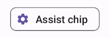
Assist : کاربر را در طول یک کار راهنمایی می کند. اغلب به عنوان یک عنصر رابط کاربری موقت در پاسخ به ورودی کاربر ظاهر می شود.
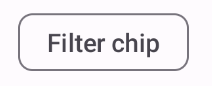
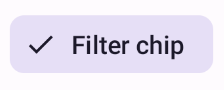
فیلتر : به کاربران امکان می دهد محتوا را از مجموعه ای از گزینه ها اصلاح کنند. آنها را می توان انتخاب کرد یا از حالت انتخاب خارج کرد، و ممکن است هنگام انتخاب یک نماد علامت چک داشته باشند.
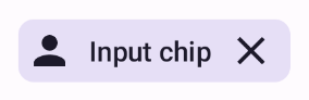
ورودی : اطلاعات ارائه شده توسط کاربر، مانند انتخاب های موجود در یک منو را نشان می دهد. آنها می توانند حاوی یک نماد و متن باشند و یک "X" برای حذف ارائه دهند.
پیشنهاد : توصیه هایی را بر اساس فعالیت یا ورودی اخیر به کاربر ارائه می دهد. معمولاً در زیر یک فیلد ورودی ظاهر میشود تا اقدامات کاربر را درخواست کند.
برافراشته : به جای صاف به نظر رسیدن ظاهری برجسته دارد.
سازگاری نسخه
این پیاده سازی مستلزم آن است که minSDK پروژه شما روی سطح API 21 یا بالاتر تنظیم شود.
وابستگی ها
یک تراشه کمکی ایجاد کنید
AssistChip composable یک راه ساده برای ایجاد یک تراشه کمکی ارائه می دهد که کاربر را به یک جهت خاص هدایت می کند. یکی از ویژگی های متمایز، پارامتر leadingIcon آن است که به شما امکان می دهد یک نماد را در سمت چپ تراشه نمایش دهید، همانطور که در شکل 1 نشان داده شده است. مثال زیر نشان می دهد که چگونه می توانید آن را پیاده سازی کنید:
شکل 1. تراشه کمکی.
یک تراشه فیلتر ایجاد کنید
قابلیت Composable FilterChip از شما میخواهد ردیابی کنید که آیا تراشه انتخاب شده است یا خیر. مثال زیر نشان میدهد که چگونه میتوانید تنها زمانی که کاربر تراشه را انتخاب کرده باشد، یک نماد علامتدار اصلی را نشان دهید:
نتایج
شکل 2. تراشه فیلتر انتخاب نشده. شکل 3. تراشه فیلتر انتخاب شده.
یک تراشه ورودی ایجاد کنید
شما می توانید از InputChip composable برای ایجاد تراشه هایی که از تعامل کاربر ایجاد می شود استفاده کنید. به عنوان مثال، در یک سرویس گیرنده ایمیل، زمانی که کاربر در حال نوشتن ایمیل است، یک تراشه ورودی ممکن است نشان دهنده شخصی باشد که کاربر آدرس او را در قسمت "to:" وارد کرده است.
پیاده سازی زیر یک تراشه ورودی را نشان می دهد که در حالت انتخابی قرار دارد. هنگامی که کاربر تراشه را فشار می دهد، آن را حذف می کند.
نتایج
شکل 4. تراشه ورودی.
یک تراشه پیشنهاد ایجاد کنید
ترکیبپذیر SuggestionChip اساسیترین ترکیبپذیر فهرستشده در این صفحه است، هم در تعریف API و هم در موارد استفاده رایج آن. تراشههای پیشنهاد نکاتی را ارائه میدهند که به صورت پویا تولید میشوند. به عنوان مثال، در یک برنامه چت هوش مصنوعی، ممکن است از تراشههای پیشنهاد برای ارائه پاسخهای احتمالی به جدیدترین پیام استفاده کنید.
این اجرای SuggestionChip را در نظر بگیرید:
نتایج
شکل 5. تراشه کمکی.
یک تراشه مرتفع ایجاد کنید
همه نمونههای موجود در این سند از ترکیبهای پایه استفاده میکنند که ظاهری مسطح دارند. اگر تراشه ای می خواهید که ظاهری برجسته داشته باشد، از یکی از سه ترکیب زیر استفاده کنید:
محتوا و نمونه کدها در این صفحه مشمول پروانههای توصیفشده در پروانه محتوا هستند. جاوا و OpenJDK علامتهای تجاری یا علامتهای تجاری ثبتشده Oracle و/یا وابستههای آن هستند.
تاریخ آخرین بهروزرسانی 2025-02-06 بهوقت ساعت هماهنگ جهانی.
[[["درک آسان","easyToUnderstand","thumb-up"],["مشکلم را برطرف کرد","solvedMyProblem","thumb-up"],["غیره","otherUp","thumb-up"]],[["اطلاعاتی که نیاز دارم وجود ندارد","missingTheInformationINeed","thumb-down"],["بیشازحد پیچیده/ مراحل بسیار زیاد","tooComplicatedTooManySteps","thumb-down"],["قدیمی","outOfDate","thumb-down"],["مشکل ترجمه","translationIssue","thumb-down"],["مشکل کد / نمونهها","samplesCodeIssue","thumb-down"],["غیره","otherDown","thumb-down"]],["تاریخ آخرین بهروزرسانی 2025-02-06 بهوقت ساعت هماهنگ جهانی."],[],[],null,["\u003cbr /\u003e\n\nThe `Chip` component is a compact, interactive UI element. It represents complex\nentities like a contact or tag, often with an icon and label. It can be\ncheckable, dismissible, or clickable.\n\nThe five types of chips and where you might use them are as follows:\n\n- [Assist](#assist): Guides the user during a task. Often appears as a temporary UI element in response to user input.\n- [Filter](#filter): Lets users refine content from a set of options. They can be selected or deselected, and may include a checkmark icon when selected.\n- [Input](#input): Represents user-provided information, such as selections in a menu. They can contain an icon and text, and provide an 'X' for removal.\n- [Suggestion](#suggestion): Provides recommendations to the user based on their recent activity or input. Typically appear beneath an input field to prompt user actions.\n- [Elevated](#elevated): Has an elevated appearance instead of looking flat.\n\nVersion compatibility\n\nThis implementation requires that your project minSDK be set to API level 21 or\nhigher.\n\nDependencies\n\nCreate an assist chip\n\nThe [`AssistChip`](/reference/kotlin/androidx/compose/material3/package-summary#AssistChip(kotlin.Function0,kotlin.Function0,androidx.compose.ui.Modifier,kotlin.Boolean,kotlin.Function0,kotlin.Function0,androidx.compose.ui.graphics.Shape,androidx.compose.material3.ChipColors,androidx.compose.material3.ChipElevation,androidx.compose.foundation.BorderStroke,androidx.compose.foundation.interaction.MutableInteractionSource)) composable provides a straightforward way to create an\nassist chip that nudges the user in a particular direction. One distinguishing\nfeature is its `leadingIcon` parameter that lets you display an icon on the left\nside of the chip, as shown in figure 1. The following example demonstrates how\nyou can implement it:\n**Figure 1.** Assist chip.\n\nCreate a filter chip\n\nThe [`FilterChip`](/reference/kotlin/androidx/compose/material3/package-summary#FilterChip(kotlin.Boolean,kotlin.Function0,kotlin.Function0,androidx.compose.ui.Modifier,kotlin.Boolean,kotlin.Function0,kotlin.Function0,androidx.compose.ui.graphics.Shape,androidx.compose.material3.SelectableChipColors,androidx.compose.material3.SelectableChipElevation,androidx.compose.foundation.BorderStroke,androidx.compose.foundation.interaction.MutableInteractionSource)) composable requires you to track whether or not the chip\nis selected. The following example demonstrates how you can show a leading\nchecked icon only when the user has selected the chip:\n\nResults **Figure 2.** Unselected filter chip. **Figure 3.** Selected filter chip.\n\nCreate an input chip\n\nYou can use the [`InputChip`](/reference/kotlin/androidx/compose/material3/package-summary#InputChip(kotlin.Boolean,kotlin.Function0,kotlin.Function0,androidx.compose.ui.Modifier,kotlin.Boolean,kotlin.Function0,kotlin.Function0,kotlin.Function0,androidx.compose.ui.graphics.Shape,androidx.compose.material3.SelectableChipColors,androidx.compose.material3.SelectableChipElevation,androidx.compose.foundation.BorderStroke,androidx.compose.foundation.interaction.MutableInteractionSource)) composable to create chips that result from\nuser interaction. For example, in an email client, when the user is writing an\nemail, an input chip might represent a person whose address the user has entered\ninto the \"to:\" field.\n\nThe following implementation demonstrates an input chip that is in a selected\nstate. The user dismisses the chip when they press it.\n| **Note:** Consider how you might use a chip like this in the preceding email use case, with a name passed in for the `text` parameter, and a function that performs the necessary network calls for `onDismiss`.\n\nResults **Figure 4.** Input chip.\n\nCreate a suggestion chip\n\nThe [`SuggestionChip`](/reference/kotlin/androidx/compose/material3/package-summary#SuggestionChip(kotlin.Function0,kotlin.Function0,androidx.compose.ui.Modifier,kotlin.Boolean,kotlin.Function0,androidx.compose.ui.graphics.Shape,androidx.compose.material3.ChipColors,androidx.compose.material3.ChipElevation,androidx.compose.foundation.BorderStroke,androidx.compose.foundation.interaction.MutableInteractionSource)) composable is the most basic of the composables listed\non this page, both in its API definition and its common use cases. Suggestion\nchips present dynamically generated hints. For example, in an AI chat app, you\nmight use suggestion chips to present possible responses to the most recent\nmessage.\n\nConsider this implementation of `SuggestionChip`:\n\nResults **Figure 5.** Assist chip. **Note:** Although the suggestion chip component is intended for informational purposes, it does still take an `onClick` lambda that you can use to create interactivity.\n\nCreate an elevated chip\n\nAll the examples in this document use the base composables that take a flat\nappearance. If you want a chip that has an elevated appearance, use one of the\nthree following composables:\n\n- [`ElevatedAssistChip`](/reference/kotlin/androidx/compose/material3/package-summary#ElevatedAssistChip(kotlin.Function0,kotlin.Function0,androidx.compose.ui.Modifier,kotlin.Boolean,kotlin.Function0,kotlin.Function0,androidx.compose.ui.graphics.Shape,androidx.compose.material3.ChipColors,androidx.compose.material3.ChipElevation,androidx.compose.foundation.BorderStroke,androidx.compose.foundation.interaction.MutableInteractionSource))\n- [`ElevatedFilterChip`](/reference/kotlin/androidx/compose/material3/package-summary#ElevatedFilterChip(kotlin.Boolean,kotlin.Function0,kotlin.Function0,androidx.compose.ui.Modifier,kotlin.Boolean,kotlin.Function0,kotlin.Function0,androidx.compose.ui.graphics.Shape,androidx.compose.material3.SelectableChipColors,androidx.compose.material3.SelectableChipElevation,androidx.compose.foundation.BorderStroke,androidx.compose.foundation.interaction.MutableInteractionSource))\n- [`ElevatedSuggestionChip`](/reference/kotlin/androidx/compose/material3/package-summary#ElevatedSuggestionChip(kotlin.Function0,kotlin.Function0,androidx.compose.ui.Modifier,kotlin.Boolean,kotlin.Function0,androidx.compose.ui.graphics.Shape,androidx.compose.material3.ChipColors,androidx.compose.material3.ChipElevation,androidx.compose.foundation.BorderStroke,androidx.compose.foundation.interaction.MutableInteractionSource))\n\nKey points\n\nFour composables correspond to the four types of chips, and they share the\nfollowing parameters:\n\n- **`label`**: The string that appears on the chip.\n- **`icon`** : The icon displayed at the start of the chip. Some composables have a separate `leadingIcon` and `trailingIcon` parameter.\n- **`onClick`**: The lambda that the chip calls when the user clicks it.\n\nCollections that contain this guide\n\nThis guide is part of these curated Quick Guide collections that cover\nbroader Android development goals: \n\nDisplay interactive components \nLearn how composable functions can enable you to easily create beautiful UI components based on the Material Design design system. \n[Quick guide collection](/develop/ui/compose/quick-guides/collections/display-interactive-components) \n\nHave questions or feedback \nGo to our frequently asked questions page and learn about quick guides or reach out and let us know your thoughts. \n[Go to FAQ](/quick-guides/faq) [Leave feedback](https://issuetracker.google.com/issues/new?component=1573691&template=1993320)"]]