
Card 컴포저블은 UI의 Material Design 컨테이너 역할을 합니다.
카드는 다음과 같이 일관된 단일 콘텐츠를 표시합니다.
- 쇼핑 앱의 제품
- 뉴스 앱의 뉴스 기사
- 커뮤니케이션 앱의 메시지
단일 콘텐츠를 묘사하는 데 중점을 두는 것이 Card를 다른 컨테이너와 구별하는 점입니다. 예를 들어 Scaffold는 전체 화면에 일반적인 구조를 제공합니다. 카드는 더 큰 레이아웃 내의 더 작은 UI 요소인 반면 Column 또는 Row와 같은 레이아웃 구성요소는 더 단순하고 더 일반적인 API를 제공합니다.
이 주제에서는 다음 4가지 유형의 카드를 구현하는 방법을 보여줍니다.
버전 호환성
이 구현을 사용하려면 프로젝트 minSDK를 API 수준 21 이상으로 설정해야 합니다.
종속 항목
기본 카드 만들기
Card는 Compose의 다른 컨테이너와 매우 유사하게 동작합니다. 내부에서 다른 컴포저블을 호출하여 콘텐츠를 선언합니다. 예를 들어 다음 최소 예시에서 Card에 Text 호출이 포함되는 방식을 살펴보세요.
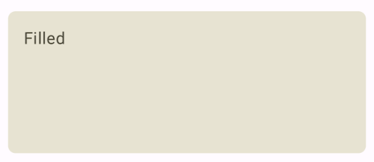
채워진 카드 만들기
여기서 중요한 점은 colors 속성을 사용하여 채워진 색상을 변경하는 것입니다.
결과
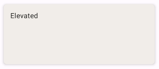
상단 카드 만들기
다음 스니펫은 상단 카드를 구현하는 방법을 보여줍니다. 전용 ElevatedCard 컴포저블을 사용합니다.
elevation 속성을 사용하여 고도의 모양과 그로 인한 그림자를 제어할 수 있습니다.
결과
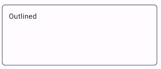
윤곽선이 있는 카드 만들기
다음은 윤곽선이 있는 카드의 예입니다. 전용 OutlinedCard 컴포저블을 사용합니다.
결과
핵심사항
Card의 API 정의는 참조를 참고하세요. 구성요소의 모양과 동작을 맞춤설정하는 데 사용할 수 있는 여러 매개변수를 정의합니다.
몇 가지 주요 매개변수는 다음과 같습니다.
elevation: 구성요소에 그림자를 추가하여 배경 위로 올라간 것처럼 보이게 합니다.colors:CardColors유형을 사용하여 컨테이너와 모든 하위 요소의 기본 색상을 설정합니다.enabled: 이 매개변수에false를 전달하면 카드가 사용 중지된 것처럼 표시되고 사용자 입력에 응답하지 않습니다.onClick: 일반적으로Card는 클릭 이벤트를 허용하지 않습니다. 따라서 주목해야 할 기본 오버로드는onClick매개변수를 정의하는 오버로드입니다.Card구현이 사용자의 클릭에 응답하도록 하려면 이 오버로드를 사용하세요.
카드에는 기본 스크롤 또는 닫기 작업이 포함되어 있지 않지만 이러한 기능을 제공하는 컴포저블에 통합할 수 있습니다. 예를 들어 카드에서 스와이프하여 닫기를 구현하려면 SwipeToDismiss 컴포저블과 통합합니다. 스크롤과 통합하려면 verticalScroll와 같은 스크롤 수정자를 사용하세요. 자세한 내용은 Scroll 문서를 참고하세요.
이 가이드가 포함된 컬렉션
이 가이드는 더 광범위한 Android 개발 목표를 다루는 선별된 빠른 가이드 모음의 일부입니다.
대화형 구성요소 표시