با مجموعهها، منظم بمانید
ذخیره و طبقهبندی محتوا براساس اولویتهای شما.
Card composable به عنوان یک محفظه طراحی متریال برای رابط کاربری شما عمل می کند. کارت ها یک محتوای منسجم را ارائه می دهند، مانند:
یک محصول در یک اپلیکیشن خرید.
یک خبر در یک اپلیکیشن خبری.
یک پیام در یک برنامه ارتباطی
تمرکز بر به تصویر کشیدن یک محتوا، Card از سایر کانتینرها متمایز می کند. به عنوان مثال، Scaffold ساختار کلی را برای یک صفحه نمایش کامل فراهم می کند. کارت یک عنصر رابط کاربری کوچکتر در یک طرح بندی بزرگتر است، در حالی که یک مؤلفه طرح بندی مانند Column یا Row یک API ساده تر و عمومی تر ارائه می دهد.
این موضوع به شما نشان می دهد که چگونه چهار نوع کارت را پیاده سازی کنید:
این پیاده سازی مستلزم آن است که minSDK پروژه شما روی سطح API 21 یا بالاتر تنظیم شود.
وابستگی ها
یک کارت پایه ایجاد کنید
Card بسیار شبیه سایر کانتینرها در Compose عمل می کند. شما محتوای آن را با فراخوانی سایر اجزای سازنده درون آن اعلام می کنید. به عنوان مثال، در نظر بگیرید که چگونه Card شامل یک تماس به Text در مثال حداقل زیر است:
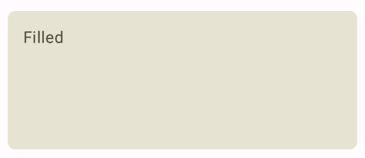
یک کارت پر شده ایجاد کنید
نکته کلیدی در اینجا استفاده از ویژگی colors برای تغییر رنگ پر شده است:
نتایج
شکل 1. نمونه ای از کارت پر شده.
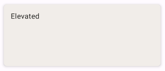
یک کارت مرتفع ایجاد کنید
قطعه زیر نحوه پیاده سازی کارت elevated را نشان می دهد. از ElevatedCard اختصاصی composable استفاده کنید.
می توانید از ویژگی elevation برای کنترل ظاهر elevation و سایه حاصل استفاده کنید.
نتایج
شکل 2. نمونه ای از یک کارت بالا.
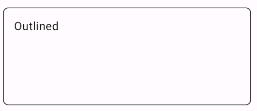
یک کارت مشخص ایجاد کنید
در زیر نمونه ای از یک کارت مشخص شده است. از OutlinedCard اختصاصی composable استفاده کنید.
نتایج
شکل 3. نمونه ای از یک کارت مشخص شده.
نکات کلیدی
مرجع تعریف API Card را ببینید. چندین پارامتر را تعریف می کند که می توانید از آنها برای سفارشی کردن ظاهر و رفتار جزء استفاده کنید.
برخی از پارامترهای کلیدی عبارتند از:
elevation : سایه ای به مولفه اضافه می کند که باعث می شود آن را بالاتر از پس زمینه به نظر برسانید.
colors : از نوع CardColors برای تنظیم رنگ پیشفرض ظرف و هر فرزند استفاده میکند.
enabled : اگر این پارامتر را false ارسال کنید، کارت غیرفعال شده ظاهر می شود و به ورودی کاربر پاسخ نمی دهد.
onClick : معمولاً یک Card رویدادهای کلیک را نمی پذیرد. به این ترتیب، اضافه بار اولیه ای که می خواهید به آن توجه کنید همان چیزی است که یک پارامتر onClick را تعریف می کند. زمانی که میخواهید پیادهسازی Card به کلیکهای کاربر پاسخ دهد، از این اضافه بار استفاده کنید.
کارتها با پیمایش ذاتی یا رد کردن کنشها ارائه نمیشوند، اما میتوانند در ترکیبهایی که این ویژگیها را ارائه میدهند، ادغام شوند. به عنوان مثال، برای پیاده سازی Swipe to dismiss روی کارت، آن را با SwipeToDismiss composable ادغام کنید. برای ادغام با اسکرول، از اصلاح کننده های اسکرول مانند verticalScroll استفاده کنید. برای اطلاعات بیشتر به مستندات Scroll مراجعه کنید.
مجموعه هایی که حاوی این راهنما هستند
این راهنما بخشی از مجموعههای راهنمای Quick Guide است که اهداف توسعه Android گستردهتری را پوشش میدهد:
نمایش اجزای تعاملی
بیاموزید که چگونه توابع ترکیبپذیر میتوانند به شما کمک کنند تا به راحتی اجزای رابط کاربری زیبا را بر اساس سیستم طراحی مواد طراحی کنید.
محتوا و نمونه کدها در این صفحه مشمول پروانههای توصیفشده در پروانه محتوا هستند. جاوا و OpenJDK علامتهای تجاری یا علامتهای تجاری ثبتشده Oracle و/یا وابستههای آن هستند.
تاریخ آخرین بهروزرسانی 2025-02-06 بهوقت ساعت هماهنگ جهانی.
[[["درک آسان","easyToUnderstand","thumb-up"],["مشکلم را برطرف کرد","solvedMyProblem","thumb-up"],["غیره","otherUp","thumb-up"]],[["اطلاعاتی که نیاز دارم وجود ندارد","missingTheInformationINeed","thumb-down"],["بیشازحد پیچیده/ مراحل بسیار زیاد","tooComplicatedTooManySteps","thumb-down"],["قدیمی","outOfDate","thumb-down"],["مشکل ترجمه","translationIssue","thumb-down"],["مشکل کد / نمونهها","samplesCodeIssue","thumb-down"],["غیره","otherDown","thumb-down"]],["تاریخ آخرین بهروزرسانی 2025-02-06 بهوقت ساعت هماهنگ جهانی."],[],[],null,["# Create a card as a container\n\n\u003cbr /\u003e\n\nThe [`Card`](/reference/kotlin/androidx/compose/material3/package-summary#Card(androidx.compose.ui.Modifier,androidx.compose.ui.graphics.Shape,androidx.compose.material3.CardColors,androidx.compose.material3.CardElevation,androidx.compose.foundation.BorderStroke,kotlin.Function1)) composable acts as a Material Design container for your UI.\nCards present a single coherent piece of content, such as:\n\n- A product in a shopping app.\n- A news story in a news app.\n- A message in a communications app.\n\nThe focus on portraying a single piece of content distinguishes\n`Card` from other containers. For example, `Scaffold` provides general structure\nto a whole screen. Card is a smaller UI element inside a larger\nlayout, whereas a layout component such as `Column` or `Row` provides a simpler\nand more generic API.\n\nThis topic shows you how to implement four types of cards:\n\n- [Basic](#basic)\n- [Filled](#filled)\n- [Elevated](#elevated)\n- [Outlined](#outlined)\n\nVersion compatibility\n---------------------\n\nThis implementation requires that your project minSDK be set to API level 21 or\nhigher.\n\n### Dependencies\n\n### Kotlin\n\n\u003cbr /\u003e\n\n```kotlin\n implementation(platform(\"androidx.compose:compose-bom:2025.08.00\"))\n \n```\n\n\u003cbr /\u003e\n\n### Groovy\n\n\u003cbr /\u003e\n\n```groovy\n implementation platform('androidx.compose:compose-bom:2025.08.00')\n \n```\n\n\u003cbr /\u003e\n\nCreate a basic card\n-------------------\n\n`Card` behaves much like other containers in Compose. You declare its content by\ncalling other composables within it. For example, consider how `Card` contains a\ncall to `Text` in the following minimal example:\n\n @Composable\n fun CardMinimalExample() {\n Card() {\n Text(text = \"Hello, world!\")\n }\n }\n\n| **Note:** By default, a `Card` wraps its content in a `Column` composable, placing each item inside the card beneath one another.\n\nCreate a filled card\n--------------------\n\nThe key here is the use of the `colors` property to change the filled\ncolor:\n\n\u003cbr /\u003e\n\n```kotlin\n@Composable\nfun FilledCardExample() {\n Card(\n colors = CardDefaults.cardColors(\n containerColor = MaterialTheme.colorScheme.surfaceVariant,\n ),\n modifier = Modifier\n .size(width = 240.dp, height = 100.dp)\n ) {\n Text(\n text = \"Filled\",\n modifier = Modifier\n .padding(16.dp),\n textAlign = TextAlign.Center,\n )\n }\n}\n \n https://github.com/android/snippets/blob/dd30aee903e8c247786c064faab1a9ca8d10b46e/compose/snippets/src/main/java/com/example/compose/snippets/components/Card.kt#L106-L122\n \n```\n\n\u003cbr /\u003e\n\n### Results\n\n**Figure 1.** Example of a filled card.\n\nCreate an elevated card\n-----------------------\n\nThe following snippet demonstrates how to implement an elevated card. Use the\ndedicated [`ElevatedCard`](/reference/kotlin/androidx/compose/material3/package-summary#ElevatedCard(androidx.compose.ui.Modifier,androidx.compose.ui.graphics.Shape,androidx.compose.material3.CardColors,androidx.compose.material3.CardElevation,kotlin.Function1)) composable.\n\nYou can use the `elevation` property to control the appearance of elevation and\nthe resulting shadow.\n\n\u003cbr /\u003e\n\n```kotlin\n@Composable\nfun ElevatedCardExample() {\n ElevatedCard(\n elevation = CardDefaults.cardElevation(\n defaultElevation = 6.dp\n ),\n modifier = Modifier\n .size(width = 240.dp, height = 100.dp)\n ) {\n Text(\n text = \"Elevated\",\n modifier = Modifier\n .padding(16.dp),\n textAlign = TextAlign.Center,\n )\n }\n}\n \n https://github.com/android/snippets/blob/dd30aee903e8c247786c064faab1a9ca8d10b46e/compose/snippets/src/main/java/com/example/compose/snippets/components/Card.kt#L85-L101\n \n```\n\n\u003cbr /\u003e\n\n### Results\n\n**Figure 2.** Example of an elevated card.\n\nCreate an outlined card\n-----------------------\n\nThe following is an example of an outlined card. Use the dedicated\n[`OutlinedCard`](/reference/kotlin/androidx/compose/material3/package-summary#OutlinedCard(androidx.compose.ui.Modifier,androidx.compose.ui.graphics.Shape,androidx.compose.material3.CardColors,androidx.compose.material3.CardElevation,androidx.compose.foundation.BorderStroke,kotlin.Function1)) composable.\n\n\u003cbr /\u003e\n\n```kotlin\n@Composable\nfun OutlinedCardExample() {\n OutlinedCard(\n colors = CardDefaults.cardColors(\n containerColor = MaterialTheme.colorScheme.surface,\n ),\n border = BorderStroke(1.dp, Color.Black),\n modifier = Modifier\n .size(width = 240.dp, height = 100.dp)\n ) {\n Text(\n text = \"Outlined\",\n modifier = Modifier\n .padding(16.dp),\n textAlign = TextAlign.Center,\n )\n }\n}\n \n https://github.com/android/snippets/blob/dd30aee903e8c247786c064faab1a9ca8d10b46e/compose/snippets/src/main/java/com/example/compose/snippets/components/Card.kt#L127-L144\n \n```\n\n\u003cbr /\u003e\n\n### Results\n\n**Figure 3.** Example of an outlined card.\n\nKey points\n----------\n\nSee the [reference](/reference/kotlin/androidx/compose/material3/package-summary#Card(androidx.compose.ui.Modifier,androidx.compose.ui.graphics.Shape,androidx.compose.material3.CardColors,androidx.compose.material3.CardElevation,androidx.compose.foundation.BorderStroke,kotlin.Function1)) for the API definition of `Card`. It defines several\nparameters that you can use to customize the appearance and behavior of the\ncomponent.\n\nSome key parameters include:\n\n- **`elevation`**: Adds a shadow to the component that makes it look elevated above the background.\n- **`colors`** : Uses the `CardColors` type to set the default color of both the container and any children.\n- **`enabled`** : If you pass `false` for this parameter, the card appears as disabled and does not respond to user input.\n- **`onClick`** : Ordinarily, a `Card` does not accept click events. As such, the primary overload you would like to note is that which defines an `onClick` parameter. Use this overload when you want your implementation of `Card` to respond to clicks from the user.\n\n| **Beta:** The `Card` overload that defines the `onClick` parameter is experimental.\n\nCards don't come with inherent scroll or dismiss actions, but can integrate into\ncomposables offering these features. For example, to implement swipe to dismiss\non a card, integrate it with the [`SwipeToDismiss`](/reference/kotlin/androidx/compose/material3/package-summary#SwipeToDismiss(androidx.compose.material3.DismissState,kotlin.Function1,kotlin.Function1,androidx.compose.ui.Modifier,kotlin.collections.Set)) composable. To integrate\nwith scroll, use scroll modifiers such as [`verticalScroll`](/reference/kotlin/androidx/compose/foundation/package-summary#(androidx.compose.ui.Modifier).verticalScroll(androidx.compose.foundation.ScrollState,kotlin.Boolean,androidx.compose.foundation.gestures.FlingBehavior,kotlin.Boolean)). See the [`Scroll`\ndocumentation](/develop/ui/compose/touch-input/pointer-input/scroll) for more information.\n\nCollections that contain this guide\n-----------------------------------\n\nThis guide is part of these curated Quick Guide collections that cover\nbroader Android development goals: \n\n### Display interactive components\n\nLearn how composable functions can enable you to easily create beautiful UI components based on the Material Design design system. \n[Quick guide collection](/develop/ui/compose/quick-guides/collections/display-interactive-components) \n\nHave questions or feedback\n--------------------------\n\nGo to our frequently asked questions page and learn about quick guides or reach out and let us know your thoughts. \n[Go to FAQ](/quick-guides/faq) [Leave feedback](https://issuetracker.google.com/issues/new?component=1573691&template=1993320)"]]