
Tombol memungkinkan pengguna memicu tindakan yang ditentukan. Ada lima jenis tombol:
Jenis |
Tampilan |
Tujuan |
|---|---|---|
| Diisi | Latar belakang solid dengan teks yang kontras. |
Untuk tindakan utama, seperti "Kirim" dan "Simpan". Efek bayangan menekankan pentingnya tombol. |
| Tonal | Warna latar belakang bervariasi agar sesuai dengan permukaan. |
Untuk tindakan utama atau signifikan. Tombol yang terisi memberikan bobot visual dan sesuai untuk tindakan seperti "Tambahkan ke keranjang" dan "Login". |
| Panas | Bayangan membuatnya terlihat jelas. |
Untuk tindakan utama atau signifikan. Tingkatkan elevasi untuk membuat tombol lebih terlihat. |
| Disertai garis batas | Memiliki batas tanpa isi. |
Untuk tindakan yang penting, tetapi bukan tindakan utama. Tombol dengan garis batas cocok dipasangkan dengan tombol lain untuk menunjukkan tindakan alternatif sekunder seperti "Batal" atau "Kembali". |
| Teks | Teks tanpa latar belakang atau batas. |
Untuk tindakan yang kurang penting seperti link navigasi, atau tindakan sekunder seperti "Pelajari lebih lanjut" atau "Lihat detail". |
Kompatibilitas versi
Implementasi ini mengharuskan minSDK project Anda ditetapkan ke API level 21 atau yang lebih tinggi.
Dependensi
Membuat tombol isi
Komponen tombol yang terisi menggunakan composable Button dasar. Secara default,
warnanya diisi dengan warna solid.
Hasil

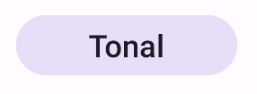
Membuat tombol tonal yang terisi
Komponen tombol tonal yang terisi menggunakan composable FilledTonalButton.
Secara default, warna ini diisi dengan warna tonal.
Hasil
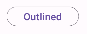
Membuat tombol dengan garis batas
Komponen tombol yang digarisbatasi menggunakan composable OutlinedButton. Secara default,
tampilannya akan muncul dengan garis batas.
Hasil
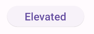
Membuat tombol yang ditinggikan
Komponen tombol yang ditinggikan menggunakan composable ElevatedButton. Tombol ini memiliki
bayangan yang mewakili efek elevasi secara default dan muncul sebagai
tombol yang digarisbatasi dengan bayangan.
Hasil
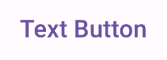
Membuat tombol teks
Komponen tombol teks menggunakan composable TextButton. Hingga diklik,
ikon hanya akan muncul sebagai teks. Secara default, bentuk ini tidak memiliki isian atau garis batas yang solid.
Hasil
Poin utama
onClick: Fungsi yang dipanggil saat pengguna menekan tombol.enabled: Jika salah, parameter ini akan menyebabkan tombol tampak tidak tersedia dan tidak aktif.colors: InstanceButtonColorsyang menentukan warna yang digunakan di tombol.contentPadding: Padding dalam tombol.
Koleksi yang berisi panduan ini
Panduan ini adalah bagian dari koleksi Panduan Cepat pilihan yang membahas sasaran pengembangan Android yang lebih luas:

Menampilkan komponen interaktif