
دکمه ها به کاربر این امکان را می دهند که یک عمل تعریف شده را راه اندازی کند. پنج نوع دکمه وجود دارد:
تایپ کنید | ظاهر | هدف |
|---|---|---|
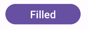
| پر شده است | پس زمینه جامد با متن متضاد. | برای اقدامات اولیه، مانند «ارسال» و «ذخیره». افکت سایه بر اهمیت دکمه تاکید می کند. |
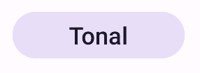
| تونال | رنگ پس زمینه برای مطابقت با سطح متفاوت است. | برای اقدامات اولیه یا مهم. دکمه های پر شده وزن بصری را ارائه می دهند و برای اقداماتی مانند "افزودن به سبد خرید" و "ورود به سیستم" مناسب هستند. |
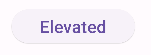
| مرتفع | سایه آن را برجسته می کند. | برای اقدامات اولیه یا مهم. ارتفاع را افزایش دهید تا دکمه برجسته تر شود. |
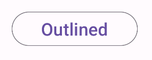
| مشخص شده است | دارای حاشیه بدون پر کردن. | برای اقداماتی که مهم هستند اما اولیه نیستند. دکمههای مشخص شده به خوبی با دکمههای دیگر جفت میشوند تا اقدامات ثانویه دیگری مانند «لغو» یا «بازگشت» را نشان دهند. |
| متن | متن بدون پس زمینه یا حاشیه. | برای اقدامات کمتر مهم مانند پیوندهای ناوبری یا اقدامات ثانویه مانند "بیشتر بیاموزید" یا "مشاهده جزئیات". |
سازگاری نسخه
این پیاده سازی مستلزم آن است که minSDK پروژه شما روی سطح API 21 یا بالاتر تنظیم شود.
وابستگی ها
یک دکمه پر شده ایجاد کنید
مولفه دکمه پر شده از Button اصلی قابل ترکیب استفاده می کند. به طور پیش فرض با یک رنگ ثابت پر شده است.
نتایج
یک دکمه تونال پر شده ایجاد کنید
کامپوننت دکمه تونال پر شده از Composable FilledTonalButton استفاده می کند. به طور پیش فرض با یک رنگ تونال پر شده است.
نتایج
یک دکمه مشخص شده ایجاد کنید
جزء دکمه outlined از OutlinedButton قابل ترکیب استفاده می کند. به طور پیش فرض با یک طرح کلی ظاهر می شود.
نتایج
یک دکمه مرتفع ایجاد کنید
مولفه دکمه elevated از ElevatedButton composable استفاده می کند. دارای سایهای است که بهطور پیشفرض جلوه ارتفاع را نشان میدهد و بهعنوان یک دکمه مشخص شده با یک سایه ظاهر میشود.
نتایج
یک دکمه متن ایجاد کنید
جزء دکمه متن از TextButton composable استفاده می کند. تا زمانی که کلیک شود، فقط به صورت متن ظاهر می شود. به طور پیش فرض پر شده یا طرح کلی ندارد.
نتایج
نکات کلیدی
-
onClick: تابعی که با فشار دادن دکمه توسط کاربر فراخوانی می شود. -
enabled: در صورت false، این پارامتر باعث می شود که دکمه در دسترس و غیرفعال به نظر برسد. -
colors: نمونه ای ازButtonColorsکه رنگ های استفاده شده در دکمه را تعیین می کند. -
contentPadding: بالشتک داخل دکمه.
مجموعه هایی که حاوی این راهنما هستند
این راهنما بخشی از مجموعههای راهنمای Quick Guide است که اهداف توسعه Android گستردهتری را پوشش میدهد:
نمایش اجزای تعاملی