
Mithilfe von Schaltflächen können Nutzer eine definierte Aktion auslösen. Es gibt fünf Arten von Schaltflächen:
Eingeben |
Darstellung |
Zweck |
|---|---|---|
| Ausgefüllt | Einfarbiger Hintergrund mit kontrastierendem Text |
Für primäre Aktionen wie „Senden“ und „Speichern“ Der Schatteneffekt unterstreicht die Wichtigkeit der Schaltfläche. |
| Ton | Die Hintergrundfarbe passt sich der Oberfläche an. |
Für primäre oder wichtige Aktionen. Ausgefüllte Schaltflächen wirken optisch schwerer und eignen sich für Aktionen wie „In den Einkaufswagen legen“ und „Anmelden“. |
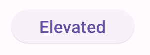
| Erhöht | Der Schatten hebt sie hervor. |
Für primäre oder wichtige Aktionen. Erhöhen Sie die Elevation, um die Schaltfläche besser sichtbar zu machen. |
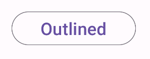
| Umrissen | Hat einen Rahmen ohne Füllung. |
Für Aktionen, die wichtig, aber nicht primär sind. Schaltflächen mit Umriss eignen sich gut, um alternative oder sekundäre Aktionen wie „Abbrechen“ oder „Zurück“ anzuzeigen. |
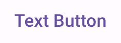
| Text | Text ohne Hintergrund oder Rahmen |
Für weniger wichtige Aktionen wie Navigationslinks oder sekundäre Aktionen wie „Weitere Informationen“ oder „Details ansehen“. |
Versionskompatibilität
Für diese Implementierung muss das minSDK Ihres Projekts auf API-Level 21 oder höher festgelegt sein.
Abhängigkeiten
Gefüllte Schaltfläche erstellen
Für die Schaltfläche mit Füllung wird die grundlegende Komponente Button verwendet. Standardmäßig ist er mit einer durchgehenden Farbe gefüllt.
Ergebnisse

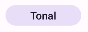
Eine gefüllte Schaltfläche mit Tonwerten erstellen
Für die Schaltfläche mit farbigem Hintergrund wird das FilledTonalButton-Element verwendet.
Es ist standardmäßig mit einer Tonfarbe gefüllt.
Ergebnisse
Eine umrandete Schaltfläche erstellen
Für die umrandete Schaltflächenkomponente wird das OutlinedButton-Element verwendet. Sie wird standardmäßig mit einem Umriss angezeigt.
Ergebnisse
Erhöhte Schaltfläche erstellen
Für die Schaltfläche mit erhöhtem Sichtfeld wird das ElevatedButton-Element verwendet. Sie hat einen Schatten, der standardmäßig den Höheneffekt darstellt, und wird als umrandete Schaltfläche mit Schatten angezeigt.
Ergebnisse
Textschaltfläche erstellen
Für die Schaltfläche mit Text wird das TextButton-Element verwendet. Bis zum Klicken wird es nur als Text angezeigt. Sie hat standardmäßig keine durchgehende Füllung oder keinen Umriss.
Ergebnisse
Wichtige Fakten
onClick: Die Funktion, die aufgerufen wird, wenn der Nutzer auf die Schaltfläche drückt.enabled: Wenn dieser Parameter auf „false“ gesetzt ist, wird die Schaltfläche als nicht verfügbar und inaktiv angezeigt.colors: Eine Instanz vonButtonColors, die die Farben der Schaltfläche bestimmt.contentPadding: Der Abstand innerhalb der Schaltfläche.
Sammlungen, die diesen Leitfaden enthalten
Dieser Leitfaden ist Teil der folgenden ausgewählten Sammlungen von Kurzanleitungen, die allgemeinere Ziele der Android-Entwicklung abdecken:

Interaktive Komponenten anzeigen