ক্রিয়াগুলির জন্য যা গুরুত্বপূর্ণ কিন্তু প্রাথমিক নয়। "বাতিল" বা "ব্যাক" এর মত বিকল্প, গৌণ ক্রিয়াগুলি নির্দেশ করতে রূপরেখাযুক্ত বোতামগুলি অন্যান্য বোতামগুলির সাথে ভালভাবে যুক্ত হয়৷
নেভিগেশনাল লিঙ্ক বা "আরো জানুন" বা "বিশদ বিবরণ দেখুন" এর মতো মাধ্যমিক ক্রিয়াগুলির মতো কম গুরুত্বপূর্ণ ক্রিয়াগুলির জন্য৷
সংস্করণ সামঞ্জস্য
এই বাস্তবায়নের জন্য আপনার প্রজেক্ট minSDK এপিআই লেভেল 21 বা তার উপরে সেট করা প্রয়োজন।
নির্ভরতা
একটি ভরাট বোতাম তৈরি করুন
ভরা বোতাম উপাদান মৌলিক Button কম্পোজেবল ব্যবহার করে। এটি ডিফল্টরূপে একটি কঠিন রঙ দিয়ে ভরা হয়।
ফলাফল
চিত্র 1. একটি ভরাট বোতাম।
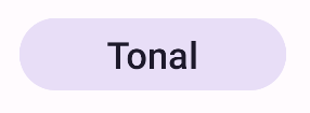
একটি ভরাট টোনাল বোতাম তৈরি করুন
ভরা টোনাল বোতাম উপাদানটি FilledTonalButton কম্পোজেবল ব্যবহার করে। এটি ডিফল্টরূপে একটি টোনাল রঙ দিয়ে ভরা হয়।
ফলাফল
চিত্র 2. একটি টোনাল বোতাম।
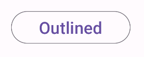
একটি রূপরেখাযুক্ত বোতাম তৈরি করুন
আউটলাইন করা বোতাম কম্পোনেন্ট OutlinedButton কম্পোজেবল ব্যবহার করে। এটি ডিফল্টরূপে একটি রূপরেখা সহ প্রদর্শিত হয়।
ফলাফল
চিত্র 3. একটি রূপরেখাযুক্ত বোতাম।
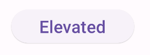
একটি উন্নত বোতাম তৈরি করুন
এলিভেটেড বোতাম কম্পোনেন্ট ElevatedButton বাটন কম্পোজেবল ব্যবহার করে। এটিতে একটি ছায়া রয়েছে যা ডিফল্টরূপে উচ্চতার প্রভাবকে উপস্থাপন করে এবং একটি ছায়া সহ একটি রূপরেখাযুক্ত বোতাম হিসাবে উপস্থিত হয়।
ফলাফল
চিত্র 4. একটি উন্নত বোতাম।
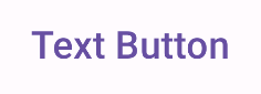
একটি পাঠ্য বোতাম তৈরি করুন
টেক্সট বোতাম কম্পোনেন্ট TextButton কম্পোজেবল ব্যবহার করে। ক্লিক না করা পর্যন্ত, এটি শুধুমাত্র পাঠ্য হিসাবে প্রদর্শিত হবে। এটি ডিফল্টরূপে একটি কঠিন পূরণ বা রূপরেখা নেই।
ফলাফল
চিত্র 5. একটি পাঠ্য বোতাম।
মূল পয়েন্ট
onClick : ব্যবহারকারী বোতাম টিপে যখন ফাংশন বলা হয়।
enabled : মিথ্যা হলে, এই প্যারামিটারটি বোতামটিকে অনুপলব্ধ এবং নিষ্ক্রিয় দেখায়।
colors : ButtonColors একটি উদাহরণ যা বোতামে ব্যবহৃত রং নির্ধারণ করে।
contentPadding : বোতামের মধ্যে প্যাডিং।
এই নির্দেশিকা ধারণকারী সংগ্রহ
এই নির্দেশিকাটি এই কিউরেট করা কুইক গাইড সংগ্রহের অংশ যা বৃহত্তর অ্যান্ড্রয়েড উন্নয়ন লক্ষ্যগুলি কভার করে:
ইন্টারেক্টিভ উপাদান প্রদর্শন
মেটেরিয়াল ডিজাইন ডিজাইন সিস্টেমের উপর ভিত্তি করে কীভাবে কম্পোজেবল ফাংশনগুলি আপনাকে সহজেই সুন্দর UI উপাদান তৈরি করতে সক্ষম করে তা শিখুন।
এই পৃষ্ঠার কন্টেন্ট ও কোডের নমুনাগুলি Content License-এ বর্ণিত লাইসেন্সের অধীনস্থ। Java এবং OpenJDK হল Oracle এবং/অথবা তার অ্যাফিলিয়েট সংস্থার রেজিস্টার্ড ট্রেডমার্ক।
2025-02-06 UTC-তে শেষবার আপডেট করা হয়েছে।
[[["সহজে বোঝা যায়","easyToUnderstand","thumb-up"],["আমার সমস্যার সমাধান হয়েছে","solvedMyProblem","thumb-up"],["অন্যান্য","otherUp","thumb-up"]],[["এতে আমার প্রয়োজনীয় তথ্য নেই","missingTheInformationINeed","thumb-down"],["খুব জটিল / অনেক ধাপ","tooComplicatedTooManySteps","thumb-down"],["পুরনো","outOfDate","thumb-down"],["অনুবাদ সংক্রান্ত সমস্যা","translationIssue","thumb-down"],["নমুনা / কোড সংক্রান্ত সমস্যা","samplesCodeIssue","thumb-down"],["অন্যান্য","otherDown","thumb-down"]],["2025-02-06 UTC-তে শেষবার আপডেট করা হয়েছে।"],[],[],null,["\u003cbr /\u003e\n\nButtons let the user trigger a defined action. There are five types of\nbutton:\n\n| Type | Appearance | Purpose |\n|-------------------------------|-----------------------------------------------|-------------------------------------------------------------------------------------------------------------------------------------------------------------------|\n| [Filled](#create-filled) | Solid background with contrasting text. | For primary actions, such as \"Submit\" and \"Save.\" The shadow effect emphasizes the button's importance. |\n| [Tonal](#create-filled-tonal) | Background color varies to match the surface. | For primary or significant actions. Filled buttons provide visual weight and are appropriate for actions like \"Add to cart\" and \"Sign in.\" |\n| [Elevated](#create-elevated) | Shadow makes it stand out. | For primary or significant actions. Increase elevation to make the button more prominent. |\n| [Outlined](#create-outlined) | Features a border with no fill. | For actions that are important but not primary. Outlined buttons pair well with other buttons to indicate alternative, secondary actions like \"Cancel\" or \"Back.\" |\n| [Text](#create-text) | Text with no background or border. | For less critical actions such as navigational links, or secondary actions like \"Learn more\" or \"View details.\" |\n\nVersion compatibility\n\nThis implementation requires that your project minSDK be set to API level 21 or\nhigher.\n\nDependencies\n\nCreate a filled button\n\nThe filled button component uses the basic [`Button`](/reference/kotlin/androidx/compose/material3/package-summary?#Button(kotlin.Function0,androidx.compose.ui.Modifier,kotlin.Boolean,androidx.compose.ui.graphics.Shape,androidx.compose.material3.ButtonColors,androidx.compose.material3.ButtonElevation,androidx.compose.foundation.BorderStroke,androidx.compose.foundation.layout.PaddingValues,androidx.compose.foundation.interaction.MutableInteractionSource,kotlin.Function1)) composable. It is\nfilled with a solid color by default.\n\nResults **Figure 1.** A filled button.\n\nCreate a filled tonal button\n\nThe filled tonal button component uses the [`FilledTonalButton`](/reference/kotlin/androidx/compose/material3/package-summary#FilledTonalButton(kotlin.Function0,androidx.compose.ui.Modifier,kotlin.Boolean,androidx.compose.ui.graphics.Shape,androidx.compose.material3.ButtonColors,androidx.compose.material3.ButtonElevation,androidx.compose.foundation.BorderStroke,androidx.compose.foundation.layout.PaddingValues,androidx.compose.foundation.interaction.MutableInteractionSource,kotlin.Function1)) composable.\nIt is filled with a tonal color by default.\n\nResults **Figure 2.** A tonal button.\n\nCreate an outlined button\n\nThe outlined button component uses the [`OutlinedButton`](/reference/kotlin/androidx/compose/material3/package-summary#OutlinedButton(kotlin.Function0,androidx.compose.ui.Modifier,kotlin.Boolean,androidx.compose.ui.graphics.Shape,androidx.compose.material3.ButtonColors,androidx.compose.material3.ButtonElevation,androidx.compose.foundation.BorderStroke,androidx.compose.foundation.layout.PaddingValues,androidx.compose.foundation.interaction.MutableInteractionSource,kotlin.Function1)) composable. It\nappears with an outline by default.\n\nResults **Figure 3.** An outlined button.\n\nCreate an elevated button\n\nThe elevated button component uses the [`ElevatedButton`](/reference/kotlin/androidx/compose/material3/package-summary#ElevatedButton(kotlin.Function0,androidx.compose.ui.Modifier,kotlin.Boolean,androidx.compose.ui.graphics.Shape,androidx.compose.material3.ButtonColors,androidx.compose.material3.ButtonElevation,androidx.compose.foundation.BorderStroke,androidx.compose.foundation.layout.PaddingValues,androidx.compose.foundation.interaction.MutableInteractionSource,kotlin.Function1)) composable. It has\na shadow that represents the elevation effect by default and appears as\nan outlined button with a shadow.\n\nResults **Figure 4.** An elevated button.\n\nCreate a text button\n\nThe text button component uses the [`TextButton`](/reference/kotlin/androidx/compose/material3/package-summary#TextButton(kotlin.Function0,androidx.compose.ui.Modifier,kotlin.Boolean,androidx.compose.ui.graphics.Shape,androidx.compose.material3.ButtonColors,androidx.compose.material3.ButtonElevation,androidx.compose.foundation.BorderStroke,androidx.compose.foundation.layout.PaddingValues,androidx.compose.foundation.interaction.MutableInteractionSource,kotlin.Function1)) composable. Until clicked,\nit appears only as text. It does not have a solid fill or outline by default.\n\nResults **Figure 5.** A text button.\n\nKey points\n\n- `onClick`: The function called when the user presses the button.\n- `enabled`: When false, this parameter causes the button to appear unavailable and inactive.\n- `colors`: An instance of `ButtonColors` that determines the colors used in the button.\n- `contentPadding`: The padding within the button.\n\nCollections that contain this guide\n\nThis guide is part of these curated Quick Guide collections that cover\nbroader Android development goals: \n\nDisplay interactive components \nLearn how composable functions can enable you to easily create beautiful UI components based on the Material Design design system. \n[Quick guide collection](/develop/ui/compose/quick-guides/collections/display-interactive-components) \n\nHave questions or feedback \nGo to our frequently asked questions page and learn about quick guides or reach out and let us know your thoughts. \n[Go to FAQ](/quick-guides/faq) [Leave feedback](https://issuetracker.google.com/issues/new?component=1573691&template=1993320)"]]