একটি নীচের শীট তৈরি করুন
সেভ করা পৃষ্ঠা গুছিয়ে রাখতে 'সংগ্রহ' ব্যবহার করুন
আপনার পছন্দ অনুযায়ী কন্টেন্ট সেভ করুন ও সঠিক বিভাগে রাখুন।
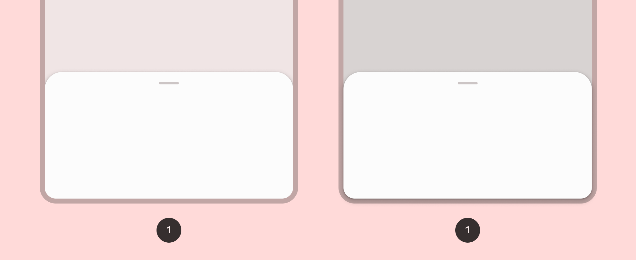
একটি নীচের শীট পর্দার নীচে নোঙ্গর করা সেকেন্ডারি বিষয়বস্তু দেখায়৷
সংস্করণ সামঞ্জস্য
এই বাস্তবায়নের জন্য আপনার প্রজেক্ট minSDK এপিআই লেভেল 21 বা তার উপরে সেট করা প্রয়োজন।
নির্ভরতা
একটি নীচে শীট বাস্তবায়ন
একটি নীচের শীট বাস্তবায়ন করতে, ModalBottomSheet
কম্পোজযোগ্য ব্যবহার করুন:
শীটটি প্রসারিত করুন এবং সঙ্কুচিত করুন
শীটটি প্রসারিত এবং সঙ্কুচিত করতে, SheetState
ব্যবহার করুন:
মূল পয়েন্ট
-
content
স্লট ব্যবহার করুন, যা একটি কলামে শীট কন্টেন্ট কম্পোজেবল লেয়ার করার জন্য একটি ColumnScope
ব্যবহার করে। - আপনি
sheetState
প্যারামিটার সহ ModalBottomSheet
এ পাস করেন এমন SheetState
এর একটি উদাহরণ তৈরি করতে rememberSheetState
ব্যবহার করুন। SheetState
show
এবং hide
ফাংশন এবং বর্তমান শীট অবস্থা সম্পর্কিত বৈশিষ্ট্য অ্যাক্সেস প্রদান করে. এই ফাংশনগুলির জন্য একটি CoroutineScope
প্রয়োজন - উদাহরণস্বরূপ, rememberCoroutineScope
- এবং UI ইভেন্টগুলির প্রতিক্রিয়া হিসাবে কল করা যেতে পারে।
আপনি নীচের শীট লুকান যখন রচনা থেকে ModalBottomSheet
অপসারণ নিশ্চিত করুন.
ফলাফল
চিত্র 1. একটি আদর্শ নীচের শীট (বাম) এবং একটি মডেল নীচের শীট (ডানদিকে)।
এই নির্দেশিকা ধারণকারী সংগ্রহ
এই নির্দেশিকাটি এই কিউরেট করা কুইক গাইড সংগ্রহের অংশ যা বৃহত্তর অ্যান্ড্রয়েড উন্নয়ন লক্ষ্যগুলি কভার করে:
ইন্টারেক্টিভ উপাদান প্রদর্শন
মেটেরিয়াল ডিজাইন ডিজাইন সিস্টেমের উপর ভিত্তি করে কীভাবে কম্পোজেবল ফাংশনগুলি আপনাকে সহজেই সুন্দর UI উপাদান তৈরি করতে সক্ষম করে তা শিখুন।
এই পৃষ্ঠার কন্টেন্ট ও কোডের নমুনাগুলি Content License-এ বর্ণিত লাইসেন্সের অধীনস্থ। Java এবং OpenJDK হল Oracle এবং/অথবা তার অ্যাফিলিয়েট সংস্থার রেজিস্টার্ড ট্রেডমার্ক।
2025-02-06 UTC-তে শেষবার আপডেট করা হয়েছে।
[[["সহজে বোঝা যায়","easyToUnderstand","thumb-up"],["আমার সমস্যার সমাধান হয়েছে","solvedMyProblem","thumb-up"],["অন্যান্য","otherUp","thumb-up"]],[["এতে আমার প্রয়োজনীয় তথ্য নেই","missingTheInformationINeed","thumb-down"],["খুব জটিল / অনেক ধাপ","tooComplicatedTooManySteps","thumb-down"],["পুরনো","outOfDate","thumb-down"],["অনুবাদ সংক্রান্ত সমস্যা","translationIssue","thumb-down"],["নমুনা / কোড সংক্রান্ত সমস্যা","samplesCodeIssue","thumb-down"],["অন্যান্য","otherDown","thumb-down"]],["2025-02-06 UTC-তে শেষবার আপডেট করা হয়েছে।"],[],[],null,["# Create a bottom sheet\n\n\u003cbr /\u003e\n\nA bottom sheet shows secondary content, anchored to the bottom of the screen.\n\nVersion compatibility\n---------------------\n\nThis implementation requires that your project minSDK be set to API level 21 or\nhigher.\n\n### Dependencies\n\n### Kotlin\n\n\u003cbr /\u003e\n\n```kotlin\n implementation(platform(\"androidx.compose:compose-bom:2025.08.00\"))\n \n```\n\n\u003cbr /\u003e\n\n### Groovy\n\n\u003cbr /\u003e\n\n```groovy\n implementation platform('androidx.compose:compose-bom:2025.08.00')\n \n```\n\n\u003cbr /\u003e\n\nImplement a bottom sheet\n------------------------\n\nTo implement a [bottom sheet](https://m3.material.io/components/bottom-sheets/overview), use the [`ModalBottomSheet`](/reference/kotlin/androidx/compose/material3/package-summary#ModalBottomSheet(kotlin.Function0,androidx.compose.ui.Modifier,androidx.compose.material3.SheetState,androidx.compose.ui.unit.Dp,androidx.compose.ui.graphics.Shape,androidx.compose.ui.graphics.Color,androidx.compose.ui.graphics.Color,androidx.compose.ui.unit.Dp,androidx.compose.ui.graphics.Color,kotlin.Function0,kotlin.Function0,androidx.compose.material3.ModalBottomSheetProperties,kotlin.Function1))\ncomposable:\n\n\u003cbr /\u003e\n\n```kotlin\nModalBottomSheet(onDismissRequest = { /* Executed when the sheet is dismissed */ }) {\n // Sheet content\n}\n \n https://github.com/android/snippets/blob/dd30aee903e8c247786c064faab1a9ca8d10b46e/compose/snippets/src/main/java/com/example/compose/snippets/layouts/MaterialLayoutSnippets.kt#L364-L366\n \n```\n\n\u003cbr /\u003e\n\nExpand and collapse the sheet\n-----------------------------\n\nTo expand and collapse the sheet, use [`SheetState`](/reference/kotlin/androidx/compose/material3/SheetState):\n\n\u003cbr /\u003e\n\n```kotlin\nval sheetState = rememberModalBottomSheetState()\nval scope = rememberCoroutineScope()\nvar showBottomSheet by remember { mutableStateOf(false) }\nScaffold(\n floatingActionButton = {\n ExtendedFloatingActionButton(\n text = { Text(\"Show bottom sheet\") },\n icon = { Icon(Icons.Filled.Add, contentDescription = \"\") },\n onClick = {\n showBottomSheet = true\n }\n )\n }\n) { contentPadding -\u003e\n // Screen content\n\n if (showBottomSheet) {\n ModalBottomSheet(\n onDismissRequest = {\n showBottomSheet = false\n },\n sheetState = sheetState\n ) {\n // Sheet content\n Button(onClick = {\n scope.launch { sheetState.hide() }.invokeOnCompletion {\n if (!sheetState.isVisible) {\n showBottomSheet = false\n }\n }\n }) {\n Text(\"Hide bottom sheet\")\n }\n }\n }\n}\n \n https://github.com/android/snippets/blob/dd30aee903e8c247786c064faab1a9ca8d10b46e/compose/snippets/src/main/java/com/example/compose/snippets/layouts/MaterialLayoutSnippets.kt#L370-L408\n \n```\n\n\u003cbr /\u003e\n\n### Key points\n\n- Use the `content` slot, which uses a [`ColumnScope`](/reference/kotlin/androidx/compose/foundation/layout/ColumnScope) to lay out sheet content composables in a column.\n- Use [`rememberSheetState`](/reference/kotlin/androidx/compose/material3/package-summary#rememberSheetState(kotlin.Boolean,kotlin.Function1)) to create an instance of `SheetState` that you pass to `ModalBottomSheet` with the `sheetState` parameter.\n- `SheetState` provides access to the [`show`](/reference/kotlin/androidx/compose/material3/SheetState#show()) and [`hide`](/reference/kotlin/androidx/compose/material3/SheetState#hide()) functions\n and to properties related to the current sheet state. These functions\n require a `CoroutineScope` --- for example, [`rememberCoroutineScope`](/reference/kotlin/androidx/compose/runtime/package-summary#remembercoroutinescope) ---\n and can be called in response to UI events.\n\n- Make sure to remove the `ModalBottomSheet` from composition when you hide\n the bottom sheet.\n\nResults\n-------\n\n\n**Figure 1.** A standard bottom sheet (left) and a modal bottom sheet (right).\n\n\u003cbr /\u003e\n\nCollections that contain this guide\n-----------------------------------\n\nThis guide is part of these curated Quick Guide collections that cover\nbroader Android development goals: \n\n### Display interactive components\n\nLearn how composable functions can enable you to easily create beautiful UI components based on the Material Design design system. \n[Quick guide collection](/develop/ui/compose/quick-guides/collections/display-interactive-components) \n\nHave questions or feedback\n--------------------------\n\nGo to our frequently asked questions page and learn about quick guides or reach out and let us know your thoughts. \n[Go to FAQ](/quick-guides/faq) [Leave feedback](https://issuetracker.google.com/issues/new?component=1573691&template=1993320)"]]