Menambahkan tombol yang dapat diaktifkan atau dinonaktifkan pengguna
Tetap teratur dengan koleksi
Simpan dan kategorikan konten berdasarkan preferensi Anda.
Komponen Switch memungkinkan pengguna beralih antara dua status: dicentang
dan tidak dicentang. Gunakan tombol untuk memungkinkan pengguna melakukan salah satu
hal berikut:
Aktifkan atau nonaktifkan setelan.
Mengaktifkan atau menonaktifkan fitur.
Pilih salah satu opsi.
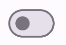
Komponen ini memiliki dua bagian: thumb dan trek. Thumb adalah bagian tombol yang dapat ditarik, dan jalur adalah latar belakang. Pengguna dapat menarik thumb
ke kiri atau kanan untuk mengubah status tombol. Mereka juga dapat mengetuk
tombol untuk memeriksa dan menghapusnya.
Kompatibilitas versi
Implementasi ini mengharuskan minSDK project Anda ditetapkan ke API level 21 atau
yang lebih tinggi.
Dependensi
Mengimplementasikan tombol
Contoh berikut adalah implementasi minimal composable Switch:
Hasil
Gambar 1. Tombol yang tidak dicentang.Gambar 2. Tombol yang dicentang.
Membuat thumbnail kustom
Anda dapat meneruskan composable apa pun untuk parameter thumbContent guna membuat thumbnail
kustom. Berikut adalah contoh tombol yang menggunakan ikon kustom untuk
thumb-nya:
Hasil
Tampilan yang tidak dicentang sama dengan contoh di
bagian sebelumnya. Namun, jika dicentang, penerapan ini akan muncul sebagai
berikut:
Gambar 3. Tombol dengan ikon centang kustom.
Menggunakan warna kustom
Gunakan parameter colors untuk
mengubah warna tombol dan jalur tombol, dengan mempertimbangkan apakah
tombol dicentang.
Hasil
Gambar 4. Tombol dengan warna kustom.
Poin utama
Parameter dasar:
checked: Status awal tombol.
onCheckedChange: Callback yang dipanggil saat status
tombol berubah.
enabled: Apakah tombol diaktifkan atau dinonaktifkan.
colors: Warna yang digunakan untuk tombol.
Parameter lanjutan
thumbContent: Gunakan ini untuk menyesuaikan tampilan thumb saat
dipilih.
colors: Gunakan ini untuk menyesuaikan warna trek dan thumbnail.
Koleksi yang berisi panduan ini
Panduan ini adalah bagian dari koleksi Panduan Cepat pilihan yang membahas
sasaran pengembangan Android yang lebih luas:
Menampilkan komponen interaktif
Pelajari cara fungsi composable dapat memudahkan Anda
membuat komponen UI yang menarik berdasarkan sistem desain
Desain Material.
Konten dan contoh kode di halaman ini tunduk kepada lisensi yang dijelaskan dalam Lisensi Konten. Java dan OpenJDK adalah merek dagang atau merek dagang terdaftar dari Oracle dan/atau afiliasinya.
Terakhir diperbarui pada 2025-05-08 UTC.
[[["Mudah dipahami","easyToUnderstand","thumb-up"],["Memecahkan masalah saya","solvedMyProblem","thumb-up"],["Lainnya","otherUp","thumb-up"]],[["Informasi yang saya butuhkan tidak ada","missingTheInformationINeed","thumb-down"],["Terlalu rumit/langkahnya terlalu banyak","tooComplicatedTooManySteps","thumb-down"],["Sudah usang","outOfDate","thumb-down"],["Masalah terjemahan","translationIssue","thumb-down"],["Masalah kode / contoh","samplesCodeIssue","thumb-down"],["Lainnya","otherDown","thumb-down"]],["Terakhir diperbarui pada 2025-05-08 UTC."],[],[],null,["\u003cbr /\u003e\n\nThe [`Switch`](/reference/kotlin/androidx/compose/material3/package-summary#Switch(kotlin.Boolean,kotlin.Function1,androidx.compose.ui.Modifier,kotlin.Function0,kotlin.Boolean,androidx.compose.material3.SwitchColors,androidx.compose.foundation.interaction.MutableInteractionSource)) component lets users toggle between two states: checked\nand unchecked. Use a switch to let the user to do one of the\nfollowing:\n\n- Toggle a setting on or off.\n- Enable or disable a feature.\n- Select an option.\n\nThe component has two parts: the thumb and the track. The thumb is the draggable\npart of the switch, and the track is the background. The user can drag the thumb\nto the left or right to change the state of the switch. They can also tap the\nswitch to check and clear it.\n\nVersion compatibility\n\nThis implementation requires that your project minSDK be set to API level 21 or\nhigher.\n\nDependencies\n\nImplement a switch\n\nThe following example is a minimal implementation of the `Switch` composable:\n\nResults **Figure 1.** An unchecked switch. **Figure 2.** A checked switch.\n\nCreate a custom thumb\n\nYou can pass any composable for the `thumbContent` parameter to create a custom\nthumb. The following is an example of a switch that uses a custom icon for its\nthumb:\n\nResults\n\nThe unchecked appearance is the same as the example in\nthe preceding section. However, when checked, this implementation appears as\nfollows:\n**Figure 3.** A switch with a custom checked icon.\n\nUse custom colors\n\nUse the `colors` parameter to\nchange the color of a switch's thumb and track, taking into account whether the\nswitch is checked.\n\nResults **Figure 4.** A switch with custom colors.\n\nKey points\n\n- Basic parameters:\n\n - **`checked`**: The initial state of the switch.\n - **`onCheckedChange`**: A callback that is called when the state of the switch changes.\n - **`enabled`**: Whether the switch is enabled or disabled.\n - **`colors`**: The colors used for the switch.\n- Advanced parameters\n\n - **`thumbContent`**: Use this to customize the appearance of the thumb when it is checked.\n - **`colors`**: Use this to customize the color of the track and thumb.\n\nCollections that contain this guide\n\nThis guide is part of these curated Quick Guide collections that cover\nbroader Android development goals: \n\nDisplay interactive components \nLearn how composable functions can enable you to easily create beautiful UI components based on the Material Design design system. \n[Quick guide collection](/develop/ui/compose/quick-guides/collections/display-interactive-components) \n\nHave questions or feedback \nGo to our frequently asked questions page and learn about quick guides or reach out and let us know your thoughts. \n[Go to FAQ](/quick-guides/faq) [Leave feedback](https://issuetracker.google.com/issues/new?component=1573691&template=1993320)"]]