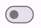
یک سوئیچ اضافه کنید که کاربران بتوانند آن را تغییر دهند
با مجموعهها، منظم بمانید
ذخیره و طبقهبندی محتوا براساس اولویتهای شما.
مولفه Switch به کاربران امکان می دهد بین دو حالت جابجا شوند: علامت زده و علامت زده نشده. از یک سوئیچ استفاده کنید تا کاربر یکی از موارد زیر را انجام دهد:
یک تنظیم را روشن یا خاموش کنید.
یک ویژگی را فعال یا غیرفعال کنید.
یک گزینه را انتخاب کنید.
کامپوننت دارای دو بخش است: شست و مسیر. انگشت شست قسمت قابل کشیدن سوئیچ است و آهنگ پس زمینه است. کاربر می تواند انگشت شست را به سمت چپ یا راست بکشد تا وضعیت سوئیچ را تغییر دهد. آنها همچنین می توانند برای بررسی و پاک کردن سوئیچ ضربه بزنند.
سازگاری نسخه
این پیاده سازی مستلزم آن است که minSDK پروژه شما روی سطح API 21 یا بالاتر تنظیم شود.
وابستگی ها
یک سوئیچ را اجرا کنید
مثال زیر یک اجرای حداقلی از Switch composable است:
نتایج
شکل 1. یک سوئیچ بدون علامت. شکل 2. یک سوئیچ چک شده.
یک انگشت شست سفارشی ایجاد کنید
شما می توانید هر composable را برای پارامتر thumbContent برای ایجاد یک شست سفارشی ارسال کنید. در زیر نمونه ای از سوئیچ است که از یک نماد سفارشی برای انگشت شست خود استفاده می کند:
نتایج
ظاهر بدون علامت مانند مثال در بخش قبل است. با این حال، هنگامی که بررسی می شود، این پیاده سازی به صورت زیر ظاهر می شود:
شکل 3. یک سوئیچ با یک نماد علامت گذاری شده سفارشی.
از رنگ های سفارشی استفاده کنید
از پارامتر colors برای تغییر رنگ انگشت شست و مسیر سوئیچ، با در نظر گرفتن اینکه آیا سوئیچ بررسی شده است، استفاده کنید.
نتایج
شکل 4. یک سوئیچ با رنگ های سفارشی.
نکات کلیدی
پارامترهای اساسی:
checked : وضعیت اولیه سوئیچ.
onCheckedChange : یک تماس برگشتی که زمانی فراخوانی می شود که وضعیت سوئیچ تغییر کند.
enabled : اینکه سوئیچ فعال یا غیرفعال باشد.
colors : رنگ هایی که برای سوئیچ استفاده می شود.
پارامترهای پیشرفته
thumbContent : از این برای سفارشی کردن ظاهر انگشت شست هنگام علامت زدن استفاده کنید.
colors : از این برای سفارشی کردن رنگ مسیر و انگشت شست استفاده کنید.
مجموعه هایی که حاوی این راهنما هستند
این راهنما بخشی از مجموعههای راهنمای Quick Guide است که اهداف توسعه Android گستردهتری را پوشش میدهد:
نمایش اجزای تعاملی
بیاموزید که چگونه توابع ترکیبپذیر میتوانند به شما کمک کنند تا به راحتی اجزای رابط کاربری زیبا را بر اساس سیستم طراحی مواد طراحی کنید.
محتوا و نمونه کدها در این صفحه مشمول پروانههای توصیفشده در پروانه محتوا هستند. جاوا و OpenJDK علامتهای تجاری یا علامتهای تجاری ثبتشده Oracle و/یا وابستههای آن هستند.
تاریخ آخرین بهروزرسانی 2025-05-08 بهوقت ساعت هماهنگ جهانی.
[[["درک آسان","easyToUnderstand","thumb-up"],["مشکلم را برطرف کرد","solvedMyProblem","thumb-up"],["غیره","otherUp","thumb-up"]],[["اطلاعاتی که نیاز دارم وجود ندارد","missingTheInformationINeed","thumb-down"],["بیشازحد پیچیده/ مراحل بسیار زیاد","tooComplicatedTooManySteps","thumb-down"],["قدیمی","outOfDate","thumb-down"],["مشکل ترجمه","translationIssue","thumb-down"],["مشکل کد / نمونهها","samplesCodeIssue","thumb-down"],["غیره","otherDown","thumb-down"]],["تاریخ آخرین بهروزرسانی 2025-05-08 بهوقت ساعت هماهنگ جهانی."],[],[],null,["\u003cbr /\u003e\n\nThe [`Switch`](/reference/kotlin/androidx/compose/material3/package-summary#Switch(kotlin.Boolean,kotlin.Function1,androidx.compose.ui.Modifier,kotlin.Function0,kotlin.Boolean,androidx.compose.material3.SwitchColors,androidx.compose.foundation.interaction.MutableInteractionSource)) component lets users toggle between two states: checked\nand unchecked. Use a switch to let the user to do one of the\nfollowing:\n\n- Toggle a setting on or off.\n- Enable or disable a feature.\n- Select an option.\n\nThe component has two parts: the thumb and the track. The thumb is the draggable\npart of the switch, and the track is the background. The user can drag the thumb\nto the left or right to change the state of the switch. They can also tap the\nswitch to check and clear it.\n\nVersion compatibility\n\nThis implementation requires that your project minSDK be set to API level 21 or\nhigher.\n\nDependencies\n\nImplement a switch\n\nThe following example is a minimal implementation of the `Switch` composable:\n\nResults **Figure 1.** An unchecked switch. **Figure 2.** A checked switch.\n\nCreate a custom thumb\n\nYou can pass any composable for the `thumbContent` parameter to create a custom\nthumb. The following is an example of a switch that uses a custom icon for its\nthumb:\n\nResults\n\nThe unchecked appearance is the same as the example in\nthe preceding section. However, when checked, this implementation appears as\nfollows:\n**Figure 3.** A switch with a custom checked icon.\n\nUse custom colors\n\nUse the `colors` parameter to\nchange the color of a switch's thumb and track, taking into account whether the\nswitch is checked.\n\nResults **Figure 4.** A switch with custom colors.\n\nKey points\n\n- Basic parameters:\n\n - **`checked`**: The initial state of the switch.\n - **`onCheckedChange`**: A callback that is called when the state of the switch changes.\n - **`enabled`**: Whether the switch is enabled or disabled.\n - **`colors`**: The colors used for the switch.\n- Advanced parameters\n\n - **`thumbContent`**: Use this to customize the appearance of the thumb when it is checked.\n - **`colors`**: Use this to customize the color of the track and thumb.\n\nCollections that contain this guide\n\nThis guide is part of these curated Quick Guide collections that cover\nbroader Android development goals: \n\nDisplay interactive components \nLearn how composable functions can enable you to easily create beautiful UI components based on the Material Design design system. \n[Quick guide collection](/develop/ui/compose/quick-guides/collections/display-interactive-components) \n\nHave questions or feedback \nGo to our frequently asked questions page and learn about quick guides or reach out and let us know your thoughts. \n[Go to FAQ](/quick-guides/faq) [Leave feedback](https://issuetracker.google.com/issues/new?component=1573691&template=1993320)"]]