
TextView
  public


  class
  TextView
extends View
      implements

        ViewTreeObserver.OnPreDrawListener
| java.lang.Object | ||
| ↳ | android.view.View | |
| ↳ | android.widget.TextView | |
A user interface element that displays text to the user.
To provide user-editable text, see EditText.
The following code sample shows a typical use, with an XML layout and code to modify the contents of the text view:
 <LinearLayout
       xmlns:android="http://schemas.android.com/apk/res/android"
       android:layout_width="match_parent"
       android:layout_height="match_parent">
    <TextView
        android:id="@+id/text_view_id"
        android:layout_height="wrap_content"
        android:layout_width="wrap_content"
        android:text="@string/hello" />
 </LinearLayout>
This code sample demonstrates how to modify the contents of the text view defined in the previous XML layout:
 public class MainActivity extends Activity {

    protected void onCreate(Bundle savedInstanceState) {
         super.onCreate(savedInstanceState);
         setContentView(R.layout.activity_main);
         final TextView helloTextView = (TextView) findViewById(R.id.text_view_id);
         helloTextView.setText(R.string.user_greeting);
     }
 }
To customize the appearance of TextView, see Styles and Themes.
XML attributes
See TextView Attributes,
View Attributes
Summary
Nested classes | ||||||||||||||||
|---|---|---|---|---|---|---|---|---|---|---|---|---|---|---|---|---|
interface |
TextView.OnEditorActionListener
Interface definition for a callback to be invoked when an action is performed on the editor. |
|||||||||||||||
class |
TextView.SavedState
User interface state that is stored by TextView for implementing
|
|||||||||||||||
XML attributes | ||||||||||||||||
|---|---|---|---|---|---|---|---|---|---|---|---|---|---|---|---|---|
android:allowUndo |
Whether undo should be allowed for editable text. | |||||||||||||||
android:autoLink |
Controls whether links such as urls and email addresses are automatically found and converted to clickable links. | |||||||||||||||
android:autoSizeMaxTextSize |
The maximum text size constraint to be used when auto-sizing text. | |||||||||||||||
android:autoSizeMinTextSize |
The minimum text size constraint to be used when auto-sizing text. | |||||||||||||||
android:autoSizePresetSizes |
Resource array of dimensions to be used in conjunction with
autoSizeTextType set to uniform.
|
|||||||||||||||
android:autoSizeStepGranularity |
Specify the auto-size step size if autoSizeTextType is set to
uniform.
|
|||||||||||||||
android:autoSizeTextType |
Specify the type of auto-size. | |||||||||||||||
android:autoText |
This is deprecated.
Use inputType instead.
May be a boolean value, such as " |
|||||||||||||||
android:breakStrategy |
Break strategy (control over paragraph layout). | |||||||||||||||
android:bufferType |
Determines the minimum type that getText() will return. | |||||||||||||||
android:capitalize |
This is deprecated.
Use inputType instead.
Must be one of the following constant values.
|
|||||||||||||||
android:cursorVisible |
Makes the cursor visible (the default) or invisible. | |||||||||||||||
android:digits |
If set, specifies that this TextView has a numeric input method and that these specific characters are the ones that it will accept. | |||||||||||||||
android:drawableBottom |
The drawable to be drawn below the text. | |||||||||||||||
android:drawableEnd |
The drawable to be drawn to the end of the text. | |||||||||||||||
android:drawableLeft |
The drawable to be drawn to the left of the text. | |||||||||||||||
android:drawablePadding |
The padding between the drawables and the text. | |||||||||||||||
android:drawableRight |
The drawable to be drawn to the right of the text. | |||||||||||||||
android:drawableStart |
The drawable to be drawn to the start of the text. | |||||||||||||||
android:drawableTint |
Tint to apply to the compound (left, top, etc.) drawables. | |||||||||||||||
android:drawableTintMode |
Blending mode used to apply the compound (left, top, etc.) drawables tint. | |||||||||||||||
android:drawableTop |
The drawable to be drawn above the text. | |||||||||||||||
android:editable |
This is deprecated.
Use inputType instead.
May be a boolean value, such as " |
|||||||||||||||
android:editorExtras |
Reference to an
<input-extras>
XML resource containing additional data to
supply to an input method, which is private to the implementation
of the input method.
|
|||||||||||||||
android:elegantTextHeight |
Elegant text height, especially for less compacted complex script text. | |||||||||||||||
android:ellipsize |
If set, causes words that are longer than the view is wide to be ellipsized instead of broken in the middle. | |||||||||||||||
android:ems |
Makes the TextView be exactly this many ems wide. | |||||||||||||||
android:enabled |
Specifies whether the widget is enabled. | |||||||||||||||
android:fallbackLineSpacing |
Whether to respect the ascent and descent of the fallback fonts that are used in displaying the text. | |||||||||||||||
android:firstBaselineToTopHeight |
Distance from the top of the TextView to the first text baseline. | |||||||||||||||
android:focusedSearchResultHighlightColor |
Color of focused search result highlight. | |||||||||||||||
android:focusedSearchResultHighlightColor |
Color of focused search result highlight. | |||||||||||||||
android:fontFamily |
Font family (named by string or as a font resource reference) for the text. | |||||||||||||||
android:fontFeatureSettings |
Font feature settings. | |||||||||||||||
android:fontVariationSettings |
Font variation settings. | |||||||||||||||
android:freezesText |
If set, the text view will include its current complete text inside of its frozen icicle in addition to meta-data such as the current cursor position. | |||||||||||||||
android:gravity |
Specifies how to align the text by the view's x- and/or y-axis when the text is smaller than the view. | |||||||||||||||
android:height |
Makes the TextView be exactly this tall. | |||||||||||||||
android:hint |
Hint text to display when the text is empty. | |||||||||||||||
android:hyphenationFrequency |
Frequency of automatic hyphenation. | |||||||||||||||
android:imeActionId |
Supply a value for
EditorInfo.actionId
used when an input method is connected to the text view.
|
|||||||||||||||
android:imeActionLabel |
Supply a value for
EditorInfo.actionLabel
used when an input method is connected to the text view.
|
|||||||||||||||
android:imeOptions |
Additional features you can enable in an IME associated with an editor to improve the integration with your application. | |||||||||||||||
android:includeFontPadding |
Leave enough room for ascenders and descenders instead of using the font ascent and descent strictly. | |||||||||||||||
android:inputMethod |
This is deprecated.
Use inputType instead.
May be a string value, using '\\;' to escape characters such as '\\n' or '\\uxxxx' for a unicode character; |
|||||||||||||||
android:inputType |
The type of data being placed in a text field, used to help an input method decide how to let the user enter text. | |||||||||||||||
android:justificationMode |
Mode for justification. | |||||||||||||||
android:lastBaselineToBottomHeight |
Distance from the bottom of the TextView to the last text baseline. | |||||||||||||||
android:letterSpacing |
Text letter-spacing. | |||||||||||||||
android:lineBreakStyle |
Specifies the line-break strategies for text wrapping. | |||||||||||||||
android:lineBreakWordStyle |
Specifies the line-break word strategies for text wrapping. | |||||||||||||||
android:lineHeight |
Explicit height between lines of text. | |||||||||||||||
android:lineSpacingExtra |
Extra spacing between lines of text. | |||||||||||||||
android:lineSpacingMultiplier |
Extra spacing between lines of text, as a multiplier. | |||||||||||||||
android:lines |
Makes the TextView be exactly this many lines tall. | |||||||||||||||
android:linksClickable |
If set to false, keeps the movement method from being set to the link movement method even if autoLink causes links to be found. | |||||||||||||||
android:marqueeRepeatLimit |
The number of times to repeat the marquee animation. | |||||||||||||||
android:maxEms |
Makes the TextView be at most this many ems wide. | |||||||||||||||
android:maxHeight |
Makes the TextView be at most this many pixels tall. | |||||||||||||||
android:maxLength |
Set an input filter to constrain the text length to the specified number. | |||||||||||||||
android:maxLines |
Makes the TextView be at most this many lines tall. | |||||||||||||||
android:maxWidth |
Makes the TextView be at most this many pixels wide. | |||||||||||||||
android:minEms |
Makes the TextView be at least this many ems wide. | |||||||||||||||
android:minHeight |
Makes the TextView be at least this many pixels tall. | |||||||||||||||
android:minLines |
Makes the TextView be at least this many lines tall. | |||||||||||||||
android:minWidth |
Makes the TextView be at least this many pixels wide. | |||||||||||||||
android:numeric |
This is deprecated.
Use inputType instead.
Must be one or more (separated by '|') of the following constant values.
|
|||||||||||||||
android:password |
This is deprecated.
Use inputType instead.
May be a boolean value, such as " |
|||||||||||||||
android:phoneNumber |
This is deprecated.
Use inputType instead.
May be a boolean value, such as " |
|||||||||||||||
android:privateImeOptions |
An addition content type description to supply to the input method attached to the text view, which is private to the implementation of the input method. | |||||||||||||||
android:scrollHorizontally |
Whether the text is allowed to be wider than the view (and therefore can be scrolled horizontally). | |||||||||||||||
android:searchResultHighlightColor |
Color of search results highlight. | |||||||||||||||
android:searchResultHighlightColor |
Color of search results highlight. | |||||||||||||||
android:selectAllOnFocus |
If the text is selectable, select it all when the view takes focus. | |||||||||||||||
android:shadowColor |
Place a blurred shadow of text underneath the text, drawn with the specified color. | |||||||||||||||
android:shadowDx |
Horizontal offset of the text shadow. | |||||||||||||||
android:shadowDy |
Vertical offset of the text shadow. | |||||||||||||||
android:shadowRadius |
Blur radius of the text shadow. | |||||||||||||||
android:singleLine |
This is deprecated.
This attribute is deprecated. Use maxLines instead to change
the layout of a static text, and use the textMultiLine flag in the
inputType attribute instead for editable text views (if both singleLine and inputType
are supplied, the inputType flags will override the value of singleLine).
May be a boolean value, such as " |
|||||||||||||||
android:text |
Text to display. | |||||||||||||||
android:textAllCaps |
Present the text in ALL CAPS. | |||||||||||||||
android:textAppearance |
Base text color, typeface, size, and style. | |||||||||||||||
android:textColor |
Text color. | |||||||||||||||
android:textColorHighlight |
Color of the text selection highlight. | |||||||||||||||
android:textColorHint |
Color of the hint text. | |||||||||||||||
android:textColorLink |
Text color for links. | |||||||||||||||
android:textCursorDrawable |
Reference to a drawable that will be drawn under the insertion cursor. | |||||||||||||||
android:textFontWeight |
Weight for the font used in the TextView. | |||||||||||||||
android:textIsSelectable |
Indicates that the content of a non-editable text can be selected. | |||||||||||||||
android:textScaleX |
Sets the horizontal scaling factor for the text. | |||||||||||||||
android:textSelectHandle |
Reference to a drawable that will be used to display a text selection anchor for positioning the cursor within text. | |||||||||||||||
android:textSelectHandleLeft |
Reference to a drawable that will be used to display a text selection anchor on the left side of a selection region. | |||||||||||||||
android:textSelectHandleRight |
Reference to a drawable that will be used to display a text selection anchor on the right side of a selection region. | |||||||||||||||
android:textSize |
Size of the text. | |||||||||||||||
android:textStyle |
Style (normal, bold, italic, bold|italic) for the text. | |||||||||||||||
android:typeface |
Typeface (normal, sans, serif, monospace) for the text. | |||||||||||||||
android:width |
Makes the TextView be exactly this wide. | |||||||||||||||
Inherited XML attributes | |
|---|---|
Constants | |
|---|---|
int |
AUTO_SIZE_TEXT_TYPE_NONE
The TextView does not auto-size text (default). |
int |
AUTO_SIZE_TEXT_TYPE_UNIFORM
The TextView scales text size both horizontally and vertically to fit within the container. |
int |
FOCUSED_SEARCH_RESULT_INDEX_NONE
A special index used for |
Inherited constants |
|---|
Inherited fields |
|---|
Public constructors | |
|---|---|
TextView(Context context)
|
|
TextView(Context context, AttributeSet attrs)
|
|
TextView(Context context, AttributeSet attrs, int defStyleAttr)
|
|
TextView(Context context, AttributeSet attrs, int defStyleAttr, int defStyleRes)
|
|
Public methods | |
|---|---|
void
|
addExtraDataToAccessibilityNodeInfo(AccessibilityNodeInfo info, String extraDataKey, Bundle arguments)
Adds extra data to an |
void
|
addTextChangedListener(TextWatcher watcher)
Adds a TextWatcher to the list of those whose methods are called whenever this TextView's text changes. |
        final

        void
|
append(CharSequence text)
Convenience method to append the specified text to the TextView's
display buffer, upgrading it to |
void
|
append(CharSequence text, int start, int end)
Convenience method to append the specified text slice to the TextView's
display buffer, upgrading it to |
void
|
autofill(AutofillValue value)
Automatically fills the content of this view with the |
void
|
beginBatchEdit()
|
boolean
|
bringPointIntoView(int offset)
Move the point, specified by the offset, into the view if it is needed. |
boolean
|
bringPointIntoView(int offset, boolean requestRectWithoutFocus)
Move the insertion position of the given offset into visible area of the View. |
void
|
cancelLongPress()
Cancels a pending long press. |
void
|
clearComposingText()
Use |
void
|
computeScroll()
Called by a parent to request that a child update its values for mScrollX and mScrollY if necessary. |
void
|
debug(int depth)
|
boolean
|
didTouchFocusSelect()
Returns true, only while processing a touch gesture, if the initial touch down event caused focus to move to the text view and as a result its selection changed. |
void
|
drawableHotspotChanged(float x, float y)
This function is called whenever the view hotspot changes and needs to be propagated to drawables or child views managed by the view. |
void
|
endBatchEdit()
|
boolean
|
extractText(ExtractedTextRequest request, ExtractedText outText)
If this TextView contains editable content, extract a portion of it based on the information in request in to outText. |
void
|
findViewsWithText(ArrayList<View> outViews, CharSequence searched, int flags)
Finds the Views that contain given text. |
CharSequence
|
getAccessibilityClassName()
Return the class name of this object to be used for accessibility purposes. |
        final

        int
|
getAutoLinkMask()
Gets the autolink mask of the text. |
int
|
getAutoSizeMaxTextSize()
|
int
|
getAutoSizeMinTextSize()
|
int
|
getAutoSizeStepGranularity()
|
int[]
|
getAutoSizeTextAvailableSizes()
|
int
|
getAutoSizeTextType()
Returns the type of auto-size set for this widget. |
String[]
|
getAutofillHints()
Gets the hints that help an |
int
|
getAutofillType()
Describes the autofill type of this view, so an
|
AutofillValue
|
getAutofillValue()
Gets the |
int
|
getBaseline()
Return the offset of the widget's text baseline from the widget's top boundary. |
int
|
getBreakStrategy()
Gets the current strategy for breaking paragraphs into lines. |
int
|
getCompoundDrawablePadding()
Returns the padding between the compound drawables and the text. |
BlendMode
|
getCompoundDrawableTintBlendMode()
Returns the blending mode used to apply the tint to the compound drawables, if specified. |
ColorStateList
|
getCompoundDrawableTintList()
|
PorterDuff.Mode
|
getCompoundDrawableTintMode()
Returns the blending mode used to apply the tint to the compound drawables, if specified. |
Drawable[]
|
getCompoundDrawables()
Returns drawables for the left, top, right, and bottom borders. |
Drawable[]
|
getCompoundDrawablesRelative()
Returns drawables for the start, top, end, and bottom borders. |
int
|
getCompoundPaddingBottom()
Returns the bottom padding of the view, plus space for the bottom Drawable if any. |
int
|
getCompoundPaddingEnd()
Returns the end padding of the view, plus space for the end Drawable if any. |
int
|
getCompoundPaddingLeft()
Returns the left padding of the view, plus space for the left Drawable if any. |
int
|
getCompoundPaddingRight()
Returns the right padding of the view, plus space for the right Drawable if any. |
int
|
getCompoundPaddingStart()
Returns the start padding of the view, plus space for the start Drawable if any. |
int
|
getCompoundPaddingTop()
Returns the top padding of the view, plus space for the top Drawable if any. |
        final

        int
|
getCurrentHintTextColor()
Return the current color selected to paint the hint text. |
        final

        int
|
getCurrentTextColor()
Return the current color selected for normal text. |
ActionMode.Callback
|
getCustomInsertionActionModeCallback()
Retrieves the value set in |
ActionMode.Callback
|
getCustomSelectionActionModeCallback()
Retrieves the value set in |
Editable
|
getEditableText()
Return the text that TextView is displaying as an Editable object. |
TextUtils.TruncateAt
|
getEllipsize()
Returns where, if anywhere, words that are longer than the view is wide should be ellipsized. |
CharSequence
|
getError()
Returns the error message that was set to be displayed with
|
int
|
getExtendedPaddingBottom()
Returns the extended bottom padding of the view, including both the bottom Drawable if any and any extra space to keep more than maxLines of text from showing. |
int
|
getExtendedPaddingTop()
Returns the extended top padding of the view, including both the top Drawable if any and any extra space to keep more than maxLines of text from showing. |
InputFilter[]
|
getFilters()
Returns the current list of input filters. |
int
|
getFirstBaselineToTopHeight()
Returns the distance between the first text baseline and the top of this TextView. |
void
|
getFocusedRect(Rect r)
When a view has focus and the user navigates away from it, the next view is searched for starting from the rectangle filled in by this method. |
int
|
getFocusedSearchResultHighlightColor()
Gets focused search result highlight color. |
int
|
getFocusedSearchResultIndex()
Gets the focused search result index. |
String
|
getFontFeatureSettings()
Returns the font feature settings. |
String
|
getFontVariationSettings()
Returns the font variation settings. |
boolean
|
getFreezesText()
Return whether this text view is including its entire text contents in frozen icicles. |
int
|
getGravity()
Returns the horizontal and vertical alignment of this TextView. |
int
|
getHighlightColor()
|
Highlights
|
getHighlights()
Returns highlights |
CharSequence
|
getHint()
Returns the hint that is displayed when the text of the TextView is empty. |
        final

        ColorStateList
|
getHintTextColors()
|
int
|
getHyphenationFrequency()
Gets the current frequency of automatic hyphenation to be used when determining word breaks. |
int
|
getImeActionId()
Get the IME action ID previous set with |
CharSequence
|
getImeActionLabel()
Get the IME action label previous set with |
LocaleList
|
getImeHintLocales()
|
int
|
getImeOptions()
Get the type of the Input Method Editor (IME). |
boolean
|
getIncludeFontPadding()
Gets whether the TextView includes extra top and bottom padding to make room for accents that go above the normal ascent and descent. |
Bundle
|
getInputExtras(boolean create)
Retrieve the input extras currently associated with the text view, which can be viewed as well as modified. |
int
|
getInputType()
Get the type of the editable content. |
int
|
getJustificationMode()
|
        final

        KeyListener
|
getKeyListener()
Gets the current |
int
|
getLastBaselineToBottomHeight()
Returns the distance between the last text baseline and the bottom of this TextView. |
        final

        Layout
|
getLayout()
Gets the |
float
|
getLetterSpacing()
Gets the text letter-space value, which determines the spacing between characters. |
int
|
getLineBounds(int line, Rect bounds)
Return the baseline for the specified line (0...getLineCount() - 1) If bounds is not null, return the top, left, right, bottom extents of the specified line in it. |
int
|
getLineBreakStyle()
Gets the current line-break style for text wrapping. |
int
|
getLineBreakWordStyle()
Gets the current line-break word style for text wrapping. |
int
|
getLineCount()
Return the number of lines of text, or 0 if the internal Layout has not been built. |
int
|
getLineHeight()
Gets the vertical distance between lines of text, in pixels. |
float
|
getLineSpacingExtra()
Gets the line spacing extra space |
float
|
getLineSpacingMultiplier()
Gets the line spacing multiplier |
        final

        ColorStateList
|
getLinkTextColors()
|
        final

        boolean
|
getLinksClickable()
Returns whether the movement method will automatically be set to
|
int
|
getMarqueeRepeatLimit()
Gets the number of times the marquee animation is repeated. |
int
|
getMaxEms()
Returns the maximum width of TextView in terms of ems or -1 if the maximum width was set
using |
int
|
getMaxHeight()
Returns the maximum height of TextView in terms of pixels or -1 if the maximum height was
set using |
int
|
getMaxLines()
Returns the maximum height of TextView in terms of number of lines or -1 if the
maximum height was set using |
int
|
getMaxWidth()
Returns the maximum width of TextView in terms of pixels or -1 if the maximum width was set
using |
int
|
getMinEms()
Returns the minimum width of TextView in terms of ems or -1 if the minimum width was set
using |
int
|
getMinHeight()
Returns the minimum height of TextView in terms of pixels or -1 if the minimum height was
set using |
int
|
getMinLines()
Returns the minimum height of TextView in terms of number of lines or -1 if the minimum
height was set using |
int
|
getMinWidth()
Returns the minimum width of TextView in terms of pixels or -1 if the minimum width was set
using |
Paint.FontMetrics
|
getMinimumFontMetrics()
Get the minimum font metrics used for line spacing. |
        final

        MovementMethod
|
getMovementMethod()
Gets the |
int
|
getOffsetForPosition(float x, float y)
Get the character offset closest to the specified absolute position. |
TextPaint
|
getPaint()
Gets the |
int
|
getPaintFlags()
Gets the flags on the Paint being used to display the text. |
String
|
getPrivateImeOptions()
Get the private type of the content. |
int
|
getSearchResultHighlightColor()
Gets the search result highlight color. |
int[]
|
getSearchResultHighlights()
Gets the current search result ranges. |
int
|
getSelectionEnd()
Convenience for |
int
|
getSelectionStart()
Convenience for |
int
|
getShadowColor()
Gets the color of the shadow layer. |
float
|
getShadowDx()
|
float
|
getShadowDy()
Gets the vertical offset of the shadow layer. |
float
|
getShadowRadius()
Gets the radius of the shadow layer. |
boolean
|
getShiftDrawingOffsetForStartOverhang()
Returns true if shifting the drawing x offset for start overhang. |
        final

        boolean
|
getShowSoftInputOnFocus()
Returns whether the soft input method will be made visible when this TextView gets focused. |
CharSequence
|
getText()
Return the text that TextView is displaying. |
TextClassifier
|
getTextClassifier()
Returns the |
        final

        ColorStateList
|
getTextColors()
Gets the text colors for the different states (normal, selected, focused) of the TextView. |
Drawable
|
getTextCursorDrawable()
Returns the Drawable corresponding to the text cursor. |
TextDirectionHeuristic
|
getTextDirectionHeuristic()
Returns resolved |
Locale
|
getTextLocale()
Get the default primary |
LocaleList
|
getTextLocales()
Get the default |
PrecomputedText.Params
|
getTextMetricsParams()
Gets the parameters for text layout precomputation, for use with |
float
|
getTextScaleX()
Gets the extent by which text should be stretched horizontally. |
Drawable
|
getTextSelectHandle()
Returns the Drawable corresponding to the selection handle used for positioning the cursor within text. |
Drawable
|
getTextSelectHandleLeft()
Returns the Drawable corresponding to the left handle used for selecting text. |
Drawable
|
getTextSelectHandleRight()
Returns the Drawable corresponding to the right handle used for selecting text. |
float
|
getTextSize()
|
int
|
getTextSizeUnit()
Gets the text size unit defined by the developer. |
int
|
getTotalPaddingBottom()
Returns the total bottom padding of the view, including the bottom Drawable if any, the extra space to keep more than maxLines from showing, and the vertical offset for gravity, if any. |
int
|
getTotalPaddingEnd()
Returns the total end padding of the view, including the end Drawable if any. |
int
|
getTotalPaddingLeft()
Returns the total left padding of the view, including the left Drawable if any. |
int
|
getTotalPaddingRight()
Returns the total right padding of the view, including the right Drawable if any. |
int
|
getTotalPaddingStart()
Returns the total start padding of the view, including the start Drawable if any. |
int
|
getTotalPaddingTop()
Returns the total top padding of the view, including the top Drawable if any, the extra space to keep more than maxLines from showing, and the vertical offset for gravity, if any. |
        final

        TransformationMethod
|
getTransformationMethod()
Gets the current |
Typeface
|
getTypeface()
Gets the current |
URLSpan[]
|
getUrls()
Returns the list of |
boolean
|
getUseBoundsForWidth()
Returns true if using bounding box as a width, false for using advance as a width. |
boolean
|
hasOverlappingRendering()
Returns whether this View has content which overlaps. |
boolean
|
hasSelection()
Return true iff there is a selection of nonzero length inside this text view. |
void
|
invalidateDrawable(Drawable drawable)
Invalidates the specified Drawable. |
boolean
|
isAllCaps()
Checks whether the transformation method applied to this TextView is set to ALL CAPS. |
boolean
|
isAutoHandwritingEnabled()
Return whether the View allows automatic handwriting initiation. |
boolean
|
isCursorVisible()
|
boolean
|
isElegantTextHeight()
Get the value of the TextView's elegant height metrics flag. |
boolean
|
isFallbackLineSpacing()
|
        final

        boolean
|
isHorizontallyScrollable()
Returns whether the text is allowed to be wider than the View. |
boolean
|
isInputMethodTarget()
Returns whether this text view is a current input method target. |
boolean
|
isLocalePreferredLineHeightForMinimumUsed()
Returns true if the locale preferred line height is used for the minimum line height. |
boolean
|
isSingleLine()
Returns if the text is constrained to a single horizontally scrolling line ignoring new line characters instead of letting it wrap onto multiple lines. |
boolean
|
isSuggestionsEnabled()
Return whether or not suggestions are enabled on this TextView. |
boolean
|
isTextSelectable()
Returns the state of the |
void
|
jumpDrawablesToCurrentState()
Call |
int
|
length()
Returns the length, in characters, of the text managed by this TextView |
boolean
|
moveCursorToVisibleOffset()
Move the cursor, if needed, so that it is at an offset that is visible to the user. |
void
|
onBeginBatchEdit()
Called by the framework in response to a request to begin a batch
of edit operations through a call to link |
boolean
|
onCheckIsTextEditor()
Check whether the called view is a text editor, in which case it would make sense to automatically display a soft input window for it. |
void
|
onCommitCompletion(CompletionInfo text)
Called by the framework in response to a text completion from
the current input method, provided by it calling
|
void
|
onCommitCorrection(CorrectionInfo info)
Called by the framework in response to a text auto-correction (such as fixing a typo using a
dictionary) from the current input method, provided by it calling
|
InputConnection
|
onCreateInputConnection(EditorInfo outAttrs)
Create a new InputConnection for an InputMethod to interact with the view. |
void
|
onCreateViewTranslationRequest(int[] supportedFormats, Consumer<ViewTranslationRequest> requestsCollector)
Collects a |
boolean
|
onDragEvent(DragEvent event)
Handles drag events sent by the system following a call to
|
void
|
onEditorAction(int actionCode)
Called when an attached input method calls
|
void
|
onEndBatchEdit()
Called by the framework in response to a request to end a batch
of edit operations through a call to link |
boolean
|
onGenericMotionEvent(MotionEvent event)
Implement this method to handle generic motion events. |
boolean
|
onKeyDown(int keyCode, KeyEvent event)
Default implementation of |
boolean
|
onKeyMultiple(int keyCode, int repeatCount, KeyEvent event)
Default implementation of |
boolean
|
onKeyPreIme(int keyCode, KeyEvent event)
Handle a key event before it is processed by any input method associated with the view hierarchy. |
boolean
|
onKeyShortcut(int keyCode, KeyEvent event)
Called on the focused view when a key shortcut event is not handled. |
boolean
|
onKeyUp(int keyCode, KeyEvent event)
Default implementation of |
boolean
|
onPreDraw()
Callback method to be invoked when the view tree is about to be drawn. |
boolean
|
onPrivateIMECommand(String action, Bundle data)
Called by the framework in response to a private command from the
current method, provided by it calling
|
ContentInfo
|
onReceiveContent(ContentInfo payload)
Default |
PointerIcon
|
onResolvePointerIcon(MotionEvent event, int pointerIndex)
Resolve the pointer icon that should be used for specified pointer in the motion event. |
void
|
onRestoreInstanceState(Parcelable state)
Hook allowing a view to re-apply a representation of its internal state that had previously
been generated by |
void
|
onRtlPropertiesChanged(int layoutDirection)
Called when any RTL property (layout direction or text direction or text alignment) has been changed. |
Parcelable
|
onSaveInstanceState()
Hook allowing a view to generate a representation of its internal state that can later be used to create a new instance with that same state. |
void
|
onScreenStateChanged(int screenState)
This method is called whenever the state of the screen this view is attached to changes. |
boolean
|
onTextContextMenuItem(int id)
Called when a context menu option for the text view is selected. |
boolean
|
onTouchEvent(MotionEvent event)
Implement this method to handle pointer events. |
boolean
|
onTrackballEvent(MotionEvent event)
Implement this method to handle trackball motion events. |
void
|
onVisibilityAggregated(boolean isVisible)
Called when the user-visibility of this View is potentially affected by a change to this view itself, an ancestor view or the window this view is attached to. |
void
|
onWindowFocusChanged(boolean hasWindowFocus)
Called when the window containing this view gains or loses focus. |
boolean
|
performLongClick()
Calls this view's OnLongClickListener, if it is defined. |
void
|
removeTextChangedListener(TextWatcher watcher)
Removes the specified TextWatcher from the list of those whose methods are called whenever this TextView's text changes. |
void
|
sendAccessibilityEventUnchecked(AccessibilityEvent event)
This method behaves exactly as |
void
|
setAllCaps(boolean allCaps)
Sets the properties of this field to transform input to ALL CAPS display. |
        final

        void
|
setAutoLinkMask(int mask)
Sets the autolink mask of the text. |
void
|
setAutoSizeTextTypeUniformWithConfiguration(int autoSizeMinTextSize, int autoSizeMaxTextSize, int autoSizeStepGranularity, int unit)
Specify whether this widget should automatically scale the text to try to perfectly fit within the layout bounds. |
void
|
setAutoSizeTextTypeUniformWithPresetSizes(int[] presetSizes, int unit)
Specify whether this widget should automatically scale the text to try to perfectly fit within the layout bounds. |
void
|
setAutoSizeTextTypeWithDefaults(int autoSizeTextType)
Specify whether this widget should automatically scale the text to try to perfectly fit within the layout bounds by using the default auto-size configuration. |
void
|
setBreakStrategy(int breakStrategy)
Sets the break strategy for breaking paragraphs into lines. |
void
|
setCompoundDrawablePadding(int pad)
Sets the size of the padding between the compound drawables and the text. |
void
|
setCompoundDrawableTintBlendMode(BlendMode blendMode)
Specifies the blending mode used to apply the tint specified by
|
void
|
setCompoundDrawableTintList(ColorStateList tint)
Applies a tint to the compound drawables. |
void
|
setCompoundDrawableTintMode(PorterDuff.Mode tintMode)
Specifies the blending mode used to apply the tint specified by
|
void
|
setCompoundDrawables(Drawable left, Drawable top, Drawable right, Drawable bottom)
Sets the Drawables (if any) to appear to the left of, above, to the right of, and below the text. |
void
|
setCompoundDrawablesRelative(Drawable start, Drawable top, Drawable end, Drawable bottom)
Sets the Drawables (if any) to appear to the start of, above, to the end of, and below the text. |
void
|
setCompoundDrawablesRelativeWithIntrinsicBounds(Drawable start, Drawable top, Drawable end, Drawable bottom)
Sets the Drawables (if any) to appear to the start of, above, to the end of, and below the text. |
void
|
setCompoundDrawablesRelativeWithIntrinsicBounds(int start, int top, int end, int bottom)
Sets the Drawables (if any) to appear to the start of, above, to the end of, and below the text. |
void
|
setCompoundDrawablesWithIntrinsicBounds(Drawable left, Drawable top, Drawable right, Drawable bottom)
Sets the Drawables (if any) to appear to the left of, above, to the right of, and below the text. |
void
|
setCompoundDrawablesWithIntrinsicBounds(int left, int top, int right, int bottom)
Sets the Drawables (if any) to appear to the left of, above, to the right of, and below the text. |
void
|
setCursorVisible(boolean visible)
Set whether the cursor is visible. |
void
|
setCustomInsertionActionModeCallback(ActionMode.Callback actionModeCallback)
If provided, this ActionMode.Callback will be used to create the ActionMode when text insertion is initiated in this View. |
void
|
setCustomSelectionActionModeCallback(ActionMode.Callback actionModeCallback)
If provided, this ActionMode.Callback will be used to create the ActionMode when text selection is initiated in this View. |
        final

        void
|
setEditableFactory(Editable.Factory factory)
Sets the Factory used to create new |
void
|
setElegantTextHeight(boolean elegant)
Set the TextView's elegant height metrics flag. |
void
|
setEllipsize(TextUtils.TruncateAt where)
Causes words in the text that are longer than the view's width to be ellipsized instead of broken in the middle. |
void
|
setEms(int ems)
Sets the width of the TextView to be exactly |
void
|
setEnabled(boolean enabled)
Set the enabled state of this view. |
void
|
setError(CharSequence error)
Sets the right-hand compound drawable of the TextView to the "error" icon and sets an error message that will be displayed in a popup when the TextView has focus. |
void
|
setError(CharSequence error, Drawable icon)
Sets the right-hand compound drawable of the TextView to the specified icon and sets an error message that will be displayed in a popup when the TextView has focus. |
void
|
setExtractedText(ExtractedText text)
Apply to this text view the given extracted text, as previously
returned by |
void
|
setFallbackLineSpacing(boolean enabled)
Set whether to respect the ascent and descent of the fallback fonts that are used in displaying the text (which is needed to avoid text from consecutive lines running into each other). |
void
|
setFilters(InputFilter[] filters)
Sets the list of input filters that will be used if the buffer is Editable. |
void
|
setFirstBaselineToTopHeight(int firstBaselineToTopHeight)
Updates the top padding of the TextView so that |
void
|
setFocusedSearchResultHighlightColor(int color)
Sets focused search result highlight color. |
void
|
setFocusedSearchResultIndex(int index)
Sets the focused search result index. |
void
|
setFontFeatureSettings(String fontFeatureSettings)
Sets font feature settings. |
boolean
|
setFontVariationSettings(String fontVariationSettings)
Sets TrueType or OpenType font variation settings. |
void
|
setFreezesText(boolean freezesText)
Control whether this text view saves its entire text contents when freezing to an icicle, in addition to dynamic state such as cursor position. |
void
|
setGravity(int gravity)
Sets the horizontal alignment of the text and the vertical gravity that will be used when there is extra space in the TextView beyond what is required for the text itself. |
void
|
setHeight(int pixels)
Sets the height of the TextView to be exactly |
void
|
setHighlightColor(int color)
Sets the color used to display the selection highlight. |
void
|
setHighlights(Highlights highlights)
Set Highlights |
        final

        void
|
setHint(CharSequence hint)
Sets the text to be displayed when the text of the TextView is empty. |
        final

        void
|
setHint(int resid)
Sets the text to be displayed when the text of the TextView is empty, from a resource. |
        final

        void
|
setHintTextColor(ColorStateList colors)
Sets the color of the hint text. |
        final

        void
|
setHintTextColor(int color)
Sets the color of the hint text for all the states (disabled, focussed, selected...) of this TextView. |
void
|
setHorizontallyScrolling(boolean whether)
Sets whether the text should be allowed to be wider than the View is. |
void
|
setHyphenationFrequency(int hyphenationFrequency)
Sets the frequency of automatic hyphenation to use when determining word breaks. |
void
|
setImeActionLabel(CharSequence label, int actionId)
Change the custom IME action associated with the text view, which
will be reported to an IME with |
void
|
setImeHintLocales(LocaleList hintLocales)
Change "hint" locales associated with the text view, which will be reported to an IME with
|
void
|
setImeOptions(int imeOptions)
Change the editor type integer associated with the text view, which
is reported to an Input Method Editor (IME) with |
void
|
setIncludeFontPadding(boolean includepad)
Set whether the TextView includes extra top and bottom padding to make room for accents that go above the normal ascent and descent. |
void
|
setInputExtras(int xmlResId)
Set the extra input data of the text, which is the
|
void
|
setInputType(int type)
Set the type of the content with a constant as defined for |
void
|
setJustificationMode(int justificationMode)
Set justification mode. |
void
|
setKeyListener(KeyListener input)
Sets the key listener to be used with this TextView. |
void
|
setLastBaselineToBottomHeight(int lastBaselineToBottomHeight)
Updates the bottom padding of the TextView so that |
void
|
setLetterSpacing(float letterSpacing)
Sets text letter-spacing in em units. |
void
|
setLineBreakStyle(int lineBreakStyle)
Sets the line-break style for text wrapping. |
void
|
setLineBreakWordStyle(int lineBreakWordStyle)
Sets the line-break word style for text wrapping. |
void
|
setLineHeight(int unit, float lineHeight)
Sets an explicit line height to a given unit and value for this TextView. |
void
|
setLineHeight(int lineHeight)
Sets an explicit line height for this TextView. |
void
|
setLineSpacing(float add, float mult)
Sets line spacing for this TextView. |
void
|
setLines(int lines)
Sets the height of the TextView to be exactly |
        final

        void
|
setLinkTextColor(ColorStateList colors)
Sets the color of links in the text. |
        final

        void
|
setLinkTextColor(int color)
Sets the color of links in the text. |
        final

        void
|
setLinksClickable(boolean whether)
Sets whether the movement method will automatically be set to
|
void
|
setLocalePreferredLineHeightForMinimumUsed(boolean flag)
Set true if the locale preferred line height is used for the minimum line height. |
void
|
setMarqueeRepeatLimit(int marqueeLimit)
Sets how many times to repeat the marquee animation. |
void
|
setMaxEms(int maxEms)
Sets the width of the TextView to be at most |
void
|
setMaxHeight(int maxPixels)
Sets the height of the TextView to be at most |
void
|
setMaxLines(int maxLines)
Sets the height of the TextView to be at most |
void
|
setMaxWidth(int maxPixels)
Sets the width of the TextView to be at most |
void
|
setMinEms(int minEms)
Sets the width of the TextView to be at least |
void
|
setMinHeight(int minPixels)
Sets the height of the TextView to be at least |
void
|
setMinLines(int minLines)
Sets the height of the TextView to be at least |
void
|
setMinWidth(int minPixels)
Sets the width of the TextView to be at least |
void
|
setMinimumFontMetrics(Paint.FontMetrics minimumFontMetrics)
Set the minimum font metrics used for line spacing. |
        final

        void
|
setMovementMethod(MovementMethod movement)
Sets the |
void
|
setOnEditorActionListener(TextView.OnEditorActionListener l)
Set a special listener to be called when an action is performed on the text view. |
void
|
setPadding(int left, int top, int right, int bottom)
Sets the padding. |
void
|
setPaddingRelative(int start, int top, int end, int bottom)
Sets the relative padding. |
void
|
setPaintFlags(int flags)
Sets flags on the Paint being used to display the text and reflows the text if they are different from the old flags. |
void
|
setPrivateImeOptions(String type)
Set the private content type of the text, which is the
|
void
|
setRawInputType(int type)
Directly change the content type integer of the text view, without modifying any other state. |
void
|
setScroller(Scroller s)
Sets the Scroller used for producing a scrolling animation |
void
|
setSearchResultHighlightColor(int color)
Sets the search result highlight color. |
void
|
setSearchResultHighlights(int... ranges)
Sets the search result ranges with flatten range representation. |
void
|
setSelectAllOnFocus(boolean selectAllOnFocus)
Set the TextView so that when it takes focus, all the text is selected. |
void
|
setSelected(boolean selected)
Changes the selection state of this view. |
void
|
setShadowLayer(float radius, float dx, float dy, int color)
Gives the text a shadow of the specified blur radius and color, the specified distance from its drawn position. |
void
|
setShiftDrawingOffsetForStartOverhang(boolean shiftDrawingOffsetForStartOverhang)
Set true for shifting the drawing x offset for showing overhang at the start position. |
        final

        void
|
setShowSoftInputOnFocus(boolean show)
Sets whether the soft input method will be made visible when this TextView gets focused. |
void
|
setSingleLine(boolean singleLine)
If true, sets the properties of this field (number of lines, horizontally scrolling, transformation method) to be for a single-line input; if false, restores these to the default conditions. |
void
|
setSingleLine()
Sets the properties of this field (lines, horizontally scrolling, transformation method) to be for a single-line input. |
        final

        void
|
setSpannableFactory(Spannable.Factory factory)
Sets the Factory used to create new |
        final

        void
|
setText(int resid)
Sets the text to be displayed using a string resource identifier. |
        final

        void
|
setText(CharSequence text)
Sets the text to be displayed. |
void
|
setText(CharSequence text, TextView.BufferType type)
Sets the text to be displayed and the |
        final

        void
|
setText(int resid, TextView.BufferType type)
Sets the text to be displayed using a string resource identifier and the
|
        final

        void
|
setText(char[] text, int start, int len)
Sets the TextView to display the specified slice of the specified char array. |
void
|
setTextAppearance(Context context, int resId)
This method was deprecated
in API level 23.
Use |
void
|
setTextAppearance(int resId)
Sets the text appearance from the specified style resource. |
void
|
setTextClassifier(TextClassifier textClassifier)
Sets the |
void
|
setTextColor(int color)
Sets the text color for all the states (normal, selected, focused) to be this color. |
void
|
setTextColor(ColorStateList colors)
Sets the text color. |
void
|
setTextCursorDrawable(Drawable textCursorDrawable)
Sets the Drawable corresponding to the text cursor. |
void
|
setTextCursorDrawable(int textCursorDrawable)
Sets the Drawable corresponding to the text cursor. |
void
|
setTextIsSelectable(boolean selectable)
Sets whether the content of this view is selectable by the user. |
        final

        void
|
setTextKeepState(CharSequence text)
Sets the text to be displayed but retains the cursor position. |
        final

        void
|
setTextKeepState(CharSequence text, TextView.BufferType type)
Sets the text to be displayed and the |
void
|
setTextLocale(Locale locale)
Set the default |
void
|
setTextLocales(LocaleList locales)
Set the default |
void
|
setTextMetricsParams(PrecomputedText.Params params)
Apply the text layout parameter. |
void
|
setTextScaleX(float size)
Sets the horizontal scale factor for text. |
void
|
setTextSelectHandle(int textSelectHandle)
Sets the Drawable corresponding to the selection handle used for positioning the cursor within text. |
void
|
setTextSelectHandle(Drawable textSelectHandle)
Sets the Drawable corresponding to the selection handle used for positioning the cursor within text. |
void
|
setTextSelectHandleLeft(int textSelectHandleLeft)
Sets the Drawable corresponding to the left handle used for selecting text. |
void
|
setTextSelectHandleLeft(Drawable textSelectHandleLeft)
Sets the Drawable corresponding to the left handle used for selecting text. |
void
|
setTextSelectHandleRight(Drawable textSelectHandleRight)
Sets the Drawable corresponding to the right handle used for selecting text. |
void
|
setTextSelectHandleRight(int textSelectHandleRight)
Sets the Drawable corresponding to the right handle used for selecting text. |
void
|
setTextSize(int unit, float size)
Set the default text size to a given unit and value. |
void
|
setTextSize(float size)
Set the default text size to the given value, interpreted as "scaled pixel" units. |
        final

        void
|
setTransformationMethod(TransformationMethod method)
Sets the transformation that is applied to the text that this TextView is displaying. |
void
|
setTypeface(Typeface tf)
Sets the typeface and style in which the text should be displayed. |
void
|
setTypeface(Typeface tf, int style)
Sets the typeface and style in which the text should be displayed, and turns on the fake bold and italic bits in the Paint if the Typeface that you provided does not have all the bits in the style that you specified. |
void
|
setUseBoundsForWidth(boolean useBoundsForWidth)
Set true for using width of bounding box as a source of automatic line breaking and drawing. |
void
|
setWidth(int pixels)
Sets the width of the TextView to be exactly |
boolean
|
showContextMenu()
Shows the context menu for this view. |
boolean
|
showContextMenu(float x, float y)
Shows the context menu for this view anchored to the specified view-relative coordinate. |
Protected methods | |
|---|---|
int
|
computeHorizontalScrollRange()
Compute the horizontal range that the horizontal scrollbar represents. |
int
|
computeVerticalScrollExtent()
Compute the vertical extent of the vertical scrollbar's thumb within the vertical range. |
int
|
computeVerticalScrollRange()
Compute the vertical range that the vertical scrollbar represents. |
void
|
drawableStateChanged()
This function is called whenever the state of the view changes in such a way that it impacts the state of drawables being shown. |
int
|
getBottomPaddingOffset()
Amount by which to extend the bottom fading region. |
boolean
|
getDefaultEditable()
Subclasses override this to specify that they have a KeyListener by default even if not specifically called for in the XML options. |
MovementMethod
|
getDefaultMovementMethod()
Subclasses override this to specify a default movement method. |
float
|
getLeftFadingEdgeStrength()
Returns the strength, or intensity, of the left faded edge. |
int
|
getLeftPaddingOffset()
Amount by which to extend the left fading region. |
float
|
getRightFadingEdgeStrength()
Returns the strength, or intensity, of the right faded edge. |
int
|
getRightPaddingOffset()
Amount by which to extend the right fading region. |
int
|
getTopPaddingOffset()
Amount by which to extend the top fading region. |
boolean
|
isPaddingOffsetRequired()
If the View draws content inside its padding and enables fading edges, it needs to support padding offsets. |
void
|
onAttachedToWindow()
This is called when the view is attached to a window. |
void
|
onConfigurationChanged(Configuration newConfig)
Called when the current configuration of the resources being used by the application have changed. |
void
|
onCreateContextMenu(ContextMenu menu)
Views should implement this if the view itself is going to add items to the context menu. |
int[]
|
onCreateDrawableState(int extraSpace)
Generate the new |
void
|
onDraw(Canvas canvas)
Implement this to do your drawing. |
void
|
onFocusChanged(boolean focused, int direction, Rect previouslyFocusedRect)
Called by the view system when the focus state of this view changes. |
void
|
onLayout(boolean changed, int left, int top, int right, int bottom)
Called from layout when this view should assign a size and position to each of its children. |
void
|
onMeasure(int widthMeasureSpec, int heightMeasureSpec)
Measure the view and its content to determine the measured width and the measured height. |
void
|
onScrollChanged(int horiz, int vert, int oldHoriz, int oldVert)
This is called in response to an internal scroll in this view (i.e., the view scrolled its own contents). |
void
|
onSelectionChanged(int selStart, int selEnd)
This method is called when the selection has changed, in case any subclasses would like to know. |
void
|
onTextChanged(CharSequence text, int start, int lengthBefore, int lengthAfter)
This method is called when the text is changed, in case any subclasses would like to know. |
void
|
onVisibilityChanged(View changedView, int visibility)
Called when the visibility of the view or an ancestor of the view has changed. |
boolean
|
setFrame(int l, int t, int r, int b)
|
boolean
|
verifyDrawable(Drawable who)
If your view subclass is displaying its own Drawable objects, it should override this function and return true for any Drawable it is displaying. |
Inherited methods | |
|---|---|
XML attributes
android:allowUndo
Whether undo should be allowed for editable text. Defaults to true.
May be a boolean value, such as "true" or
"false".
android:autoLink
Controls whether links such as urls and email addresses are automatically found and converted to clickable links. The default value is "none", disabling this feature.
Must be one or more (separated by '|') of the following constant values.
| Constant | Value | Description |
|---|---|---|
| all | f | Match all patterns (equivalent to web|email|phone|map). |
| 2 | Match email addresses. | |
| map | 8 | Match map addresses.
Deprecated: see Linkify.MAP_ADDRESSES. |
| none | 0 | Match no patterns (default). |
| phone | 4 | Match phone numbers. |
| web | 1 | Match Web URLs. |
Related methods:
android:autoSizeMaxTextSize
The maximum text size constraint to be used when auto-sizing text.
May be a dimension value, which is a floating point number appended with a
unit such as "14.5sp".
Available units are: px (pixels), dp (density-independent pixels),
sp (scaled pixels based on preferred font size), in (inches), and
mm (millimeters).
Related methods:
android:autoSizeMinTextSize
The minimum text size constraint to be used when auto-sizing text.
May be a dimension value, which is a floating point number appended with a
unit such as "14.5sp".
Available units are: px (pixels), dp (density-independent pixels),
sp (scaled pixels based on preferred font size), in (inches), and
mm (millimeters).
Related methods:
android:autoSizePresetSizes
Resource array of dimensions to be used in conjunction with
autoSizeTextType set to uniform. Overrides
autoSizeStepGranularity if set.
May be a reference to another resource, in the form
"@[+][package:]type/name" or a theme
attribute in the form
"?[package:]type/name".
May be a string value, using '\\;' to escape characters such as '\\n' or '\\uxxxx' for a unicode character;
May be an integer value, such as "100".
May be a boolean value, such as "true" or
"false".
May be a color value, in the form of "#rgb",
"#argb", "#rrggbb", or
"#aarrggbb".
May be a floating point value, such as "1.2".
May be a dimension value, which is a floating point number appended with a
unit such as "14.5sp".
Available units are: px (pixels), dp (density-independent pixels),
sp (scaled pixels based on preferred font size), in (inches), and
mm (millimeters).
May be a fractional value, which is a floating point number appended with
either % or %p, such as "14.5%".
The % suffix always means a percentage of the base size;
the optional %p suffix provides a size relative to some parent container.
Related methods:
android:autoSizeStepGranularity
Specify the auto-size step size if autoSizeTextType is set to
uniform. The default is 1px. Overwrites
autoSizePresetSizes if set.
May be a dimension value, which is a floating point number appended with a
unit such as "14.5sp".
Available units are: px (pixels), dp (density-independent pixels),
sp (scaled pixels based on preferred font size), in (inches), and
mm (millimeters).
Related methods:
android:autoSizeTextType
Specify the type of auto-size. Note that this feature is not supported by EditText, works only for TextView.
Must be one of the following constant values.
| Constant | Value | Description |
|---|---|---|
| none | 0 | No auto-sizing (default). |
| uniform | 1 | Uniform horizontal and vertical text size scaling to fit within the container. |
Related methods:
android:autoText
This is deprecated.
Use inputType instead.
May be a boolean value, such as "true" or
"false".
If set, specifies that this TextView has a textual input method and automatically corrects some common spelling errors. The default is "false".
Related methods:
android:breakStrategy
Break strategy (control over paragraph layout).
Must be one of the following constant values.
| Constant | Value | Description |
|---|---|---|
| balanced | 2 | Line breaking strategy balances line lengths. |
| high_quality | 1 | Line breaking uses high-quality strategy, including hyphenation. |
| simple | 0 | Line breaking uses simple strategy. |
Related methods:
android:bufferType
Determines the minimum type that getText() will return. The default is "normal". Note that EditText and LogTextBox always return Editable, even if you specify something less powerful here.
Must be one of the following constant values.
| Constant | Value | Description |
|---|---|---|
| editable | 2 | Can only return Spannable and Editable. |
| normal | 0 | Can return any CharSequence, possibly a Spanned one if the source text was Spanned. |
| spannable | 1 | Can only return Spannable. |
Related methods:
android:capitalize
This is deprecated.
Use inputType instead.
Must be one of the following constant values.
| Constant | Value | Description |
|---|---|---|
| characters | 3 | Capitalize every character. |
| none | 0 | Don't automatically capitalize anything. |
| sentences | 1 | Capitalize the first word of each sentence. |
| words | 2 | Capitalize the first letter of every word. |
If set, specifies that this TextView has a textual input method and should automatically capitalize what the user types. The default is "none".
Related methods:
android:cursorVisible
Makes the cursor visible (the default) or invisible.
May be a boolean value, such as "true" or
"false".
Related methods:
android:digits
If set, specifies that this TextView has a numeric input method and that these specific characters are the ones that it will accept. If this is set, numeric is implied to be true. The default is false.
May be a string value, using '\\;' to escape characters such as '\\n' or '\\uxxxx' for a unicode character;
Related methods:
android:drawableBottom
The drawable to be drawn below the text.
May be a reference to another resource, in the form
"@[+][package:]type/name" or a theme
attribute in the form
"?[package:]type/name".
May be a color value, in the form of "#rgb",
"#argb", "#rrggbb", or
"#aarrggbb".
Related methods:
android:drawableEnd
The drawable to be drawn to the end of the text.
May be a reference to another resource, in the form
"@[+][package:]type/name" or a theme
attribute in the form
"?[package:]type/name".
May be a color value, in the form of "#rgb",
"#argb", "#rrggbb", or
"#aarrggbb".
Related methods:
android:drawableLeft
The drawable to be drawn to the left of the text.
May be a reference to another resource, in the form
"@[+][package:]type/name" or a theme
attribute in the form
"?[package:]type/name".
May be a color value, in the form of "#rgb",
"#argb", "#rrggbb", or
"#aarrggbb".
Related methods:
android:drawablePadding
The padding between the drawables and the text.
May be a dimension value, which is a floating point number appended with a
unit such as "14.5sp".
Available units are: px (pixels), dp (density-independent pixels),
sp (scaled pixels based on preferred font size), in (inches), and
mm (millimeters).
Related methods:
android:drawableRight
The drawable to be drawn to the right of the text.
May be a reference to another resource, in the form
"@[+][package:]type/name" or a theme
attribute in the form
"?[package:]type/name".
May be a color value, in the form of "#rgb",
"#argb", "#rrggbb", or
"#aarrggbb".
Related methods:
android:drawableStart
The drawable to be drawn to the start of the text.
May be a reference to another resource, in the form
"@[+][package:]type/name" or a theme
attribute in the form
"?[package:]type/name".
May be a color value, in the form of "#rgb",
"#argb", "#rrggbb", or
"#aarrggbb".
Related methods:
android:drawableTint
Tint to apply to the compound (left, top, etc.) drawables.
May be a color value, in the form of "#rgb",
"#argb", "#rrggbb", or
"#aarrggbb".
Related methods:
android:drawableTintMode
Blending mode used to apply the compound (left, top, etc.) drawables tint.
Must be one of the following constant values.
| Constant | Value | Description |
|---|---|---|
| add | 10 | Combines the tint and drawable color and alpha channels, clamping the result to valid color values. Saturate(S + D) |
| multiply | e | Multiplies the color and alpha channels of the drawable with those of the tint. [Sa * Da, Sc * Dc] |
| screen | f | [Sa + Da - Sa * Da, Sc + Dc - Sc * Dc] |
| src_atop | 9 | The tint is drawn above the drawable, but with the drawable\u2019s alpha channel masking the result. [Da, Sc * Da + (1 - Sa) * Dc] |
| src_in | 5 | The tint is masked by the alpha channel of the drawable. The drawable\u2019s color channels are thrown out. [Sa * Da, Sc * Da] |
| src_over | 3 | The tint is drawn on top of the drawable. [Sa + (1 - Sa)*Da, Rc = Sc + (1 - Sa)*Dc] |
Related methods:
android:drawableTop
The drawable to be drawn above the text.
May be a reference to another resource, in the form
"@[+][package:]type/name" or a theme
attribute in the form
"?[package:]type/name".
May be a color value, in the form of "#rgb",
"#argb", "#rrggbb", or
"#aarrggbb".
Related methods:
android:editable
This is deprecated.
Use inputType instead.
May be a boolean value, such as "true" or
"false".
If set, specifies that this TextView has an input method. It will be a textual one unless it has otherwise been specified. For TextView, this is false by default. For EditText, it is true by default.
android:editorExtras
Reference to an
<input-extras>
XML resource containing additional data to
supply to an input method, which is private to the implementation
of the input method. This simply fills in
the EditorInfo.extras field when the input
method is connected.
May be a reference to another resource, in the form
"@[+][package:]type/name" or a theme
attribute in the form
"?[package:]type/name".
Related methods:
android:elegantTextHeight
Elegant text height, especially for less compacted complex script text.
May be a boolean value, such as "true" or
"false".
Related methods:
android:ellipsize
If set, causes words that are longer than the view is wide to be ellipsized instead of broken in the middle. You will often also want to set scrollHorizontally or singleLine as well so that the text as a whole is also constrained to a single line instead of still allowed to be broken onto multiple lines.
Must be one of the following constant values.
| Constant | Value | Description |
|---|---|---|
| end | 3 | |
| marquee | 4 | |
| middle | 2 | |
| none | 0 | |
| start | 1 |
Related methods:
android:ems
Makes the TextView be exactly this many ems wide.
May be an integer value, such as "100".
Related methods:
android:enabled
Specifies whether the widget is enabled. The interpretation of the enabled state varies by subclass. For example, a non-enabled EditText prevents the user from editing the contained text, and a non-enabled Button prevents the user from tapping the button. The appearance of enabled and non-enabled widgets may differ, if the drawables referenced from evaluating state_enabled differ.
May be a boolean value, such as "true" or
"false".
android:fallbackLineSpacing
Whether to respect the ascent and descent of the fallback fonts that are used in displaying the text. When true, fallback fonts that end up getting used can increase the ascent and descent of the lines that they are used on.
May be a boolean value, such as "true" or
"false".
Related methods:
android:firstBaselineToTopHeight
Distance from the top of the TextView to the first text baseline. If set, this overrides the value set for paddingTop.
May be a dimension value, which is a floating point number appended with a
unit such as "14.5sp".
Available units are: px (pixels), dp (density-independent pixels),
sp (scaled pixels based on preferred font size), in (inches), and
mm (millimeters).
Related methods:
android:focusedSearchResultHighlightColor
Color of focused search result highlight. This color is typically used when TextView/EditText shows search result in-app text search invoked with Ctrl+F.
May be a color value, in the form of "#rgb",
"#argb", "#rrggbb", or
"#aarrggbb".
Related methods:
android:focusedSearchResultHighlightColor
Color of focused search result highlight. This color is typically used when TextView/EditText shows search result in-app text search invoked with Ctrl+F.
May be a color value, in the form of "#rgb",
"#argb", "#rrggbb", or
"#aarrggbb".
Related methods:
android:fontFamily
Font family (named by string or as a font resource reference) for the text.
May be a string value, using '\\;' to escape characters such as '\\n' or '\\uxxxx' for a unicode character;
Related methods:
android:fontFeatureSettings
Font feature settings.
May be a string value, using '\\;' to escape characters such as '\\n' or '\\uxxxx' for a unicode character;
Related methods:
android:fontVariationSettings
Font variation settings.
May be a string value, using '\\;' to escape characters such as '\\n' or '\\uxxxx' for a unicode character;
Related methods:
android:freezesText
If set, the text view will include its current complete text
inside of its frozen icicle in addition to meta-data such as
the current cursor position. By default this is disabled;
it can be useful when the contents of a text view is not stored
in a persistent place such as a content provider. For
EditText it is always enabled, regardless
of the value of the attribute.
May be a boolean value, such as "true" or
"false".
Related methods:
android:gravity
Specifies how to align the text by the view's x- and/or y-axis when the text is smaller than the view.
Must be one or more (separated by '|') of the following constant values.
| Constant | Value | Description |
|---|---|---|
| bottom | 50 | Push object to the bottom of its container, not changing its size. |
| center | 11 | Place the object in the center of its container in both the vertical and horizontal axis, not changing its size. |
| center_horizontal | 1 | Place object in the horizontal center of its container, not changing its size. |
| center_vertical | 10 | Place object in the vertical center of its container, not changing its size. |
| clip_horizontal | 8 | Additional option that can be set to have the left and/or right edges of the child clipped to its container's bounds. The clip will be based on the horizontal gravity: a left gravity will clip the right edge, a right gravity will clip the left edge, and neither will clip both edges. |
| clip_vertical | 80 | Additional option that can be set to have the top and/or bottom edges of the child clipped to its container's bounds. The clip will be based on the vertical gravity: a top gravity will clip the bottom edge, a bottom gravity will clip the top edge, and neither will clip both edges. |
| end | 800005 | Push object to the end of its container, not changing its size. |
| fill | 77 | Grow the horizontal and vertical size of the object if needed so it completely fills its container. |
| fill_horizontal | 7 | Grow the horizontal size of the object if needed so it completely fills its container. |
| fill_vertical | 70 | Grow the vertical size of the object if needed so it completely fills its container. |
| left | 3 | Push object to the left of its container, not changing its size. |
| right | 5 | Push object to the right of its container, not changing its size. |
| start | 800003 | Push object to the beginning of its container, not changing its size. |
| top | 30 | Push object to the top of its container, not changing its size. |
Related methods:
android:height
Makes the TextView be exactly this tall. You could get the same effect by specifying this number in the layout parameters.
May be a dimension value, which is a floating point number appended with a
unit such as "14.5sp".
Available units are: px (pixels), dp (density-independent pixels),
sp (scaled pixels based on preferred font size), in (inches), and
mm (millimeters).
Related methods:
android:hint
Hint text to display when the text is empty.
May be a string value, using '\\;' to escape characters such as '\\n' or '\\uxxxx' for a unicode character;
Related methods:
android:hyphenationFrequency
Frequency of automatic hyphenation.
Must be one of the following constant values.
| Constant | Value | Description |
|---|---|---|
| full | 2 | Standard amount of hyphenation, useful for running text and for screens with limited space for text. |
| fullFast | 4 | Same to hyphenationFrequency="full" but using faster algorithm for measuring hyphenation break points. To make text rendering faster with hyphenation, this algorithm ignores some hyphen character related typographic features, e.g. kerning. |
| none | 0 | No hyphenation. |
| normal | 1 | Less frequent hyphenation, useful for informal use cases, such as chat messages. |
| normalFast | 3 | Same to hyphenationFrequency="normal" but using faster algorithm for measuring hyphenation break points. To make text rendering faster with hyphenation, this algorithm ignores some hyphen character related typographic features, e.g. kerning. |
Related methods:
android:imeActionId
Supply a value for
EditorInfo.actionId
used when an input method is connected to the text view.
May be an integer value, such as "100".
Related methods:
android:imeActionLabel
Supply a value for
EditorInfo.actionLabel
used when an input method is connected to the text view.
May be a string value, using '\\;' to escape characters such as '\\n' or '\\uxxxx' for a unicode character;
Related methods:
android:imeOptions
Additional features you can enable in an IME associated with an editor
to improve the integration with your application. The constants
here correspond to those defined by
EditorInfo.imeOptions.
Must be one or more (separated by '|') of the following constant values.
| Constant | Value | Description |
|---|---|---|
| actionDone | 6 | The action key performs a "done"
operation, closing the soft input method.
Corresponds to
EditorInfo.IME_ACTION_DONE. |
| actionGo | 2 | The action key performs a "go"
operation to take the user to the target of the text they typed.
Typically used, for example, when entering a URL.
Corresponds to
EditorInfo.IME_ACTION_GO. |
| actionNext | 5 | The action key performs a "next"
operation, taking the user to the next field that will accept text.
Corresponds to
EditorInfo.IME_ACTION_NEXT. |
| actionNone | 1 | This editor has no action associated with it.
Corresponds to
EditorInfo.IME_ACTION_NONE. |
| actionPrevious | 7 | The action key performs a "previous"
operation, taking the user to the previous field that will accept text.
Corresponds to
EditorInfo.IME_ACTION_PREVIOUS. |
| actionSearch | 3 | The action key performs a "search"
operation, taking the user to the results of searching for the text
the have typed (in whatever context is appropriate).
Corresponds to
EditorInfo.IME_ACTION_SEARCH. |
| actionSend | 4 | The action key performs a "send"
operation, delivering the text to its target. This is typically used
when composing a message.
Corresponds to
EditorInfo.IME_ACTION_SEND. |
| actionUnspecified | 0 | There is no specific action associated with this editor, let the
editor come up with its own if it can.
Corresponds to
EditorInfo.IME_NULL. |
| flagForceAscii | 80000000 | Used to request that the IME should be capable of inputting ASCII
characters. The intention of this flag is to ensure that the user
can type Roman alphabet characters in a TextView
used for, typically, account ID or password input. It is expected that IMEs
normally are able to input ASCII even without being told so (such IMEs
already respect this flag in a sense), but there could be some cases they
aren't when, for instance, only non-ASCII input languages like Arabic,
Greek, Hebrew, Russian are enabled in the IME. Applications need to be
aware that the flag is not a guarantee, and not all IMEs will respect it.
However, it is strongly recommended for IME authors to respect this flag
especially when their IME could end up with a state that has only non-ASCII
input languages enabled.
Corresponds to
|
| flagNavigateNext | 8000000 | Used to specify that there is something
interesting that a forward navigation can focus on. This is like using
actionNext, except allows the IME to be multiline (with
an enter key) as well as provide forward navigation. Note that some
IMEs may not be able to do this, especially when running on a small
screen where there is little space. In that case it does not need to
present a UI for this option. Like actionNext, if the
user selects the IME's facility to forward navigate, this will show up
in the application at
InputConnection.performEditorAction(int).
Corresponds to
|
| flagNavigatePrevious | 4000000 | Like flagNavigateNext, but
specifies there is something interesting that a backward navigation
can focus on. If the user selects the IME's facility to backward
navigate, this will show up in the application as an actionPrevious
at InputConnection.performEditorAction(int).
Corresponds to
|
| flagNoAccessoryAction | 20000000 | Used in conjunction with a custom action, this indicates that the
action should not be available as an accessory button when the
input method is full-screen.
Note that by setting this flag, there can be cases where the action
is simply never available to the user. Setting this generally means
that you think showing text being edited is more important than the
action you have supplied.
Corresponds to
|
| flagNoEnterAction | 40000000 | Used in conjunction with a custom action,
this indicates that the action should not be available in-line as
a replacement for the "enter" key. Typically this is
because the action has such a significant impact or is not recoverable
enough that accidentally hitting it should be avoided, such as sending
a message. Note that TextView will
automatically set this flag for you on multi-line text views.
Corresponds to
|
| flagNoExtractUi | 10000000 | Used to specify that the IME does not need
to show its extracted text UI. For input methods that may be fullscreen,
often when in landscape mode, this allows them to be smaller and let part
of the application be shown behind. Though there will likely be limited
access to the application available from the user, it can make the
experience of a (mostly) fullscreen IME less jarring. Note that when
this flag is specified the IME may not be set up to be able
to display text, so it should only be used in situations where this is
not needed.
Corresponds to
|
| flagNoFullscreen | 2000000 | Used to request that the IME never go
into fullscreen mode. Applications need to be aware that the flag is not
a guarantee, and not all IMEs will respect it.
Corresponds to
|
| flagNoPersonalizedLearning | 1000000 | Used to request that the IME should not update any personalized data such as typing
history and personalized language model based on what the user typed on this text
editing object. Typical use cases are:
Applications need to be aware that the flag is not a guarantee, and some IMEs may not respect it. |
| normal | 0 | There are no special semantics associated with this editor. |
Related methods:
android:includeFontPadding
Leave enough room for ascenders and descenders instead of using the font ascent and descent strictly. (Normally true).
May be a boolean value, such as "true" or
"false".
Related methods:
android:inputMethod
This is deprecated.
Use inputType instead.
May be a string value, using '\\;' to escape characters such as '\\n' or '\\uxxxx' for a unicode character;
If set, specifies that this TextView should use the specified input method (specified by fully-qualified class name).
Related methods:
android:inputType
The type of data being placed in a text field, used to help an
input method decide how to let the user enter text. The constants
here correspond to those defined by
InputType. Generally you can select
a single value, though some can be combined together as
indicated. Setting this attribute to anything besides
none also implies that the text is editable.
Must be one or more (separated by '|') of the following constant values.
| Constant | Value | Description |
|---|---|---|
| date | 14 | For entering a date. Corresponds to
InputType.TYPE_CLASS_DATETIME |
InputType.TYPE_DATETIME_VARIATION_DATE. |
| datetime | 4 | For entering a date and time. Corresponds to
InputType.TYPE_CLASS_DATETIME |
InputType.TYPE_DATETIME_VARIATION_NORMAL. |
| none | 0 | There is no content type. The text is not editable. |
| number | 2 | A numeric only field. Corresponds to
InputType.TYPE_CLASS_NUMBER |
InputType.TYPE_NUMBER_VARIATION_NORMAL. |
| numberDecimal | 2002 | Can be combined with number and its other options to
allow a decimal (fractional) number. Corresponds to
InputType.TYPE_CLASS_NUMBER |
InputType.TYPE_NUMBER_FLAG_DECIMAL. |
| numberPassword | 12 | A numeric password field. Corresponds to
InputType.TYPE_CLASS_NUMBER |
InputType.TYPE_NUMBER_VARIATION_PASSWORD. |
| numberSigned | 1002 | Can be combined with number and its other options to
allow a signed number. Corresponds to
InputType.TYPE_CLASS_NUMBER |
InputType.TYPE_NUMBER_FLAG_SIGNED. |
| phone | 3 | For entering a phone number. Corresponds to
InputType.TYPE_CLASS_PHONE. |
| text | 1 | Just plain old text. Corresponds to
InputType.TYPE_CLASS_TEXT |
InputType.TYPE_TEXT_VARIATION_NORMAL. |
| textAutoComplete | 10001 | Can be combined with text and its variations to
specify that this field will be doing its own auto-completion and
talking with the input method appropriately. Corresponds to
InputType.TYPE_TEXT_FLAG_AUTO_COMPLETE. |
| textAutoCorrect | 8001 | Can be combined with text and its variations to
request auto-correction of text being input. Corresponds to
InputType.TYPE_TEXT_FLAG_AUTO_CORRECT. |
| textCapCharacters | 1001 | Can be combined with text and its variations to
request capitalization of all characters. Corresponds to
InputType.TYPE_TEXT_FLAG_CAP_CHARACTERS. |
| textCapSentences | 4001 | Can be combined with text and its variations to
request capitalization of the first character of every sentence. Corresponds to
InputType.TYPE_TEXT_FLAG_CAP_SENTENCES. |
| textCapWords | 2001 | Can be combined with text and its variations to
request capitalization of the first character of every word. Corresponds to
InputType.TYPE_TEXT_FLAG_CAP_WORDS. |
| textEmailAddress | 21 | Text that will be used as an e-mail address. Corresponds to
InputType.TYPE_CLASS_TEXT |
InputType.TYPE_TEXT_VARIATION_EMAIL_ADDRESS. |
| textEmailSubject | 31 | Text that is being supplied as the subject of an e-mail. Corresponds to
InputType.TYPE_CLASS_TEXT |
InputType.TYPE_TEXT_VARIATION_EMAIL_SUBJECT. |
| textEnableTextConversionSuggestions | 100001 | Can be combined with text and its variations to
indicate that if there is extra information, the IME should provide
TextAttribute. Corresponds to
InputType.TYPE_TEXT_FLAG_ENABLE_TEXT_CONVERSION_SUGGESTIONS. |
| textEnableTextSuggestionSelected | 200000 | Can be combined with text and its variations to
indicate that if there is extra information, the IME should provide
TextAttribute with text suggestion selected
information. Corresponds to
InputType.TYPE_TEXT_FLAG_ENABLE_TEXT_SUGGESTION_SELECTED. |
| textFilter | b1 | Text that is filtering some other data. Corresponds to
InputType.TYPE_CLASS_TEXT |
InputType.TYPE_TEXT_VARIATION_FILTER. |
| textImeMultiLine | 40001 | Can be combined with text and its variations to
indicate that though the regular text view should not be multiple
lines, the IME should provide multiple lines if it can. Corresponds to
InputType.TYPE_TEXT_FLAG_IME_MULTI_LINE. |
| textLongMessage | 51 | Text that is the content of a long message. Corresponds to
InputType.TYPE_CLASS_TEXT |
InputType.TYPE_TEXT_VARIATION_LONG_MESSAGE. |
| textMultiLine | 20001 | Can be combined with text and its variations to
allow multiple lines of text in the field. If this flag is not set,
the text field will be constrained to a single line. Corresponds to
InputType.TYPE_TEXT_FLAG_MULTI_LINE.
Note: If this flag is not set and the text field doesn't have max length limit, the
framework automatically set maximum length of the characters to 5000 for the
performance reasons. |
| textNoSuggestions | 80001 | Can be combined with text and its variations to
indicate that the IME should not show any
dictionary-based word suggestions. Corresponds to
InputType.TYPE_TEXT_FLAG_NO_SUGGESTIONS. |
| textPassword | 81 | Text that is a password. Corresponds to
InputType.TYPE_CLASS_TEXT |
InputType.TYPE_TEXT_VARIATION_PASSWORD. |
| textPersonName | 61 | Text that is the name of a person. Corresponds to
InputType.TYPE_CLASS_TEXT |
InputType.TYPE_TEXT_VARIATION_PERSON_NAME. |
| textPhonetic | c1 | Text that is for phonetic pronunciation, such as a phonetic name
field in a contact entry. Corresponds to
InputType.TYPE_CLASS_TEXT |
InputType.TYPE_TEXT_VARIATION_PHONETIC. |
| textPostalAddress | 71 | Text that is being supplied as a postal mailing address. Corresponds to
InputType.TYPE_CLASS_TEXT |
InputType.TYPE_TEXT_VARIATION_POSTAL_ADDRESS. |
| textShortMessage | 41 | Text that is the content of a short message. Corresponds to
InputType.TYPE_CLASS_TEXT |
InputType.TYPE_TEXT_VARIATION_SHORT_MESSAGE. |
| textUri | 11 | Text that will be used as a URI. Corresponds to
InputType.TYPE_CLASS_TEXT |
InputType.TYPE_TEXT_VARIATION_URI. |
| textVisiblePassword | 91 | Text that is a password that should be visible. Corresponds to
InputType.TYPE_CLASS_TEXT |
InputType.TYPE_TEXT_VARIATION_VISIBLE_PASSWORD. |
| textWebEditText | a1 | Text that is being supplied as text in a web form. Corresponds to
InputType.TYPE_CLASS_TEXT |
InputType.TYPE_TEXT_VARIATION_WEB_EDIT_TEXT. |
| textWebEmailAddress | d1 | Text that will be used as an e-mail address on a web form. Corresponds to
InputType.TYPE_CLASS_TEXT |
InputType.TYPE_TEXT_VARIATION_WEB_EMAIL_ADDRESS. |
| textWebPassword | e1 | Text that will be used as a password on a web form. Corresponds to
InputType.TYPE_CLASS_TEXT |
InputType.TYPE_TEXT_VARIATION_WEB_PASSWORD. |
| time | 24 | For entering a time. Corresponds to
InputType.TYPE_CLASS_DATETIME |
InputType.TYPE_DATETIME_VARIATION_TIME. |
Related methods:
android:justificationMode
Mode for justification.
Must be one of the following constant values.
| Constant | Value | Description |
|---|---|---|
| inter_character | 2 | @FlaggedApi("com.android.text.flags.inter_character_justification") |
| inter_word | 1 | Justification by stretching word spacing. |
| none | 0 | No justification. |
android:lastBaselineToBottomHeight
Distance from the bottom of the TextView to the last text baseline. If set, this overrides the value set for paddingBottom.
May be a dimension value, which is a floating point number appended with a
unit such as "14.5sp".
Available units are: px (pixels), dp (density-independent pixels),
sp (scaled pixels based on preferred font size), in (inches), and
mm (millimeters).
Related methods:
android:letterSpacing
Text letter-spacing.
May be a floating point value, such as "1.2".
Related methods:
android:lineBreakStyle
Specifies the line-break strategies for text wrapping.
Must be one of the following constant values.
| Constant | Value | Description |
|---|---|---|
| loose | 1 | The least restrictive line-break rules are used for line breaking. |
| none | 0 | No line-break rules are used for line breaking. |
| normal | 2 | The most common line-break rules are used for line breaking. |
| strict | 3 | The most strict line-break rules are used for line breaking. |
android:lineBreakWordStyle
Specifies the line-break word strategies for text wrapping.
Must be one of the following constant values.
| Constant | Value | Description |
|---|---|---|
| none | 0 | No line-break word style is used for line breaking. |
| phrase | 1 | Line breaking is based on phrases, which results in text wrapping only on meaningful words. |
android:lineHeight
Explicit height between lines of text. If set, this will override the values set for lineSpacingExtra and lineSpacingMultiplier.
May be a dimension value, which is a floating point number appended with a
unit such as "14.5sp".
Available units are: px (pixels), dp (density-independent pixels),
sp (scaled pixels based on preferred font size), in (inches), and
mm (millimeters).
Related methods:
android:lineSpacingExtra
Extra spacing between lines of text. The value will not be applied for the last line of text.
May be a dimension value, which is a floating point number appended with a
unit such as "14.5sp".
Available units are: px (pixels), dp (density-independent pixels),
sp (scaled pixels based on preferred font size), in (inches), and
mm (millimeters).
Related methods:
android:lineSpacingMultiplier
Extra spacing between lines of text, as a multiplier. The value will not be applied for the last line of text.
May be a floating point value, such as "1.2".
Related methods:
android:lines
Makes the TextView be exactly this many lines tall.
May be an integer value, such as "100".
Related methods:
android:linksClickable
If set to false, keeps the movement method from being set to the link movement method even if autoLink causes links to be found.
May be a boolean value, such as "true" or
"false".
Related methods:
android:marqueeRepeatLimit
The number of times to repeat the marquee animation. Only applied if the TextView has marquee enabled.
May be an integer value, such as "100".
Must be one of the following constant values.
| Constant | Value | Description |
|---|---|---|
| marquee_forever | ffffffff | Indicates that marquee should repeat indefinitely. |
Related methods:
android:maxEms
Makes the TextView be at most this many ems wide.
May be an integer value, such as "100".
Related methods:
android:maxHeight
Makes the TextView be at most this many pixels tall.
May be a dimension value, which is a floating point number appended with a
unit such as "14.5sp".
Available units are: px (pixels), dp (density-independent pixels),
sp (scaled pixels based on preferred font size), in (inches), and
mm (millimeters).
Related methods:
android:maxLength
Set an input filter to constrain the text length to the specified number.
May be an integer value, such as "100".
Related methods:
android:maxLines
Makes the TextView be at most this many lines tall.
When used on an editable text, the inputType attribute's value must be
combined with the textMultiLine flag for the maxLines attribute to apply.
May be an integer value, such as "100".
Related methods:
android:maxWidth
Makes the TextView be at most this many pixels wide.
May be a dimension value, which is a floating point number appended with a
unit such as "14.5sp".
Available units are: px (pixels), dp (density-independent pixels),
sp (scaled pixels based on preferred font size), in (inches), and
mm (millimeters).
Related methods:
android:minEms
Makes the TextView be at least this many ems wide.
May be an integer value, such as "100".
Related methods:
android:minHeight
Makes the TextView be at least this many pixels tall.
May be a dimension value, which is a floating point number appended with a
unit such as "14.5sp".
Available units are: px (pixels), dp (density-independent pixels),
sp (scaled pixels based on preferred font size), in (inches), and
mm (millimeters).
Related methods:
android:minLines
Makes the TextView be at least this many lines tall.
When used on an editable text, the inputType attribute's value must be
combined with the textMultiLine flag for the minLines attribute to apply.
May be an integer value, such as "100".
Related methods:
android:minWidth
Makes the TextView be at least this many pixels wide.
May be a dimension value, which is a floating point number appended with a
unit such as "14.5sp".
Available units are: px (pixels), dp (density-independent pixels),
sp (scaled pixels based on preferred font size), in (inches), and
mm (millimeters).
Related methods:
android:numeric
This is deprecated.
Use inputType instead.
Must be one or more (separated by '|') of the following constant values.
| Constant | Value | Description |
|---|---|---|
| decimal | 5 | Input is numeric, with decimals allowed. |
| integer | 1 | Input is numeric. |
| signed | 3 | Input is numeric, with sign allowed. |
If set, specifies that this TextView has a numeric input method. The default is false.
Related methods:
android:password
This is deprecated.
Use inputType instead.
May be a boolean value, such as "true" or
"false".
Whether the characters of the field are displayed as password dots instead of themselves.
Related methods:
android:phoneNumber
This is deprecated.
Use inputType instead.
May be a boolean value, such as "true" or
"false".
If set, specifies that this TextView has a phone number input method. The default is false.
Related methods:
android:privateImeOptions
An addition content type description to supply to the input
method attached to the text view, which is private to the
implementation of the input method. This simply fills in
the EditorInfo.privateImeOptions field when the input
method is connected.
May be a string value, using '\\;' to escape characters such as '\\n' or '\\uxxxx' for a unicode character;
Related methods:
android:scrollHorizontally
Whether the text is allowed to be wider than the view (and therefore can be scrolled horizontally).
May be a boolean value, such as "true" or
"false".
Related methods:
android:searchResultHighlightColor
Color of search results highlight. This color is typically used when TextView/EditText shows search result in-app text search invoked with Ctrl+F.
May be a color value, in the form of "#rgb",
"#argb", "#rrggbb", or
"#aarrggbb".
Related methods:
android:searchResultHighlightColor
Color of search results highlight. This color is typically used when TextView/EditText shows search result in-app text search invoked with Ctrl+F.
May be a color value, in the form of "#rgb",
"#argb", "#rrggbb", or
"#aarrggbb".
Related methods:
android:selectAllOnFocus
If the text is selectable, select it all when the view takes focus.
May be a boolean value, such as "true" or
"false".
Related methods:
android:shadowColor
Place a blurred shadow of text underneath the text, drawn with the
specified color. The text shadow produced does not interact with
properties on View that are responsible for real time shadows,
elevation and
translationZ.
May be a color value, in the form of "#rgb",
"#argb", "#rrggbb", or
"#aarrggbb".
Related methods:
android:shadowDx
Horizontal offset of the text shadow.
May be a floating point value, such as "1.2".
Related methods:
android:shadowDy
Vertical offset of the text shadow.
May be a floating point value, such as "1.2".
Related methods:
android:shadowRadius
Blur radius of the text shadow.
May be a floating point value, such as "1.2".
Related methods:
android:singleLine
This is deprecated.
This attribute is deprecated. Use maxLines instead to change
the layout of a static text, and use the textMultiLine flag in the
inputType attribute instead for editable text views (if both singleLine and inputType
are supplied, the inputType flags will override the value of singleLine).
May be a boolean value, such as "true" or
"false".
Constrains the text to a single horizontally scrolling line instead of letting it wrap onto multiple lines, and advances focus instead of inserting a newline when you press the enter key. The default value is false (multi-line wrapped text mode) for non-editable text, but if you specify any value for inputType, the default is true (single-line input field mode).
Related methods:
android:text
Text to display.
May be a string value, using '\\;' to escape characters such as '\\n' or '\\uxxxx' for a unicode character;
Related methods:
android:textAllCaps
Present the text in ALL CAPS. This may use a small-caps form when available.
May be a boolean value, such as "true" or
"false".
Related methods:
android:textAppearance
Base text color, typeface, size, and style.
May be a reference to another resource, in the form
"@[+][package:]type/name" or a theme
attribute in the form
"?[package:]type/name".
Related methods:
android:textColor
Text color.
May be a reference to another resource, in the form
"@[+][package:]type/name" or a theme
attribute in the form
"?[package:]type/name".
May be a color value, in the form of "#rgb",
"#argb", "#rrggbb", or
"#aarrggbb".
Related methods:
android:textColorHighlight
Color of the text selection highlight.
May be a reference to another resource, in the form
"@[+][package:]type/name" or a theme
attribute in the form
"?[package:]type/name".
May be a color value, in the form of "#rgb",
"#argb", "#rrggbb", or
"#aarrggbb".
Related methods:
android:textColorHint
Color of the hint text.
May be a reference to another resource, in the form
"@[+][package:]type/name" or a theme
attribute in the form
"?[package:]type/name".
May be a color value, in the form of "#rgb",
"#argb", "#rrggbb", or
"#aarrggbb".
Related methods:
android:textColorLink
Text color for links.
May be a reference to another resource, in the form
"@[+][package:]type/name" or a theme
attribute in the form
"?[package:]type/name".
May be a color value, in the form of "#rgb",
"#argb", "#rrggbb", or
"#aarrggbb".
Related methods:
android:textCursorDrawable
Reference to a drawable that will be drawn under the insertion cursor.
May be a reference to another resource, in the form
"@[+][package:]type/name" or a theme
attribute in the form
"?[package:]type/name".
Related methods:
android:textFontWeight
Weight for the font used in the TextView.
May be an integer value, such as "100".
android:textIsSelectable
Indicates that the content of a non-editable text can be selected.
May be a boolean value, such as "true" or
"false".
Related methods:
android:textScaleX
Sets the horizontal scaling factor for the text.
May be a floating point value, such as "1.2".
Related methods:
android:textSelectHandle
Reference to a drawable that will be used to display a text selection anchor for positioning the cursor within text.
May be a reference to another resource, in the form
"@[+][package:]type/name" or a theme
attribute in the form
"?[package:]type/name".
Related methods:
android:textSelectHandleLeft
Reference to a drawable that will be used to display a text selection anchor on the left side of a selection region.
May be a reference to another resource, in the form
"@[+][package:]type/name" or a theme
attribute in the form
"?[package:]type/name".
Related methods:
android:textSelectHandleRight
Reference to a drawable that will be used to display a text selection anchor on the right side of a selection region.
May be a reference to another resource, in the form
"@[+][package:]type/name" or a theme
attribute in the form
"?[package:]type/name".
Related methods:
android:textSize
Size of the text. Recommended dimension type for text is "sp" for scaled-pixels (example: 15sp).
May be a dimension value, which is a floating point number appended with a
unit such as "14.5sp".
Available units are: px (pixels), dp (density-independent pixels),
sp (scaled pixels based on preferred font size), in (inches), and
mm (millimeters).
Related methods:
android:textStyle
Style (normal, bold, italic, bold|italic) for the text.
Must be one or more (separated by '|') of the following constant values.
| Constant | Value | Description |
|---|---|---|
| bold | 1 | |
| italic | 2 | |
| normal | 0 |
Related methods:
android:typeface
Typeface (normal, sans, serif, monospace) for the text.
Must be one of the following constant values.
| Constant | Value | Description |
|---|---|---|
| monospace | 3 | |
| normal | 0 | |
| sans | 1 | |
| serif | 2 |
Related methods:
android:width
Makes the TextView be exactly this wide. You could get the same effect by specifying this number in the layout parameters.
May be a dimension value, which is a floating point number appended with a
unit such as "14.5sp".
Available units are: px (pixels), dp (density-independent pixels),
sp (scaled pixels based on preferred font size), in (inches), and
mm (millimeters).
Related methods:
Constants
AUTO_SIZE_TEXT_TYPE_NONE
public static final int AUTO_SIZE_TEXT_TYPE_NONE
The TextView does not auto-size text (default).
Constant Value: 0 (0x00000000)
AUTO_SIZE_TEXT_TYPE_UNIFORM
public static final int AUTO_SIZE_TEXT_TYPE_UNIFORM
The TextView scales text size both horizontally and vertically to fit within the container.
Constant Value: 1 (0x00000001)
FOCUSED_SEARCH_RESULT_INDEX_NONE
public static final int FOCUSED_SEARCH_RESULT_INDEX_NONE
A special index used for setFocusedSearchResultIndex(int) and
getFocusedSearchResultIndex() inidicating there is no focused search result.
Constant Value: -1 (0xffffffff)
Public constructors
TextView
public TextView (Context context, AttributeSet attrs)
| Parameters | |
|---|---|
context |
Context |
attrs |
AttributeSet: This value may be null. |
TextView
public TextView (Context context, AttributeSet attrs, int defStyleAttr)
| Parameters | |
|---|---|
context |
Context |
attrs |
AttributeSet: This value may be null. |
defStyleAttr |
int |
TextView
public TextView (Context context, AttributeSet attrs, int defStyleAttr, int defStyleRes)
| Parameters | |
|---|---|
context |
Context |
attrs |
AttributeSet: This value may be null. |
defStyleAttr |
int |
defStyleRes |
int |
Public methods
addExtraDataToAccessibilityNodeInfo
public void addExtraDataToAccessibilityNodeInfo (AccessibilityNodeInfo info, String extraDataKey, Bundle arguments)
Adds extra data to an AccessibilityNodeInfo based on an explicit request for the
additional data.
This method only needs overloading if the node is marked as having extra data available.
.If you override this method you must call through to the superclass implementation.
| Parameters | |
|---|---|
info |
AccessibilityNodeInfo: The info to which to add the extra data. Never null. |
extraDataKey |
String: A key specifying the type of extra data to add to the info. The
extra data should be added to the Bundle returned by
the info's AccessibilityNodeInfo.getExtras method. Never
null. |
arguments |
Bundle: A Bundle holding any arguments relevant for this request. May be
null if the service provided no arguments. |
addTextChangedListener
public void addTextChangedListener (TextWatcher watcher)
Adds a TextWatcher to the list of those whose methods are called whenever this TextView's text changes.
In 1.0, the TextWatcher.afterTextChanged method was erroneously
not called after setText(char, int, int) calls. Now, doing setText(char, int, int)
if there are any text changed listeners forces the buffer type to
Editable if it would not otherwise be and does call this method.
| Parameters | |
|---|---|
watcher |
TextWatcher |
append
public final void append (CharSequence text)
Convenience method to append the specified text to the TextView's
display buffer, upgrading it to TextView.BufferType.EDITABLE
if it was not already editable.
| Parameters | |
|---|---|
text |
CharSequence: text to be appended to the already displayed text |
append
public void append (CharSequence text, int start, int end)
Convenience method to append the specified text slice to the TextView's
display buffer, upgrading it to TextView.BufferType.EDITABLE
if it was not already editable.
| Parameters | |
|---|---|
text |
CharSequence: text to be appended to the already displayed text |
start |
int: the index of the first character in the text |
end |
int: the index of the character following the last character in the text |
See also:
autofill
public void autofill (AutofillValue value)
Automatically fills the content of this view with the value.
Views support the Autofill Framework mainly by:
- Providing the metadata defining what the view means and how it can be autofilled.
- Implementing the methods that autofill the view.
onProvideAutofillStructure(ViewStructure,int) is responsible for the former,
this method is responsible for latter.
This method does nothing by default, but when overridden it typically:
- Checks if the provided value matches the expected type (which is defined by
getAutofillType()). - Checks if the view is editable - if it isn't, it should return right away.
- Call the proper getter method on
AutofillValueto fetch the actual value. - Pass the actual value to the equivalent setter in the view.
For example, a text-field view could implement the method this way:
@Override
public void autofill(AutofillValue value) {
if (!value.isText() || !this.isEditable()) {
return;
}
CharSequence text = value.getTextValue();
if (text != null) {
this.setText(text);
}
}
If the value is updated asynchronously, the next call to
AutofillManager.notifyValueChanged(View) must happen after the value was
changed to the autofilled value. If not, the view will not be considered autofilled.
Note: After this method is called, the value returned by
getAutofillValue() must be equal to the value passed to it, otherwise the
view will not be highlighted as autofilled.
| Parameters | |
|---|---|
value |
AutofillValue: value to be autofilled. |
bringPointIntoView
public boolean bringPointIntoView (int offset)
Move the point, specified by the offset, into the view if it is needed. This has to be called after layout. Returns true if anything changed.
| Parameters | |
|---|---|
offset |
int |
| Returns | |
|---|---|
boolean |
|
bringPointIntoView
public boolean bringPointIntoView (int offset,
boolean requestRectWithoutFocus)Move the insertion position of the given offset into visible area of the View.
If the View is focused or requestRectWithoutFocus is set to true, this API may call
View.requestRectangleOnScreen(Rect) to bring the point to the visible area if
necessary.
| Parameters | |
|---|---|
offset |
int: an offset of the character.
Value is 0 or greater |
requestRectWithoutFocus |
boolean: True for calling View.requestRectangleOnScreen(Rect)
in the unfocused state. False for calling it only the View has
the focus. |
| Returns | |
|---|---|
boolean |
true if anything changed, otherwise false. |
See also:
cancelLongPress
public void cancelLongPress ()
Cancels a pending long press. Your subclass can use this if you want the context menu to come up if the user presses and holds at the same place, but you don't want it to come up if they press and then move around enough to cause scrolling.
clearComposingText
public void clearComposingText ()
Use BaseInputConnection.removeComposingSpans() to remove any IME composing
state from this text view.
computeScroll
public void computeScroll ()
Called by a parent to request that a child update its values for mScrollX
and mScrollY if necessary. This will typically be done if the child is
animating a scroll using a Scroller
object.
didTouchFocusSelect
public boolean didTouchFocusSelect ()
Returns true, only while processing a touch gesture, if the initial touch down event caused focus to move to the text view and as a result its selection changed. Only valid while processing the touch gesture of interest, in an editable text view.
| Returns | |
|---|---|
boolean |
|
drawableHotspotChanged
public void drawableHotspotChanged (float x,
float y)This function is called whenever the view hotspot changes and needs to be propagated to drawables or child views managed by the view.
Dispatching to child views is handled by
dispatchDrawableHotspotChanged(float, float).
Be sure to call through to the superclass when overriding this function.
If you override this method you must call through to the
superclass implementation.
| Parameters | |
|---|---|
x |
float: hotspot x coordinate |
y |
float: hotspot y coordinate |
extractText
public boolean extractText (ExtractedTextRequest request, ExtractedText outText)
If this TextView contains editable content, extract a portion of it based on the information in request in to outText.
| Parameters | |
|---|---|
request |
ExtractedTextRequest |
outText |
ExtractedText |
| Returns | |
|---|---|
boolean |
Returns true if the text was successfully extracted, else false. |
findViewsWithText
public void findViewsWithText (ArrayList<View> outViews, CharSequence searched, int flags)
Finds the Views that contain given text. The containment is case insensitive.
The search is performed by either the text that the View renders or the content
description that describes the view for accessibility purposes and the view does
not render or both. Clients can specify how the search is to be performed via
passing the FIND_VIEWS_WITH_TEXT and
FIND_VIEWS_WITH_CONTENT_DESCRIPTION flags.
| Parameters | |
|---|---|
outViews |
ArrayList: The output list of matching Views. |
searched |
CharSequence: The text to match against. |
flags |
int: Value is either 0 or a combination of the following:
|
getAccessibilityClassName
public CharSequence getAccessibilityClassName ()
Return the class name of this object to be used for accessibility purposes.
Subclasses should only override this if they are implementing something that
should be seen as a completely new class of view when used by accessibility,
unrelated to the class it is deriving from. This is used to fill in
AccessibilityNodeInfo.setClassName.
| Returns | |
|---|---|
CharSequence |
|
getAutoLinkMask
public final int getAutoLinkMask ()
Gets the autolink mask of the text.
See Linkify.ALL and peers for possible values.
Related XML Attributes:
| Returns | |
|---|---|
int |
|
getAutoSizeMaxTextSize
public int getAutoSizeMaxTextSize ()
Related XML Attributes:
| Returns | |
|---|---|
int |
the current auto-size maximum text size in pixels (the default is 112sp). Note that
if auto-size has not been configured this function returns -1. |
getAutoSizeMinTextSize
public int getAutoSizeMinTextSize ()
Related XML Attributes:
| Returns | |
|---|---|
int |
the current auto-size minimum text size in pixels (the default is 12sp). Note that
if auto-size has not been configured this function returns -1. |
getAutoSizeStepGranularity
public int getAutoSizeStepGranularity ()
Related XML Attributes:
| Returns | |
|---|---|
int |
the current auto-size step granularity in pixels. |
getAutoSizeTextAvailableSizes
public int[] getAutoSizeTextAvailableSizes ()
| Returns | |
|---|---|
int[] |
the current auto-size int sizes array (in pixels). |
getAutoSizeTextType
public int getAutoSizeTextType ()
Returns the type of auto-size set for this widget.
Related XML Attributes:
| Returns | |
|---|---|
int |
an int corresponding to one of the auto-size types:
TextView.AUTO_SIZE_TEXT_TYPE_NONE or
TextView.AUTO_SIZE_TEXT_TYPE_UNIFORM
Value is one of the following: |
getAutofillHints
public String[] getAutofillHints ()
Gets the hints that help an AutofillService determine how
to autofill the view with the user's data.
See setAutofillHints(String...) for more info about these hints.
| Returns | |
|---|---|
String[] |
The hints set via the attribute or setAutofillHints(String...), or
null if no hints were set. |
getAutofillType
public int getAutofillType ()
Describes the autofill type of this view, so an
AutofillService can create the proper AutofillValue
when autofilling the view.
By default returns AUTOFILL_TYPE_NONE, but views should override it to properly
support the Autofill Framework.
| Returns | |
|---|---|
int |
Value is one of the following: |
getAutofillValue
public AutofillValue getAutofillValue ()
Gets the TextView's current text for AutoFill. The value is trimmed to 100K
chars if longer.
| Returns | |
|---|---|
AutofillValue |
current text, null if the text is not editable |
See also:
getBaseline
public int getBaseline ()
Return the offset of the widget's text baseline from the widget's top boundary. If this widget does not support baseline alignment, this method returns -1.
| Returns | |
|---|---|
int |
the offset of the baseline within the widget's bounds or -1 if baseline alignment is not supported |
getBreakStrategy
public int getBreakStrategy ()
Gets the current strategy for breaking paragraphs into lines.
Related XML Attributes:
| Returns | |
|---|---|
int |
the current strategy for breaking paragraphs into lines.
Value is one of the following: |
See also:
getCompoundDrawablePadding
public int getCompoundDrawablePadding ()
Returns the padding between the compound drawables and the text.
Related XML Attributes:
| Returns | |
|---|---|
int |
|
getCompoundDrawableTintBlendMode
public BlendMode getCompoundDrawableTintBlendMode ()
Returns the blending mode used to apply the tint to the compound drawables, if specified.
Related XML Attributes:
| Returns | |
|---|---|
BlendMode |
the blending mode used to apply the tint to the compound
drawables.
This value may be null. |
getCompoundDrawableTintList
public ColorStateList getCompoundDrawableTintList ()
Related XML Attributes:
| Returns | |
|---|---|
ColorStateList |
the tint applied to the compound drawables |
getCompoundDrawableTintMode
public PorterDuff.Mode getCompoundDrawableTintMode ()
Returns the blending mode used to apply the tint to the compound drawables, if specified.
Related XML Attributes:
| Returns | |
|---|---|
PorterDuff.Mode |
the blending mode used to apply the tint to the compound drawables |
getCompoundDrawables
public Drawable[] getCompoundDrawables ()
Returns drawables for the left, top, right, and bottom borders.
Related XML Attributes:
| Returns | |
|---|---|
Drawable[] |
This value cannot be null. |
getCompoundDrawablesRelative
public Drawable[] getCompoundDrawablesRelative ()
Returns drawables for the start, top, end, and bottom borders.
Related XML Attributes:
| Returns | |
|---|---|
Drawable[] |
This value cannot be null. |
getCompoundPaddingBottom
public int getCompoundPaddingBottom ()
Returns the bottom padding of the view, plus space for the bottom Drawable if any.
| Returns | |
|---|---|
int |
|
getCompoundPaddingEnd
public int getCompoundPaddingEnd ()
Returns the end padding of the view, plus space for the end Drawable if any.
| Returns | |
|---|---|
int |
|
getCompoundPaddingLeft
public int getCompoundPaddingLeft ()
Returns the left padding of the view, plus space for the left Drawable if any.
| Returns | |
|---|---|
int |
|
getCompoundPaddingRight
public int getCompoundPaddingRight ()
Returns the right padding of the view, plus space for the right Drawable if any.
| Returns | |
|---|---|
int |
|
getCompoundPaddingStart
public int getCompoundPaddingStart ()
Returns the start padding of the view, plus space for the start Drawable if any.
| Returns | |
|---|---|
int |
|
getCompoundPaddingTop
public int getCompoundPaddingTop ()
Returns the top padding of the view, plus space for the top Drawable if any.
| Returns | |
|---|---|
int |
|
getCurrentHintTextColor
public final int getCurrentHintTextColor ()
Return the current color selected to paint the hint text.
| Returns | |
|---|---|
int |
Returns the current hint text color. |
getCurrentTextColor
public final int getCurrentTextColor ()
Return the current color selected for normal text.
| Returns | |
|---|---|
int |
Returns the current text color. |
getCustomInsertionActionModeCallback
public ActionMode.Callback getCustomInsertionActionModeCallback ()
Retrieves the value set in setCustomInsertionActionModeCallback(Callback). Default is null.
| Returns | |
|---|---|
ActionMode.Callback |
The current custom insertion callback. |
getCustomSelectionActionModeCallback
public ActionMode.Callback getCustomSelectionActionModeCallback ()
Retrieves the value set in setCustomSelectionActionModeCallback(Callback). Default is null.
| Returns | |
|---|---|
ActionMode.Callback |
The current custom selection callback. |
getEditableText
public Editable getEditableText ()
Return the text that TextView is displaying as an Editable object. If the text is not editable, null is returned.
| Returns | |
|---|---|
Editable |
|
See also:
getEllipsize
public TextUtils.TruncateAt getEllipsize ()
Returns where, if anywhere, words that are longer than the view is wide should be ellipsized.
| Returns | |
|---|---|
TextUtils.TruncateAt |
|
getError
public CharSequence getError ()
Returns the error message that was set to be displayed with
setError(CharSequence), or null if no error was set
or if it the error was cleared by the widget after user input.
| Returns | |
|---|---|
CharSequence |
|
getExtendedPaddingBottom
public int getExtendedPaddingBottom ()
Returns the extended bottom padding of the view, including both the bottom Drawable if any and any extra space to keep more than maxLines of text from showing. It is only valid to call this after measuring.
| Returns | |
|---|---|
int |
|
getExtendedPaddingTop
public int getExtendedPaddingTop ()
Returns the extended top padding of the view, including both the top Drawable if any and any extra space to keep more than maxLines of text from showing. It is only valid to call this after measuring.
| Returns | |
|---|---|
int |
|
getFilters
public InputFilter[] getFilters ()
Returns the current list of input filters.
Related XML Attributes:
| Returns | |
|---|---|
InputFilter[] |
|
getFirstBaselineToTopHeight
public int getFirstBaselineToTopHeight ()
Returns the distance between the first text baseline and the top of this TextView.
Related XML Attributes:
| Returns | |
|---|---|
int |
|
See also:
getFocusedRect
public void getFocusedRect (Rect r)
When a view has focus and the user navigates away from it, the next view is searched for
starting from the rectangle filled in by this method.
By default, the rectangle is the getDrawingRect(android.graphics.Rect))
of the view. However, if your view maintains some idea of internal selection,
such as a cursor, or a selected row or column, you should override this method and
fill in a more specific rectangle.
| Parameters | |
|---|---|
r |
Rect: The rectangle to fill in, in this view's coordinates. |
getFocusedSearchResultHighlightColor
public int getFocusedSearchResultHighlightColor ()
Gets focused search result highlight color.
Related XML Attributes:
- android:searchResultHighlightColor
- android:searchResultHighlightColor
- android:focusedSearchResultHighlightColor
- android:focusedSearchResultHighlightColor
| Returns | |
|---|---|
int |
a focused search result highlight color. |
getFocusedSearchResultIndex
public int getFocusedSearchResultIndex ()
Gets the focused search result index.
Related XML Attributes:
- android:searchResultHighlightColor
- android:searchResultHighlightColor
- android:focusedSearchResultHighlightColor
- android:focusedSearchResultHighlightColor
| Returns | |
|---|---|
int |
a focused search index or FOCUSED_SEARCH_RESULT_INDEX_NONE |
getFontFeatureSettings
public String getFontFeatureSettings ()
Returns the font feature settings. The format is the same as the CSS font-feature-settings attribute: https://www.w3.org/TR/css-fonts-3/#font-feature-settings-prop
| Returns | |
|---|---|
String |
the currently set font feature settings. Default is null. |
getFontVariationSettings
public String getFontVariationSettings ()
Returns the font variation settings.
| Returns | |
|---|---|
String |
the currently set font variation settings. Returns null if no variation is specified. |
getFreezesText
public boolean getFreezesText ()
Return whether this text view is including its entire text contents
in frozen icicles. For EditText it always returns true.
| Returns | |
|---|---|
boolean |
Returns true if text is included, false if it isn't. |
See also:
getGravity
public int getGravity ()
Returns the horizontal and vertical alignment of this TextView.
Related XML Attributes:
| Returns | |
|---|---|
int |
|
See also:
getHighlightColor
public int getHighlightColor ()
Related XML Attributes:
| Returns | |
|---|---|
int |
the color used to display the selection highlight |
See also:
getHighlights
public Highlights getHighlights ()
Returns highlights
| Returns | |
|---|---|
Highlights |
a highlight to be drawn. null if no highlight was set. |
See also:
getHint
public CharSequence getHint ()
Returns the hint that is displayed when the text of the TextView is empty.
Related XML Attributes:
| Returns | |
|---|---|
CharSequence |
|
getHintTextColors
public final ColorStateList getHintTextColors ()
Related XML Attributes:
| Returns | |
|---|---|
ColorStateList |
the color of the hint text, for the different states of this TextView. |
getHyphenationFrequency
public int getHyphenationFrequency ()
Gets the current frequency of automatic hyphenation to be used when determining word breaks.
Related XML Attributes:
| Returns | |
|---|---|
int |
the current frequency of automatic hyphenation to be used when determining word
breaks.
Value is one of the following: |
See also:
getImeActionId
public int getImeActionId ()
Get the IME action ID previous set with setImeActionLabel(CharSequence, int).
| Returns | |
|---|---|
int |
|
getImeActionLabel
public CharSequence getImeActionLabel ()
Get the IME action label previous set with setImeActionLabel(CharSequence, int).
| Returns | |
|---|---|
CharSequence |
|
getImeHintLocales
public LocaleList getImeHintLocales ()
| Returns | |
|---|---|
LocaleList |
The current languages list "hint". null when no "hint" is available. |
getImeOptions
public int getImeOptions ()
Get the type of the Input Method Editor (IME).
| Returns | |
|---|---|
int |
the type of the IME |
See also:
getIncludeFontPadding
public boolean getIncludeFontPadding ()
Gets whether the TextView includes extra top and bottom padding to make room for accents that go above the normal ascent and descent.
Related XML Attributes:
| Returns | |
|---|---|
boolean |
|
See also:
getInputExtras
public Bundle getInputExtras (boolean create)
Retrieve the input extras currently associated with the text view, which can be viewed as well as modified.
Related XML Attributes:
| Parameters | |
|---|---|
create |
boolean: If true, the extras will be created if they don't already
exist. Otherwise, null will be returned if none have been created. |
| Returns | |
|---|---|
Bundle |
|
See also:
getInputType
public int getInputType ()
Get the type of the editable content.
| Returns | |
|---|---|
int |
|
See also:
getJustificationMode
public int getJustificationMode ()
| Returns | |
|---|---|
int |
true if currently paragraph justification mode.
Value is one of the following: |
See also:
getKeyListener
public final KeyListener getKeyListener ()
Gets the current KeyListener for the TextView.
This will frequently be null for non-EditText TextViews.
Related XML Attributes:
- android:numeric
- android:digits
- android:phoneNumber
- android:inputMethod
- android:capitalize
- android:autoText
| Returns | |
|---|---|
KeyListener |
the current key listener for this TextView. |
getLastBaselineToBottomHeight
public int getLastBaselineToBottomHeight ()
Returns the distance between the last text baseline and the bottom of this TextView.
Related XML Attributes:
| Returns | |
|---|---|
int |
|
See also:
getLayout
public final Layout getLayout ()
Gets the Layout that is currently being used to display the text.
This value can be null if the text or width has recently changed.
| Returns | |
|---|---|
Layout |
The Layout that is currently being used to display the text. |
getLetterSpacing
public float getLetterSpacing ()
Gets the text letter-space value, which determines the spacing between characters. The value returned is in ems. Normally, this value is 0.0.
| Returns | |
|---|---|
float |
The text letter-space value in ems. |
getLineBounds
public int getLineBounds (int line,
Rect bounds)Return the baseline for the specified line (0...getLineCount() - 1) If bounds is not null, return the top, left, right, bottom extents of the specified line in it. If the internal Layout has not been built, return 0 and set bounds to (0, 0, 0, 0)
| Parameters | |
|---|---|
line |
int: which line to examine (0..getLineCount() - 1) |
bounds |
Rect: Optional. If not null, it returns the extent of the line |
| Returns | |
|---|---|
int |
the Y-coordinate of the baseline |
getLineBreakStyle
public int getLineBreakStyle ()
Gets the current line-break style for text wrapping.
| Returns | |
|---|---|
int |
The line-break style to be used for text wrapping.
Value is one of the following: |
getLineBreakWordStyle
public int getLineBreakWordStyle ()
Gets the current line-break word style for text wrapping.
| Returns | |
|---|---|
int |
The line-break word style to be used for text wrapping.
Value is one of the following: |
getLineCount
public int getLineCount ()
Return the number of lines of text, or 0 if the internal Layout has not been built.
| Returns | |
|---|---|
int |
|
getLineHeight
public int getLineHeight ()
Gets the vertical distance between lines of text, in pixels. Note that markup within the text can cause individual lines to be taller or shorter than this height, and the layout may contain additional first-or last-line padding.
| Returns | |
|---|---|
int |
The height of one standard line in pixels. |
getLineSpacingExtra
public float getLineSpacingExtra ()
Gets the line spacing extra space
Related XML Attributes:
| Returns | |
|---|---|
float |
the extra space that is added to the height of each lines of this TextView. |
getLineSpacingMultiplier
public float getLineSpacingMultiplier ()
Gets the line spacing multiplier
Related XML Attributes:
| Returns | |
|---|---|
float |
the value by which each line's height is multiplied to get its actual height. |
getLinkTextColors
public final ColorStateList getLinkTextColors ()
Related XML Attributes:
| Returns | |
|---|---|
ColorStateList |
the list of colors used to paint the links in the text, for the different states of this TextView |
getLinksClickable
public final boolean getLinksClickable ()
Returns whether the movement method will automatically be set to
LinkMovementMethod if setAutoLinkMask(int) has been
set to nonzero and links are detected in setText(char, int, int).
The default is true.
Related XML Attributes:
| Returns | |
|---|---|
boolean |
|
getMarqueeRepeatLimit
public int getMarqueeRepeatLimit ()
Gets the number of times the marquee animation is repeated. Only meaningful if the TextView has marquee enabled.
Related XML Attributes:
| Returns | |
|---|---|
int |
the number of times the marquee animation is repeated. -1 if the animation repeats indefinitely |
See also:
getMaxEms
public int getMaxEms ()
Returns the maximum width of TextView in terms of ems or -1 if the maximum width was set
using setMaxWidth(int) or setWidth(int).
Related XML Attributes:
| Returns | |
|---|---|
int |
the maximum width of TextView in terms of ems or -1 if the maximum width is not defined in ems |
See also:
getMaxHeight
public int getMaxHeight ()
Returns the maximum height of TextView in terms of pixels or -1 if the maximum height was
set using setMaxLines(int) or setLines(int).
Related XML Attributes:
| Returns | |
|---|---|
int |
the maximum height of TextView in terms of pixels or -1 if the maximum height is not defined in pixels |
See also:
getMaxLines
public int getMaxLines ()
Returns the maximum height of TextView in terms of number of lines or -1 if the
maximum height was set using setMaxHeight(int) or setHeight(int).
Related XML Attributes:
| Returns | |
|---|---|
int |
the maximum height of TextView in terms of number of lines. -1 if the maximum height is not defined in lines. |
See also:
getMaxWidth
public int getMaxWidth ()
Returns the maximum width of TextView in terms of pixels or -1 if the maximum width was set
using setMaxEms(int) or setEms(int).
Related XML Attributes:
| Returns | |
|---|---|
int |
the maximum width of TextView in terms of pixels. -1 if the maximum width is not defined in pixels |
See also:
getMinEms
public int getMinEms ()
Returns the minimum width of TextView in terms of ems or -1 if the minimum width was set
using setMinWidth(int) or setWidth(int).
Related XML Attributes:
| Returns | |
|---|---|
int |
the minimum width of TextView in terms of ems. -1 if the minimum width is not defined in ems |
See also:
getMinHeight
public int getMinHeight ()
Returns the minimum height of TextView in terms of pixels or -1 if the minimum height was
set using setMinLines(int) or setLines(int).
Related XML Attributes:
| Returns | |
|---|---|
int |
the minimum height of TextView in terms of pixels or -1 if the minimum height is not defined in pixels |
See also:
getMinLines
public int getMinLines ()
Returns the minimum height of TextView in terms of number of lines or -1 if the minimum
height was set using setMinHeight(int) or setHeight(int).
Related XML Attributes:
| Returns | |
|---|---|
int |
the minimum height of TextView in terms of number of lines or -1 if the minimum height is not defined in lines |
See also:
getMinWidth
public int getMinWidth ()
Returns the minimum width of TextView in terms of pixels or -1 if the minimum width was set
using setMinEms(int) or setEms(int).
Related XML Attributes:
| Returns | |
|---|---|
int |
the minimum width of TextView in terms of pixels or -1 if the minimum width is not defined in pixels |
See also:
getMinimumFontMetrics
public Paint.FontMetrics getMinimumFontMetrics ()
Get the minimum font metrics used for line spacing.
| Returns | |
|---|---|
Paint.FontMetrics |
a minimum font metrics. null for using the value obtained by
Paint.getFontMetricsForLocale(Paint.FontMetrics) |
getMovementMethod
public final MovementMethod getMovementMethod ()
Gets the MovementMethod being used for this TextView,
which provides positioning, scrolling, and text selection functionality.
This will frequently be null for non-EditText TextViews.
| Returns | |
|---|---|
MovementMethod |
the movement method being used for this TextView. |
See also:
getOffsetForPosition
public int getOffsetForPosition (float x,
float y)Get the character offset closest to the specified absolute position. A typical use case is to
pass the result of MotionEvent.getX() and MotionEvent.getY() to this method.
| Parameters | |
|---|---|
x |
float: The horizontal absolute position of a point on screen |
y |
float: The vertical absolute position of a point on screen |
| Returns | |
|---|---|
int |
the character offset for the character whose position is closest to the specified position. Returns -1 if there is no layout. |
getPaint
public TextPaint getPaint ()
Gets the TextPaint used for the text.
Use this only to consult the Paint's properties and not to change them.
| Returns | |
|---|---|
TextPaint |
The base paint used for the text. |
getPaintFlags
public int getPaintFlags ()
Gets the flags on the Paint being used to display the text.
| Returns | |
|---|---|
int |
The flags on the Paint being used to display the text. |
See also:
getPrivateImeOptions
public String getPrivateImeOptions ()
Get the private type of the content.
| Returns | |
|---|---|
String |
|
getSearchResultHighlightColor
public int getSearchResultHighlightColor ()
Gets the search result highlight color.
Related XML Attributes:
- android:searchResultHighlightColor
- android:searchResultHighlightColor
- android:focusedSearchResultHighlightColor
- android:focusedSearchResultHighlightColor
| Returns | |
|---|---|
int |
a search result highlight color. |
getSearchResultHighlights
public int[] getSearchResultHighlights ()
Gets the current search result ranges.
| Returns | |
|---|---|
int[] |
a flatten search result ranges. null if not available. |
getSelectionEnd
public int getSelectionEnd ()
Convenience for Selection.getSelectionEnd.
| Returns | |
|---|---|
int |
|
getSelectionStart
public int getSelectionStart ()
Convenience for Selection.getSelectionStart.
| Returns | |
|---|---|
int |
|
getShadowColor
public int getShadowColor ()
Gets the color of the shadow layer.
Related XML Attributes:
| Returns | |
|---|---|
int |
the color of the shadow layer |
See also:
getShadowDx
public float getShadowDx ()
Related XML Attributes:
| Returns | |
|---|---|
float |
the horizontal offset of the shadow layer |
See also:
getShadowDy
public float getShadowDy ()
Gets the vertical offset of the shadow layer.
Related XML Attributes:
| Returns | |
|---|---|
float |
The vertical offset of the shadow layer. |
See also:
getShadowRadius
public float getShadowRadius ()
Gets the radius of the shadow layer.
Related XML Attributes:
| Returns | |
|---|---|
float |
the radius of the shadow layer. If 0, the shadow layer is not visible |
See also:
getShiftDrawingOffsetForStartOverhang
public boolean getShiftDrawingOffsetForStartOverhang ()
Returns true if shifting the drawing x offset for start overhang.
| Returns | |
|---|---|
boolean |
True if shifting the drawing x offset for start overhang. |
getShowSoftInputOnFocus
public final boolean getShowSoftInputOnFocus ()
Returns whether the soft input method will be made visible when this TextView gets focused. The default is true.
| Returns | |
|---|---|
boolean |
|
getText
public CharSequence getText ()
Return the text that TextView is displaying. If setText(CharSequence) was called
with an argument of BufferType.SPANNABLE
or BufferType.EDITABLE, you can cast
the return value from this method to Spannable or Editable, respectively.
The content of the return value should not be modified. If you want a modifiable one, you should make your own copy first.
Related XML Attributes:
| Returns | |
|---|---|
CharSequence |
The text displayed by the text view. |
getTextClassifier
public TextClassifier getTextClassifier ()
Returns the TextClassifier used by this TextView.
If no TextClassifier has been set, this TextView uses the default set by the
TextClassificationManager.
| Returns | |
|---|---|
TextClassifier |
This value cannot be null. |
getTextColors
public final ColorStateList getTextColors ()
Gets the text colors for the different states (normal, selected, focused) of the TextView.
Related XML Attributes:
| Returns | |
|---|---|
ColorStateList |
|
getTextCursorDrawable
public Drawable getTextCursorDrawable ()
Returns the Drawable corresponding to the text cursor. Note that any change applied to the cursor Drawable will not be visible until the cursor is hidden and then drawn again.
Related XML Attributes:
| Returns | |
|---|---|
Drawable |
the text cursor drawable.
This value may be null. |
getTextDirectionHeuristic
public TextDirectionHeuristic getTextDirectionHeuristic ()
Returns resolved TextDirectionHeuristic that will be used for text layout.
The TextDirectionHeuristic that is used by TextView is only available after
View.getTextDirection() and View.getLayoutDirection() is resolved. Therefore the
return value may not be the same as the one TextView uses if the View's layout direction is
not resolved or detached from parent root view.
| Returns | |
|---|---|
TextDirectionHeuristic |
This value cannot be null. |
getTextLocale
public Locale getTextLocale ()
Get the default primary Locale of the text in this TextView. This will always be
the first member of getTextLocales().
| Returns | |
|---|---|
Locale |
the default primary Locale of the text in this TextView.
This value cannot be null. |
getTextLocales
public LocaleList getTextLocales ()
Get the default LocaleList of the text in this TextView.
| Returns | |
|---|---|
LocaleList |
the default LocaleList of the text in this TextView.
This value cannot be null. |
getTextMetricsParams
public PrecomputedText.Params getTextMetricsParams ()
Gets the parameters for text layout precomputation, for use with PrecomputedText.
| Returns | |
|---|---|
PrecomputedText.Params |
a current PrecomputedText.Params
This value cannot be null. |
See also:
getTextScaleX
public float getTextScaleX ()
Gets the extent by which text should be stretched horizontally. This will usually be 1.0.
| Returns | |
|---|---|
float |
The horizontal scale factor. |
getTextSelectHandle
public Drawable getTextSelectHandle ()
Returns the Drawable corresponding to the selection handle used for positioning the cursor within text. Note that any change applied to the handle Drawable will not be visible until the handle is hidden and then drawn again.
Related XML Attributes:
| Returns | |
|---|---|
Drawable |
the text select handle drawable.
This value may be null. |
getTextSelectHandleLeft
public Drawable getTextSelectHandleLeft ()
Returns the Drawable corresponding to the left handle used for selecting text. Note that any change applied to the handle Drawable will not be visible until the handle is hidden and then drawn again.
Related XML Attributes:
| Returns | |
|---|---|
Drawable |
the left text selection handle drawable.
This value may be null. |
getTextSelectHandleRight
public Drawable getTextSelectHandleRight ()
Returns the Drawable corresponding to the right handle used for selecting text. Note that any change applied to the handle Drawable will not be visible until the handle is hidden and then drawn again.
Related XML Attributes:
| Returns | |
|---|---|
Drawable |
the right text selection handle drawable.
This value may be null. |
getTextSize
public float getTextSize ()
| Returns | |
|---|---|
float |
the size (in pixels) of the default text size in this TextView. |
getTextSizeUnit
public int getTextSizeUnit ()
Gets the text size unit defined by the developer. It may be specified in resources or be
passed as the unit argument of setTextSize(int, float) at runtime.
| Returns | |
|---|---|
int |
the dimension type of the text size unit originally defined. |
See also:
getTotalPaddingBottom
public int getTotalPaddingBottom ()
Returns the total bottom padding of the view, including the bottom Drawable if any, the extra space to keep more than maxLines from showing, and the vertical offset for gravity, if any.
| Returns | |
|---|---|
int |
|
getTotalPaddingEnd
public int getTotalPaddingEnd ()
Returns the total end padding of the view, including the end Drawable if any.
| Returns | |
|---|---|
int |
|
getTotalPaddingLeft
public int getTotalPaddingLeft ()
Returns the total left padding of the view, including the left Drawable if any.
| Returns | |
|---|---|
int |
|
getTotalPaddingRight
public int getTotalPaddingRight ()
Returns the total right padding of the view, including the right Drawable if any.
| Returns | |
|---|---|
int |
|
getTotalPaddingStart
public int getTotalPaddingStart ()
Returns the total start padding of the view, including the start Drawable if any.
| Returns | |
|---|---|
int |
|
getTotalPaddingTop
public int getTotalPaddingTop ()
Returns the total top padding of the view, including the top Drawable if any, the extra space to keep more than maxLines from showing, and the vertical offset for gravity, if any.
| Returns | |
|---|---|
int |
|
getTransformationMethod
public final TransformationMethod getTransformationMethod ()
Gets the current TransformationMethod for the TextView.
This is frequently null, except for single-line and password fields.
Related XML Attributes:
| Returns | |
|---|---|
TransformationMethod |
the current transformation method for this TextView. |
getTypeface
public Typeface getTypeface ()
Gets the current Typeface that is used to style the text.
Related XML Attributes:
| Returns | |
|---|---|
Typeface |
The current Typeface. |
See also:
getUrls
public URLSpan[] getUrls ()
Returns the list of URLSpans attached to the text
(by Linkify or otherwise) if any. You can call
URLSpan.getURL on them to find where they link to
or use Spanned.getSpanStart and Spanned.getSpanEnd
to find the region of the text they are attached to.
| Returns | |
|---|---|
URLSpan[] |
|
getUseBoundsForWidth
public boolean getUseBoundsForWidth ()
Returns true if using bounding box as a width, false for using advance as a width.
| Returns | |
|---|---|
boolean |
True if using bounding box for width, false if using advance for width. |
hasOverlappingRendering
public boolean hasOverlappingRendering ()
Returns whether this View has content which overlaps.
This function, intended to be overridden by specific View types, is an optimization when alpha is set on a view. If rendering overlaps in a view with alpha < 1, that view is drawn to an offscreen buffer and then composited into place, which can be expensive. If the view has no overlapping rendering, the view can draw each primitive with the appropriate alpha value directly. An example of overlapping rendering is a TextView with a background image, such as a Button. An example of non-overlapping rendering is a TextView with no background, or an ImageView with only the foreground image. The default implementation returns true; subclasses should override if they have cases which can be optimized.
Note: The return value of this method is ignored if forceHasOverlappingRendering(boolean) has been called on this view.
| Returns | |
|---|---|
boolean |
true if the content in this view might overlap, false otherwise. |
hasSelection
public boolean hasSelection ()
Return true iff there is a selection of nonzero length inside this text view.
| Returns | |
|---|---|
boolean |
|
invalidateDrawable
public void invalidateDrawable (Drawable drawable)
Invalidates the specified Drawable.
| Parameters | |
|---|---|
drawable |
Drawable: This value cannot be null. |
isAllCaps
public boolean isAllCaps ()
Checks whether the transformation method applied to this TextView is set to ALL CAPS.
| Returns | |
|---|---|
boolean |
Whether the current transformation method is for ALL CAPS. |
isAutoHandwritingEnabled
public boolean isAutoHandwritingEnabled ()
Return whether the View allows automatic handwriting initiation. Returns true if automatic handwriting initiation is enabled, and vice versa.
| Returns | |
|---|---|
boolean |
|
isCursorVisible
public boolean isCursorVisible ()
Related XML Attributes:
| Returns | |
|---|---|
boolean |
whether or not the cursor is visible (assuming this TextView is editable). This
method may return false when the IME is consuming the input even if the
mEditor.mCursorVisible attribute is true or #setCursorVisible(true)
is called. |
See also:
isElegantTextHeight
public boolean isElegantTextHeight ()
Get the value of the TextView's elegant height metrics flag. This setting selects font variants that have not been compacted to fit Latin-based vertical metrics, and also increases top and bottom bounds to provide more space.
| Returns | |
|---|---|
boolean |
true if the elegant height metrics flag is set. |
isFallbackLineSpacing
public boolean isFallbackLineSpacing ()
Related XML Attributes:
| Returns | |
|---|---|
boolean |
whether fallback line spacing is enabled, true by default |
See also:
isHorizontallyScrollable
public final boolean isHorizontallyScrollable ()
Returns whether the text is allowed to be wider than the View. If false, the text will be wrapped to the width of the View.
Related XML Attributes:
| Returns | |
|---|---|
boolean |
|
See also:
isInputMethodTarget
public boolean isInputMethodTarget ()
Returns whether this text view is a current input method target. The
default implementation just checks with InputMethodManager.
| Returns | |
|---|---|
boolean |
True if the TextView is a current input method target; false otherwise. |
isLocalePreferredLineHeightForMinimumUsed
public boolean isLocalePreferredLineHeightForMinimumUsed ()
Returns true if the locale preferred line height is used for the minimum line height.
| Returns | |
|---|---|
boolean |
true if using locale preferred line height for the minimum line height. Otherwise false. |
isSingleLine
public boolean isSingleLine ()
Returns if the text is constrained to a single horizontally scrolling line ignoring new line characters instead of letting it wrap onto multiple lines.
Related XML Attributes:
| Returns | |
|---|---|
boolean |
|
isSuggestionsEnabled
public boolean isSuggestionsEnabled ()
Return whether or not suggestions are enabled on this TextView. The suggestions are generated
by the IME or by the spell checker as the user types. This is done by adding
SuggestionSpans to the text.
When suggestions are enabled (default), this list of suggestions will be displayed when the
user asks for them on these parts of the text. This value depends on the inputType of this
TextView.
The class of the input type must be InputType.TYPE_CLASS_TEXT.
In addition, the type variation must be one of
InputType.TYPE_TEXT_VARIATION_NORMAL,
InputType.TYPE_TEXT_VARIATION_EMAIL_SUBJECT,
InputType.TYPE_TEXT_VARIATION_LONG_MESSAGE,
InputType.TYPE_TEXT_VARIATION_SHORT_MESSAGE or
InputType.TYPE_TEXT_VARIATION_WEB_EDIT_TEXT.
And finally, the InputType.TYPE_TEXT_FLAG_NO_SUGGESTIONS flag must not be set.
| Returns | |
|---|---|
boolean |
true if the suggestions popup window is enabled, based on the inputType. |
isTextSelectable
public boolean isTextSelectable ()
Returns the state of the textIsSelectable flag (See
setTextIsSelectable()). Although you have to set this flag
to allow users to select and copy text in a non-editable TextView, the content of an
EditText can always be selected, independently of the value of this flag.
Related XML Attributes:
| Returns | |
|---|---|
boolean |
True if the text displayed in this TextView can be selected by the user. |
jumpDrawablesToCurrentState
public void jumpDrawablesToCurrentState ()
Call Drawable.jumpToCurrentState()
on all Drawable objects associated with this view.
Also calls StateListAnimator.jumpToCurrentState() if there is a StateListAnimator
attached to this view.
If you override this method you must call through to the
superclass implementation.
length
public int length ()
Returns the length, in characters, of the text managed by this TextView
| Returns | |
|---|---|
int |
The length of the text managed by the TextView in characters. |
moveCursorToVisibleOffset
public boolean moveCursorToVisibleOffset ()
Move the cursor, if needed, so that it is at an offset that is visible to the user. This will not move the cursor if it represents more than one character (a selection range). This will only work if the TextView contains spannable text; otherwise it will do nothing.
| Returns | |
|---|---|
boolean |
True if the cursor was actually moved, false otherwise. |
onBeginBatchEdit
public void onBeginBatchEdit ()
Called by the framework in response to a request to begin a batch
of edit operations through a call to link beginBatchEdit().
onCheckIsTextEditor
public boolean onCheckIsTextEditor ()
Check whether the called view is a text editor, in which case it
would make sense to automatically display a soft input window for
it. Subclasses should override this if they implement
onCreateInputConnection(EditorInfo) to return true if
a call on that method would return a non-null InputConnection, and
they are really a first-class editor that the user would normally
start typing on when the go into a window containing your view.
The default implementation always returns false. This does
not mean that its onCreateInputConnection(EditorInfo)
will not be called or the user can not otherwise perform edits on your
view; it is just a hint to the system that this is not the primary
purpose of this view.
| Returns | |
|---|---|
boolean |
Returns true if this view is a text editor, else false. |
onCommitCompletion
public void onCommitCompletion (CompletionInfo text)
Called by the framework in response to a text completion from
the current input method, provided by it calling
InputConnection.commitCompletion(). The default implementation does
nothing; text views that are supporting auto-completion should override
this to do their desired behavior.
| Parameters | |
|---|---|
text |
CompletionInfo: The auto complete text the user has selected. |
onCommitCorrection
public void onCommitCorrection (CorrectionInfo info)
Called by the framework in response to a text auto-correction (such as fixing a typo using a
dictionary) from the current input method, provided by it calling
InputConnection.commitCorrection().
The default implementation flashes the background of the corrected word to provide
feedback to the user.
| Parameters | |
|---|---|
info |
CorrectionInfo: The auto correct info about the text that was corrected. |
onCreateInputConnection
public InputConnection onCreateInputConnection (EditorInfo outAttrs)
Create a new InputConnection for an InputMethod to interact with the view. The default implementation returns null, since it doesn't support input methods. You can override this to implement such support. This is only needed for views that take focus and text input.
When implementing this, you probably also want to implement
onCheckIsTextEditor() to indicate you will return a
non-null InputConnection.
Also, take good care to fill in the EditorInfo
object correctly and in its entirety, so that the connected IME can rely
on its values. For example, EditorInfo.initialSelStart
and EditorInfo.initialSelEnd members
must be filled in with the correct cursor position for IMEs to work correctly
with your application.
| Parameters | |
|---|---|
outAttrs |
EditorInfo: Fill in with attribute information about the connection. |
| Returns | |
|---|---|
InputConnection |
|
onCreateViewTranslationRequest
public void onCreateViewTranslationRequest (int[] supportedFormats,
Consumer<ViewTranslationRequest> requestsCollector)Collects a ViewTranslationRequest which represents the content to be translated in
the view.
NOTE: When overriding the method, it should not collect a request to translate this TextView if it is displaying a password.
| Parameters | |
|---|---|
supportedFormats |
int: the supported translation format. The value could be TranslationSpec.DATA_FORMAT_TEXT.
This value cannot be null. |
requestsCollector |
Consumer: Consumer to receiver the ViewTranslationRequest
which contains the information to be translated.
This value cannot be null. |
onDragEvent
public boolean onDragEvent (DragEvent event)
Handles drag events sent by the system following a call to
startDragAndDrop().
If this text view is not editable, delegates to the default View.onDragEvent
implementation.
If this text view is editable, accepts all drag actions (returns true for an
ACTION_DRAG_STARTED event and all
subsequent drag events). While the drag is in progress, updates the cursor position
to follow the touch location. Once a drop event is received, handles content insertion
via View.performReceiveContent(ContentInfo).
| Parameters | |
|---|---|
event |
DragEvent: The DragEvent sent by the system.
The DragEvent.getAction() method returns an action type constant
defined in DragEvent, indicating the type of drag event represented by this object. |
| Returns | |
|---|---|
boolean |
Returns true if this text view is editable and delegates to super otherwise.
See View.onDragEvent. |
onEditorAction
public void onEditorAction (int actionCode)
Called when an attached input method calls
InputConnection.performEditorAction()
for this text view. The default implementation will call your action
listener supplied to setOnEditorActionListener(OnEditorActionListener), or perform
a standard operation for EditorInfo.IME_ACTION_NEXT, EditorInfo.IME_ACTION_PREVIOUS, or EditorInfo.IME_ACTION_DONE.
For backwards compatibility, if no IME options have been set and the text view would not normally advance focus on enter, then the NEXT and DONE actions received here will be turned into an enter key down/up pair to go through the normal key handling.
| Parameters | |
|---|---|
actionCode |
int: The code of the action being performed. |
onEndBatchEdit
public void onEndBatchEdit ()
Called by the framework in response to a request to end a batch
of edit operations through a call to link endBatchEdit().
onGenericMotionEvent
public boolean onGenericMotionEvent (MotionEvent event)
Implement this method to handle generic motion events.
Generic motion events describe joystick movements, hover events from mouse or stylus
devices, trackpad touches, scroll wheel movements and other motion events not handled
by onTouchEvent(MotionEvent) or onTrackballEvent(MotionEvent).
The source of the motion event specifies
the class of input that was received. Implementations of this method
must examine the bits in the source before processing the event.
The following code example shows how this is done.
Generic motion events with source class InputDevice.SOURCE_CLASS_POINTER
are delivered to the view under the pointer. All other generic motion events are
delivered to the focused view.
public boolean onGenericMotionEvent(MotionEvent event) {
if (event.isFromSource(InputDevice.SOURCE_CLASS_JOYSTICK)) {
if (event.getAction() == MotionEvent.ACTION_MOVE) {
// process the joystick movement...
return true;
}
}
if (event.isFromSource(InputDevice.SOURCE_CLASS_POINTER)) {
switch (event.getAction()) {
case MotionEvent.ACTION_HOVER_MOVE:
// process the hover movement...
return true;
case MotionEvent.ACTION_SCROLL:
// process the scroll wheel movement...
return true;
}
}
return super.onGenericMotionEvent(event);
}| Parameters | |
|---|---|
event |
MotionEvent: The generic motion event being processed. |
| Returns | |
|---|---|
boolean |
True if the event was handled, false otherwise. |
onKeyDown
public boolean onKeyDown (int keyCode,
KeyEvent event)Default implementation of KeyEvent.Callback.onKeyDown(): perform press of the view
when KeyEvent.KEYCODE_DPAD_CENTER or KeyEvent.KEYCODE_ENTER
is released, if the view is enabled and clickable.
Key presses in software keyboards will generally NOT trigger this listener, although some may elect to do so in some situations. Do not rely on this to catch software key presses.
| Parameters | |
|---|---|
keyCode |
int: a key code that represents the button pressed, from
KeyEvent |
event |
KeyEvent: the KeyEvent object that defines the button action |
| Returns | |
|---|---|
boolean |
If you handled the event, return true. If you want to allow the event to be handled by the next receiver, return false. |
onKeyMultiple
public boolean onKeyMultiple (int keyCode,
int repeatCount,
KeyEvent event)Default implementation of KeyEvent.Callback.onKeyMultiple(): always returns false (doesn't handle
the event).
Key presses in software keyboards will generally NOT trigger this listener, although some may elect to do so in some situations. Do not rely on this to catch software key presses.
| Parameters | |
|---|---|
keyCode |
int: A key code that represents the button pressed, from
KeyEvent. |
repeatCount |
int: The number of times the action was made. |
event |
KeyEvent: The KeyEvent object that defines the button action. |
| Returns | |
|---|---|
boolean |
If you handled the event, return true. If you want to allow the event to be handled by the next receiver, return false. |
onKeyPreIme
public boolean onKeyPreIme (int keyCode,
KeyEvent event)Handle a key event before it is processed by any input method associated with the view hierarchy. This can be used to intercept key events in special situations before the IME consumes them; a typical example would be handling the BACK key to update the application's UI instead of allowing the IME to see it and close itself. Due to a bug, this function is not called for BACK key events on Android T and U, when the IME is shown.
| Parameters | |
|---|---|
keyCode |
int: The value in event.getKeyCode(). |
event |
KeyEvent: Description of the key event. |
| Returns | |
|---|---|
boolean |
If you handled the event, return true. If you want to allow the event to be handled by the next receiver, return false. |
onKeyShortcut
public boolean onKeyShortcut (int keyCode,
KeyEvent event)Called on the focused view when a key shortcut event is not handled.
Override this method to implement local key shortcuts for the View.
Key shortcuts can also be implemented by setting the
shortcut property of menu items.
| Parameters | |
|---|---|
keyCode |
int: The value in event.getKeyCode(). |
event |
KeyEvent: Description of the key event. |
| Returns | |
|---|---|
boolean |
If you handled the event, return true. If you want to allow the event to be handled by the next receiver, return false. |
onKeyUp
public boolean onKeyUp (int keyCode,
KeyEvent event)Default implementation of KeyEvent.Callback.onKeyUp(): perform clicking of the view
when KeyEvent.KEYCODE_DPAD_CENTER, KeyEvent.KEYCODE_ENTER
or KeyEvent.KEYCODE_SPACE is released.
Key presses in software keyboards will generally NOT trigger this listener, although some may elect to do so in some situations. Do not rely on this to catch software key presses.
| Parameters | |
|---|---|
keyCode |
int: A key code that represents the button pressed, from
KeyEvent. |
event |
KeyEvent: The KeyEvent object that defines the button action. |
| Returns | |
|---|---|
boolean |
If you handled the event, return true. If you want to allow the event to be handled by the next receiver, return false. |
onPreDraw
public boolean onPreDraw ()
Callback method to be invoked when the view tree is about to be drawn. At this point, all views in the tree have been measured and given a frame. Clients can use this to adjust their scroll bounds or even to request a new layout before drawing occurs.
| Returns | |
|---|---|
boolean |
Return true to proceed with the current drawing pass, or false to cancel. |
onPrivateIMECommand
public boolean onPrivateIMECommand (String action, Bundle data)
Called by the framework in response to a private command from the
current method, provided by it calling
InputConnection.performPrivateCommand().
| Parameters | |
|---|---|
action |
String: The action name of the command. |
data |
Bundle: Any additional data for the command. This may be null. |
| Returns | |
|---|---|
boolean |
Return true if you handled the command, else false. |
onReceiveContent
public ContentInfo onReceiveContent (ContentInfo payload)
Default TextView implementation for receiving content. Apps wishing to provide
custom behavior should configure a listener via View.setOnReceiveContentListener(String, OnReceiveContentListener).
For non-editable TextViews the default behavior is a no-op (returns the passed-in content without acting on it).
For editable TextViews the default behavior is to insert text into the view, coercing
non-text content to text as needed. The MIME types "text/plain" and "text/html" have
well-defined behavior for this, while other MIME types have reasonable fallback behavior
(see ClipData.Item.coerceToStyledText).
| Parameters | |
|---|---|
payload |
ContentInfo: The content to insert and related metadata.
This value cannot be null. |
| Returns | |
|---|---|
ContentInfo |
The portion of the passed-in content that was not handled (may be all, some, or none
of the passed-in content).
This value may be null. |
onResolvePointerIcon
public PointerIcon onResolvePointerIcon (MotionEvent event, int pointerIndex)
Resolve the pointer icon that should be used for specified pointer in the motion event.
The default implementation will resolve the pointer icon to one set using
setPointerIcon(PointerIcon) for mouse devices. Subclasses may override this to
customize the icon for the given pointer.
For example, to always show the PointerIcon.TYPE_HANDWRITING icon for a stylus pointer,
the event can be resolved in the following way:
@Override
public PointerIcon onResolvePointerIcon(MotionEvent event, int pointerIndex) {
final int toolType = event.getToolType(pointerIndex);
if (!event.isFromSource(InputDevice.SOURCE_MOUSE)
&& event.isFromSource(InputDevice.SOURCE_STYLUS)
&& (toolType == MotionEvent.TOOL_TYPE_STYLUS
|| toolType == MotionEvent.TOOL_TYPE_ERASER)) {
// Show this pointer icon only if this pointer is a stylus.
return PointerIcon.getSystemIcon(mContext, PointerIcon.TYPE_HANDWRITING);
}
// Use the default logic for determining the pointer icon for other non-stylus pointers,
// like for the mouse cursor.
return super.onResolvePointerIcon(event, pointerIndex);
}
| Parameters | |
|---|---|
event |
MotionEvent: The MotionEvent that requires a pointer icon to be resolved for one of
pointers. |
pointerIndex |
int: The index of the pointer in event for which to retrieve the
PointerIcon. This will be between 0 and MotionEvent.getPointerCount(). |
| Returns | |
|---|---|
PointerIcon |
the pointer icon to use for specified pointer, or null if a pointer icon
is not specified and the default icon should be used. |
onRestoreInstanceState
public void onRestoreInstanceState (Parcelable state)
Hook allowing a view to re-apply a representation of its internal state that had previously
been generated by onSaveInstanceState(). This function will never be called with a
null state.
If you override this method you must call through to the
superclass implementation.
| Parameters | |
|---|---|
state |
Parcelable: The frozen state that had previously been returned by
onSaveInstanceState(). |
onRtlPropertiesChanged
public void onRtlPropertiesChanged (int layoutDirection)
Called when any RTL property (layout direction or text direction or text alignment) has been changed. Subclasses need to override this method to take care of cached information that depends on the resolved layout direction, or to inform child views that inherit their layout direction. The default implementation does nothing.
| Parameters | |
|---|---|
layoutDirection |
int: the direction of the layout.
Value is one of the following: |
onSaveInstanceState
public Parcelable onSaveInstanceState ()
Hook allowing a view to generate a representation of its internal state that can later be used to create a new instance with that same state. This state should only contain information that is not persistent or can not be reconstructed later. For example, you will never store your current position on screen because that will be computed again when a new instance of the view is placed in its view hierarchy.
Some examples of things you may store here: the current cursor position
in a text view (but usually not the text itself since that is stored in a
content provider or other persistent storage), the currently selected
item in a list view.
If you override this method you must call through to the
superclass implementation.
| Returns | |
|---|---|
Parcelable |
Returns a Parcelable object containing the view's current dynamic state, or null if there is nothing interesting to save. |
onScreenStateChanged
public void onScreenStateChanged (int screenState)
This method is called whenever the state of the screen this view is attached to changes. A state change will usually occurs when the screen turns on or off (whether it happens automatically or the user does it manually.)
| Parameters | |
|---|---|
screenState |
int: The new state of the screen. Can be either
View.SCREEN_STATE_ON or View.SCREEN_STATE_OFF |
onTextContextMenuItem
public boolean onTextContextMenuItem (int id)
Called when a context menu option for the text view is selected. Currently
this will be one of R.id.selectAll, R.id.cut,
R.id.copy, R.id.paste,
R.id.pasteAsPlainText (starting at API level\u202f23) or
R.id.shareText.
| Parameters | |
|---|---|
id |
int |
| Returns | |
|---|---|
boolean |
true if the context menu item action was performed. |
onTouchEvent
public boolean onTouchEvent (MotionEvent event)
Implement this method to handle pointer events.
This method is called to handle motion events where pointers are down on the view. For example, this could include touchscreen touches, stylus touches, or click-and-drag events from a mouse. However, it is not called for motion events that do not involve pointers being down, such as hover events or mouse scroll wheel movements.
If this method is used to detect click actions, it is recommended that
the actions be performed by implementing and calling
performClick(). This will ensure consistent system behavior,
including:
- obeying click sound preferences
- dispatching OnClickListener calls
- handling
ACTION_CLICKwhen accessibility features are enabled
| Parameters | |
|---|---|
event |
MotionEvent: The motion event. |
| Returns | |
|---|---|
boolean |
True if the event was handled, false otherwise. |
onTrackballEvent
public boolean onTrackballEvent (MotionEvent event)
Implement this method to handle trackball motion events.
The relative movement of the trackball since the last event
can be retrieve with MotionEvent.getX() and
MotionEvent.getY(). These are normalized so
that a movement of 1 corresponds to the user pressing one DPAD key (so
they will often be fractional values, representing the more fine-grained
movement information available from a trackball).
| Parameters | |
|---|---|
event |
MotionEvent: The motion event. |
| Returns | |
|---|---|
boolean |
True if the event was handled, false otherwise. |
onVisibilityAggregated
public void onVisibilityAggregated (boolean isVisible)
Called when the user-visibility of this View is potentially affected by a change
to this view itself, an ancestor view or the window this view is attached to.
If you override this method you must call through to the
superclass implementation.
| Parameters | |
|---|---|
isVisible |
boolean: true if this view and all of its ancestors are View.VISIBLE
and this view's window is also visible |
onWindowFocusChanged
public void onWindowFocusChanged (boolean hasWindowFocus)
Called when the window containing this view gains or loses focus. Note that this is separate from view focus: to receive key events, both your view and its window must have focus. If a window is displayed on top of yours that takes input focus, then your own window will lose focus but the view focus will remain unchanged.
| Parameters | |
|---|---|
hasWindowFocus |
boolean: True if the window containing this view now has
focus, false otherwise. |
performLongClick
public boolean performLongClick ()
Calls this view's OnLongClickListener, if it is defined. Invokes the context menu if the OnLongClickListener did not consume the event.
| Returns | |
|---|---|
boolean |
true if one of the above receivers consumed the event,
false otherwise |
removeTextChangedListener
public void removeTextChangedListener (TextWatcher watcher)
Removes the specified TextWatcher from the list of those whose methods are called whenever this TextView's text changes.
| Parameters | |
|---|---|
watcher |
TextWatcher |
sendAccessibilityEventUnchecked
public void sendAccessibilityEventUnchecked (AccessibilityEvent event)
This method behaves exactly as sendAccessibilityEvent(int) but
takes as an argument an empty AccessibilityEvent and does not
perform a check whether accessibility is enabled.
If an AccessibilityDelegate has been specified via calling
setAccessibilityDelegate(AccessibilityDelegate) its
AccessibilityDelegate.sendAccessibilityEventUnchecked(View,AccessibilityEvent)
is responsible for handling this call.
| Parameters | |
|---|---|
event |
AccessibilityEvent: The event to send. |
setAllCaps
public void setAllCaps (boolean allCaps)
Sets the properties of this field to transform input to ALL CAPS display. This may use a "small caps" formatting if available. This setting will be ignored if this field is editable or selectable. This call replaces the current transformation method. Disabling this will not necessarily restore the previous behavior from before this was enabled.
Related XML Attributes:
| Parameters | |
|---|---|
allCaps |
boolean |
setAutoLinkMask
public final void setAutoLinkMask (int mask)
Sets the autolink mask of the text. See Linkify.ALL and peers for
possible values.
Note:
Linkify.MAP_ADDRESSES
is deprecated and should be avoided; see its documentation.
Related XML Attributes:
| Parameters | |
|---|---|
mask |
int |
setAutoSizeTextTypeUniformWithConfiguration
public void setAutoSizeTextTypeUniformWithConfiguration (int autoSizeMinTextSize,
                int autoSizeMaxTextSize,
                int autoSizeStepGranularity,
                int unit)
Specify whether this widget should automatically scale the text to try to perfectly fit
within the layout bounds. If all the configuration params are valid the type of auto-size is
set to AUTO_SIZE_TEXT_TYPE_UNIFORM.
Related XML Attributes:
- android:autoSizeTextType
- android:autoSizeMinTextSize
- android:autoSizeMaxTextSize
- android:autoSizeStepGranularity
| Parameters | |
|---|---|
autoSizeMinTextSize |
int: the minimum text size available for auto-size |
autoSizeMaxTextSize |
int: the maximum text size available for auto-size |
autoSizeStepGranularity |
int: the auto-size step granularity. It is used in conjunction with
the minimum and maximum text size in order to build the set of
text sizes the system uses to choose from when auto-sizing |
unit |
int: the desired dimension unit for all sizes above. See TypedValue for the
possible dimension units |
| Throws | |
|---|---|
IllegalArgumentException |
if any of the configuration params are invalid. |
setAutoSizeTextTypeUniformWithPresetSizes
public void setAutoSizeTextTypeUniformWithPresetSizes (int[] presetSizes,
                int unit)
Specify whether this widget should automatically scale the text to try to perfectly fit
within the layout bounds. If at least one value from the presetSizes is valid
then the type of auto-size is set to AUTO_SIZE_TEXT_TYPE_UNIFORM.
Related XML Attributes:
| Parameters | |
|---|---|
presetSizes |
int: an int array of sizes in pixels.
This value cannot be null. |
unit |
int: the desired dimension unit for the preset sizes above. See TypedValue for
the possible dimension units |
| Throws | |
|---|---|
IllegalArgumentException |
if all of the presetSizes are invalid. |
setAutoSizeTextTypeWithDefaults
public void setAutoSizeTextTypeWithDefaults (int autoSizeTextType)
Specify whether this widget should automatically scale the text to try to perfectly fit within the layout bounds by using the default auto-size configuration.
Related XML Attributes:
| Parameters | |
|---|---|
autoSizeTextType |
int: the type of auto-size. Must be one of
TextView.AUTO_SIZE_TEXT_TYPE_NONE or
TextView.AUTO_SIZE_TEXT_TYPE_UNIFORM
Value is one of the following: |
| Throws | |
|---|---|
IllegalArgumentException |
if autoSizeTextType is none of the types above. |
See also:
setBreakStrategy
public void setBreakStrategy (int breakStrategy)
Sets the break strategy for breaking paragraphs into lines. The default value for
TextView is Layout.BREAK_STRATEGY_HIGH_QUALITY, and the default value for
EditText is Layout.BREAK_STRATEGY_SIMPLE, the latter to avoid the
text "dancing" when being edited.
Enabling hyphenation with either using Layout.HYPHENATION_FREQUENCY_NORMAL or
Layout.HYPHENATION_FREQUENCY_FULL while line breaking is set to one of
Layout.BREAK_STRATEGY_BALANCED, Layout.BREAK_STRATEGY_HIGH_QUALITY
improves the structure of text layout however has performance impact and requires more time
to do the text layout.
Compared with setLineBreakStyle(int), line break style with different strictness is
evaluated in the ICU to identify the potential breakpoints. In
setBreakStrategy(int), line break strategy handles the post processing of ICU's line
break result. It aims to evaluate ICU's breakpoints and break the lines based on the
constraint.
Related XML Attributes:
| Parameters | |
|---|---|
breakStrategy |
int: Value is one of the following:
|
setCompoundDrawablePadding
public void setCompoundDrawablePadding (int pad)
Sets the size of the padding between the compound drawables and the text.
Related XML Attributes:
| Parameters | |
|---|---|
pad |
int |
setCompoundDrawableTintBlendMode
public void setCompoundDrawableTintBlendMode (BlendMode blendMode)
Specifies the blending mode used to apply the tint specified by
setCompoundDrawableTintList(ColorStateList) to the compound
drawables. The default mode is PorterDuff.Mode.SRC_IN.
Related XML Attributes:
| Parameters | |
|---|---|
blendMode |
BlendMode: the blending mode used to apply the tint, may be
null to clear tint |
setCompoundDrawableTintList
public void setCompoundDrawableTintList (ColorStateList tint)
Applies a tint to the compound drawables. Does not modify the
current tint mode, which is BlendMode.SRC_IN by default.
Subsequent calls to
setCompoundDrawables(Drawable,Drawable,Drawable,Drawable)
and related methods will automatically mutate the drawables and apply
the specified tint and tint mode using
Drawable.setTintList(ColorStateList).
Related XML Attributes:
| Parameters | |
|---|---|
tint |
ColorStateList: the tint to apply, may be null to clear tint |
setCompoundDrawableTintMode
public void setCompoundDrawableTintMode (PorterDuff.Mode tintMode)
Specifies the blending mode used to apply the tint specified by
setCompoundDrawableTintList(ColorStateList) to the compound
drawables. The default mode is PorterDuff.Mode.SRC_IN.
Related XML Attributes:
| Parameters | |
|---|---|
tintMode |
PorterDuff.Mode: the blending mode used to apply the tint, may be
null to clear tint |
setCompoundDrawables
public void setCompoundDrawables (Drawable left,
                Drawable top,
                Drawable right,
                Drawable bottom)
Sets the Drawables (if any) to appear to the left of, above, to the
right of, and below the text. Use null if you do not want a
Drawable there. The Drawables must already have had
Drawable.setBounds called.
Calling this method will overwrite any Drawables previously set using
setCompoundDrawablesRelative(Drawable, Drawable, Drawable, Drawable) or related methods.
Related XML Attributes:
| Parameters | |
|---|---|
left |
Drawable: This value may be null. |
top |
Drawable: This value may be null. |
right |
Drawable: This value may be null. |
bottom |
Drawable: This value may be null. |
setCompoundDrawablesRelative
public void setCompoundDrawablesRelative (Drawable start,
                Drawable top,
                Drawable end,
                Drawable bottom)
Sets the Drawables (if any) to appear to the start of, above, to the end
of, and below the text. Use null if you do not want a Drawable
there. The Drawables must already have had Drawable.setBounds
called.
Calling this method will overwrite any Drawables previously set using
setCompoundDrawables(Drawable, Drawable, Drawable, Drawable) or related methods.
Related XML Attributes:
| Parameters | |
|---|---|
start |
Drawable: This value may be null. |
top |
Drawable: This value may be null. |
end |
Drawable: This value may be null. |
bottom |
Drawable: This value may be null. |
setCompoundDrawablesRelativeWithIntrinsicBounds
public void setCompoundDrawablesRelativeWithIntrinsicBounds (Drawable start, Drawable top, Drawable end, Drawable bottom)
Sets the Drawables (if any) to appear to the start of, above, to the end
of, and below the text. Use null if you do not want a Drawable
there. The Drawables' bounds will be set to their intrinsic bounds.
Calling this method will overwrite any Drawables previously set using
setCompoundDrawables(Drawable, Drawable, Drawable, Drawable) or related methods.
Related XML Attributes:
| Parameters | |
|---|---|
start |
Drawable: This value may be null. |
top |
Drawable: This value may be null. |
end |
Drawable: This value may be null. |
bottom |
Drawable: This value may be null. |
setCompoundDrawablesRelativeWithIntrinsicBounds
public void setCompoundDrawablesRelativeWithIntrinsicBounds (int start,
int top,
int end,
int bottom)Sets the Drawables (if any) to appear to the start of, above, to the end of, and below the text. Use 0 if you do not want a Drawable there. The Drawables' bounds will be set to their intrinsic bounds.
Calling this method will overwrite any Drawables previously set using
setCompoundDrawables(Drawable, Drawable, Drawable, Drawable) or related methods.
Related XML Attributes:
| Parameters | |
|---|---|
start |
int: Resource identifier of the start Drawable. |
top |
int: Resource identifier of the top Drawable. |
end |
int: Resource identifier of the end Drawable. |
bottom |
int: Resource identifier of the bottom Drawable. |
setCompoundDrawablesWithIntrinsicBounds
public void setCompoundDrawablesWithIntrinsicBounds (Drawable left, Drawable top, Drawable right, Drawable bottom)
Sets the Drawables (if any) to appear to the left of, above, to the
right of, and below the text. Use null if you do not want a
Drawable there. The Drawables' bounds will be set to their intrinsic
bounds.
Calling this method will overwrite any Drawables previously set using
setCompoundDrawablesRelative(Drawable, Drawable, Drawable, Drawable) or related methods.
Related XML Attributes:
| Parameters | |
|---|---|
left |
Drawable: This value may be null. |
top |
Drawable: This value may be null. |
right |
Drawable: This value may be null. |
bottom |
Drawable: This value may be null. |
setCompoundDrawablesWithIntrinsicBounds
public void setCompoundDrawablesWithIntrinsicBounds (int left,
int top,
int right,
int bottom)Sets the Drawables (if any) to appear to the left of, above, to the right of, and below the text. Use 0 if you do not want a Drawable there. The Drawables' bounds will be set to their intrinsic bounds.
Calling this method will overwrite any Drawables previously set using
setCompoundDrawablesRelative(Drawable, Drawable, Drawable, Drawable) or related methods.
Related XML Attributes:
| Parameters | |
|---|---|
left |
int: Resource identifier of the left Drawable. |
top |
int: Resource identifier of the top Drawable. |
right |
int: Resource identifier of the right Drawable. |
bottom |
int: Resource identifier of the bottom Drawable. |
setCursorVisible
public void setCursorVisible (boolean visible)
Set whether the cursor is visible. The default is true. Note that this property only makes sense for editable TextView. If IME is consuming the input, the cursor will always be invisible, visibility will be updated as the last state when IME does not consume the input anymore.
Related XML Attributes:
| Parameters | |
|---|---|
visible |
boolean |
See also:
setCustomInsertionActionModeCallback
public void setCustomInsertionActionModeCallback (ActionMode.Callback actionModeCallback)
If provided, this ActionMode.Callback will be used to create the ActionMode when text insertion is initiated in this View. The standard implementation populates the menu with a subset of Select All, Paste and Replace actions, depending on what this View supports.
A custom implementation can add new entries in the default menu in its
ActionMode.Callback.onPrepareActionMode(android.view.ActionMode, android.view.Menu) method. The default actions can also be removed from the menu using
Menu.removeItem(int) and passing R.id.selectAll,
R.id.paste, R.id.pasteAsPlainText (starting at API
level\u202f23) or R.id.replaceText ids as parameters.
Returning false from
ActionMode.Callback.onCreateActionMode(android.view.ActionMode, android.view.Menu) will prevent the action mode from being started.
Action click events should be handled by the custom implementation of
ActionMode.Callback.onActionItemClicked(android.view.ActionMode, android.view.MenuItem).
Note that text insertion mode is not started when a TextView receives focus and the
R.attr.selectAllOnFocus flag has been set.
| Parameters | |
|---|---|
actionModeCallback |
ActionMode.Callback |
setCustomSelectionActionModeCallback
public void setCustomSelectionActionModeCallback (ActionMode.Callback actionModeCallback)
If provided, this ActionMode.Callback will be used to create the ActionMode when text selection is initiated in this View.
The standard implementation populates the menu with a subset of Select All, Cut, Copy, Paste, Replace and Share actions, depending on what this View supports.
A custom implementation can add new entries in the default menu in its
android.view.ActionMode.Callback.onPrepareActionMode(ActionMode,android.view.Menu)
method. The default actions can also be removed from the menu using
Menu.removeItem(int) and passing R.id.selectAll,
R.id.cut, R.id.copy, R.id.paste,
R.id.pasteAsPlainText (starting at API level\u202f23),
R.id.replaceText or R.id.shareText ids as parameters.
Returning false from
android.view.ActionMode.Callback.onCreateActionMode(ActionMode,android.view.Menu)
will prevent the action mode from being started.
Action click events should be handled by the custom implementation of
android.view.ActionMode.Callback.onActionItemClicked(ActionMode,android.view.MenuItem).
Note that text selection mode is not started when a TextView receives focus and the
R.attr.selectAllOnFocus flag has been set. The content is highlighted in
that case, to allow for quick replacement.
| Parameters | |
|---|---|
actionModeCallback |
ActionMode.Callback |
setEditableFactory
public final void setEditableFactory (Editable.Factory factory)
Sets the Factory used to create new Editables.
| Parameters | |
|---|---|
factory |
Editable.Factory: Editable.Factory to be used |
setElegantTextHeight
public void setElegantTextHeight (boolean elegant)
Set the TextView's elegant height metrics flag. This setting selects font variants that have not been compacted to fit Latin-based vertical metrics, and also increases top and bottom bounds to provide more space.
Related XML Attributes:
| Parameters | |
|---|---|
elegant |
boolean: set the paint's elegant metrics flag. |
setEllipsize
public void setEllipsize (TextUtils.TruncateAt where)
Causes words in the text that are longer than the view's width
to be ellipsized instead of broken in the middle. You may also
want to setSingleLine() or setHorizontallyScrolling(boolean)
to constrain the text to a single line. Use null
to turn off ellipsizing.
If setMaxLines(int) has been used to set two or more lines,
only TextUtils.TruncateAt.END and
TextUtils.TruncateAt.MARQUEE are supported
(other ellipsizing types will not do anything).
Related XML Attributes:
| Parameters | |
|---|---|
where |
TextUtils.TruncateAt |
setEms
public void setEms (int ems)
Sets the width of the TextView to be exactly ems wide.
This value is used for width calculation if LayoutParams does not force TextView to have an
exact width. Setting this value overrides previous minimum/maximum configurations such as
setMinEms(int) or setMaxEms(int).
Related XML Attributes:
| Parameters | |
|---|---|
ems |
int: the exact width of the TextView in terms of ems |
See also:
setEnabled
public void setEnabled (boolean enabled)
Set the enabled state of this view. The interpretation of the enabled state varies by subclass.
| Parameters | |
|---|---|
enabled |
boolean: True if this view is enabled, false otherwise. |
setError
public void setError (CharSequence error)
Sets the right-hand compound drawable of the TextView to the "error"
icon and sets an error message that will be displayed in a popup when
the TextView has focus. The icon and error message will be reset to
null when any key events cause changes to the TextView's text. If the
error is null, the error message and icon
will be cleared.
| Parameters | |
|---|---|
error |
CharSequence |
setError
public void setError (CharSequence error, Drawable icon)
Sets the right-hand compound drawable of the TextView to the specified
icon and sets an error message that will be displayed in a popup when
the TextView has focus. The icon and error message will be reset to
null when any key events cause changes to the TextView's text. The
drawable must already have had Drawable.setBounds set on it.
If the error is null, the error message will
be cleared (and you should provide a null icon as well).
| Parameters | |
|---|---|
error |
CharSequence |
icon |
Drawable |
setExtractedText
public void setExtractedText (ExtractedText text)
Apply to this text view the given extracted text, as previously
returned by extractText(ExtractedTextRequest,ExtractedText).
| Parameters | |
|---|---|
text |
ExtractedText |
setFallbackLineSpacing
public void setFallbackLineSpacing (boolean enabled)
Set whether to respect the ascent and descent of the fallback fonts that are used in displaying the text (which is needed to avoid text from consecutive lines running into each other). If set, fallback fonts that end up getting used can increase the ascent and descent of the lines that they are used on.
It is required to be true if text could be in languages like Burmese or Tibetan where text is typically much taller or deeper than Latin text.Related XML Attributes:
| Parameters | |
|---|---|
enabled |
boolean: whether to expand linespacing based on fallback fonts, true by default |
setFilters
public void setFilters (InputFilter[] filters)
Sets the list of input filters that will be used if the buffer is Editable. Has no effect otherwise.
Related XML Attributes:
| Parameters | |
|---|---|
filters |
InputFilter |
setFirstBaselineToTopHeight
public void setFirstBaselineToTopHeight (int firstBaselineToTopHeight)
Updates the top padding of the TextView so that firstBaselineToTopHeight is
the distance between the top of the TextView and first line's baseline.
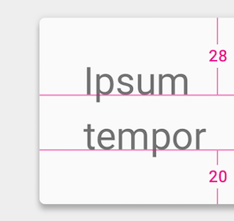
FontMetrics.top or FontMetrics.ascent was
already greater than firstBaselineToTopHeight, the top padding is not updated.
Moreover since this function sets the top padding, if the height of the TextView is less than
the sum of top padding, line height and bottom padding, top of the line will be pushed
down and bottom will be clipped.
Related XML Attributes:
| Parameters | |
|---|---|
firstBaselineToTopHeight |
int: distance between first baseline to top of the container
in pixels.
The units of this value are pixels. Value is 0 or greater |
setFocusedSearchResultHighlightColor
public void setFocusedSearchResultHighlightColor (int color)
Sets focused search result highlight color.
Related XML Attributes:
- android:searchResultHighlightColor
- android:searchResultHighlightColor
- android:focusedSearchResultHighlightColor
- android:focusedSearchResultHighlightColor
| Parameters | |
|---|---|
color |
int: a focused search result highlight color. |
setFocusedSearchResultIndex
public void setFocusedSearchResultIndex (int index)
Sets the focused search result index.
The focused search result is drawn in a focused color.
Calling FOCUSED_SEARCH_RESULT_INDEX_NONE for clearing focused search result.
This method must be called after setting search result ranges by
setSearchResultHighlights(int[]).
Related XML Attributes:
- android:searchResultHighlightColor
- android:searchResultHighlightColor
- android:focusedSearchResultHighlightColor
- android:focusedSearchResultHighlightColor
| Parameters | |
|---|---|
index |
int: a focused search index or FOCUSED_SEARCH_RESULT_INDEX_NONE |
setFontFeatureSettings
public void setFontFeatureSettings (String fontFeatureSettings)
Sets font feature settings. The format is the same as the CSS font-feature-settings attribute: https://www.w3.org/TR/css-fonts-3/#font-feature-settings-prop
Related XML Attributes:
| Parameters | |
|---|---|
fontFeatureSettings |
String: font feature settings represented as CSS compatible string.
This value may be null. |
setFontVariationSettings
public boolean setFontVariationSettings (String fontVariationSettings)
Sets TrueType or OpenType font variation settings. The settings string is constructed from multiple pairs of axis tag and style values. The axis tag must contain four ASCII characters and must be wrapped with single quotes (U+0027) or double quotes (U+0022). Axis strings that are longer or shorter than four characters, or contain characters outside of U+0020..U+007E are invalid. If a specified axis name is not defined in the font, the settings will be ignored.
Examples,
- Set font width to 150.
TextView textView = (TextView) findViewById(R.id.textView); textView.setFontVariationSettings("'wdth' 150"); - Set the font slant to 20 degrees and ask for italic style.
TextView textView = (TextView) findViewById(R.id.textView); textView.setFontVariationSettings("'slnt' 20, 'ital' 1");
Related XML Attributes:
| Parameters | |
|---|---|
fontVariationSettings |
String: font variation settings. You can pass null or empty string as
no variation settings. |
| Returns | |
|---|---|
boolean |
true if the given settings is effective to at least one font file underlying this TextView. This function also returns true for empty settings string. Otherwise returns false. |
| Throws | |
|---|---|
IllegalArgumentException |
If given string is not a valid font variation settings format. |
setFreezesText
public void setFreezesText (boolean freezesText)
Control whether this text view saves its entire text contents when
freezing to an icicle, in addition to dynamic state such as cursor
position. By default this is false, not saving the text. Set to true
if the text in the text view is not being saved somewhere else in
persistent storage (such as in a content provider) so that if the
view is later thawed the user will not lose their data. For
EditText it is always enabled, regardless of
the value of the attribute.
Related XML Attributes:
| Parameters | |
|---|---|
freezesText |
boolean: Controls whether a frozen icicle should include the
entire text data: true to include it, false to not. |
setGravity
public void setGravity (int gravity)
Sets the horizontal alignment of the text and the vertical gravity that will be used when there is extra space in the TextView beyond what is required for the text itself.
Related XML Attributes:
| Parameters | |
|---|---|
gravity |
int |
See also:
setHeight
public void setHeight (int pixels)
Sets the height of the TextView to be exactly pixels tall.
This value is used for height calculation if LayoutParams does not force TextView to have an
exact height. Setting this value overrides previous minimum/maximum height configurations
such as setMinHeight(int) or setMaxHeight(int).
Related XML Attributes:
| Parameters | |
|---|---|
pixels |
int: the exact height of the TextView in terms of pixels |
See also:
setHighlightColor
public void setHighlightColor (int color)
Sets the color used to display the selection highlight.
Related XML Attributes:
| Parameters | |
|---|---|
color |
int |
setHighlights
public void setHighlights (Highlights highlights)
Set Highlights
| Parameters | |
|---|---|
highlights |
Highlights: A highlight object. Call with null for reset. |
See also:
setHint
public final void setHint (CharSequence hint)
Sets the text to be displayed when the text of the TextView is empty. Null means to use the normal empty text. The hint does not currently participate in determining the size of the view.
Related XML Attributes:
| Parameters | |
|---|---|
hint |
CharSequence |
setHint
public final void setHint (int resid)
Sets the text to be displayed when the text of the TextView is empty, from a resource.
Related XML Attributes:
| Parameters | |
|---|---|
resid |
int |
setHintTextColor
public final void setHintTextColor (ColorStateList colors)
Sets the color of the hint text.
Related XML Attributes:
| Parameters | |
|---|---|
colors |
ColorStateList |
setHintTextColor
public final void setHintTextColor (int color)
Sets the color of the hint text for all the states (disabled, focussed, selected...) of this TextView.
Related XML Attributes:
| Parameters | |
|---|---|
color |
int |
setHorizontallyScrolling
public void setHorizontallyScrolling (boolean whether)
Sets whether the text should be allowed to be wider than the View is. If false, it will be wrapped to the width of the View.
Related XML Attributes:
| Parameters | |
|---|---|
whether |
boolean |
setHyphenationFrequency
public void setHyphenationFrequency (int hyphenationFrequency)
Sets the frequency of automatic hyphenation to use when determining word breaks.
The default value for both TextView and EditText is
Layout.HYPHENATION_FREQUENCY_NONE. Note that the default hyphenation frequency value
is set from the theme.
Layout.HYPHENATION_FREQUENCY_NORMAL or
Layout.HYPHENATION_FREQUENCY_FULL while line breaking is set to one of
Layout.BREAK_STRATEGY_BALANCED, Layout.BREAK_STRATEGY_HIGH_QUALITY
improves the structure of text layout however has performance impact and requires more time
to do the text layout.
Note: Before Android Q, in the theme hyphenation frequency is set to
Layout.HYPHENATION_FREQUENCY_NORMAL. The default value is changed into
Layout.HYPHENATION_FREQUENCY_NONE on Q.
Related XML Attributes:
| Parameters | |
|---|---|
hyphenationFrequency |
int: the hyphenation frequency to use, one of
Layout.HYPHENATION_FREQUENCY_NONE,
Layout.HYPHENATION_FREQUENCY_NORMAL,
Layout.HYPHENATION_FREQUENCY_FULL
Value is one of the following: |
setImeActionLabel
public void setImeActionLabel (CharSequence label, int actionId)
Change the custom IME action associated with the text view, which
will be reported to an IME with EditorInfo.actionLabel
and EditorInfo.actionId when it has focus.
Related XML Attributes:
| Parameters | |
|---|---|
label |
CharSequence |
actionId |
int |
setImeHintLocales
public void setImeHintLocales (LocaleList hintLocales)
Change "hint" locales associated with the text view, which will be reported to an IME with
EditorInfo.hintLocales when it has focus.
Starting with Android O, this also causes internationalized listeners to be created (or
change locale) based on the first locale in the input locale list.
Note: If you want new "hint" to take effect immediately you need to
call InputMethodManager.restartInput(View).
| Parameters | |
|---|---|
hintLocales |
LocaleList: List of the languages that the user is supposed to switch to no matter
what input method subtype is currently used. Set null to clear the current "hint". |
setImeOptions
public void setImeOptions (int imeOptions)
Change the editor type integer associated with the text view, which
is reported to an Input Method Editor (IME) with EditorInfo.imeOptions
when it has focus.
Related XML Attributes:
| Parameters | |
|---|---|
imeOptions |
int |
See also:
setIncludeFontPadding
public void setIncludeFontPadding (boolean includepad)
Set whether the TextView includes extra top and bottom padding to make room for accents that go above the normal ascent and descent. The default is true.
Related XML Attributes:
| Parameters | |
|---|---|
includepad |
boolean |
See also:
setInputExtras
public void setInputExtras (int xmlResId)
Set the extra input data of the text, which is the
TextBoxAttribute.extras
Bundle that will be filled in when creating an input connection. The
given integer is the resource identifier of an XML resource holding an
<input-extras> XML tree.
Related XML Attributes:
| Parameters | |
|---|---|
xmlResId |
int |
| Throws | |
|---|---|
IOException |
|
XmlPullParserException |
|
See also:
setInputType
public void setInputType (int type)
Set the type of the content with a constant as defined for EditorInfo.inputType. This
will take care of changing the key listener, by calling setKeyListener(KeyListener),
to match the given content type. If the given content type is EditorInfo.TYPE_NULL
then a soft keyboard will not be displayed for this text view.
Note that the maximum number of displayed lines (see setMaxLines(int)) will be
modified if you change the EditorInfo.TYPE_TEXT_FLAG_MULTI_LINE flag of the input
type.
Related XML Attributes:
| Parameters | |
|---|---|
type |
int |
setJustificationMode
public void setJustificationMode (int justificationMode)
Set justification mode. The default value is Layout.JUSTIFICATION_MODE_NONE. If the
last line is too short for justification, the last line will be displayed with the
alignment set by View.setTextAlignment(int).
| Parameters | |
|---|---|
justificationMode |
int: Value is one of the following:
|
| Returns | |
|---|---|
void |
Value is one of the following: |
See also:
setKeyListener
public void setKeyListener (KeyListener input)
Sets the key listener to be used with this TextView. This can be null
to disallow user input. Note that this method has significant and
subtle interactions with soft keyboards and other input method:
see KeyListener.getInputType()
for important details. Calling this method will replace the current
content type of the text view with the content type returned by the
key listener.
Be warned that if you want a TextView with a key listener or movement
method not to be focusable, or if you want a TextView without a
key listener or movement method to be focusable, you must call
View.setFocusable(boolean) again after calling this to get the focusability
back the way you want it.
Related XML Attributes:
- android:numeric
- android:digits
- android:phoneNumber
- android:inputMethod
- android:capitalize
- android:autoText
| Parameters | |
|---|---|
input |
KeyListener |
setLastBaselineToBottomHeight
public void setLastBaselineToBottomHeight (int lastBaselineToBottomHeight)
Updates the bottom padding of the TextView so that lastBaselineToBottomHeight is
the distance between the bottom of the TextView and the last line's baseline.
FontMetrics.bottom or FontMetrics.descent was
already greater than lastBaselineToBottomHeight, the bottom padding is not updated.
Moreover since this function sets the bottom padding, if the height of the TextView is less
than the sum of top padding, line height and bottom padding, bottom of the text will be
clipped.
Related XML Attributes:
| Parameters | |
|---|---|
lastBaselineToBottomHeight |
int: distance between last baseline to bottom of the container
in pixels.
The units of this value are pixels. Value is 0 or greater |
setLetterSpacing
public void setLetterSpacing (float letterSpacing)
Sets text letter-spacing in em units. Typical values for slight expansion will be around 0.05. Negative values tighten text.
Related XML Attributes:
| Parameters | |
|---|---|
letterSpacing |
float: A text letter-space value in ems. |
See also:
setLineBreakStyle
public void setLineBreakStyle (int lineBreakStyle)
Sets the line-break style for text wrapping.
Line-break style specifies the line-break strategies that can be used for text wrapping. The line-break style affects rule-based line breaking by specifying the strictness of line-breaking rules.
The following are types of line-break styles:
LineBreakConfig.LINE_BREAK_STYLE_LOOSELineBreakConfig.LINE_BREAK_STYLE_NORMALLineBreakConfig.LINE_BREAK_STYLE_STRICT
The default line-break style is
LineBreakConfig.LINE_BREAK_STYLE_NONE, which specifies that no
line-breaking rules are used.
See the line-break property for more information.
| Parameters | |
|---|---|
lineBreakStyle |
int: The line-break style for the text.
Value is one of the following: |
setLineBreakWordStyle
public void setLineBreakWordStyle (int lineBreakWordStyle)
Sets the line-break word style for text wrapping.
The line-break word style affects dictionary-based line breaking by
providing phrase-based line-breaking opportunities. Use
LineBreakConfig.LINE_BREAK_WORD_STYLE_PHRASE to specify
phrase-based line breaking.
The default line-break word style is
LineBreakConfig.LINE_BREAK_WORD_STYLE_NONE, which specifies that
no line-breaking word style is used.
See the word-break property for more information.
| Parameters | |
|---|---|
lineBreakWordStyle |
int: The line-break word style for the text.
Value is one of the following: |
setLineHeight
public void setLineHeight (int unit,
float lineHeight)Sets an explicit line height to a given unit and value for this TextView. This is equivalent
to the vertical distance between subsequent baselines in the TextView. See TypedValue for the possible dimension units.
Related XML Attributes:
| Parameters | |
|---|---|
unit |
int: The desired dimension unit. SP units are strongly recommended so that line height
stays proportional to the text size when fonts are scaled up for accessibility.
Value is one of the following: |
lineHeight |
float: The desired line height in the given units.
Value is 0.0f or greater |
setLineHeight
public void setLineHeight (int lineHeight)
Sets an explicit line height for this TextView. This is equivalent to the vertical distance between subsequent baselines in the TextView.
Related XML Attributes:
| Parameters | |
|---|---|
lineHeight |
int: the line height in pixels.
The units of this value are pixels. Value is 0 or greater |
setLineSpacing
public void setLineSpacing (float add,
float mult)Sets line spacing for this TextView. Each line other than the last line will have its height
multiplied by mult and have add added to it.
Related XML Attributes:
| Parameters | |
|---|---|
add |
float: The value in pixels that should be added to each line other than the last line.
This will be applied after the multiplier |
mult |
float: The value by which each line height other than the last line will be multiplied
by |
setLines
public void setLines (int lines)
Sets the height of the TextView to be exactly lines tall.
This value is used for height calculation if LayoutParams does not force TextView to have an
exact height. Setting this value overrides previous minimum/maximum height configurations
such as setMinLines(int) or setMaxLines(int). setSingleLine() will
set this value to 1.
Related XML Attributes:
| Parameters | |
|---|---|
lines |
int: the exact height of the TextView in terms of lines |
See also:
setLinkTextColor
public final void setLinkTextColor (ColorStateList colors)
Sets the color of links in the text.
Related XML Attributes:
| Parameters | |
|---|---|
colors |
ColorStateList |
setLinkTextColor
public final void setLinkTextColor (int color)
Sets the color of links in the text.
Related XML Attributes:
| Parameters | |
|---|---|
color |
int |
setLinksClickable
public final void setLinksClickable (boolean whether)
Sets whether the movement method will automatically be set to
LinkMovementMethod if setAutoLinkMask(int) has been
set to nonzero and links are detected in setText(char, int, int).
The default is true.
Related XML Attributes:
| Parameters | |
|---|---|
whether |
boolean |
setLocalePreferredLineHeightForMinimumUsed
public void setLocalePreferredLineHeightForMinimumUsed (boolean flag)
Set true if the locale preferred line height is used for the minimum line height.
By setting this flag to true is equivalenet to call
setMinimumFontMetrics(Paint.FontMetrics) with the one obtained by
Paint.getFontMetricsForLocale(Paint.FontMetrics).
If custom minimum line height was specified by
setMinimumFontMetrics(Paint.FontMetrics), this flag will be ignored.
| Parameters | |
|---|---|
flag |
boolean: true for using locale preferred line height for the minimum line height. |
setMarqueeRepeatLimit
public void setMarqueeRepeatLimit (int marqueeLimit)
Sets how many times to repeat the marquee animation. Only applied if the TextView has marquee enabled. Set to -1 to repeat indefinitely.
Related XML Attributes:
| Parameters | |
|---|---|
marqueeLimit |
int |
See also:
setMaxEms
public void setMaxEms (int maxEms)
Sets the width of the TextView to be at most maxEms wide.
This value is used for width calculation if LayoutParams does not force TextView to have an
exact width. Setting this value overrides previous maximum width configurations such as
setMaxWidth(int) or setWidth(int).
Related XML Attributes:
| Parameters | |
|---|---|
maxEms |
int: the maximum width of TextView in terms of ems |
See also:
setMaxHeight
public void setMaxHeight (int maxPixels)
Sets the height of the TextView to be at most maxPixels tall.
This value is used for height calculation if LayoutParams does not force TextView to have an
exact height. Setting this value overrides previous maximum height configurations such as
setMaxLines(int) or setLines(int).
Related XML Attributes:
| Parameters | |
|---|---|
maxPixels |
int: the maximum height of TextView in terms of pixels |
See also:
setMaxLines
public void setMaxLines (int maxLines)
Sets the height of the TextView to be at most maxLines tall.
This value is used for height calculation if LayoutParams does not force TextView to have an
exact height. Setting this value overrides previous maximum height configurations such as
setMaxHeight(int) or setLines(int).
Related XML Attributes:
| Parameters | |
|---|---|
maxLines |
int: the maximum height of TextView in terms of number of lines |
See also:
setMaxWidth
public void setMaxWidth (int maxPixels)
Sets the width of the TextView to be at most maxPixels wide.
This value is used for width calculation if LayoutParams does not force TextView to have an
exact width. Setting this value overrides previous maximum width configurations such as
setMaxEms(int) or setEms(int).
Related XML Attributes:
| Parameters | |
|---|---|
maxPixels |
int: the maximum width of TextView in terms of pixels |
See also:
setMinEms
public void setMinEms (int minEms)
Sets the width of the TextView to be at least minEms wide.
This value is used for width calculation if LayoutParams does not force TextView to have an
exact width. Setting this value overrides previous minimum width configurations such as
setMinWidth(int) or setWidth(int).
Related XML Attributes:
| Parameters | |
|---|---|
minEms |
int: the minimum width of TextView in terms of ems |
See also:
setMinHeight
public void setMinHeight (int minPixels)
Sets the height of the TextView to be at least minPixels tall.
This value is used for height calculation if LayoutParams does not force TextView to have an
exact height. Setting this value overrides previous minimum height configurations such as
setMinLines(int) or setLines(int).
The value given here is different than View.setMinimumHeight(int). Between
minHeight and the value set in View.setMinimumHeight(int), the greater one is
used to decide the final height.
Related XML Attributes:
| Parameters | |
|---|---|
minPixels |
int: the minimum height of TextView in terms of pixels |
See also:
setMinLines
public void setMinLines (int minLines)
Sets the height of the TextView to be at least minLines tall.
This value is used for height calculation if LayoutParams does not force TextView to have an
exact height. Setting this value overrides other previous minimum height configurations such
as setMinHeight(int) or setHeight(int). setSingleLine() will set
this value to 1.
Related XML Attributes:
| Parameters | |
|---|---|
minLines |
int: the minimum height of TextView in terms of number of lines |
See also:
setMinWidth
public void setMinWidth (int minPixels)
Sets the width of the TextView to be at least minPixels wide.
This value is used for width calculation if LayoutParams does not force TextView to have an
exact width. Setting this value overrides previous minimum width configurations such as
setMinEms(int) or setEms(int).
The value given here is different than View.setMinimumWidth(int). Between
minWidth and the value set in View.setMinimumWidth(int), the greater one is used
to decide the final width.
Related XML Attributes:
| Parameters | |
|---|---|
minPixels |
int: the minimum width of TextView in terms of pixels |
See also:
setMinimumFontMetrics
public void setMinimumFontMetrics (Paint.FontMetrics minimumFontMetrics)
Set the minimum font metrics used for line spacing.
null is the default value. If null is set or left as default, the font
metrics obtained by Paint.getFontMetricsForLocale(Paint.FontMetrics) is used.
The minimum meaning here is the minimum value of line spacing: maximum value of
Paint.ascent(), minimum value of Paint.descent().
By setting this value, each line will have minimum line spacing regardless of the text
rendered. For example, usually Japanese script has larger vertical metrics than Latin script.
By setting the metrics obtained by Paint.getFontMetricsForLocale(Paint.FontMetrics)
for Japanese or leave it null if the TextView's locale or system locale is Japanese,
the line spacing for Japanese is reserved if the TextView contains English text. If the
vertical metrics of the text is larger than Japanese, for example Burmese, the bigger font
metrics is used.
| Parameters | |
|---|---|
minimumFontMetrics |
Paint.FontMetrics: A minimum font metrics. Passing null for using the value
obtained by
Paint.getFontMetricsForLocale(Paint.FontMetrics) |
setMovementMethod
public final void setMovementMethod (MovementMethod movement)
Sets the MovementMethod for handling arrow key movement
for this TextView. This can be null to disallow using the arrow keys to move the
cursor or scroll the view.
Be warned that if you want a TextView with a key listener or movement
method not to be focusable, or if you want a TextView without a
key listener or movement method to be focusable, you must call
View.setFocusable(boolean) again after calling this to get the focusability
back the way you want it.
| Parameters | |
|---|---|
movement |
MovementMethod |
setOnEditorActionListener
public void setOnEditorActionListener (TextView.OnEditorActionListener l)
Set a special listener to be called when an action is performed on the text view. This will be called when the enter key is pressed, or when an action supplied to the IME is selected by the user. Setting this means that the normal hard key event will not insert a newline into the text view, even if it is multi-line; holding down the ALT modifier will, however, allow the user to insert a newline character.
| Parameters | |
|---|---|
l |
TextView.OnEditorActionListener |
setPadding
public void setPadding (int left,
int top,
int right,
int bottom)Sets the padding. The view may add on the space required to display
the scrollbars, depending on the style and visibility of the scrollbars.
So the values returned from getPaddingLeft(), getPaddingTop(),
getPaddingRight() and getPaddingBottom() may be different
from the values set in this call.
| Parameters | |
|---|---|
left |
int: the left padding in pixels |
top |
int: the top padding in pixels |
right |
int: the right padding in pixels |
bottom |
int: the bottom padding in pixels |
setPaddingRelative
public void setPaddingRelative (int start,
int top,
int end,
int bottom)Sets the relative padding. The view may add on the space required to display
the scrollbars, depending on the style and visibility of the scrollbars.
So the values returned from getPaddingStart(), getPaddingTop(),
getPaddingEnd() and getPaddingBottom() may be different
from the values set in this call.
| Parameters | |
|---|---|
start |
int: the start padding in pixels |
top |
int: the top padding in pixels |
end |
int: the end padding in pixels |
bottom |
int: the bottom padding in pixels |
setPaintFlags
public void setPaintFlags (int flags)
Sets flags on the Paint being used to display the text and reflows the text if they are different from the old flags.
| Parameters | |
|---|---|
flags |
int |
See also:
setPrivateImeOptions
public void setPrivateImeOptions (String type)
Set the private content type of the text, which is the
EditorInfo.privateImeOptions
field that will be filled in when creating an input connection.
Related XML Attributes:
| Parameters | |
|---|---|
type |
String |
setRawInputType
public void setRawInputType (int type)
Directly change the content type integer of the text view, without modifying any other state.
Related XML Attributes:
| Parameters | |
|---|---|
type |
int |
See also:
setScroller
public void setScroller (Scroller s)
Sets the Scroller used for producing a scrolling animation
| Parameters | |
|---|---|
s |
Scroller: A Scroller instance |
setSearchResultHighlightColor
public void setSearchResultHighlightColor (int color)
Sets the search result highlight color.
Related XML Attributes:
- android:searchResultHighlightColor
- android:searchResultHighlightColor
- android:focusedSearchResultHighlightColor
- android:focusedSearchResultHighlightColor
| Parameters | |
|---|---|
color |
int: a search result highlight color. |
setSearchResultHighlights
public void setSearchResultHighlights (int... ranges)
Sets the search result ranges with flatten range representation.
Ranges are represented of flattened inclusive start and exclusive end integers array. The
inclusive start offset of the i-th range is stored in 2 * i-th of the array.
The exclusive end offset of the i-th range is stored in 2* i + 1-th of the
array. For example, the two ranges: (1, 2) and (3, 4) are flattened into single int array
[1, 2, 3, 4].
TextView will render the search result with the highlights with specified color in the theme.
If there is a focused search result, it is rendered with focused color. By calling this
method, the focused search index will be cleared.
Related XML Attributes:
- android:searchResultHighlightColor
- android:searchResultHighlightColor
- android:focusedSearchResultHighlightColor
- android:focusedSearchResultHighlightColor
| Parameters | |
|---|---|
ranges |
int: the flatten ranges of the search result. null for clear. |
setSelectAllOnFocus
public void setSelectAllOnFocus (boolean selectAllOnFocus)
Set the TextView so that when it takes focus, all the text is selected.
Related XML Attributes:
| Parameters | |
|---|---|
selectAllOnFocus |
boolean |
setSelected
public void setSelected (boolean selected)
Changes the selection state of this view. A view can be selected or not. Note that selection is not the same as focus. Views are typically selected in the context of an AdapterView like ListView or GridView; the selected view is the view that is highlighted.
| Parameters | |
|---|---|
selected |
boolean: true if the view must be selected, false otherwise |
setShadowLayer
public void setShadowLayer (float radius,
float dx,
float dy,
int color)Gives the text a shadow of the specified blur radius and color, the specified distance from its drawn position.
The text shadow produced does not interact with the properties on view
that are responsible for real time shadows,
elevation and
translationZ.
Related XML Attributes:
| Parameters | |
|---|---|
radius |
float |
dx |
float |
dy |
float |
color |
int |
setShiftDrawingOffsetForStartOverhang
public void setShiftDrawingOffsetForStartOverhang (boolean shiftDrawingOffsetForStartOverhang)
Set true for shifting the drawing x offset for showing overhang at the start position.
This flag is ignored if the getUseBoundsForWidth() is false.
If this value is false, the TextView draws text from the zero even if there is a glyph stroke
in a region where the x coordinate is negative. TextView clips the stroke in the region where
the X coordinate is negative unless the parents has ViewGroup.getClipChildren() to
true. This is useful for aligning multiple TextViews vertically.
If this value is true, the TextView draws text with shifting the x coordinate of the drawing
bounding box. This prevents the clipping even if the parents doesn't have
ViewGroup.getClipChildren() to true.
This value is false by default.
| Parameters | |
|---|---|
shiftDrawingOffsetForStartOverhang |
boolean: true for shifting the drawing offset for showing
the stroke that is in the region whre the x
coorinate is negative. |
setShowSoftInputOnFocus
public final void setShowSoftInputOnFocus (boolean show)
Sets whether the soft input method will be made visible when this TextView gets focused. The default is true.
| Parameters | |
|---|---|
show |
boolean |
setSingleLine
public void setSingleLine (boolean singleLine)
If true, sets the properties of this field (number of lines, horizontally scrolling, transformation method) to be for a single-line input; if false, restores these to the default conditions. Note that the default conditions are not necessarily those that were in effect prior this method, and you may want to reset these properties to your custom values. Note that due to performance reasons, by setting single line for the EditText, the maximum text length is set to 5000 if no other character limitation are applied.
Related XML Attributes:
| Parameters | |
|---|---|
singleLine |
boolean |
setSingleLine
public void setSingleLine ()
Sets the properties of this field (lines, horizontally scrolling, transformation method) to be for a single-line input.
Related XML Attributes:
setSpannableFactory
public final void setSpannableFactory (Spannable.Factory factory)
Sets the Factory used to create new Spannables.
| Parameters | |
|---|---|
factory |
Spannable.Factory: Spannable.Factory to be used |
setText
public final void setText (int resid)
Sets the text to be displayed using a string resource identifier.
Related XML Attributes:
| Parameters | |
|---|---|
resid |
int: the resource identifier of the string resource to be displayed |
See also:
setText
public final void setText (CharSequence text)
Sets the text to be displayed. TextView does not accept
HTML-like formatting, which you can do with text strings in XML resource files.
To style your strings, attach android.text.style.* objects to a
SpannableString, or see the
Available Resource Types documentation for an example of setting
formatted text in the XML resource file.
Spannable.Factory to create final or
intermediate Spannables. Likewise it will use
Editable.Factory to create final or intermediate
Editables.
If the passed text is a PrecomputedText but the parameters used to create the
PrecomputedText mismatches with this TextView, IllegalArgumentException is thrown. To ensure
the parameters match, you can call TextView.setTextMetricsParams before calling this.
Related XML Attributes:
| Parameters | |
|---|---|
text |
CharSequence: text to be displayed |
| Throws | |
|---|---|
IllegalArgumentException |
if the passed text is a PrecomputedText but the
parameters used to create the PrecomputedText mismatches
with this TextView. |
setText
public void setText (CharSequence text, TextView.BufferType type)
Sets the text to be displayed and the TextView.BufferType.
Spannable.Factory to create final or
intermediate Spannables. Likewise it will use
Editable.Factory to create final or intermediate
Editables.
Subclasses overriding this method should ensure that the following post condition holds,
in order to guarantee the safety of the view's measurement and layout operations:
regardless of the input, after calling #setText both mText and mTransformed
will be different from null.
Related XML Attributes:
| Parameters | |
|---|---|
text |
CharSequence: text to be displayed |
type |
TextView.BufferType: a TextView.BufferType which defines whether the text is
stored as a static text, styleable/spannable text, or editable text |
setText
public final void setText (int resid,
TextView.BufferType type)Sets the text to be displayed using a string resource identifier and the
TextView.BufferType.
Spannable.Factory to create final or
intermediate Spannables. Likewise it will use
Editable.Factory to create final or intermediate
Editables.
Related XML Attributes:
| Parameters | |
|---|---|
resid |
int: the resource identifier of the string resource to be displayed |
type |
TextView.BufferType: a TextView.BufferType which defines whether the text is
stored as a static text, styleable/spannable text, or editable text |
setText
public final void setText (char[] text,
int start,
int len)Sets the TextView to display the specified slice of the specified char array. You must promise that you will not change the contents of the array except for right before another call to setText(), since the TextView has no way to know that the text has changed and that it needs to invalidate and re-layout.
| Parameters | |
|---|---|
text |
char: char array to be displayed.
This value cannot be null. |
start |
int: start index in the char array |
len |
int: length of char count after start |
| Throws | |
|---|---|
IndexOutOfBoundsException |
if start or start+len are not in 0 to text.length |
NullPointerException |
if text is null |
setTextAppearance
public void setTextAppearance (Context context, int resId)
This method was deprecated
in API level 23.
Use setTextAppearance(int) instead.
Sets the text color, size, style, hint color, and highlight color from the specified TextAppearance resource.
| Parameters | |
|---|---|
context |
Context |
resId |
int |
setTextAppearance
public void setTextAppearance (int resId)
Sets the text appearance from the specified style resource.
Use a framework-defined TextAppearance style like
@android:style/TextAppearance.Material.Body1
or see TextAppearance for the
set of attributes that can be used in a custom style.
Related XML Attributes:
| Parameters | |
|---|---|
resId |
int: the resource identifier of the style to apply |
setTextClassifier
public void setTextClassifier (TextClassifier textClassifier)
Sets the TextClassifier for this TextView.
| Parameters | |
|---|---|
textClassifier |
TextClassifier: This value may be null. |
setTextColor
public void setTextColor (int color)
Sets the text color for all the states (normal, selected, focused) to be this color.
Related XML Attributes:
| Parameters | |
|---|---|
color |
int: A color value in the form 0xAARRGGBB.
Do not pass a resource ID. To get a color value from a resource ID, call
getColor. |
setTextColor
public void setTextColor (ColorStateList colors)
Sets the text color.
Related XML Attributes:
| Parameters | |
|---|---|
colors |
ColorStateList |
setTextCursorDrawable
public void setTextCursorDrawable (Drawable textCursorDrawable)
Sets the Drawable corresponding to the text cursor. The Drawable defaults to the value of the textCursorDrawable attribute. Note that any change applied to the cursor Drawable will not be visible until the cursor is hidden and then drawn again.
Related XML Attributes:
| Parameters | |
|---|---|
textCursorDrawable |
Drawable: This value may be null. |
See also:
setTextCursorDrawable
public void setTextCursorDrawable (int textCursorDrawable)
Sets the Drawable corresponding to the text cursor. The Drawable defaults to the value of the textCursorDrawable attribute. Note that any change applied to the cursor Drawable will not be visible until the cursor is hidden and then drawn again.
Related XML Attributes:
| Parameters | |
|---|---|
textCursorDrawable |
int |
See also:
setTextIsSelectable
public void setTextIsSelectable (boolean selectable)
Sets whether the content of this view is selectable by the user. The default is
false, meaning that the content is not selectable.
When you use a TextView to display a useful piece of information to the user (such as a
contact's address), make it selectable, so that the user can select and copy its
content. You can also use set the XML attribute
R.styleable.TextView_textIsSelectable to "true".
When you call this method to set the value of textIsSelectable, it sets
the flags focusable, focusableInTouchMode, clickable,
and longClickable to the same value. These flags correspond to the attributes
android:focusable,
android:focusableInTouchMode,
android:clickable, and
android:longClickable. To restore any of these
flags to a state you had set previously, call one or more of the following methods:
setFocusable(),
setFocusableInTouchMode(),
setClickable() or
setLongClickable().
| Parameters | |
|---|---|
selectable |
boolean: Whether the content of this TextView should be selectable. |
setTextKeepState
public final void setTextKeepState (CharSequence text)
Sets the text to be displayed but retains the cursor position. Same as
setText(CharSequence) except that the cursor position (if any) is retained in the
new text.
Spannable.Factory to create final or
intermediate Spannables. Likewise it will use
Editable.Factory to create final or intermediate
Editables.
| Parameters | |
|---|---|
text |
CharSequence: text to be displayed |
See also:
setTextKeepState
public final void setTextKeepState (CharSequence text, TextView.BufferType type)
Sets the text to be displayed and the TextView.BufferType but retains
the cursor position. Same as
setText(CharSequence,android.widget.TextView.BufferType) except that the cursor
position (if any) is retained in the new text.
Spannable.Factory to create final or
intermediate Spannables. Likewise it will use
Editable.Factory to create final or intermediate
Editables.
| Parameters | |
|---|---|
text |
CharSequence: text to be displayed |
type |
TextView.BufferType: a TextView.BufferType which defines whether the text is
stored as a static text, styleable/spannable text, or editable text |
setTextLocale
public void setTextLocale (Locale locale)
Set the default Locale of the text in this TextView to a one-member
LocaleList containing just the given Locale.
| Parameters | |
|---|---|
locale |
Locale: the Locale for drawing text, must not be null. |
See also:
setTextLocales
public void setTextLocales (LocaleList locales)
Set the default LocaleList of the text in this TextView to the given value.
This value is used to choose appropriate typefaces for ambiguous characters (typically used
for CJK locales to disambiguate Hanzi/Kanji/Hanja characters). It also affects
other aspects of text display, including line breaking.
| Parameters | |
|---|---|
locales |
LocaleList: the LocaleList for drawing text, must not be null or empty. |
See also:
setTextMetricsParams
public void setTextMetricsParams (PrecomputedText.Params params)
Apply the text layout parameter.
Update the TextView parameters to be compatible with PrecomputedText.Params.
| Parameters | |
|---|---|
params |
PrecomputedText.Params: This value cannot be null. |
See also:
setTextScaleX
public void setTextScaleX (float size)
Sets the horizontal scale factor for text. The default value is 1.0. Values greater than 1.0 stretch the text wider. Values less than 1.0 make the text narrower. By default, this value is 1.0.
Related XML Attributes:
| Parameters | |
|---|---|
size |
float: The horizontal scale factor. |
setTextSelectHandle
public void setTextSelectHandle (int textSelectHandle)
Sets the Drawable corresponding to the selection handle used for positioning the cursor within text. The Drawable defaults to the value of the textSelectHandle attribute. Note that any change applied to the handle Drawable will not be visible until the handle is hidden and then drawn again.
Related XML Attributes:
| Parameters | |
|---|---|
textSelectHandle |
int |
See also:
setTextSelectHandle
public void setTextSelectHandle (Drawable textSelectHandle)
Sets the Drawable corresponding to the selection handle used for positioning the cursor within text. The Drawable defaults to the value of the textSelectHandle attribute. Note that any change applied to the handle Drawable will not be visible until the handle is hidden and then drawn again.
Related XML Attributes:
| Parameters | |
|---|---|
textSelectHandle |
Drawable: This value cannot be null. |
See also:
setTextSelectHandleLeft
public void setTextSelectHandleLeft (int textSelectHandleLeft)
Sets the Drawable corresponding to the left handle used for selecting text. The Drawable defaults to the value of the textSelectHandleLeft attribute. Note that any change applied to the handle Drawable will not be visible until the handle is hidden and then drawn again.
Related XML Attributes:
| Parameters | |
|---|---|
textSelectHandleLeft |
int |
See also:
setTextSelectHandleLeft
public void setTextSelectHandleLeft (Drawable textSelectHandleLeft)
Sets the Drawable corresponding to the left handle used for selecting text. The Drawable defaults to the value of the textSelectHandleLeft attribute. Note that any change applied to the handle Drawable will not be visible until the handle is hidden and then drawn again.
Related XML Attributes:
| Parameters | |
|---|---|
textSelectHandleLeft |
Drawable: This value cannot be null. |
See also:
setTextSelectHandleRight
public void setTextSelectHandleRight (Drawable textSelectHandleRight)
Sets the Drawable corresponding to the right handle used for selecting text. The Drawable defaults to the value of the textSelectHandleRight attribute. Note that any change applied to the handle Drawable will not be visible until the handle is hidden and then drawn again.
Related XML Attributes:
| Parameters | |
|---|---|
textSelectHandleRight |
Drawable: This value cannot be null. |
See also:
setTextSelectHandleRight
public void setTextSelectHandleRight (int textSelectHandleRight)
Sets the Drawable corresponding to the right handle used for selecting text. The Drawable defaults to the value of the textSelectHandleRight attribute. Note that any change applied to the handle Drawable will not be visible until the handle is hidden and then drawn again.
Related XML Attributes:
| Parameters | |
|---|---|
textSelectHandleRight |
int |
See also:
setTextSize
public void setTextSize (int unit,
float size)Set the default text size to a given unit and value. See TypedValue for the possible dimension units.
Note: if this TextView has the auto-size feature enabled, then this function is no-op.
Related XML Attributes:
| Parameters | |
|---|---|
unit |
int: The desired dimension unit. |
size |
float: The desired size in the given units. |
setTextSize
public void setTextSize (float size)
Set the default text size to the given value, interpreted as "scaled pixel" units. This size is adjusted based on the current density and user font size preference.
Note: if this TextView has the auto-size feature enabled, then this function is no-op.
Related XML Attributes:
| Parameters | |
|---|---|
size |
float: The scaled pixel size. |
setTransformationMethod
public final void setTransformationMethod (TransformationMethod method)
Sets the transformation that is applied to the text that this TextView is displaying.
Related XML Attributes:
| Parameters | |
|---|---|
method |
TransformationMethod |
setTypeface
public void setTypeface (Typeface tf)
Sets the typeface and style in which the text should be displayed.
Note that not all Typeface families actually have bold and italic
variants, so you may need to use
setTypeface(Typeface,int) to get the appearance
that you actually want.
Related XML Attributes:
| Parameters | |
|---|---|
tf |
Typeface: This value may be null. |
See also:
setTypeface
public void setTypeface (Typeface tf, int style)
Sets the typeface and style in which the text should be displayed, and turns on the fake bold and italic bits in the Paint if the Typeface that you provided does not have all the bits in the style that you specified.
Related XML Attributes:
| Parameters | |
|---|---|
tf |
Typeface: This value may be null. |
style |
int: Value is one of the following:
|
setUseBoundsForWidth
public void setUseBoundsForWidth (boolean useBoundsForWidth)
Set true for using width of bounding box as a source of automatic line breaking and drawing. If this value is false, the TextView determines the View width, drawing offset and automatic line breaking based on total advances as text widths. By setting true, use glyph bound's as a source of text width. If the font used for this TextView has glyphs that has negative bearing X or glyph xMax is greater than advance, the glyph clipping can be happened because the drawing area may be bigger than advance. By setting this to true, the TextView will reserve more spaces for drawing are, so clipping can be prevented. This value is true by default if the target API version is 35 or later.
| Parameters | |
|---|---|
useBoundsForWidth |
boolean: true for using bounding box for width. false for using advances for
width. |
setWidth
public void setWidth (int pixels)
Sets the width of the TextView to be exactly pixels wide.
This value is used for width calculation if LayoutParams does not force TextView to have an
exact width. Setting this value overrides previous minimum/maximum width configurations
such as setMinWidth(int) or setMaxWidth(int).
Related XML Attributes:
| Parameters | |
|---|---|
pixels |
int: the exact width of the TextView in terms of pixels |
See also:
showContextMenu
public boolean showContextMenu ()
Shows the context menu for this view.
| Returns | |
|---|---|
boolean |
true if the context menu was shown, false
otherwise |
showContextMenu
public boolean showContextMenu (float x,
float y)Shows the context menu for this view anchored to the specified view-relative coordinate.
| Parameters | |
|---|---|
x |
float: the X coordinate in pixels relative to the view to which the
menu should be anchored, or Float.NaN to disable anchoring |
y |
float: the Y coordinate in pixels relative to the view to which the
menu should be anchored, or Float.NaN to disable anchoring |
| Returns | |
|---|---|
boolean |
true if the context menu was shown, false
otherwise |
Protected methods
computeHorizontalScrollRange
protected int computeHorizontalScrollRange ()
Compute the horizontal range that the horizontal scrollbar represents.
The range is expressed in arbitrary units that must be the same as the
units used by computeHorizontalScrollExtent() and
computeHorizontalScrollOffset().
The default range is the drawing width of this view.
| Returns | |
|---|---|
int |
the total horizontal range represented by the horizontal scrollbar |
computeVerticalScrollExtent
protected int computeVerticalScrollExtent ()
Compute the vertical extent of the vertical scrollbar's thumb within the vertical range. This value is used to compute the length of the thumb within the scrollbar's track.
The range is expressed in arbitrary units that must be the same as the
units used by computeVerticalScrollRange() and
computeVerticalScrollOffset().
The default extent is the drawing height of this view.
| Returns | |
|---|---|
int |
the vertical extent of the scrollbar's thumb |
computeVerticalScrollRange
protected int computeVerticalScrollRange ()
Compute the vertical range that the vertical scrollbar represents.
The range is expressed in arbitrary units that must be the same as the
units used by computeVerticalScrollExtent() and
computeVerticalScrollOffset().
| Returns | |
|---|---|
int |
the total vertical range represented by the vertical scrollbar
The default range is the drawing height of this view. |
drawableStateChanged
protected void drawableStateChanged ()
This function is called whenever the state of the view changes in such a way that it impacts the state of drawables being shown.
If the View has a StateListAnimator, it will also be called to run necessary state change animations.
Be sure to call through to the superclass when overriding this function.
If you override this method you must call through to the
superclass implementation.
getBottomPaddingOffset
protected int getBottomPaddingOffset ()
Amount by which to extend the bottom fading region. Called only when
isPaddingOffsetRequired() returns true.
| Returns | |
|---|---|
int |
The bottom padding offset in pixels. |
getDefaultEditable
protected boolean getDefaultEditable ()
Subclasses override this to specify that they have a KeyListener by default even if not specifically called for in the XML options.
| Returns | |
|---|---|
boolean |
|
getDefaultMovementMethod
protected MovementMethod getDefaultMovementMethod ()
Subclasses override this to specify a default movement method.
| Returns | |
|---|---|
MovementMethod |
|
getLeftFadingEdgeStrength
protected float getLeftFadingEdgeStrength ()
Returns the strength, or intensity, of the left faded edge. The strength is a value between 0.0 (no fade) and 1.0 (full fade). The default implementation returns 0.0 or 1.0 but no value in between. Subclasses should override this method to provide a smoother fade transition when scrolling occurs.
| Returns | |
|---|---|
float |
the intensity of the left fade as a float between 0.0f and 1.0f |
getLeftPaddingOffset
protected int getLeftPaddingOffset ()
Amount by which to extend the left fading region. Called only when
isPaddingOffsetRequired() returns true.
| Returns | |
|---|---|
int |
The left padding offset in pixels. |
getRightFadingEdgeStrength
protected float getRightFadingEdgeStrength ()
Returns the strength, or intensity, of the right faded edge. The strength is a value between 0.0 (no fade) and 1.0 (full fade). The default implementation returns 0.0 or 1.0 but no value in between. Subclasses should override this method to provide a smoother fade transition when scrolling occurs.
| Returns | |
|---|---|
float |
the intensity of the right fade as a float between 0.0f and 1.0f |
getRightPaddingOffset
protected int getRightPaddingOffset ()
Amount by which to extend the right fading region. Called only when
isPaddingOffsetRequired() returns true.
| Returns | |
|---|---|
int |
The right padding offset in pixels. |
getTopPaddingOffset
protected int getTopPaddingOffset ()
Amount by which to extend the top fading region. Called only when
isPaddingOffsetRequired() returns true.
| Returns | |
|---|---|
int |
The top padding offset in pixels. |
isPaddingOffsetRequired
protected boolean isPaddingOffsetRequired ()
If the View draws content inside its padding and enables fading edges, it needs to support padding offsets. Padding offsets are added to the fading edges to extend the length of the fade so that it covers pixels drawn inside the padding. Subclasses of this class should override this method if they need to draw content inside the padding.
| Returns | |
|---|---|
boolean |
True if padding offset must be applied, false otherwise. |
onAttachedToWindow
protected void onAttachedToWindow ()
This is called when the view is attached to a window. At this point it
has a Surface and will start drawing. Note that this function is
guaranteed to be called before onDraw(android.graphics.Canvas),
however it may be called any time before the first onDraw -- including
before or after onMeasure(int, int).
If you override this method you must call through to the
superclass implementation.
onConfigurationChanged
protected void onConfigurationChanged (Configuration newConfig)
Called when the current configuration of the resources being used
by the application have changed. You can use this to decide when
to reload resources that can changed based on orientation and other
configuration characteristics. You only need to use this if you are
not relying on the normal Activity mechanism of
recreating the activity instance upon a configuration change.
| Parameters | |
|---|---|
newConfig |
Configuration: The new resource configuration. |
onCreateContextMenu
protected void onCreateContextMenu (ContextMenu menu)
Views should implement this if the view itself is going to add items to the context menu.
| Parameters | |
|---|---|
menu |
ContextMenu: the context menu to populate |
onCreateDrawableState
protected int[] onCreateDrawableState (int extraSpace)
Generate the new Drawable state for
this view. This is called by the view
system when the cached Drawable state is determined to be invalid. To
retrieve the current state, you should use getDrawableState().
| Parameters | |
|---|---|
extraSpace |
int: if non-zero, this is the number of extra entries you
would like in the returned array in which you can place your own
states. |
| Returns | |
|---|---|
int[] |
Returns an array holding the current Drawable state of
the view. |
onDraw
protected void onDraw (Canvas canvas)
Implement this to do your drawing.
| Parameters | |
|---|---|
canvas |
Canvas: the canvas on which the background will be drawn.
This value cannot be null. |
onFocusChanged
protected void onFocusChanged (boolean focused,
int direction,
Rect previouslyFocusedRect)Called by the view system when the focus state of this view changes.
When the focus change event is caused by directional navigation, direction
and previouslyFocusedRect provide insight into where the focus is coming from.
When overriding, be sure to call up through to the super class so that
the standard focus handling will occur.
If you override this method you must call through to the
superclass implementation.
| Parameters | |
|---|---|
focused |
boolean: True if the View has focus; false otherwise. |
direction |
int: The direction focus has moved when requestFocus()
is called to give this view focus. Values are
View.FOCUS_UP, View.FOCUS_DOWN, View.FOCUS_LEFT,
View.FOCUS_RIGHT, View.FOCUS_FORWARD, or View.FOCUS_BACKWARD.
It may not always apply, in which case use the default.
Value is one of the following: |
previouslyFocusedRect |
Rect: The rectangle, in this view's coordinate
system, of the previously focused view. If applicable, this will be
passed in as finer grained information about where the focus is coming
from (in addition to direction). Will be null otherwise. |
onLayout
protected void onLayout (boolean changed,
int left,
int top,
int right,
int bottom)Called from layout when this view should assign a size and position to each of its children. Derived classes with children should override this method and call layout on each of their children.
| Parameters | |
|---|---|
changed |
boolean: This is a new size or position for this view |
left |
int: Left position, relative to parent |
top |
int: Top position, relative to parent |
right |
int: Right position, relative to parent |
bottom |
int: Bottom position, relative to parent |
onMeasure
protected void onMeasure (int widthMeasureSpec,
int heightMeasureSpec)
Measure the view and its content to determine the measured width and the
measured height. This method is invoked by measure(int, int) and
should be overridden by subclasses to provide accurate and efficient
measurement of their contents.
CONTRACT: When overriding this method, you
must call setMeasuredDimension(int, int) to store the
measured width and height of this view. Failure to do so will trigger an
IllegalStateException, thrown by
measure(int, int). Calling the superclass'
onMeasure(int, int) is a valid use.
The base class implementation of measure defaults to the background size,
unless a larger size is allowed by the MeasureSpec. Subclasses should
override onMeasure(int, int) to provide better measurements of
their content.
If this method is overridden, it is the subclass's responsibility to make
sure the measured height and width are at least the view's minimum height
and width (getSuggestedMinimumHeight() and
getSuggestedMinimumWidth()).
| Parameters | |
|---|---|
widthMeasureSpec |
int: horizontal space requirements as imposed by the parent.
The requirements are encoded with
View.MeasureSpec. |
heightMeasureSpec |
int: vertical space requirements as imposed by the parent.
The requirements are encoded with
View.MeasureSpec. |
onScrollChanged
protected void onScrollChanged (int horiz,
int vert,
int oldHoriz,
int oldVert)This is called in response to an internal scroll in this view (i.e., the
view scrolled its own contents). This is typically as a result of
scrollBy(int, int) or scrollTo(int, int) having been
called.
| Parameters | |
|---|---|
horiz |
int: Current horizontal scroll origin. |
vert |
int: Current vertical scroll origin. |
oldHoriz |
int: Previous horizontal scroll origin. |
oldVert |
int: Previous vertical scroll origin. |
onSelectionChanged
protected void onSelectionChanged (int selStart,
int selEnd)This method is called when the selection has changed, in case any subclasses would like to know.
Note: Always call the super implementation, which informs the accessibility subsystem about the selection change.
.If you override this method you must call through to the superclass implementation.
| Parameters | |
|---|---|
selStart |
int: The new selection start location. |
selEnd |
int: The new selection end location. |
onTextChanged
protected void onTextChanged (CharSequence text, int start, int lengthBefore, int lengthAfter)
This method is called when the text is changed, in case any subclasses
would like to know.
Within text, the lengthAfter characters
beginning at start have just replaced old text that had
length lengthBefore. It is an error to attempt to make
changes to text from this callback.
| Parameters | |
|---|---|
text |
CharSequence: The text the TextView is displaying |
start |
int: The offset of the start of the range of the text that was
modified |
lengthBefore |
int: The length of the former text that has been replaced |
lengthAfter |
int: The length of the replacement modified text |
onVisibilityChanged
protected void onVisibilityChanged (View changedView, int visibility)
Called when the visibility of the view or an ancestor of the view has changed.
| Parameters | |
|---|---|
changedView |
View: The view whose visibility changed. May be
this or an ancestor view.
This value cannot be null. |
visibility |
int: The new visibility, one of View.VISIBLE,
View.INVISIBLE or View.GONE.
Value is one of the following: |
setFrame
protected boolean setFrame (int l,
int t,
int r,
int b)| Parameters | |
|---|---|
l |
int |
t |
int |
r |
int |
b |
int |
| Returns | |
|---|---|
boolean |
|
verifyDrawable
protected boolean verifyDrawable (Drawable who)
If your view subclass is displaying its own Drawable objects, it should override this function and return true for any Drawable it is displaying. This allows animations for those drawables to be scheduled.
Be sure to call through to the super class when overriding this
function.
If you override this method you must call through to the
superclass implementation.
| Parameters | |
|---|---|
who |
Drawable: This value cannot be null. |
| Returns | |
|---|---|
boolean |
boolean If true then the Drawable is being displayed in the view; else false and it is not allowed to animate. |
Content and code samples on this page are subject to the licenses described in the Content License. Java and OpenJDK are trademarks or registered trademarks of Oracle and/or its affiliates.
Last updated 2026-03-26 UTC.