সেভ করা পৃষ্ঠা গুছিয়ে রাখতে 'সংগ্রহ' ব্যবহার করুন
আপনার পছন্দ অনুযায়ী কন্টেন্ট সেভ করুন ও সঠিক বিভাগে রাখুন।
ব্যবহারকারীদের নেভিগেট করতে এবং আপনার অ্যাপে ফাংশন অ্যাক্সেস করতে সাহায্য করার জন্য একটি নীচের অ্যাপ বার তৈরি করুন। BottomAppBar কম্পোজেবল ব্যবহার করে আপনার অ্যাপে একটি নিচের অ্যাপ বার যোগ করতে এই নির্দেশিকা অনুসরণ করুন।
সংস্করণ সামঞ্জস্য
এই বাস্তবায়নের জন্য আপনার প্রজেক্ট minSDK এপিআই লেভেল 21 বা তার উপরে সেট করা প্রয়োজন।
নির্ভরতা
নিচের অ্যাপ বার তৈরি করুন
চারটি আইকন বোতাম এবং একটি ফ্লোটিং অ্যাকশন বোতাম সহ একটি নীচের অ্যাপ বার তৈরি করতে নিম্নলিখিত কোডটি ব্যবহার করুন:
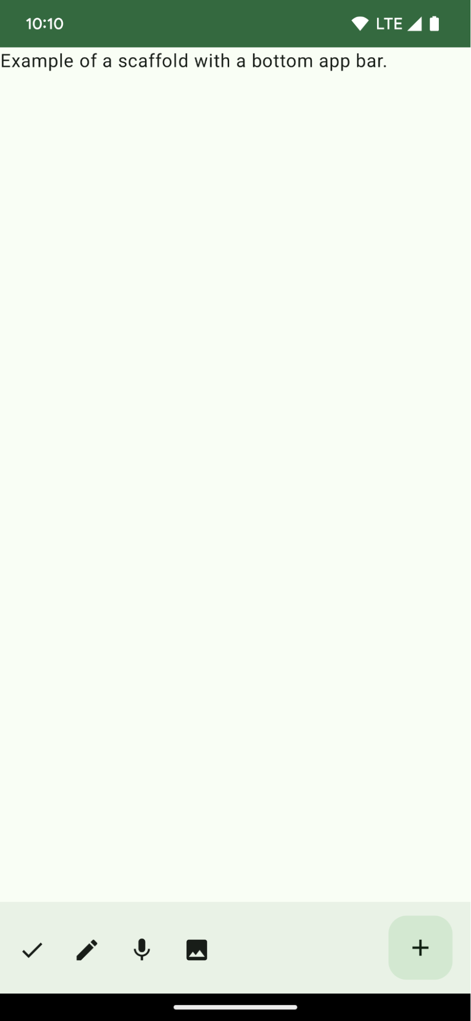
@ComposablefunBottomAppBarExample(){Scaffold(bottomBar={BottomAppBar(actions={IconButton(onClick={/* do something */}){Icon(Icons.Filled.Check,contentDescription="Localized description")}IconButton(onClick={/* do something */}){Icon(Icons.Filled.Edit,contentDescription="Localized description",)}IconButton(onClick={/* do something */}){Icon(Icons.Filled.Mic,contentDescription="Localized description",)}IconButton(onClick={/* do something */}){Icon(Icons.Filled.Image,contentDescription="Localized description",)}},floatingActionButton={FloatingActionButton(onClick={/* do something */},containerColor=BottomAppBarDefaults.bottomAppBarFabColor,elevation=FloatingActionButtonDefaults.bottomAppBarFabElevation()){Icon(Icons.Filled.Add,"Localized description")}})},){innerPadding->
Text(modifier=Modifier.padding(innerPadding),text="Example of a scaffold with a bottom app bar.")}}
একটি bottomBar বাস্তবায়ন যাতে কর্মের একটি তালিকা থাকে।
যে ক্রিয়াগুলি IconButton এর বাস্তবায়ন যা ইমেজ এবং বিষয়বস্তু বর্ণনা পাঠ্যের জন্য Icon ধারণ করে, এই ক্রিয়াগুলি সম্পাদন করার জন্য প্রতিটিতে একটি onClick lambda সহ।
আপনি নিম্নলিখিত কী প্যারামিটারের জন্য কম্পোজেবল পাস করতে পারেন:
actions : আইকনগুলির একটি সিরিজ যা বারের বাম দিকে প্রদর্শিত হয়। এগুলি সাধারণত প্রদত্ত স্ক্রিনের জন্য বা নেভিগেশন আইটেমগুলির জন্য মূল ক্রিয়া।
এই নির্দেশিকাটি এই কিউরেট করা কুইক গাইড সংগ্রহের অংশ যা বৃহত্তর অ্যান্ড্রয়েড উন্নয়ন লক্ষ্যগুলি কভার করে:
একটি হোম স্ক্রীন স্ক্যাফোল্ড তৈরি করুন
জটিল ইউজার ইন্টারফেস তৈরি করতে একটি প্রমিত প্ল্যাটফর্ম কীভাবে ব্যবহার করবেন তা খুঁজে বের করুন। স্ক্যাফোল্ড UI এর বিভিন্ন অংশকে একত্রিত করে, অ্যাপগুলিকে একটি সুসংগত চেহারা এবং অনুভূতি দেয়।
এই পৃষ্ঠার কন্টেন্ট ও কোডের নমুনাগুলি Content License-এ বর্ণিত লাইসেন্সের অধীনস্থ। Java এবং OpenJDK হল Oracle এবং/অথবা তার অ্যাফিলিয়েট সংস্থার রেজিস্টার্ড ট্রেডমার্ক।
2025-06-04 UTC-তে শেষবার আপডেট করা হয়েছে।
[[["সহজে বোঝা যায়","easyToUnderstand","thumb-up"],["আমার সমস্যার সমাধান হয়েছে","solvedMyProblem","thumb-up"],["অন্যান্য","otherUp","thumb-up"]],[["এতে আমার প্রয়োজনীয় তথ্য নেই","missingTheInformationINeed","thumb-down"],["খুব জটিল / অনেক ধাপ","tooComplicatedTooManySteps","thumb-down"],["পুরনো","outOfDate","thumb-down"],["অনুবাদ সংক্রান্ত সমস্যা","translationIssue","thumb-down"],["নমুনা / কোড সংক্রান্ত সমস্যা","samplesCodeIssue","thumb-down"],["অন্যান্য","otherDown","thumb-down"]],["2025-06-04 UTC-তে শেষবার আপডেট করা হয়েছে।"],[],[],null,["# Display a bottom app bar\n\n\u003cbr /\u003e\n\nCreate a bottom app bar to help users navigate and access functions in your app.\nFollow this guidance to add a bottom app bar to your app by using the\n[`BottomAppBar`](/reference/com/google/android/material/bottomappbar/BottomAppBar) composable.\n\nVersion compatibility\n---------------------\n\nThis implementation requires that your project minSDK be set to API level 21 or\nhigher.\n\n### Dependencies\n\n### Kotlin\n\n\u003cbr /\u003e\n\n```kotlin\n implementation(platform(\"androidx.compose:compose-bom:2025.08.00\"))\n implementation (\"androidx.compose.material:material-icons-extended\")\n \n```\n\n\u003cbr /\u003e\n\n### Groovy\n\n\u003cbr /\u003e\n\n```groovy\n implementation platform('androidx.compose:compose-bom:2025.08.00')\n implementation 'androidx.compose.material:material-icons-extended'\n \n```\n\n\u003cbr /\u003e\n\nCreate a bottom app bar\n-----------------------\n\nUse the following code to create a bottom app bar containing four icon buttons,\nand a floating action button:\n\n\n```kotlin\n@Composable\nfun BottomAppBarExample() {\n Scaffold(\n bottomBar = {\n BottomAppBar(\n actions = {\n IconButton(onClick = { /* do something */ }) {\n Icon(Icons.Filled.Check, contentDescription = \"Localized description\")\n }\n IconButton(onClick = { /* do something */ }) {\n Icon(\n Icons.Filled.Edit,\n contentDescription = \"Localized description\",\n )\n }\n IconButton(onClick = { /* do something */ }) {\n Icon(\n Icons.Filled.Mic,\n contentDescription = \"Localized description\",\n )\n }\n IconButton(onClick = { /* do something */ }) {\n Icon(\n Icons.Filled.Image,\n contentDescription = \"Localized description\",\n )\n }\n },\n floatingActionButton = {\n FloatingActionButton(\n onClick = { /* do something */ },\n containerColor = BottomAppBarDefaults.bottomAppBarFabColor,\n elevation = FloatingActionButtonDefaults.bottomAppBarFabElevation()\n ) {\n Icon(Icons.Filled.Add, \"Localized description\")\n }\n }\n )\n },\n ) { innerPadding -\u003e\n Text(\n modifier = Modifier.padding(innerPadding),\n text = \"Example of a scaffold with a bottom app bar.\"\n )\n }\n}https://github.com/android/snippets/blob/dd30aee903e8c247786c064faab1a9ca8d10b46e/compose/snippets/src/main/java/com/example/compose/snippets/components/AppBar.kt#L138-L183\n```\n\n\u003cbr /\u003e\n\n### Key points about the code\n\n- An outer [`Scaffold`](/reference/kotlin/androidx/compose/material/package-summary#Scaffold(androidx.compose.foundation.layout.WindowInsets,androidx.compose.ui.Modifier,androidx.compose.material.ScaffoldState,kotlin.Function0,kotlin.Function0,kotlin.Function1,kotlin.Function0,androidx.compose.material.FabPosition,kotlin.Boolean,kotlin.Function1,kotlin.Boolean,androidx.compose.ui.graphics.Shape,androidx.compose.ui.unit.Dp,androidx.compose.ui.graphics.Color,androidx.compose.ui.graphics.Color,androidx.compose.ui.graphics.Color,androidx.compose.ui.graphics.Color,androidx.compose.ui.graphics.Color,kotlin.Function1)) that has a `bottomBar` set.\n- A `bottomBar` implementation that contains a list of actions.\n- Actions that are implementations of [`IconButton`](/reference/kotlin/androidx/compose/material/package-summary#IconButton(kotlin.Function0,androidx.compose.ui.Modifier,kotlin.Boolean,androidx.compose.foundation.interaction.MutableInteractionSource,kotlin.Function0)) that contain [`Icon`](/reference/kotlin/androidx/compose/material3/package-summary#Icon(androidx.compose.ui.graphics.ImageBitmap,kotlin.String,androidx.compose.ui.Modifier,androidx.compose.ui.graphics.Color)) for image and content description text, each with an `onClick` lambda to perform these actions.\n\nYou can pass composables for the following key parameters:\n\n- `actions`: a series of icons that appear on the left side of the bar. These are commonly either key actions for the given screen, or navigation items.\n- [`floatingActionButton`](/reference/com/google/android/material/floatingactionbutton/FloatingActionButton): the floating action button that appears on the right side of the bar.\n\n| **Note:** After you add the bottom app bar, you can customize it with content as you do with other containers by filling the `BottomAppBar` composable with other content. You can also use `BottomAppBar` without passing a value for `actions` or `floatingActionButton`.\n\nResults\n-------\n\n**Figure 1.** An example of a bottom app bar.\n\nCollections that contain this guide\n-----------------------------------\n\nThis guide is part of these curated Quick Guide collections that cover\nbroader Android development goals: \n\n### Create a home screen scaffold\n\nFind out how to use a standardized platform to build complex user interfaces. The scaffold holds together different parts of the UI, giving apps a coherent look and feel. \n[Quick guide collection](/develop/ui/compose/quick-guides/collections/create-a-home-screen-scaffold) \n\n### Display interactive components\n\nLearn how composable functions can enable you to easily create beautiful UI components based on the Material Design design system. \n[Quick guide collection](/develop/ui/compose/quick-guides/collections/display-interactive-components) \n\nHave questions or feedback\n--------------------------\n\nGo to our frequently asked questions page and learn about quick guides or reach out and let us know your thoughts. \n[Go to FAQ](/quick-guides/faq) [Leave feedback](https://issuetracker.google.com/issues/new?component=1573691&template=1993320)"]]