
App widgets (sometimes just "widgets") are a feature introduced in Android 1.5 and vastly improved in Android 3.0 and 3.1. A widget can display an application's most timely or otherwise relevant information at a glance, on a user's Home screen. The standard Android system image includes several widgets, including a widget for the Analog Clock, Music, and other applications.
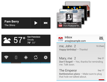
Figure 1. Example app widgets in Android 4.0.
This document describes how to design a widget so that it fits graphically with other widgets and with the other elements of the Android Home screen such as launcher icons and shortcuts. It also describes some standards for widget artwork and some widget graphics tips and tricks.
For information about developing widgets, see the App Widgets section of the Developer's Guide.
Standard Widget Anatomy
Typical Android app widgets have three main components: A bounding box, a frame, and the widget's graphical controls and other elements. App widgets can contain a subset of the View widgets in Android; supported controls include text labels, buttons, and images. For a full list of available Views, see the Creating the App Widget Layout section in the Developer's Guide. Well-designed widgets leave some margins between the edges of the bounding box and the frame, and padding between the inner edges of the frame and the widget's controls.
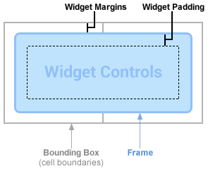
Figure 2. Widgets generally have margins between the bounding box and frame, and padding between the frame and widget controls.
Note: As of Android 4.0, app widgets are automatically given margins between the widget frame and the app widget's bounding box to provide better alignment with other widgets and icons on the user's home screen. To take advantage of this strongly recommended behavior, set your application's targetSdkVersion to 14 or greater.
Widgets designed to fit visually with other widgets on the Home screen take cues from the other elements on the Home screen for alignment; they also use standard shading effects. All of these details are described on this page.
Determining a size for your widget
Each widget must define a minWidth and minHeight, indicating the
minimum amount of space it should consume by default. When users add a widget to their Home screen,
it will generally occupy more than the minimum width and height you specify. Android Home screens
offer users a grid of available spaces into which they can place widgets and icons. This grid can
vary by device; for example, many handsets offer a 4x4 grid, and tablets can offer a larger, 8x7
grid. When your widget is added, it will be stretched to occupy the minimum number of cells,
horizontally and vertically, required to satisfy its minWidth and
minHeight constraints. As we discuss in Designing Widget
Layouts and Background Graphics below, using nine-patch backgrounds and flexible layouts for app
widgets will allow your widget to gracefully adapt to the device's Home screen grid and remain
usable and aesthetically awesome.
While the width and height of a cell—as well as the amount of automatic margins applied to widgets—may vary across devices, you can use the table below to roughly estimate your widget's minimum dimensions, given the desired number of occupied grid cells:
| # of Cells (Columns or Rows) |
Available Size (dp) ( minWidth or
minHeight) |
|---|---|
| 1 | 40dp |
| 2 | 110dp |
| 3 | 180dp |
| 4 | 250dp |
| … | … |
| n | 70 × n − 30 |
It is a good practice to be conservative with minWidth and minHeight,
specifying the minimum size that renders the widget in a good default state. For an example of how
to provide a minWidth and minHeight, suppose you have a music player
widget that shows the currently playing song artist and title (vertically stacked), a
Play button, and a Next button:
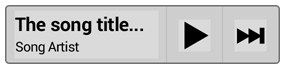
Figure 3. An example music player widget.
Your minimum height should be the height of your two TextViews for the artist and title, plus some text margins. Your minimum width should be the minimum usable widths of the Play and Next buttons, plus the minimum text width (say, the width of 10 characters), plus any horizontal text margins.
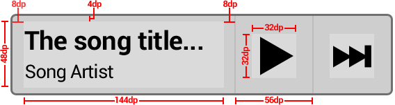
Figure 4. Example sizes and margins for
minWidth/minHeight calculations. We chose 144dp as an example good minimum
width for the text labels.
Example calculations are below:
minWidth= 144dp + (2 × 8dp) + (2 × 56dp) = 272dpminHeight= 48dp + (2 × 4dp) = 56dp
If there is any inherent content padding in your widget background nine-patch, you should add to
minWidth and minHeight accordingly.
Resizable widgets
Widgets can be resized horizontally and/or vertically as of Android 3.1, meaning that
minWidth and minHeight effectively become the default size for
the widget. You can specify the minimum widget size using minResizeWidth and
minResizeHeight; these values should specify the size below which the widget would be
illegible or otherwise unusable.
This is generally a preferred feature for collection widgets such as those based on ListView or GridView.
Adding margins to your app widget
As previously mentioned, Android 4.0 will automatically add small, standard margins to each edge
of widgets on the Home screen, for applications that specify a targetSdkVersion of 14
or greater. This helps to visually balance the Home screen, and thus we recommend that you
do not add any extra margins outside of your app widget's background shape in Android
4.0.
It's easy to write a single layout that has custom margins applied for earlier versions of the platform, and has no extra margins for Android 4.0 and greater. See Adding Margins to App Widgets in the Developer's Guide for information on how to achieve this with layout XML.
Designing Widget Layouts and Background Graphics
Most widgets will have a solid background rectangle or rounded rectangle shape. It is a best practice to define this shape using nine patches; one for each screen density (see Supporting Multiple Screens for details). Nine-patches can be created with the draw9patch tool, or simply with a graphics editing program such as Adobe® Photoshop. This will allow the widget background shape to take up the entire available space. The nine-patch should be edge-to-edge with no transparent pixels providing extra margins, save for perhaps a few border pixels for subtle drop shadows or other subtle effects.
Note: Just like with controls in activities, you should ensure that interactive controls have distinct visual focused and pressed states using state list drawables.
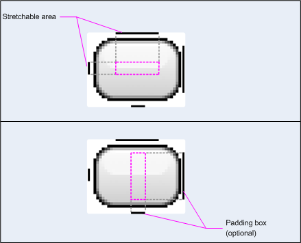
Figure 5. Nine-patch border pixels indicating stretchable regions and content padding.
Some app widgets, such as those using a StackView, have a transparent
background. For this case, each individual item in the StackView should use a nine-patch background
that is edge-to-edge with little or no border transparent pixels for margins.
For the contents of the widget, you should use flexible layouts such as RelativeLayout, LinearLayout, or FrameLayout. Just as your activity layouts must adapt to different physical screen
sizes, widget layouts must adapt to different Home screen grid cell sizes.
Below is an example layout that a music widget showing text information and two buttons can use.
It builds upon the previous discussion of adding margins depending on OS version. Note that the
most robust and resilient way to add margins to the widget is to wrap the widget frame and contents
in a padded FrameLayout.
<FrameLayout
  android:layout_width="match_parent"
  android:layout_height="match_parent"
  android:padding="@dimen/widget_margin">

  <LinearLayout
    android:layout_width="match_parent"
    android:layout_height="match_parent"
    android:orientation="horizontal"
    android:background="@drawable/my_widget_background">

    <TextView
      android:id="@+id/song_info"
      android:layout_width="0dp"
      android:layout_height="match_parent"
      android:layout_weight="1" />

    <Button
      android:id="@+id/play_button"
      android:layout_width="@dimen/my_button_width"
      android:layout_height="match_parent" />

    <Button
      android:id="@+id/skip_button"
      android:layout_width="@dimen/my_button_width"
      android:layout_height="match_parent" />
  </LinearLayout>
</FrameLayout>
If you now take a look at the example music widget from the previous section, you can begin to use flexible layouts attributes like so:
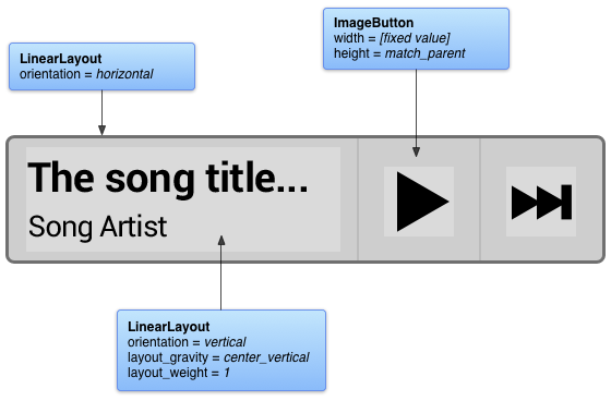
Figure 6. Excerpt flexible layouts and attributes.
When a user adds the widget to their home screen, on an example Android 4.0 device where each grid cell is 80dp × 100dp in size and 8dp of margins are automatically applied on all sizes, the widget will be stretched, like so:

Figure 7. Music widget sitting on an example 80dp x 100dp grid with 8dp of automatic margins added by the system.
Using the App Widget Templates Pack
When starting to design a new widget, or updating an existing widget, it's a good idea to first look at the widget design templates below. The downloadable package below includes nine-patch background graphics, XML, and source Adobe® Photoshop files for multiple screen densities, OS version widget styles, and widget colors. The template package also contains graphics useful for making your entire widget or parts of your widget (e.g. buttons) interactive.
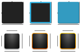
Figure 8. Excerpts from the App Widget Templates Pack (medium-density, dark, Android 4.0/previous styles, default/focused/pressed states).
You can obtain the latest App Widget Templates Pack archive using the link below:
Download the App Widget Templates Pack for Android 4.0 »