Design adaptable Android widgets that scale seamlessly. Use our recommended default sizes as a starting point, and test your layouts across different dimensions to ensure optimal readability and user experience.
Default sizes
Deliver a polished widget experience by optimizing your layout for at least one
of our recommended sizes. Ensure correct placement and visibility in the widget
picker by defining targetCellWidth and targetCellHeight attributes for both
handheld and tablet devices.
These values are based off Pixel devices. Use these sizes as a starting point for your widget design. Thoroughly test your widget at different sizes and on various devices to ensure a quality user experience.
Handheld
| Sizes | Min width | Max width | Min height | Max height |
|---|---|---|---|---|
| 2x1 | 109 | 306 | 44 | 130 |
| 2x2 | 109 | 306 | 115 | 276 |
| 2x3 | 109 | 306 | 185 | 422 |
| 4x1 | 245 | 624 | 44 | 130 |
| 4x2 | 245 | 624 | 115 | 276 |
| 4x3 | 245 | 624 | 185 | 422 |
Tablet
| Sizes | Min width | Max width | Min height | Max height |
|---|---|---|---|---|
| 2x1 | 180 | 304 | 64 | 120 |
| 2x2 | 180 | 304 | 184 | 304 |
| 2x3 | 180 | 304 | 304 | 488 |
| 3x1 | 328 | 488 | 64 | 120 |
| 3x2 | 298 | 488 | 184 | 304 |
| 3x3 | 298 | 488 | 424 | 672 |
| 3x4 | 456 | 672 | 344 | 488 |
Breakpoints
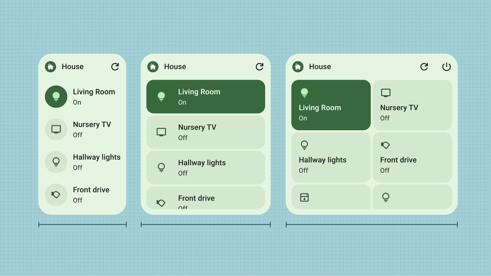
Breakpoints are essential for crafting adaptable, user-friendly resizable widgets. By testing your design, you can pinpoint size thresholds where layout adjustments are necessary. Implement breakpoints to trigger these changes, ensuring your widget maintains visual appeal and functionality at any size.
Breakpoints also offer the flexibility to conditionally include or exclude supplemental content, optimizing space utilization based on the widget's dimensions.

Fill the bounds
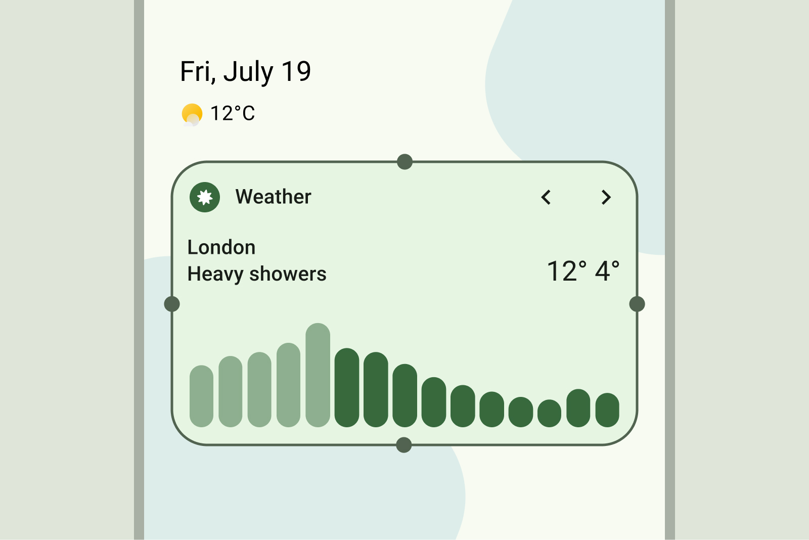
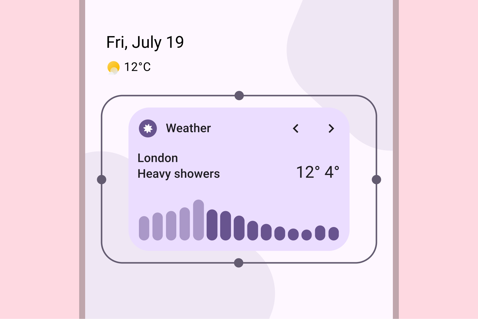
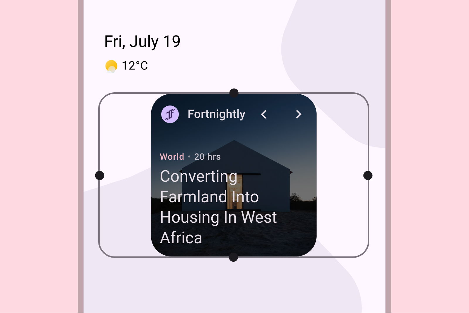
One of the primary reasons users remove widgets is due to misalignment with other home screen elements. To prevent this, ensure your widget always fills its allocated grid space completely.

Do

Don't

Do

