
Shared element transitions are a seamless way to transition between composables that have content that is consistent between them. They are often used for navigation, allowing you to visually connect different screens as a user navigates between them.
For example, in the following video, you can see the image and title of the snack are shared from the listing page, to the detail page.
In Compose, there are a few high level APIs that help you create shared elements:
SharedTransitionLayout: The outermost layout required to implement shared element transitions. It provides aSharedTransitionScope. Composables need to be in aSharedTransitionScopeto use the shared element modifiers.Modifier.sharedElement(): The modifier that flags to theSharedTransitionScopethe composable that should be matched with another composable.Modifier.sharedBounds(): The modifier that flags to theSharedTransitionScopethat this composable's bounds should be used as the container bounds for where the transition should take place. In contrast tosharedElement(),sharedBounds()is designed for visually different content.
An important concept when creating shared elements in Compose is how they work with overlays and clipping. Take a look at the clipping and overlays section to learn more about this important topic.
Basic Usage
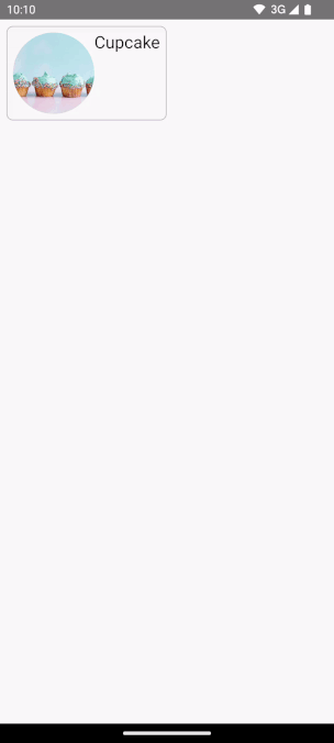
The following transition will be built in this section, transitioning from the smaller "list" item, to the larger detailed item:
The best way to use Modifier.sharedElement() is in conjunction with
AnimatedContent or AnimatedVisibility as this manages the transition between
composables automatically for you.
The starting point is an existing basic AnimatedContent that has a
MainContent, and DetailsContent composable before adding shared elements:

AnimatedContent without any shared element transitions.
In order to make the shared elements animate between the two layouts, surround the
AnimatedContentcomposable withSharedTransitionLayout. The scopes fromSharedTransitionLayoutandAnimatedContentare passed to theMainContentandDetailsContent:var showDetails by remember { mutableStateOf(false) } SharedTransitionLayout { AnimatedContent( showDetails, label = "basic_transition" ) { targetState -> if (!targetState) { MainContent( onShowDetails = { showDetails = true }, animatedVisibilityScope = this@AnimatedContent, sharedTransitionScope = this@SharedTransitionLayout ) } else { DetailsContent( onBack = { showDetails = false }, animatedVisibilityScope = this@AnimatedContent, sharedTransitionScope = this@SharedTransitionLayout ) } } }Add
Modifier.sharedElement()to your composable modifier chain on the two composables that match. Create aSharedContentStateobject and remember it withrememberSharedContentState(). TheSharedContentStateobject is storing the unique key which determines the elements that are shared. Provide a unique key to identify the content, and userememberSharedContentState()for the item to be remembered. TheAnimatedContentScopeis passed into the modifier, which is used to coordinate the animation.@Composable private fun MainContent( onShowDetails: () -> Unit, modifier: Modifier = Modifier, sharedTransitionScope: SharedTransitionScope, animatedVisibilityScope: AnimatedVisibilityScope ) { Row( // ... ) { with(sharedTransitionScope) { Image( painter = painterResource(id = R.drawable.cupcake), contentDescription = "Cupcake", modifier = Modifier .sharedElement( rememberSharedContentState(key = "image"), animatedVisibilityScope = animatedVisibilityScope ) .size(100.dp) .clip(CircleShape), contentScale = ContentScale.Crop ) // ... } } } @Composable private fun DetailsContent( modifier: Modifier = Modifier, onBack: () -> Unit, sharedTransitionScope: SharedTransitionScope, animatedVisibilityScope: AnimatedVisibilityScope ) { Column( // ... ) { with(sharedTransitionScope) { Image( painter = painterResource(id = R.drawable.cupcake), contentDescription = "Cupcake", modifier = Modifier .sharedElement( rememberSharedContentState(key = "image"), animatedVisibilityScope = animatedVisibilityScope ) .size(200.dp) .clip(CircleShape), contentScale = ContentScale.Crop ) // ... } } }
To get information on if a shared element match has occurred, extract
rememberSharedContentState() into a variable, and query isMatchFound.
Which results in the following automatic animation:
You may notice that the background color and size of the whole container still
uses the default AnimatedContent settings.
Shared bounds versus shared element
Modifier.sharedBounds() is similar to Modifier.sharedElement().
However, the modifiers are different in the following ways:
sharedBounds()is for content that is visually different but should share the same area between states, whereassharedElement()expects the content to be the same.- With
sharedBounds(), the content entering and exiting the screen is visible during the transition between the two states, whereas withsharedElement()only the target content is rendered in the transforming bounds.Modifier.sharedBounds()hasenterandexitparameters for specifying how the content should transition, similar to howAnimatedContentworks. - The most common use case for
sharedBounds()is the container transform pattern, whereas forsharedElement()the example use case is a hero transition. - When using
Textcomposables,sharedBounds()is preferred to support font changes such as transitioning between italic and bold or color changes.
From the previous example, adding Modifier.sharedBounds() onto the Row and
Column in the two different scenarios will allow us to share the bounds of the
two and perform the transition animation, allowing them to grow
between each other:
@Composable
private fun MainContent(
onShowDetails: () -> Unit,
modifier: Modifier = Modifier,
sharedTransitionScope: SharedTransitionScope,
animatedVisibilityScope: AnimatedVisibilityScope
) {
with(sharedTransitionScope) {
Row(
modifier = Modifier
.padding(8.dp)
.sharedBounds(
rememberSharedContentState(key = "bounds"),
animatedVisibilityScope = animatedVisibilityScope,
enter = fadeIn(),
exit = fadeOut(),
resizeMode = SharedTransitionScope.ResizeMode.ScaleToBounds()
)
// ...
) {
// ...
}
}
}
@Composable
private fun DetailsContent(
modifier: Modifier = Modifier,
onBack: () -> Unit,
sharedTransitionScope: SharedTransitionScope,
animatedVisibilityScope: AnimatedVisibilityScope
) {
with(sharedTransitionScope) {
Column(
modifier = Modifier
.padding(top = 200.dp, start = 16.dp, end = 16.dp)
.sharedBounds(
rememberSharedContentState(key = "bounds"),
animatedVisibilityScope = animatedVisibilityScope,
enter = fadeIn(),
exit = fadeOut(),
resizeMode = SharedTransitionScope.ResizeMode.ScaleToBounds()
)
// ...
) {
// ...
}
}
}
Unique keys
When working with complex shared elements, it is a good practice to create a key that is not a string, because strings can be error prone to match. Each key must be unique for matches to occur. For example, in Jetsnack we have the following shared elements:
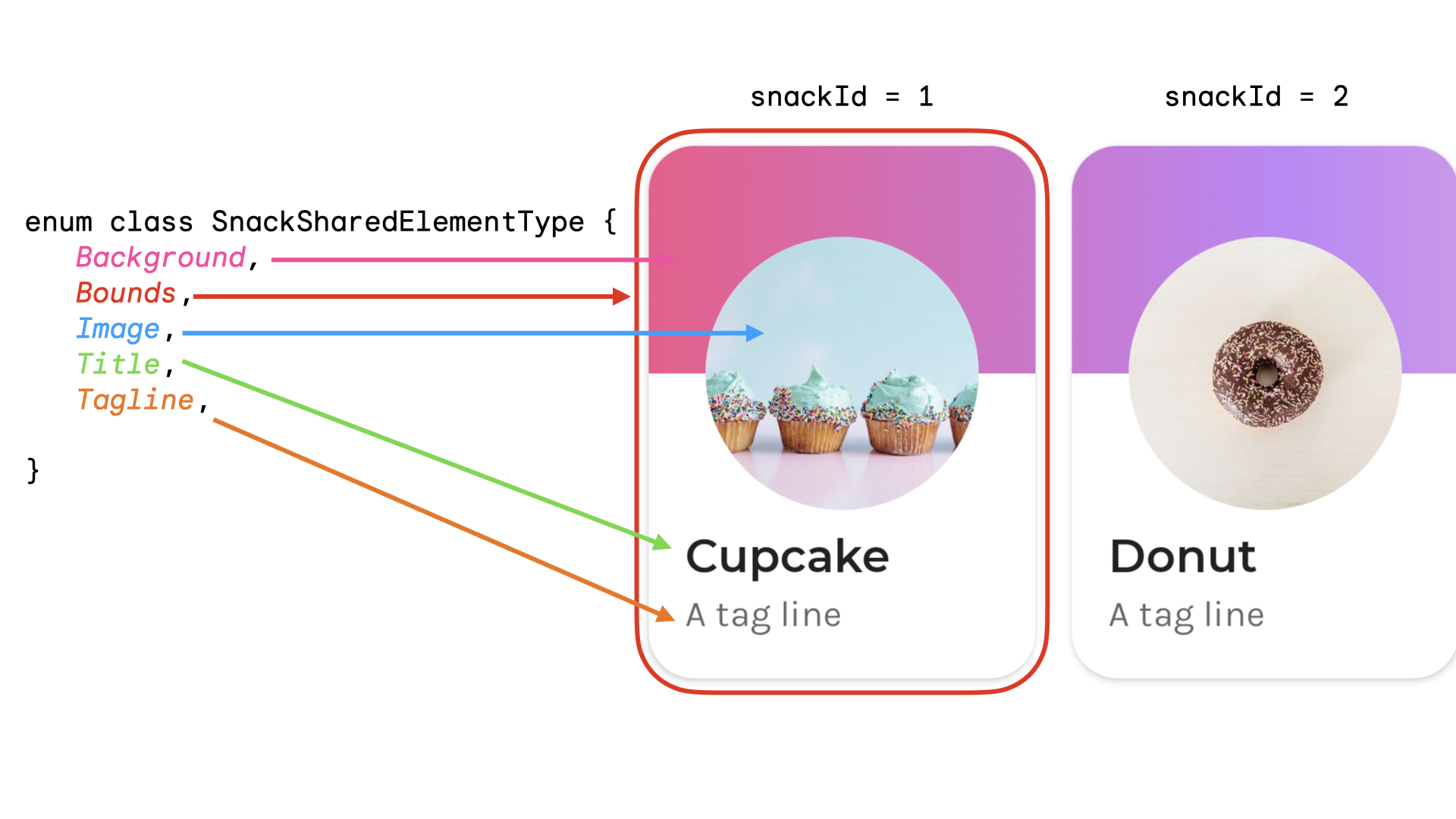
You could create an enum to represent the shared element type. In this example
the whole snack card can also appear from multiple different places on the home
screen, for example in a "Popular" and a "Recommended" section. You can create a
key that has the snackId, the origin ("Popular" / "Recommended"), and the
type of the shared element that will be shared:
data class SnackSharedElementKey(
val snackId: Long,
val origin: String,
val type: SnackSharedElementType
)
enum class SnackSharedElementType {
Bounds,
Image,
Title,
Tagline,
Background
}
@Composable
fun SharedElementUniqueKey() {
// ...
Box(
modifier = Modifier
.sharedElement(
rememberSharedContentState(
key = SnackSharedElementKey(
snackId = 1,
origin = "latest",
type = SnackSharedElementType.Image
)
),
animatedVisibilityScope = this@AnimatedVisibility
)
)
// ...
}
Data classes are recommended for keys since they implement hashCode() and
isEquals().
Understand Scopes
To use Modifier.sharedElement(), the composable needs to be in a
SharedTransitionScope. The SharedTransitionLayout composable provides the
SharedTransitionScope. Make sure to place at the same top-level point in your
UI hierarchy that contains the elements you want to share.
Generally, the composables should also be placed inside an
AnimatedVisibilityScope. This is typically provided by using AnimatedContent
to switch between composables or when using AnimatedVisibility directly,
unless you manage the visibility manually. In order to use multiple
scopes, you may want to save your required scopes in a CompositionLocal,
use context receivers in Kotlin, or pass the scopes as parameters to your
functions.
Use CompositionLocals in the scenario where you have multiple scopes to keep
track of, or a deeply nested hierarchy. A CompositionLocal lets you choose the
exact scopes to save and use. On the other hand, when you use context receivers,
other layouts in your hierarchy might accidentally override the provided scopes.
For example, if you have multiple nested AnimatedContent, the scopes could be
overridden.
Modifier ordering
With Modifier.sharedElement() and Modifier.sharedBounds() the order of your
modifier chain matters,
as with the rest of Compose. The incorrect placement of size-affecting modifiers
can cause unexpected visual jumps during shared element matching.
For example, if you place a padding modifier in a different position on two shared elements, there is a visual difference in the animation.
var selectFirst by remember { mutableStateOf(true) }
val key = remember { Any() }
SharedTransitionLayout(
Modifier
.fillMaxSize()
.padding(10.dp)
.clickable {
selectFirst = !selectFirst
}
) {
AnimatedContent(targetState = selectFirst, label = "AnimatedContent") { targetState ->
if (targetState) {
Box(
Modifier
.padding(12.dp)
.sharedBounds(
rememberSharedContentState(key = key),
animatedVisibilityScope = this@AnimatedContent
)
.border(2.dp, Color.Red)
) {
Text(
"Hello",
fontSize = 20.sp
)
}
} else {
Box(
Modifier
.offset(180.dp, 180.dp)
.sharedBounds(
rememberSharedContentState(
key = key,
),
animatedVisibilityScope = this@AnimatedContent
)
.border(2.dp, Color.Red)
// This padding is placed after sharedBounds, but it doesn't match the
// other shared elements modifier order, resulting in visual jumps
.padding(12.dp)
) {
Text(
"Hello",
fontSize = 36.sp
)
}
}
}
}
Matched bounds |
Unmatched bounds: Notice how the shared element animation appears a bit off as it needs to resize to the incorrect bounds |
|---|---|
The modifiers used before the shared element modifiers provide constraints to the shared element modifiers, which is then used to derive the initial and target bounds, and subsequently the bounds animation.
The modifiers used after the shared element modifiers use the constraints from before to measure and calculate the child's target size. The shared element modifiers create a series of animated constraints to gradually transform the child from the initial size to the target size.
The exception to this is if you use resizeMode = ScaleToBounds() for
the animation, or Modifier.skipToLookaheadSize() on a composable. In this
case, Compose lays out the child using the target constraints, and instead uses
a scale factor to perform the animation instead of changing the layout size
itself.
Manage the visibility of shared elements manually
In cases where you may not be using AnimatedVisibility or AnimatedContent,
you can manage the shared element visibility yourself. Use
Modifier.sharedElementWithCallerManagedVisibility() and provide your own
conditional that determines when an item should be visible or not:
var selectFirst by remember { mutableStateOf(true) }
val key = remember { Any() }
SharedTransitionLayout(
Modifier
.fillMaxSize()
.padding(10.dp)
.clickable {
selectFirst = !selectFirst
}
) {
Box(
Modifier
.sharedElementWithCallerManagedVisibility(
rememberSharedContentState(key = key),
!selectFirst
)
.background(Color.Red)
.size(100.dp)
) {
Text(if (!selectFirst) "false" else "true", color = Color.White)
}
Box(
Modifier
.offset(180.dp, 180.dp)
.sharedElementWithCallerManagedVisibility(
rememberSharedContentState(
key = key,
),
selectFirst
)
.alpha(0.5f)
.background(Color.Blue)
.size(180.dp)
) {
Text(if (selectFirst) "false" else "true", color = Color.White)
}
}
Current limitations
These APIs have a few limitations. Most notably:
- No interoperability between Views and Compose is supported.
- There is no automatic animation support for the following:
- Shared Image composables:
ContentScaleis not animated by default. It snaps to the set endContentScale.
- Shape clipping - There is no built-in support for automatic animation between shapes - for example animating from a square to a circle as the item transitions.
- For the unsupported cases, use
Modifier.sharedBounds()instead ofsharedElement()and addModifier.animateEnterExit()onto the items.
- Shared Image composables: