
App widgets allow your user to deliver key glanceable content and quick actions from your app on their home screens and similar surfaces. Improving your widget's discoverability ensures users are aware of these powerful extensions of your app.
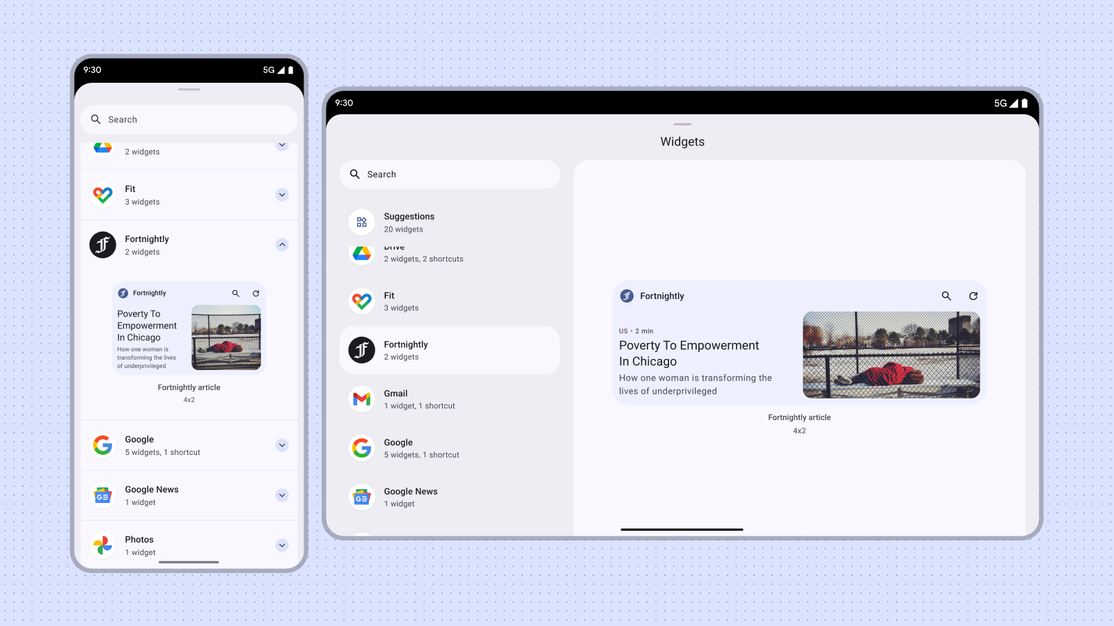
Users discover and add your widget through the widget picker, as shown from the Widgets menu that appears when they long-press on the home screen or on your app icon. On some devices, the widget picker displays a suggestions section that shows quality widgets. Additionally, you can promote your widget from within your app at relevant moments when the widget's functionality is most relevant. This guide describes how to to effectively promote your widgets.
Sizing
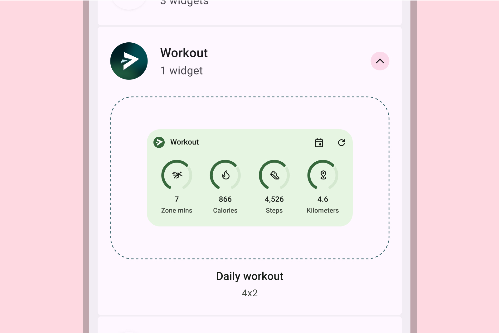
Imagine the widget picker as a shopping window. Your widget's default size is its initial display, making a first impression that can greatly influence selection. Use a size that effectively showcases your widget's functionality without cluttering the view.
For more information on choosing an appropriate default size for your widget, see Sizing.
When designing for the default size, consider different form factors such as phones, tablets and foldables.
Don't
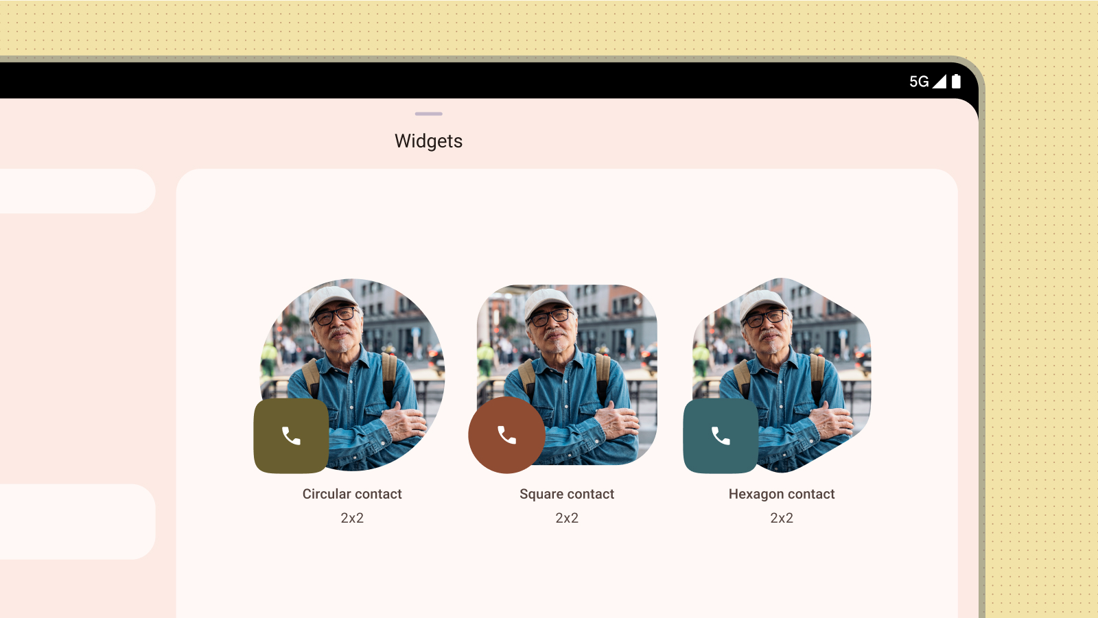
Avoid publishing multiple versions of the same widget size solely to offer different colors or shapes. Instead, incorporate a configuration activity within the widget to allow users to customize colors, enhancing flexibility and streamline the widget picker.
Don't
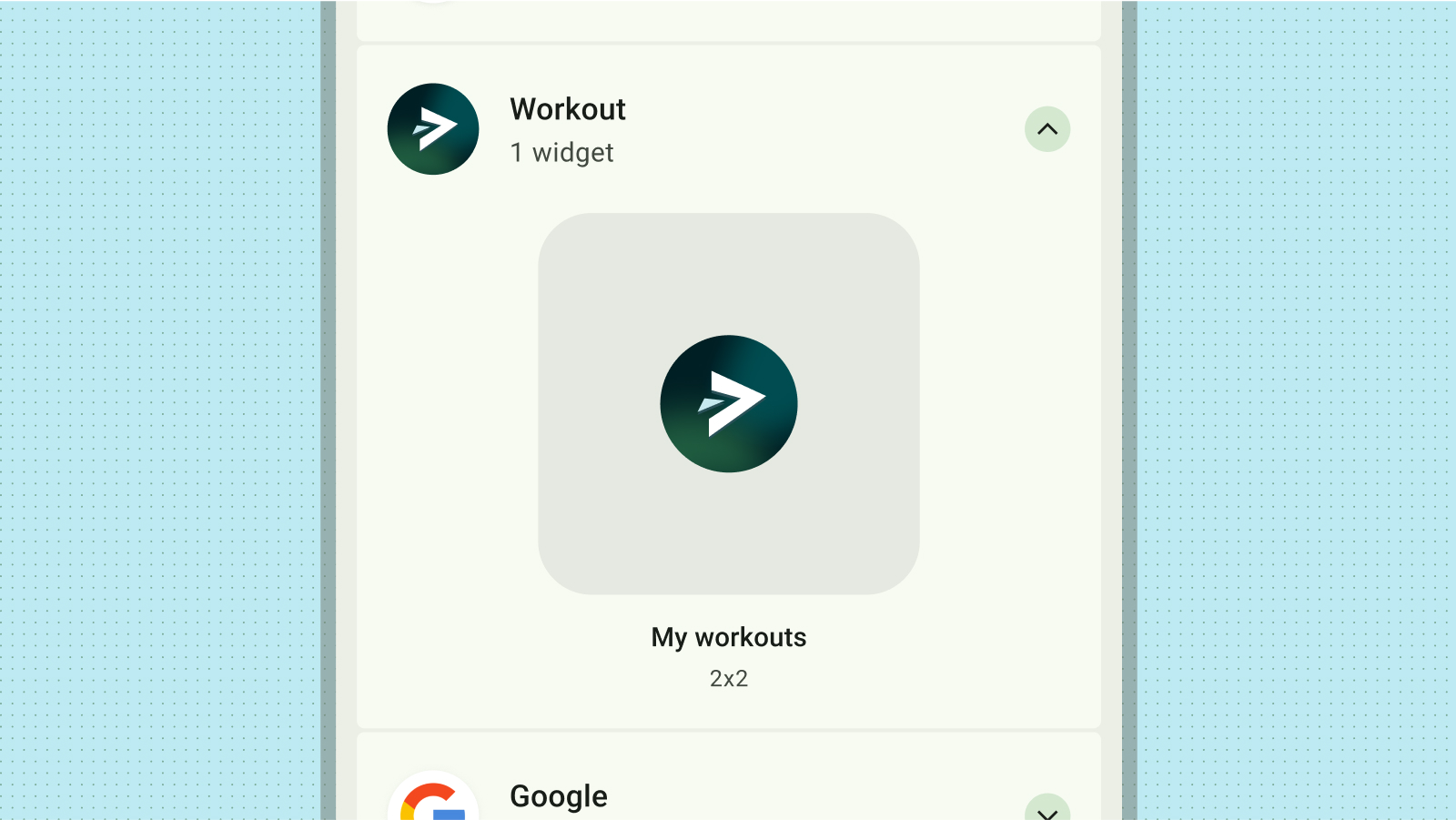
Content preview
Drive user adoption of your widget by providing an accurate and informative content preview. By mirroring the actual layout and functionality of the widget in the preview, you provide users with a clear understanding of what they can expect once they add it to their home screen.
Don't
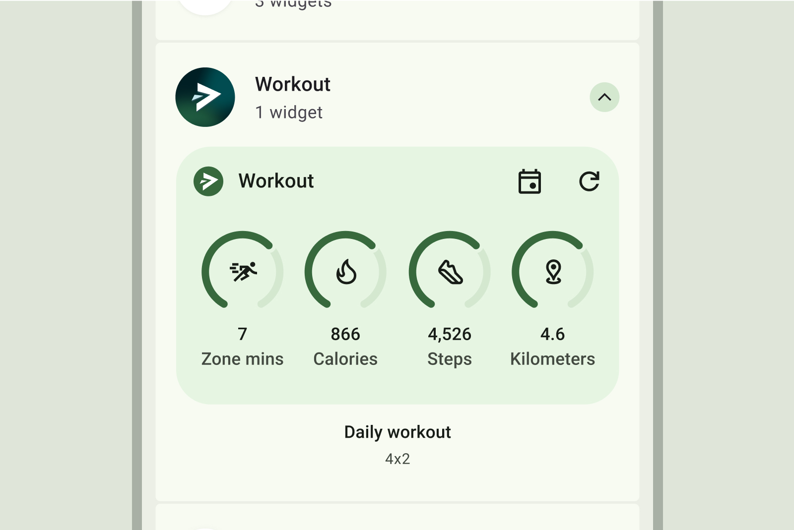
Do
Don't
Don't
If your widget supports dynamic colors, design your previews to also display in those colors. Craft a clear and concise description for your widget that provides a clear value proposition for the user.
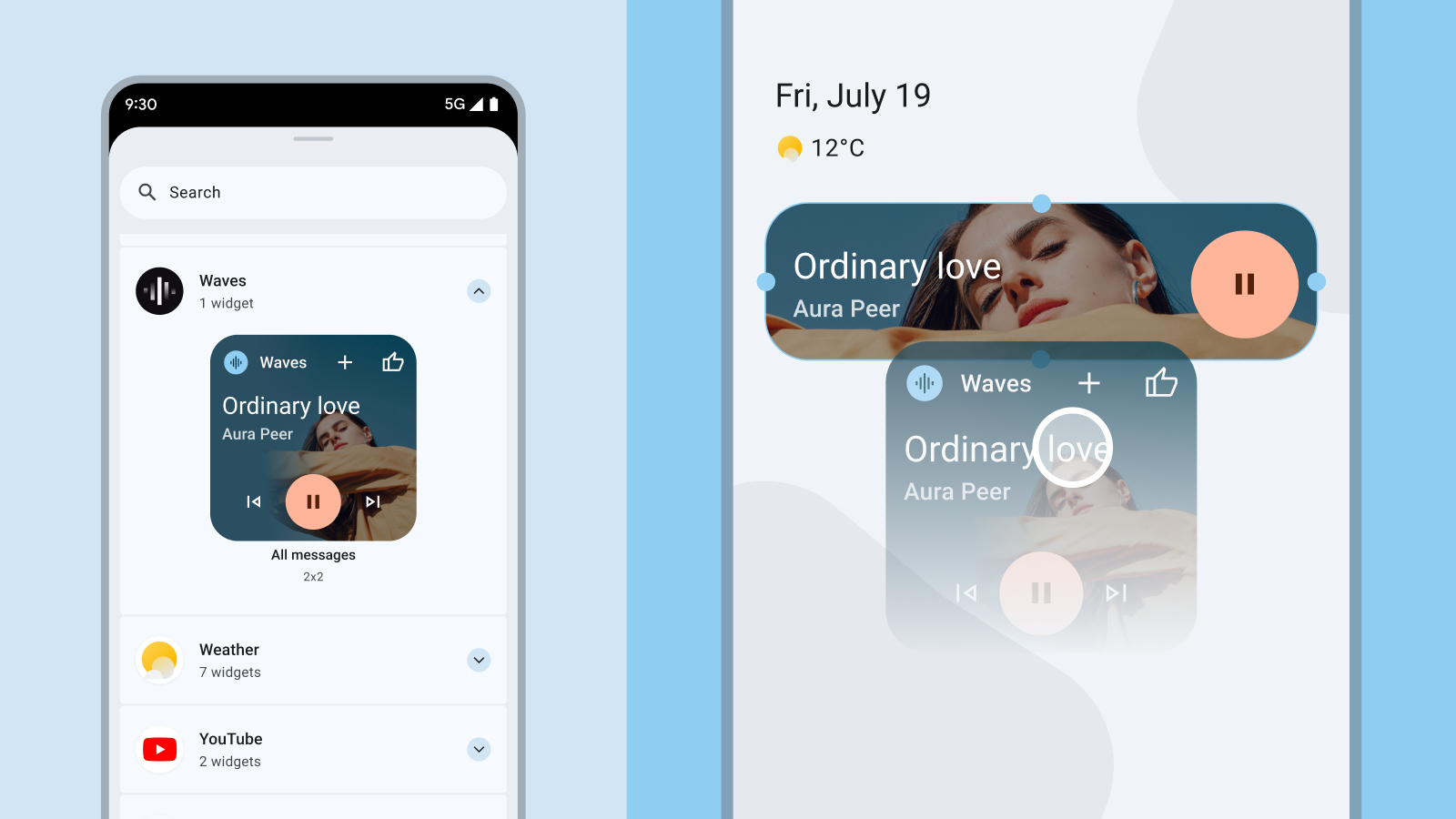
In-app discovery of your widget
You can proactively surface the option to pin relevant widgets at contextually appropriate moments in your app. When doing so keep the following factors in mind:
- Present the pin widget option when it makes the most sense based on the user's actions within the app. For example, after a user successfully completes a task that has a corresponding widget or When a user repeatedly accesses a feature that could be streamlined with a widget.
- Use subtle visual hints such as an icon or a brief animation to draw attention to the option to pin a widget.
- The widget pinning suggestion should never block or hinder the user's primary actions within your app.

For more information, see Let users pin a widget to configure widget pinning from within your app.