The CircularProgressIndicator component is a circular
display of the length of a process or an otherwise unspecified wait time.
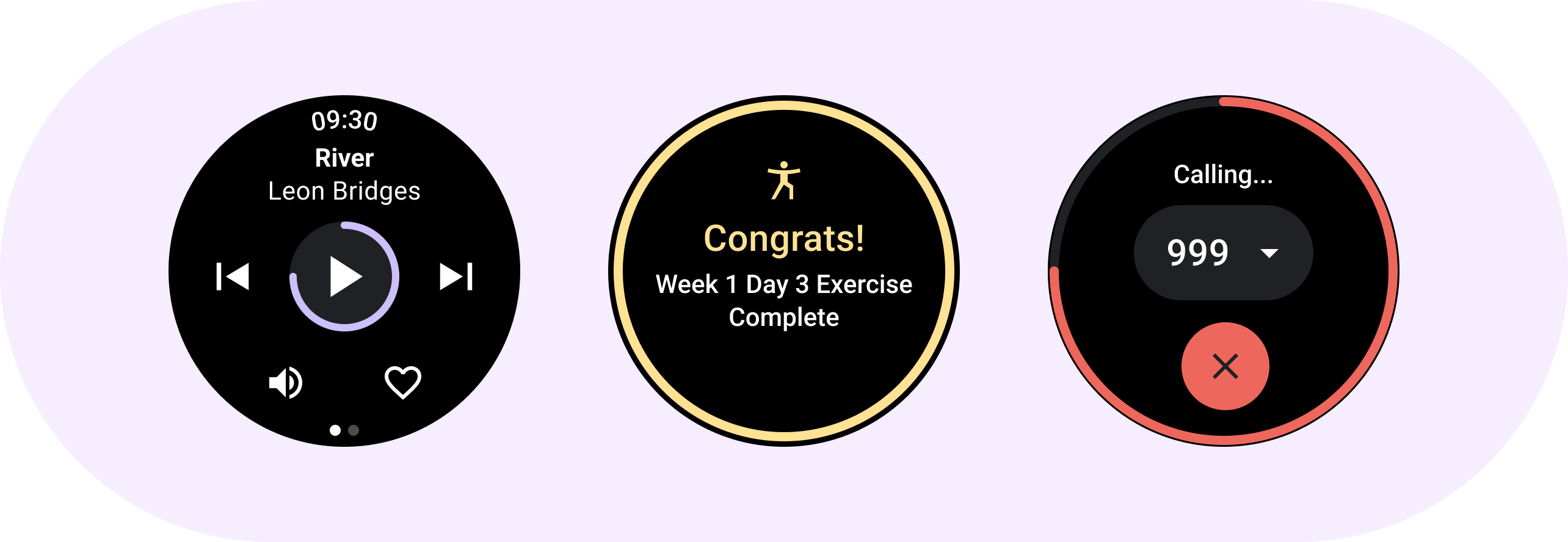
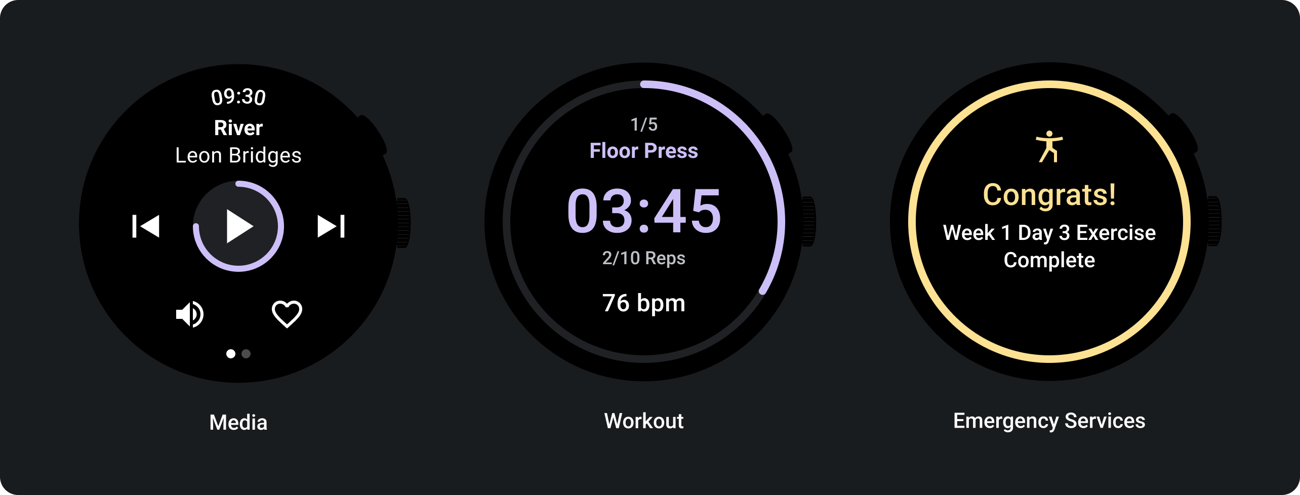
You can apply progress indicators to components such as a play button.
Anatomy
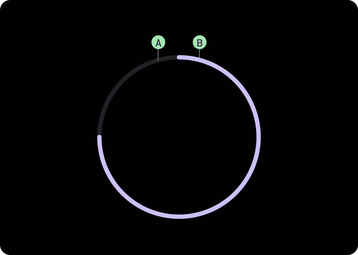
B. Track progress
Design recommendations
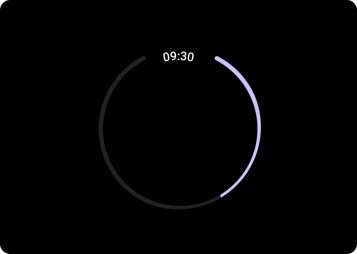
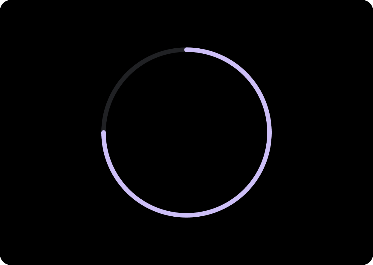
Create progress indicators with a gap to leave space for important
information such as the time. To create a gap, change the progress
indicator’s startAngle and endAngle.
Create a progress indicator with a gap, as shown in the following example:
CircularProgressIndicator(
    progress = 0.4f,
    modifier = Modifier.fillMaxSize(),
    startAngle = 290f,
    endAngle = 250f,
    strokeWidth = 4.dp
)

Apply the small progress indicator directly to a button when the indicated progress is directly related to the action the button represents and when the screen space is limited.
You can create a small progress indicator, as shown in the following example:
CircularProgressIndicator(
    progress = 0.75f,
    modifier = Modifier.fillMaxSize(),
    startAngle = 0f,
    indicatorColor = MaterialTheme.colors.secondary,
    trackColor = MaterialTheme.colors.onBackground.copy(alpha = 0.1f),
    strokeWidth = 4.dp
)
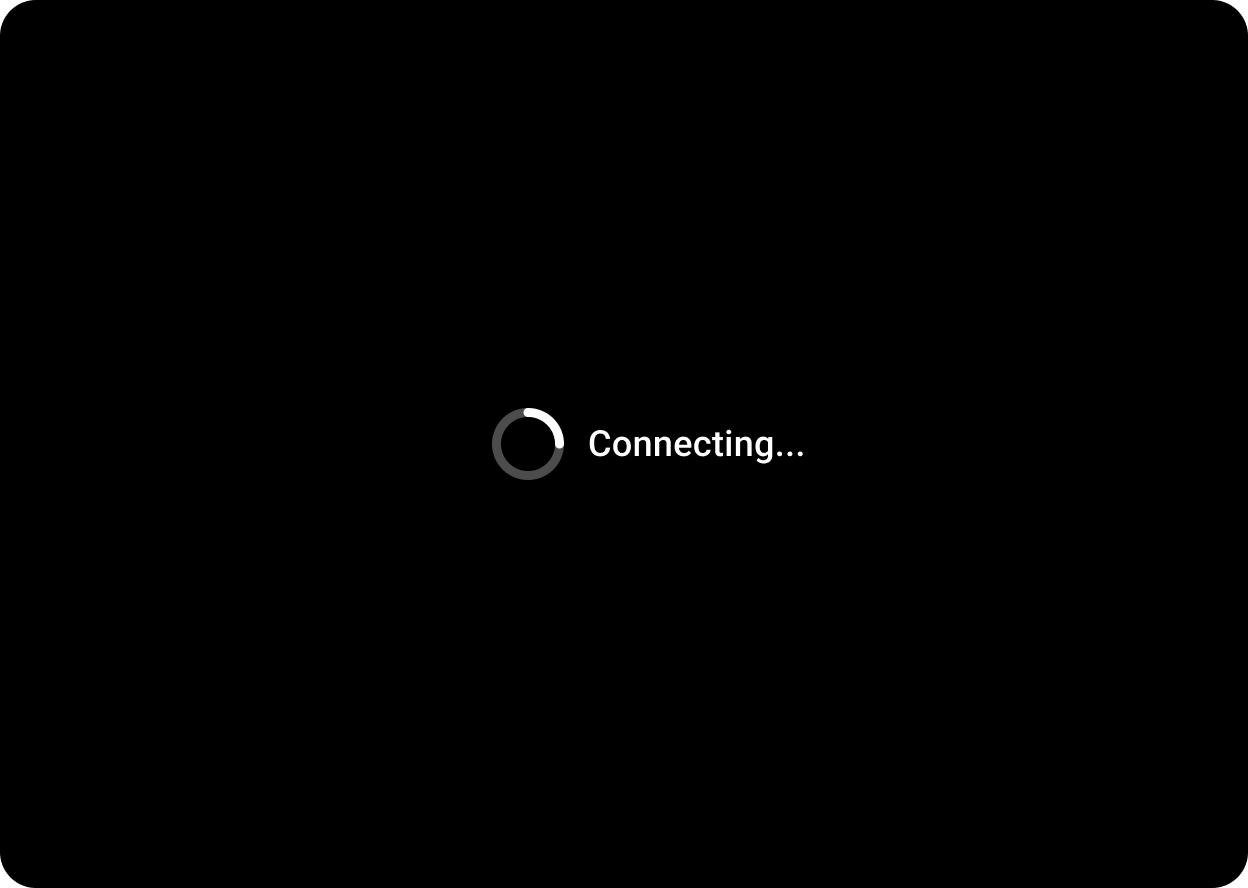
When using the progress indicator for situations where there is no set time, use a progress indicator with animated value. This can also be called a spinner. Use spinners sparingly as they can increase pereceived wait time.
You can create an indeterminate progress indicator, as shown in the following example:
CircularProgressIndicator(
    indicatorColor = MaterialTheme.colors.secondary,
    trackColor = MaterialTheme.colors.onBackground.copy(alpha = 0.1f),
    strokeWidth = 4.dp
)
Usage
See the following examples of progress indicators.