
Responsive/adaptive layouts provide an optimized user experience regardless of screen size. Implement responsive/adaptive layouts to enable your view‑based app to support all display sizes, orientations, and configurations, including resizable configurations such as multi-window mode.
Responsive design
The first step in supporting a variety of device form factors is to create a layout that is responsive to variations in the amount of display space available to your app.
ConstraintLayout
The best way to create a responsive layout is to use
ConstraintLayout
as the base layout for your UI. ConstraintLayout enables you to specify the
position and size of each view according to spatial relationships with other
views in the layout. All the views can then move and resize together as the
display space changes.
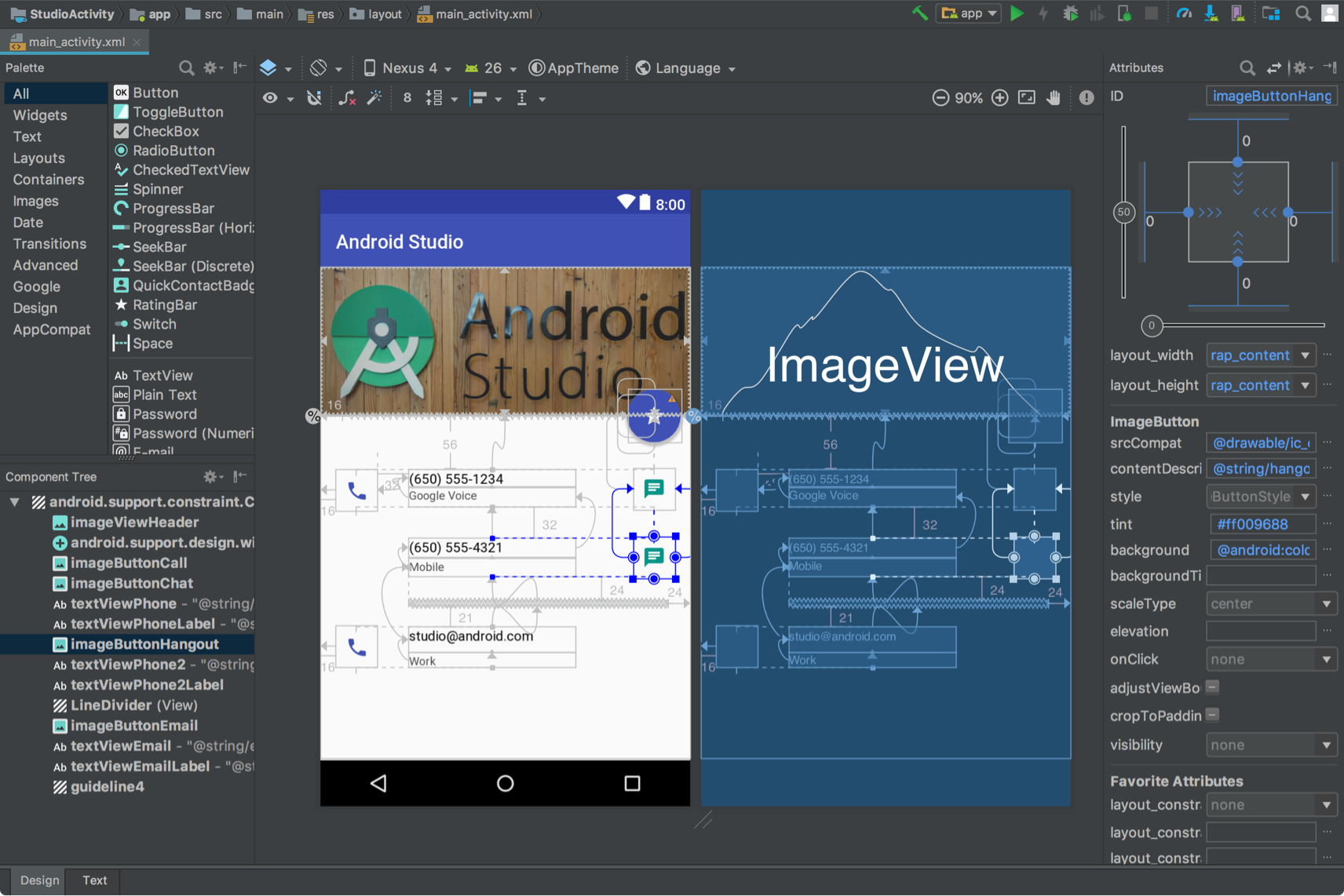
The easiest way to build a layout with ConstraintLayout is to use the Layout
Editor in Android Studio. Layout Editor enables you to drag new views to the
layout, apply constraints relative to parent and sibling views, and set view
properties—all without editing any XML by hand.
ConstraintLayout.
For more information, see Build a Responsive UI With ConstraintLayout.
Responsive width and height
To ensure your layout is responsive to different display sizes, use
wrap_content, match_parent, or 0dp (match constraint) for the width and
height of view components instead of hard‑coded values:
wrap_content: The view sets its size to fit the content the view contains.match_parent: The view expands as much as possible within the parent view.0dp (match constraint): In aConstraintLayout, similar tomatch_parent. The view takes all the available space within the view's constraints.
For example:
<TextView
    android:layout_width="match_parent"
    android:layout_height="wrap_content"
    android:text="@string/lorem_ipsum" />
Figure 4 shows how the width and height of the TextView adjust as the display
width changes with device orientation.
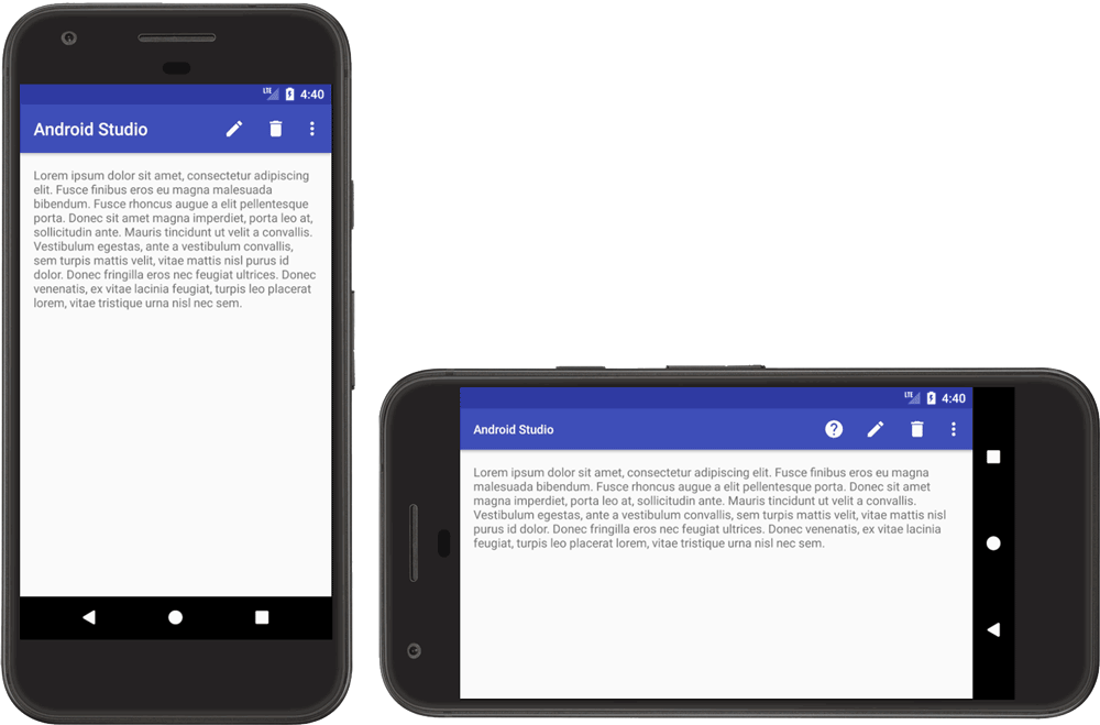
TextView.
The TextView sets its width to fill all available space (match_parent) and
its height to exactly as much space is required by the height of the contained
text (wrap_content), which enables the view to adapt to different display
dimensions and different amounts of text.
If you're using a LinearLayout, you
can also expand the child views based on layout
weight so the views proportionally fill
the available space. However, using weights in a nested LinearLayout requires
the system to perform multiple layout passes to determine the size for each
view, slowing UI performance.
ConstraintLayout can create nearly all of the layouts possible with
LinearLayout without the performance impact, so convert your nested
LinearLayout to
ConstraintLayout. Then you
can define weighted layouts with constraint
chains.
Adaptive design
Your app's layout should always be responsive to different display sizes. However, even a responsive layout can't provide the best user experience on every device or multi‑window mode display. For example, the UI you designed for a phone, probably doesn't provide an optimal user experience on a tablet. Adaptive design provides alternative layouts optimized for different display dimensions.
SlidingPaneLayout for list-detail UIs
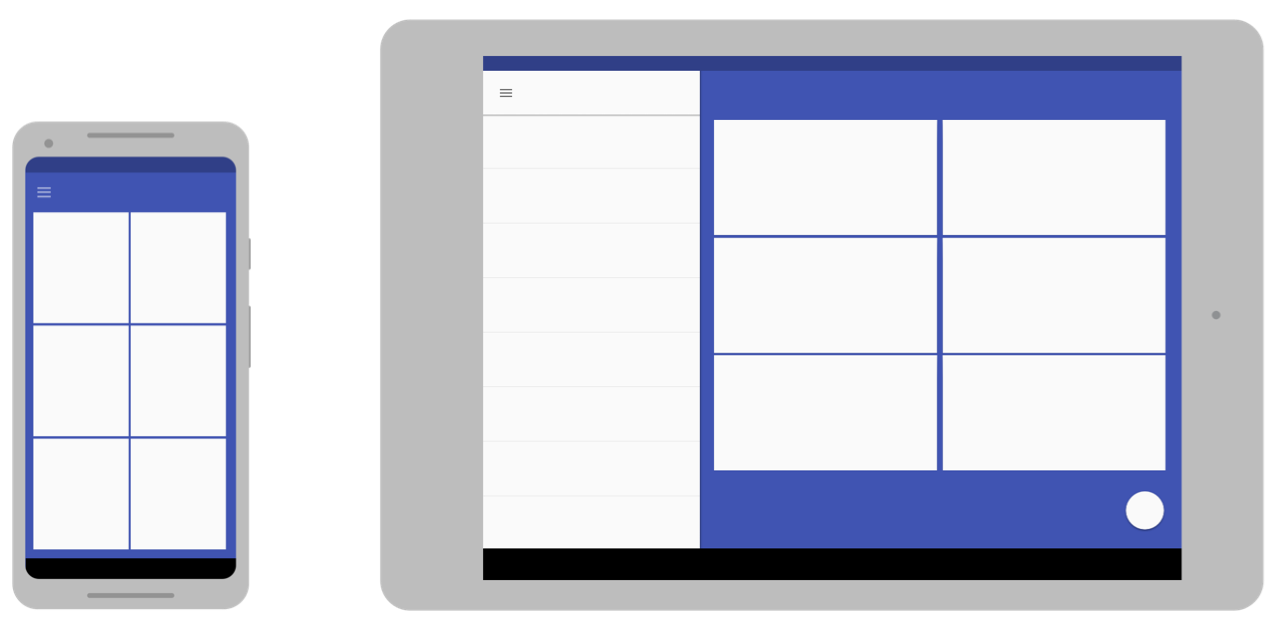
A list-detail UI typically provides a different user experience on different‑size screens. On large screens, the list and detail panes are usually side by side. When an item in the list is selected, item information is displayed in the detail pane without changing the UI—the two panes remain side by side. However, on small screens, the two panes are displayed separately, each pane occupying the entire display area. When an item in the list pane is selected, the detail pane (containing the selected item's information) replaces the list pane. Back navigation replaces the detail pane with the list.
SlidingPaneLayout
manages the logic for determining which of the two user experiences is
appropriate for the current window size:
<?xml version="1.0" encoding="utf-8"?>
<androidx.slidingpanelayout.widget.SlidingPaneLayout
    xmlns:android="http://schemas.android.com/apk/res/android"
    xmlns:app="http://schemas.android.com/apk/res-auto"
    xmlns:tools="http://schemas.android.com/tools"
    android:layout_width="match_parent"
    android:layout_height="match_parent"
    tools:context=".MainActivity">

    <androidx.recyclerview.widget.RecyclerView
        android:id="@+id/recycler_view"
        android:layout_width="280dp"
        android:layout_height="match_parent"
        android:layout_gravity="start" />

    <androidx.fragment.app.FragmentContainerView
        android:id="@+id/nav_host_fragment"
        android:name="androidx.navigation.fragment.NavHostFragment"
        android:layout_width="300dp"
        android:layout_height="match_parent"
        android:layout_weight="1"
        app:defaultNavHost="true"
        app:navGraph="@navigation/item_navigation" />

</androidx.slidingpanelayout.widget.SlidingPaneLayout>
The layout_width and layout_weight attributes of the two views contained in
SlidingPaneLayout determine the SlidingPaneLayout behavior. In the example,
if the window is large enough (at least 580dp wide) to display both views, the
panes are displayed side by side. But, if the window width is smaller than
580dp, the panes slide over one another to individually occupy the entire app
window.
If the window width is larger than the total specified minimum width (580dp),
layout_weight values can be used to size the two panes proportionally. In the
example, the list pane is always 280dp wide because it does not have a weight.
The detail pane however, always fills any horizontal space beyond 580dp because
of the view's layout_weight setting.
Alternative layout resources
To adapt your UI design to widely varying display sizes, use alternative layouts identified by resource qualifiers.
You can provide adaptive, screen‑specific layouts by creating additional
res/layout/ directories in your app's source code. Create a directory for each
screen configuration that requires a different layout. Then append a screen
configuration qualifier to the layout directory name (for example,
layout-w600dp for screens that have 600dp of available width).
The configuration qualifiers represent the visible display space available for your app UI. The system takes into account any system decorations (such as the navigation bar) and window configuration changes (such as multi‑window mode) when selecting the layout for your app.
To create alternative layouts in Android Studio, see Use layout variants to optimize for different screens in Develop a UI with Views.
Smallest width qualifier
The smallest width screen size qualifier enables you to provide alternative layouts for displays that have a minimum width measured in density-independent pixels (dp).
By describing the screen size as a measure of dp, Android enables you to create layouts that are designed for specific display dimensions without concern for different pixel densities.
For example, you can create a layout named main_activity that's optimized for
phones and tablets by creating different versions of the file in different
directories:
res/layout/main_activity.xml           # For phones (smaller than 600dp smallest width)
res/layout-sw600dp/main_activity.xml   # For 7" tablets (600dp wide or wider)
The smallest width qualifier specifies the smallest of the display's two sides, regardless of the device's current orientation, so it's a way to specify the overall display size available for your layout.
Here's how other smallest width values correspond to typical screen sizes:
- 320dp: Small phone screen (240x320 ldpi, 320x480 mdpi, 480x800 hdpi, etc.)
- 480dp: Large phone screen ~5" (480x800 mdpi)
- 600dp: 7" tablet (600x1024 mdpi)
- 720dp: 10" tablet (720x1280 mdpi, 800x1280 mdpi, etc.)
The following figure gives a more detailed view of how different screen dp widths correspond to different screen sizes and orientations.
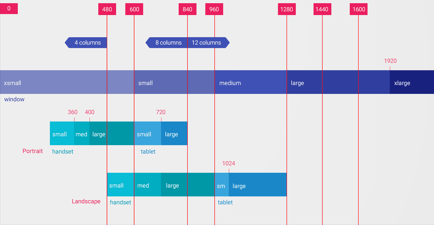
Values for the smallest width qualifier are dp, because what matters is the amount of display space available after the system accounts for pixel density (not the raw pixel resolution).
The sizes you specify using resource qualifiers like smallest width are not the actual screen sizes. Rather, the sizes specify the width or height in dp units that are available to your app's window. The Android system might use some of the screen for system UI (such as the system bar at the bottom of the screen or the status bar at the top), so some of the screen might not be available for your layout. If your app is used in multi‑window mode, the app only has access to the size of the window that contains the app. When the window is resized, it triggers a configuration change with the new window size, which enables the system to select an appropriate layout file. So, the resource qualifier sizes you declare should specify only the space needed by your app. The system accounts for any space used by system UI when providing space for your layout.
Available width qualifier
Instead of changing the layout based on the smallest width of the display, you might want to change your layout based on how much width or height is available. For example, you might want to use a two‑pane layout whenever the screen provides at least 600dp of width, which might change depending on whether the device is in landscape or portrait orientation. In that case, you should use the available width qualifier as follows:
res/layout/main_activity.xml         # For phones (smaller than 600dp available width)
res/layout-w600dp/main_activity.xml  # For 7" tablets or any screen with 600dp available width
                                     # (possibly landscape phones)
If available height is a concern for your app, you can use the
available height qualifier. For example, layout-h600dp for screens with at
least 600dp of screen height.
Orientation qualifiers
Even though you may be able to support all size variations using only combinations of the smallest width and available width qualifiers, you might also want to change the user experience when the user switches between portrait and landscape orientations.
For that, you can add the port or land qualifiers to your layout directory
names. Just be sure the orientation qualifiers come after the size qualifiers.
For example:
res/layout/main_activity.xml                # For phones
res/layout-land/main_activity.xml           # For phones in landscape
res/layout-sw600dp/main_activity.xml        # For 7" tablets
res/layout-sw600dp-land/main_activity.xml   # For 7" tablets in landscape
For more information about all the screen configuration qualifiers, see App resources overview.
Window size classes
Window size classes are viewport breakpoints that help you create adaptive layouts. The breakpoints identify the display area available to your app as compact, medium, or expanded. Width and height are specified separately, so your app always has a window size class for width and a window size class for height.
To programmatically apply adaptive layouts, do the following:
- Create layout resources based on the window size class breakpoints
- Compute your app's width and height window size classes using the
WindowSizeClass#compute()function from the Jetpack WindowManager library - Inflate the layout resource for the current window size classes
For more information, see Window size classes.
Modularized UI components using fragments
When designing your app for multiple display sizes, use fragments to extract your UI logic into separate components to make sure you aren't needlessly duplicating UI behavior across activities. Then you can combine fragments to create multi‑pane layouts on large screens, or you can place fragments in separate activities on small screens.
For example, the list‑detail pattern (see SlidingPaneLayout above) could be implemented with one fragment containing the list and another fragment containing the list item details. On large screens, the fragments could be displayed side by side; on small screens, individually, filling the screen.
To learn more, see the Fragments overview.
Activity embedding
If your app consists of multiple activities, activity embedding enables you to easily create an adaptive UI.
Activity embedding displays multiple activities or multiple instances of the same activity simultaneously in an application's task window. On large screens, activities can be displayed side by side; on small screens, stacked one on top of the other.
You determine how your app displays its activities by creating an XML configuration file which the system uses to determine the appropriate presentation based on display size. Alternatively, you can make Jetpack WindowManager API calls.
Activity embedding supports device orientation changes and foldable devices, stacking and unstacking activities as the device rotates or folds and unfolds.
For more information, see Activity embedding.
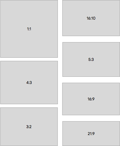
Screen sizes and aspect ratios
Test your app on a variety of screen sizes and aspect ratios to ensure your UI scales correctly.
Android 10 (API level 29) and higher support a wide range of aspect ratios. Foldable form factors can vary from tall, narrow screens, such as 21:9 when folded, to a square aspect ratio of 1:1 when unfolded.
To ensure compatibility with as many devices as possible, test your apps for as many of the following screen aspect ratios as you can:
If you don't have access to devices for all the different screen sizes you want to test, you can use the Android Emulator to emulate almost any screen size.
If you would rather test on a real device but don't have the device, you can use the Firebase Test Lab to access devices in a Google data center.
Additional resources
- Material Design — Understanding layout