An expandable item is a custom chip that displays additional content inline.
Expandable item chip
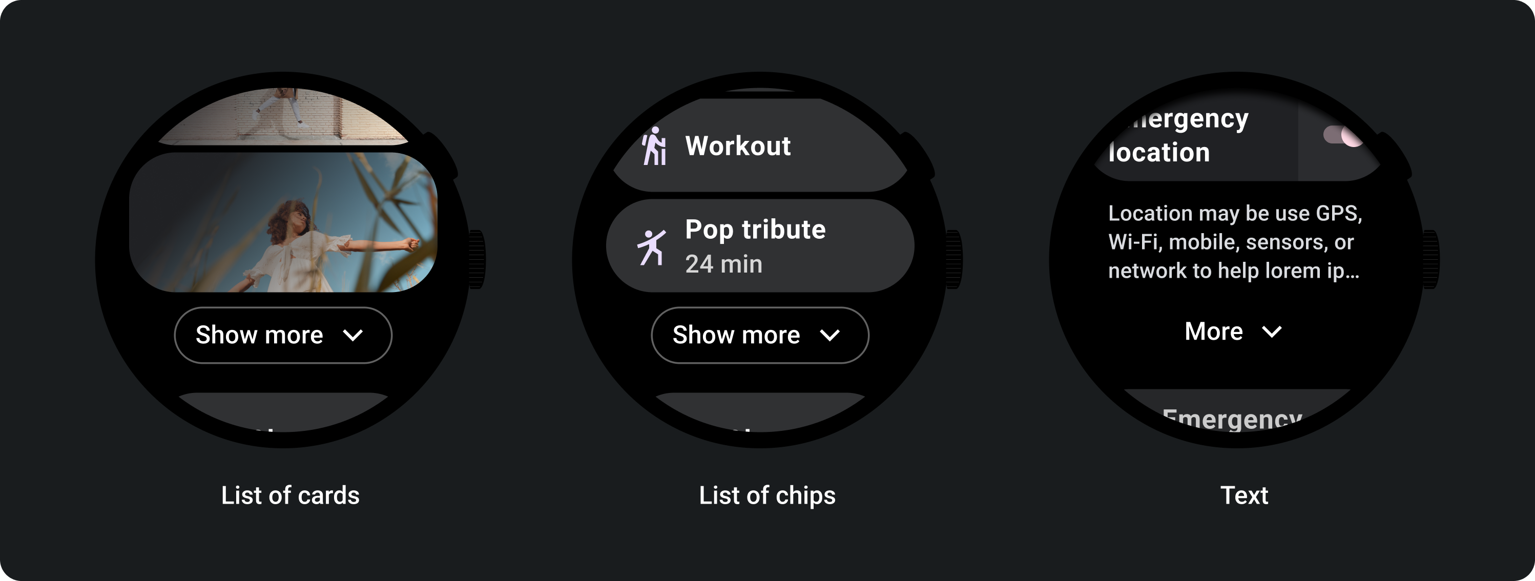
Expandable items let apps include high-density content in less space on the screen. Use this component when you want to keep an app compact while allowing users quick access to additional content. Use this component to let users perform the following tasks:
- Show more list items (chips, cards)
- Show more text
Anatomy
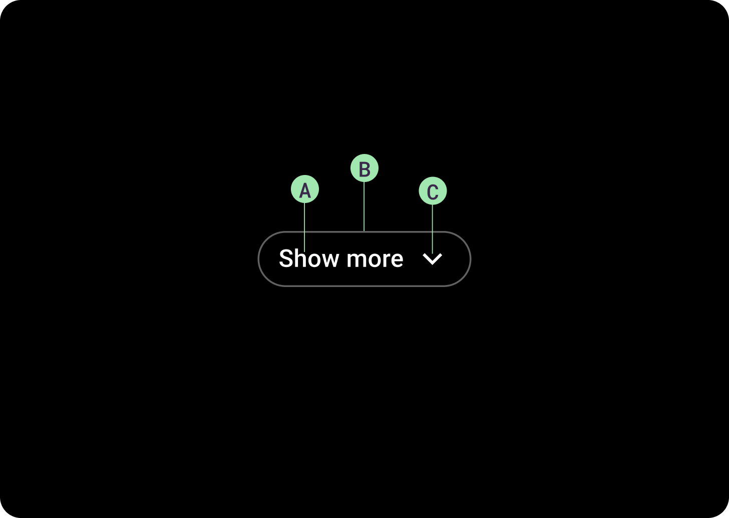
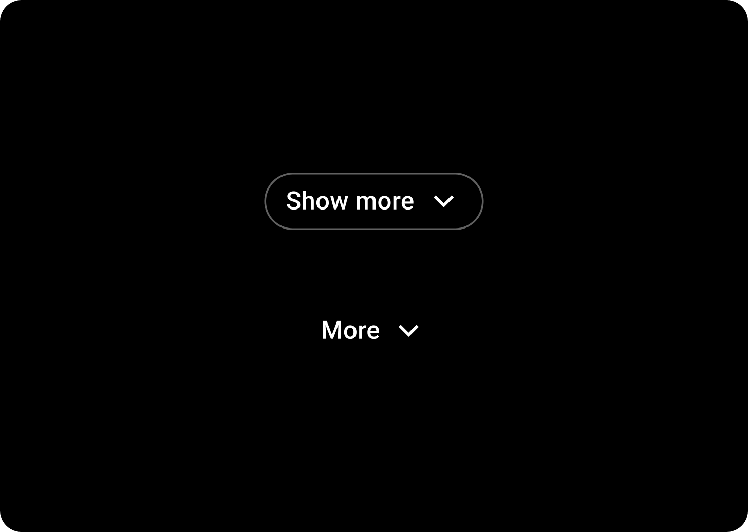
The chip must be center-aligned. A. Label
The label text can be customized. Default is "Show more". B. Container
The button must include a container border. C. Expand icon
The default icon is the down-facing chevron, which can be customized or removed. The icon is right-aligned for a LTR language locale, and left-aligned for an RTL language locale.
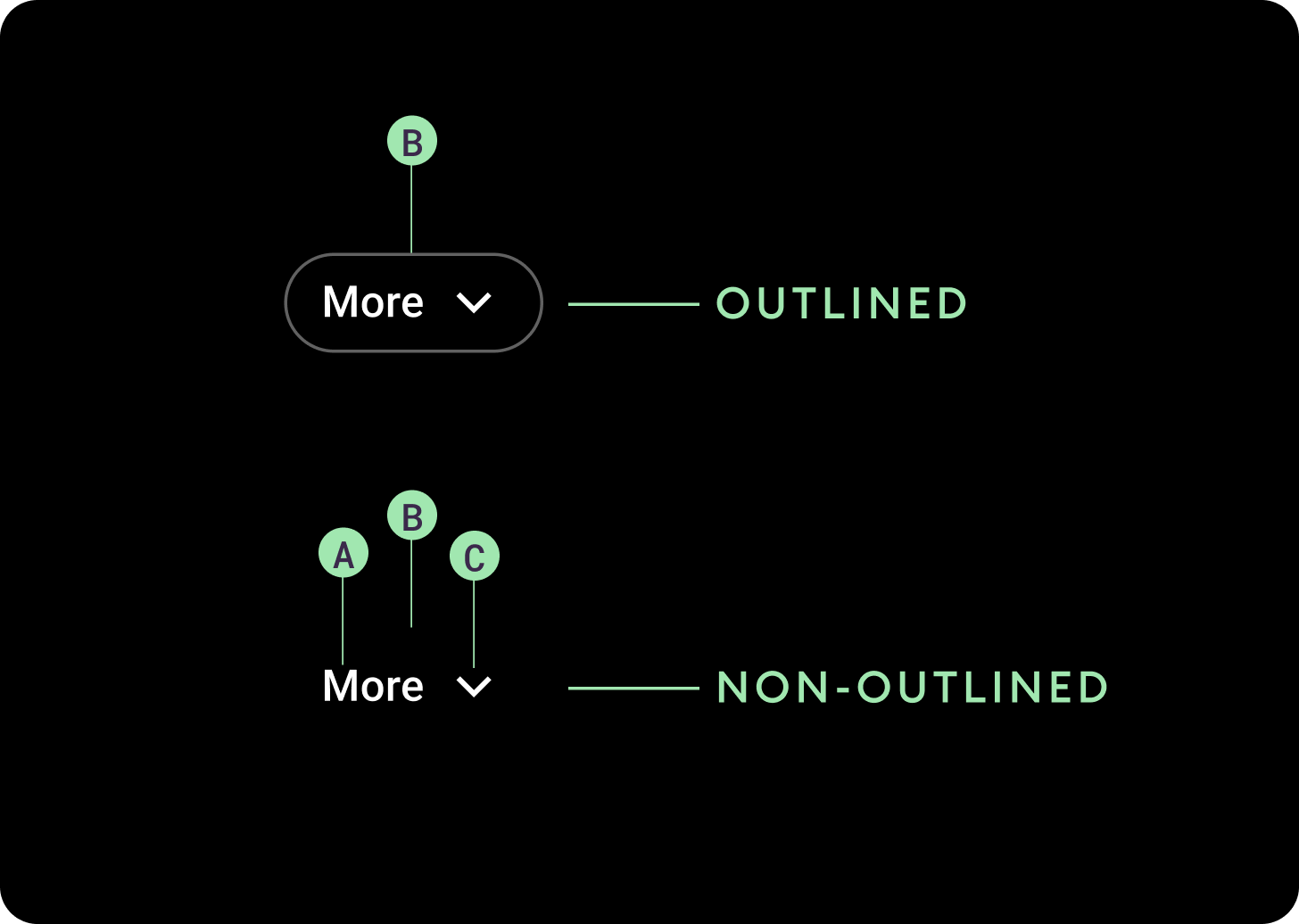
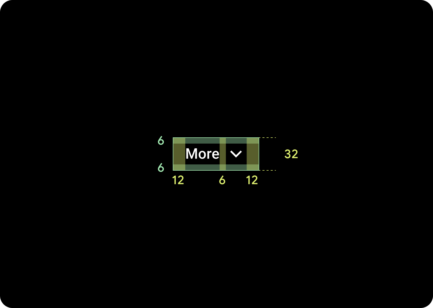
The chip must be center-aligned. A. Label
The label text can be customized. Default is "More". B. Container
The button has two variants: outlined and non-outlined. C. Expand icon
The default icon is the down-facing chevron, which can be customized or removed. The icon is right-aligned for a LTR language locale, and left-aligned for an RTL language locale.
Behavior
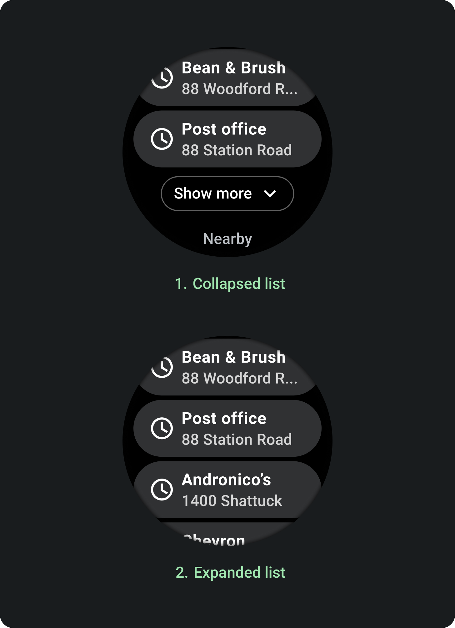
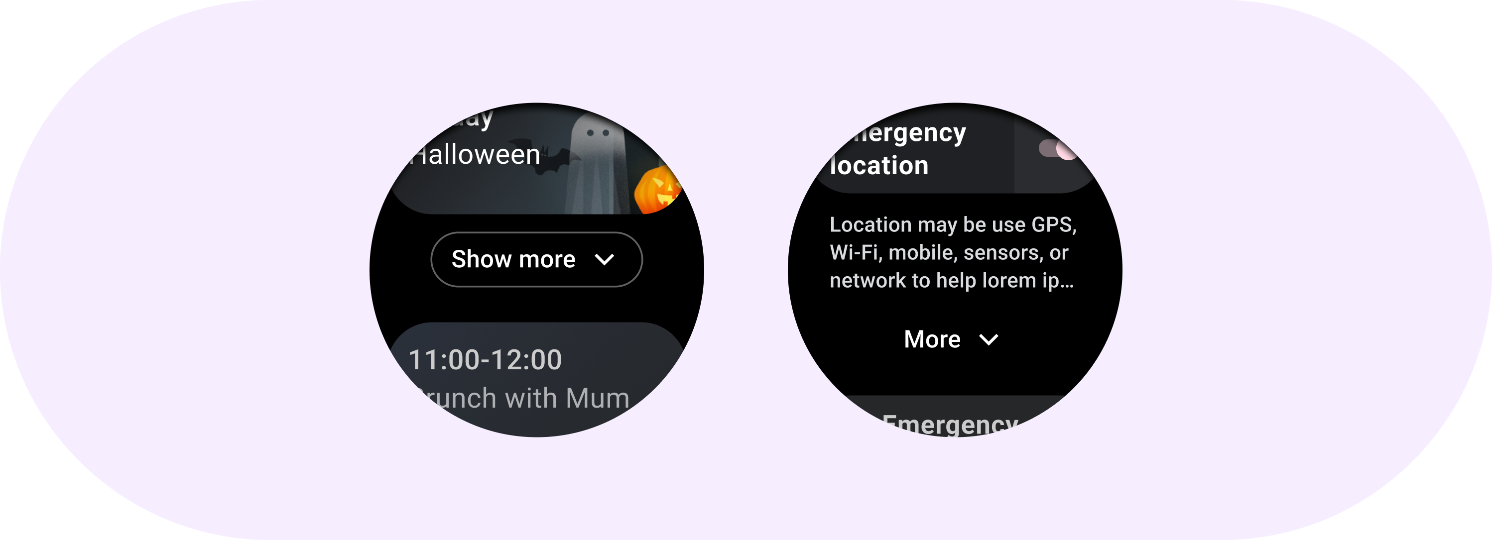
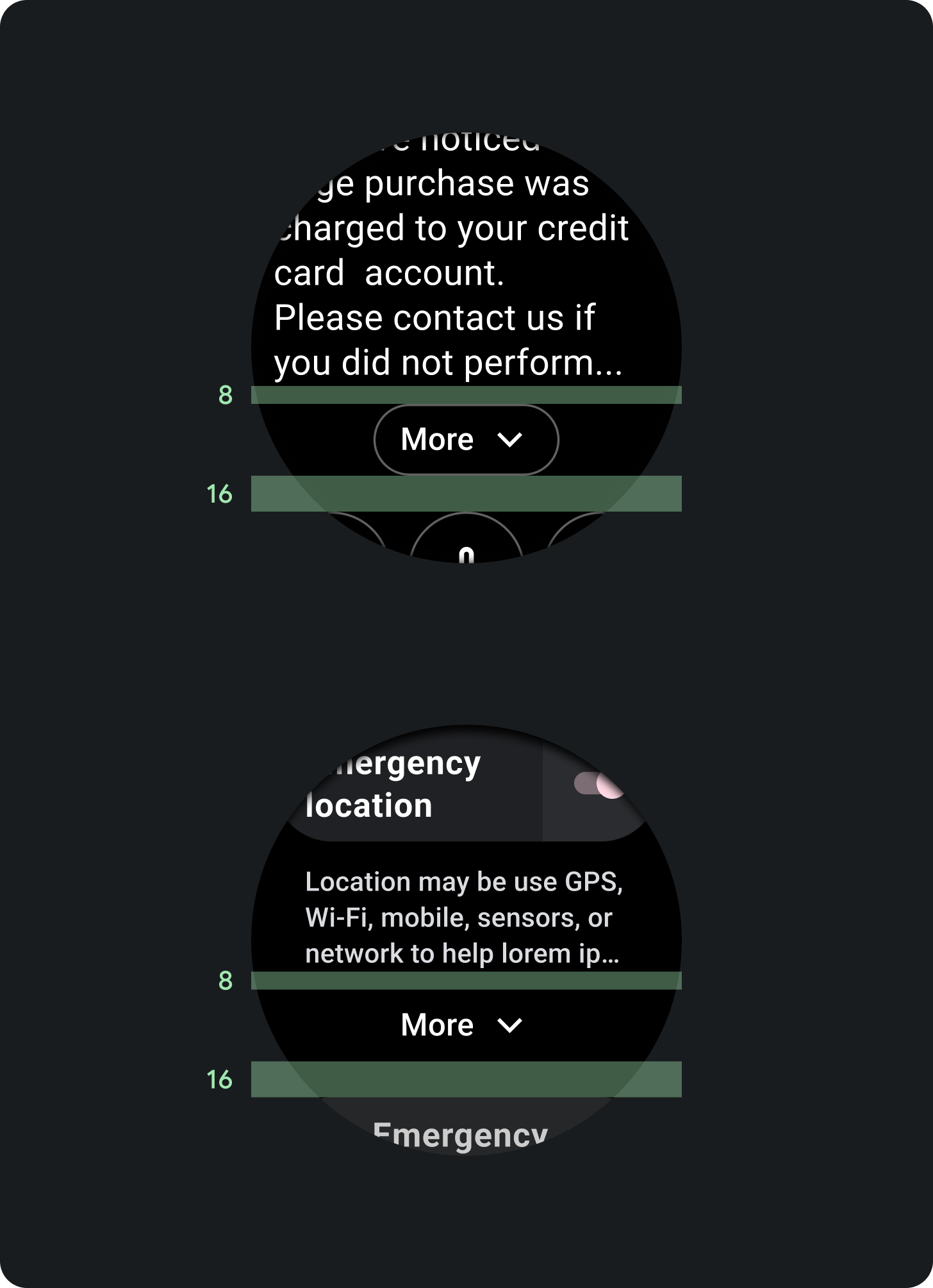
Tap the chip to expand and display more items in a list. The expansion action animates, hiding the Show more text and revealing the other items in one smooth motion. You can customize the number of items displayed in the collapsed state. The recommended number of items is three.
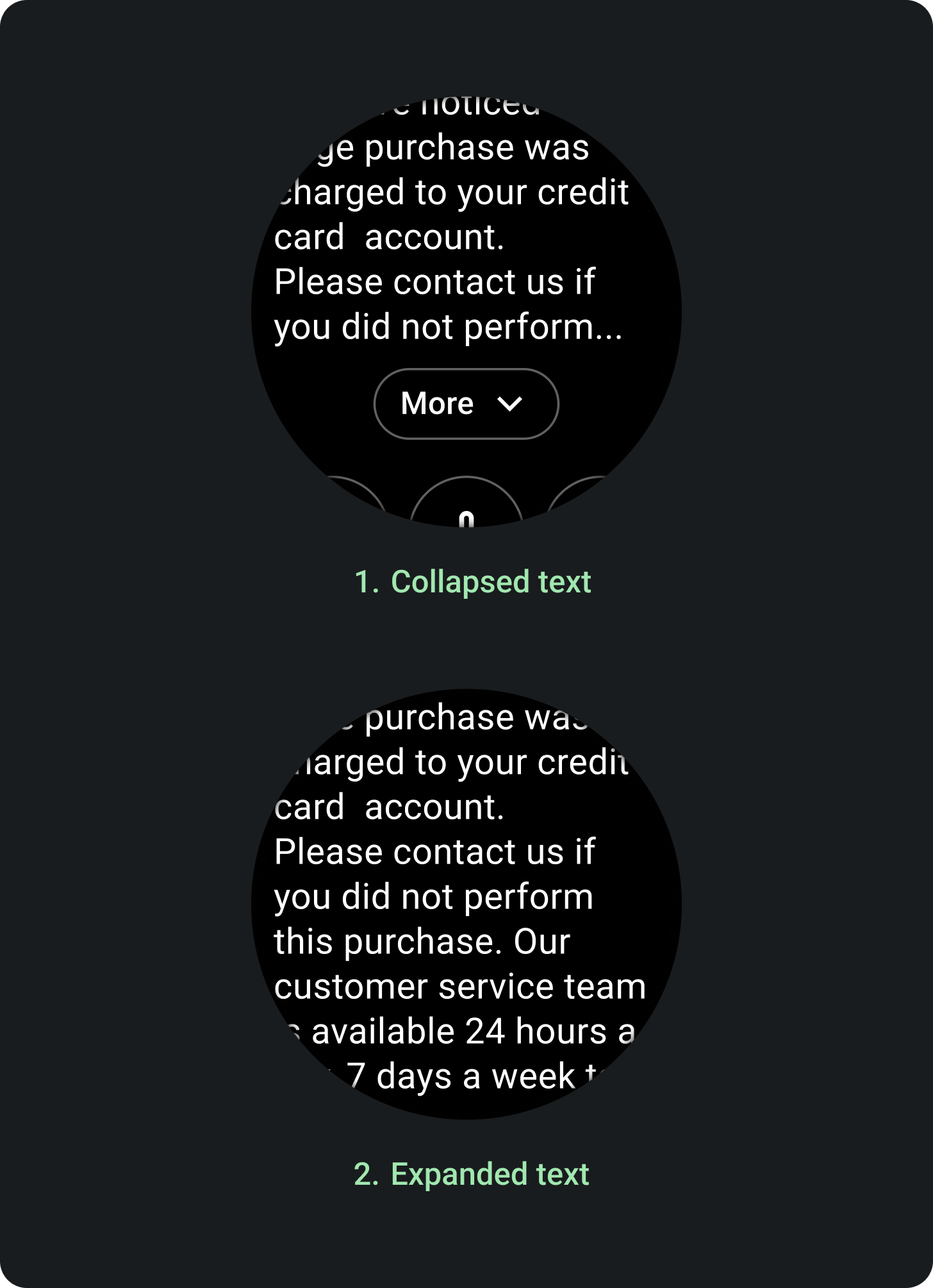
Tap the chip to expand and display more text. The expansion action animates, hiding the More text and revealing the other items in one smooth motion. You can customize the number of lines of text displayed in the collapsed state. The recommended number of lines is eight.
The tap target consists of the entire text area, not just the button.
Chip styles
Expanding list
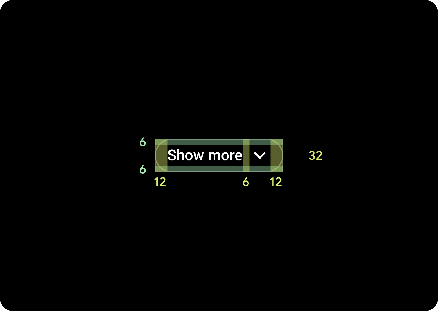
Icon size: 20 dp x 20 dp
Icon color: On Surface
Height: 32 dp
Width: Varies based on text and language
Stroke: 1 dp
Label style: Caption 1
Label color: On Surface
Expanding text
Icon size: 20 dp x 20 dp
Icon color: On Surface
Height: 32 dp
Width: Varies based on text & language
Stroke: 0 or 1 dp
Fill: None
Label style: Caption 1
Label color: On Surface
Padding
For both the list variant and the text variant of the expandable item component, the chip should have the following padding values:
- Top padding: 8 dp
- Bottom padding: 16 dp
Usage
Examples of using expandable items: