
1. Introduction
Users can interact with your app using a hardware keyboard, typically on large screen devices like tablets and ChromeOS devices, but also on XR devices. It's important that users can navigate your app as effectively with a hardware keyboard as with a touchscreen. Additionally, when designing your app for TV and car displays, which might not have touch input and instead rely on D-pads or rotary encoders, you need to apply similar keyboard navigation principles.
Compose allows you to handle input from hardware keyboards, D-pads, and rotary encoders in a unified way. A key principle of good user experience for these input methods is that users can intuitively and consistently move keyboard focus to the interactive component they want to interact with.
In this codelab, you'll learn the following:
- How to implement common keyboard focus management patterns for intuitive and consistent navigation
- How to test whether keyboard focus movement behaves as expected
Prerequisites
- Experience building apps with Compose
- Basic knowledge of Kotlin, including lambdas and coroutines
What you build
You implement the following typical keyboard focus management patterns:
- Keyboard focus movement — From start to end, top to bottom in the z shaped pattern
- Logical initial focus — Set focus to the UI element your user is likely to interact with
- Focus restoration — Move focus to the UI element your user previously interacted with
What you'll learn
- Basics of focus management in Compose
- How to make an UI element as a focus target
- How to request focus to move a UI element
- How to move the keyboard focus to a certain UI element in a group of UI elements
What you need
- Android Studio Ladybug or newer version
- Any of the following devices to run the sample app:
- A large screen device with a hardware keyboard
- An Android virtual device for large screen devices, such as the resizable emulator
2. Set up
- Clone the large-screen-codelabs GitHub repository:
git clone https://github.com/android/large-screen-codelabs
Alternatively, you can download and unarchive the large-screen-codelabs zip file:
- Navigate to the
focus-management-in-composefolder. - In Android Studio, open the project. The
focus-management-in-composefolder contains one project. - If you don't have an Android tablet, foldable device, or a ChromeOS device with a hardware keyboard, open Device Manager in Android Studio and then create the Resizable device in the Phone category.
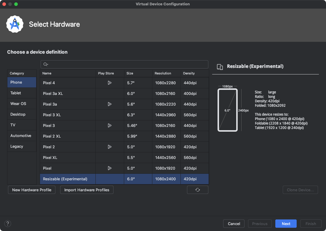 Figure 1. Configuring the resizable emulator in Android Studio.
3. Explore the starter code
The project has two modules:
- start — Contains the starter code of the project. You make changes to this code to complete the codelab.
- solution — Contains the completed code for this codelab.
The sample app consists of three tabs:
- Focus target
- Focus traversal order
- Focus group
The focus target tab is displayed when the app is launched.
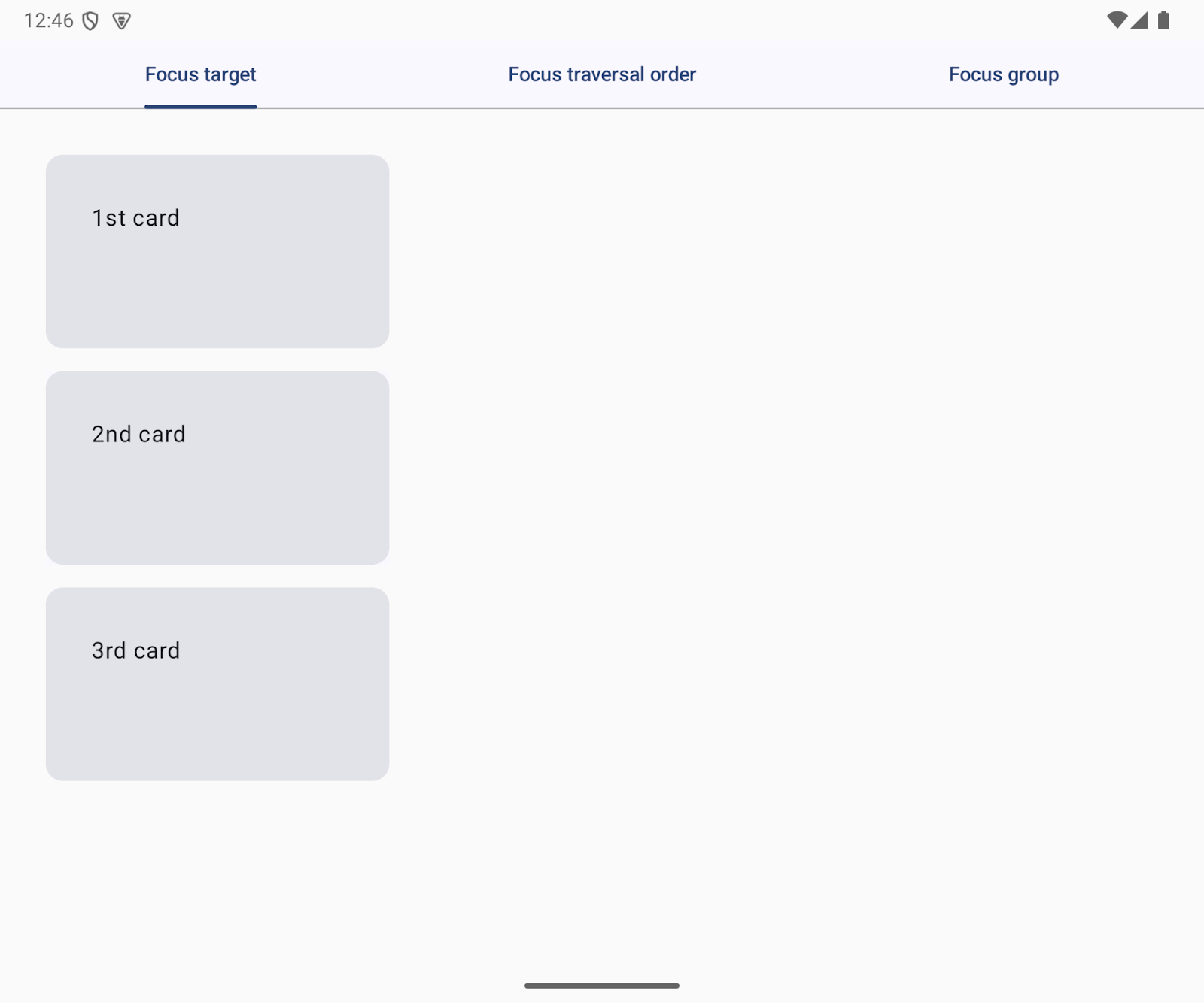
Figure 2. The Focus target tab is displayed when the app launches.
The ui package contains the following UI code you interact with:
App.kt— Implements tabstab.FocusTargetTab.kt— Contains the code for the focus target tabtab.FocusTraversalOrderTab.kt— Contains the code for the focus traversal order tabtab.FocusGroup.kt— Contains the code for the focus group tabFocusGroupTabTest.kt— An instrumented test fortab.FocusTargetTab.kt)The file is located in theandroidTestfolder)
4. Focus target
A focus target is a UI element that keyboard focus can move to. Users can move the keyboard focus with the Tab key or directional (arrow) keys:
Tabkey — Focus moves to the next focus target or the previous focus target one dimensionally.- Directional keys — Focus can move two dimensionally: up, down, left, and right.
Tabs are focus targets. In the sample app, the background of the tabs is visually updated when the tab acquires focus.
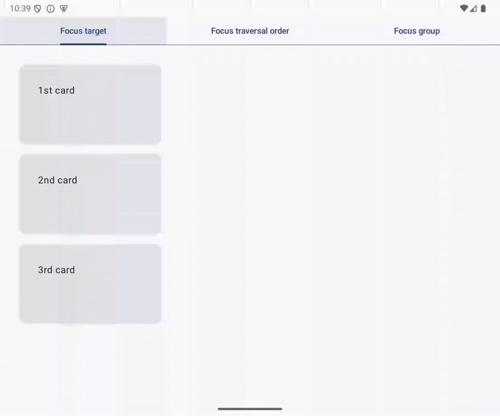
Figure 3. The component background changes when focus moves to a focus target.
Interactive UI elements are focus targets by default
An interactive component is a focus target by default. In other words, the UI element is a focus target if users can tap it.
The sample app has three cards in the Focus target tab. 1st card and 3rd card are focus targets; 2nd card is not. The background of 3rd card is updated when the user moves focus from 1st card with the Tab key.
Figure 4. App focus targets exclude 2nd card.
Modify 2nd card to be a focus target
You can make 2nd card a focus target by changing it to an interactive UI element. The easiest way is by using the clickable modifier as follows:
- Open
FocusTargetTab.ktin thetabspackage - Modify the
SecondCardcomposable with theclickablemodifier as follows:
@Composable
fun FocusTargetTab(
    onClick: () -> Unit,
    modifier: Modifier = Modifier
) {
    Column(
        verticalArrangement = Arrangement.spacedBy(16.dp),
        modifier = modifier
    ) {
        FirstCard(
            onClick = onClick,
            modifier = Modifier.width(240.dp)
        )
        SecondCard(
            modifier = Modifier
                .width(240.dp)
                .clickable(onClick = onClick)
        )
        ThirdCard(
            onClick = onClick,
            modifier = Modifier.width(240.dp)
        )
    }
}
Run it
Now, the user can move focus to 2nd card in addition to 1st card and 3rd card. You can try it on the Focus target tab; confirm that you can move focus from 1st card to 2nd card using the Tab key.
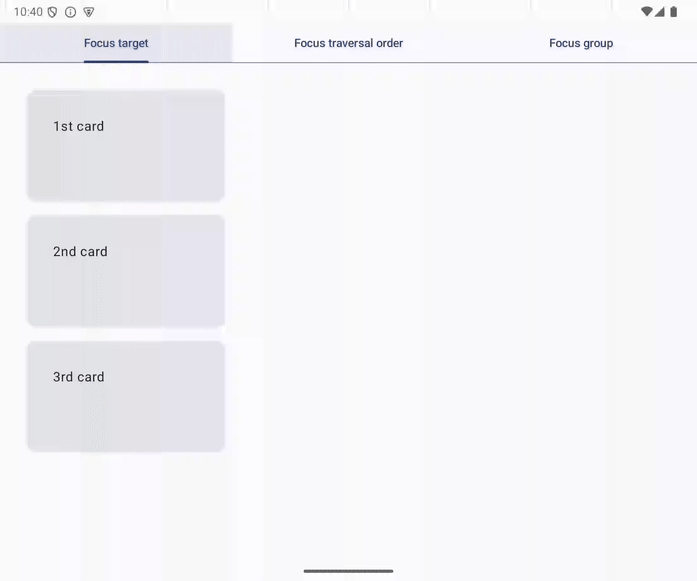
Figure 5. Moving focus from 1st card to 2nd card with the Tab key.
5. Focus traversal in a z-shaped pattern
Users expect keyboard focus to move from left to right and top to bottom in left-to-right language settings. This focus traversal order is called a z-shaped pattern.
Compose, however, ignores the layout when it determines the Tab key's next focus target and instead uses one-dimensional focus traversal based on the order of composable function calls.
One-dimensional focus traversal
One-dimensional focus traversal order comes from the order of composable function calls rather than the app layout.
In the sample app, the focus moves in the following order on the Focus traversal order tab:
- 1st card
- 4th card
- 3rd card
- 2nd card
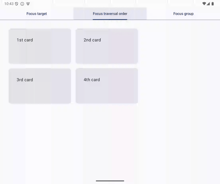
Figure 6. Focus traversal follows the order of composable functions.
The FocusTraversalOrderTab function implements the sample app's Focus traversal tab. The function calls composable functions for the cards: FirstCard, FourthCard, ThirdCard, and SecondCard, in that order.
@Composable
fun FocusTraversalOrderTab(
    modifier: Modifier = Modifier
) {
    Row(
        horizontalArrangement = Arrangement.spacedBy(16.dp),
        modifier = modifier
    ) {
        Column(
            verticalArrangement = Arrangement.spacedBy(16.dp)
        ) {
            FirstCard(
                onClick = onClick,
                modifier = Modifier.width(240.dp)
            )
            FourthCard(
                onClick = onClick,
                modifier = Modifier
                    .width(240.dp)
                    .offset(x = 256.dp)
            )
            ThirdCard(
                onClick = onClick,
                modifier = Modifier
                    .width(240.dp)
                    .offset(y = (-151).dp)
            )
        }
        SecondCard(
            modifier = Modifier.width(240.dp)
        )
    }
}
Focus movement in the z-shaped pattern
You can integrate z-shaped focus movement in the sample app's Focus traversal order tab in the following steps:
- Open
tabs.FocusTraversalOrderTab.kt - Remove the offset modifier from the
ThirdCardandFourthCardcomposables. - Change the layout of the tab to one column with two rows from the current one row with two columns.
- Move the
FirstCardandSecondCardcomposables to the first row. - Move the
ThirdCardandFourthCardcomposables to the second row.
The modified code is as follows:
@Composable
fun FocusTraversalOrderTab(
    onClick: () -> Unit,
    modifier: Modifier = Modifier
) {
    Column(
        verticalArrangement = Arrangement.spacedBy(16.dp),
        modifier = modifier
    ) {
        Row(
            horizontalArrangement = Arrangement.spacedBy(16.dp)
        ) {
            FirstCard(
                onClick = onClick,
                modifier = Modifier.width(240.dp),
            )
            SecondCard(
                onClick = onClick,
                modifier = Modifier.width(240.dp)
            )
        }
        Row(
            horizontalArrangement = Arrangement.spacedBy(16.dp)
        ) {
            ThirdCard(
                onClick = onClick,
                modifier = Modifier.width(240.dp)
            )
            FourthCard(
                onClick = onClick,
                modifier = Modifier.width(240.dp)
            )
        }
    }
}
Run it
Now, the user can move the focus from right to left, top to bottom in the z-shaped pattern. You can try it in the Focus traversal order tab and confirm that the focus moves in the following order with the Tab key:
- 1st card
- 2nd card
- 3rd card
- 4th card
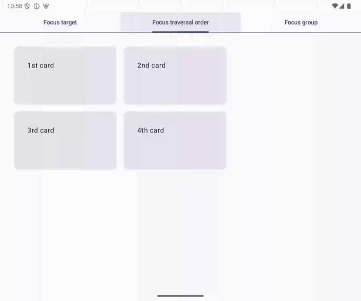
Figure 7. Focus traversal in a z-shaped pattern.
6. focusGroup
Focus moves to 3rd card from 1st card with the right directional key on the Focus group tab. The movement is probably slightly confusing for users as the two cards are not side by side.
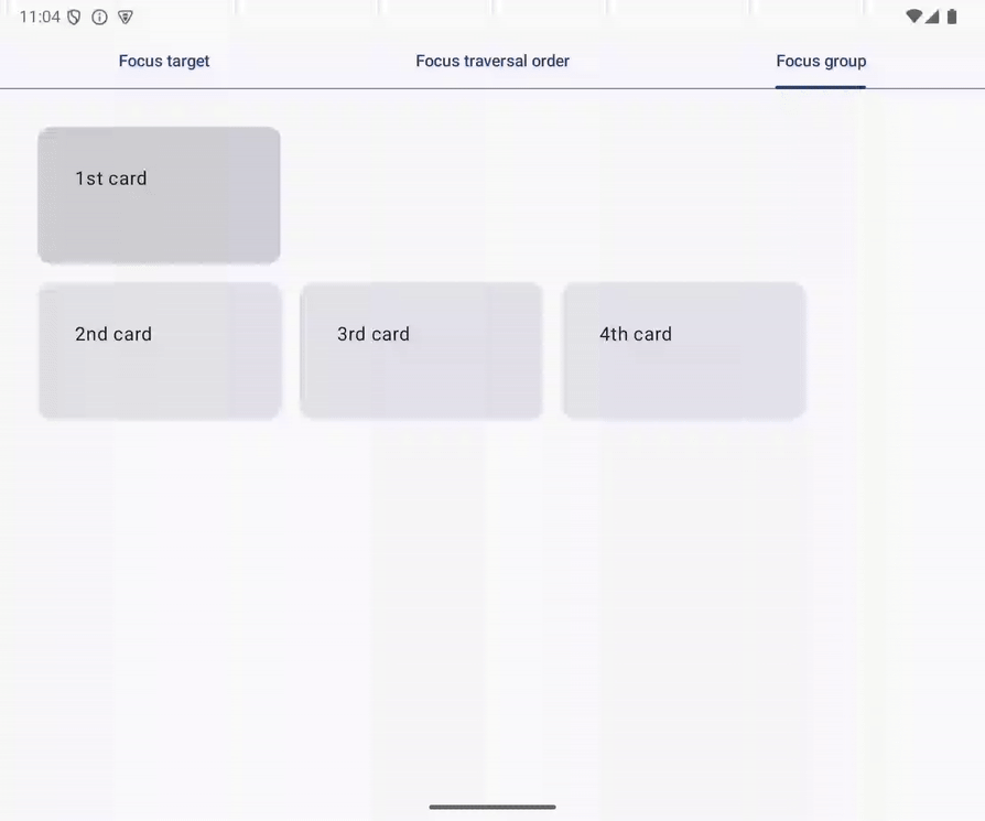
Figure 8. Unexpected focus movement from 1st card to 3rd card.
Two-dimensional focus traversal refers to layout information
Pressing a direction key triggers two-dimensional focus traversal. This is a common focus traversal on TVs as users interact with your app with a D-pad. Pressing keyboard arrow keys also triggers two-dimensional focus traversal as they mimic navigation with a D-pad.
In two-dimensional focus traversal, the system refers to the geometric information of UI elements and determines the focus target to move focus. For example, focus moves to 1st card from the focus target tab with the down directional key, and pressing the up directional key moves focus to the focus target tab.
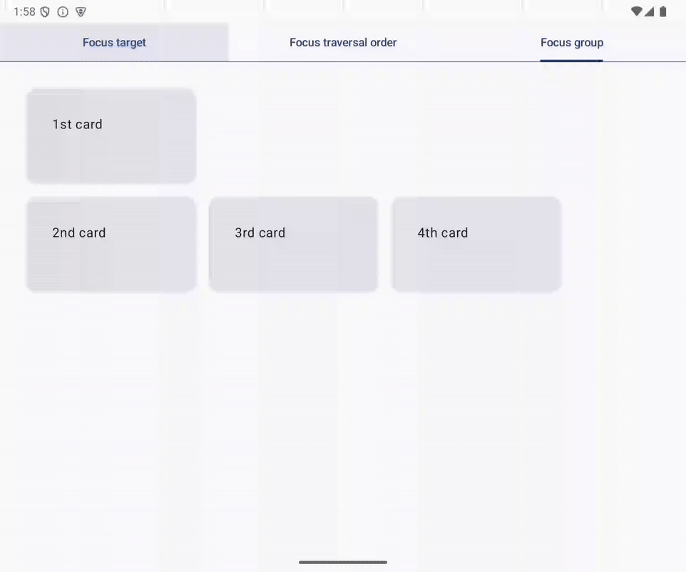
Figure 9. Focus traversal with down and up directional keys.
Two-dimensional focus traversal does not wrap around, in contrast to one-dimensional focus traversal with the Tab key. For example, the user can't move focus with the down key when 2nd card gets focused.
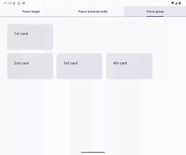
Figure 10. Directional down key can't move focus when 2nd card is focused.
Focus targets are at the same level
The following code implements the screen mentioned above. There are four focus targets: FirstCard, SecondCard, ThirdCard, and FourthCard. These four focus targets are at the same level, and ThirdCard is the first item to the right of FirstCard in the layout. That's why focus moves to 3rd card from 1st card with the right directional key.
@Composable
fun FocusGroupTab(
    onClick: () -> Unit,
    modifier: Modifier = Modifier
) {
    Column(
        verticalArrangement = Arrangement.spacedBy(16.dp),
        modifier = modifier,
    ) {
        FirstCard(
            onClick = onClick,
            modifier = Modifier.width(208.dp)
        )
        Row(
            horizontalArrangement = Arrangement.spacedBy(16.dp),
        ) {
            SecondCard(
                onClick = onClick,
                modifier = Modifier.width(208.dp)
            )
            ThirdCard(
                onClick = onClick,
                modifier = Modifier.width(208.dp)
            )
            FourthCard(
                onClick = onClick,
                modifier = Modifier.width(208.dp)
            )
        }
    }
}
Group focus targets with the focusGroup modifier
You can change the confusing focus movement with the following steps:
- Open
tabs.FocusGroup.kt - Modify the
Columncomposable function in theFocusGroupTabcomposable function with thefocusGroupmodifier.
The updated code is as follows:
@Composable
fun FocusGroupTab(
    onClick: () -> Unit,
    modifier: Modifier = Modifier
) {
    Column(
        verticalArrangement = Arrangement.spacedBy(16.dp),
        modifier = modifier,
    ) {
        FirstCard(
            onClick = onClick,
            modifier = Modifier.width(208.dp)
        )
        Row(
            horizontalArrangement = Arrangement.spacedBy(16.dp),
            modifier = Modifier.focusGroup(),
        ) {
            SecondCard(
                onClick = onClick,
                modifier = Modifier.width(208.dp)
            )
            ThirdCard(
                onClick = onClick,
                modifier = Modifier.width(208.dp)
            )
            FourthCard(
                onClick = onClick,
                modifier = Modifier.width(208.dp)
            )
        }
    }
}
The focusGroup modifier creates a focus group that consists of the focus targets inside the modified component. The focus targets in the focus group and the ones outside of the focus group are at different levels, and there is no focus target placed on the right-hand side of the FirstCard composable. As a result, focus does not move to any cards from 1st card with the right directional key.
Run it
Now, focus does not move to 3rd card from 1st card with the right directional key in the sample app's Focus group tab.
7. Request focus
Users can't use keyboards or D-pads to select arbitrary UI elements to interact with. Users need to move the keyboard focus to an interactive component before they interact with the element.
For example, users need to move focus from the Focus target tab to 1st card before they interact with the card. You can reduce the number of actions to start your user's primary task by logically setting initial focus.
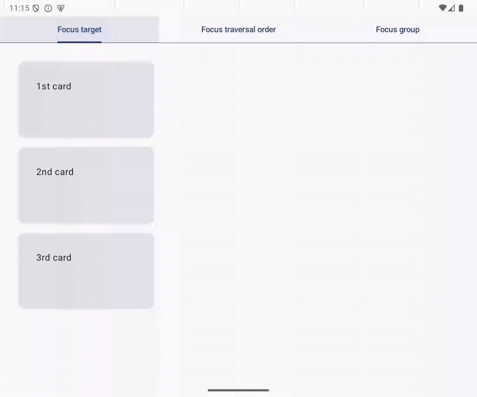
Figure 11. Three Tab key presses move focus to 1st card.
Request focus with FocusRequester
You can request focus to move an UI element with FocusRequester. A FocusRequester object should be associated with an UI element before calling the requestFocus() method.
Set the initial focus to 1st card
You can set the initial focus to 1st card with the following steps:
- Open
tabs.FocusTarget.kt - Declare the
firstCardvalue in theFocusTargetTabcomposable function, and initialize the value with aFocusRequesterobject that is returned from therememberfunction. - Modify the
FirstCardcomposable function with thefocusRequestermodifier. - Specify the
firstCardvalue as the argument of thefocusRequestermodifier. - Call the
LaunchedEffectcomposable function withUnitvalue, and call the requestFocus() method over thefirstCardvalue in the lambda passed to theLaunchedEffectcomposable function.
A FocusRequester object is created and associated with a UI element in the second and third steps. In the fifth step, focus is requested to move to the associated UI element when the FocusdTargetTab composable is composed the first time.
The updated code looks as follows:
@Composable
fun FocusTargetTab(
    onClick: () -> Unit,
    modifier: Modifier = Modifier
) {
    val firstCard = remember { FocusRequester() }

    Column(
        verticalArrangement = Arrangement.spacedBy(16.dp),
        modifier = modifier
    ) {
        FirstCard(
            onClick = onClick,
            modifier = Modifier
                .width(240.dp)
                .focusRequester(focusRequester = firstCard)
        )
        SecondCard(
            modifier = Modifier
                .width(240.dp)
                .clickable(onClick = onClick)
        )
        ThirdCard(
            onClick = onClick,
            modifier = Modifier.width(240.dp)
        )
    }

    LaunchedEffect(Unit) {
        firstCard.requestFocus()
    }
}
Run it
Now, keyboard focus moves to 1st card in the Focus target tab when the tab is selected. You can try it by switching tabs. Also, 1st card is selected when the app launches.
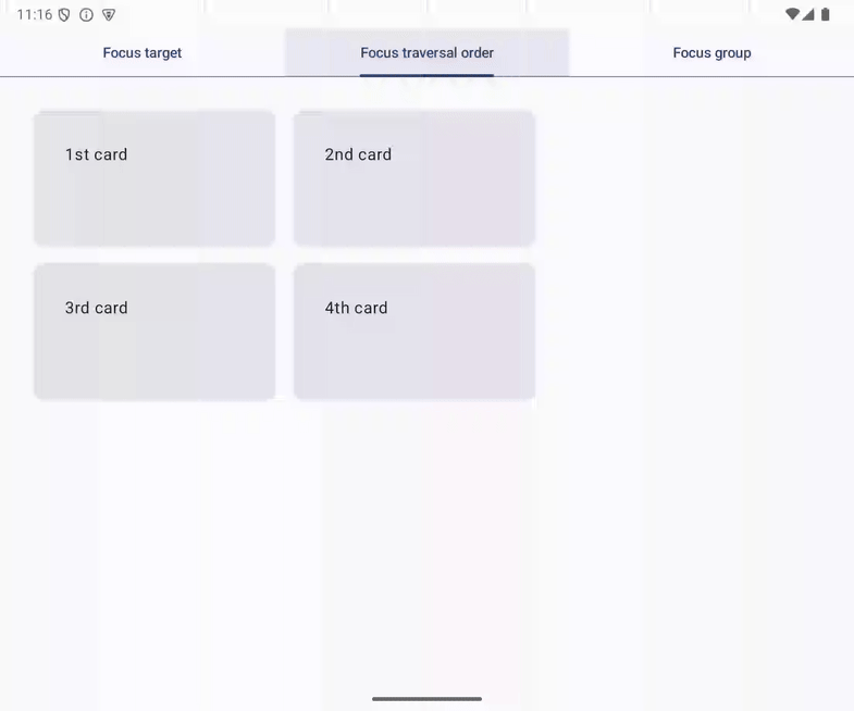
Figure 12. Focus moves to 1st card when the Focus target tab is selected.
8. Move focus to the selected tab
You can specify the focus target when keyboard focus is entering a focus group. For example, you can move the focus to the selected tab when your user is moving focus to the tab row.
You can implement this behavior with the following steps:
- Open
App.kt. - Declare the
focusRequestersvalue in theAppcomposable function. - Initialize the
focusRequestersvalue with the return value of therememberfunction that returns a list ofFocusRequesterobjects. The length of the returned list should be equal to the length ofScreens.entries. - Associate each
FocusRequesterobject of thefocusRequestervalue with theTabcomposable by modifying the Tab composable with thefocusRequestermodifier. - Modify the PrimaryTabRow composable with the
focusPropertiesmodifier and thefocusGroupmodifier. - Pass a lambda to the
focusPropertiesmodifier, and associate theonEnterproperty with another lambda. - Call
requestFocusmethod over the FocusRequester, which is indexed with theselectedTabIndexvalue in thefocusRequestersvalue, from the lambda associated with theenterproperty.
The modified code looks as follows:
@Composable
fun App(
    modifier: Modifier = Modifier,
) {
    val context = LocalContext.current

    val backstack = rememberNavBackStack(Tab.FocusTarget)
    val selectedTabIndex = Tab.entries.indexOf(backstack.last())
    val focusRequesters = remember {
        List(Tab.entries.size) { FocusRequester() }
    }

    Column(modifier = modifier) {
        PrimaryTabRow(
            selectedTabIndex = selectedTabIndex,
            modifier = Modifier
                .focusProperties {
                    onEnter = {
                        focusRequesters[selectedTabIndex].requestFocus()
                    }
                }
                .focusGroup()
        ) {
            Tab.entries.forEachIndexed { index, tab ->
                val isSelected = selectedTabIndex == index
                Tab(
                    selected = isSelected,
                    onClick = {
                        if (!isSelected) {
                            backstack.add(tab)
                        }
                    },
                    text = { Text(stringResource(tab.title)) },
                    modifier = Modifier.focusRequester(focusRequester = focusRequesters[index])
                )
            }
        }
        NavDisplay(
            backStack = backstack,
            entryProvider = entryProvider {
                entry<Tab.FocusTarget> {
                    FocusTargetTab(
                        onClick = context::onCardClicked,
                        modifier = Modifier.padding(32.dp),
                    )
                }
                entry<Tab.FocusTraversalOrder> {
                    FocusTraversalOrderTab(
                        onClick = context::onCardClicked,
                        modifier = Modifier.padding(32.dp)
                    )
                }
                entry<Tab.FocusGroup> {
                    FocusGroupTab(
                        onClick = context::onCardClicked,
                        modifier = Modifier.padding(32.dp)
                    )
                }
            }
        )
    }
}
You can control the focus movement with the focusProperties modifier. In the lambda passed to the modifier, modify FocusProperties, which is referred to when the system chooses the focus target when users press the Tab key or directional keys when the modified UI element is focused.
When the focus enters a focus group, the system calls the lambda set to the onEnter property. You can move the focus to a UI element by requesting focus in the lambda.
Run it
Now, keyboard focus moves to the selected tab when the user is moving focus to the tab row. You can try it with the following steps:
- Run the app
- Select the Focus group tab
- Move the focus to 1st card with the
downdirectional key. - Move the focus with the
updirectional key.
Figure 13. Focus moves to the selected tab.
9. Focus restoration
Users expect that they can easily resume a task when it's interrupted. Focus restoration supports recovery from an interruption. Focus restoration moves keyboard focus to the UI element that was previously selected.
A typical use case of focus restoration is the home screen of video streaming apps. The screen has multiple lists of video content, such as movies in a category or episodes of a TV show. Users look around the lists and find interesting content. Sometimes, users move back to the previously examined list and continue browsing it. With focus restoration, users can continue browsing without moving keyboard focus to the last item they looked at in the list.
focusRestorer modifier restores focus to a focus group
Use the focusRestorer modifier to save and restore focus to a focus group. When focus leaves the focus group, focus stores a reference to the item that was previously focused. Then when focus re-enters the focus group, focus is restored to the previously focused item.
Integrate focus restoration with the Focus group tab
The sample app's Focus group tab has a row containing 2nd card, 3rd card, and 4th card.
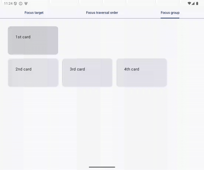
Figure 14. Focus group containing 2nd card, 3rd card, and 4th card.
You can integrate focus restoration in the row with the following steps:
- Open
tab.FocusGroupTab.kt - Modify the
Rowcomposable in theFocusGroupTabcomposable with thefocusRestorermodifier. The modifier should be called before thefocusGroupmodifier.
The modified code looks as follows:
@Composable
fun FocusGroupTab(
    onClick: () -> Unit,
    modifier: Modifier = Modifier
) {
    Column(
        verticalArrangement = Arrangement.spacedBy(16.dp),
        modifier = modifier,
    ) {
        FirstCard(
            onClick = onClick,
            modifier = Modifier.width(208.dp)
        )
        Row(
            horizontalArrangement = Arrangement.spacedBy(16.dp),
            modifier = Modifier
                .focusRestorer()
                .focusGroup(),
        ) {
            SecondCard(
                onClick = onClick,
                modifier = Modifier.width(208.dp)
            )
            ThirdCard(
                onClick = onClick,
                modifier = Modifier.width(208.dp)
            )
            FourthCard(
                onClick = onClick,
                modifier = Modifier.width(208.dp)
            )
        }
    }
}
Run it
Now, the row in the Focus group tab restores focus, and you can try it with the following steps:
- Select the Focus group tab
- Move focus to 1st card
- Move focus to 4th card with the
Tabkey - Move focus to 1st card with
updirectional key - Press the
Tabkey
Keyboard focus moves to 4th card as the focusRestorer modifier saves the card's reference and restores focus when keyboard focus enters the focus group set to the row.
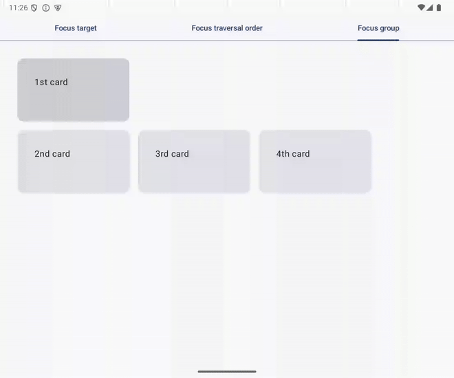
Figure 15. Focus returns to 4th card after up directional keypress followed by Tab keypress.
10. Write a test
You can test the implemented keyboard focus management with tests. Compose provides an API to test whether a UI element is focused and perform key presses on the UI components. Refer to the Testing in Jetpack Compose codelab for more information.
Test the Focus target tab
You modified the FocusTargetTab composable function to set 2nd card as a focus target in the previous section. Write a test of the implementation which you performed manually in the previous section. The test can be written with the following steps:
- Open
FocusTargetTabTest.kt. You will modify thetestSecondCardIsFocusTargetfunction in the following steps. - Request the focus to move to 1st card by calling the
requestFocusmethod over theSemanticsNodeInteractionobject for 1st card. - Ensure that 1st card is focused with the
assertIsFocused()method. - Perform the
Tabkey press by calling thepressKeymethod withKey.Tabvalue inside the lambda passed to theperformKeyInputmethod. - Test whether keyboard focus moves to 2nd card by calling the
assertIsFocused()method over theSemanticsNodeInteractionobject for 2nd card.
The updated code looks as follows:
@OptIn(ExperimentalTestApi::class, ExperimentalComposeUiApi::class)
@Test
fun testSecondCardIsFocusTarget() {
    composeTestRule.setContent {
        LocalInputModeManager
            .current
            .requestInputMode(InputMode.Keyboard)
        FocusTargetTab(onClick = {})
    }
    val context = InstrumentationRegistry.getInstrumentation().targetContext

    // Ensure the 1st card is focused
    composeTestRule
        .onNodeWithText(context.getString(R.string.first_card))
        .requestFocus()
        .performKeyInput { pressKey(Key.Tab) }

    // Test if focus moves to the 2nd card from the 1st card with Tab key
    composeTestRule
        .onNodeWithText(context.getString(R.string.second_card))
        .assertIsFocused()
}
Run it
You can run the test by clicking the triangular icon displayed to the left of the FocusTargetTest class declaration. Refer to the Run tests section in Test in Android Studio for more information.
11. Congratulations
Well done! You learned the building blocks for keyboard focus management:
- Focus target
- Focus traversal
You can control the focus traversal order with following Compose modifiers:
- The
focusGroupmodifier - The
focusPropertiesmodifier
You implemented the typical pattern for UX with hardware keyboard, initial focus, and focus restoration. These patterns are implemented by combinating the following APIs:
FocusRequesterclass- The
focusRequestermodifier - The
focusRestorermodifier LaunchedEffectcomposable function
The implemented UX can be tested with instrumented tests. Compose offers ways to perform key presses and test whether a SemanticsNode has keyboard focus or not.