
1. Introduction
Your app is available for large-screen devices–such as tablets, foldables, and ChromeOS devices–when the app is available for standard phones.
Users expect your app to offer a user experience on large screens that's equivalent to, or better than, the UX on small screens.
Users are also more likely to use your app with a physical keyboard and pointing device—such as a mouse or trackpad—on large screen devices. Some large screen devices, such as Chromebooks, include a physical keyboard and pointing device. Others connect to USB or Bluetooth keyboards and pointing devices. Users expect to be able to accomplish the same tasks when they're using your app with a physical keyboard and pointing device as they can with touch screens.
Prerequisites
- Experience building apps with Compose
- Basic knowledge of Kotlin, including lambdas and coroutines
What you build
You add support for physical keyboard and mouse to a Jetpack Compose-based app. The steps consist of the following:
- Check the app with the criteria defined in the large screen app quality guidelines
- Review the audit result and figure out the issues related to physical keyboard and mouse support
- Fix the issues
More specifically, you will update the sample app with the following:
- Keyboard navigation
- Keyboard shortcut to scroll down and up
- Keyboard Shortcuts Helper
What you learn
- How to audit your app for virtual device support
- How to manage keyboard navigation with Compose
- How to add keyboard shortcuts with Compose
What you need
- Android Studio Hedgehog or newer
- Any of the following devices to run the sample app:
- A large screen device with a physical keyboard and mouse
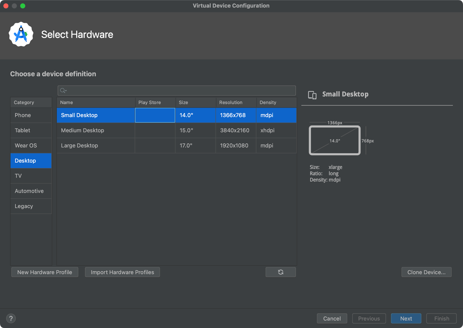
- An Android virtual device with a profile in the Desktop device definition category
2. Set up
- Clone the large-screen-codelabs GitHub repository:
git clone https://github.com/android/large-screen-codelabs
Alternatively, you can download and unarchive the large-screen-codelabs zip file:
- Navigate to the
add-keyboard-and-mouse-support-with-composefolder. - In Android Studio, open the project. The
add-keyboard-and-cursor-support-with-composefolder contains one project. - If you don't have an Android tablet or foldable devices, or a ChromeOS device with a physical keyboard and mouse, open Device Manager in Android Studio and then create any of the virtual devices in the Desktop category.
3. Explore the app
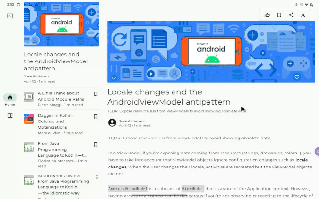
The sample app displays a list of articles. Users are able to read an article selected from the list.
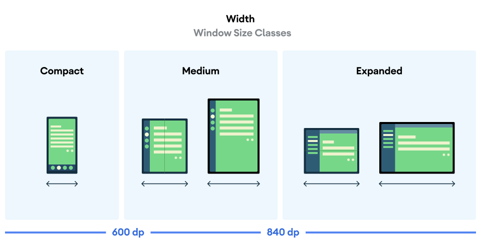
The app adaptively updates the layout according to the app's window width. There are three window classes to categorize the app's window width: compact, medium, and expanded.
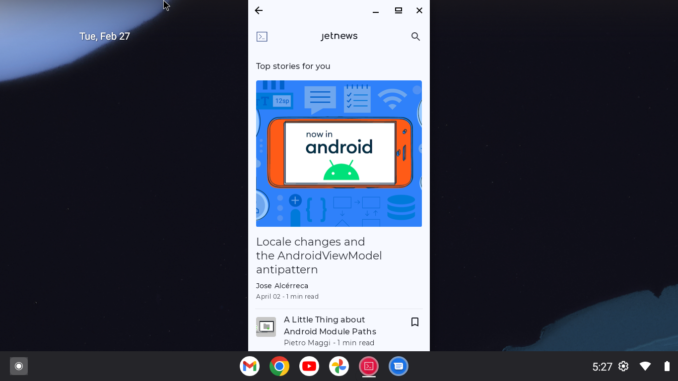
Layout for the compact and medium window size classes
The app uses a single pane layout. On the home screen, the app shows a list of articles. When the user selects an article from the list, a screen transition happens and the article is displayed.
The global navigation is implemented with a navigation drawer.
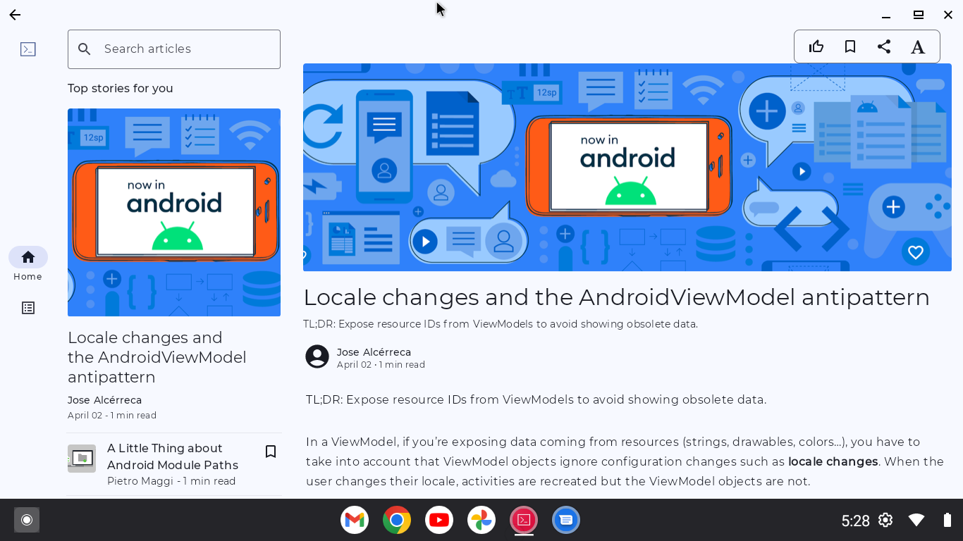
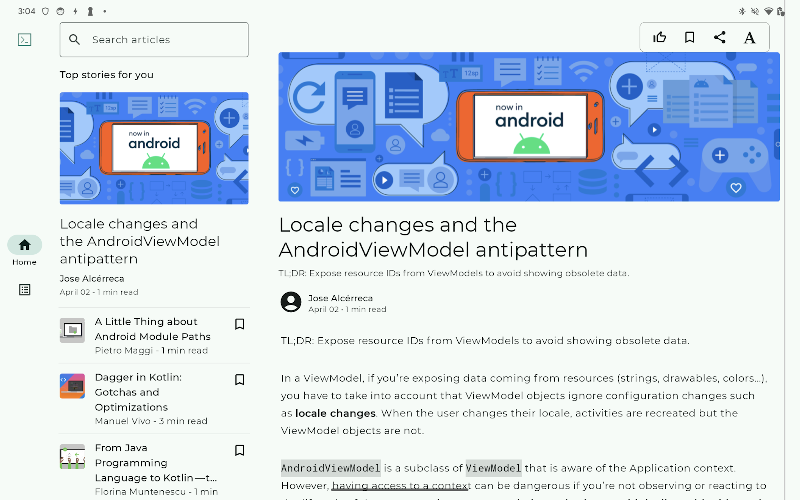
Layout for the expanded window size class
The app uses a list-detail layout. The list pane shows an article list. The details pane shows the selected article.
The global navigation is implemented with a navigation rail.
4. Background
Compose provides a variety of APIs to help your app handle events from the physical keyboard and mouse. Some of the APIs enable keyboard and mouse event handling that's similar to handling touch events. As a result, for many use cases, your app supports the physical keyboard and mouse without any development effort on your part.
A typical example is the clickable modifier, which allows click detection. A finger tap is detected as a click. A mouse click and pressing the Enter key are also detected as clicks. Your app enables users to interact with components regardless of the input device if your app detects clicks with the clickable modifier.
But, despite this high level of API support, some development effort is still required for physical keyboard and mouse support. One reason is that you need to find out the corner cases by testing your app. Some effort is also required to reduce the user friction that comes from the characteristics of the devices, such as the following:
- Users don't understand which components they can click
- Users can't move the keyboard focus as they expect
- Users can't scroll up or down when they are using the physical keyboard
Keyboard focus
Keyboard focus is the main difference between the interaction with the physical keyboard and screen touches. Users can tap any component on the screen regardless of the position of the component they previously touched. In contrast, with keyboards, users need to select the component to interact with before the actual interaction starts. The selection is called keyboard focus.
Users can move the keyboard focus with the Tab key and direction (or arrow) keys. The keyboard focus moves only to the neighboring components by default.
Most of the friction for the physical keyboard is related to keyboard focus. The following list shows the typical issues:
- Users can't move the keyboard focus to the component they want to interact with
- The component does not detect clicks when users hit the
Enterkey - The keyboard focus moves differently from the user's expectation.
- Users need to hit many keys to move the keyboard focus to the component they want to interact with after screen transitions.
- Users aren't able to determine which component has keyboard focus as no visual cue indicates the keyboard focus
- Users aren't able to determine the default component that has focus when navigating to a new screen
Visual indication of the keyboard focus is important, otherwise users can get lost in your app and they won't understand what happens when they hit the Enter key. Highlighting is a typical visual cue to indicate keyboard focus. Users can see that the button in the right card has keyboard focus because the button is highlighted.

Keyboard shortcuts
Users expect that they can use common keyboard shortcuts when they are using your app with a physical keyboard. Some components enable standard keyboard shortcuts by default. BasicTextField is a typical example. It enables users to use standard text-editing keyboard shortcuts, including the following:
Shortcut | Feature |
| Copy |
| Cut |
| Paste |
| Undo |
| Redo |
Your app can add keyboard shortcuts by handling key events. The onKeyEvent modifier and the onPreviewKeyEvent modifier allow you to monitor the key events.
Pointing devices: Mouse, trackpad, and stylus
Your app can handle mouse, trackpad, and stylus in the same manner. A tap on the trackpad is detected as a click with the clickable modifier. A tap with the stylus is also detected as a click.
It's important for users to be able to visually understand if they can click a component or not. That is why hover state is mentioned in the large screen app quality guidelines.
Material3 Components support hover state by default. Material 3 offers the visual effect for hover state. You can apply it to your interactive component with the indication modifier.
Scrolls
Scrollable containers support mouse-wheel scrolling, scrolling gestures on the trackpad, and scrolling with the Page up and Page down keys by default.
For horizontal scrolling, your app would be very user friendly if it showed left and right arrow buttons in hover state so that users can scroll the content by clicking the buttons.
Configuration changes by device attachment and detachment
Users can attach or detach a keyboard and mouse while your app is running. Users might connect a physical keyboard when they see a text field to input a large amount of text. A Bluetooth-connected mouse disconnects as the mouse goes into sleep mode. A USB-connected keyboard might be detached by accident.
The attachment or detachment of peripheral hardware triggers configuration changes. Your app should retain its state throughout the configuration changes. For more information, see Save UI states.
5. Check the sample app with keyboard and mouse
To begin the development effort for physical keyboard and mouse support, start the sample app and confirm the following:
- Users should be able to move the keyboard focus to all interactive components
- Users should be able to "click" the focused component with the
Enterkey - Interactive components should show an indication when they get keyboard focus
- The keyboard focus moves as users expect (that is, according to established conventions) using the
Tabkey,Shift+Tab, and directional (arrow) keys - Interactive components should have a hover state
- Users should be able to click the interactive components
- Context menu appears by right-clicking (secondary control-clicking) on the appropriate components, such as the ones where the context menu shows up with a long tap or text selection
You should go through all items twice in this codelab: once for the single-pane layout and once for the list-detail layout.
Issues to fix in this codelab
You should find issues. In this codelab, you fix the following:
- Users can't read the entire article with only the physical keyboard because they cannot scroll down the article
- Users can't determine whether the detail pane has keyboard focus or not
6. Enable users to read the entire article in the details pane
The detail pane shows the selected article. Some articles are too long to read the entire article without scrolling. However, users are unable to scroll up and down the article with only the physical keyboard.
Scrollable containers, such as LazyColumn, enable users to scroll down with the Page down key. The root cause of the issue is that users cannot move keyboard focus to the detail pane.
The component should be able to get keyboard focus to receive a keyboard event. The focusable modifier enables the modified component to get keyboard focus.
To fix this issue, follow these steps:
- Access the
PostContentcomposable function in theui/article/PostContent.ktfile - Modify the
LazyColumncomposable function with thefocusablemodifier
@OptIn(ExperimentalFoundationApi::class)
@Composable
fun PostContent(
    post: Post,
    modifier: Modifier = Modifier,
    contentPadding: PaddingValues = PaddingValues(0.dp),
    state: LazyListState = rememberLazyListState(),
    coroutineScope: CoroutineScope = rememberCoroutineScope(),
    focusRequester: FocusRequester = remember { FocusRequester() },
    header: (@Composable () -> Unit)? = null
) {
    LazyColumn(
        contentPadding = contentPadding,
        modifier = modifier
            .padding(horizontal = defaultSpacerSize)
            .focusable(),
        state = state,
    ) {
      // Code to layout the selected article.
    }
}
Indicate the article has keyboard focus
Now, users can read the entire article by scrolling down the article with the Page down key. However, it is difficult for them to understand if the PostContent component has keyboard focus or not as no visual effect indicates it.
Your app can visually indicate keyboard focus by associating an Indication with components. An Indication creates an object to render visual effects according to interactions. For example, the default Indication for Material 3highlights the component when it has the keyboard focus.
The sample app has an Indication called BorderIndication. The indication shows a line next to the component that has keyboard focus (as in the following screenshot). The code is stored in the ui/components/BorderIndication.kt file.
To make the PostConent composable show the BorderIndication when it has keyboard focus, follow these steps:
- Access the
PostContentcomposable function in theui/article/PostContent.ktfile - Declare the
interactionSourcevalue that is associated with the return value of theremember()function - Call the
MutableInteractionSource()function in theremember()function so that the createdMutableInteractionSourceobject is associated with theinteractionSourcevalue - Pass the
interactionSourcevalue to thefocusablemodifier using the interactionSource parameter - Change the modifier of the
PostContentcomposable to call thefocusablemodifier after the invocation of theindicationmodifier - Pass the
interactionSourcevalue and the return value of theBorderIndicationfunction to the indication modifier
@OptIn(ExperimentalFoundationApi::class)
@Composable
fun PostContent(
    post: Post,
    modifier: Modifier = Modifier,
    contentPadding: PaddingValues = PaddingValues(0.dp),
    state: LazyListState = rememberLazyListState(),
    coroutineScope: CoroutineScope = rememberCoroutineScope(),
    focusRequester: FocusRequester = remember { FocusRequester() },
    header: (@Composable () -> Unit)? = null
) {
    val interactionSource = remember { MutableInteractionSource() }

    LazyColumn(
        contentPadding = contentPadding,
        modifier = modifier
            .padding(horizontal = defaultSpacerSize)
            .indication(interactionSource, BorderIndication())
            .focusable(interactionSource = interactionSource),
        state = state,
    ) {
      // Code to layout the selected article.
    }
}
Add keyboard shortcuts to scroll up and down
It is a common feature to enable users to scroll up and down with the Spacebar. Your app can implement the feature by adding a keyboard shortcut as the following table:
Shortcut | Feature |
| Scroll down the article |
| Scroll up the article |
The onKeyEvent modifier enables your app to handle key events happening on a modified component. The modifier takes a lambda that is called with a KeyEvent object describing the key event. The lambda should return a Boolean value indicating whether the key event is consumed.
The scroll position of a LazyColumn and LazyRow is captured in a LazyListState object. Your app can trigger scrolling by calling the animateScrollBy() suspend method over the LazyListState object. The method scrolls down the LazyColumn by the specified number of pixels. When the suspend function is called with a negative float value, the function scrolls up the LazyColumn.
To implement these keyboard shortcuts, follow these steps:
- Access the
PostContentcomposable function in theui/article/PostContent.ktfile - Modify the
LazyColumncomposable function with theonKeyEventmodifier - Add an
ifexpression to the lambda passed to theonKeyEventmodifier as follows:
- Return
trueif the following conditions are satisfied: Spacebaris pressed. You can detect it by testing whether thetypeattribute isKeyType.KeyDownand thekeyattribute isKey.Spacebar- The
isCtrlPressedattribute is false to ensure theCtrlkey is not pressed - The
isAltPressedattribute is false to ensure theAltkey is not pressed - The
isMetaPressedattribute is false to ensure theMetakey (see note) is not pressed - Return
falseotherwise
- Determine the scrolling with
Spacebaramount as follows:
-0.4fwhen theShiftkey is pressed, which is described by theisShiftPressedattribute of the givenKeyEventobject0.4fotherwise
- Call the
launch()method over thecoroutineScope, which is a parameter of thePostContentcomposable function - Calculate the actual amount of the scroll by multiplying the relative scroll amount calculated in the previous step and
state.layoutInfo.viewportSize.heightattribute in the lambda parameter of thelaunchmethod. The attribute represents the height of theLazyColumncalled in thePostContentcomposable function. - Call the
state.animateScrollBy()method in the lambda for thelaunch()method to trigger the vertical scroll
@OptIn(ExperimentalFoundationApi::class)
@Composable
fun PostContent(
    post: Post,
    modifier: Modifier = Modifier,
    contentPadding: PaddingValues = PaddingValues(0.dp),
    state: LazyListState = rememberLazyListState(),
    coroutineScope: CoroutineScope = rememberCoroutineScope(),
    focusRequester: FocusRequester = remember { FocusRequester() },
    header: (@Composable () -> Unit)? = null
) {
    val interactionSource = remember { MutableInteractionSource() }

    LazyColumn(
        contentPadding = contentPadding,
        modifier = modifier
            .padding(horizontal = defaultSpacerSize)
            .onKeyEvent {
                if (
                    it.type == KeyEventType.KeyDown &&
                    it.key == Key.Spacebar &&
                    !it.isCtrlPressed &&
                    !it.isAltPressed &&
                    !it.isMetaPressed
                ) {

                    val relativeAmount = if (it.isShiftPressed) {
                        -0.4f
                    } else {
                        0.4f
                    }
                    coroutineScope.launch {
                        state.animateScrollBy(relativeAmount * state.layoutInfo.viewportSize.height)
                    }
                    true
                } else {
                    false
                }
            }
            .indication(interactionSource, BorderIndication())
            .focusable(interactionSource = interactionSource),
        state = state,
    ) {
      // Code to layout the selected article.
    }
}
Let users know the keyboard shortcuts
Users are unable to take full advantage of the added keyboard unless they realize the shortcuts. Your app can let users know available shortcuts with the keyboard shortcut helper, which is a part of the Android system UI. Users can open the shortcut helper with Meta+/.
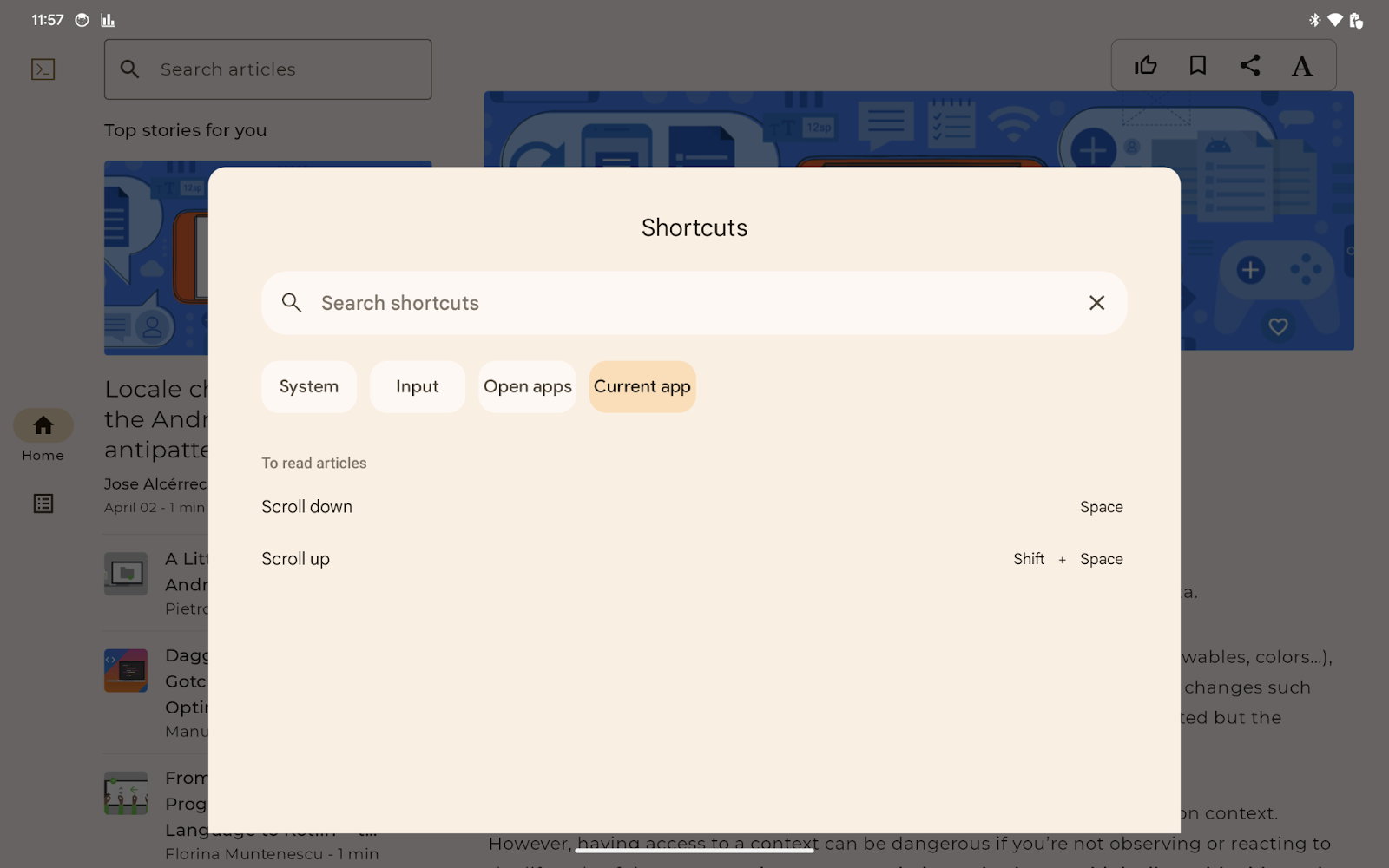
Your app overrides the onProvideKeyboardShortcuts() method in your app's main activity to provide a list of keyboard shortcuts to the keyboard shortcuts helper.
More specifically, your app provides several KeyboardShortcutGroup objects by adding them to the mutable list passed to onProvideKeyboardShortcuts(). Each KeyboardShortcutGroup represents a named category of keyboard shortcuts, which enables your app to group available keyboard shortcuts by purpose or context.
The sample app has two keyboard shortcuts, Spacebar and Shift+Spacebar.
To make these two shortcuts available in the keyboard shortcuts helper, follow these steps:
- Open the
MainActivity.ktfile - Override the
onProvideKeyboardShortcuts()method inMainActivity - Ensure the Android SDK version is Android 7.0 (API level 24) or higher so that the keyboard shortcuts helper is available.
- Confirm that the first parameter of the method is not
null - Create a
KeyboardShortcutInfoobject for theSpacebarkey with the following parameters:
- Description text
android.view.KeyEvent.KEYCODE_SPACE0(indicates no modifiers)
- Create another
KeyboardShortcutInfoforShift+Spacebarwith the following parameters:
- Description text
android.view.KeyEvent.KEYCODE_SPACEandroid.view.KeyEvent.META_SHIFT_ON
- Create an immutable list containing the two
KeyboardShortcutInfoobjects - Create a
KeyboardShortcutGroupobject with the following parameters:
- Group name in text
- The immutable list from the previous step
- Add the
KeyboardShortcutGroupobject to the mutable list passed as the first parameter of theonProvideKeyboardShortcuts()method
The overridden method looks like this:
   override fun onProvideKeyboardShortcuts(
        data: MutableList<KeyboardShortcutGroup>?,
        menu: Menu?,
        deviceId: Int
    ) {
        if (Build.VERSION.SDK_INT >= Build.VERSION_CODES.N && data != null) {
            val shortcutGroup = KeyboardShortcutGroup(
                "To read articles",
                listOf(
                    KeyboardShortcutInfo("Scroll down", KeyEvent.KEYCODE_SPACE, 0), // 0 means no modifier key is pressed
                    KeyboardShortcutInfo("Scroll up", KeyEvent.KEYCODE_SPACE, KeyEvent.META_SHIFT_ON),
                )
            )
            data.add(shortcutGroup)
        }
    }
Run it
Now, users are able to read the entire article even by scrolling the article with the Spacebar. You can try it by moving the keyboard focus to the article with the Tab key or directional keys. You can see the message encouraging you to hit the Spacebar.
The keyboard shortcuts helper shows the two keyboard shortcuts you added (press Meta+/). The added shortcuts are listed in the Current app tab.
7. Expedite keyboard navigation in the detail pane
Users need to press the Tab key several times to move the keyboard focus to the detail pane when the app is running in the expanded window-size class. With the right directional key, users can move the keyboard focus from the article list to the article with a single action, but they still need to move the keyboard focus. The initial focus does not support the user's primary goal of reading the articles.
Your app can request moving the keyboard focus to the specific component with a FocusRequester object. The focusRequester modifier associates a FocusRequester object with the modified component. Your app can send the actual request for the focus movement by calling the requestFocus() method of the FocusRequester object.
Sending a request to move the keyboard focus is a side effect of the component. Your app should call the method in the proper manner using the LaunchedEffect function.
To set the PostContent composable to get the keyboard focus when users select an article from the article list, follow these steps:
- Access the
PostContentcomposable function in theui/article/PostContent.ktfile. - Associate the
focusRequestervalue with theLazyColumncomposable function with thefocusRequestermodifier. The focusRequester value is specified as an optional parameter of thePostContentcomposable function. - Call
LaunchedEffectwithpost, the first parameter of thePostContentcomposable function, so that the passed lambda is called when the user selects an article. - Call the
focusRequester.requestFocus()method in the lambda passed to theLaunchedEffectfunction.
The updated PostContent composable looks like this:
@OptIn(ExperimentalFoundationApi::class)
@Composable
fun PostContent(
    post: Post,
    modifier: Modifier = Modifier,
    contentPadding: PaddingValues = PaddingValues(0.dp),
    state: LazyListState = rememberLazyListState(),
    coroutineScope: CoroutineScope = rememberCoroutineScope(),
    focusRequester: FocusRequester = remember { FocusRequester() },
    header: (@Composable () -> Unit)? = null
) {
    val interactionSource = remember { MutableInteractionSource() }

    LaunchedEffect(post) {
        focusRequester.requestFocus()
    }

    LazyColumn(
        contentPadding = contentPadding,
        modifier = modifier
            .padding(horizontal = defaultSpacerSize)
            .onKeyEvent {
                if (it.type == KeyEventType.KeyDown && it.key == Key.Spacebar) {
                    val relativeAmount = if (it.isShiftPressed) {
                        -0.4f
                    } else {
                        0.4f
                    }
                    coroutineScope.launch {
                        state.animateScrollBy(relativeAmount * state.layoutInfo.viewportSize.height)
                    }
                    true
                } else {
                    false
                }
            }
            .focusRequester(focusRequester),
            .indication(interactionSource, BorderIndication())
            .focusable(interactionSource = interactionSource),
        state = state,
    ) {
      // Code to layout the selected article.
    }
}
Run it
Now, the keyboard focus moves to the article when users choose an article from the article list. You can find that the message encourages you to use the Spacebar to scroll down the article when you choose an article.
8. Congratulations
Well done! You added physical keyboard and mouse support to the sample app. As a result, users are able to select an article from the article list and read the selected article using only a physical keyboard or mouse.
You learned the following things necessary to add physical keyboard and mouse support:
- How to check if your app supports a physical keyboard and mouse, including with an emulator
- How to manage the keyboard navigation with Compose
- How to add keyboard shortcuts with Compose
You also added the physical keyboard and mouse support with a small amount of code modification.
You're ready to add the physical keyboard and mouse support to your production app with Compose.
And with a little more learning, you could add keyboard shortcuts for the following functionalities:
- Mark the selected article as liked.
- Bookmark the selected article.
- Share the selected article with other apps.