
1. Before you begin
In this codelab, you learn how to add a simple animation to your Android app. Animations can make your app more interactive, interesting, and easier for users to interpret. Animating individual updates on a screen full of information can help the user see what changed.
There are many types of animations that can be used in an app's user interface. Items can fade in as they appear and fade out as they disappear, they can move on or off of the screen, or they can transform in interesting ways. This helps make the app's UI expressive and easy to use.
Animations can also add a polished look to your app, which gives it an elegant look and feel, and also helps the user at the same time.
Prerequisites
- Knowledge of Kotlin, including functions, lambdas, and stateless composables.
- Basic knowledge of how to build layouts in Jetpack Compose.
- Basic knowledge of how to create lists in Jetpack Compose.
- Basic knowledge of Material Design.
What you'll learn
- How to build a simple spring animation with Jetpack Compose.
What you'll build
- You will build on the Woof app from the Material Theming with Jetpack Compose codelab, and add a simple animation to acknowledge the user's action.
What you'll need
- The latest stable version of Android Studio.
- Internet connection to download starter code.
2. App Overview
In the Material Theming with Jetpack Compose codelab, you created the Woof app using Material Design which displays a list of dogs and their information.
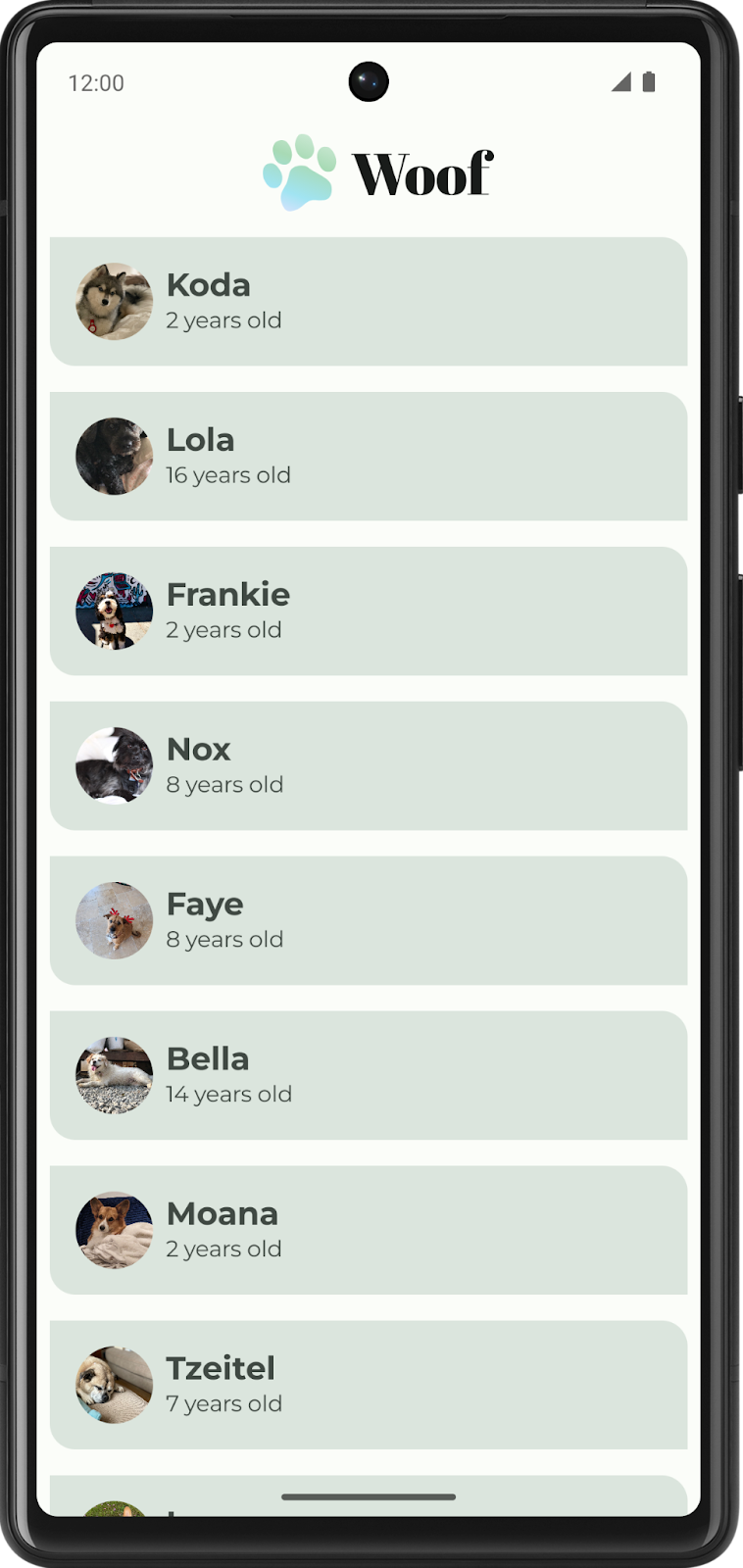
In this codelab, you will add animation to the Woof app. You'll add hobby information which will display when you expand the list item. You'll also add a spring animation to animate the list item being expanded.
Get the starter code
To get started, download the starter code:
Alternatively, you can clone the GitHub repository for the code:
$ git clone https://github.com/google-developer-training/basic-android-kotlin-compose-training-woof.git
$ cd basic-android-kotlin-compose-training-woof
$ git checkout material
You can browse the code in the Woof app GitHub repository.
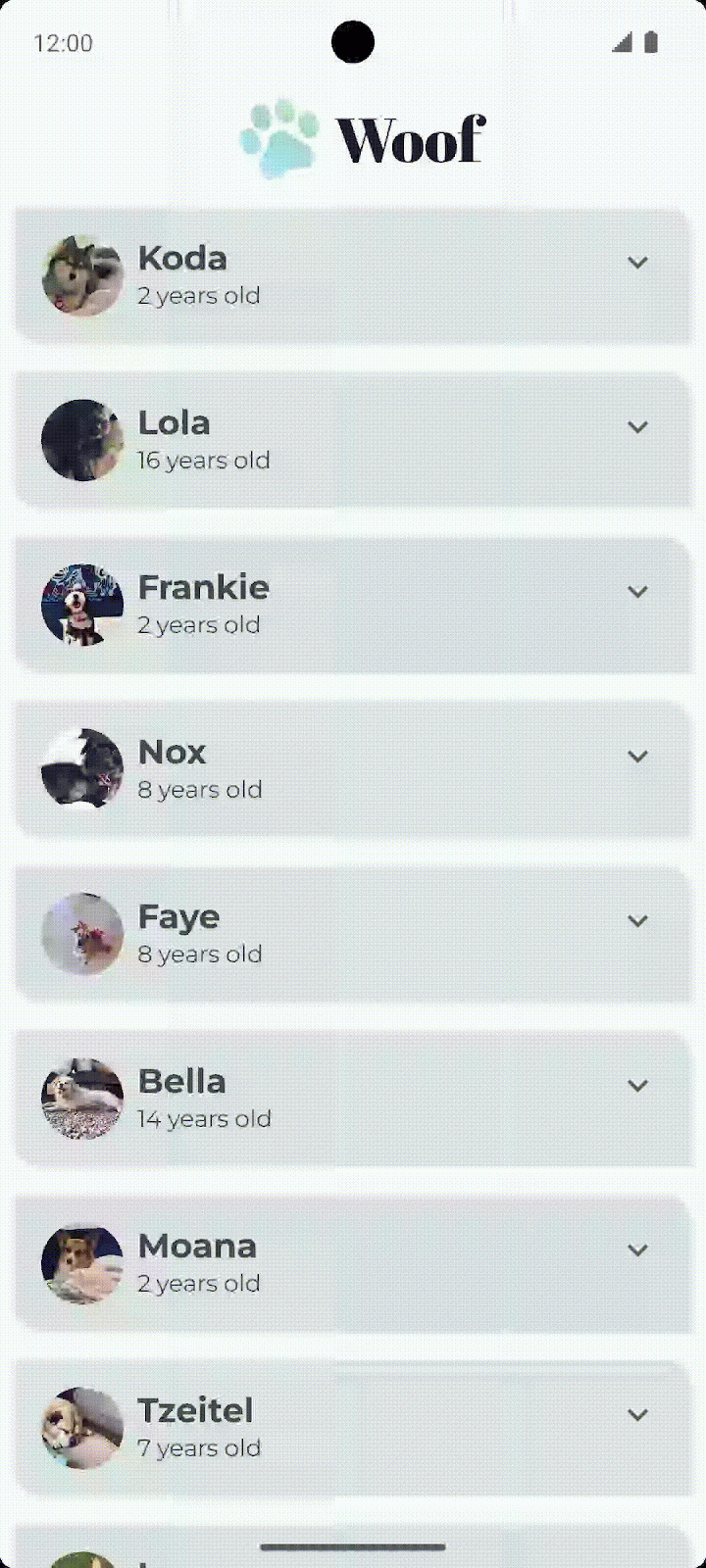
3. Add expand more icon
In this section you will add the Expand More  and Expand Less
  icons to your app.

Icons
Icons are symbols that can help users understand a user interface by visually communicating the intended function. They often take inspiration from objects in the physical world that a user is expected to have experienced. Icon design often reduces the level of detail to the minimum required to be familiar to a user. For example, a pencil in the physical world is used for writing, so its icon counterpart usually indicates create or edit.
|
|
 Photo by
Material Design provides a number of icons, arranged in common categories, for most of your needs.
Add Gradle dependency
Add the material-icons-extended library dependency to your project. You will use the Icons.Filled.ExpandLess and Icons.Filled.ExpandMore icons from this library.
- In the Project pane, open Gradle Scripts > build.gradle.kts (Module :app).
- Scroll to the end of the
build.gradle.kts (Module :app)file. In thedependencies{}block, add the following line:
implementation("androidx.compose.material:material-icons-extended")
Add the icon composable
Add a function to display the Expand More icon from the Material icons library and use it as a button.
- In
MainActivity.kt, after theDogItem()function, create a new composable function calledDogItemButton(). - Pass in a
Booleanfor the expanded state, a lambda expression for the button onClick handler, and an optionalModifieras follows:
@Composable
private fun DogItemButton(
   expanded: Boolean,
   onClick: () -> Unit,
   modifier: Modifier = Modifier
) {


}
- Inside the
DogItemButton()function, add anIconButton()composable that accepts anonClicknamed parameter, a lambda using trailing lambda syntax, that is invoked when this icon is pressed and an optionalmodifier. Set theIconButton's onClickandmodifier value parametersequal to the ones passed in toDogItemButton.
@Composable
private fun DogItemButton(
   expanded: Boolean,
   onClick: () -> Unit,
   modifier: Modifier = Modifier
){
   IconButton(
       onClick = onClick,
       modifier = modifier
   ) {

   }
}
- Inside the
IconButton()lambda block, add in anIconcomposable and set theimageVector value-parametertoIcons.Filled.ExpandMore. This is what will display at the end of the list item. Android Studio shows you a warning for the Icon()composable parameters that you will fix in the next step.
import androidx.compose.material.icons.filled.ExpandMore
import androidx.compose.material.icons.Icons
import androidx.compose.material3.Icon
import androidx.compose.material3.IconButton

IconButton(
   onClick = onClick,
   modifier = modifier
) {
   Icon(
       imageVector = Icons.Filled.ExpandMore
   )
}
- Add the value parameter
tint, and set the color of the icon toMaterialTheme.colorScheme.secondary. Add the named parametercontentDescription, and set it to the string resourceR.string.expand_button_content_description.
IconButton(
   onClick = onClick,
   modifier = modifier
){
   Icon(
       imageVector = Icons.Filled.ExpandMore,
       contentDescription = stringResource(R.string.expand_button_content_description),
       tint = MaterialTheme.colorScheme.secondary
   )
}
Display the icon
Display the DogItemButton() composable by adding it to the layout.
- At the beginning of
DogItem(), add avarto save the expanded state of the list item. Set the initial value tofalse.
import androidx.compose.runtime.getValue
import androidx.compose.runtime.mutableStateOf
import androidx.compose.runtime.remember
import androidx.compose.runtime.setValue

var expanded by remember { mutableStateOf(false) }
- Display the icon button within the list item. In the
DogItem()composable, at the end of theRowblock, after the call toDogInformation(), addDogItemButton(). Pass in theexpandedstate and an empty lambda for the callback. You will define theonClickaction in a later step.
Row(
   modifier = Modifier
       .fillMaxWidth()
       .padding(dimensionResource(R.dimen.padding_small))
) {
   DogIcon(dog.imageResourceId)
   DogInformation(dog.name, dog.age)
   DogItemButton(
       expanded = expanded,
       onClick = { /*TODO*/ }
   )
}
- Check out
WoofPreview()in the Design pane.
 with button added")
Notice the expand more button is not aligned to the end of the list item. You will fix that in the next step.
Align the expand more button
To align the expand more button to the end of the list item, you need to add a spacer in the layout with the Modifier.weight() attribute.
In the Woof app, each list item row contains a dog image, dog information, and an expand more button. You will add a Spacer composable before the expand more button with weight 1f to properly align the button icon. Since the spacer is the only weighted child element in the row, it will fill the space remaining in the row after measuring the other unweighted child elements' width.

Add the spacer to the list item row
- In
DogItem(), betweenDogInformation()andDogItemButton(), add aSpacer. Pass in aModifierwithweight(1f). TheModifier.weight()causes the spacer to fill the space remaining in the row.
import androidx.compose.foundation.layout.Spacer

Row(
   modifier = Modifier
       .fillMaxWidth()
       .padding(dimensionResource(R.dimen.padding_small))
) {
   DogIcon(dog.imageResourceId)
   DogInformation(dog.name, dog.age)
   Spacer(modifier = Modifier.weight(1f))
   DogItemButton(
       expanded = expanded,
       onClick = { /*TODO*/ }
   )
}
- Check out
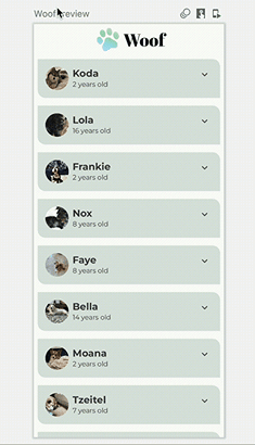
WoofPreview()in the Design pane. Notice that the expand more button is now aligned to the end of the list item.

4. Add Composable to display hobby
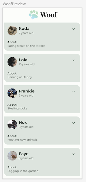
In this task, you'll add Text composables to display the dog's hobby information.

- Create a new composable function called
DogHobby()that takes in a dog's hobby string resource ID and an optionalModifier.
@Composable
fun DogHobby(
   @StringRes dogHobby: Int,
   modifier: Modifier = Modifier
) {
}
- Inside the
DogHobby()function, create aColumnand pass in the modifier passed intoDogHobby().
@Composable
fun DogHobby(
   @StringRes dogHobby: Int,
   modifier: Modifier = Modifier
){
   Column(
       modifier = modifier
   ) {

   }
}
- Inside the
Columnblock, add twoTextcomposables – one to display the About text above the hobby information, and another to display the hobby information.
Set the first one's text to the about from the strings.xml file and set the style as labelSmall. Set the second one's text to dogHobby which is passed in and set the style to bodyLarge.
Column(
   modifier = modifier
) {
   Text(
       text = stringResource(R.string.about),
       style = MaterialTheme.typography.labelSmall
   )
   Text(
       text = stringResource(dogHobby),
       style = MaterialTheme.typography.bodyLarge
   )
}
- In
DogItem(), theDogHobby()composable will go below theRowthat contains theDogIcon(),DogInformation(),Spacer()andDogItemButton(). To do this, wrap theRowwith aColumnso that the hobby can be added below theRow.
Column() {
   Row(
       modifier = Modifier
           .fillMaxWidth()
           .padding(dimensionResource(R.dimen.padding_small))
   ) {
       DogIcon(dog.imageResourceId)
       DogInformation(dog.name, dog.age)
       Spacer(modifier = Modifier.weight(1f))
       DogItemButton(
           expanded = expanded,
           onClick = { /*TODO*/ }
       )
   }
}
- Add
DogHobby()after theRowas a second child of theColumn. Pass indog.hobbieswhich contains the unique hobby of the dog passed in and amodifierwith the padding for theDogHobby()composable.
Column() {
   Row() {
      ...
   }
   DogHobby(
       dog.hobbies,
       modifier = Modifier.padding(
           start = dimensionResource(R.dimen.padding_medium),
           top = dimensionResource(R.dimen.padding_small),
           end = dimensionResource(R.dimen.padding_medium),
           bottom = dimensionResource(R.dimen.padding_medium)
       )
   )
}
The complete DogItem() function should look like this:
@Composable
fun DogItem(
   dog: Dog,
   modifier: Modifier = Modifier
) {
   var expanded by remember { mutableStateOf(false) }
   Card(
       modifier = modifier
   ) {
       Column() {
           Row(
               modifier = Modifier
                   .fillMaxWidth()
                   .padding(dimensionResource(R.dimen.padding_small))
           ) {
               DogIcon(dog.imageResourceId)
               DogInformation(dog.name, dog.age)
               Spacer(Modifier.weight(1f))
               DogItemButton(
                   expanded = expanded,
                   onClick = { /*TODO*/ },
               )
           }
           DogHobby(
               dog.hobbies,
               modifier = Modifier.padding(
                   start = dimensionResource(R.dimen.padding_medium),
                   top = dimensionResource(R.dimen.padding_small),
                   end = dimensionResource(R.dimen.padding_medium),
                   bottom = dimensionResource(R.dimen.padding_medium)
               )
           )
       }
   }
}
- Check out
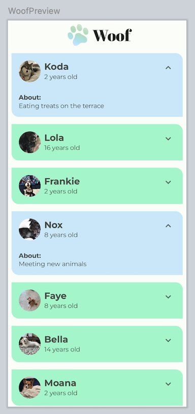
WoofPreview()in the Design pane. Notice the dog's hobby displays.
5. Show or hide the hobby on button click
Your app has an Expand More button for every list item, but it doesn't do anything yet! In this section, you will add the option to hide or reveal the hobby information when the user clicks the expand more button.
- In the
DogItem()composable function, in theDogItemButton()function call, define theonClick()lambda expression, change theexpandedboolean state value totruewhen the button is clicked, and change it back tofalseif the button is clicked again.
DogItemButton(
   expanded = expanded,
   onClick = { expanded = !expanded }
)
- In the
DogItem()function, wrap theDogHobby()function call with anifcheck on theexpandedboolean.
@Composable
fun DogItem(
   dog: Dog,
   modifier: Modifier = Modifier
) {
   var expanded by remember { mutableStateOf(false) }
   Card(
       ...
   ) {
       Column(
           ...
       ) {
           Row(
               ...
           ) {
               ...
           }
           if (expanded) {
               DogHobby(
                   dog.hobbies, modifier = Modifier.padding(
                       start = dimensionResource(R.dimen.padding_medium),
                       top = dimensionResource(R.dimen.padding_small),
                       end = dimensionResource(R.dimen.padding_medium),
                       bottom = dimensionResource(R.dimen.padding_medium)
                   )
               )
           }
       }
   }
}
Now, the dog's hobby information only displays if the value of expanded is true.
- The preview can show you what the UI looks like, and you can also interact with it. To interact with the UI preview, hover above the WoofPreview text in the Design Pane, then click the Interactive Mode button
 in the top-right corner of the Design pane. This starts the preview in interactive mode.
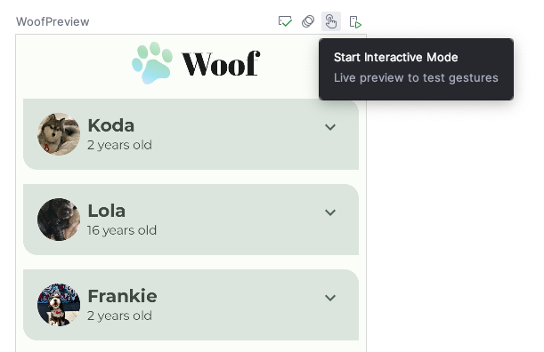
- Interact with the preview by clicking the expand more button. Notice the dog's hobby information is hidden and revealed when you click the expand more button.
Notice that the expand more button icon remains the same when the list item is expanded. For a better user experience, you'll change the icon so that ExpandMore displays the downward arrow  , and
, and ExpandLess displays the upward arrow  .
.
- In the
DogItemButton()function, add anifstatement that updates theimageVectorvalue based on theexpandedstate as follows:
import androidx.compose.material.icons.filled.ExpandLess


@Composable
private fun DogItemButton(
   ...
) {
   IconButton(onClick = onClick) {
       Icon(
           imageVector = if (expanded) Icons.Filled.ExpandLess else Icons.Filled.ExpandMore,
           ...
       )
   }
}
Notice how you wrote if-else in the previous code snippet.
if (expanded) Icons.Filled.ExpandLess else Icons.Filled.ExpandMore
This is the same as using the curly braces { } in the following code:
if (expanded) {
`Icons.Filled.ExpandLess`
} else {
`Icons.Filled.ExpandMore`
}
The curly braces are optional if there is a single line of code for the if-else statement.
- Run the app on a device or emulator, or use the interactive mode in the preview again. Notice the icon alternates between the
ExpandMore and the ExpandLess icons.

Good job updating the icon!
When you expanded the list item, did you notice the abrupt height change? The abrupt height change doesn't look like a polished app. To resolve this issue, you will next add an animation to your app.
6. Add animation
Animations can add visual cues that notify users about what's going on in your app. They are especially useful when the UI changes state, such as when new content loads or new actions become available. Animations can also add a polished look to your app.
In this section you will add a spring animation to animate the change in height of the list item.
Spring Animation
Spring animation is a physics-based animation driven by a spring force. With a spring animation, the value and velocity of movement are calculated based on the spring force that is applied.
For example, if you drag an app icon around the screen and then release it by lifting your finger, the icon jumps back to its original location by an invisible force.
The following animation demonstrates the spring effect. Once the finger is released from the icon, the icon jumps back, mimicking a spring.

Spring effect
Spring force is guided by the following two properties:
- Damping ratio: The bounciness of the spring.
- Stiffness level: The stiffness of the spring, that is, how fast the spring moves toward the end.
Below are some examples of animations with different damping ratios and stiffness levels.
|
|
 High Bounce
  No Bounce
|
|
 High Stiffness
  Very low Stiffness
Take a look at the DogHobby() function call in the DogItem() composable function. The dog's hobby information is included in the composition, based on the expanded boolean value. The height of the list item changes, depending on whether the hobby information is visible or hidden. Currently, the transition is jarring. In this section you will use the animateContentSize modifier to add a smoother transition between the expanded and not expanded states.
// No need to copy over
@Composable
fun DogItem(...) {
  ...
    if (expanded) {
       DogHobby(
          dog.hobbies,
          modifier = Modifier.padding(
              start = dimensionResource(R.dimen.padding_medium),
              top = dimensionResource(R.dimen.padding_small),
              end = dimensionResource(R.dimen.padding_medium),
              bottom = dimensionResource(R.dimen.padding_medium)
          )
      )
   }
}
- In
MainActivity.kt, inDogItem(), add amodifierparameter to theColumnlayout.
@Composable
fun DogItem(
   dog: Dog,
   modifier: Modifier = Modifier
) {
   ...
   Card(
       ...
   ) {
       Column(
          modifier = Modifier
       ){
           ...
       }
   }
}
- Chain the modifier with the
animateContentSizemodifier to animate the size (list item height) change.
import androidx.compose.animation.animateContentSize

Column(
   modifier = Modifier
       .animateContentSize()
)
In the current implementation, you are animating the list item height in your app. But, the animation is so subtle that it is difficult to discern when you run the app. To resolve this, use an optional animationSpec parameter that lets you customize the animation.
- For Woof, the animation eases in and out with no bounce. To achieve that, add the
animationSpecparameter to theanimateContentSize()function call. Set it to a spring animation withDampingRatioNoBouncyso that there isn't a bounce to it and aStiffnessMediumparameter to make the spring a bit stiffer.
import androidx.compose.animation.core.Spring
import androidx.compose.animation.core.spring

Column(
   modifier = Modifier
       .animateContentSize(
           animationSpec = spring(
               dampingRatio = Spring.DampingRatioNoBouncy,
               stiffness = Spring.StiffnessMedium
           )
       )
)
- Check out
WoofPreview()in the Design pane, and use the interactive mode or run your app on an emulator or device to see your spring animation in action.
You did it! Enjoy your beautiful app with animations.
7. (Optional) Experiment with other animations
animate*AsState
The animate*AsState() functions are one of the simplest animation APIs in Compose for animating a single value. You only provide the end value (or target value), and the API starts animation from the current value to the specified end value.
Compose provides animate*AsState() functions for Float, Color, Dp, Size, Offset, and Int, to name a few. You can easily add support for other data types using animateValueAsState() that takes a generic type.
Try using the animateColorAsState() function to change the color when a list item is expanded.
- In
DogItem(), declare a color and delegate its initialization toanimateColorAsState()function.
import androidx.compose.animation.animateColorAsState

@Composable
fun DogItem(
   dog: Dog,
   modifier: Modifier = Modifier
) {
   var expanded by remember { mutableStateOf(false) }
   val color by animateColorAsState()
   ...
}
- Set the
targetValuenamed parameter, depending on theexpandedboolean value. If the list item is expanded, set the list item totertiaryContainercolor. Else, set it toprimaryContainercolor.
import androidx.compose.animation.animateColorAsState

@Composable
fun DogItem(
   dog: Dog,
   modifier: Modifier = Modifier
) {
   var expanded by remember { mutableStateOf(false) }
   val color by animateColorAsState(
       targetValue = if (expanded) MaterialTheme.colorScheme.tertiaryContainer
       else MaterialTheme.colorScheme.primaryContainer,
   )
   ...
}
- Set the
coloras the background modifier to theColumn.
@Composable
fun DogItem(
   dog: Dog,
   modifier: Modifier = Modifier
) {
   ...
   Card(
       ...
   ) {
       Column(
           modifier = Modifier
               .animateContentSize(
                   ...
                   )
               )
               .background(color = color)
       ) {...}
}
- Check out how the color changes when the list item is expanded. Non expanded list items are
primaryContainercolor and expanded list items aretertiaryContainercolor.
8. Get the solution code
To download the code for the finished codelab, you can use this git command:
$ git clone https://github.com/google-developer-training/basic-android-kotlin-compose-training-woof.git
Alternatively, you can download the repository as a zip file, unzip it, and open it in Android Studio.
If you want to see the solution code, view it on GitHub.
9. Conclusion
Congratulations! You added a button to hide and reveal information about the dog. You enhanced the user experience using spring animations. You also learned how to use interactive mode in the Design pane.
You can also try a different type of Jetpack Compose Animation. Don't forget to share your work on social media with #AndroidBasics!