
1. Before you begin
Jetpack Compose is a modern toolkit designed to simplify UI development. It combines a reactive programming model with the conciseness and ease of use of the Kotlin programming language. It is fully declarative, meaning you describe your UI by calling a series of functions that transform data into a UI hierarchy. When the underlying data changes, the framework automatically re-executes these functions, updating the UI hierarchy for you.
A Compose app is made up of composable functions - just regular functions marked with @Composable, which can call other composable functions. A function is all you need to create a new UI component. The annotation tells Compose to add special support to the function for updating and maintaining your UI over time. Compose lets you structure your code into small chunks. Composable functions are often referred to as "composables" for short.
By making small reusable composables, it's easy to build up a library of UI elements used in your app. Each one is responsible for one part of the screen and can be edited independently.
For more support as you're walking through this codelab, check out the following code-along:
Note: The code-along uses Material 2 while the codelab is updated to use Material 3. Be aware that there will be some steps where they are different.
Prerequisites
- Experience with Kotlin syntax, including lambdas
What you'll do
In this codelab, you will learn:
- What Compose is
- How to build UIs with Compose
- How to manage state in composable functions
- How to create a performant list
- How to add animations
- How to style and theme an app
You'll build an app with an onboarding screen, and a list of animated expanding items:
What you'll need
2. Starting a new Compose project
To start a new Compose project, open Android Studio.
If you're in the Welcome to Android Studio window, click Start a new Android Studio project. If you already have an Android Studio project open, select File > New > New Project from the menu bar.
For a new project, choose Empty Activity from the available templates.
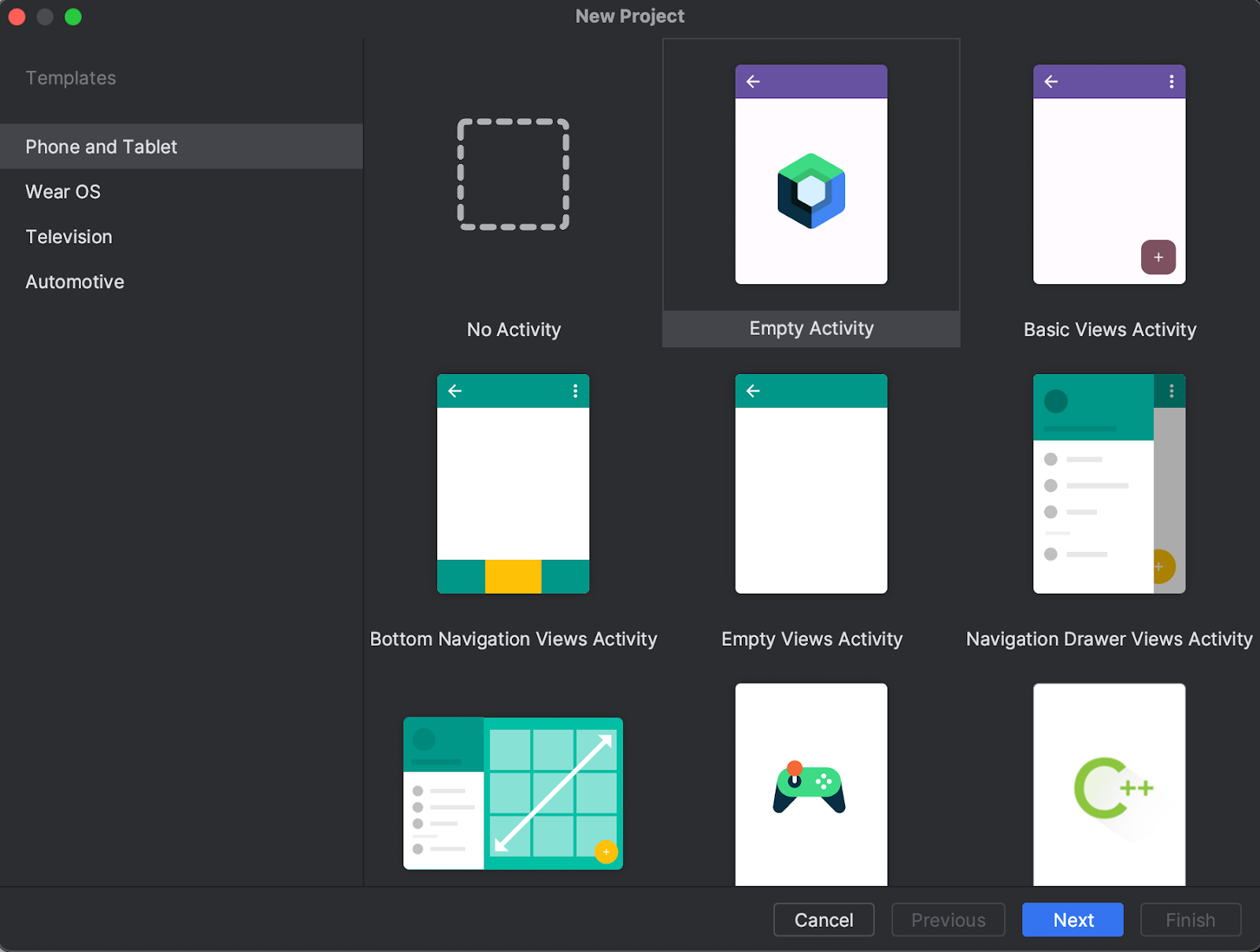
Click Next and configure your project as usual, calling it "Basics Codelab". Make sure you select a minimumSdkVersion of at least API level 21, which is the minimum API Compose supports.
When choosing the Empty Activity template, the following code is generated for you in your project:
- The project is already configured to use Compose.
- The
AndroidManifest.xmlfile is created. - The
build.gradle.ktsandapp/build.gradle.ktsfiles contain options and dependencies needed for Compose.
After syncing the project, open MainActivity.kt and check out the code.
class MainActivity : ComponentActivity() {
    override fun onCreate(savedInstanceState: Bundle?) {
        super.onCreate(savedInstanceState)
        setContent {
            BasicsCodelabTheme {
                // Scaffold provides the basic Material Design layout structure
                Scaffold(modifier = Modifier.fillMaxSize()) { innerPadding ->
                    // innerPadding contains padding values to avoid content being hidden
                    // by system UI elements like status bar, navigation bar, or top app bar
                    Greeting(
                        name = "Android",
                        // Apply the inner padding to ensure content doesn't overlap with system UI
                        modifier = Modifier.padding(innerPadding)
                    )
                }
            }
        }
    }
}

@Composable
fun Greeting(name: String, modifier: Modifier = Modifier) {
    Text(
        text = "Hello $name!",
        modifier = modifier
    )
}

@Preview(showBackground = true)
@Composable
fun GreetingPreview() {
    BasicsCodelabTheme {
        Greeting("Android")
    }
}
In the next section, you'll see what each method does, and how you can improve them to create flexible and reusable layouts.
Solution to the codelab
You can get the code for the solution of this codelab from GitHub:
$ git clone https://github.com/android/codelab-android-compose
Alternatively you can download the repository as a Zip file:
You'll find the solution code in the BasicsCodelab project. We recommend that you follow the codelab step-by-step at your own pace and check the solution if you consider it necessary. During the codelab, you'll be presented with snippets of code that you'll need to add to the project.
3. Getting started with Compose
Go through the different classes and methods related to Compose that Android Studio has generated for you.
Composable functions
A composable function is a regular function annotated with @Composable. This enables your function to call other @Composable functions within it. You can see how the Greeting function is marked as @Composable. This function will produce a piece of UI hierarchy displaying the given input, String. Text is a composable function provided by the library.
@Composable
fun Greeting(name: String, modifier: Modifier = Modifier) {
    Text(
        text = "Hello $name!",
        modifier = modifier
    )
}
Compose in an Android app
With Compose, an Activity remains the entry point to an Android app. In our project, MainActivity is launched when the user opens the app (as it's specified in the AndroidManifest.xml file). You use setContent to define your layout, but instead of using an XML file as you'd do in the traditional View system, you call Composable functions within it.
class MainActivity : AppCompatActivity() {
    override fun onCreate(savedInstanceState: Bundle?) {
        super.onCreate(savedInstanceState)
        setContent {
            BasicsCodelabTheme {
                // A surface container using the 'background' color from the theme
                Surface(
                  modifier = Modifier.fillMaxSize(),
                  color = MaterialTheme.colorScheme.background
                ) {
                    Greeting("Android")
                }
            }
        }
    }
}
BasicsCodelabTheme is a way to style Composable functions. You'll see more about this in the Theming your app section. To see how the text displays on the screen, you can either run the app in an emulator or device, or use the Android Studio preview.
To use the Android Studio preview, you just have to mark any parameterless Composable function or functions with default parameters with the @Preview annotation and build your project. You can already see a Preview Composable function in the MainActivity.kt file. You can have multiple previews in the same file and give them names.
@Preview(showBackground = true, name = "Text preview")
@Composable
fun GreetingPreview() {
    BasicsCodelabTheme {
        Greeting(name = "Android")
    }
}

The preview might not appear if Code  is selected. Click Split
  to see the preview.
4. Tweaking the UI
Let's start by setting a different background color for the Greeting. You can do this by wrapping the Text composable with a Surface. Surface takes a color, so use MaterialTheme.colorScheme.primary.
@Composable
fun Greeting(name: String, modifier: Modifier = Modifier) {
    Surface(color = MaterialTheme.colorScheme.primary) {
        Text(
            text = "Hello $name!",
            modifier = modifier
        )
    }
}
The components nested inside Surface will be drawn on top of that background color.
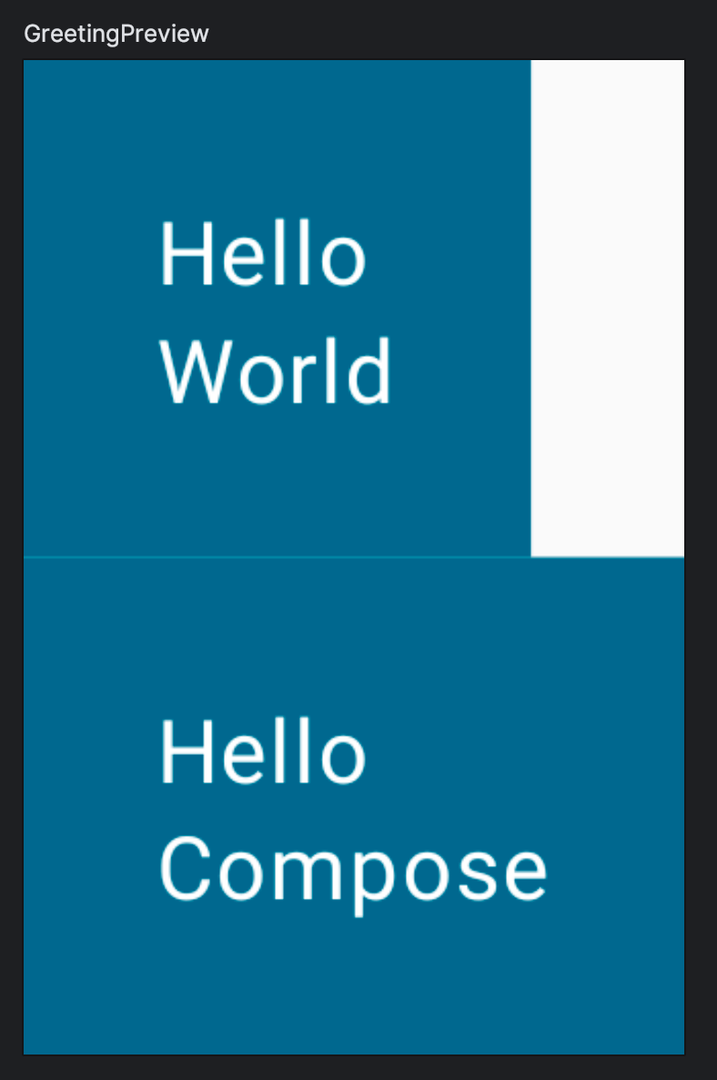
You can see the new changes in the preview:

You might have missed an important detail: the text is now white. When did we define this?
You didn't! The Material components, such as androidx.compose.material3.Surface, are built to make your experience better by taking care of common features that you probably want in your app, such as choosing an appropriate color for text. We say Material is opinionated because it provides good defaults and patterns that are common to most apps. The Material components in Compose are built on top of other foundational components (in androidx.compose.foundation), which are also accessible from your app components in case you need more flexibility.
In this case, Surface understands that, when the background is set to the primary color, any text on top of it should use the onPrimary color, which is also defined in the theme. You can learn more about this in the Theming your app section.
Modifiers
Most Compose UI elements such as Surface and Text accept an optional modifier parameter. Modifiers tell a UI element how to lay out, display, or behave within its parent layout. You may have already noticed that the Greeting composable already has a default modifier, which is then passed to the Text.
For example, the padding modifier will apply an amount of space around the element it decorates. You can create a padding modifier with Modifier.padding(). You can also add multiple modifiers by chaining them, so in our case we can add the padding modifier to the default one: modifier.padding(24.dp).
Now, add padding to your Text on the screen:
import androidx.compose.foundation.layout.padding
import androidx.compose.ui.unit.dp
// ...

@Composable
fun Greeting(name: String, modifier: Modifier = Modifier) {
    Surface(color = MaterialTheme.colorScheme.primary) {
        Text(
            text = "Hello $name!",
            modifier = modifier.padding(24.dp)
        )
    }
}

There are dozens of modifiers which can be used to align, animate, lay out, make clickable or scrollable, transform, etc. For a comprehensive list, check out the List of Compose Modifiers. You'll use some of them in the next steps.
5. Reusing composables
The more components you add to the UI, the more levels of nesting you create. This can affect readability if a function becomes really large. By making small reusable components it's easy to build up a library of UI elements used in your app. Each one is responsible for one small part of the screen and can be edited independently.
As a best practice, your function should include a Modifier parameter that is assigned an empty Modifier by default. Forward this modifier to the first composable you call inside your function. This way, the calling site can adapt layout instructions and behaviors from outside of your composable function.
Create a Composable called MyApp that includes the greeting.
@Composable
fun MyApp(modifier: Modifier = Modifier) {
    Surface(
        modifier = modifier,
        color = MaterialTheme.colorScheme.background
    ) {
        Greeting("Android")
    }
}
This lets you clean up the onCreate callback and the preview as you can now reuse the MyApp composable, avoiding code duplication.
In the preview, let's call MyApp and remove the name of the preview.
Your MainActivity.kt file should look like this:
package com.example.basicscodelab

import android.os.Bundle
import androidx.activity.ComponentActivity
import androidx.activity.compose.setContent
import androidx.compose.foundation.layout.fillMaxSize
import androidx.compose.foundation.layout.padding
import androidx.compose.material3.MaterialTheme
import androidx.compose.material3.Surface
import androidx.compose.material3.Text
import androidx.compose.runtime.Composable
import androidx.compose.ui.Modifier
import androidx.compose.ui.tooling.preview.Preview
import androidx.compose.ui.unit.dp
import com.example.basicscodelab.ui.theme.BasicsCodelabTheme

class MainActivity : ComponentActivity() {
    override fun onCreate(savedInstanceState: Bundle?) {
        super.onCreate(savedInstanceState)
        setContent {
            BasicsCodelabTheme {
                MyApp(modifier = Modifier.fillMaxSize())
            }
        }
    }
}

@Composable
fun MyApp(modifier: Modifier = Modifier) {
    Surface(
        modifier = modifier,
        color = MaterialTheme.colorScheme.background
    ) {
        Greeting("Android")
    }
}

@Composable
fun Greeting(name: String, modifier: Modifier = Modifier) {
    Surface(color = MaterialTheme.colorScheme.primary) {
        Text(
            text = "Hello $name!",
            modifier = modifier.padding(24.dp)
        )
    }
}

@Preview(showBackground = true)
@Composable
fun GreetingPreview() {
    BasicsCodelabTheme {
        MyApp()
    }
}
6. Creating columns and rows
The three basic standard layout elements in Compose are Column, Row and Box.
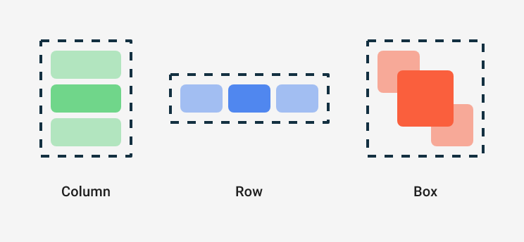
They are Composable functions that take Composable content, so you can place items inside. For example, each child inside of a Column will be placed vertically.
// Don't copy over
Column {
    Text("First row")
    Text("Second row")
}
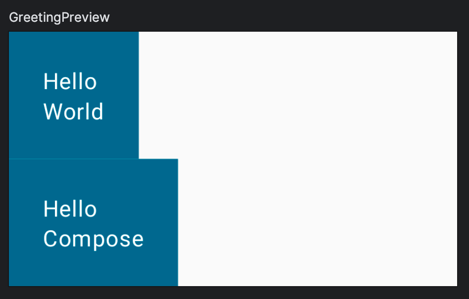
Now try to change Greeting so that it shows a column with two text elements like in this example:

Note that you might have to move the padding around.
Compare your result with this solution:
import androidx.compose.foundation.layout.Column
// ...

@Composable
fun Greeting(name: String, modifier: Modifier = Modifier) {
    Surface(color = MaterialTheme.colorScheme.primary) {
        Column(modifier = modifier.padding(24.dp)) {
            Text(text = "Hello ")
            Text(text = name)
        }
    }
}
Compose and Kotlin
Composable functions can be used like any other function in Kotlin. This makes building UIs really powerful since you can add statements to influence how the UI will be displayed.
For example, you can use a for loop to add elements to the Column:
@Composable
fun MyApp(
    modifier: Modifier = Modifier,
    names: List<String> = listOf("World", "Compose")
) {
    Column(modifier) {
        for (name in names) {
            Greeting(name = name)
        }
    }
}
You haven't set dimensions or added any constraints to the size of your composables yet, so each row takes the minimum space it can and the preview does the same thing. Let's change our preview to emulate a common width of a small phone, 320dp. Add a widthDp parameter to the @Preview annotation like so:
@Preview(showBackground = true, widthDp = 320)
@Composable
fun GreetingPreview() {
    BasicsCodelabTheme {
        MyApp()
    }
}
Modifiers are used extensively in Compose so let's practice with a more advanced exercise: Try to replicate the following layout using the fillMaxWidth and padding modifiers.
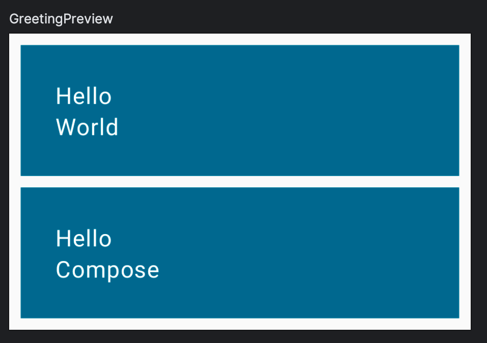
Now compare your code with the solution:
import androidx.compose.foundation.layout.fillMaxWidth

@Composable
fun MyApp(
    modifier: Modifier = Modifier,
    names: List<String> = listOf("World", "Compose")
) {
    Column(modifier = modifier.padding(vertical = 4.dp)) {
        for (name in names) {
            Greeting(name = name)
        }
    }
}

@Composable
fun Greeting(name: String, modifier: Modifier = Modifier) {
    Surface(
        color = MaterialTheme.colorScheme.primary,
        modifier = modifier.padding(vertical = 4.dp, horizontal = 8.dp)
    ) {
        Column(modifier = Modifier.fillMaxWidth().padding(24.dp)) {
            Text(text = "Hello ")
            Text(text = name)
        }
    }
}
Note that:
- Modifiers can have overloads so, for example, you can specify different ways to create a padding.
- To add multiple modifiers to an element, you simply chain them.
There are multiple ways to achieve this result, so if your code doesn't match this snippet, that doesn't mean your code is wrong. However, copy and paste this code to continue with the codelab.
Adding a button
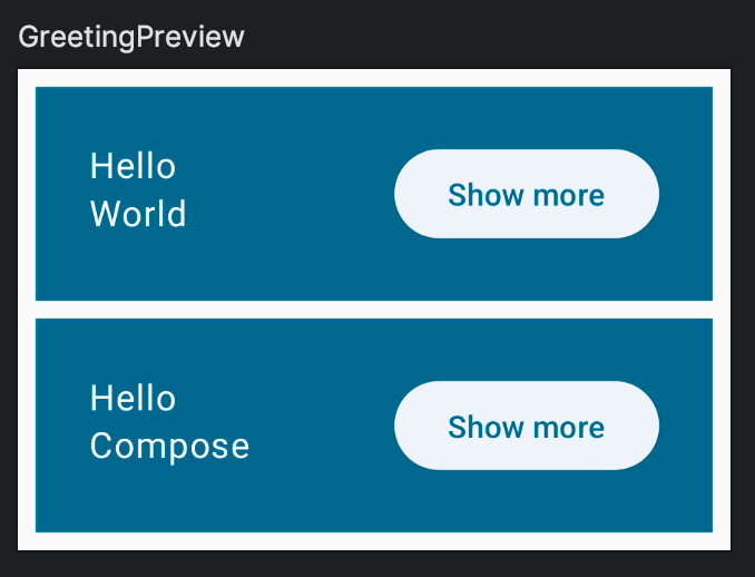
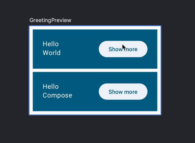
In the next step you'll add a clickable element that expands the Greeting, so we need to add that button first. The goal is to create the following layout:
Button is a composable provided by the material3 package which takes a composable as the last argument. Since trailing lambdas can be moved outside of the parentheses, you can add any content to the button as a child. For example, a Text:
// Don't copy yet
Button(
    onClick = { } // You'll learn about this callback later
) {
    Text("Show less")
}
To achieve this you need to learn how to place a composable at the end of a row. There's no alignEnd modifier so, instead, you give some weight to the composable at the start. The weight modifier makes the element fill all available space, making it flexible, effectively pushing away the other elements that don't have a weight, which are called inflexible. It also makes the fillMaxWidth modifier redundant.
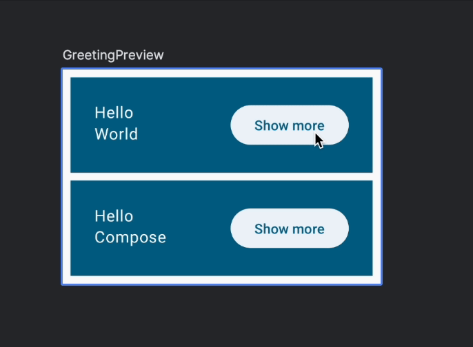
Now try to add the button and place it as shown in the previous image.
Check out the solution here:
import androidx.compose.foundation.layout.Row
import androidx.compose.material3.ElevatedButton
// ...

@Composable
fun Greeting(name: String, modifier: Modifier = Modifier) {
    Surface(
        color = MaterialTheme.colorScheme.primary,
        modifier = modifier.padding(vertical = 4.dp, horizontal = 8.dp)
    ) {
        Row(modifier = Modifier.padding(24.dp)) {
            Column(modifier = Modifier.weight(1f)) {
                Text(text = "Hello ")
                Text(text = name)
            }
            ElevatedButton(
                onClick = { /* TODO */ }
            ) {
                Text("Show more")
            }
        }
    }
}
7. State in Compose
In this section you'll add some interaction to your screen. So far you've created static layouts but now you'll make them react to user changes to achieve this:
Before getting into how to make a button clickable and how to resize an item, you need to store some value somewhere that indicates whether each item is expanded or not–the state of the item. Since we need to have one of these values per greeting, the logical place for it is in the Greeting composable. Take a look at this expanded boolean and how it's used in the code:
// Don't copy over
@Composable
fun Greeting(name: String) {
    var expanded = false // Don't do this!

    Surface(
        color = MaterialTheme.colorScheme.primary,
        modifier = Modifier.padding(vertical = 4.dp, horizontal = 8.dp)
    ) {
        Row(modifier = Modifier.padding(24.dp)) {
            Column(modifier = Modifier.weight(1f)) {
                Text(text = "Hello, ")
                Text(text = name)
            }
            ElevatedButton(
                onClick = { expanded = !expanded }
            ) {
                Text(if (expanded) "Show less" else "Show more")
            }
        }
    }
}
Note that we also added an onClick action and a dynamic button text. More on that later.
However, this won't work as expected. Setting a different value for the expanded variable won't make Compose detect it as a state change so nothing will happen.
The reason why mutating this variable does not trigger recompositions is that it's not being tracked by Compose. Also, each time Greeting is called, the variable will be reset to false.
To add internal state to a composable, you can use the mutableStateOf function, which makes Compose recompose functions that read that State.
import androidx.compose.runtime.mutableStateOf
// ...

// Don't copy over
@Composable
fun Greeting() {
    val expanded = mutableStateOf(false) // Don't do this!
}
However you can't just assign mutableStateOf to a variable inside a composable. As explained before, recomposition can happen at any time which would call the composable again, resetting the state to a new mutable state with a value of false.
To preserve state across recompositions, remember the mutable state using remember.
import androidx.compose.runtime.mutableStateOf
import androidx.compose.runtime.remember
// ...

@Composable
fun Greeting(...) {
    val expanded = remember { mutableStateOf(false) }
    // ...
}
remember is used to guard against recomposition, so the state is not reset.
Note that if you call the same composable from different parts of the screen you will create different UI elements, each with its own version of the state. You can think of internal state as a private variable in a class.
The composable function will automatically be "subscribed" to the state. If the state changes, composables that read these fields will be recomposed to display the updates.
Mutating state and reacting to state changes
In order to change the state, you might have noticed that Button has a parameter called onClick but it doesn't take a value, it takes a function.
You can define the action to take on click by assigning a lambda expression to it. For example, let's toggle the value of the expanded state, and show a different text depending on the value.
ElevatedButton(
    onClick = { expanded.value = !expanded.value },
) {
   Text(if (expanded.value) "Show less" else "Show more")
}
Run the app in interactive mode to see the behavior.
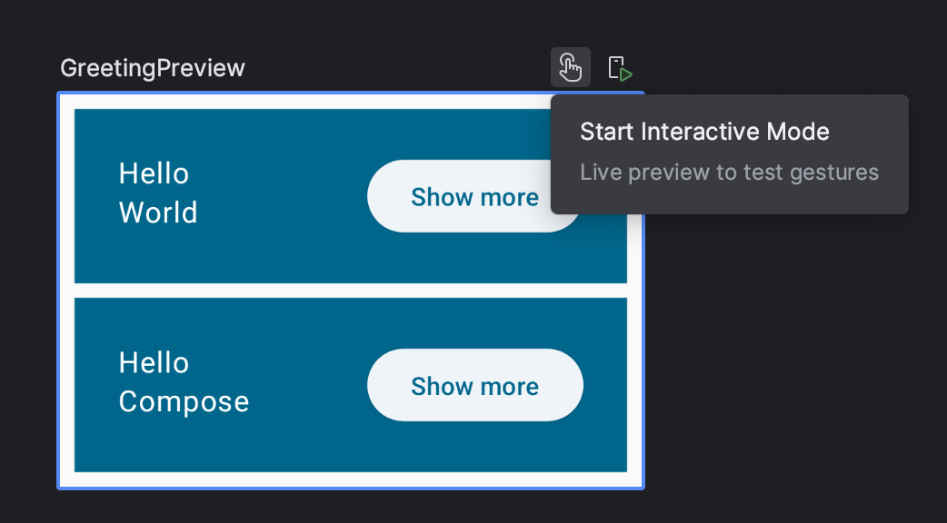
When the button is clicked, expanded is toggled triggering a recomposition of the text inside the button. Each Greeting maintains its own expanded state, because they belong to different UI elements.
Code up to this point:
@Composable
fun Greeting(name: String, modifier: Modifier = Modifier) {
    val expanded = remember { mutableStateOf(false) }
    Surface(
        color = MaterialTheme.colorScheme.primary,
        modifier = modifier.padding(vertical = 4.dp, horizontal = 8.dp)
    ) {
        Row(modifier = Modifier.padding(24.dp)) {
            Column(modifier = Modifier.weight(1f)) {
                Text(text = "Hello ")
                Text(text = name)
            }
            ElevatedButton(
                onClick = { expanded.value = !expanded.value }
            ) {
                Text(if (expanded.value) "Show less" else "Show more")
            }
        }
    }
}
Expanding the item
Now let's actually expand an item when requested. Add an additional variable that depends on our state:
@Composable
fun Greeting(name: String, modifier: Modifier = Modifier) {

    val expanded = remember { mutableStateOf(false) }

    val extraPadding = if (expanded.value) 48.dp else 0.dp
// ...
You don't need to remember extraPadding against recomposition because it's doing a simple calculation.
And now we can apply a new padding modifier to the Column:
@Composable
fun Greeting(name: String, modifier: Modifier = Modifier) {
    val expanded = remember { mutableStateOf(false) }
    val extraPadding = if (expanded.value) 48.dp else 0.dp
    Surface(
        color = MaterialTheme.colorScheme.primary,
        modifier = modifier.padding(vertical = 4.dp, horizontal = 8.dp)
    ) {
        Row(modifier = Modifier.padding(24.dp)) {
            Column(
                modifier = Modifier
                    .weight(1f)
                    .padding(bottom = extraPadding)
            ) {
                Text(text = "Hello ")
                Text(text = name)
            }
            ElevatedButton(
                onClick = { expanded.value = !expanded.value }
            ) {
                Text(if (expanded.value) "Show less" else "Show more")
            }
        }
    }
}
If you run on an emulator or in the interactive mode, you should see that each item can be expanded independently:
8. State hoisting
In Composable functions, state that is read or modified by multiple functions should live in a common ancestor—this process is called state hoisting. To hoist means to lift or elevate.
Making state hoistable avoids duplicating state and introducing bugs, helps reuse composables, and makes composables substantially easier to test. Contrarily, state that doesn't need to be controlled by a composable's parent should not be hoisted. The source of truth belongs to whoever creates and controls that state.
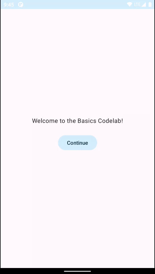
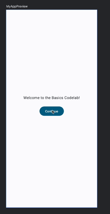
For example, let's create an onboarding screen for our app.

Add the following code to MainActivity.kt:
import androidx.compose.foundation.layout.Arrangement
import androidx.compose.material3.Button
import androidx.compose.runtime.getValue
import androidx.compose.runtime.setValue
import androidx.compose.ui.Alignment
// ...
@Composable
fun OnboardingScreen(modifier: Modifier = Modifier) {
// TODO: This state should be hoisted
var shouldShowOnboarding by remember { mutableStateOf(true) }
Column(
modifier = modifier.fillMaxSize(),
verticalArrangement = Arrangement.Center,
horizontalAlignment = Alignment.CenterHorizontally
) {
Text("Welcome to the Basics Codelab!")
Button(
modifier = Modifier.padding(vertical = 24.dp),
onClick = { shouldShowOnboarding = false }
) {
Text("Continue")
}
}
}
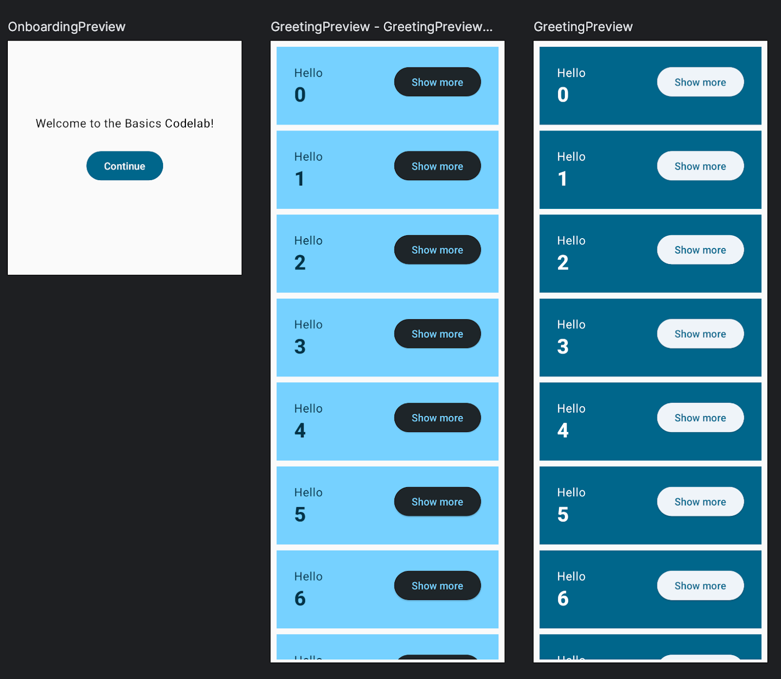
@Preview(showBackground = true, widthDp = 320, heightDp = 320)
@Composable
fun OnboardingPreview() {
BasicsCodelabTheme {
OnboardingScreen()
}
}
This code contains a bunch of new features:
- You have added a new composable called
OnboardingScreenand also a new preview. If you build the project you'll notice you can have multiple previews at the same time. We also added a fixed height to verify that the content is aligned correctly. Columncan be configured to display its contents in the center of the screen.shouldShowOnboardingis using abykeyword instead of the=. This is a property delegate that saves you from typing.valueevery time.- When the button is clicked,
shouldShowOnboardingis set tofalse, however you are not reading the state from anywhere yet.
Now we can add this new onboarding screen to our app. We want to show it on launch and then hide it when the user presses "Continue".
In Compose you don't hide UI elements. Instead, you simply don't add them to the composition, so they're not added to the UI tree that Compose generates. You do this with simple conditional Kotlin logic. For example to show the onboarding screen or the list of greetings you would do something like:
// Don't copy yet
@Composable
fun MyApp(modifier: Modifier = Modifier) {
    Surface(modifier) {
        if (shouldShowOnboarding) { // Where does this come from?
            OnboardingScreen()
        } else {
            Greetings()
        }
    }
}
However we don't have access to shouldShowOnboarding . It's clear that we need to share the state that we created in OnboardingScreen with the MyApp composable.
Instead of somehow sharing the value of the state with its parent, we hoist the state–we simply move it to the common ancestor that needs to access it.
First, move the content of MyApp into a new composable called Greetings. Also adapt the preview to call the Greetings method instead:
@Composable
fun MyApp(modifier: Modifier = Modifier) {
     Greetings()
}

@Composable
private fun Greetings(
    modifier: Modifier = Modifier,
    names: List<String> = listOf("World", "Compose")
) {
    Column(modifier = modifier.padding(vertical = 4.dp)) {
        for (name in names) {
            Greeting(name = name)
        }
    }
}

@Preview(showBackground = true, widthDp = 320)
@Composable
fun GreetingsPreview() {
    BasicsCodelabTheme {
        Greetings()
    }
}
Add a preview for our new top level MyApp composable so we can test its behavior:
@Preview
@Composable
fun MyAppPreview() {
    BasicsCodelabTheme {
        MyApp(Modifier.fillMaxSize())
    }
}
Now add the logic to show the different screens in MyApp, and hoist the state.
@Composable
fun MyApp(modifier: Modifier = Modifier) {

    var shouldShowOnboarding by remember { mutableStateOf(true) }

    Surface(modifier) {
        if (shouldShowOnboarding) {
            OnboardingScreen(/* TODO */)
        } else {
            Greetings()
        }
    }
}
We also need to share shouldShowOnboarding with the onboarding screen but we are not going to pass it directly. Instead of letting OnboardingScreen mutate our state, it would be better to let it notify us when the user clicked on the Continue button.
How do we pass events up? By passing callbacks down. Callbacks are functions that are passed as arguments to other functions and get executed when the event occurs.
Try to add a function parameter to the onboarding screen defined as onContinueClicked: () -> Unit so you can mutate the state from MyApp.
Solution:
@Composable
fun MyApp(modifier: Modifier = Modifier) {

    var shouldShowOnboarding by remember { mutableStateOf(true) }

    Surface(modifier) {
        if (shouldShowOnboarding) {
            OnboardingScreen(onContinueClicked = { shouldShowOnboarding = false })
        } else {
            Greetings()
        }
    }
}

@Composable
fun OnboardingScreen(
    onContinueClicked: () -> Unit,
    modifier: Modifier = Modifier
) {


    Column(
        modifier = modifier.fillMaxSize(),
        verticalArrangement = Arrangement.Center,
        horizontalAlignment = Alignment.CenterHorizontally
    ) {
        Text("Welcome to the Basics Codelab!")
        Button(
            modifier = Modifier
                .padding(vertical = 24.dp),
            onClick = onContinueClicked
        ) {
            Text("Continue")
        }
    }

}
By passing a function and not a state to OnboardingScreen we are making this composable more reusable and protecting the state from being mutated by other composables. In general, it keeps things simple. A good example is how the onboarding preview needs to be modified to call the OnboardingScreen now:
@Preview(showBackground = true, widthDp = 320, heightDp = 320)
@Composable
fun OnboardingPreview() {
    BasicsCodelabTheme {
        OnboardingScreen(onContinueClicked = {}) // Do nothing on click.
    }
}
Assigning onContinueClicked to an empty lambda expression means "do nothing", which is perfect for a preview.
This is looking more and more like a real app, good job!
In MyApp composable we used the by property delegate for the first time to avoid using value every time. Let's use by instead of = also in the Greeting composable for the expanded property. Make sure you change expanded from val to var.
Full code so far:
package com.example.basicscodelab

import android.os.Bundle
import androidx.activity.ComponentActivity
import androidx.activity.compose.setContent
import androidx.compose.foundation.layout.Arrangement
import androidx.compose.foundation.layout.Column
import androidx.compose.foundation.layout.Row
import androidx.compose.foundation.layout.fillMaxSize
import androidx.compose.foundation.layout.padding
import androidx.compose.material3.Button
import androidx.compose.material3.ElevatedButton
import androidx.compose.material3.MaterialTheme
import androidx.compose.material3.Surface
import androidx.compose.material3.Text
import androidx.compose.runtime.Composable
import androidx.compose.runtime.getValue
import androidx.compose.runtime.mutableStateOf
import androidx.compose.runtime.remember
import androidx.compose.runtime.setValue
import androidx.compose.ui.Alignment
import androidx.compose.ui.Modifier
import androidx.compose.ui.tooling.preview.Preview
import androidx.compose.ui.unit.dp
import com.codelab.basics.ui.theme.BasicsCodelabTheme

class MainActivity : ComponentActivity() {
    override fun onCreate(savedInstanceState: Bundle?) {
        super.onCreate(savedInstanceState)
        setContent {
            BasicsCodelabTheme {
                MyApp(modifier = Modifier.fillMaxSize())
            }
        }
    }
}

@Composable
fun MyApp(modifier: Modifier = Modifier) {

    var shouldShowOnboarding by remember { mutableStateOf(true) }

    Surface(modifier) {
        if (shouldShowOnboarding) {
            OnboardingScreen(onContinueClicked = { shouldShowOnboarding = false })
        } else {
            Greetings()
        }
    }
}

@Composable
fun OnboardingScreen(
    onContinueClicked: () -> Unit,
    modifier: Modifier = Modifier
) {

    Column(
        modifier = modifier.fillMaxSize(),
        verticalArrangement = Arrangement.Center,
        horizontalAlignment = Alignment.CenterHorizontally
    ) {
        Text("Welcome to the Basics Codelab!")
        Button(
            modifier = Modifier.padding(vertical = 24.dp),
            onClick = onContinueClicked
        ) {
            Text("Continue")
        }
    }
}

@Composable
private fun Greetings(
    modifier: Modifier = Modifier,
    names: List<String> = listOf("World", "Compose")
) {
    Column(modifier = modifier.padding(vertical = 4.dp)) {
        for (name in names) {
            Greeting(name = name)
        }
    }
}

@Preview(showBackground = true, widthDp = 320, heightDp = 320)
@Composable
fun OnboardingPreview() {
    BasicsCodelabTheme {
        OnboardingScreen(onContinueClicked = {})
    }
}

@Composable
fun Greeting(name: String, modifier: Modifier = Modifier) {

    var expanded by remember { mutableStateOf(false) }

    val extraPadding = if (expanded) 48.dp else 0.dp

    Surface(
        color = MaterialTheme.colorScheme.primary,
        modifier = modifier.padding(vertical = 4.dp, horizontal = 8.dp)
    ) {
        Row(modifier = Modifier.padding(24.dp)) {
            Column(
                modifier = Modifier
                .weight(1f)
                .padding(bottom = extraPadding)
            ) {
                Text(text = "Hello, ")
                Text(text = name)
            }
            ElevatedButton(
                onClick = { expanded = !expanded }
            ) {
                Text(if (expanded) "Show less" else "Show more")
            }
        }
    }
}

@Preview(showBackground = true, widthDp = 320)
@Composable
fun GreetingPreview() {
    BasicsCodelabTheme {
        Greetings()
    }
}

@Preview
@Composable
fun MyAppPreview() {
    BasicsCodelabTheme {
        MyApp(Modifier.fillMaxSize())
    }
}
9. Creating a performant lazy list
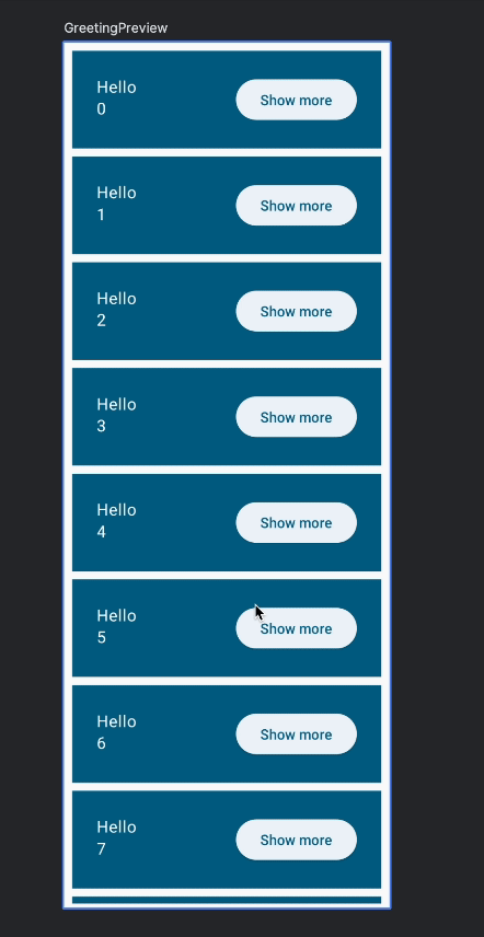
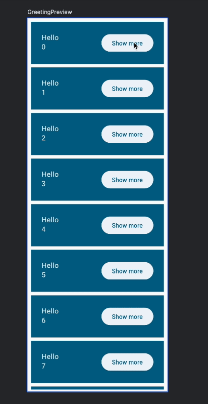
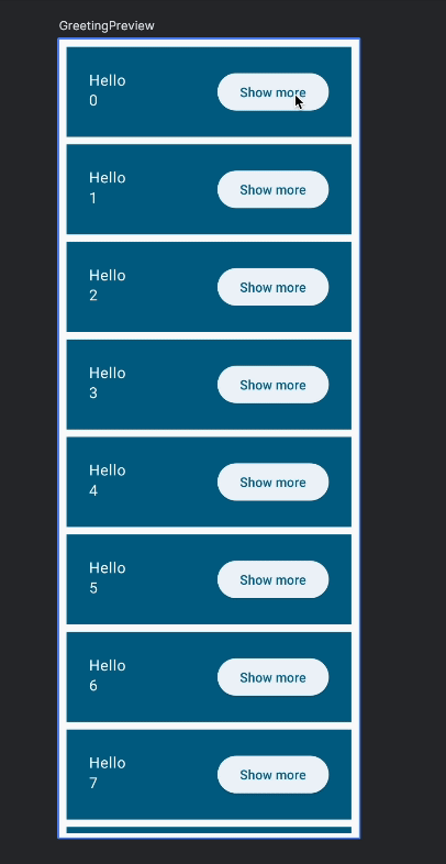
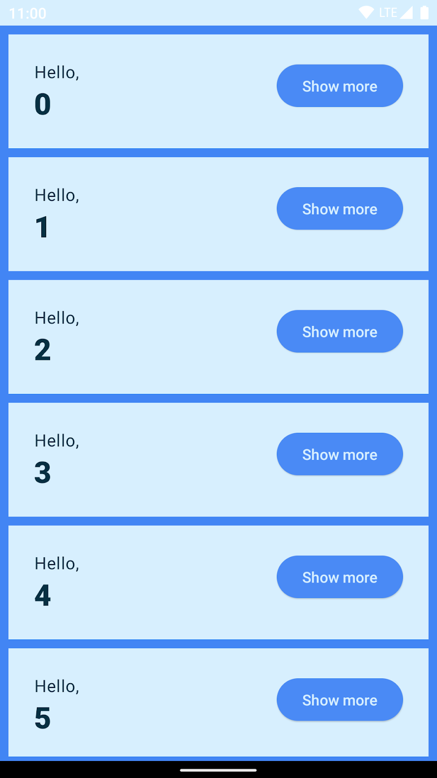
Now let's make the names list more realistic. So far you have displayed two greetings in a Column. But, can it handle thousands of them?
Change the default list value in the Greetings parameters to use another list constructor which allows to set the list size and fill it with the value contained in its lambda (here $it represents the list index):
names: List<String> = List(1000) { "$it" }
This creates 1000 greetings, even the ones that don't fit in the screen. Obviously this is not performant. You can try to run it on an emulator (warning: this code might freeze your emulator).
To display a scrollable column we use a LazyColumn. LazyColumn renders only the visible items on screen, allowing performance gains when rendering a big list.
In its basic usage, the LazyColumn API provides an items element within its scope, where individual item rendering logic is written:
import androidx.compose.foundation.lazy.LazyColumn
import androidx.compose.foundation.lazy.items
// ...

@Composable
private fun Greetings(
    modifier: Modifier = Modifier,
    names: List<String> = List(1000) { "$it" }
) {
    LazyColumn(modifier = modifier.padding(vertical = 4.dp)) {
        items(items = names) { name ->
            Greeting(name = name)
        }
    }
}
10. Persisting state
Our app has two problems:
Persisting the onboarding screen state
If you run the app on a device, click on the buttons and then you rotate, the onboarding screen is shown again. The remember function works only as long as the composable is kept in the Composition. When you rotate, the whole activity is restarted so all state is lost. This also happens with any configuration change and on process death.
Instead of using remember you can use rememberSaveable. This will save each state surviving configuration changes (such as rotations) and process death.
Now replace the use of remember in shouldShowOnboarding with rememberSaveable:
    import androidx.compose.runtime.saveable.rememberSaveable
    // ...

    var shouldShowOnboarding by rememberSaveable { mutableStateOf(true) }
Run, rotate, change to dark mode or kill the process. The onboarding screen is not shown unless you have previously exited the app.
Persisting the expanded state of the list items
If you expand a list item and then either scroll the list until the item is out of view, or rotate the device and then go back to the expanded item, you'll see that the item is now back to its initial state.
The solution for this is to use rememberSaveable for the expanded state as well:
var expanded by rememberSaveable { mutableStateOf(false) }
With around 120 lines of code so far, you were able to display a long and performant scrolling list of items each holding their own state. Also, as you can see, your app has a perfectly correct dark mode without extra lines of code. You'll learn about theming later.
11. Animating your list
In Compose, there are multiple ways to animate your UI: from high-level APIs for simple animations to low-level methods for full control and complex transitions. You can read about them in the documentation.
In this section you will use one of the low-level APIs but don't worry, they can also be very simple. Let's animate the change in size that we already implemented:
For this you'll use the animateDpAsState composable. It returns a State object whose value will continuously be updated by the animation until it finishes. It takes a "target value" whose type is Dp.
Create an animated extraPadding that depends on the expanded state.
import androidx.compose.animation.core.animateDpAsState

@Composable
private fun Greeting(name: String, modifier: Modifier = Modifier) {

    var expanded by rememberSaveable { mutableStateOf(false) }

    val extraPadding by animateDpAsState(
        if (expanded) 48.dp else 0.dp
    )
    Surface(
        color = MaterialTheme.colorScheme.primary,
        modifier = modifier.padding(vertical = 4.dp, horizontal = 8.dp)
    ) {
        Row(modifier = Modifier.padding(24.dp)) {
            Column(modifier = Modifier
                .weight(1f)
                .padding(bottom = extraPadding)
            ) {
                Text(text = "Hello, ")
                Text(text = name)
            }
            ElevatedButton(
                onClick = { expanded = !expanded }
            ) {
                Text(if (expanded) "Show less" else "Show more")
            }

        }
    }
}
Run the app and try the animation out.
animateDpAsState takes an optional animationSpec parameter that lets you customize the animation. Let's do something more fun like adding a spring-based animation:
import androidx.compose.animation.core.Spring
import androidx.compose.animation.core.spring


@Composable
private fun Greeting(name: String, modifier: Modifier = Modifier) {

    var expanded by rememberSaveable { mutableStateOf(false) }

    val extraPadding by animateDpAsState(
        if (expanded) 48.dp else 0.dp,
        animationSpec = spring(
            dampingRatio = Spring.DampingRatioMediumBouncy,
            stiffness = Spring.StiffnessLow
        )
    )

    Surface(
    // ...
            Column(modifier = Modifier
                .weight(1f)
                .padding(bottom = extraPadding.coerceAtLeast(0.dp))

    // ...

    )
}
Note that we are also making sure that padding is never negative, otherwise it could crash the app. This introduces a subtle animation bug that we'll fix later in Finishing touches.
The spring spec does not take any time-related parameters. Instead it relies on physical properties (damping and stiffness) to make animations more natural. Run the app now to try the new animation:
Any animation created with animate*AsState is interruptible. This means that if the target value changes in the middle of the animation, animate*AsState restarts the animation and points to the new value. Interruptions look especially natural with spring-based animations:
If you want to explore the different types of animations, try out different parameters for spring, different specs (tween, repeatable) and different functions: animateColorAsState or a different type of animation API.
Full code for this section
package com.example.basicscodelab

import android.os.Bundle
import androidx.activity.ComponentActivity
import androidx.activity.compose.setContent
import androidx.compose.animation.core.Spring
import androidx.compose.animation.core.animateDpAsState
import androidx.compose.animation.core.spring
import androidx.compose.foundation.layout.Arrangement
import androidx.compose.foundation.layout.Column
import androidx.compose.foundation.layout.Row
import androidx.compose.foundation.layout.fillMaxSize
import androidx.compose.foundation.layout.padding
import androidx.compose.foundation.lazy.LazyColumn
import androidx.compose.foundation.lazy.items
import androidx.compose.material3.Button
import androidx.compose.material3.ElevatedButton
import androidx.compose.material3.MaterialTheme
import androidx.compose.material3.Surface
import androidx.compose.material3.Text
import androidx.compose.runtime.Composable
import androidx.compose.runtime.getValue
import androidx.compose.runtime.mutableStateOf
import androidx.compose.runtime.saveable.rememberSaveable
import androidx.compose.runtime.setValue
import androidx.compose.ui.Alignment
import androidx.compose.ui.Modifier
import androidx.compose.ui.tooling.preview.Preview
import androidx.compose.ui.unit.dp
import com.codelab.basics.ui.theme.BasicsCodelabTheme

class MainActivity : ComponentActivity() {
    override fun onCreate(savedInstanceState: Bundle?) {
        super.onCreate(savedInstanceState)
        setContent {
            BasicsCodelabTheme {
                MyApp(modifier = Modifier.fillMaxSize())
            }
        }
    }
}

@Composable
fun MyApp(modifier: Modifier = Modifier) {

    var shouldShowOnboarding by rememberSaveable { mutableStateOf(true) }

    Surface(modifier) {
        if (shouldShowOnboarding) {
            OnboardingScreen(onContinueClicked = { shouldShowOnboarding = false })
        } else {
            Greetings()
        }
    }
}

@Composable
fun OnboardingScreen(
    onContinueClicked: () -> Unit,
    modifier: Modifier = Modifier
) {


    Column(
        modifier = modifier.fillMaxSize(),
        verticalArrangement = Arrangement.Center,
        horizontalAlignment = Alignment.CenterHorizontally
    ) {
        Text("Welcome to the Basics Codelab!")
        Button(
            modifier = Modifier.padding(vertical = 24.dp),
            onClick = onContinueClicked
        ) {
            Text("Continue")
        }
    }

}

@Composable
private fun Greetings(
    modifier: Modifier = Modifier,
    names: List<String> = List(1000) { "$it" }
) {
    LazyColumn(modifier = modifier.padding(vertical = 4.dp)) {
        items(items = names) { name ->
            Greeting(name = name)
        }
    }
}

@Preview(showBackground = true, widthDp = 320, heightDp = 320)
@Composable
fun OnboardingPreview() {
    BasicsCodelabTheme {
        OnboardingScreen(onContinueClicked = {})
    }
}

@Composable
private fun Greeting(name: String, modifier: Modifier = Modifier) {

    var expanded by rememberSaveable { mutableStateOf(false) }

    val extraPadding by animateDpAsState(
        if (expanded) 48.dp else 0.dp,
        animationSpec = spring(
            dampingRatio = Spring.DampingRatioMediumBouncy,
            stiffness = Spring.StiffnessLow
        )
    )
    Surface(
        color = MaterialTheme.colorScheme.primary,
        modifier = modifier.padding(vertical = 4.dp, horizontal = 8.dp)
    ) {
        Row(modifier = Modifier.padding(24.dp)) {
            Column(modifier = Modifier
                .weight(1f)
                .padding(bottom = extraPadding.coerceAtLeast(0.dp))
            ) {
                Text(text = "Hello, ")
                Text(text = name)
            }
            ElevatedButton(
                onClick = { expanded = !expanded }
            ) {
                Text(if (expanded) "Show less" else "Show more")
            }
        }
    }
}

@Preview(showBackground = true, widthDp = 320)
@Composable
fun GreetingPreview() {
    BasicsCodelabTheme {
        Greetings()
    }
}

@Preview
@Composable
fun MyAppPreview() {
    BasicsCodelabTheme {
        MyApp(Modifier.fillMaxSize())
    }
}
12. Styling and theming your app
You didn't style any of the composables so far and yet you got a decent default, including dark mode support! Let's look into what BasicsCodelabTheme and MaterialTheme are.
If you open the ui/theme/Theme.kt file, you see that BasicsCodelabTheme uses MaterialTheme in its implementation:
// Do not copy
@Composable
fun BasicsCodelabTheme(
    darkTheme: Boolean = isSystemInDarkTheme(),
    // Dynamic color is available on Android 12+
    dynamicColor: Boolean = true,
    content: @Composable () -> Unit
) {
    // ...

    MaterialTheme(
        colorScheme = colorScheme,
        typography = Typography,
        content = content
    )
}
MaterialTheme is a composable function that reflects the styling principles from the Material design specification. That styling information cascades down to the components that are inside its content, which may read the information to style themselves. In your UI, you are already using BasicsCodelabTheme as follows:
    BasicsCodelabTheme {
        MyApp(modifier = Modifier.fillMaxSize())
    }
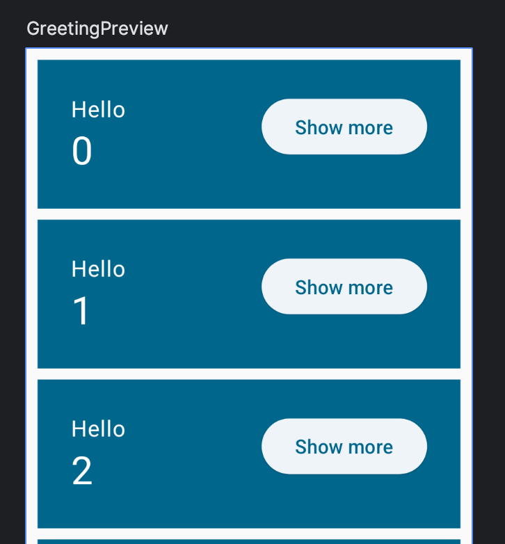
Because BasicsCodelabTheme wraps MaterialTheme internally, MyApp is styled with the properties defined in the theme. From any descendant composable you can retrieve three properties of MaterialTheme: colorScheme, typography and shapes. Use them to set a header style for one of your Texts:
            Column(modifier = Modifier
                .weight(1f)
                .padding(bottom = extraPadding.coerceAtLeast(0.dp))
            ) {
                Text(text = "Hello, ")
                Text(text = name, style = MaterialTheme.typography.headlineMedium)
            }
The Text composable in the example above sets a new TextStyle. You can create your own TextStyle, or you can retrieve a theme-defined style by using MaterialTheme.typography, which is preferred. This construct gives you access to the Material-defined text styles, such as displayLarge, headlineMedium, titleSmall, bodyLarge, labelMedium etc. In your example, you use the headlineMedium style defined in the theme.
Now build to see our newly styled text:
In general it's much better to keep your colors, shapes and font styles inside a MaterialTheme. For example, dark mode would be hard to implement if you hard-code colors and it would require a lot of error-prone work to fix.
However sometimes you need to deviate slightly from the selection of colors and font styles. In those situations it's better to base your color or style on an existing one.
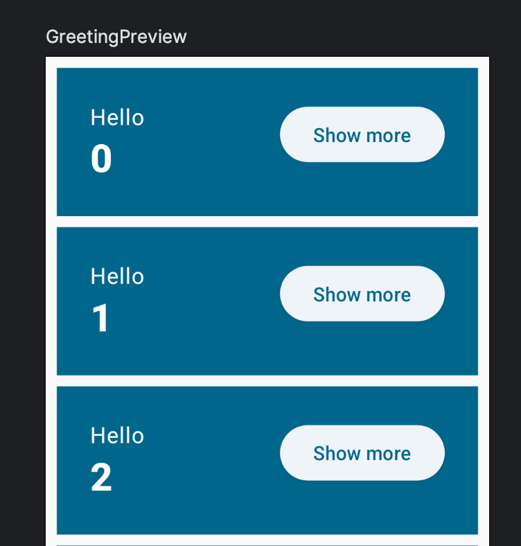
For this, you can modify a predefined style by using the copy function. Make the number extra bold:
import androidx.compose.ui.text.font.FontWeight
// ...
Text(
    text = name,
    style = MaterialTheme.typography.headlineMedium.copy(
        fontWeight = FontWeight.ExtraBold
    )
)
This way if you need to change the font family or any other attribute of headlineMedium, you don't have to worry about the small deviations.
Now this should be the result in the preview window:
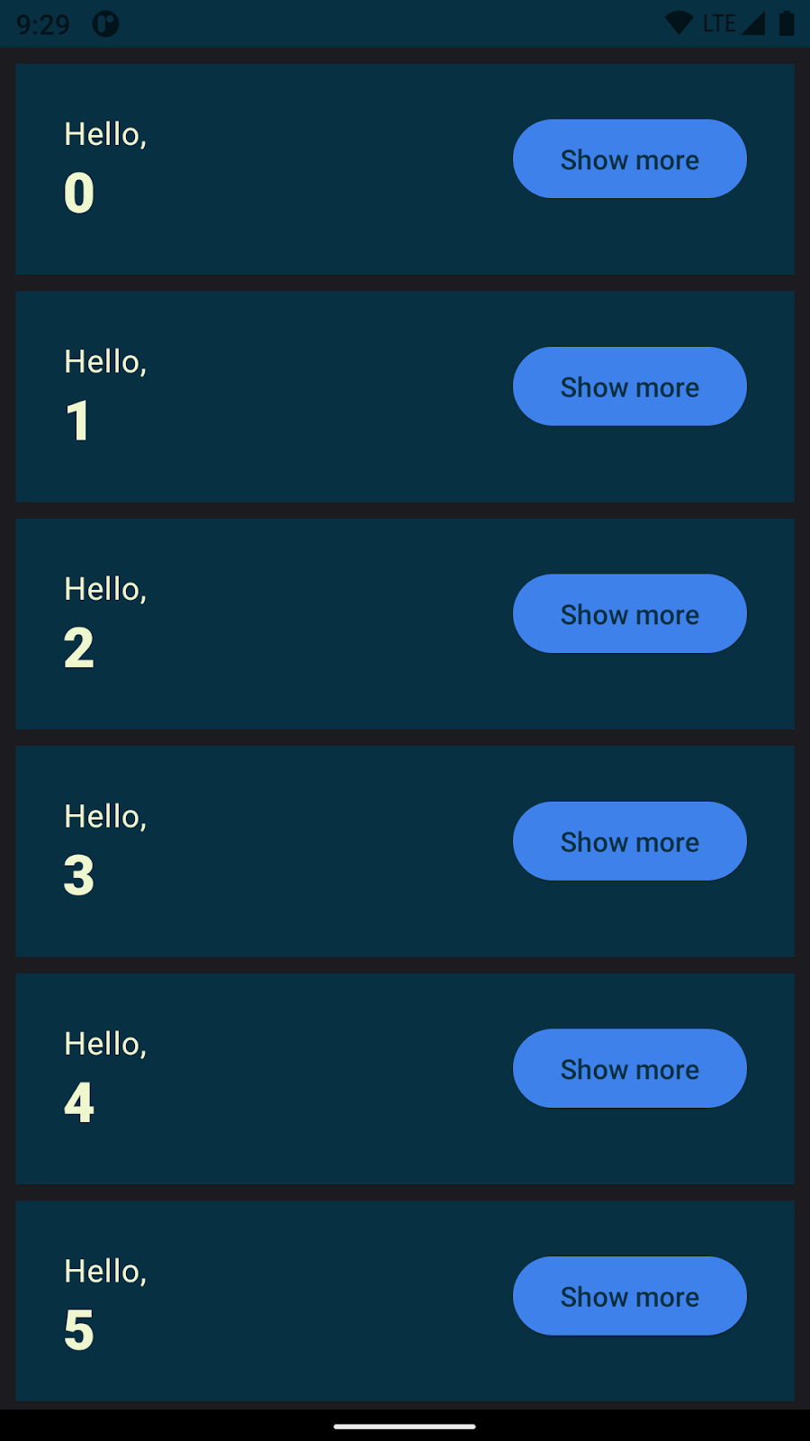
Set up a dark mode preview
Currently, our preview shows only what the app will look like in light mode. Add an additional @Preview annotation to GreetingPreview with UI_MODE_NIGHT_YES:
import android.content.res.Configuration.UI_MODE_NIGHT_YES


@Preview(
    showBackground = true,
    widthDp = 320,
    uiMode = UI_MODE_NIGHT_YES,
    name = "GreetingPreviewDark"
)
@Preview(showBackground = true, widthDp = 320)
@Composable
fun GreetingPreview() {
    BasicsCodelabTheme {
        Greetings()
    }
}
This adds a preview in dark mode.
Tweak your app's theme
You can find everything related to the current theme in the files inside the ui/theme folder. For example, the default colors that we have been using so far are defined in Color.kt.
Let's start by defining new colors. Add these to Color.kt:
val Navy = Color(0xFF073042)
val Blue = Color(0xFF4285F4)
val LightBlue = Color(0xFFD7EFFE)
val Chartreuse = Color(0xFFEFF7CF)
Now assign them to the MaterialTheme's palette in Theme.kt:
private val LightColorScheme = lightColorScheme(
    surface = Blue,
    onSurface = Color.White,
    primary = LightBlue,
    onPrimary = Navy
)
If you go back to MainActivity.kt and refresh the preview, the preview colors don't actually change! That's because by default, your Preview will use dynamic colors. You can see the logic for adding dynamic coloring in Theme.kt, using the dynamicColor boolean parameter.
To see the non-adaptive version of your color scheme, run your app on a device with API level lower than 31 (corresponding to Android S, where adaptive colors were introduced). You'll see the new colors:
In Theme.kt, define the palette for dark colors:
private val DarkColorScheme = darkColorScheme(
    surface = Blue,
    onSurface = Navy,
    primary = Navy,
    onPrimary = Chartreuse
)
When we now run the app, we will see the dark colors in action:
Final code for Theme.kt
import android.app.Activity
import android.os.Build
import androidx.compose.foundation.isSystemInDarkTheme
import androidx.compose.material3.MaterialTheme
import androidx.compose.material3.darkColorScheme
import androidx.compose.material3.dynamicDarkColorScheme
import androidx.compose.material3.dynamicLightColorScheme
import androidx.compose.material3.lightColorScheme
import androidx.compose.runtime.Composable
import androidx.compose.runtime.SideEffect
import androidx.compose.ui.graphics.Color
import androidx.compose.ui.graphics.toArgb
import androidx.compose.ui.platform.LocalContext
import androidx.compose.ui.platform.LocalView
import androidx.core.view.ViewCompat

private val DarkColorScheme = darkColorScheme(
    surface = Blue,
    onSurface = Navy,
    primary = Navy,
    onPrimary = Chartreuse
)

private val LightColorScheme = lightColorScheme(
    surface = Blue,
    onSurface = Color.White,
    primary = LightBlue,
    onPrimary = Navy
)

@Composable
fun BasicsCodelabTheme(
    darkTheme: Boolean = isSystemInDarkTheme(),
    // Dynamic color is available on Android 12+
    dynamicColor: Boolean = true,
    content: @Composable () -> Unit
) {
    val colorScheme = when {
        dynamicColor && Build.VERSION.SDK_INT >= Build.VERSION_CODES.S -> {
            val context = LocalContext.current
            if (darkTheme) dynamicDarkColorScheme(context) else dynamicLightColorScheme(context)
        }
        darkTheme -> DarkColorScheme
        else -> LightColorScheme
    }
    val view = LocalView.current
    if (!view.isInEditMode) {
        SideEffect {
            (view.context as Activity).window.statusBarColor = colorScheme.primary.toArgb()
            ViewCompat.getWindowInsetsController(view)?.isAppearanceLightStatusBars = darkTheme
        }
    }

    MaterialTheme(
        colorScheme = colorScheme,
        typography = Typography,
        content = content
    )
}
13. Finishing touches!
In this step, you'll apply what you already know and learn new concepts with only a few hints. You will create this:
Replace button with an icon
- Use the
IconButtoncomposable together with a childIcon. - Use
Icons.Filled.ExpandLessandIcons.Filled.ExpandMore, which are available in thematerial-icons-extendedartifact. Add the following line to dependencies in yourapp/build.gradle.ktsfile.
implementation("androidx.compose.material:material-icons-extended")
- Modify paddings to fix alignment.
- Add a content description for accessibility (see "Use string resources" below).
Use string resources
Content description for "Show more" and "show less" should be present and you can add them with a simple if statement:
contentDescription = if (expanded) "Show less" else "Show more"
However, hard-coding strings is a bad practice and you should get them from the strings.xml file.
You can use "Extract string resource" on each string, available in "Context Actions" in Android Studio to do this automatically.
Alternatively, open app/src/res/values/strings.xml and add the following resources:
<string name="show_less">Show less</string>
<string name="show_more">Show more</string>
Showing more
The "Composem ipsum" text appears and disappears, triggering a change in size of each card.
- Add a new
Textto the Column insideGreetingthat is displayed when the item is expanded. - Remove the
extraPaddingand instead apply theanimateContentSizemodifier to theRow. This is going to automate the process of creating the animation, which would be hard to do manually. Also, it removes the need tocoerceAtLeast.
Add elevation and shapes
- You could use the
shadowmodifier together withclipmodifier to achieve the card look. However, there's a Material composable that does exactly that:Card. You can change theCard's colors by callingCardDefaults.cardColorsand overriding the color you want to change.
Final code
package com.example.basicscodelab

import android.content.res.Configuration.UI_MODE_NIGHT_YES
import android.os.Bundle
import androidx.activity.ComponentActivity
import androidx.activity.compose.setContent
import androidx.compose.animation.animateContentSize
import androidx.compose.animation.core.Spring
import androidx.compose.animation.core.spring
import androidx.compose.foundation.layout.Arrangement
import androidx.compose.foundation.layout.Column
import androidx.compose.foundation.layout.Row
import androidx.compose.foundation.layout.fillMaxSize
import androidx.compose.foundation.layout.padding
import androidx.compose.foundation.lazy.LazyColumn
import androidx.compose.foundation.lazy.items
import androidx.compose.material.icons.Icons.Filled
import androidx.compose.material.icons.filled.ExpandLess
import androidx.compose.material.icons.filled.ExpandMore
import androidx.compose.material3.Button
import androidx.compose.material3.Card
import androidx.compose.material3.CardDefaults
import androidx.compose.material3.Icon
import androidx.compose.material3.IconButton
import androidx.compose.material3.MaterialTheme
import androidx.compose.material3.Surface
import androidx.compose.material3.Text
import androidx.compose.runtime.Composable
import androidx.compose.runtime.getValue
import androidx.compose.runtime.mutableStateOf
import androidx.compose.runtime.saveable.rememberSaveable
import androidx.compose.runtime.setValue
import androidx.compose.ui.Alignment
import androidx.compose.ui.Modifier
import androidx.compose.ui.res.stringResource
import androidx.compose.ui.text.font.FontWeight
import androidx.compose.ui.tooling.preview.Preview
import androidx.compose.ui.unit.dp
import com.example.basicscodelab.ui.theme.BasicsCodelabTheme


class MainActivity : ComponentActivity() {
    override fun onCreate(savedInstanceState: Bundle?) {
        super.onCreate(savedInstanceState)
        setContent {
            BasicsCodelabTheme {
                MyApp(modifier = Modifier.fillMaxSize())
            }
        }
    }
}

@Composable
fun MyApp(modifier: Modifier = Modifier) {
    var shouldShowOnboarding by rememberSaveable { mutableStateOf(true) }

    Surface(modifier, color = MaterialTheme.colorScheme.background) {
        if (shouldShowOnboarding) {
            OnboardingScreen(onContinueClicked = { shouldShowOnboarding = false })
        } else {
            Greetings()
        }
    }
}

@Composable
fun OnboardingScreen(
    onContinueClicked: () -> Unit,
    modifier: Modifier = Modifier
) {
    Column(
        modifier = modifier.fillMaxSize(),
        verticalArrangement = Arrangement.Center,
        horizontalAlignment = Alignment.CenterHorizontally
    ) {
        Text("Welcome to the Basics Codelab!")
        Button(
            modifier = Modifier.padding(vertical = 24.dp),
            onClick = onContinueClicked
        ) {
            Text("Continue")
        }
    }
}

@Composable
private fun Greetings(
    modifier: Modifier = Modifier,
    names: List<String> = List(1000) { "$it" }
) {
    LazyColumn(modifier = modifier.padding(vertical = 4.dp)) {
        items(items = names) { name ->
            Greeting(name = name)
        }
    }
}

@Composable
private fun Greeting(name: String, modifier: Modifier = Modifier) {
    Card(
        colors = CardDefaults.cardColors(
            containerColor = MaterialTheme.colorScheme.primary
        ),
        modifier = modifier.padding(vertical = 4.dp, horizontal = 8.dp)
    ) {
        CardContent(name)
    }
}

@Composable
private fun CardContent(name: String) {
    var expanded by rememberSaveable { mutableStateOf(false) }

    Row(
        modifier = Modifier
            .padding(12.dp)
            .animateContentSize(
                animationSpec = spring(
                    dampingRatio = Spring.DampingRatioMediumBouncy,
                    stiffness = Spring.StiffnessLow
                )
            )
    ) {
        Column(
            modifier = Modifier
                .weight(1f)
                .padding(12.dp)
        ) {
            Text(text = "Hello, ")
            Text(
                text = name, style = MaterialTheme.typography.headlineMedium.copy(
                    fontWeight = FontWeight.ExtraBold
                )
            )
            if (expanded) {
                Text(
                    text = ("Composem ipsum color sit lazy, " +
                        "padding theme elit, sed do bouncy. ").repeat(4),
                )
            }
        }
        IconButton(onClick = { expanded = !expanded }) {
            Icon(
                imageVector = if (expanded) Filled.ExpandLess else Filled.ExpandMore,
                contentDescription = if (expanded) {
                    stringResource(R.string.show_less)
                } else {
                    stringResource(R.string.show_more)
                }
            )
        }
    }
}

@Preview(
    showBackground = true,
    widthDp = 320,
    uiMode = UI_MODE_NIGHT_YES,
    name = "GreetingPreviewDark"
)
@Preview(showBackground = true, widthDp = 320)
@Composable
fun GreetingPreview() {
    BasicsCodelabTheme {
        Greetings()
    }
}

@Preview(showBackground = true, widthDp = 320, heightDp = 320)
@Composable
fun OnboardingPreview() {
    BasicsCodelabTheme {
        OnboardingScreen(onContinueClicked = {})
    }
}

@Preview
@Composable
fun MyAppPreview() {
    BasicsCodelabTheme {
        MyApp(Modifier.fillMaxSize())
    }
}
14. Congratulations
Congratulations! You learned the basics of Compose!
Solution to the codelab
You can get the code for the solution of this codelab from GitHub:
$ git clone https://github.com/android/codelab-android-compose
Alternatively you can download the repository as a Zip file:
What's next?
Check out the other codelabs on the Compose pathway:
Further reading
- Jetpack Compose basics code-along
- Compose mental model guide
- Sample apps to see Compose in action!