
1. 前言
恭喜!在本在线课程中,您学习了 Material Design 的基础知识,以及如何在应用中添加简单的动画。现在,该将您学到的知识付诸实践了。
在本练习集中,您将打造一个超级英雄应用,以此运用您在本在线课程中学到的概念。此应用专注于使用您在使用 Jetpack Compose 实现 Material 主题设置 Codelab 中学到的 Material Design 原则,创建必要的组件来构建可滚动列表和精美界面。
解决方案代码就在文末,不过建议您先做练习,然后再看答案。不妨将提供的解决方案视为实现应用的方法之一。有很大的改进空间,因此您可以随意尝试不同的方法。
您可以按照自己的节奏来解决问题。希望您能尽力而为,认真解决每一个问题。
前提条件
- 学习了“Android 之 Compose 开发基础”课程,完成了使用 Jetpack Compose 添加简单的动画。
所需条件
- 一台可连接到互联网并安装了 Android Studio 的计算机。
构建内容
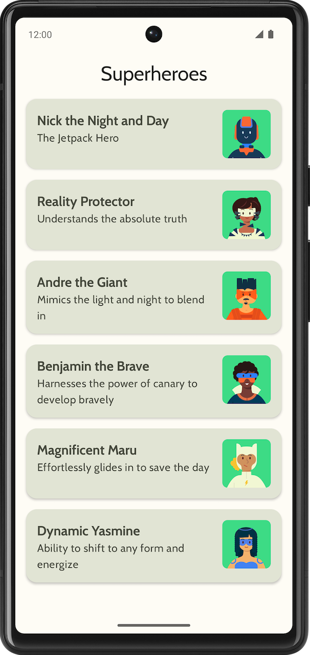
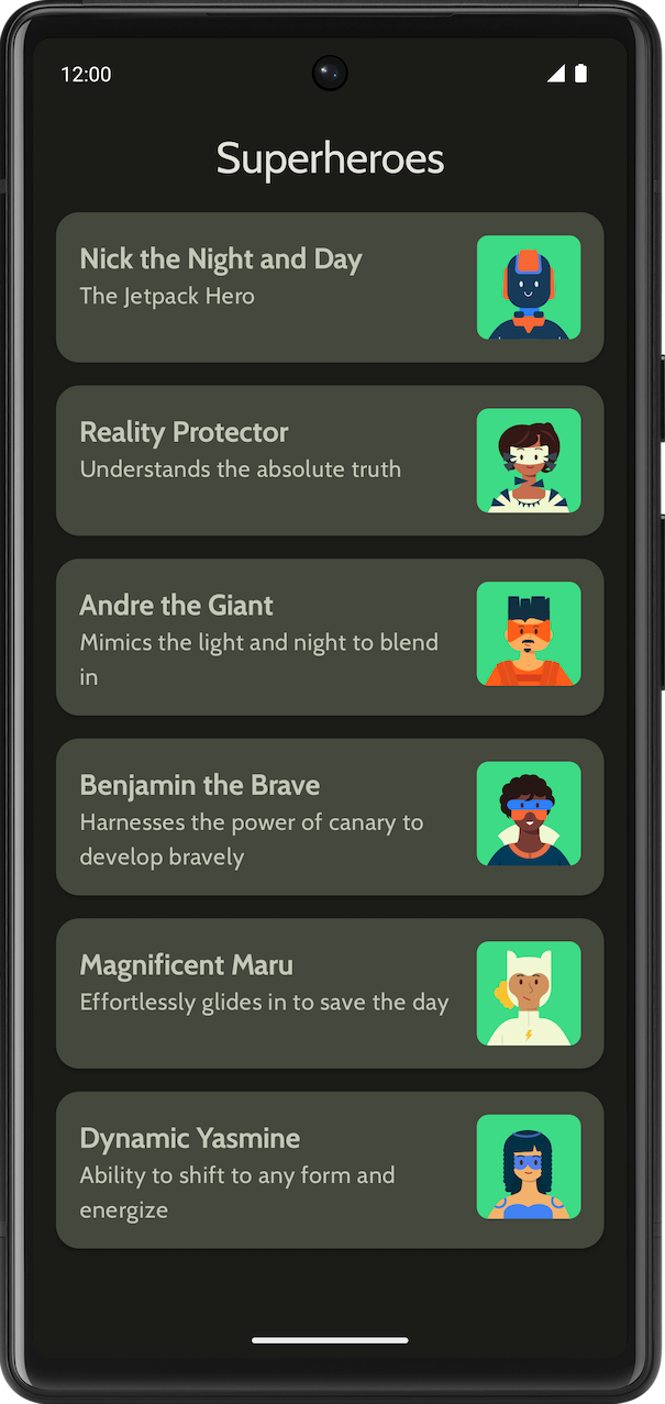
显示超级英雄列表的超级英雄应用。
最终应用在浅色主题和深色主题中应如下所示:
|
|
2. 开始
在此任务中,您将设置项目并为超级英雄创建虚拟数据。
- 使用 Empty Activity 模板创建一个新项目,并将最低 SDK 设为 24。
- 在此处下载应用的资源:超级英雄图片和应用徽标。如需回顾如何添加应用图标,请参阅更改应用图标 Codelab。如需回顾如何向应用添加图片,请参阅创建交互式 Dice Roller 应用 Codelab。
- 从 https://fonts.google.com 下载 Cabin 粗体和 Cabin 常规字体文件。探索可用的不同字体文件。如需在您的应用中自定义排版,请参阅使用 Jetpack Compose 实现 Material 主题设置 Codelab。
- 创建数据类以存储每个超级英雄的数据。为
Hero数据类创建一个名为model的新软件包来整理代码。您的列表项可能如下所示:
每个超级英雄列表项都会显示三条独特的信息:名称、说明和图片。
- 在同一
model软件包中,为您希望显示的所有英雄信息创建另一个文件。例如名称、说明和图片资源。以下是一个示例数据集,供您参考。
object HeroesRepository {
    val heroes = listOf(
        Hero(
            nameRes = R.string.hero1,
            descriptionRes = R.string.description1,
            imageRes = R.drawable.android_superhero1
        ),
        Hero(
            nameRes = R.string.hero2,
            descriptionRes = R.string.description2,
            imageRes = R.drawable.android_superhero2
        ),
        Hero(
            nameRes = R.string.hero3,
            descriptionRes = R.string.description3,
            imageRes = R.drawable.android_superhero3
        ),
        Hero(
            nameRes = R.string.hero4,
            descriptionRes = R.string.description4,
            imageRes = R.drawable.android_superhero4
        ),
        Hero(
            nameRes = R.string.hero5,
            descriptionRes = R.string.description5,
            imageRes = R.drawable.android_superhero5
        ),
        Hero(
            nameRes = R.string.hero6,
            descriptionRes = R.string.description6,
            imageRes = R.drawable.android_superhero6
        )
    )
}
- 在 strings.xml 文件中添加英雄名称和说明字符串。
<resources>
    <string name="app_name">Superheroes</string>
    <string name="hero1">Nick the Night and Day</string>
    <string name="description1">The Jetpack Hero</string>
    <string name="hero2">Reality Protector</string>
    <string name="description2">Understands the absolute truth</string>
    <string name="hero3">Andre the Giant</string>
    <string name="description3">Mimics the light and night to blend in</string>
    <string name="hero4">Benjamin the Brave</string>
    <string name="description4">Harnesses the power of canary to develop bravely</string>
    <string name="hero5">Magnificent Maru</string>
    <string name="description5">Effortlessly glides in to save the day</string>
    <string name="hero6">Dynamic Yasmine</string>
    <string name="description6">Ability to shift to any form and energize</string>
</resources>
3. Material 主题设置
在此部分中,您将添加应用的调色板、排版和形状,以改善应用的外观和风格。
以下 Color、Type 和 Shape 只是针对主题的建议。探索并修改不同的配色方案。
使用 Material 主题构建器为应用创建新主题。
颜色
ui.theme/Color.kt
import androidx.compose.ui.graphics.Color

val md_theme_light_primary = Color(0xFF466800)
val md_theme_light_onPrimary = Color(0xFFFFFFFF)
val md_theme_light_primaryContainer = Color(0xFFC6F181)
val md_theme_light_onPrimaryContainer = Color(0xFF121F00)
val md_theme_light_secondary = Color(0xFF596248)
val md_theme_light_onSecondary = Color(0xFFFFFFFF)
val md_theme_light_secondaryContainer = Color(0xFFDDE6C6)
val md_theme_light_onSecondaryContainer = Color(0xFF161E0A)
val md_theme_light_tertiary = Color(0xFF396661)
val md_theme_light_onTertiary = Color(0xFFFFFFFF)
val md_theme_light_tertiaryContainer = Color(0xFFBCECE6)
val md_theme_light_onTertiaryContainer = Color(0xFF00201D)
val md_theme_light_error = Color(0xFFBA1A1A)
val md_theme_light_errorContainer = Color(0xFFFFDAD6)
val md_theme_light_onError = Color(0xFFFFFFFF)
val md_theme_light_onErrorContainer = Color(0xFF410002)
val md_theme_light_background = Color(0xFFFEFCF5)
val md_theme_light_onBackground = Color(0xFF1B1C18)
val md_theme_light_surface = Color(0xFFFEFCF5)
val md_theme_light_onSurface = Color(0xFF1B1C18)
val md_theme_light_surfaceVariant = Color(0xFFE1E4D4)
val md_theme_light_onSurfaceVariant = Color(0xFF45483D)
val md_theme_light_outline = Color(0xFF75786C)
val md_theme_light_inverseOnSurface = Color(0xFFF2F1E9)
val md_theme_light_inverseSurface = Color(0xFF30312C)
val md_theme_light_inversePrimary = Color(0xFFABD468)
val md_theme_light_surfaceTint = Color(0xFF466800)
val md_theme_light_outlineVariant = Color(0xFFC5C8B9)
val md_theme_light_scrim = Color(0xFF000000)

val md_theme_dark_primary = Color(0xFFABD468)
val md_theme_dark_onPrimary = Color(0xFF223600)
val md_theme_dark_primaryContainer = Color(0xFF344E00)
val md_theme_dark_onPrimaryContainer = Color(0xFFC6F181)
val md_theme_dark_secondary = Color(0xFFC1CAAB)
val md_theme_dark_onSecondary = Color(0xFF2B331D)
val md_theme_dark_secondaryContainer = Color(0xFF414A32)
val md_theme_dark_onSecondaryContainer = Color(0xFFDDE6C6)
val md_theme_dark_tertiary = Color(0xFFA0D0CA)
val md_theme_dark_onTertiary = Color(0xFF013733)
val md_theme_dark_tertiaryContainer = Color(0xFF1F4E4A)
val md_theme_dark_onTertiaryContainer = Color(0xFFBCECE6)
val md_theme_dark_error = Color(0xFFFFB4AB)
val md_theme_dark_errorContainer = Color(0xFF93000A)
val md_theme_dark_onError = Color(0xFF690005)
val md_theme_dark_onErrorContainer = Color(0xFFFFDAD6)
val md_theme_dark_background = Color(0xFF1B1C18)
val md_theme_dark_onBackground = Color(0xFFE4E3DB)
val md_theme_dark_surface = Color(0xFF1B1C18)
val md_theme_dark_onSurface = Color(0xFFE4E3DB)
val md_theme_dark_surfaceVariant = Color(0xFF45483D)
val md_theme_dark_onSurfaceVariant = Color(0xFFC5C8B9)
val md_theme_dark_outline = Color(0xFF8F9285)
val md_theme_dark_inverseOnSurface = Color(0xFF1B1C18)
val md_theme_dark_inverseSurface = Color(0xFFE4E3DB)
val md_theme_dark_inversePrimary = Color(0xFF466800)
val md_theme_dark_surfaceTint = Color(0xFFABD468)
val md_theme_dark_outlineVariant = Color(0xFF45483D)
val md_theme_dark_scrim = Color(0xFF000000)
形状
ui.theme/Shape.kt
import androidx.compose.foundation.shape.RoundedCornerShape
import androidx.compose.material3.Shapes
import androidx.compose.ui.unit.dp

val Shapes = Shapes(
    small = RoundedCornerShape(8.dp),
    medium = RoundedCornerShape(16.dp),
    large = RoundedCornerShape(16.dp)
)
排版
ui.theme/Type.kt
import androidx.compose.material3.Typography
import androidx.compose.ui.text.TextStyle
import androidx.compose.ui.text.font.Font
import androidx.compose.ui.text.font.FontFamily
import androidx.compose.ui.text.font.FontWeight
import androidx.compose.ui.unit.sp
import com.example.superheroes.R


val Cabin = FontFamily(
    Font(R.font.cabin_regular, FontWeight.Normal),
    Font(R.font.cabin_bold, FontWeight.Bold)
)
// Set of Material typography styles to start with
val Typography = Typography(
    bodyLarge = TextStyle(
        fontFamily = Cabin,
        fontWeight = FontWeight.Normal,
        fontSize = 16.sp,
        lineHeight = 24.sp,
        letterSpacing = 0.5.sp
    ),
    displayLarge = TextStyle(
        fontFamily = Cabin,
        fontWeight = FontWeight.Normal,
        fontSize = 30.sp
    ),
    displayMedium = TextStyle(
        fontFamily = Cabin,
        fontWeight = FontWeight.Bold,
        fontSize = 20.sp
    ),
    displaySmall = TextStyle(
        fontFamily = Cabin,
        fontWeight = FontWeight.Bold,
        fontSize = 20.sp
    )
)
主题
ui.theme/Theme.kt
import android.app.Activity
import android.os.Build
import androidx.compose.foundation.isSystemInDarkTheme
import androidx.compose.material3.MaterialTheme
import androidx.compose.material3.darkColorScheme
import androidx.compose.material3.dynamicDarkColorScheme
import androidx.compose.material3.dynamicLightColorScheme
import androidx.compose.material3.lightColorScheme
import androidx.compose.runtime.Composable
import androidx.compose.runtime.SideEffect
import androidx.compose.ui.graphics.toArgb
import androidx.compose.ui.platform.LocalContext
import androidx.compose.ui.platform.LocalView
import androidx.core.view.WindowCompat

private val LightColors = lightColorScheme(
   primary = md_theme_light_primary,
   onPrimary = md_theme_light_onPrimary,
   primaryContainer = md_theme_light_primaryContainer,
   onPrimaryContainer = md_theme_light_onPrimaryContainer,
   secondary = md_theme_light_secondary,
   onSecondary = md_theme_light_onSecondary,
   secondaryContainer = md_theme_light_secondaryContainer,
   onSecondaryContainer = md_theme_light_onSecondaryContainer,
   tertiary = md_theme_light_tertiary,
   onTertiary = md_theme_light_onTertiary,
   tertiaryContainer = md_theme_light_tertiaryContainer,
   onTertiaryContainer = md_theme_light_onTertiaryContainer,
   error = md_theme_light_error,
   errorContainer = md_theme_light_errorContainer,
   onError = md_theme_light_onError,
   onErrorContainer = md_theme_light_onErrorContainer,
   background = md_theme_light_background,
   onBackground = md_theme_light_onBackground,
   surface = md_theme_light_surface,
   onSurface = md_theme_light_onSurface,
   surfaceVariant = md_theme_light_surfaceVariant,
   onSurfaceVariant = md_theme_light_onSurfaceVariant,
   outline = md_theme_light_outline,
   inverseOnSurface = md_theme_light_inverseOnSurface,
   inverseSurface = md_theme_light_inverseSurface,
   inversePrimary = md_theme_light_inversePrimary,
   surfaceTint = md_theme_light_surfaceTint,
   outlineVariant = md_theme_light_outlineVariant,
   scrim = md_theme_light_scrim,
)

private val DarkColors = darkColorScheme(
   primary = md_theme_dark_primary,
   onPrimary = md_theme_dark_onPrimary,
   primaryContainer = md_theme_dark_primaryContainer,
   onPrimaryContainer = md_theme_dark_onPrimaryContainer,
   secondary = md_theme_dark_secondary,
   onSecondary = md_theme_dark_onSecondary,
   secondaryContainer = md_theme_dark_secondaryContainer,
   onSecondaryContainer = md_theme_dark_onSecondaryContainer,
   tertiary = md_theme_dark_tertiary,
   onTertiary = md_theme_dark_onTertiary,
   tertiaryContainer = md_theme_dark_tertiaryContainer,
   onTertiaryContainer = md_theme_dark_onTertiaryContainer,
   error = md_theme_dark_error,
   errorContainer = md_theme_dark_errorContainer,
   onError = md_theme_dark_onError,
   onErrorContainer = md_theme_dark_onErrorContainer,
   background = md_theme_dark_background,
   onBackground = md_theme_dark_onBackground,
   surface = md_theme_dark_surface,
   onSurface = md_theme_dark_onSurface,
   surfaceVariant = md_theme_dark_surfaceVariant,
   onSurfaceVariant = md_theme_dark_onSurfaceVariant,
   outline = md_theme_dark_outline,
   inverseOnSurface = md_theme_dark_inverseOnSurface,
   inverseSurface = md_theme_dark_inverseSurface,
   inversePrimary = md_theme_dark_inversePrimary,
   surfaceTint = md_theme_dark_surfaceTint,
   outlineVariant = md_theme_dark_outlineVariant,
   scrim = md_theme_dark_scrim,
)

@Composable
fun SuperheroesTheme(
   darkTheme: Boolean = isSystemInDarkTheme(),
   // Dynamic color is available on Android 12+
   // Dynamic color in this app is turned off for learning purposes
   dynamicColor: Boolean = false,
   content: @Composable () -> Unit
) {
   val colorScheme = when {
       dynamicColor && Build.VERSION.SDK_INT >= Build.VERSION_CODES.S -> {
           val context = LocalContext.current
           if (darkTheme) dynamicDarkColorScheme(context) else dynamicLightColorScheme(context)
       }

       darkTheme -> DarkColors
       else -> LightColors
   }
   val view = LocalView.current
   if (!view.isInEditMode) {
       SideEffect {
           val window = (view.context as Activity).window
           window.statusBarColor = colorScheme.background.toArgb()
           WindowCompat.getInsetsController(window, view).isAppearanceLightStatusBars = !darkTheme
       }
   }

   MaterialTheme(
       colorScheme = colorScheme,
       typography = Typography,
       shapes = Shapes,
       content = content
   )
}
4. 显示列表
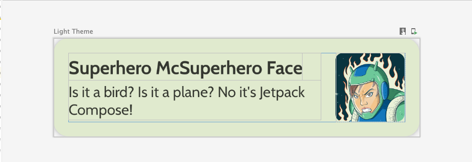
创建列表的第一步是创建列表项。
- 在
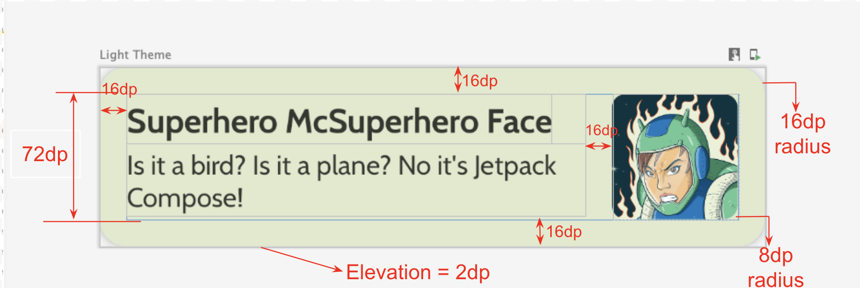
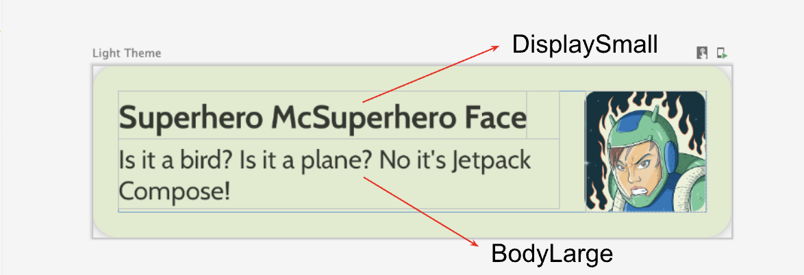
com.example.superheroes软件包下,创建一个名为HeroesScreen.kt的文件。您将在此文件中创建列表项和列表可组合项。 - 创建一个可组合项来代表超级英雄列表项,类似于以下屏幕截图和界面规范。
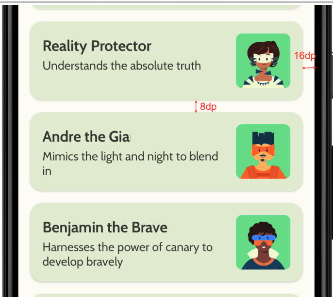
请遵照此界面规范,或发挥创意并自行设计列表项:
- 卡片高度为
2dp - 列表项的高度为
72dp,内边距为16dp - 列表项的裁剪半径为
16dp - 尺寸为
72dp且包含图片的Box布局 - 图片的裁剪半径为
8dp - 图片和文字之间的间距为
16dp - 超级英雄名称的样式为
DisplaySmall - 超级英雄说明的样式为
BodyLarge
探索不同的内边距和尺寸选项;根据 Material 3 准则,内边距应以 4dp 为增量。
创建延迟列
- 创建另一个可组合项,用于获取英雄列表并显示列表。您可以在此处使用
LazyColumn。 - 对内边距使用以下界面规范。
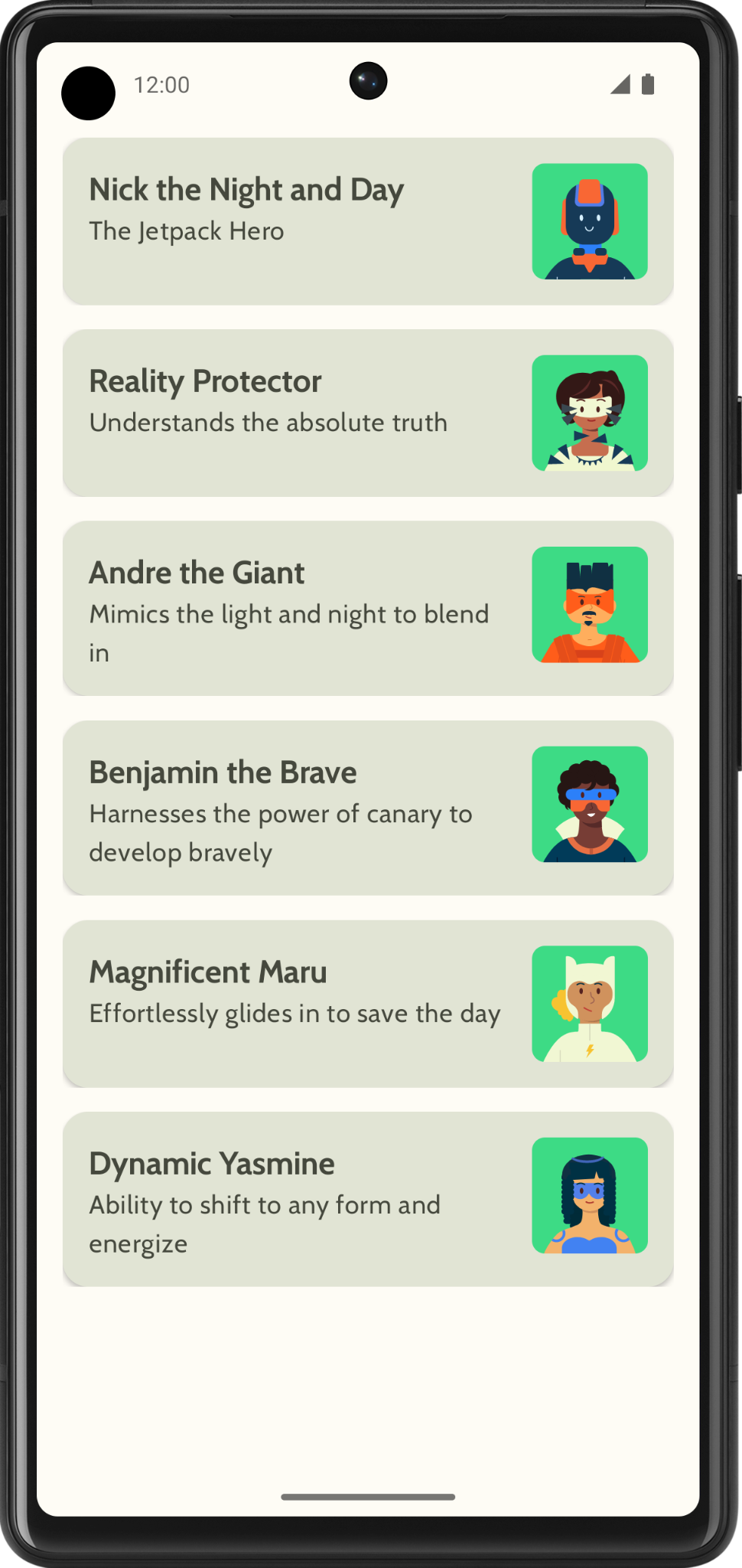
完成实现后,您的应用应与以下屏幕截图一致:
5. 添加顶部应用栏
为您的应用添加一个顶部应用栏。
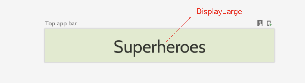
- 在
MainActivity.kt中,添加一个可组合项以显示顶部应用栏。在顶部应用栏中添加文字;可以是应用名称。在水平和垂直方向上居中对齐。 - 您可将顶部应用栏的样式设置为
DisplayLarge。
- 使用
scaffold显示顶部应用栏。如有需要,请参阅顶部应用栏 - Material Design 3 文档。
自定义状态栏颜色
如需让应用无边框,您可以自定义状态栏颜色,使其与背景颜色保持一致。
- 在
Theme.kt中,添加此新方法来更改状态栏和导航栏颜色,以实现无边框。
/**
 * Sets up edge-to-edge for the window of this [view]. The system icon colors are set to either
 * light or dark depending on whether the [darkTheme] is enabled or not.
 */
private fun setUpEdgeToEdge(view: View, darkTheme: Boolean) {
    val window = (view.context as Activity).window
    WindowCompat.setDecorFitsSystemWindows(window, false)
    window.statusBarColor = Color.Transparent.toArgb()
    val navigationBarColor = when {
        Build.VERSION.SDK_INT >= 29 -> Color.Transparent.toArgb()
        Build.VERSION.SDK_INT >= 26 -> Color(0xFF, 0xFF, 0xFF, 0x63).toArgb()
        // Min sdk version for this app is 24, this block is for SDK versions 24 and 25
        else -> Color(0x00, 0x00, 0x00, 0x50).toArgb()
    }
    window.navigationBarColor = navigationBarColor
    val controller = WindowCompat.getInsetsController(window, view)
    controller.isAppearanceLightStatusBars = !darkTheme
    controller.isAppearanceLightNavigationBars = !darkTheme
}
- 在
SuperheroesTheme()函数中,从SideEffect块内调用setUpEdgeToEdge()函数。
fun SuperheroesTheme(
    darkTheme: Boolean = isSystemInDarkTheme(),
    // Dynamic color is available on Android 12+
    // Dynamic color in this app is turned off for learning purposes
    dynamicColor: Boolean = false,
    content: @Composable () -> Unit
) {
    //...
    val view = LocalView.current
    if (!view.isInEditMode) {
        SideEffect {
            setUpEdgeToEdge(view, darkTheme)
        }
    }

    //...
}
|
|
6. 获取解决方案代码
如需下载完成后的 Codelab 代码,您可以使用以下 Git 命令:
$ git clone https://github.com/google-developer-training/basic-android-kotlin-compose-training-superheroes.git
或者,您也可以下载 ZIP 文件形式的代码库,将其解压缩并在 Android Studio 中打开。
如果您想查看解决方案代码,请前往 GitHub 查看。