
1. Before you begin
In this codelab, you learn how to add images to your app using an Image composable.
Prerequisites
- Basic knowledge of how to create and run an app in Android Studio.
- Basic knowledge of how to add UI elements, such as text composables.
What you'll learn
- How to add an image or photo to your Android app.
- How to display an image in your app with an
Imagecomposable. - Best practices using
Stringresources.
What you'll build
- Enhance the Happy Birthday app to include an image.
What you'll need
- A computer with Android Studio installed.
- The app from the Build a simple app with text composables codelab.
2. Set up your app
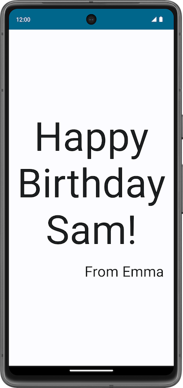
Open your Happy Birthday project from the previous codelab in Android Studio.
When you run the app, it should look like this screenshot.
Add an image to your project
In this task, you'll download an image from the internet and add it to your Happy Birthday app.
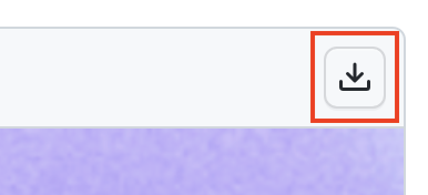
- Open the image for your birthday card app from this link.
- Click Download.
- Right-click the image and then save the file to your computer as
androidparty.png. - Make note of where you saved the image.
For example, you may have saved it in your Downloads folder.
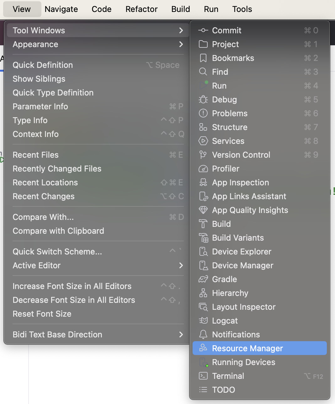
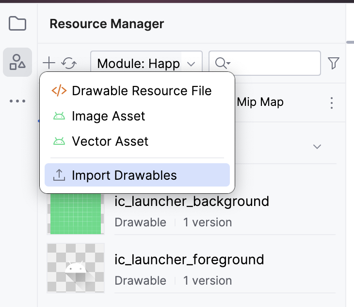
- In Android Studio, click View > Tool Windows > Resource Manager or click the Resource Manager tab next to the Project window.
- Click + (Add resources to the module) > Import Drawables.
- In the file browser, select the image file that you downloaded and then click Open.
This action opens the Import drawables dialog.
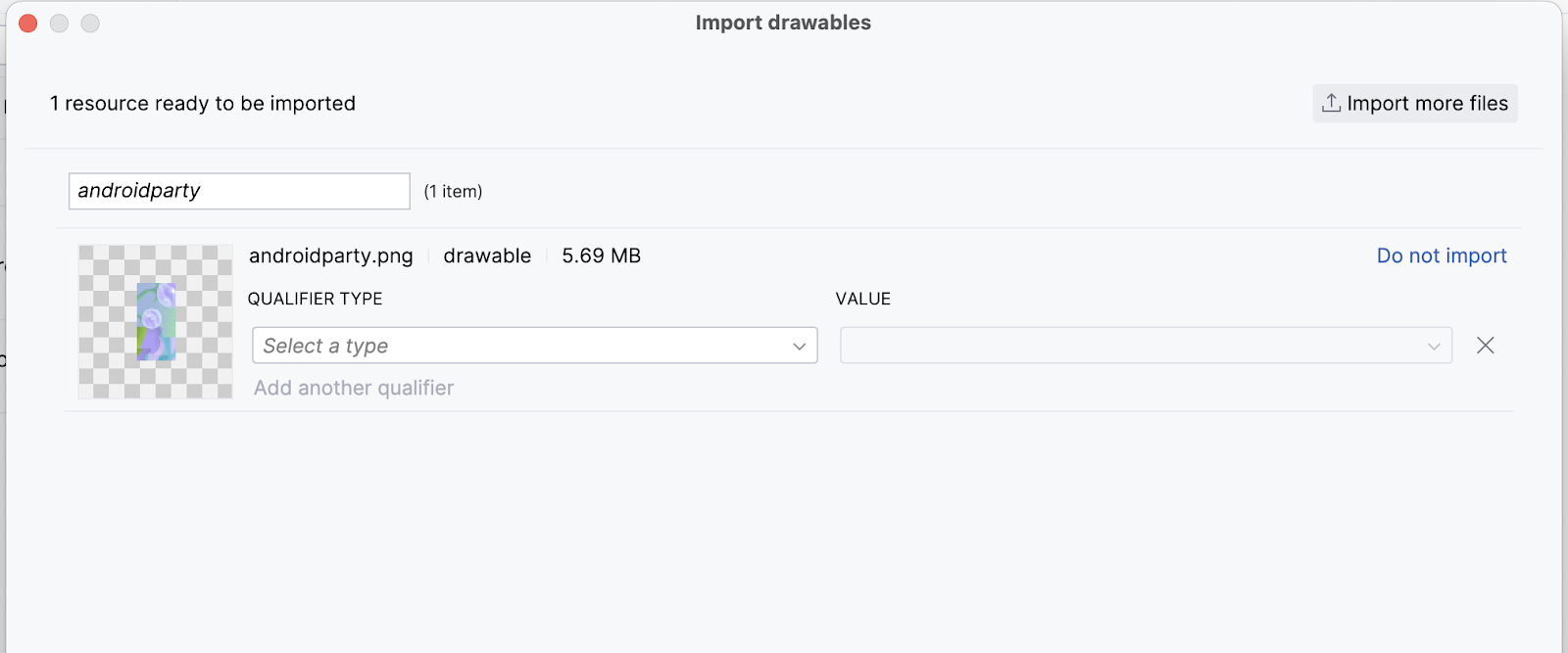
- Android Studio shows you a preview of the image. Select Density from the QUALIFIER TYPE drop-down list. You'll learn why you're doing this, in a later section.
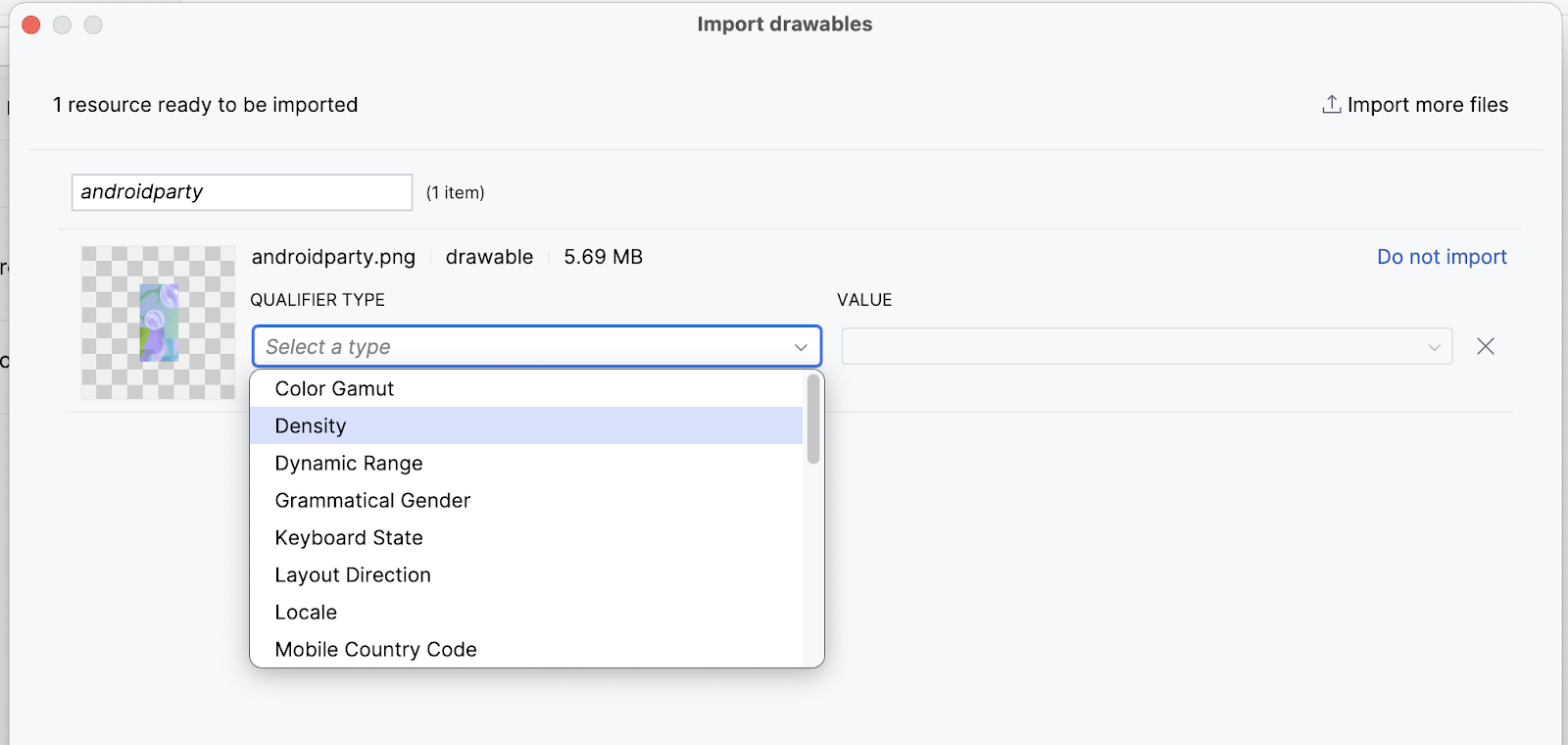
- Select No Density from the VALUE list.
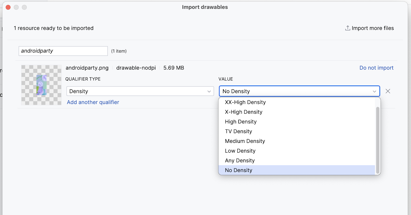
Android devices come in different screen sizes (phones, tablets, and TVs to name a few), and their screens also have different pixel sizes. That is, while one device has 160 pixels per square inch, another device fits 480 pixels in the same space. If you don't consider these variations in pixel density, the system might scale your images, which could result in blurry images, or large images that consume too much memory, or images that are sized improperly.
When you resize images that are larger than the Android system can handle, an out-of-memory error is thrown. For photographs and background images, such as the current image, the androidparty.png, you should place them in the drawable-nodpi folder, which stops the resizing behavior.
For more information about pixel densities, see Support different pixel densities.
- Click Next.
- Android Studio shows you the folder structure in which your image will be placed. Notice the
drawable-nodpifolder. - Click Import(C).
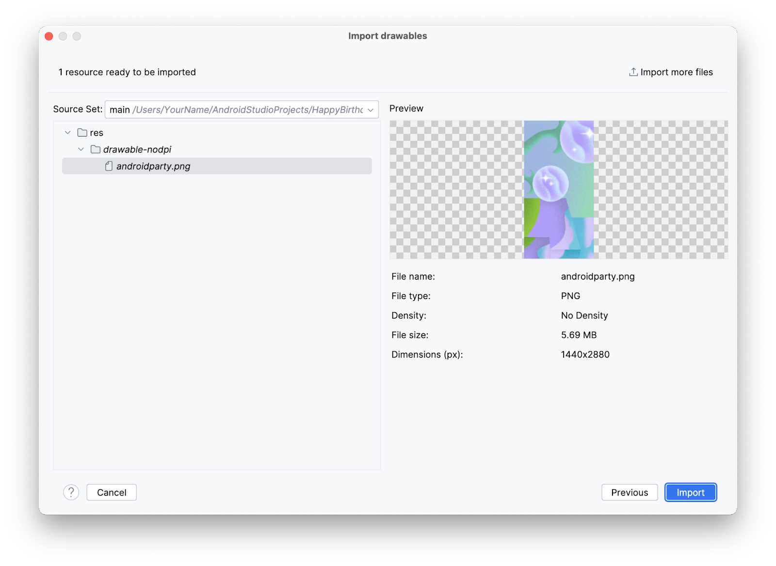
Android Studio creates a drawable-nodpi folder and places your image in it. In the Android Studio project view, the resource name is displayed as androidparty.png (nodpi). In the computer file system, Android Studio would have created a folder called drawable-nodpi.

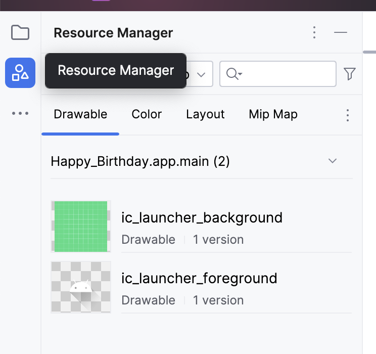
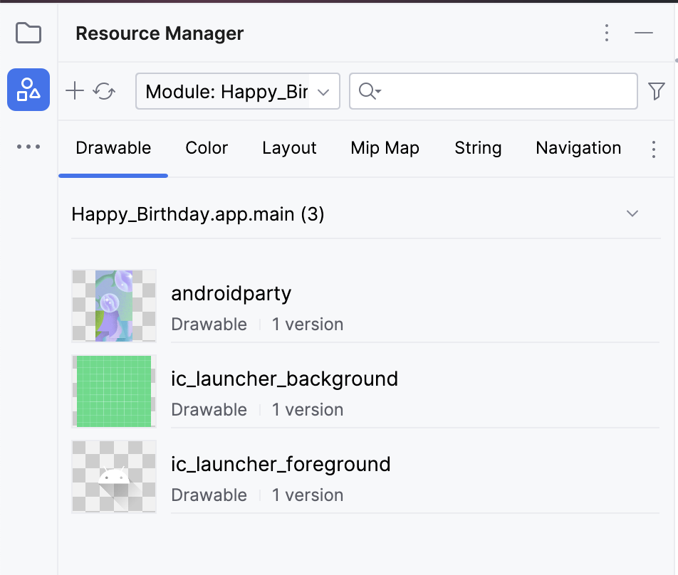
If the image is imported successfully, Android Studio adds the image to the list under the Drawable tab. This list includes all your images and icons for the app. You can now use this image in your app.
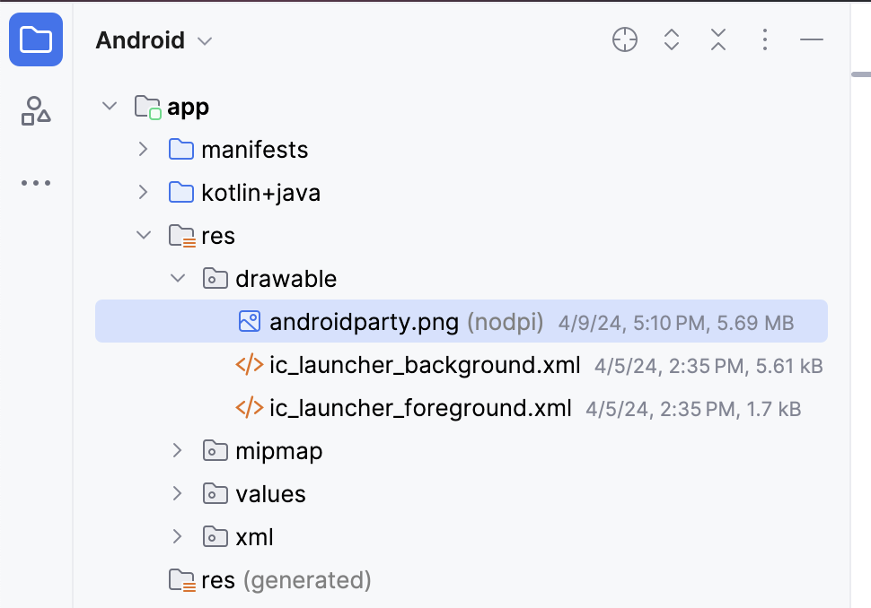
- Switch back to the project view, click View > Tool Windows > Project or click the Project tab on the far left.
- Click app > res > drawable to confirm that the image is in the
drawablefolder.
3. Add an Image composable
To display an image in your app, it needs a place to be displayed. Just like you use a Text composable to display text, you can use an Image composable to display an image.
In this task, you add an Image composable to your app, set its image to the image that you downloaded, position it and adjust its size so that it fills the screen.
Add a composable function to add an image
- In the
MainActivity.ktfile, add aGreetingImage()composable function after theGreetingText()function. - Pass the
GreetingImage()function twoStringparameters: one calledmessagefor the birthday greeting and the other calledfromfor your signature.
@Composable
fun GreetingImage(message: String, from: String) {
}
- Every composable function should accept an optional
Modifierparameter. Modifiers tell a UI element how to lay out, display, or behave within its parent layout. Add another parameter at theGreetingImage()composable.
@Composable
fun GreetingImage(message: String, from: String, modifier: Modifier = Modifier) {
}
Resources in Jetpack Compose
Resources are the additional files and static content that your code uses, such as bitmaps, user-interface strings, animation instructions, and more. For more information about resources in Android, see App resources overview.
You should always separate app resources, such as images and strings, from your code so that you can maintain them independently. At runtime, Android uses the appropriate resource based on the current configuration. For example, you might want to provide a different UI layout based on the screen size or different strings based on the language setting.
Grouping resources
You should always place each type of resource in a specific subdirectory of your project's res/ directory. For example, here's the file hierarchy for a simple project:
MyProject/
    src/
        MyActivity.kt
    res/
        drawable/
            graphic.png
        mipmap/
            icon.png
        values/
            strings.xml
As you can see in this example, the res/ directory contains all the resources in subdirectories, which includes a drawable/ directory for an image resource, a mipmap/ directory for launcher icons, and a values/ directory for string resources. To learn more about the usage, format, and syntax for app resources, see Resource types overview.
Accessing resources
Jetpack Compose can access the resources defined in your Android project. Resources can be accessed with resource IDs that are generated in your project's R class.
An R class is an automatically generated class by Android that contains the IDs of all resources in the project. In most cases, the resource ID is the same as the filename. For example, the image in the previous file hierarchy can be accessed with this code:
R.drawable.graphic

In the next task, you use the image, androidparty.png file, which you added in the previous task.
- In the
GreetingImage()function, declare avalproperty and name itimage. - Make a call to
painterResource()function by passing in theandroidpartyresource. Assign the returned value to theimagevariable.
val image = painterResource(R.drawable.androidparty)
Android Studio highlights the .painterResource code because you need to import the function to compile your app.
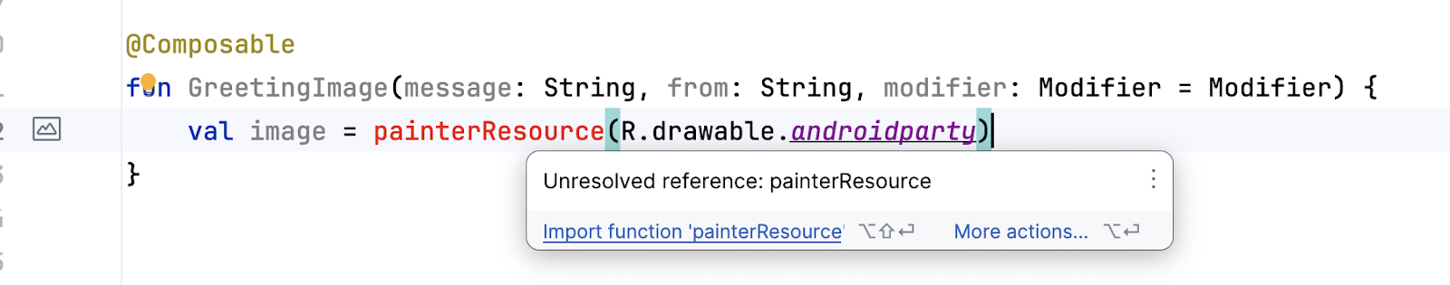
- Click
.painterResourcewhich is highlighted by Android Studio. - Click Import in the popup to add the import for
androidx.compose.ui.res.painterResource.
The painterResource() function loads a drawable image resource and takes resource ID (R.drawable.androidparty in this case) as an argument.
- After the call to the
painterResource()function, add anImagecomposable and then pass in theimageas a named argument for thepainter.
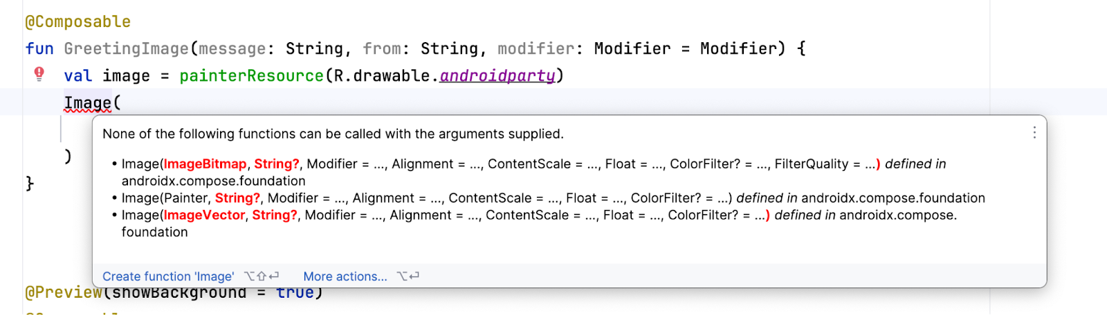
Image(
    painter = image
)
Android Studio highlights the Image code because you need to import the function to compile your app.
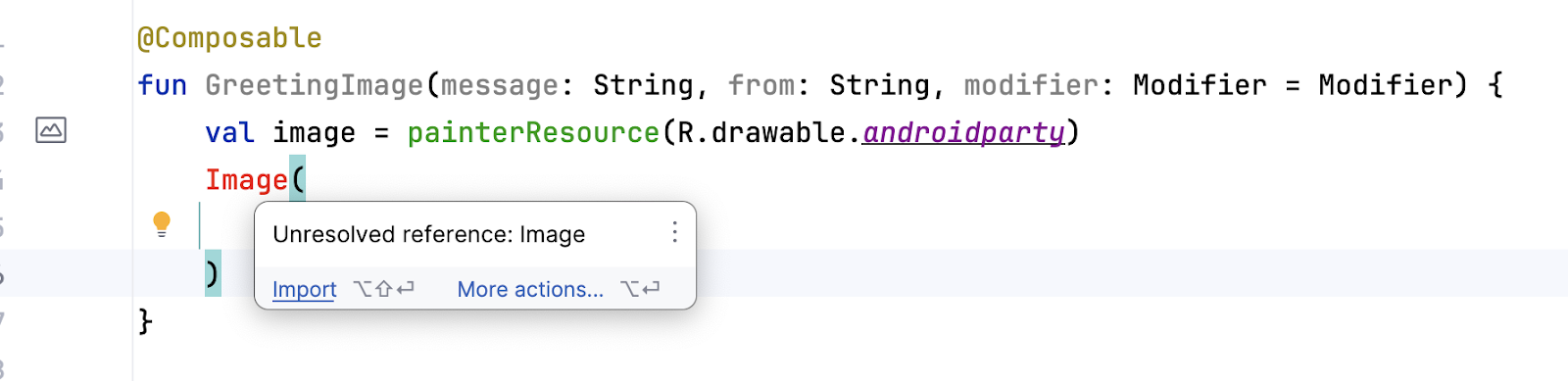
To fix this warning, add the following import at the top of your MainActivity.kt file:
import androidx.compose.foundation.Image
The initial warning is now resolved but if you hover over the word Image, Android Studio displays a new warning that states, "None of the following functions can be called with the arguments supplied." This is because the provided argument does not match any of the Image function signatures.
This warning will be fixed in the next section.
Check your app for accessibility
When you follow coding practices for accessibility, you let all of your users, including those with disabilities, more easily navigate, and interact with, your app.
Android Studio provides hints and warnings to help you make your app more accessible. A content description defines the purpose of a UI element, which makes your app more usable with TalkBack.
However, the image in this app is only included for decorative purposes. The addition of a content description for the image would make it harder to use with TalkBack in this particular case. Instead of setting the content description that's announced to the user, you can set the image's contentDescription argument to null so that TalkBack skips the Image composable.
- In the
Imagecomposable, add another named argument calledcontentDescriptionand set its value tonull.
Image(
    painter = image,
    contentDescription = null
)
Preview the Image composable
In this task, you preview the image composable and run the app on an emulator or device.
- In the
BirthdayCardPreview()function, replace theGreetingText()function call with aGreetingImage()function call.
Your function should look like this code snippet:
@Preview(showBackground = true)
@Composable
fun BirthdayCardPreview() {
    HappyBirthdayTheme {
        GreetingImage(
            message = "Happy Birthday Sam!",
            from = "From Emma"
        )
    }
}
- The Design pane should auto update, if it doesn't, click
 to build.
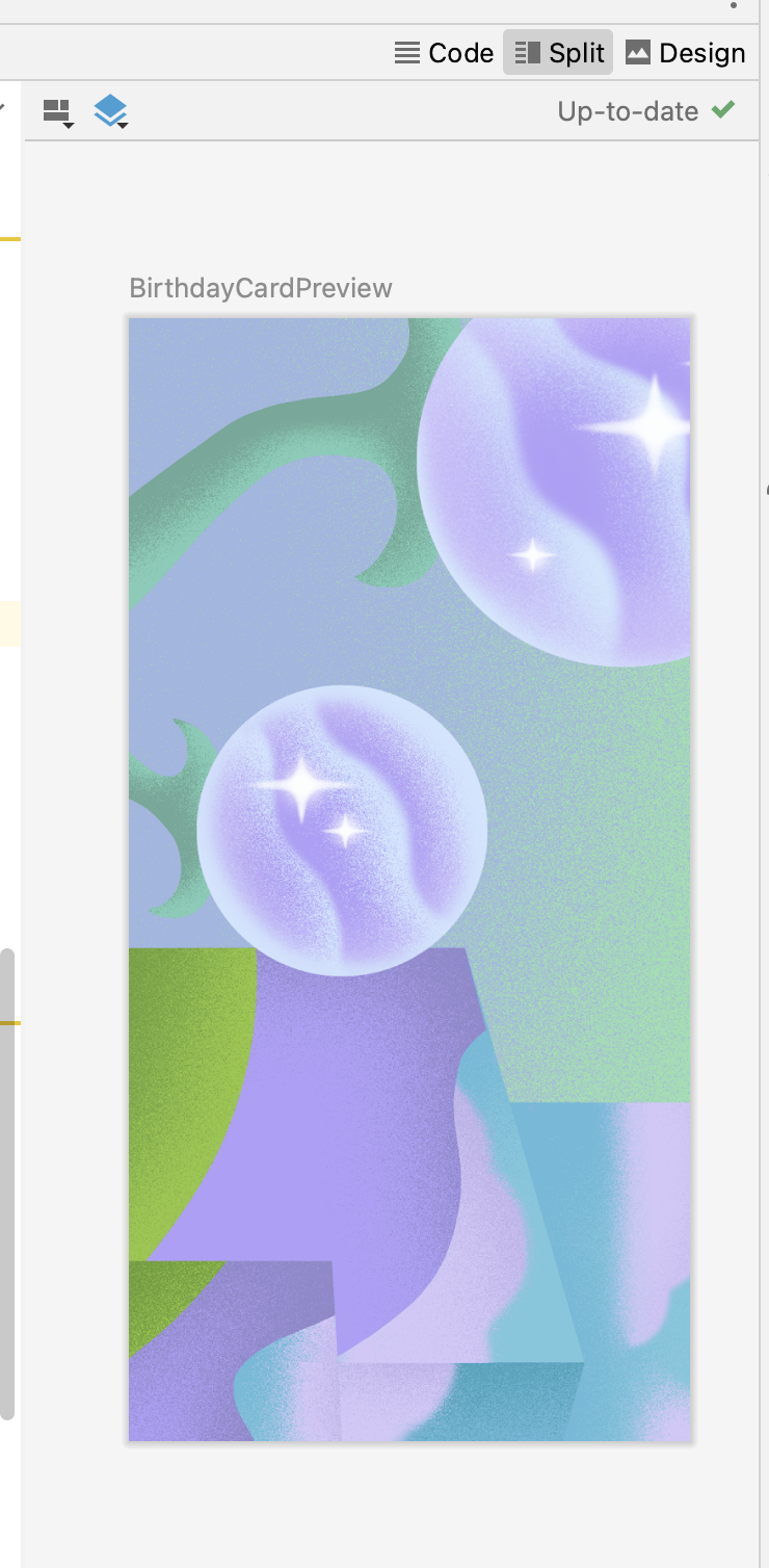
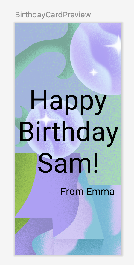
Notice that you can't see the text anymore because the new function only has an Image composable, but not a Text composable.
4. Add Box layout
The three basic, standard layout elements in Compose are Column, Row, and Box composables. You learned about Column and Row composables in the previous codelabs, now you will explore more about the Box composable.
Box layout is one of the standard layout elements in Compose. Use Box layout to stack elements on top of one another. Box layout also lets you configure the specific alignment of the elements that it contains.

- In the
GreetingImage()function, add aBoxcomposable around theImagecomposable as shown:
@Composable
fun GreetingImage(message: String, from: String, modifier: Modifier = Modifier) {
    val image = painterResource(R.drawable.androidparty)
    Box {
        Image(
            painter = image,
            contentDescription = null
        )
    }
}
- Import the
androidx.compose.foundation.layout.Boxfunction when prompted by Android Studio. - Add code to pass the
modifierparameter to theBoxcomposable.
@Composable
fun GreetingImage(message: String, from: String, modifier: Modifier = Modifier) {
    val image = painterResource(R.drawable.androidparty)
    Box(modifier) {
        Image(
            painter = image,
            contentDescription = null
        )
    }
}
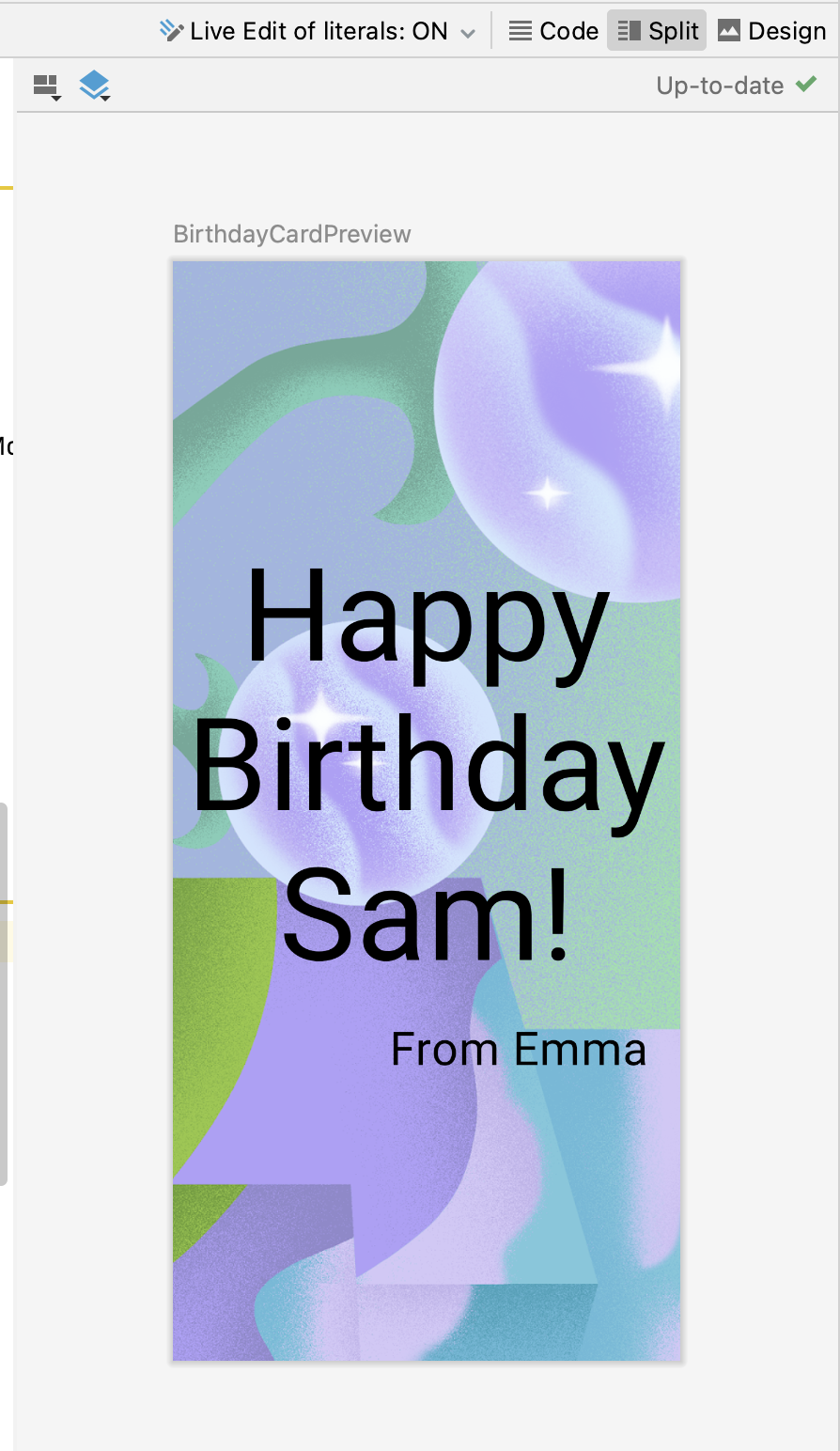
- At the end of the
Boxcomposable, call theGreetingText()function, and pass it the birthday message, signature, and the modifier as shown:
@Composable
fun GreetingImage(message: String, from: String, modifier: Modifier = Modifier) {
    val image = painterResource(R.drawable.androidparty)
    Box(modifier) {
        Image(
            painter = image,
            contentDescription = null
        )
        GreetingText(
            message = message,
            from = from,
            modifier = Modifier
                .fillMaxSize()
                .padding(8.dp)
        )
    }
}
- Notice the updated preview in the Design pane.
You should see the text and image.

- To make the above changes reflect in the emulator or a device, in the
onCreate()function, replace theGreetingText()function call with aGreetingImage()function call.
Your setContent block should look like this code snippet:
setContent {
    HappyBirthdayTheme {
        // A surface container using the 'background' color from the theme
        Surface(
            modifier = Modifier.fillMaxSize(),
            color = MaterialTheme.colorScheme.background
        ) {
            GreetingImage(
                message = "Happy Birthday Sam!",
                from = "From Emma"
            )
        }
    }
}
Notice that the image is as wide as the screen, but the image is anchored to the top of the screen. There's whitespace at the bottom of the screen that doesn't look very attractive. In your next task, you will fill the width and height of the screen, and scale the image to fill the entire screen.
5. Change opacity and scale the image
In this task, you make the image full screen to beautify your app. To achieve this you use the ContentScale parameters.
Scale content
You have added the image to your app and positioned the image. Now, you need to adjust the scale type of the image, which says how to size the image, to make it fullscreen.
There are quite a few ContentScale types available. You use the ContentScale.Crop parameter scaling, which scales the image uniformly to maintain the aspect ratio so that the width and height of the image are equal to, or larger than, the corresponding dimension of the screen.
- Add a
ContentScalenamed argument to the image.
Image(
    painter = image,
    contentDescription = null,
    contentScale = ContentScale.Crop
)
- Import the
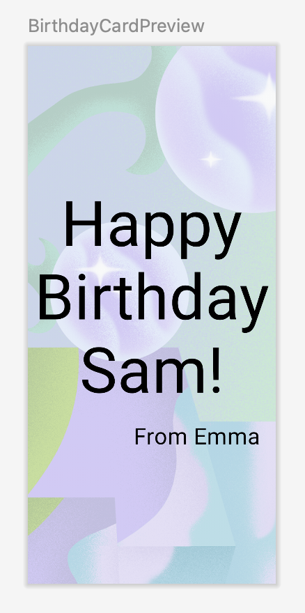
androidx.compose.ui.layout.ContentScaleinterface when prompted by Android Studio. - Check out the Design pane.
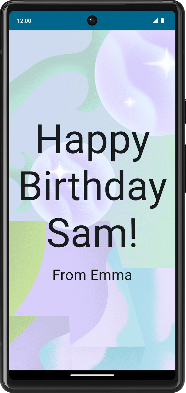
The image should now fill the entire preview screen as you can see in this screenshot:
Change opacity
To improve the app's contrast, change the opacity of the background image.
Add alpha parameter to the Image composable and set it to 0.5F.
Image(
    painter = image,
    contentDescription = null,
    contentScale = ContentScale.Crop,
    alpha = 0.5F
)
Notice the change in image opacity.
|
|
That's a lot of code! It's time to preview all your hard work.
Run the app
Run the app on a device or emulator.
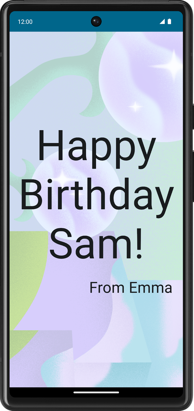
Good job with the full-screen image and text message. You have also changed the opacity of the image.
Layout Modifiers
Modifiers are used to decorate or add behavior to Jetpack Compose UI elements. For example, you can add backgrounds, padding or behavior to rows, text, or buttons. To set them, a composable or a layout needs to accept a modifier as a parameter.
In a previous codelab, you learned about modifiers and used the padding modifier (Modifier.padding) to add space around Text composable. Modifiers can do a lot and you will see that in this and upcoming pathways.
For example, this Text composable has a Modifier argument that changes the background color to green.
// Example
Text(
    text = "Hello, World!",
    // Solid element background color
    modifier = Modifier.background(color = Color.Green)
)
Similar to the above example, you can add Modifiers to layouts to position the child elements using arrangement and alignment properties.
To set children's position within a Row, set the horizontalArrangement and verticalAlignment arguments. For a Column, set the verticalArrangement and horizontalAlignment arguments.
The arrangement property is used to arrange the child elements when the size of the layout is larger than the sum of its children.
For example: when the size of the Column is larger than the sum of its children sizes, a verticalArrangement can be specified to define the positioning of the children inside the Column. Below is an illustration of different vertical arrangements:

Similarly, when the size of the Row is larger than the sum of its children sizes, a horizontalArrangement can be specified to define the positioning of the children inside the Row. Below is an illustration of different horizontal arrangements:

The alignment property is used to align the child elements at the start, center, or end of layout.
6. Align and arrange the text
In this task, you will observe the code that you have added in the previous codelab to arrange the text in the app.
- In the
MainActivity.ktfile, scroll to theGreetingText()function. TheverticalArrangementproperty in the column is set toArrangement.Center. The text content will be centered on the screen thus.
@Composable
fun GreetingText(message: String, from: String, modifier: Modifier = Modifier) {
    Column(
        verticalArrangement = Arrangement.Center,
        modifier = modifier
    ) {
        Text(
            text = message,
            fontSize = 100.sp,
            lineHeight = 116.sp,
            textAlign = TextAlign.Center
        )
        Text(
            text = from,
            fontSize = 36.sp,
            modifier = Modifier
                .padding(16.dp)
                .align(alignment = Alignment.End)
        )
    }
}
Padding
A UI element wraps itself around its content. To prevent it from wrapping too tightly, you can specify the amount of padding on each side.
|
|


Padding is used as a modifier, which means that you can apply it to any composable. For each side of the composable, the padding modifier takes an optional argument that defines the amount of padding.

// This is an example.
Modifier.padding(
    start = 16.dp,
    top = 16.dp,
    end = 16.dp,
    bottom = 16.dp
)
- Your turn! In the
MainActivity.ktfile, scroll to where theGreetingText()function is called and notice the padding attribute.
modifier = Modifier
    .fillMaxSize()
    .padding(8.dp)
- Similarly notice inside the
GreetingText()function, the padding for the signatureTextcomposable.
modifier = Modifier
    .padding(16.dp)
    .align(alignment = Alignment.End)
7. Adopt good code practices
Translation
When you write apps, it's important to remember that they may be translated into another language at some point. As you learned in an earlier codelab, a String data type is a sequence of characters, such as "Happy Birthday Sam!".
A hardcoded string is one that's written directly in the code of your app. Hardcoded strings make it more difficult to translate your app into other languages and harder to reuse strings in different places in your app. You can extract strings into a resource file to resolve these issues. Instead of hardcoding strings in your code, you put the strings into a file, name the string resources, and use the names whenever you want to use the strings. The name stays the same, even if you change the string or translate it to a different language.
- In the
MainActivity.ktfile, scroll to theonCreate()function. Select the birthday greeting,Happy Birthday Sam!string without quotes. - Click the bulb on the left side of the screen.
- Select Extract string resource.
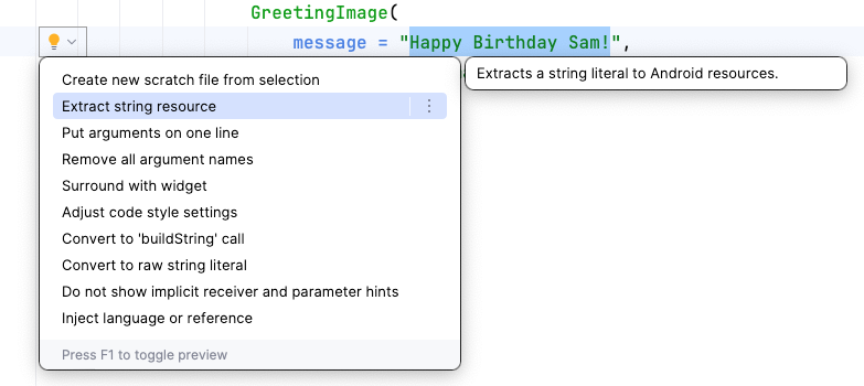
Android Studio opens the Extract Resource dialog. In this dialog, you can customize what your string resource is called and some details on how to store it. The Resource name field is where you enter what the string is going to be called. The Resource value field is where you enter the actual string itself.
- In the Extract Resource dialog, change the Resource name to
happy_birthday_text.
String resources should have lowercase names and multiple words should be separated with an underscore. Leave the other settings with the defaults.
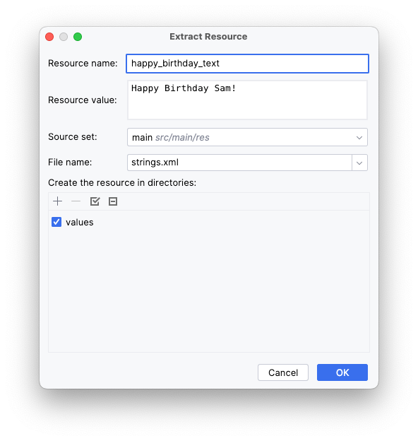
- Click OK.
- Notice the changes in code.
The hardcoded string is now replaced with a call to the getString() function.
GreetingImage(
    message = getString(R.string.happy_birthday_text),
    from = "From Emma",
    modifier = Modifier.padding(8.dp)
)
- In the Project pane, open the strings.xml file from the path
app > res > values > strings.xmland notice that Android Studio created a string resource calledhappy_birthday_text.
<resources>
    <string name="app_name">Happy Birthday</string>
    <string name="happy_birthday_text">Happy Birthday Sam!</string>
</resources>
The strings.xml file has a list of strings that the user sees in your app. Note that the name of your app is also a string resource. By putting the strings all in one place, you can more easily translate all the text in your app and more easily reuse a string in different parts of your app.
- Follow the same steps to extract the text for the signature
Textcomposable, but this time entersignature_textin the Resource name field.
Your finished file should look like this code snippet:
<resources>
    <string name="app_name">Happy Birthday</string>
    <string name="happy_birthday_text">Happy Birthday Sam!</string>
    <string name="signature_text">From Emma</string>
</resources>
- Update the
BirthdayCardPreview()to usestringResource()and the extracted strings.
@Preview(showBackground = true)
@Composable
fun BirthdayCardPreview() {
    HappyBirthdayTheme {
        GreetingImage(
            message = stringResource(R.string.happy_birthday_text),
            from = stringResource(R.string.signature_text)
        )
    }
}
- Run your app again to make sure that it still works.
8. Try this challenge
Good job on adding the image to your app. Here's a challenge for you:
- Arrange or align the signature text composable so that it is aligned to the center of the screen.
Your app should look something like this:
Here's the solution code for the GreetingText() function for your reference:
@Composable
fun GreetingText(message: String, from: String, modifier: Modifier = Modifier) {
    Column(
        verticalArrangement = Arrangement.Center,
        modifier = modifier
    ) {
        Text(
            text = message,
            fontSize = 100.sp,
            lineHeight = 116.sp,
            textAlign = TextAlign.Center
        )
        Text(
            text = from,
            fontSize = 36.sp,
            modifier = Modifier
                .padding(16.dp)
                .align(alignment = Alignment.CenterHorizontally)
        )
    }
}
9. Get the solution code
The solution code for the Happy Birthday app is on GitHub.
GitHub is a service that lets developers manage code for their software projects. It uses Git, a version-control system that tracks changes made for each version of the code. If you've ever seen the version history of a document in Google Docs, you can see what edits were made and when they were made. Similarly, you can track the version history of the code in a project. This is helpful when you work on a project as an individual or with a team.
GitHub also has a website that lets you view and manage your project. This GitHub link lets you browse the Happy Birthday project files online or download them on your computer.
To download the code for the finished codelab, you can use this git command:
$ git clone https://github.com/google-developer-training/basic-android-kotlin-compose-birthday-card-app.git
Alternatively, you can download the repository as a zip file, unzip it, and open it in Android Studio.
If you want to see the solution code, view it on GitHub.
Branches in GitHub
Before you understand what a branch is, understand what a repository or repo is. A repository is your whole project (directories and files) that you clone (copy) on your computer. A branch is a version of your repository, or in other words, an independent line of development. As an example, in this course, the starter branch could be a version of your project that you used to build up on during codelab. The main or solution branch is the version of your project at the end of your codelab, containing the complete solution code.
A repository can contain multiple branches, which means there are multiple versions of the code in the repository.
10. Conclusion
You added an image to your Happy Birthday app, aligned the text with modifiers, followed the accessibility guidelines, and made it easier to translate to other languages! More importantly, you finished creating your own Happy Birthday app! Share your work on social media, and use the hashtag #AndroidBasics so we can see it!
Summary
- The Resource Manager tab in Android Studio helps you add and organize your images and other resources.
- An
Imagecomposable is a UI element that displays images in your app. - An
Imagecomposable should have a content description to make your app more accessible. - Text that's shown to the user, such as the birthday greeting, should be extracted into a string resource to make it easier to translate your app into other languages.