
1. Introduction
In the previous codelab, you started transforming the Reply app to be adaptive by using window size classes and implementing dynamic navigation. These features are an important foundation and the first step to building apps for all screen sizes. If you missed Build an adaptive app with dynamic navigation codelab, you are strongly encouraged to go back and start there.
In this codelab, you'll build on a concept you learned to further implement adaptive layout in your app. The adaptive layout that you'll implement is part of canonical layouts - a set of commonly-used patterns for large screen displays. You'll also learn about more tooling and testing techniques to help you to quickly build robust apps.
Prerequisites
- Completion of the Build an adaptive app with dynamic navigation codelab
- Familiar with Kotlin programming, including classes, functions and conditionals
- Familiar with
ViewModelclasses - Familiar with
Composablefunctions - Experience building layouts with Jetpack Compose
- Experience running apps on a device or emulator
- Experience using
WindowSizeClassAPI
What you'll learn
- How to create a list-view pattern adaptive layout using Jetpack Compose
- How to create previews for different screen sizes
- How to test code for multiple screen sizes
What you'll build
- You will continue updating the Reply app to be adaptive for all screen sizes.
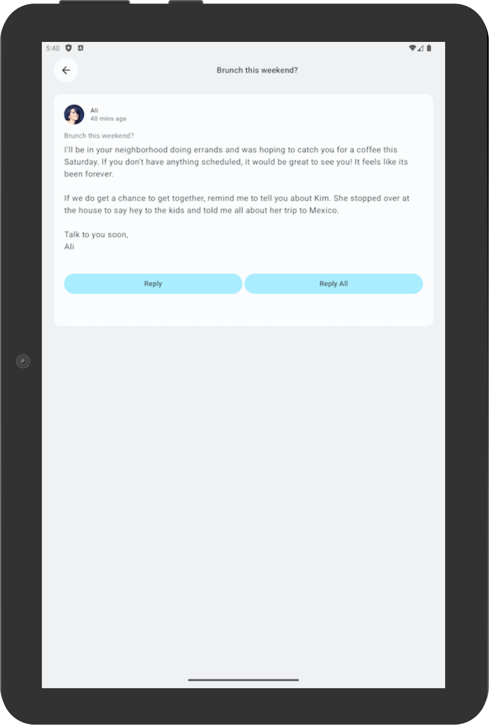
The finished app will look like this:
What you'll need
- A computer with internet access, a web browser, and Android Studio
- Access to GitHub
Download the starter code
To get started, download the starter code:
Alternatively, you can clone the GitHub repository for the code:
$ git clone
https://github.com/google-developer-training/basic-android-kotlin-compose-training-reply-app.git
$ cd basic-android-kotlin-compose-training-reply-app
$ git checkout nav-update
You can browse the starter code in the Reply GitHub repository.
2. Previews for different screen sizes
Create previews for different screen sizes
In the Build an adaptive app with dynamic navigation codelab, you learned to use preview composables to help your development process. For an adaptive app, it is the best practice to create multiple previews to show the app on different screen sizes. With multiple previews, you can see your changes on all screen sizes at once. Moreover, the previews also serve as documentation for other developers who review your code to see that your app is compatible with different screen sizes.
Previously, you only had a single preview that supported the compact screen. You'll add more previews next.
To add previews for medium and expanded screens, complete the following steps:
- Add a preview for medium screens by setting a medium
widthDpvalue in thePreviewannotation parameter and specifyingWindowWidthSizeClass.Mediumvalue as the parameter for theReplyAppcomposable.
MainActivity.kt
...
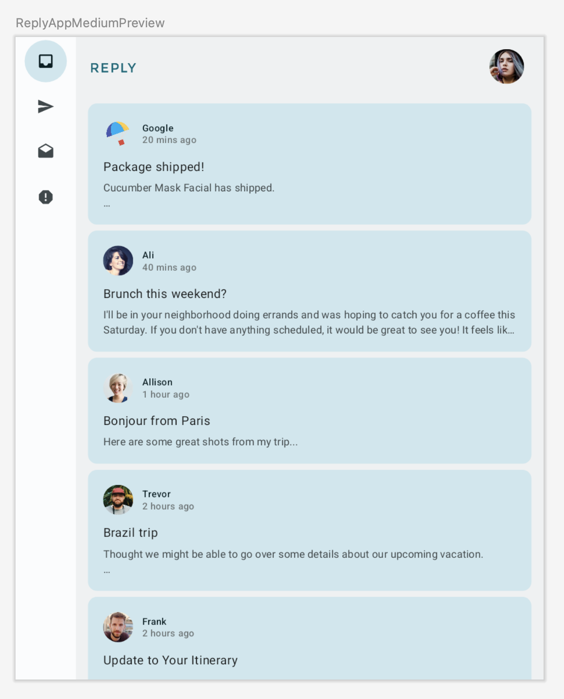
@Preview(showBackground = true, widthDp = 700)
@Composable
fun ReplyAppMediumPreview() {
ReplyTheme {
Surface {
ReplyApp(windowSize = WindowWidthSizeClass.Medium)
}
}
}
...
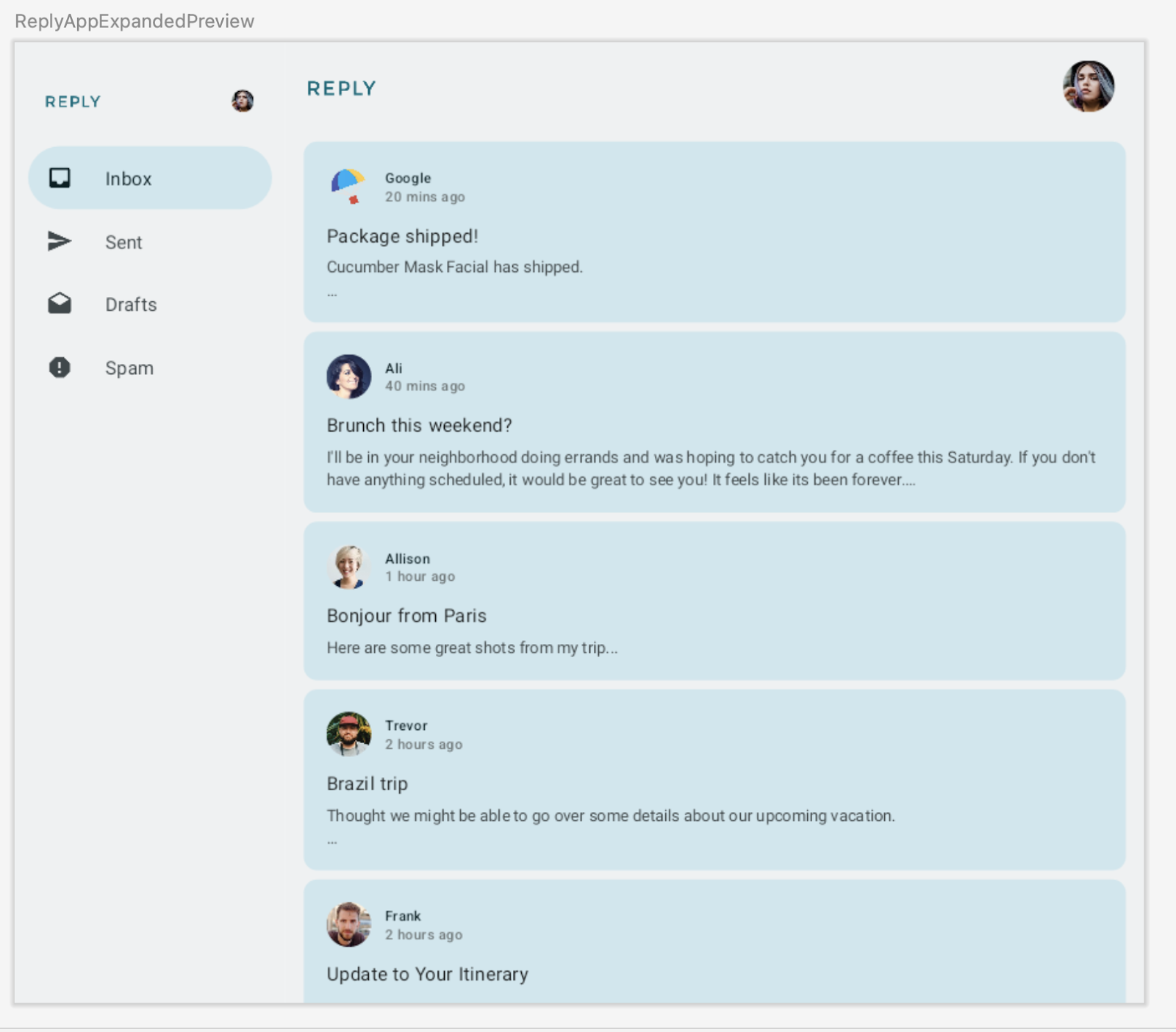
- Add another preview for expanded screens by setting a large
widthDpvalue in thePreviewannotation parameter and specifyingWindowWidthSizeClass.Expandedvalue as the parameter for theReplyAppcomposable.
MainActivity.kt
...
@Preview(showBackground = true, widthDp = 1000)
@Composable
fun ReplyAppExpandedPreview() {
    ReplyTheme {
        Surface {
            ReplyApp(windowSize = WindowWidthSizeClass.Expanded)
        }
    }
}
...
- Build the preview to view the following:
3. Implement adaptive content layout
Introduction to list-detail view
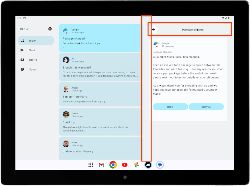
You may notice that in the expanded screens, the content looks stretched out and doesn't make good use of the available screen real estate.
You can improve this layout by applying one of the canonical layouts. Canonical layouts are large screen compositions that serve as starting points for design and implementation. You can use the three available layouts to guide how you organize common elements in an app, list-view, supporting panel, and feed. Each layout considers common use cases and components to address expectations and user needs for how apps adapt across screen sizes and breakpoints.
For the Reply app, let's implement the list-detail view, as it is best for browsing content and quickly seeing details. With a list-detail view layout, you'll create another pane next to the email list screen to display the email details. This layout allows you to use the available screen to show more information to the user and make your app more productive.
Implement list-detail view
To implement a list-detail view for expanded screens, complete the following steps:
- To represent different types of content layout, on
WindowStateUtils.kt, create a newEnumclass for different content types. Use theLIST_AND_DETAILvalue for when the expanded screen is in use andLIST_ONLYotherwise.
WindowStateUtils.kt
...
enum class ReplyContentType {
    LIST_ONLY, LIST_AND_DETAIL
}
...
- Declare the
contentTypevariable onReplyApp.ktand assign the appropriatecontentTypefor various window sizes to help determine the appropriate content type selection, depending on the screen size.
ReplyApp.kt
...
import com.example.reply.ui.utils.ReplyContentType
...

    val navigationType: ReplyNavigationType
    val contentType: ReplyContentType

    when (windowSize) {
        WindowWidthSizeClass.Compact -> {
            ...
            contentType = ReplyContentType.LIST_ONLY
        }
        WindowWidthSizeClass.Medium -> {
            ...
            contentType = ReplyContentType.LIST_ONLY
        }
        WindowWidthSizeClass.Expanded -> {
            ...
            contentType = ReplyContentType.LIST_AND_DETAIL
        }
        else -> {
            ...
            contentType = ReplyContentType.LIST_ONLY
        }
    }
...
Next, you can use the contentType value to create different branching for layouts in the ReplyAppContent composable.
- In
ReplyHomeScreen.kt, addcontentTypeas the parameter to theReplyHomeScreencomposable.
ReplyHomeScreen.kt
...
@OptIn(ExperimentalMaterial3Api::class)
@Composable
fun ReplyHomeScreen(
    navigationType: ReplyNavigationType,
    contentType: ReplyContentType,
    replyUiState: ReplyUiState,
    onTabPressed: (MailboxType) -> Unit,
    onEmailCardPressed: (Email) -> Unit,
    onDetailScreenBackPressed: () -> Unit,
    modifier: Modifier = Modifier
) {
...
- Pass the
contentTypevalue to theReplyHomeScreencomposable.
ReplyApp.kt
...
    ReplyHomeScreen(
        navigationType = navigationType,
        contentType = contentType,
        replyUiState = replyUiState,
        onTabPressed = { mailboxType: MailboxType ->
            viewModel.updateCurrentMailbox(mailboxType = mailboxType)
            viewModel.resetHomeScreenStates()
        },
        onEmailCardPressed = { email: Email ->
            viewModel.updateDetailsScreenStates(
                email = email
            )
        },
        onDetailScreenBackPressed = {
            viewModel.resetHomeScreenStates()
        },
        modifier = modifier
    )

...
- Add the
contentTypeas a parameter for theReplyAppContentcomposable.
ReplyHomeScreen.kt
...
@Composable
private fun ReplyAppContent(
    navigationType: ReplyNavigationType,
    contentType: ReplyContentType,
    replyUiState: ReplyUiState,
    onTabPressed: ((MailboxType) -> Unit),
    onEmailCardPressed: (Email) -> Unit,
    navigationItemContentList: List<NavigationItemContent>,
    modifier: Modifier = Modifier
) {
...
- Pass the
contentTypevalue to the twoReplyAppContentcomposables.
ReplyHomeScreen.kt
...
            ReplyAppContent(
                navigationType = navigationType,
                contentType = contentType,
                replyUiState = replyUiState,
                onTabPressed = onTabPressed,
                onEmailCardPressed = onEmailCardPressed,
                navigationItemContentList = navigationItemContentList,
                modifier = modifier
            )
        }
    } else {
        if (replyUiState.isShowingHomepage) {
            ReplyAppContent(
                navigationType = navigationType,
                contentType = contentType,
                replyUiState = replyUiState,
                onTabPressed = onTabPressed,
                onEmailCardPressed = onEmailCardPressed,
                navigationItemContentList = navigationItemContentList,
                modifier = modifier
            )
        } else {
            ReplyDetailsScreen(
                replyUiState = replyUiState,
                isFullScreen = true,
                onBackButtonClicked = onDetailScreenBackPressed,
                modifier = modifier
            )
        }
    }
...
Let's display either the full list and detail screen when the contentType is LIST_AND_DETAIL or the list only email content when the contentType is LIST_ONLY.
- In
ReplyHomeScreen.kt, add anif/elsestatement on theReplyAppContentcomposable to display theReplyListAndDetailContentcomposable when thecontentTypevalue isLIST_AND_DETAILand display theReplyListOnlyContentcomposable on theelsebranch.
ReplyHomeScreen.kt
...
        Column(
            modifier = modifier
                .fillMaxSize()
                .background(MaterialTheme.colorScheme.inverseOnSurface)
        ) {
            if (contentType == ReplyContentType.LIST_AND_DETAIL) {
                ReplyListAndDetailContent(
                    replyUiState = replyUiState,
                    onEmailCardPressed = onEmailCardPressed,
                    modifier = Modifier.weight(1f)
                )
            } else {
                ReplyListOnlyContent(
                    replyUiState = replyUiState,
                    onEmailCardPressed = onEmailCardPressed,
                    modifier = Modifier.weight(1f)
                        .padding(
                            horizontal = dimensionResource(R.dimen.email_list_only_horizontal_padding)
                        )
                )
            }
            AnimatedVisibility(visible = navigationType == ReplyNavigationType.BOTTOM_NAVIGATION) {
                ReplyBottomNavigationBar(
                    currentTab = replyUiState.currentMailbox,
                    onTabPressed = onTabPressed,
                    navigationItemContentList = navigationItemContentList
                )
            }
        }
...
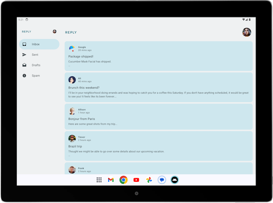
- Remove the
replyUiState.isShowingHomepagecondition to show a permanent navigation drawer, as the user doesn't need to navigate to the details view if they are using the expanded view.
ReplyHomeScreen.kt
...
    if (navigationType == ReplyNavigationType.PERMANENT_NAVIGATION_DRAWER) {
        PermanentNavigationDrawer(
            drawerContent = {
                PermanentDrawerSheet(Modifier.width(dimensionResource(R.dimen.drawer_width))) {
                    NavigationDrawerContent(
                        selectedDestination = replyUiState.currentMailbox,
                        onTabPressed = onTabPressed,
                        navigationItemContentList = navigationItemContentList,
                        modifier = Modifier
                            .wrapContentWidth()
                            .fillMaxHeight()
                            .background(MaterialTheme.colorScheme.inverseOnSurface)
                            .padding(dimensionResource(R.dimen.drawer_padding_content))
                    )
                }
            }
        ) {

...
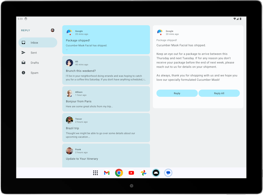
- Run your app on the tablet mode to see the screen below:
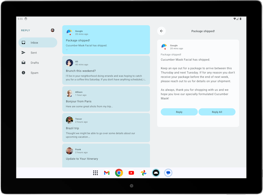
Improve UI elements for list-detail view
Currently, your app displays a details pane on the home screen for the expanded screens.
However, the screen contains extraneous elements, such as the back button, the subject header, and additional paddings, as it was designed for a standalone details screen. You can improve this next with a simple adjustment.
To improve the details screen for expanded view, complete the following steps:
- In
ReplyDetailsScreen.kt, add anisFullScreenvariable as aBooleanparameter to theReplyDetailsScreencomposable.
This addition lets you differentiate the composable when you use it as a standalone and when you use it inside the home screen.
ReplyDetailsScreen.kt
...
@Composable
fun ReplyDetailsScreen(
    replyUiState: ReplyUiState,
    onBackPressed: () -> Unit,
    modifier: Modifier = Modifier,
    isFullScreen: Boolean = false
) {
...
- Inside the
ReplyDetailsScreencomposable, wrap theReplyDetailsScreenTopBarcomposable with anifstatement so that it only displays when the app is full screen.
ReplyDetailsScreen.kt
...
    LazyColumn(
        modifier = modifier
            .fillMaxSize()
            .background(color = MaterialTheme.colorScheme.inverseOnSurface)
            .padding(top = dimensionResource(R.dimen.detail_card_list_padding_top))
    ) {
        item {
            if (isFullScreen) {
                ReplyDetailsScreenTopBar(
                    onBackPressed,
                    replyUiState,
                    Modifier
                        .fillMaxWidth()
                        .padding(bottom = dimensionResource(R.dimen.detail_topbar_padding_bottom))
                    )
                )
            }

...
You can now add padding. Padding required for the ReplyEmailDetailsCard composable differs depending on whether or not you use it as a full screen. When you use ReplyEmailDetailsCard with other composables in the expanded screen, there's additional padding from other composables.
- Pass the
isFullScreenvalue to theReplyEmailDetailsCardcomposable. Pass a modifier with a horizontal padding ofR.dimen.detail_card_outer_padding_horizontalif the screen is fullscreen and pass a modifier with an end padding ofR.dimen.detail_card_outer_padding_horizontalotherwise.
ReplyDetailsScreen.kt
...
        item {
            if (isFullScreen) {
                ReplyDetailsScreenTopBar(
                    onBackPressed,
                    replyUiState,
                    Modifier
                        .fillMaxWidth()
                        .padding(bottom = dimensionResource(R.dimen.detail_topbar_padding_bottom))
                    )
                )
            }
            ReplyEmailDetailsCard(
                email = replyUiState.currentSelectedEmail,
                mailboxType = replyUiState.currentMailbox,
                isFullScreen = isFullScreen,
                modifier = if (isFullScreen) {
                    Modifier.padding(horizontal = dimensionResource(R.dimen.detail_card_outer_padding_horizontal))
                } else {
                    Modifier.padding(end = dimensionResource(R.dimen.detail_card_outer_padding_horizontal))
                }
            )
        }
...
- Add an
isFullScreenvalue as a parameter to theReplyEmailDetailsCardcomposable.
ReplyDetailsScreen.kt
...
@OptIn(ExperimentalMaterial3Api::class)
@Composable
private fun ReplyEmailDetailsCard(
    email: Email,
    mailboxType: MailboxType,
    modifier: Modifier = Modifier,
    isFullScreen: Boolean = false
) {
...
- Inside the
ReplyEmailDetailsCardcomposable, only show the email subject text when the app is not in full screen, as the full screen layout already displays the email subject as the header. If it is full screen, add a spacer with height ofR.dimen.detail_content_padding_top.
ReplyDetailsScreen.kt
...
Column(
    modifier = Modifier
        .fillMaxWidth()
        .padding(dimensionResource(R.dimen.detail_card_inner_padding))
) {
    DetailsScreenHeader(
        email,
        Modifier.fillMaxWidth()
    )
    if (isFullScreen) {
        Spacer(modifier = Modifier.height(dimensionResource(R.dimen.detail_content_padding_top)))
    } else {
        Text(
            text = stringResource(email.subject),
            style = MaterialTheme.typography.bodyMedium,
            color = MaterialTheme.colorScheme.outline,
            modifier = Modifier.padding(
                top = dimensionResource(R.dimen.detail_content_padding_top),
                bottom = dimensionResource(R.dimen.detail_expanded_subject_body_spacing)
            ),
        )
    }
    Text(
        text = stringResource(email.body),
        style = MaterialTheme.typography.bodyLarge,
        color = MaterialTheme.colorScheme.onSurfaceVariant,
    )
    DetailsScreenButtonBar(mailboxType, displayToast)
}

...
- In
ReplyHomeScreen.kt, inside theReplyHomeScreencomposable, pass atruevalue for theisFullScreenparameter when creating theReplyDetailsScreencomposable as a standalone.
ReplyHomeScreen.kt
...
        } else {
            ReplyDetailsScreen(
                replyUiState = replyUiState,
                isFullScreen = true,
                onBackPressed = onDetailScreenBackPressed,
                modifier = modifier
            )
        }
...
- Run the app on the tablet mode and see the following layout:
Adjust back handling for list-detail view
With the expanded screens, you do not need to navigate to the ReplyDetailsScreen at all. Instead, you want the app to close when the user selects the back button. As such, we should adjust the back handler.
Modify the back handler by passing the activity.finish() function as the onBackPressed parameter of the ReplyDetailsScreen composable inside the ReplyListAndDetailContent composable.
ReplyHomeContent.kt
...
import android.app.Activity
import androidx.compose.ui.platform.LocalContext
...
        val activity = LocalContext.current as Activity
        ReplyDetailsScreen(
            replyUiState = replyUiState,
            modifier = Modifier.weight(1f),
            onBackPressed = { activity.finish() }
        )
...
4. Verify for different screen sizes
Large screen app quality guideline
To build a great and consistent experience for Android users, it is important to build and test your app with quality in mind. You can refer to the Core app quality guidelines to determine how to improve your app quality.
To build a great quality app for all form factors, review the Large screen app quality guidelines. Your app must also meet the Tier 3 - Large screen ready requirements.
Manually test your app for large screen readiness
The app quality guidelines provide test device recommendations and procedures to check your app quality. Let's take a look at a test example relevant to the Reply app.
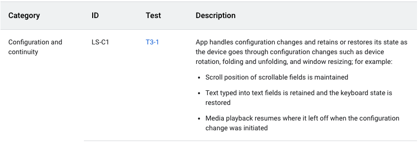
The above app quality guideline requires the app to retain or restore its state after configuration changes. The guideline also provides instructions about how to test apps, as shown in the following figure:
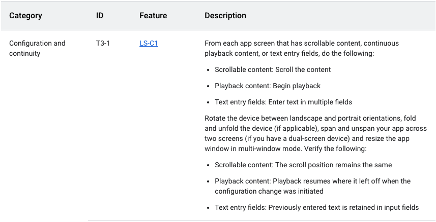
To manually test the Reply app for configuration continuity, complete the following steps:
- Run the Reply app on a medium-sized device or, if you are using the resizable emulator, in unfolded foldable mode.
- Ensure that Auto rotate on the emulator is set to on.
- Scroll down the email list.
- Click on an email card. For example, open the email from Ali.
- Rotate the device to check that the selected email is still consistent with the email selected in portrait orientation. In this example, an email from Ali is still shown.
- Rotate back to portrait orientation to check that the app still displays the same email.
5. Add automated test for adaptive apps
Configure test for the compact screen size
In the Test the Cupcake App codelab, you learned to create UI tests. Now let's learn how to create specific tests for different screen sizes.
In the Reply app, you use different navigation elements for different screen sizes. For example, you expect to see a permanent navigation drawer when the user sees the expanded screen. It is useful to create tests to verify the existence of various navigation elements, such as the bottom navigation, navigation rail, and navigation drawer for different screen sizes.
To create a test to verify the existence of a bottom navigation element in a compact screen, complete the following steps:
- In the test directory, create a new Kotlin class called
ReplyAppTest.kt. - In
ReplyAppTestclass, create a test rule usingcreateAndroidComposeRuleand passingComponentActivityas the type parameter.ComponentActivityis used to access an empty activity instead of theMainActivity.
ReplyAppTest.kt
...
class ReplyAppTest {

    @get:Rule
    val composeTestRule = createAndroidComposeRule<ComponentActivity>()
...
To differentiate between navigation elements in the screens, add a testTag in the ReplyBottomNavigationBar composable.
- Define a string resource for Navigation Bottom.
strings.xml
...
<resources>
...
    <string name="navigation_bottom">Navigation Bottom</string>
...
</resources>
- Add the string name as the
testTagargument for theModifier'stestTagmethod in theReplyBottomNavigationBarcomposable.
ReplyHomeScreen.kt
...
val bottomNavigationContentDescription = stringResource(R.string.navigation_bottom)
ReplyBottomNavigationBar(
    ...
    modifier = Modifier
        .fillMaxWidth()
        .testTag(bottomNavigationContentDescription)
)
...
- In the
ReplyAppTestclass, create a test function to test for a compact size screen. Set the content of thecomposeTestRulewith theReplyAppcomposable and pass theWindowWidthSizeClass.Compactas thewindowSizeargument.
ReplyAppTest.kt
...
    @Test
    fun compactDevice_verifyUsingBottomNavigation() {
        // Set up compact window
        composeTestRule.setContent {
            ReplyApp(
                windowSize = WindowWidthSizeClass.Compact
            )
        }
    }
- Assert that the bottom navigation element exists with the test tag. Call the extension function
onNodeWithTagForStringIdon thecomposeTestRuleand pass the navigation bottom string and call theassertExists()method.
ReplyAppTest.kt
...
    @Test
    fun compactDevice_verifyUsingBottomNavigation() {
        // Set up compact window
        composeTestRule.setContent {
            ReplyApp(
                windowSize = WindowWidthSizeClass.Compact
            )
        }
        // Bottom navigation is displayed
        composeTestRule.onNodeWithTagForStringId(
            R.string.navigation_bottom
        ).assertExists()
    }
- Run the test and verify that it passes.
Configure test for the medium and expanded screen sizes
Now that you successfully created a test for the compact screen, let's create corresponding tests for medium and expanded screens.
To create tests to verify the existence of a navigation rail and permanent navigation drawer for medium and expanded screens, complete the following steps:
- Define a string resource for the Navigation Rail to be used as a test tag later.
strings.xml
...
<resources>
...
    <string name="navigation_rail">Navigation Rail</string>
...
</resources>
- Pass the string as the test tag through the
Modifierin thePermanentNavigationDrawercomposable.
ReplyHomeScreen.kt
...
    val navigationDrawerContentDescription = stringResource(R.string.navigation_drawer)
        PermanentNavigationDrawer(
...
modifier = Modifier.testTag(navigationDrawerContentDescription)
)
...
- Pass the string as the test tag through the
ModifierinReplyNavigationRailcomposable.
ReplyHomeScreen.kt
...
val navigationRailContentDescription = stringResource(R.string.navigation_rail)
ReplyNavigationRail(
    ...
    modifier = Modifier
        .testTag(navigationRailContentDescription)
)
...
- Add a test to verify that a navigation rail element exists in the medium screens.
ReplyAppTest.kt
...
@Test
fun mediumDevice_verifyUsingNavigationRail() {
    // Set up medium window
    composeTestRule.setContent {
        ReplyApp(
            windowSize = WindowWidthSizeClass.Medium
        )
    }
    // Navigation rail is displayed
    composeTestRule.onNodeWithTagForStringId(
        R.string.navigation_rail
    ).assertExists()
}
- Add a test to verify that a navigation drawer element exists in the expanded screens.
ReplyAppTest.kt
...
@Test
fun expandedDevice_verifyUsingNavigationDrawer() {
    // Set up expanded window
    composeTestRule.setContent {
        ReplyApp(
            windowSize = WindowWidthSizeClass.Expanded
        )
    }
    // Navigation drawer is displayed
    composeTestRule.onNodeWithTagForStringId(
        R.string.navigation_drawer
    ).assertExists()
}
- Use a tablet emulator or a resizable emulator in Tablet mode to run the test.
- Run all the tests and verify that they pass.
Test for a configuration change in a compact screen
A configuration change is a common occurrence that happens in your app lifecycle. For example, when you change orientation from portrait to landscape, a configuration change occurs. When a configuration change occurs, it is important to test that your app retains its state. Next, you'll create tests, which simulate a configuration change, to test that your app retains its state in a compact screen.
To test for a configuration change in the compact screen:
- In the test directory, create a new Kotlin class called
ReplyAppStateRestorationTest.kt. - In the
ReplyAppStateRestorationTestclass, create a test rule usingcreateAndroidComposeRuleand passingComponentActivityas the type parameter.
ReplyAppStateRestorationTest.kt
...
class ReplyAppStateRestorationTest {

    /**
     * Note: To access to an empty activity, the code uses ComponentActivity instead of
     * MainActivity.
     */
    @get:Rule
    val composeTestRule = createAndroidComposeRule<ComponentActivity>()
}
...
- Create a test function to verify that an email is still selected in the compact screen after a configuration change.
ReplyAppStateRestorationTest.kt
...
@Test
fun compactDevice_selectedEmailEmailRetained_afterConfigChange() {

}
...
To test for a configuration change, you need to use StateRestorationTester.
- Setup
stateRestorationTesterby passing thecomposeTestRuleas an argument toStateRestorationTester. - Use
setContent()with theReplyAppcomposable and pass theWindowWidthSizeClass.Compactas thewindowSizeargument.
ReplyAppStateRestorationTest.kt
...
@Test
fun compactDevice_selectedEmailEmailRetained_afterConfigChange() {
    // Setup compact window
    val stateRestorationTester = StateRestorationTester(composeTestRule)
    stateRestorationTester.setContent { ReplyApp(windowSize = WindowWidthSizeClass.Compact) }

}
...
- Verify that a third email is displayed in the app. Use the
assertIsDisplayed()method on thecomposeTestRule, which looks for the text of the third email.
ReplyAppStateRestorationTest.kt
...
@Test
fun compactDevice_selectedEmailEmailRetained_afterConfigChange() {
    // Setup compact window
    val stateRestorationTester = StateRestorationTester(composeTestRule)
    stateRestorationTester.setContent { ReplyApp(windowSize = WindowWidthSizeClass.Compact) }

    // Given third email is displayed
    composeTestRule.onNodeWithText(
        composeTestRule.activity.getString(LocalEmailsDataProvider.allEmails[2].body)
    ).assertIsDisplayed()
}
...
- Navigate to the email's details screen by clicking on the email subject. Use the
performClick()method to navigate.
ReplyAppStateRestorationTest.kt
...
@Test
fun compactDevice_selectedEmailEmailRetained_afterConfigChange() {
    // Setup compact window
    val stateRestorationTester = StateRestorationTester(composeTestRule)
    stateRestorationTester.setContent { ReplyApp(windowSize = WindowWidthSizeClass.Compact) }

    // Given third email is displayed
    composeTestRule.onNodeWithText(
        composeTestRule.activity.getString(LocalEmailsDataProvider.allEmails[2].body)
    ).assertIsDisplayed()

    // Open detailed page
    composeTestRule.onNodeWithText(
        composeTestRule.activity.getString(LocalEmailsDataProvider.allEmails[2].subject)
    ).performClick()
}
...
- Verify that the third email is displayed in the details screen. Assert the existence of the back button to confirm that the app is in the details screen, and verify that the third email's text is displayed.
ReplyAppStateRestorationTest.kt
...
@Test
fun compactDevice_selectedEmailEmailRetained_afterConfigChange() {
    ...
    // Open detailed page
    composeTestRule.onNodeWithText(
        composeTestRule.activity.getString(LocalEmailsDataProvider.allEmails[2].subject)
    ).performClick()

    // Verify that it shows the detailed screen for the correct email
    composeTestRule.onNodeWithContentDescriptionForStringId(
        R.string.navigation_back
    ).assertExists()
    composeTestRule.onNodeWithText(
}
...
- Simulate a config change using
stateRestorationTester.emulateSavedInstanceStateRestore().
ReplyAppStateRestorationTest.kt
...
@Test
fun compactDevice_selectedEmailEmailRetained_afterConfigChange() {
    ...
    // Verify that it shows the detailed screen for the correct email
    composeTestRule.onNodeWithContentDescriptionForStringId(
        R.string.navigation_back
    ).assertExists()
    composeTestRule.onNodeWithText(
        composeTestRule.activity.getString(LocalEmailsDataProvider.allEmails[2].body)
    ).assertExists()

    // Simulate a config change
    stateRestorationTester.emulateSavedInstanceStateRestore()
}
...
- Verify again that the third email is displayed in the details screen. Assert the existence of the back button to confirm that the app is in the details screen, and verify that the third email's text is displayed.
ReplyAppStateRestorationTest.kt
...
@Test
fun compactDevice_selectedEmailEmailRetained_afterConfigChange() {
    // Setup compact window
    val stateRestorationTester = StateRestorationTester(composeTestRule)
    stateRestorationTester.setContent { ReplyApp(windowSize = WindowWidthSizeClass.Compact) }

    // Given third email is displayed
    composeTestRule.onNodeWithText(
        composeTestRule.activity.getString(LocalEmailsDataProvider.allEmails[2].body)
    ).assertIsDisplayed()

    // Open detailed page
    composeTestRule.onNodeWithText(
        composeTestRule.activity.getString(LocalEmailsDataProvider.allEmails[2].subject)
    ).performClick()

    // Verify that it shows the detailed screen for the correct email
    composeTestRule.onNodeWithContentDescriptionForStringId(
        R.string.navigation_back
    ).assertExists()
    composeTestRule.onNodeWithText(
        composeTestRule.activity.getString(LocalEmailsDataProvider.allEmails[2].body)
    ).assertExists()

    // Simulate a config change
    stateRestorationTester.emulateSavedInstanceStateRestore()

    // Verify that it still shows the detailed screen for the same email
    composeTestRule.onNodeWithContentDescriptionForStringId(
        R.string.navigation_back
    ).assertExists()
    composeTestRule.onNodeWithText(
        composeTestRule.activity.getString(LocalEmailsDataProvider.allEmails[2].body)
    ).assertExists()
}

...
- Run the test with a phone emulator or resizable emulator in Phone mode.
- Verify that the test passes.
Test for a configuration change in the expanded screen
To test for a configuration change in the expanded screen by simulating a configuration change and passing the appropriate WindowWidthSizeClass, complete the following steps:
- Create a test function to verify that an email is still selected in the details screen after a configuration change.
ReplyAppStateRestorationTest.kt
...
@Test
fun expandedDevice_selectedEmailEmailRetained_afterConfigChange() {

}
...
To test for a configuration change, you need to use StateRestorationTester.
- Setup
stateRestorationTesterby passing thecomposeTestRuleas an argument toStateRestorationTester. - Use
setContent()with theReplyAppcomposable and passWindowWidthSizeClass.Expandedas thewindowSizeargument.
ReplyAppStateRestorationTest.kt
...
@Test
fun expandedDevice_selectedEmailEmailRetained_afterConfigChange() {
    // Setup expanded window
    val stateRestorationTester = StateRestorationTester(composeTestRule)
    stateRestorationTester.setContent { ReplyApp(windowSize = WindowWidthSizeClass.Expanded) }
}
...
- Verify that a third email is displayed in the app. Use the
assertIsDisplayed()method on thecomposeTestRule, which looks for the text of the third email.
ReplyAppStateRestorationTest.kt
...
@Test
fun expandedDevice_selectedEmailEmailRetained_afterConfigChange() {
    // Setup expanded window
    val stateRestorationTester = StateRestorationTester(composeTestRule)
    stateRestorationTester.setContent { ReplyApp(windowSize = WindowWidthSizeClass.Expanded) }

    // Given third email is displayed
    composeTestRule.onNodeWithText(
        composeTestRule.activity.getString(LocalEmailsDataProvider.allEmails[2].body)
    ).assertIsDisplayed()
}
...
- Select the third email on the details screen. Use the
performClick()method to select the email.
ReplyAppStateRestorationTest.kt
...
@Test
fun expandedDevice_selectedEmailEmailRetained_afterConfigChange() {
    // Setup expanded window
    val stateRestorationTester = StateRestorationTester(composeTestRule)
    stateRestorationTester.setContent { ReplyApp(windowSize = WindowWidthSizeClass.Expanded) }

    // Given third email is displayed
    composeTestRule.onNodeWithText(
        composeTestRule.activity.getString(LocalEmailsDataProvider.allEmails[2].body)
    ).assertIsDisplayed()

    // Select third email
    composeTestRule.onNodeWithText(
        composeTestRule.activity.getString(LocalEmailsDataProvider.allEmails[2].subject)
    ).performClick()
    ...
}

...
- Verify that the details screen displays the third email by using the
testTagon the details screen and looking for text on its children. This approach makes sure that you can find the text in the details section and not in the email list.
ReplyAppStateRestorationTest.kt
...

@Test
fun expandedDevice_selectedEmailEmailRetained_afterConfigChange() {
    ...
    // Select third email
    composeTestRule.onNodeWithText(
        composeTestRule.activity.getString(LocalEmailsDataProvider.allEmails[2].subject)
    ).performClick()

    // Verify that third email is displayed on the details screen
    composeTestRule.onNodeWithTagForStringId(R.string.details_screen).onChildren()
        .assertAny(hasAnyDescendant(hasText(
            composeTestRule.activity.getString(LocalEmailsDataProvider.allEmails[2].body)))
        )
...
}

...
- Simulate a configuration change using
stateRestorationTester.emulateSavedInstanceStateRestore().
ReplyAppStateRestorationTest.kt
...
@Test
fun expandedDevice_selectedEmailEmailRetained_afterConfigChange() {
    ...
    // Verify that third email is displayed on the details screen
    composeTestRule.onNodeWithTagForStringId(R.string.details_screen).onChildren()
        .assertAny(hasAnyDescendant(hasText(
            composeTestRule.activity.getString(LocalEmailsDataProvider.allEmails[2].body)))
        )

    // Simulate a config change
    stateRestorationTester.emulateSavedInstanceStateRestore()
    ...
}
...
- Verify again that the details screen displays the third email after a configuration change.
ReplyAppStateRestorationTest.kt
...
@Test
fun expandedDevice_selectedEmailEmailRetained_afterConfigChange() {
    // Setup expanded window
    val stateRestorationTester = StateRestorationTester(composeTestRule)
    stateRestorationTester.setContent { ReplyApp(windowSize = WindowWidthSizeClass.Expanded) }

    // Given third email is displayed
    composeTestRule.onNodeWithText(
        composeTestRule.activity.getString(LocalEmailsDataProvider.allEmails[2].body)
    ).assertIsDisplayed()

    // Select third email
    composeTestRule.onNodeWithText(
        composeTestRule.activity.getString(LocalEmailsDataProvider.allEmails[2].subject)
    ).performClick()

    // Verify that third email is displayed on the details screen
    composeTestRule.onNodeWithTagForStringId(R.string.details_screen).onChildren()
        .assertAny(hasAnyDescendant(hasText(
            composeTestRule.activity.getString(LocalEmailsDataProvider.allEmails[2].body)))
        )

    // Simulate a config change
    stateRestorationTester.emulateSavedInstanceStateRestore()

    // Verify that third email is still displayed on the details screen
    composeTestRule.onNodeWithTagForStringId(R.string.details_screen).onChildren()
        .assertAny(hasAnyDescendant(hasText(
            composeTestRule.activity.getString(LocalEmailsDataProvider.allEmails[2].body)))
        )
}
...
- Run the test with a tablet emulator or resizable emulator in Tablet mode.
- Verify that the test passes.
Use annotations to group test for different screen sizes
You might realize from the previous tests that some tests fail when they are run on devices with an incompatible screen size. While you can run the test one by one using an appropriate device, this approach might not scale when you have many test cases.
To solve this problem, you can create annotations to denote the screen sizes that the test can run on, and configure the annotated test for the appropriate devices.
To run a test based on screen sizes, complete the following steps:
- In the test directory, create
TestAnnotations.kt, which contains three annotation classes:TestCompactWidth,TestMediumWidth,TestExpandedWidth.
TestAnnotations.kt
...
annotation class TestCompactWidth
annotation class TestMediumWidth
annotation class TestExpandedWidth
...
- Use the annotations on the test functions for compact tests by putting the
TestCompactWidthannotation after the test annotation for a compact test inReplyAppTestandReplyAppStateRestorationTest.
ReplyAppTest.kt
...
    @Test
    @TestCompactWidth
    fun compactDevice_verifyUsingBottomNavigation() {
...
ReplyAppStateRestorationTest.kt
...
    @Test
    @TestCompactWidth
    fun compactDevice_selectedEmailEmailRetained_afterConfigChange() {

...
- Use the annotations on the test functions for medium tests by putting the
TestMediumWidthannotation after the test annotation for a medium test inReplyAppTest.
ReplyAppTest.kt
...
    @Test
    @TestMediumWidth
    fun mediumDevice_verifyUsingNavigationRail() {
...
- Use the annotations on the test functions for expanded tests by putting the
TestExpandedWidthannotation after the test annotation for an expanded test inReplyAppTestandReplyAppStateRestorationTest.
ReplyAppTest.kt
...
    @Test
    @TestExpandedWidth
    fun expandedDevice_verifyUsingNavigationDrawer() {
...
ReplyAppStateRestorationTest.kt
...
    @Test
    @TestExpandedWidth
    fun expandedDevice_selectedEmailEmailRetained_afterConfigChange() {
...
To ensure success, configure the test to only run tests that are annotated with TestCompactWidth.
- In the Android Studio, select Run > Edit Configurations...
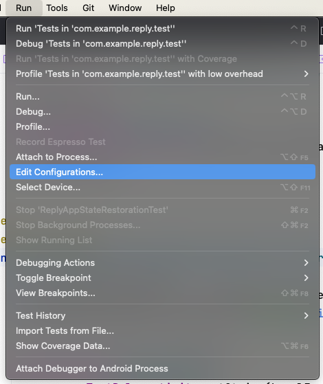
- Rename the test as Compact tests, and select to run the test All in Package.
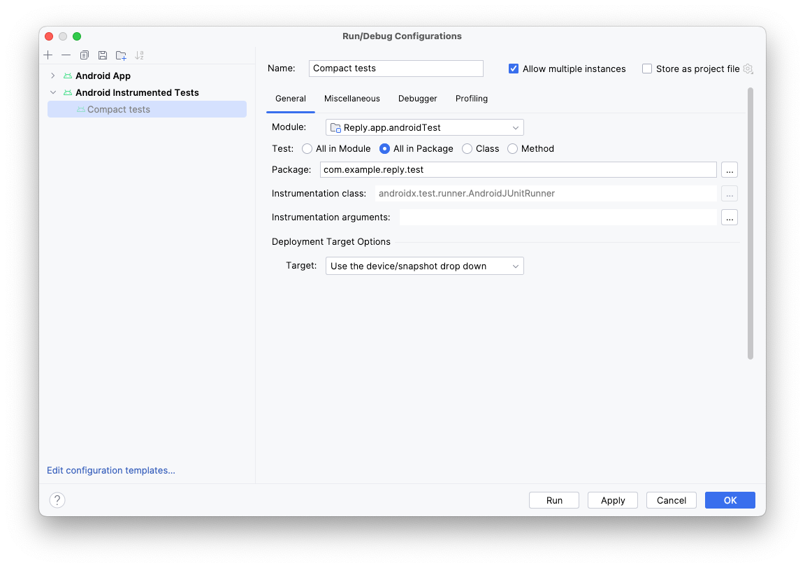
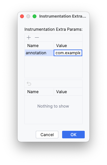
- Click the three dots (...) to the right of the Instrumentation arguments field.
- Click the plus (
+) button and add the extra parameters: annotation with the value com.example.reply.test.TestCompactWidth.
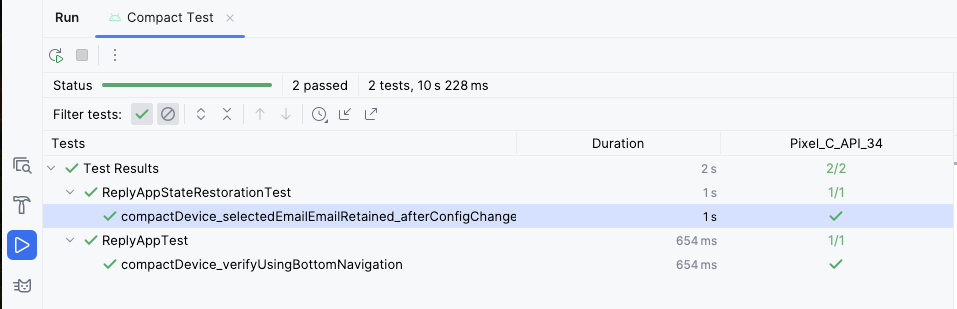
- Run the tests with a compact emulator.
- Check that only compact tests were run.
- Repeat the steps for medium and expanded screens.
6. Get the solution code
To download the code for the finished codelab, use the following git command:
$ git clone https://github.com/google-developer-training/basic-android-kotlin-compose-training-reply-app.git
Alternatively, you can download the repository as a zip file, unzip it, and open it in Android Studio.
If you want to see the solution code, view it on GitHub.
7. Conclusion
Congratulations! You made the Reply app adaptive for all screen sizes by implementing an adaptive layout. You also learned to speed up your development using previews and maintaining your app quality using various testing methods.
Don't forget to share your work on social media with #AndroidBasics!