
1. Introduction
One of the great advantages of developing your app in the Android platform is the vast opportunity to reach users in different kinds of form factors, such as wearables, foldables, tablets, desktop, and even TV. When using an app, your users may want to use the same app on large screen devices to take advantage of the increased real estate. Increasingly, Android users use their apps on multiple devices of varying screen sizes, and expect a high-quality user experience across all devices.
So far, you learned to make apps primarily for mobile devices. In this codelab, you'll learn how to transform your apps to make them adaptive to other screen sizes. You'll use adaptive navigation layout patterns that are beautiful and usable for both mobile and large screen devices, such as foldables, tablets, and desktop.
Prerequisites
- Familiarity with Kotlin programming, including classes, functions, and conditionals
- Familiarity using
ViewModelclasses - Familiarity creating
Composablefunctions - Experience building layouts with Jetpack Compose
- Experience running apps on a device or emulator
What you'll learn
- How to create navigation between screens without Navigation Graph for simple apps
- How to create an adaptive navigation layout using Jetpack Compose
- How to create a custom back handler
What you'll build
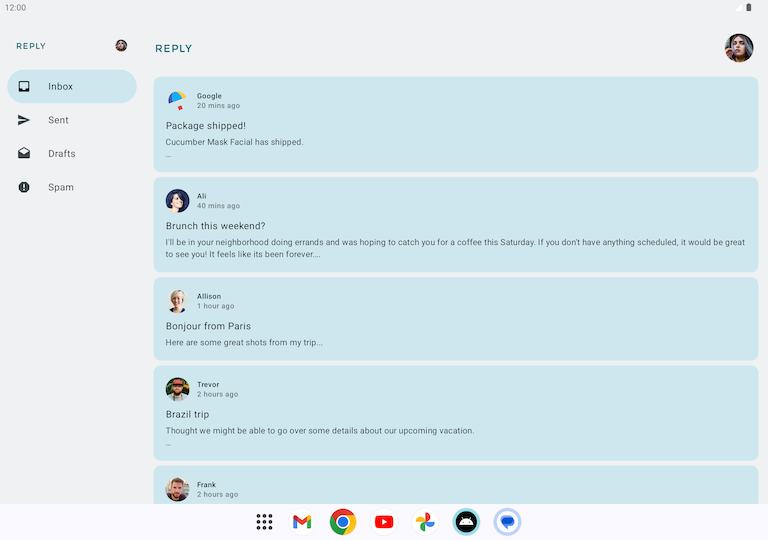
- You will implement dynamic navigation in the existing Reply app to make its layout adapt to all screen sizes
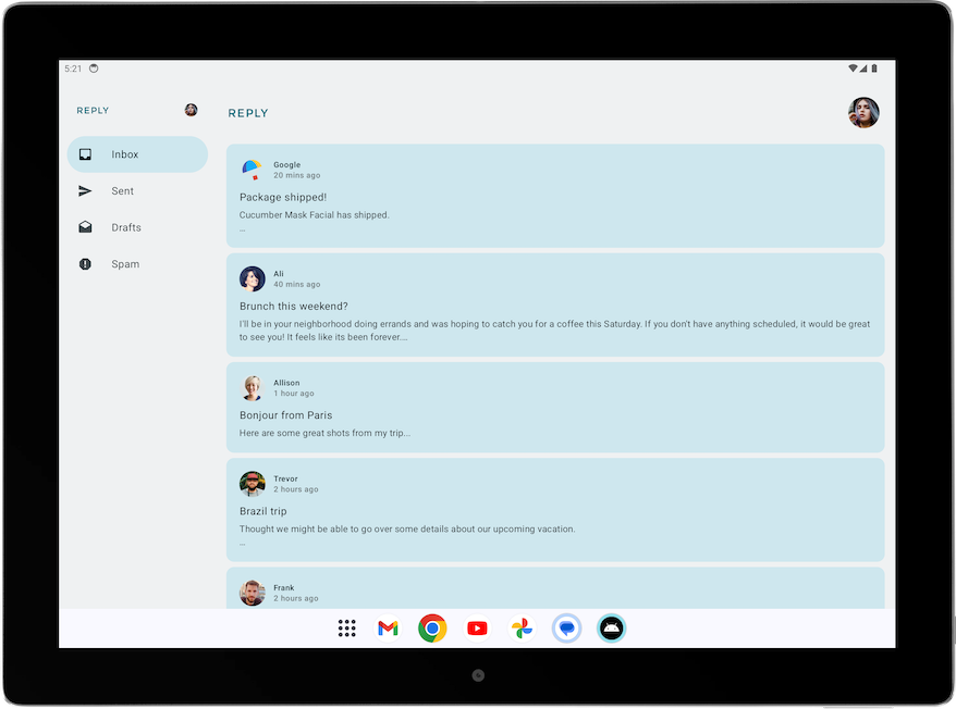
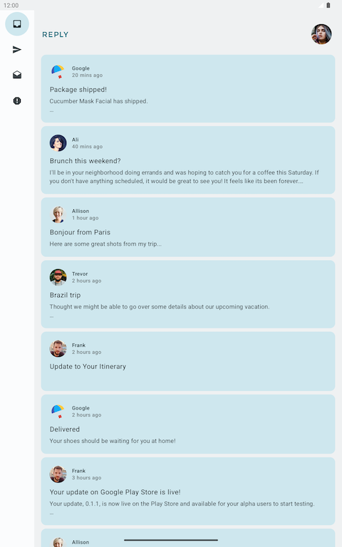
The finished product will look like the image below:
What you'll need
- A computer with internet access, a web browser, and Android Studio
- Access to GitHub
2. App overview
Reply app introduction
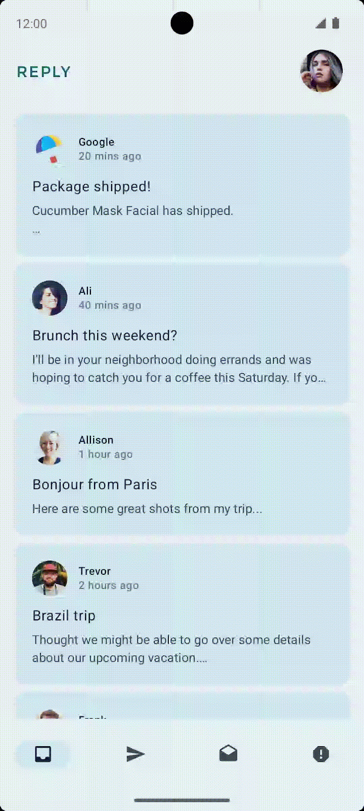
Reply app is a multiscreen app which resembles an email client.
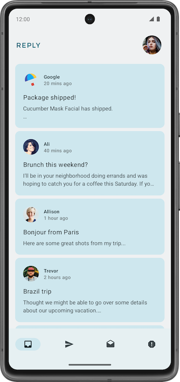
It contains 4 different categories which are displayed by different tabs, namely: inbox, sent, draft, and spam.
Download the starter code
In Android Studio, open the basic-android-kotlin-compose-training-reply-app folder.
3. Starter code walkthrough
Important directories in Reply app
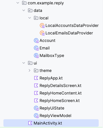
The data and UI layer of the Reply app project is separated into different directories. ReplyViewModel, ReplyUiState, and other composables are located in the ui directory. The data and enum classes that define the data layer and the data provider classes are located in the data directory.
Data initialization in Reply app
The Reply app is initialized with data through the initializeUIState() method in the ReplyViewModel, which is executed in the init function.
ReplyViewModel.kt
...
    init {
        initializeUIState()
    }


    private fun initializeUIState() {
        var mailboxes: Map<MailboxType, List<Email>> =
            LocalEmailsDataProvider.allEmails.groupBy { it.mailbox }
        _uiState.value = ReplyUiState(
            mailboxes = mailboxes,
            currentSelectedEmail = mailboxes[MailboxType.Inbox]?.get(0)
                ?: LocalEmailsDataProvider.defaultEmail
        )
    }
...
The screen level composable
As with other apps, the Reply app uses the ReplyApp composable as the main composable where the viewModel and uiState are declared. Various viewModel() functions are also passed as lambda arguments for the ReplyHomeScreen composable.
ReplyApp.kt
...
@Composable
fun ReplyApp(modifier: Modifier = Modifier) {
    val viewModel: ReplyViewModel = viewModel()
    val replyUiState = viewModel.uiState.collectAsState().value

    ReplyHomeScreen(
        replyUiState = replyUiState,
        onTabPressed = { mailboxType: MailboxType ->
            viewModel.updateCurrentMailbox(mailboxType = mailboxType)
            viewModel.resetHomeScreenStates()
        },
        onEmailCardPressed = { email: Email ->
            viewModel.updateDetailsScreenStates(
                email = email
            )
        },
        onDetailScreenBackPressed = {
            viewModel.resetHomeScreenStates()
        },
        modifier = modifier
    )
}
Other composables
ReplyHomeScreen.kt: contains the screen composables for home screen, including navigation elements.ReplyHomeContent.kt: contains composables that define more detailed composables of the home screen.ReplyDetailsScreen.kt: contains screen composables and smaller composables for the details screen.
Feel free to go through each file in detail to gain more understanding of the composables before proceeding with the next section of the codelab.
4. Change screens without a navigation graph
In the previous pathway, you learned to use a NavHostController class to navigate from one screen to another. With Compose, you can also change screens with simple conditional statements by making use of runtime mutable states. This is especially useful in small applications like the Reply app, where you only want to switch between two screens.
Change screens with state changes
In Compose, screens are recomposed when a state change occurs. You can change screens using simple conditionals to respond to changes in states.
You'll use conditionals to show the content of the home screen when the user is at the home screen, and the details screen when the user is not at the home screen.
Modify the Reply app to allow screen changes on state change by completing the following steps:
- Open the starter code in Android Studio.
- In the
ReplyHomeScreencomposable inReplyHomeScreen.kt, wrap theReplyAppContentcomposable with anifstatement for when theisShowingHomepageproperty ofreplyUiStateobject istrue.
ReplyHomeScreen.kt
@Composable
fun ReplyHomeScreen(
    replyUiState: ReplyUiState,
    onTabPressed: (MailboxType) -> Unit,
    onEmailCardPressed: (Int) -> Unit,
    onDetailScreenBackPressed: () -> Unit,
    modifier: Modifier = Modifier
) {

...
    if (replyUiState.isShowingHomepage) {
        ReplyAppContent(
            replyUiState = replyUiState,
            onTabPressed = onTabPressed,
            onEmailCardPressed = onEmailCardPressed,
            navigationItemContentList = navigationItemContentList,
            modifier = modifier

        )
    }
}
You must now account for the scenario when the user is not at the home screen by showing the details screen.
- Add an
elsebranch with theReplyDetailsScreencomposable in its body. AddreplyUIState,onDetailScreenBackPressedandmodifieras arguments for theReplyDetailsScreencomposable.
ReplyHomeScreen.kt
@Composable
fun ReplyHomeScreen(
    replyUiState: ReplyUiState,
    onTabPressed: (MailboxType) -> Unit,
    onEmailCardPressed: (Int) -> Unit,
    onDetailScreenBackPressed: () -> Unit,
    modifier: Modifier = Modifier
) {

...

    if (replyUiState.isShowingHomepage) {
        ReplyAppContent(
            replyUiState = replyUiState,
            onTabPressed = onTabPressed,
            onEmailCardPressed = onEmailCardPressed,
            navigationItemContentList = navigationItemContentList,
            modifier = modifier

        )
    } else {
        ReplyDetailsScreen(
            replyUiState = replyUiState,
            onBackPressed = onDetailScreenBackPressed,
            modifier = modifier
        )
    }
}
The replyUiState object is a state object. As such, when there is a change in the isShowingHomepage property of the replyUiState object, the ReplyHomeScreen composable is recomposed and the if/else statement is reevaluated at runtime. This approach supports navigation between different screens without the use of a NavHostController class.
Create custom back handler
One advantage of using the NavHost composable to switch between screens is that the directions of previous screens are saved in the backstack. These saved screens allow the system back button to easily navigate to the previous screen when invoked. Since the Reply app doesn't use a NavHost, you have to add the code to handle the back button manually. You will do this next.
Complete the following steps to create a custom back handler in the Reply app:
- On the first line of the
ReplyDetailsScreencomposable, add aBackHandlercomposable. - Call the
onBackPressed()function in the body of theBackHandlercomposable.
ReplyDetailsScreen.kt
...
import androidx.activity.compose.BackHandler
...
@Composable
fun ReplyDetailsScreen(
    replyUiState: ReplyUiState,
    onBackPressed: () -> Unit,
    modifier: Modifier = Modifier
) {
    BackHandler {
        onBackPressed()
    }
...
5. Run app on large screen devices
Check your app with the resizable emulator
To make usable apps, developers need to understand their users' experience in various form factors. Therefore, you must test apps on various form factors from the beginning of the development process.
You can use many emulators of different screen sizes to achieve this goal. However, doing so can be cumbersome, especially when you are building for multiple screen sizes at once. You might also need to test how an app that is running responds to screen size changes , such as orientation changes, window size changes in a desktop, and fold state changes in foldable.
Android Studio helps you to test these scenarios with the introduction of the resizable emulator.
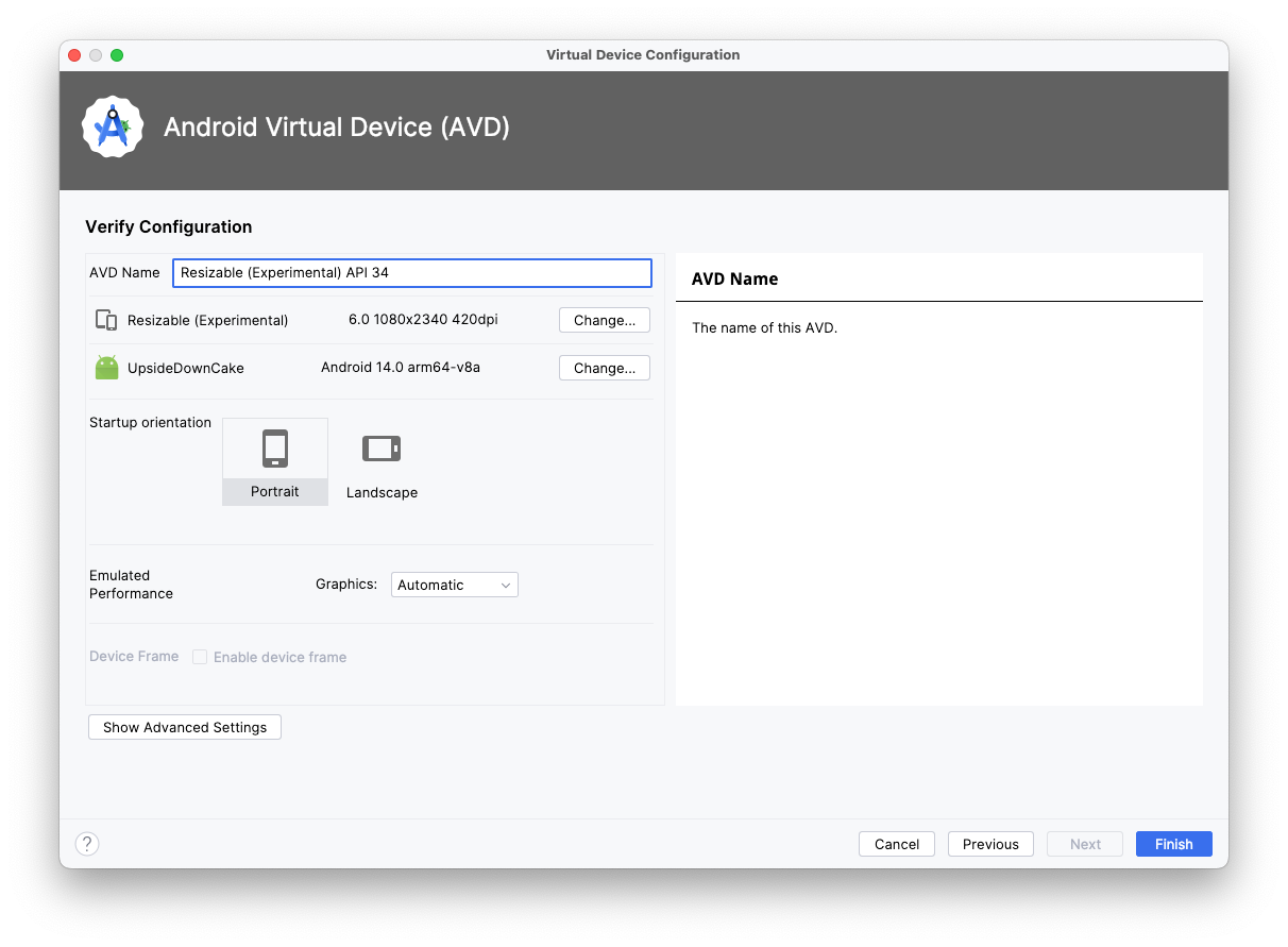
Complete the following steps to set up the resizable emulator:
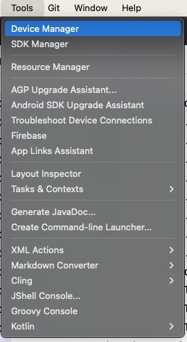
- In Android Studio, select Tools > Device Manager.
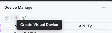
- In Device Manager, click + icon to create a virtual device.
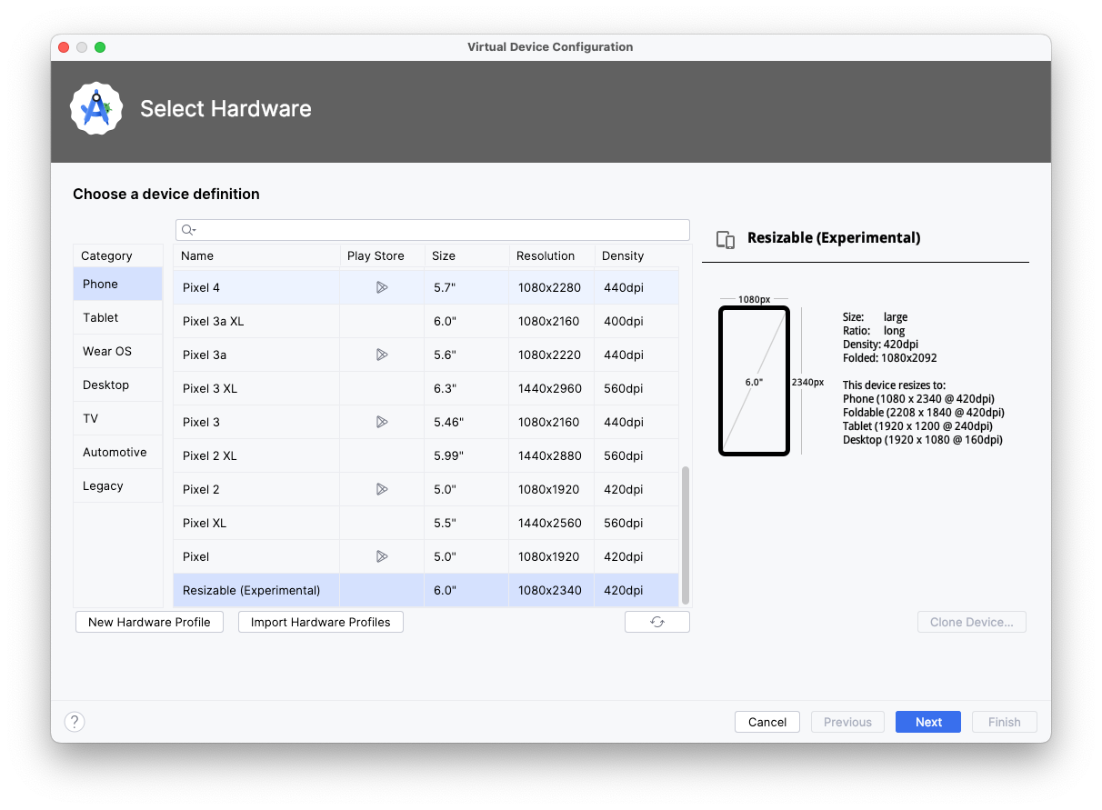
- Select the Phone category and the Resizable (Experimental) device.
- Click Next.
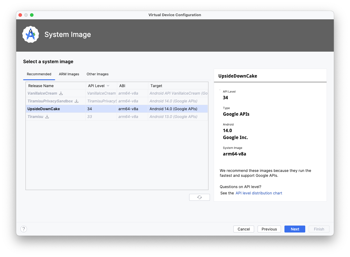
- Select API Level 34 or higher.
- Click Next.
- Name your new Android Virtual Device.
- Click Finish.
Run app on a large screen emulator
Now that you have the resizable emulator setup, let's see how the app looks on a large screen.
- Run the app on the resizable emulator.
- Select Tablet for the display mode.
- Inspect the app in the Tablet mode in landscape mode.

Notice that the tablet screen display is horizontally elongated. While this orientation functionally works, it might not be the best use of the large screen real estate. Let's address that next.
Design for large screens
Your first thought might be when looking at this app on a tablet is that it is poorly designed and unappealing. You are exactly right: this layout is not designed for large screen use.
When designing for large screens, such as tablets and foldables, you have to consider user ergonomics and the proximity of the user's fingers to the screen. With mobile devices, user's fingers can easily reach most of the screen; the location of interactive elements, such as buttons and navigation elements, are not as critical. However, for large screens, having critical interactive elements in the middle of the screen can make them hard to reach.
As you see in the Reply app, design for large screens is not just stretching or enlarging UI elements to fit the screen. It is an opportunity to use the increased real estate to create a different experience for your users. For example, you can add another layout on the same screen to prevent the need to navigate to another screen or make multitasking possible.
This design can increase user productivity and fosters greater engagement. But before you deploy this design, you must first learn how to create different layouts for different screen sizes.
6. Make your layout adapt to different screen sizes
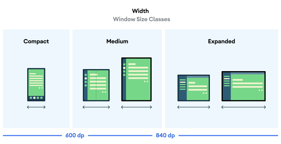
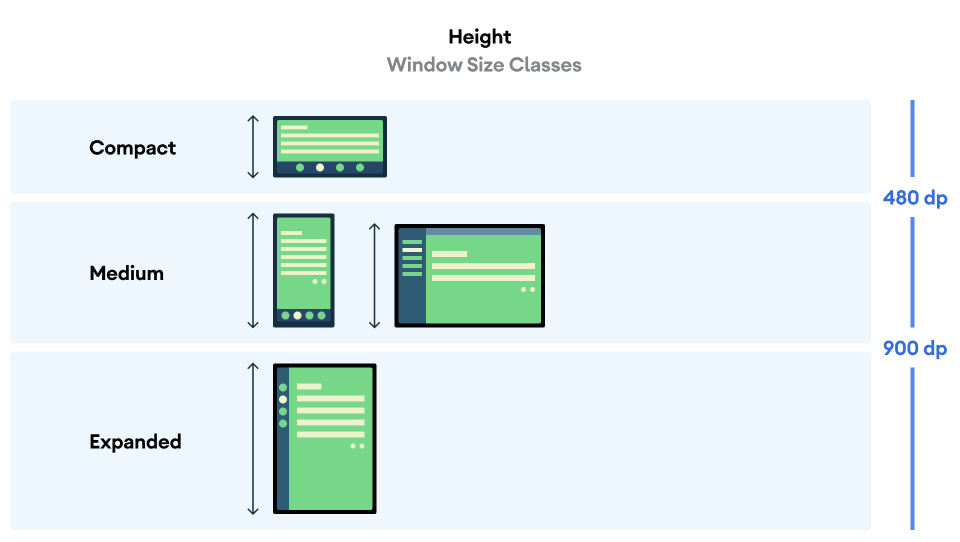
What are breakpoints?
You may wonder how you can show different layouts for the same app. The short answer is by using conditionals on different states, the way you did in the beginning of this codelab.
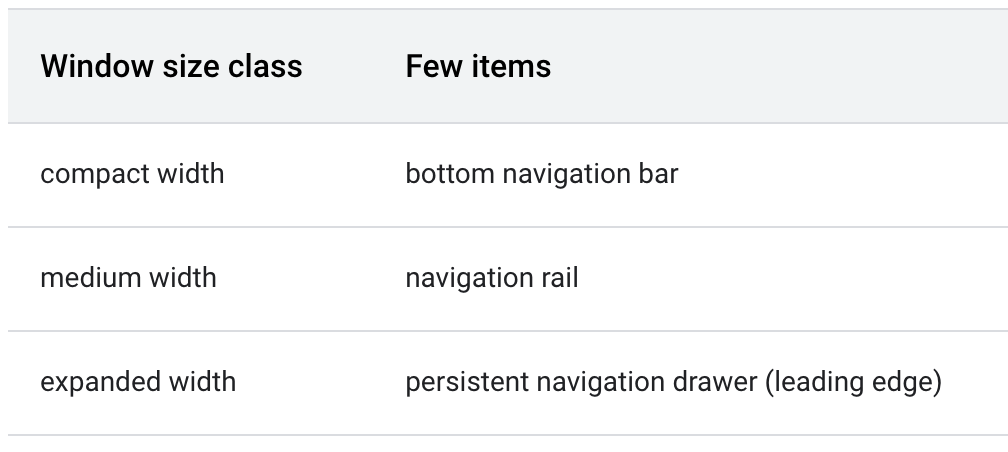
To create an adaptive app, you need the layout to change based on screen size. The measurement point where a layout changes is known as a breakpoint. Material Design created an opinionated breakpoint range that covers most Android screens.
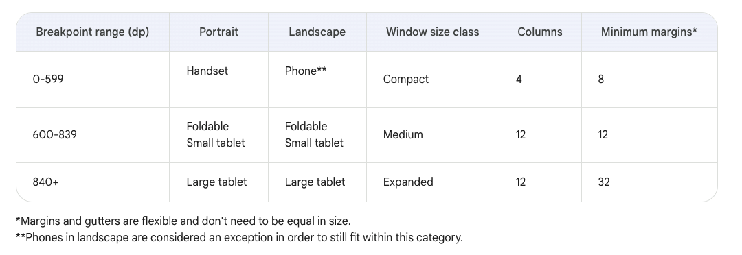
This breakpoint range table shows, for example, that if your app is currently running on a device with a screen size less than 600 dp, you should show the mobile layout.
Use Window Size Classes
The WindowSizeClass API introduced for Compose makes the implementation of Material Design breakpoints simpler.
Window Size Classes introduces three categories of sizes: Compact, Medium, and Expanded, for both width and height.
Complete the following steps to implement the WindowSizeClass API in the Reply app:
- Add the
material3-window-size-classdependency to the modulebuild.gradle.ktsfile.
build.gradle.kts
...
dependencies {
...
    implementation("androidx.compose.material3:material3-window-size-class")
...
- Click Sync Now to sync gradle after adding the dependency.

With the build.gradle.kts file up to date, you now can create a variable that stores the size of the app's window at any given time.
- In the
onCreate()function in theMainActivity.ktfile, assign thecalculateWindowSizeClass()method withthiscontext passed in the parameter to a variable namedwindowSize. - Import the appropriate
calculateWindowSizeClasspackage.
MainActivity.kt
...
import androidx.compose.material3.windowsizeclass.calculateWindowSizeClass
...
override fun onCreate(savedInstanceState: Bundle?) {
super.onCreate(savedInstanceState)
setContent {
ReplyTheme {
val layoutDirection = LocalLayoutDirection.current
Surface (
// ...
) {
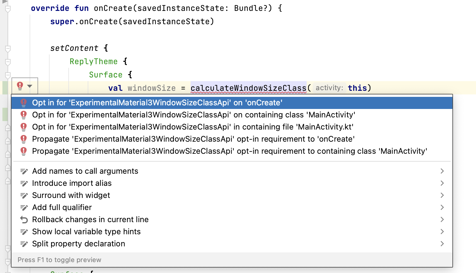
val windowSize = calculateWindowSizeClass(this)
ReplyApp()
...
- Notice the red underlining of the
calculateWindowSizeClasssyntax, which shows the red light bulb. Click the red light bulb to the left of thewindowSizevariable and select Opt in for ‘ExperimentalMaterial3WindowSizeClassApi' on ‘onCreate' to create an annotation on top of theonCreate()method.
You can use the WindowWidthSizeClass variable in the MainActivity.kt to determine which layout to display in various composables. Let's prepare the ReplyApp composable to receive this value.
- In the
ReplyApp.ktfile, modify theReplyAppcomposable to accept theWindowWidthSizeClassas the parameter and import the appropriate package.
ReplyApp.kt
...
import androidx.compose.material3.windowsizeclass.WindowWidthSizeClass
...

@Composable
fun ReplyApp(
    windowSize: WindowWidthSizeClass,
    modifier: Modifier = Modifier
) {
...
- Pass the
windowSizevariable to theReplyAppcomponent in theMainActivity.ktfile'sonCreate()method.
MainActivity.kt
...
        setContent {
            ReplyTheme {
                Surface {
                    val windowSize = calculateWindowSizeClass(this)
                    ReplyApp(
                        windowSize = windowSize.widthSizeClass
                    )
...
You also need to update the app's preview, too, for the windowSize parameter.
- Pass the
WindowWidthSizeClass.Compactas thewindowSizeparameter to theReplyAppcomposable for the preview component and import the appropriate package.
MainActivity.kt
...
import androidx.compose.material3.windowsizeclass.WindowWidthSizeClass
...

@Preview(showBackground = true)
@Composable
fun ReplyAppCompactPreview() {
    ReplyTheme {
        Surface {
            ReplyApp(
                windowSize = WindowWidthSizeClass.Compact,
            )
        }
    }
}
- To change the app layouts based on the size of the screen, add a
whenstatement in theReplyAppcomposable based on theWindowWidthSizeClassvalue.
ReplyApp.kt
...

@Composable
fun ReplyApp(
    windowSize: WindowWidthSizeClass,
    modifier: Modifier = Modifier
) {
    val viewModel: ReplyViewModel = viewModel()
    val replyUiState = viewModel.uiState.collectAsState().value

    when (windowSize) {
        WindowWidthSizeClass.Compact -> {
        }
        WindowWidthSizeClass.Medium -> {
        }
        WindowWidthSizeClass.Expanded -> {
        }
        else -> {
        }
    }
...
At this point, you established a foundation to use WindowSizeClass values to change the layouts in your app. The next step is to determine how you want your app to look on different screen sizes.
7. Implement adaptive navigation layout
Implement adaptive UI navigation
Currently, the bottom navigation is used for all screen sizes.
As previously discussed, this navigation element is not ideal because users can find it difficult to reach these essential navigation elements on larger screens. Fortunately, there are recommended patterns for different navigation elements for various window size classes in navigation for responsive UIs. For the Reply app, you can implement the following elements:
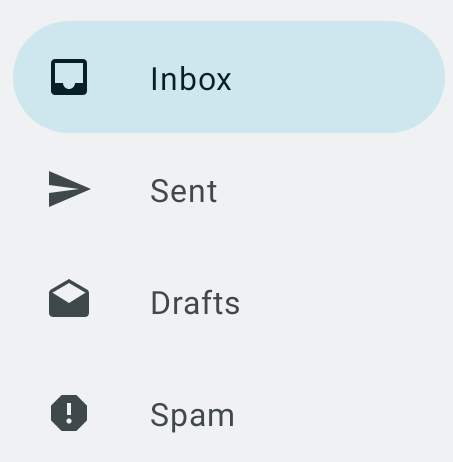
Navigation rail is another navigation component by material design which allows compact navigation options for primary destinations to be accessible from the side of the app.

Similarly, a persistent/permanent navigation drawer is created by material design as another option to provide ergonomic access for larger screens.
Implement a navigation drawer
To create a navigation drawer for expanded screens, you can use the navigationType parameter. Complete the following steps to do so:
- To represent different types of navigation elements, create a new file
WindowStateUtils.ktin a new packageutils, which is under theuidirectory. - Add an
Enumclass to represent different types of navigation elements.
WindowStateUtils.kt
package com.example.reply.ui.utils

enum class ReplyNavigationType {
    BOTTOM_NAVIGATION, NAVIGATION_RAIL, PERMANENT_NAVIGATION_DRAWER
}
To successfully implement the navigation drawer, you need to determine the navigation type based on the app's window size.
- In the
ReplyAppcomposable, create anavigationTypevariable and assign it the appropriateReplyNavigationTypevalue, according to the screen size in thewhenstatement.
ReplyApp.kt
...
import com.example.reply.ui.utils.ReplyNavigationType
...
    val navigationType: ReplyNavigationType
    when (windowSize) {
        WindowWidthSizeClass.Compact -> {
            navigationType = ReplyNavigationType.BOTTOM_NAVIGATION
        }
        WindowWidthSizeClass.Medium -> {
            navigationType = ReplyNavigationType.NAVIGATION_RAIL
        }
        WindowWidthSizeClass.Expanded -> {
            navigationType = ReplyNavigationType.PERMANENT_NAVIGATION_DRAWER
        }
        else -> {
            navigationType = ReplyNavigationType.BOTTOM_NAVIGATION
        }
    }
...
You can use the navigationType value in the ReplyHomeScreen composable. You can prepare for that by making it a parameter for the composable.
- In the
ReplyHomeScreencomposable, addnavigationTypeas a parameter.
ReplyHomeScreen.kt
...
@Composable
fun ReplyHomeScreen(
    navigationType: ReplyNavigationType,
    replyUiState: ReplyUiState,
    onTabPressed: (MailboxType) -> Unit,
    onEmailCardPressed: (Email) -> Unit,
    onDetailScreenBackPressed: () -> Unit,
    modifier: Modifier = Modifier
)

...
- Pass the
navigationTypeinto theReplyHomeScreencomposable.
ReplyApp.kt
...
    ReplyHomeScreen(
        navigationType = navigationType,
        replyUiState = replyUiState,
        onTabPressed = { mailboxType: MailboxType ->
            viewModel.updateCurrentMailbox(mailboxType = mailboxType)
            viewModel.resetHomeScreenStates()
        },
        onEmailCardPressed = { email: Email ->
            viewModel.updateDetailsScreenStates(
                email = email
            )
        },
        onDetailScreenBackPressed = {
            viewModel.resetHomeScreenStates()
        },
        modifier = modifier
    )
...
Next, you can create a branch to show the app content with a navigation drawer when the user opens the app on an expanded screen and displays the homescreen.
- In the
ReplyHomeScreencomposable body, add anifstatement fornavigationType == ReplyNavigationType.PERMANENT_NAVIGATION_DRAWER && replyUiState.isShowingHomepagecondition.
ReplyHomeScreen.kt
import androidx.compose.material3.PermanentNavigationDrawer
...
@Composable
fun ReplyHomeScreen(
    navigationType: ReplyNavigationType,
    replyUiState: ReplyUiState,
    onTabPressed: (MailboxType) -> Unit,
    onEmailCardPressed: (Email) -> Unit,
    onDetailScreenBackPressed: () -> Unit,
    modifier: Modifier = Modifier
) {
...
    if (navigationType == ReplyNavigationType.PERMANENT_NAVIGATION_DRAWER
        && replyUiState.isShowingHomepage
    ) {
    }

    if (replyUiState.isShowingHomepage) {
        ReplyAppContent(
            replyUiState = replyUiState,
...
- To create the permanent drawer, create the
PermanentNavigationDrawercomposable in the if statement's body and addNavigationDrawerContentcomposable as the input for thedrawerContentparameter. - Add the
ReplyAppContentcomposable as the final lambda argument of thePermanentNavigationDrawer.
ReplyHomeScreen.kt
...
    if (navigationType == ReplyNavigationType.PERMANENT_NAVIGATION_DRAWER
        && replyUiState.isShowingHomepage
    ) {
        PermanentNavigationDrawer(
            drawerContent = {
                PermanentDrawerSheet(Modifier.width(dimensionResource(R.dimen.drawer_width))) {
                    NavigationDrawerContent(
                        selectedDestination = replyUiState.currentMailbox,
                        onTabPressed = onTabPressed,
                        navigationItemContentList = navigationItemContentList,
                        modifier = Modifier
                            .wrapContentWidth()
                            .fillMaxHeight()
                            .background(MaterialTheme.colorScheme.inverseOnSurface)
                            .padding(dimensionResource(R.dimen.drawer_padding_content))
                    )
                }
            }
        ) {
            ReplyAppContent(
                replyUiState = replyUiState,
                onTabPressed = onTabPressed,
                onEmailCardPressed = onEmailCardPressed,
                navigationItemContentList = navigationItemContentList,
                modifier = modifier
            )
        }
    }

...
- Add an
elsebranch that uses the previous composable body to maintain the previous branching for non expanded screens.
ReplyHomeScreen.kt
...
if (navigationType == ReplyNavigationType.PERMANENT_NAVIGATION_DRAWER
        && replyUiState.isShowingHomepage
) {
        PermanentNavigationDrawer(
            drawerContent = {
                PermanentDrawerSheet(Modifier.width(dimensionResource(R.dimen.drawer_width))) {
                    NavigationDrawerContent(
                        selectedDestination = replyUiState.currentMailbox,
                        onTabPressed = onTabPressed,
                        navigationItemContentList = navigationItemContentList,
                        modifier = Modifier
                            .wrapContentWidth()
                            .fillMaxHeight()
                            .background(MaterialTheme.colorScheme.inverseOnSurface)
                            .padding(dimensionResource(R.dimen.drawer_padding_content))
                    )
                }
            }
        ) {
            ReplyAppContent(
                replyUiState = replyUiState,
                onTabPressed = onTabPressed,
                onEmailCardPressed = onEmailCardPressed,
                navigationItemContentList = navigationItemContentList,
                modifier = modifier
            )
        }
    } else {
        if (replyUiState.isShowingHomepage) {
            ReplyAppContent(
                replyUiState = replyUiState,
                onTabPressed = onTabPressed,
                onEmailCardPressed = onEmailCardPressed,
                navigationItemContentList = navigationItemContentList,
                modifier = modifier
            )
        } else {
            ReplyDetailsScreen(
                replyUiState = replyUiState,
                onBackPressed = onDetailScreenBackPressed,
                modifier = modifier
            )
        }
    }
}
...
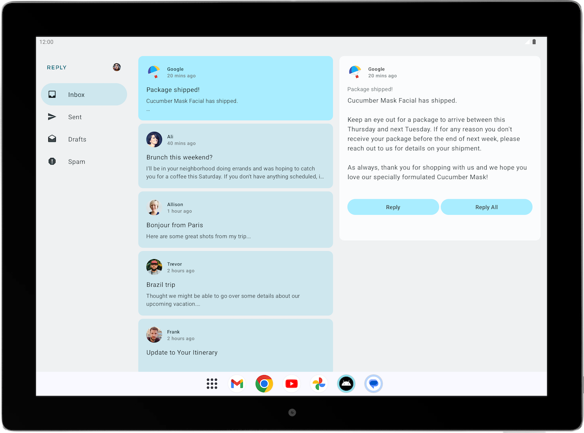
- Run the app in Tablet mode. You should see the following screen:
Implement a navigation rail
Similar to the navigation drawer implementation, you need to use the navigationType parameter to switch between navigation elements.
First, let's add a navigation rail for medium screens.
- Begin with preparation of the
ReplyAppContentcomposable by addingnavigationTypeas a parameter.
ReplyHomeScreen.kt
...
@Composable
private fun ReplyAppContent(
    navigationType: ReplyNavigationType,
    replyUiState: ReplyUiState,
    onTabPressed: ((MailboxType) -> Unit),
    onEmailCardPressed: (Email) -> Unit,
    navigationItemContentList: List<NavigationItemContent>,
    modifier: Modifier = Modifier
) {
...
- Pass the
navigationTypevalue into bothReplyAppContentcomposables.
ReplyHomeScreen.kt
...
            ReplyAppContent(
                navigationType = navigationType,
                replyUiState = replyUiState,
                onTabPressed = onTabPressed,
                onEmailCardPressed = onEmailCardPressed,
                navigationItemContentList = navigationItemContentList,
                modifier = modifier
            )
        }
    } else {
        if (replyUiState.isShowingHomepage) {
            ReplyAppContent(
                navigationType = navigationType,
                replyUiState = replyUiState,
                onTabPressed = onTabPressed,
                onEmailCardPressed = onEmailCardPressed,
                navigationItemContentList = navigationItemContentList,
                modifier = modifier
            )
...
Next, let's add branching, which allows the app to display navigation rails for some scenarios.
- In the
ReplyAppContentcomposable body first line, wrap theReplyNavigationRailcomposable around theAnimatedVisibilitycomposable and set thevisibleparameter to betrueif theReplyNavigationTypevalue isNAVIGATION_RAIL.
ReplyHomeScreen.kt
...
@Composable
private fun ReplyAppContent(
    navigationType: ReplyNavigationType,
    replyUiState: ReplyUiState,
    onTabPressed: ((MailboxType) -> Unit),
    onEmailCardPressed: (Email) -> Unit,
    navigationItemContentList: List<NavigationItemContent>,
    modifier: Modifier = Modifier
) {
    Box(modifier = modifier) {
        AnimatedVisibility(visible = navigationType == ReplyNavigationType.NAVIGATION_RAIL) {
            ReplyNavigationRail(
                currentTab = replyUiState.currentMailbox,
                onTabPressed = onTabPressed,
navigationItemContentList = navigationItemContentList
            )
        }
        Column(
            modifier = Modifier
                .fillMaxSize()
                .background(
                    MaterialTheme.colorScheme.inverseOnSurface
            )
        ) {
            ReplyListOnlyContent(
                replyUiState = replyUiState,
                onEmailCardPressed = onEmailCardPressed,
                modifier = Modifier.weight(1f)
                    .padding(
                        horizontal = dimensionResource(R.dimen.email_list_only_horizontal_padding)
                    )
            )
            ReplyBottomNavigationBar(
                currentTab = replyUiState.currentMailbox,
                onTabPressed = onTabPressed,
                navigationItemContentList = navigationItemContentList,
                  modifier = Modifier
                      .fillMaxWidth()
            )
        }
    }
}
...
- To align the composables correctly, wrap both the
AnimatedVisibilitycomposable and theColumncomposable found in theReplyAppContentbody in aRowcomposable.
ReplyHomeScreen.kt
...
@Composable
private fun ReplyAppContent(
    navigationType: ReplyNavigationType,
    replyUiState: ReplyUiState,
    onTabPressed: ((MailboxType) -> Unit),
    onEmailCardPressed: (Email) -> Unit,
    navigationItemContentList: List<NavigationItemContent>,
    modifier: Modifier = Modifier,
) {
    Row(modifier = modifier) {
        AnimatedVisibility(visible = navigationType == ReplyNavigationType.NAVIGATION_RAIL) {
            val navigationRailContentDescription = stringResource(R.string.navigation_rail)
            ReplyNavigationRail(
                currentTab = replyUiState.currentMailbox,
                onTabPressed = onTabPressed,
                navigationItemContentList = navigationItemContentList
            )
        }
        Column(
            modifier = Modifier
                .fillMaxSize()
                .background(MaterialTheme.colorScheme.inverseOnSurface)
        ) {
            ReplyListOnlyContent(
                replyUiState = replyUiState,
                onEmailCardPressed = onEmailCardPressed,
                modifier = Modifier.weight(1f)
                    .padding(
                        horizontal = dimensionResource(R.dimen.email_list_only_horizontal_padding)
                )
            )
            ReplyBottomNavigationBar(
                currentTab = replyUiState.currentMailbox,
                onTabPressed = onTabPressed,
                navigationItemContentList = navigationItemContentList,
                modifier = Modifier
                    .fillMaxWidth()
            )
        }
    }
}

...
Finally, let's make sure the bottom navigation displays in some scenarios.
- After the
ReplyListOnlyContentcomposable, wrap theReplyBottomNavigationBarcomposable with anAnimatedVisibilitycomposable. - Set the
visibleparameter when theReplyNavigationTypevalue isBOTTOM_NAVIGATION.
ReplyHomeScreen.kt
...
ReplyListOnlyContent(
    replyUiState = replyUiState,
    onEmailCardPressed = onEmailCardPressed,
    modifier = Modifier.weight(1f)
        .padding(
            horizontal = dimensionResource(R.dimen.email_list_only_horizontal_padding)
        )

)
AnimatedVisibility(visible = navigationType == ReplyNavigationType.BOTTOM_NAVIGATION) {
    val bottomNavigationContentDescription = stringResource(R.string.navigation_bottom)
    ReplyBottomNavigationBar(
        currentTab = replyUiState.currentMailbox,
        onTabPressed = onTabPressed,
        navigationItemContentList = navigationItemContentList,
        modifier = Modifier
            .fillMaxWidth()
    )
}

...
- Run the app in Unfolded foldable mode. You should to see the following screen:
8. Get the solution code
To download the code for the finished codelab, you can use these git commands:
git clone https://github.com/google-developer-training/basic-android-kotlin-compose-training-reply-app.git
cd basic-android-kotlin-compose-training-reply-app
git checkout nav-update
Alternatively, you can download the repository as a zip file, unzip it, and open it in Android Studio.
If you want to see the solution code, view it on GitHub.
9. Conclusion
Congratulations! You are one step closer to making the Reply app adaptive for all screen sizes by implementing an adaptive navigation layout. You enhanced the user experience using many Android form factors. In the next codelab, you'll further improve your skills working with adaptive apps by implementing adaptive content layout, testing, and previews.
Don't forget to share your work on social media with #AndroidBasics!