
1. Introduction
In this codelab you will learn how to use Jetpack Compose's theming APIs to style your application. We'll see how to customize colors, shapes and typography so that they're used consistently throughout your application, supporting multiple themes such as light & dark theme.
What you will learn
In this codelab, you will learn:
- A primer in Material Design and how you can customize it for your brand
- How Compose implements the Material Design system
- How to define and use colors, typography and shapes throughout your app
- How to style components
- How to support light and dark themes
What you will build
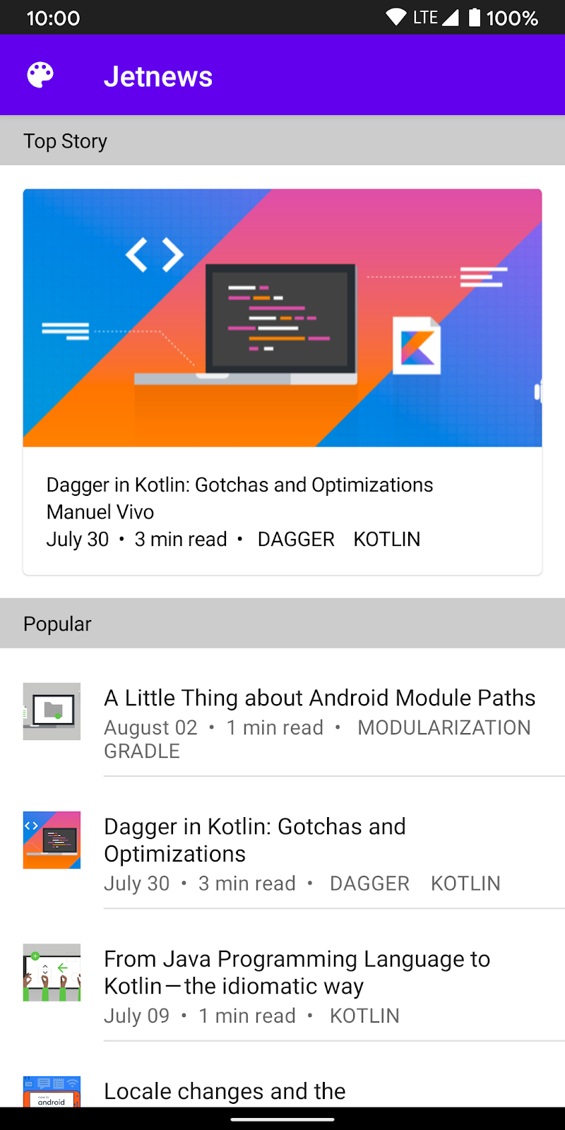
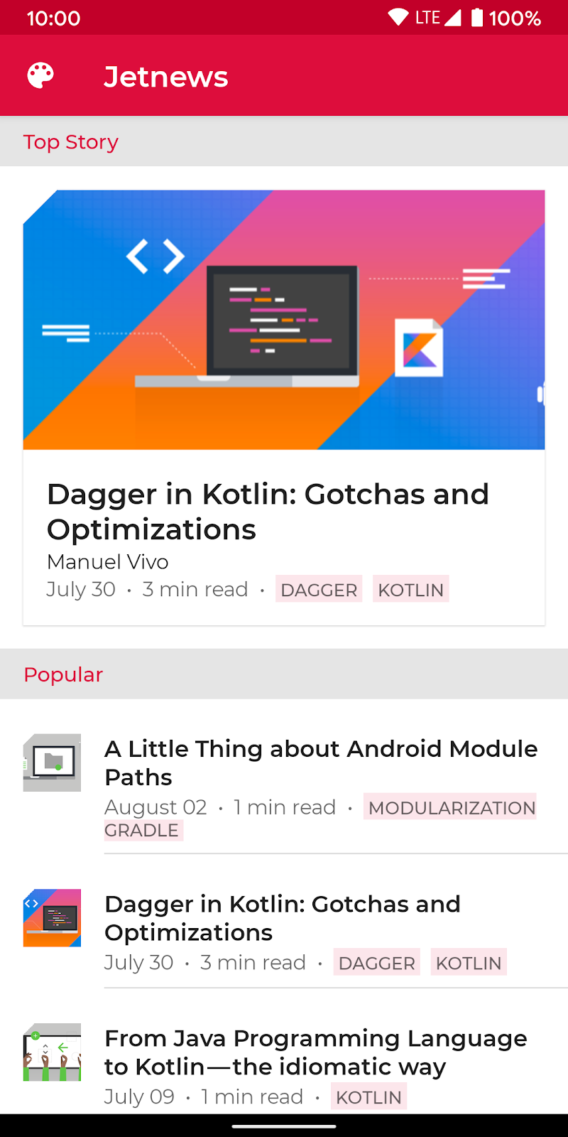
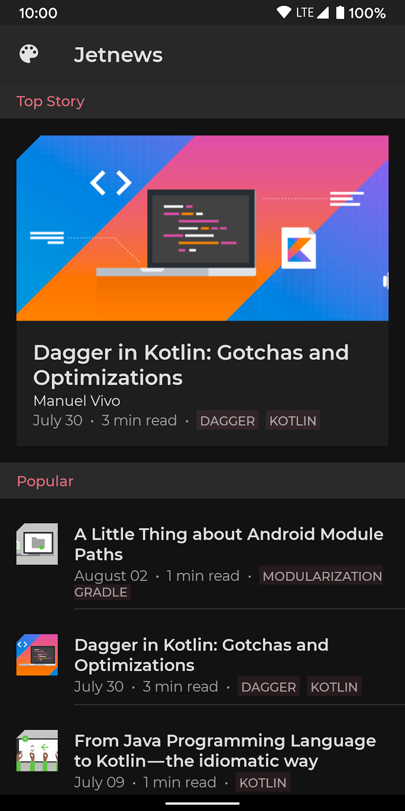
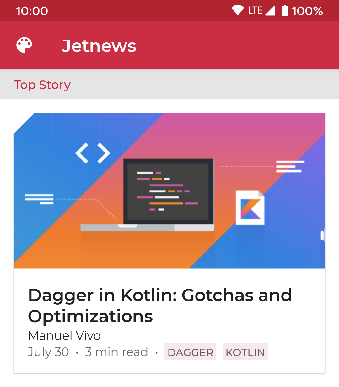
In this codelab we will style a news-reading app. We begin with an unstyled application and will apply what we learn to theme the application and support dark themes.
|
|
|
Before: unstyled app | After: styled app | After: dark theme |
Prerequisites
- Experience with Kotlin syntax, including lambdas
- Basic understanding of Compose.
- Basic familiarity with Compose layouts e.g.
Row,Column&Modifier
2. Getting set up
In this step, you will download the code for this which comprises a simple news-reader app that we will style.
What you will need
Download the code
If you have git installed, you can simply run the command below. To check whether git is installed, type git --version in the terminal or command line and verify that it executes correctly.
git clone https://github.com/googlecodelabs/android-compose-codelabs.git
cd android-compose-codelabs/ThemingCodelabM2
If you do not have git, you can click the following button to download all the code for this codelab:
Open the project in Android Studio and select ‘File > Import Project' and browse to the ThemingCodelabM2 directory.
The project contains three main packages:
com.codelab.theming.dataThis contains model classes and sample data. You should not need to edit this package during this codelab.com.codelab.theming.ui.startThis is the starting point for the codelab, you should make all changes requested in this codelab in this package.com.codelab.theming.ui.finishThis is the end state of the codelab, for your reference.
Build and run the app
The application has 2 run configurations reflecting the start and end states of the codelab. Selecting either configuration and pressing the run button will deploy the code to your device or emulator.
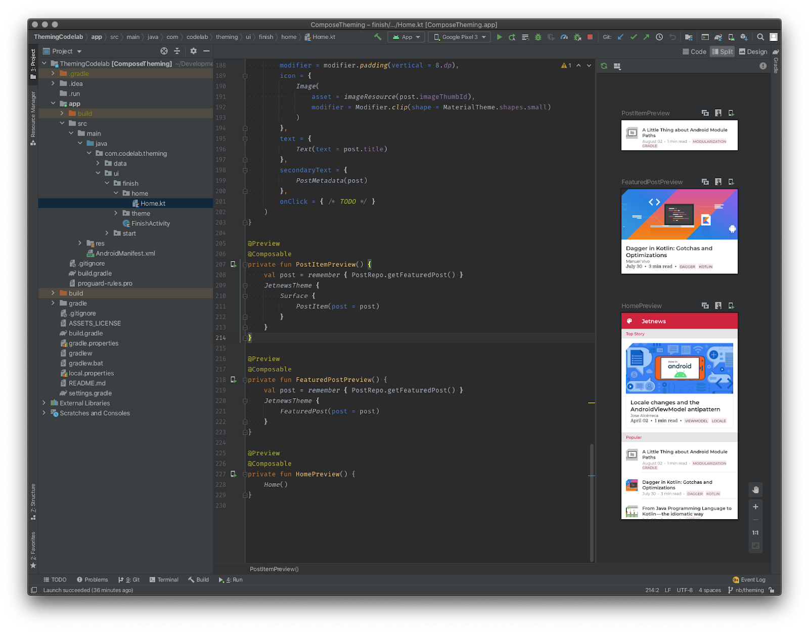
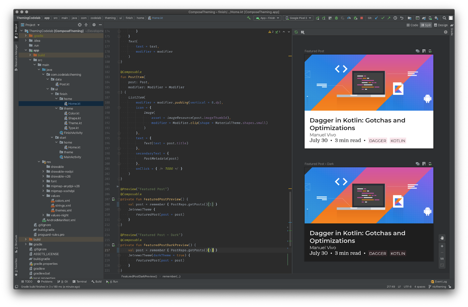
The application also contains Compose layout previews. Browsing to Home.kt in either start/finish package and opening the design view shows a number of previews enabling fast iterations on your UI code:
3. Material Theming
Jetpack Compose offers an implementation of Material Design—a comprehensive design system for creating digital interfaces. The Material Design components (Buttons, Cards, Switches etc) are built on top of Material Theming which is a systematic way to customize Material Design to better reflect your product's brand. A Material Theme comprises color, typography and shape attributes. Customizing these will be automatically reflected in the components you use to build your app.
An understanding of Material Theming is helpful to understand how to theme your Jetpack Compose apps so here's a brief description of the concepts. If you're already familiar with Material Theming, you can skip forward.
Color
Material Design defines a number of semantically named colors which you can use throughout your app:
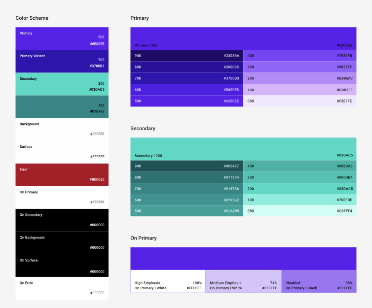
Primary is your main brand color and secondary is used to provide accents. You can supply darker/lighter variants for contrasting areas. Background and surface colors are used for containers holding components which notionally live on a "surface" in your application. Material also defines "on" colors—colors to use for content on top of one of the named colors e.g. text in a ‘surface' colored container should be colored ‘on surface'. Material components are configured to use these theme colors, for example by default a Floating Action Button is colored secondary, Cards default to surface etc.
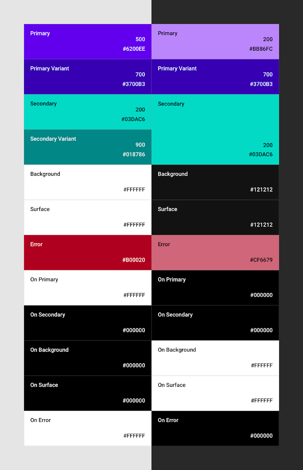
By defining named colors, it becomes possible to provide alternate color palettes such as both a light and a dark theme:
It also encourages you to define a small palette of colors and use them consistently throughout your app. The Material color tool can help to pick colors and create a color palette, even ensuring that the combinations are accessible.
Typography
Similarly, Material defines a number of semantically named type styles:
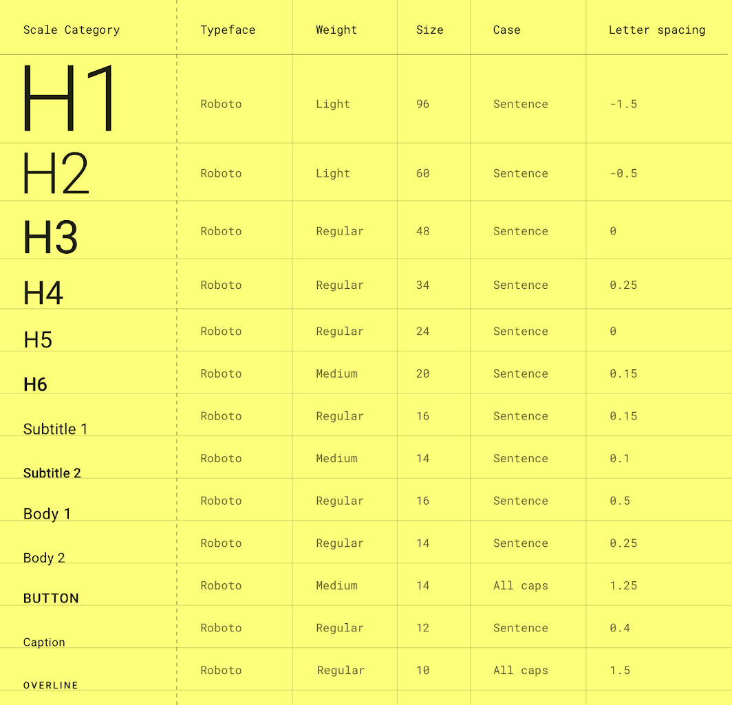
While you may not vary type styles by theme, using a type scale will promote consistency within your application. Supplying your own fonts and other type customizations will be reflected in Material components you use in your app e.g. App Bars use h6 style by default, Buttons use, err, button. The Material type scale generator tool can help you to build your type scale.
Shape
Material supports using shapes systematically to convey your brand. It defines 3 categories: small, medium and large components; each of which can define a shape to use, customizing the corner style (cut or rounded) and size.
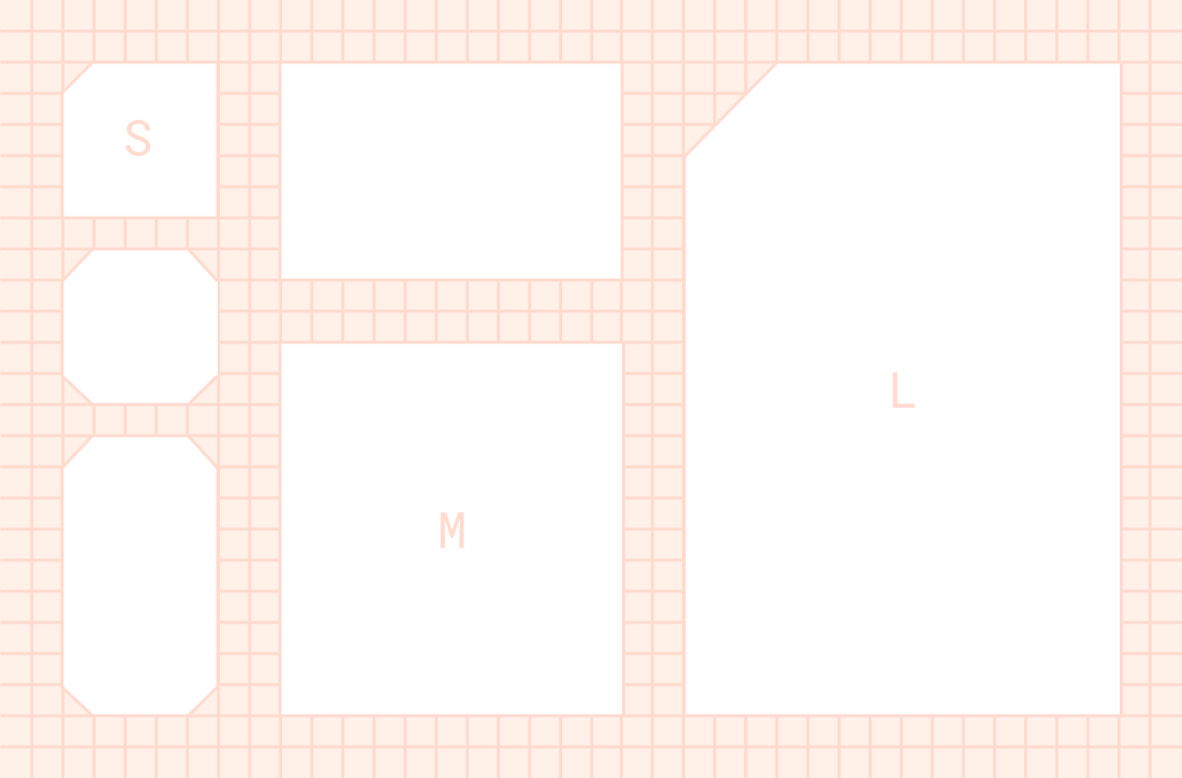
Customizing your shape theme will be reflected across numerous components e.g. Buttons & Text Fields use the small shape theme, Cards and Dialogs use medium and Sheets use the large shape theme by default. There is a complete mapping of components to shape themes here. The Material shape customization tool can help you generate a shape theme.
Baseline
Material defaults to a "baseline" theme, that is the purple color scheme, Roboto type scale and slightly rounded shapes seen in the images above. If you do not specify or customize your theme then components will use the baseline theme.
4. Define your theme
MaterialTheme
The core element for implementing theming in Jetpack Compose is the MaterialTheme composable. Placing this composable in your compose hierarchy allows you to specify your customisations to color, type and shapes for all components within it. Here is how this composable is defined in the library:
@Composable
fun MaterialTheme(
    colors: Colors,
    typography: Typography,
    shapes: Shapes,
    content: @Composable () -> Unit
) { ...
You can later retrieve the parameters passed into this composable using the MaterialTheme object, which exposes colors, typography and shapes properties. We'll go into each of these in depth later.
Open Home.kt and locate the Home composable function — this is the main entry point to the app. Notice that while we declare a MaterialTheme, we do not specify any parameters so receive the default "baseline" styling:
@Composable
fun Home() {
  ...
  MaterialTheme {
    Scaffold(...
Let's create color, type and shape parameters to implement a theme for our app.
Create a Theme
To centralize your styling, we recommend creating your own composable that wraps and configures a MaterialTheme. This gives you a single place to specify your theme customizations and allows you to reuse it easily in many places e.g. across multiple screens or @Previews. You can create multiple theme composables if needed, for example if you want to support different styles for different sections of your app.
In the com.codelab.theming.ui.start.theme package create a new file called Theme.kt. Add a new composable function called JetnewsTheme which accepts other composables as content and wraps a MaterialTheme:
@Composable
fun JetnewsTheme(content: @Composable () -> Unit) {
  MaterialTheme(content = content)
}
Now switch back to Home.kt and replace MaterialTheme with our JetnewsTheme (and import it):
-  MaterialTheme {
+  JetnewsTheme {
    ...
You won't notice any changes just yet in the @Preview on this screen. Update PostItemPreview and FeaturedPostPreview to wrap their content with our new JetnewsTheme composable so that the previews use our new theme:
@Preview("Featured Post")
@Composable
private fun FeaturedPostPreview() {
  val post = remember { PostRepo.getFeaturedPost() }
+ JetnewsTheme {
    FeaturedPost(post = post)
+ }
}
Colors
Here's the color palette we'd like to implement in our app (just a light palette for now, we'll come back to support dark theme soon):

Colors in Compose are defined using the Color class. There are multiple constructors allowing you to specify the color as a ULong or by separate color channel.
Create a new file Color.kt in your theme package. Add the following colors as top-level public properties in this file:
val Red700 = Color(0xffdd0d3c)
val Red800 = Color(0xffd00036)
val Red900 = Color(0xffc20029)
Now that we have defined our apps colors, let's pull them together into a Colors object that the MaterialTheme requires, assigning specific colors to Material's named colors. Switch back to Theme.kt and add the following:
private val LightColors = lightColors(
    primary = Red700,
    primaryVariant = Red900,
    onPrimary = Color.White,
    secondary = Red700,
    secondaryVariant = Red900,
    onSecondary = Color.White,
    error = Red800
)
Here we use the lightColors function to build our Colors, this provides sensible defaults so we don't have to specify all colors that make up a Material color palette. For example, notice that we haven't specified a background color or many of the ‘on' colors, we'll use the defaults.
Now let's use these colors in our app. Update your JetnewsTheme composable to use our new Colors:
@Composable
fun JetnewsTheme(content: @Composable () -> Unit) {
  MaterialTheme(
+   colors = LightColors,
    content = content
  )
}
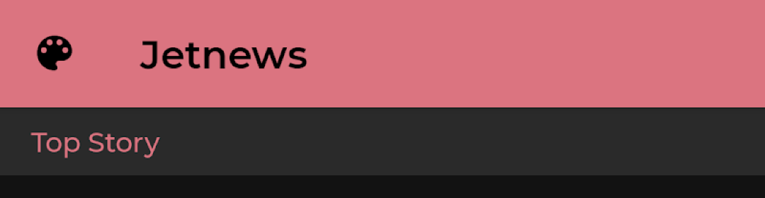
Open Home.kt and refresh the preview. Notice the new color scheme reflected in components like the TopAppBar.
Typography
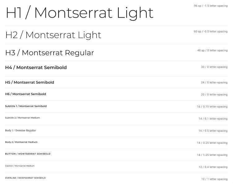
Here's the type scale that we'd like to implement in our app:
In Compose we can define TextStyle objects to define the information needed to style some text. A sample of its attributes:
data class TextStyle(
    val color: Color = Color.Unset,
    val fontSize: TextUnit = TextUnit.Inherit,
    val fontWeight: FontWeight? = null,
    val fontStyle: FontStyle? = null,
    val fontFamily: FontFamily? = null,
    val letterSpacing: TextUnit = TextUnit.Inherit,
    val background: Color = Color.Unset,
    val textAlign: TextAlign? = null,
    val textDirection: TextDirection? = null,
    val lineHeight: TextUnit = TextUnit.Inherit,
    ...
)
Our desired type scale uses Montserrat for titles and Domine for body text. The relevant font files are already added to the res/fonts folder of your project.
Create a new file Typography.kt in the theme package. Let's first define the FontFamilys (which combine the different weights of each Font ):
private val Montserrat = FontFamily(
    Font(R.font.montserrat_regular),
    Font(R.font.montserrat_medium, FontWeight.W500),
    Font(R.font.montserrat_semibold, FontWeight.W600)
)

private val Domine = FontFamily(
    Font(R.font.domine_regular),
    Font(R.font.domine_bold, FontWeight.Bold)
)
Now create a Typography object that a MaterialTheme accepts, specifying TextStyles for each semantic style in the scale:
val JetnewsTypography = Typography(
    h4 = TextStyle(
        fontFamily = Montserrat,
        fontWeight = FontWeight.W600,
        fontSize = 30.sp
    ),
    h5 = TextStyle(
        fontFamily = Montserrat,
        fontWeight = FontWeight.W600,
        fontSize = 24.sp
    ),
    h6 = TextStyle(
        fontFamily = Montserrat,
        fontWeight = FontWeight.W600,
        fontSize = 20.sp
    ),
    subtitle1 = TextStyle(
        fontFamily = Montserrat,
        fontWeight = FontWeight.W600,
        fontSize = 16.sp
    ),
    subtitle2 = TextStyle(
        fontFamily = Montserrat,
        fontWeight = FontWeight.W500,
        fontSize = 14.sp
    ),
    body1 = TextStyle(
        fontFamily = Domine,
        fontWeight = FontWeight.Normal,
        fontSize = 16.sp
    ),
    body2 = TextStyle(
        fontFamily = Montserrat,
        fontSize = 14.sp
    ),
    button = TextStyle(
        fontFamily = Montserrat,
        fontWeight = FontWeight.W500,
        fontSize = 14.sp
    ),
    caption = TextStyle(
        fontFamily = Montserrat,
        fontWeight = FontWeight.Normal,
        fontSize = 12.sp
    ),
    overline = TextStyle(
        fontFamily = Montserrat,
        fontWeight = FontWeight.W500,
        fontSize = 12.sp
    )
)
Open Theme.kt and update JetnewsTheme composable to use our new Typography:
@Composable
fun JetnewsTheme(content: @Composable () -> Unit) {
  MaterialTheme(
    colors = LightColors,
+   typography = JetnewsTypography,
    content = content
  )
}
Open Home.kt and refresh the preview to see the new typography in effect.
Shapes
We want to use shapes to express our brand in the app. We want to use a cut-corner shape on a number of elements:
Compose offers RoundedCornerShape and CutCornerShape classes which you can use to define your shape theme.
Create a new file Shape.kt in the theme package and add the following:
val JetnewsShapes = Shapes(
    small = CutCornerShape(topStart = 8.dp),
    medium = CutCornerShape(topStart = 24.dp),
    large = RoundedCornerShape(8.dp)
)
Open Theme.kt and update JetnewsTheme composable to use these Shapes:
@Composable
fun JetnewsTheme(content: @Composable () -> Unit) {
  MaterialTheme(
    colors = LightColors,
    typography = JetnewsTypography,
+   shapes = JetnewsShapes,
    content = content
  )
}
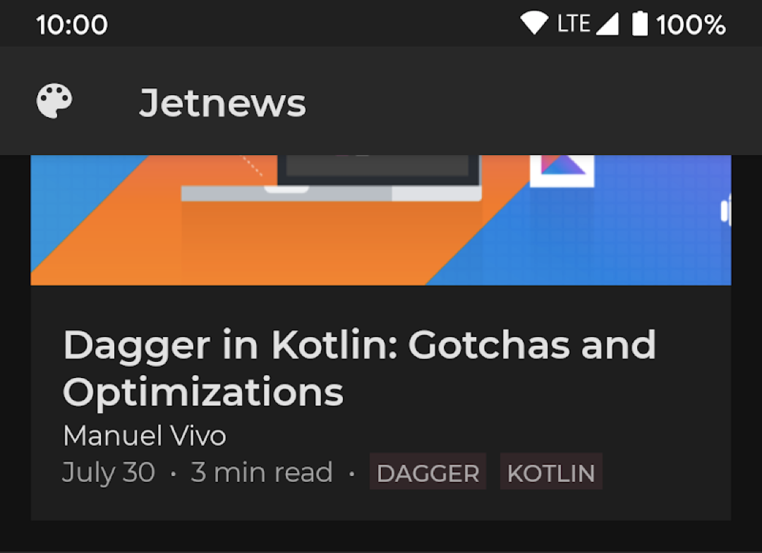
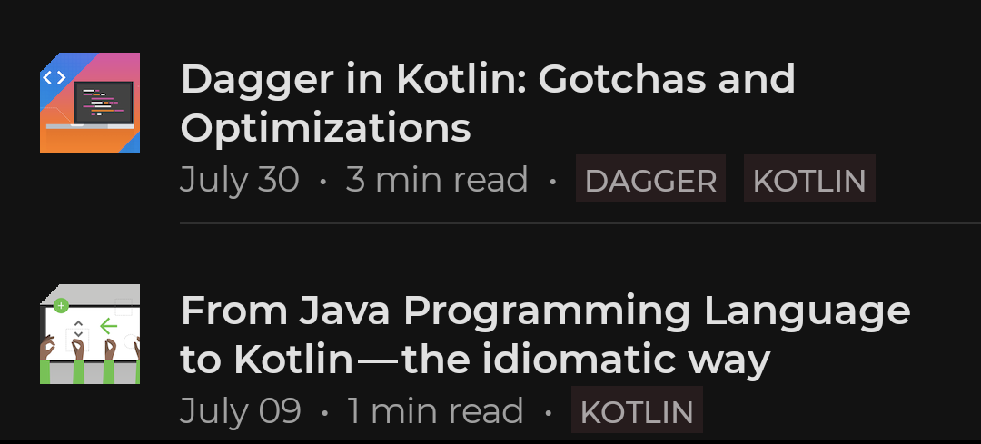
Open Home.kt and refresh the preview to see how the Card displaying the featured post reflects the newly applied shape theme.
Dark Theme
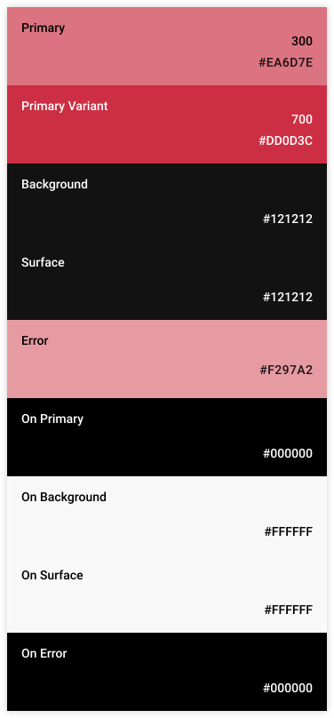
Supporting a dark theme in your app not only helps your app to integrate better on users' devices (which have a global dark theme toggle from Android 10 onward) but also can reduce power usage and support accessibility needs. Material offers design guidance on creating a dark theme. Here's an alternate color palette we'd like to implement for dark theme:
Open Color.kt and add the following colors:
val Red200 = Color(0xfff297a2)
val Red300 = Color(0xffea6d7e)
Now open Theme.kt and add:
private val DarkColors = darkColors(
    primary = Red300,
    primaryVariant = Red700,
    onPrimary = Color.Black,
    secondary = Red300,
    onSecondary = Color.Black,
    error = Red200
)
Now update JetnewsTheme:
@Composable
fun JetnewsTheme(
+ darkTheme: Boolean = isSystemInDarkTheme(),
  content: @Composable () -> Unit
) {
  MaterialTheme(
+   colors = if (darkTheme) DarkColors else LightColors,
    typography = JetnewsTypography,
    shapes = JetnewsShapes,
    content = content
  )
}
Here, we've added a new parameter of whether to use a dark theme, and defaulted it to querying the device for the global setting. This gives us a good default but is still easy to override if we want a particular screen to always/never be dark or to make a dark themed @Preview.
Open Home.kt and create a new preview for the FeaturedPost composable which displays it in dark theme:
@Preview("Featured Post • Dark")
@Composable
private fun FeaturedPostDarkPreview() {
    val post = remember { PostRepo.getFeaturedPost() }
    JetnewsTheme(darkTheme = true) {
        FeaturedPost(post = post)
    }
}
Refresh the preview pane to see the dark theme preview.
5. Working with Color
In the last step, we saw how to create your own theme to set the colors, type styles and shapes for your app. All Material components use these customizations out of the box. For example the FloatingActionButton composable defaults to using the secondary color from the theme, but you can set an alternate color by specifying a different value for this parameter:
@Composable
fun FloatingActionButton(
  backgroundColor: Color = MaterialTheme.colors.secondary,
  ...
) {
You don't always want to use the default settings, this section shows how to work with color in your app.
Raw Colors
As we saw earlier, compose offers a Color class. You can create these locally, hold them in an object etc:
Surface(color = Color.LightGray) {
  Text(
    text = "Hard coded colors don't respond to theme changes :(",
    textColor = Color(0xffff00ff)
  )
}
Color has a number of useful methods on it such as copy allowing you to create a new color with different alpha/red/green/blue values.
Theme Colors
A more flexible approach is to retrieve colors from your theme:
Surface(color = MaterialTheme.colors.primary)
Here we're using the MaterialTheme object whose colors property returns the Colors set in the MaterialTheme composable. That means we can support different look-and-feels just by supplying different sets of colors to our theme, we don't need to touch application code. For example our AppBar uses primary color and the screen background is surface; changing the theme colors is reflected in these composables:
As each color in our theme are Color instances, we can also easily derive colors using the copy method:
val derivedColor = MaterialTheme.colors.onSurface.copy(alpha = 0.1f)
Here we're making a copy of the onSurface color but with 10% opacity. This approach ensures that colors work under different themes, rather than hard-coding static colors.
Surface & Content colors
Many components accept a pair of color and "content colors":
Surface(
  color: Color = MaterialTheme.colors.surface,
  contentColor: Color = contentColorFor(color),
  ...

TopAppBar(
  backgroundColor: Color = MaterialTheme.colors.primarySurface,
  contentColor: Color = contentColorFor(backgroundColor),
  ...
This enables you to not only set the color of a composable, but to provide a default color for the "content" i.e. composables within it. Many composables use this content color by default e.g. Text color or Icon tint. The contentColorFor method retrieves the appropriate "on" color for any theme colors e.g. if you set a primary background, it will return onPrimary as the content color. If you set a non-theme background color then you should provide a sensible content color yourself.
Surface(color = MaterialTheme.colors.primary) {
  Text(...) // default text color is 'onPrimary'
}
Surface(color = MaterialTheme.colors.error) {
  Icon(...) // default tint is 'onError'
}
You can use the LocalContentColor CompositionLocal to retrieve the color which contrasts with the current background:
BottomNavigationItem(
  unselectedContentColor = LocalContentColor.current ...
When setting the color of any elements, prefer using a Surface to do this as it sets an appropriate content color CompositionLocal value, be wary of direct Modifier.background calls which do not set an appropriate content color.
-Row(Modifier.background(MaterialTheme.colors.primary)) {
+Surface(color = MaterialTheme.colors.primary) {
+  Row(
...
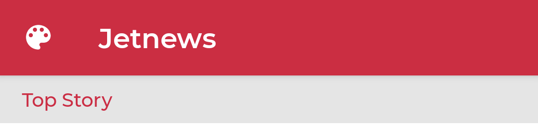
Currently, our Header components always have a Color.LightGray background. This looks ok in light theme, but will be high contrast against the background in dark theme. They also don't specify the particular text color, so inherit the current content color which might not contrast with the background:
Let's fix this. In the Header composable in Home.kt, remove the background modifier specifying the hard-coded color. Instead wrap the Text in a Surface with a theme derived color and specify that content should be colored primary:
+ Surface(
+   color = MaterialTheme.colors.onSurface.copy(alpha = 0.1f),
+   contentColor = MaterialTheme.colors.primary,
+   modifier = modifier
+ ) {
  Text(
    text = text,
    modifier = Modifier
      .fillMaxWidth()
-     .background(Color.LightGray)
      .padding(horizontal = 16.dp, vertical = 8.dp)
  )
+ }
Content Alpha
Often we want to emphasize or deemphasize content to communicate importance and provide visual hierarchy. Material Design recommends employing different levels of opacity to convey these different importance levels.
Jetpack Compose implements this via LocalContentAlpha. You can specify a content alpha for a hierarchy by providing a value for this CompositionLocal. Child composables can use this value, for example Text and Icon by default use the combination of LocalContentColor adjusted to use LocalContentAlpha. Material specifies some standard alpha values ( high, medium, disabled) which are modelled by the ContentAlpha object. Note that MaterialTheme defaults LocalContentAlpha to ContentAlpha.high.
// By default, both Icon & Text use the combination of LocalContentColor &
// LocalContentAlpha. De-emphasize content by setting a different content alpha
CompositionLocalProvider(LocalContentAlpha provides ContentAlpha.medium) {
    Text(...)
}
CompositionLocalProvider(LocalContentAlpha provides ContentAlpha.disabled) {
    Icon(...)
    Text(...)
}
This makes it easy and consistent to convey the importance of components.
We'll use content alpha to clarify the information hierarchy of the featured post. In Home.kt, in the PostMetadata composable, make the metadata medium emphasis:
+ CompositionLocalProvider(LocalContentAlpha provides ContentAlpha.medium) {
  Text(
    text = text,
    modifier = modifier
  )
+ }

Dark Theme
As we've seen, to implement dark themes in Compose you simply provide different color sets and query colors through the theme. A few exceptions of note are:
You can check if you are running in a light theme:
val isLightTheme = MaterialTheme.colors.isLight
This value is set by the lightColors/ darkColors builder functions.
In material, in dark themes, surfaces with higher elevations receive elevation overlays (their background is lightened). This is implemented automatically when using a dark color palette:
Surface(
  elevation = 2.dp,
  color = MaterialTheme.colors.surface, // color will be adjusted for elevation
  ...
We can see this automatic behaviour in our app in both the TopAppBar and the Card components that we are using; they have 4dp and 1dp elevations by default, so their backgrounds are lightened automatically in dark theme to better communicate this elevation:
Material design suggests avoiding large areas of bright colors in dark theme. A common pattern is to color a container primary color in light theme and surface color in dark themes; many components use this strategy by default e.g. App Bars and Bottom Navigation. To make this easier to implement, Colors offers a primarySurface color which provides exactly this behaviour and these components use by default.
Our app currently sets the App Bar to primary color, we can follow this guidance by either switching it to primarySurface or just removing this parameter as it's the default. In the AppBar composable, change the TopAppBar's backgroundColor parameter:
@Composable
private fun AppBar() {
  TopAppBar(
    ...
-   backgroundColor = MaterialTheme.colors.primary
+   backgroundColor = MaterialTheme.colors.primarySurface
  )
}
6. Working with Text
When working with text, we use the Text composable to display text, TextField and OutlinedTextField for text input and TextStyle to apply a single style to our text. We can use AnnotatedStrings for applying multiple styles to text.
As we saw with colors, Material components which display text will pick up our theme typography customizations:
Button(...) {
  Text("This text will use MaterialTheme.typography.button style by default")
}
Achieving this is slightly more complex than using default parameters as we saw with colors. This is because components do not tend to display text themselves, rather they offer ‘ slot APIs' allowing you to pass in a Text composable. So how do components set a theme typography style? Under the hood they use the ProvideTextStyle composable (which itself uses a CompositionLocal) to set a "current" TextStyle. The Text composable defaults to querying this "current" style if you do not provide a concrete textStyle parameter.
For example from Compose's Button & Text classes:
@Composable
fun Button(
    // many other parameters
    content: @Composable RowScope.() -> Unit
) {
  ...
  ProvideTextStyle(MaterialTheme.typography.button) { //set the "current" text style
    ...
    content()
  }
}

@Composable
fun Text(
    // many, many parameters
    style: TextStyle = LocalTextStyle.current // get the value set by ProvideTextStyle
) { ...
Theme text styles
Just like with colors, it's best to retrieve TextStyles from the current theme, encouraging you to use a small, consistent set of styles and making them more maintainable. MaterialTheme.typography retrieves the Typography instance set in your MaterialTheme composable, enabling you to use the styles you defined:
Text(
  style = MaterialTheme.typography.subtitle2
)
If you need to customize a TextStyle, you can either copy it and override properties (it's just a data class) or the Text composable accepts a number of styling parameters which will be overlaid on top of any TextStyle:
Text(
  text = "Hello World",
  style = MaterialTheme.typography.body1.copy(
    background = MaterialTheme.colors.secondary
  )
)
Text(
  text = "Hello World",
  style = MaterialTheme.typography.subtitle2,
  fontSize = 22.sp // explicit size overrides the size in the style
)
Many places in our app automatically apply theme TextStyles, for example the TopAppBar styles it's title as h6 and ListItem styles the main and secondary text to subtitle1 and body2 respectively.
Let's apply the theme typographic styles to the rest of our app. Set Header to use subtitle2 and text in the FeaturedPost to use h6 for the title and body2 for the author and metadata:
@Composable
fun Header(...) {
  ...
  Text(
    text = text,
+   style = MaterialTheme.typography.subtitle2

Multiple styles
If you need to apply multiple styles to some text, then you can use the AnnotatedString class to apply markup, adding SpanStyles to a range of text. You can either add these dynamically or use the DSL syntax to create content:
val text = buildAnnotatedString {
  append("This is some unstyled text\n")
  withStyle(SpanStyle(color = Color.Red)) {
    append("Red text\n")
  }
  withStyle(SpanStyle(fontSize = 24.sp)) {
    append("Large text")
  }
}
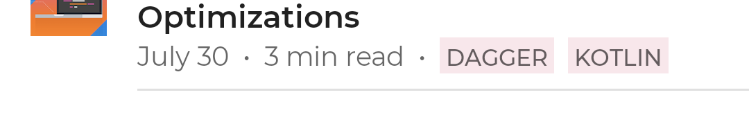
Lets style the tags describing each post in our app. Currently they use the same text style as the rest of the metadata; we'll use the overline text style and a background color to differentiate them. In the PostMetadata composable:
+ val tagStyle = MaterialTheme.typography.overline.toSpanStyle().copy(
+   background = MaterialTheme.colors.primary.copy(alpha = 0.1f)
+ )
post.tags.forEachIndexed { index, tag ->
  ...
+ withStyle(tagStyle) {
    append(" ${tag.toUpperCase()} ")
+ }
}
7. Working with Shapes
Just like color and typography, setting your shape theme will be reflected in Material components, for example Buttons will pick up the shape set for small components:
@Composable
fun Button( ...
  shape: Shape = MaterialTheme.shapes.small
) {
Like colors, Material components use default parameters so it's straightforward to check what category of shape a component will use, or to provide an alternative. For a full mapping of components to shape category, see the documentation.
Note that some components use modified theme shapes to suit their context. For example by default TextField use the small shape theme, but applies a zero corner size to the bottom corners:
@Composable
fun FilledTextField(
  // other parameters
  shape: Shape = MaterialTheme.shapes.small.copy(
    bottomStart = ZeroCornerSize, // overrides small theme style
    bottomEnd = ZeroCornerSize // overrides small theme style
  )
) {
Theme shapes
You can of course use shapes yourself when creating your own components by using composables or Modifiers which accept shapes e.g. Surface, Modifier.clip, Modifier.background, Modifier.border etc.
@Composable
fun UserProfile(
  ...
  shape: Shape = MaterialTheme.shapes.medium
) {
  Surface(shape = shape) {
    ...
  }
}
Let's add shape theming to the image displayed in PostItem; we'll apply the theme's small shape to it with a clip Modifier to cut the top-left corner:
@Composable
fun PostItem(...) {
  ...
  Image(
    painter = painterResource(post.imageThumbId),
+   modifier = Modifier.clip(shape = MaterialTheme.shapes.small)
  )
8. Component "Styles"
Compose does not offer an explicit way to extract the styling of a component like Android View styles or css styles. As all Compose components are authored in Kotlin, there are other ways to achieve the same goal. Instead, create your own library of customized components and use these throughout your app.
We've already been doing this in our app:
@Composable
fun Header(
  text: String,
  modifier: Modifier = Modifier
) {
  Surface(
    color = MaterialTheme.colors.onSurface.copy(alpha = 0.1f),
    contentColor = MaterialTheme.colors.primary,
    modifier = modifier.semantics { heading() }
  ) {
    Text(
      text = text,
      style = MaterialTheme.typography.subtitle2,
      modifier = Modifier
        .fillMaxWidth()
        .padding(horizontal = 16.dp, vertical = 8.dp)
    )
  }
}
The Header composable is essentially a styled Text that we can use across the app.
We've seen that all components are constructed out of lower level building blocks, you can use these same building blocks to customize material's components. For example we saw that Button uses the ProvideTextStyle composable to set a default text style for the content passed to it. You can use the exact same mechanism to set your own text style:
@Composable
fun LoginButton(
    onClick: () -> Unit,
    modifier: Modifier = Modifier,
    content: @Composable RowScope.() -> Unit
) {
    Button(
        colors = ButtonConstants.defaultButtonColors(
            backgroundColor = MaterialTheme.colors.secondary
        ),
        onClick = onClick,
        modifier = modifier
    ) {
        ProvideTextStyle(...) { // set our own text style
            content()
        }
    }
}
In this example we create our own "style" of LoginButton by wrapping the standard Button class and specify certain properties like a different backgroundColor and text style.
There also is no concept of default styling i.e. a way to customize the default appearance of a component type. Again, you can achieve this by creating your own component which wraps and customizes a library component. Say for example you wanted to customize the shape of all Buttons throughout your app but did not want to change the small shape theme, which would affect other (non-Button) components. To achieve this, create your own composable and use this throughout:
@Composable
fun AcmeButton(
  // expose Button params consumers should be able to change
) {
  val acmeButtonShape: Shape = ...
  Button(
    shape = acmeButtonShape,
    // other params
  )
}
9. Congratulations
Congratulations, you've successfully completed this codelab and styled a Jetpack Compose app!
You've implemented a Material theme, customizing the color, typography and shapes used throughout the app to express your brand and promote consistency. You've added support for both light and dark themes.
What's next?
Check out the other codelabs on the Compose pathway:
Further reading
Sample apps
- Owl demonstrating multiple themes
- Jetcaster demonstrating dynamic theming
- Jetsnack demonstrating implementing a custom design system