
1. Introduction
Compose and the View system can work together side by side.
In this codelab, you'll be migrating parts of the Sunflower's plant details screen to Compose. We created a copy of the project for you to try out migrating a realistic app to Compose.
By the end of the codelab, you'll be able to continue with the migration and convert the rest of Sunflower's screens if you wish.
For more support as you're walking through this codelab, check out the following code-along:
What you will learn
In this codelab, you will learn:
- The different migration paths you can follow
- How to incrementally migrate an app to Compose
- How to add Compose to an existing screen built using Views
- How to use a View from inside Compose
- How you can create a theme in Compose
- How to test a mixed screen written in both Views and Compose
Prerequisites
- Experience with Kotlin syntax, including lambdas
- Knowing the basics of Compose
What you will need
2. Migration strategy
Jetpack Compose was designed with View interoperability right from the start. To migrate to Compose, we recommend an incremental migration where Compose and View co-exist in your codebase until your app is fully in Compose.
The recommended migration strategy is this:
- Build new screens with Compose
- As you're building features, identify reusable elements and start to create a library of common UI components
- Replace existing features one screen at a time
Build new screens with Compose
Using Compose to build new features that encompass an entire screen is the best way to drive your adoption of Compose. With this strategy, you can add features and take advantage of the benefits of Compose while still catering to your company's business needs
A new feature might encompass an entire screen, in which case the entire screen would be in Compose. If you are using Fragment-based navigation, that means you would create a new Fragment and have its contents in Compose.
You can also introduce new features in an existing screen. In this case, Views and Compose will coexist on the same screen. For example, say the feature you are adding is a new view type in a RecyclerView. In that case, the new view type would be in Compose while keeping the other items the same.
Build a library of common UI components
As you're building features with Compose, you'll quickly realize that you end up building a library of components. You'll want to identify reusable components to promote reuse across your app so that shared components have a single source of truth. New features you build can then depend on this library.
Replace existing features with Compose
In addition to building new features, you'll want to gradually migrate existing features in your app to Compose. How you approach this is up to you, but here are a few good candidates:
- Simple screens - simple screens in your app with few UI elements and dynamicity such as a welcome screen, a confirmation screen, or a settings screen. These are good candidates for migrating to Compose as it can be done with few lines of code.
- Mixed View and Compose screens - screens that already contain a bit of Compose code are another good candidate as you can continue to migrate elements in that screen piece-by-piece. If you have a screen with only a subtree in Compose, you can continue migrating other parts of the tree until the entire UI is in Compose. This is called the bottom-up approach of migration.
The approach in this Codelab
In this codelab, you'll be doing an incremental migration to Compose of the Sunflower's plant details screen having Compose and Views working together. After that, you'll know enough to continue with the migration if you wish.
3. Getting set up
Get the code
Get the codelab code from GitHub:
$ git clone https://github.com/android/codelab-android-compose
Alternatively you can download the repository as a Zip file:
Running the sample app
The code you just downloaded contains code for all Compose codelabs available. To complete this codelab, open the MigrationCodelab project inside Android Studio.
In this codelab, you're going to migrate Sunflower's plant details screen to Compose. You can open the plant details screen by tapping in one of the plants available in the plant list screen.
Project setup
The project is built in multiple git branches:
- The
mainbranch is the codelab's starting point. - The
endcontains the solution to this codelab.
We recommend that you start with the code in the main branch and follow the codelab step-by-step at your own pace.
During the codelab, you'll be presented with snippets of code that you'll need to add to the project. In some places, you'll also need to remove code that is explicitly mentioned in comments on the code snippets.
To get the end branch using git, cd into the directory of the MigrationCodelab project followed by using the command:
$ git checkout end
Or download the solution code from here:
Frequently asked questions
4. Compose in Sunflower
Compose is already added to the code you downloaded from the main branch. However, let's take a look at what's required to have it working.
If you open the app-level build.gradle file, see how it imports the Compose dependencies and enables Android Studio to work with Compose by using the buildFeatures { compose true } flag.
app/build.gradle
android {
    //...
    kotlinOptions {
        jvmTarget = '1.8'
    }
    buildFeatures {
        //...
        compose true
    }
    composeOptions {
        kotlinCompilerExtensionVersion '1.3.2'
    }
}

dependencies {
    //...
    // Compose
    def composeBom = platform('androidx.compose:compose-bom:2024.09.02')
    implementation(composeBom)
    androidTestImplementation(composeBom)

    implementation "androidx.compose.runtime:runtime"
    implementation "androidx.compose.ui:ui"
    implementation "androidx.compose.foundation:foundation"
    implementation "androidx.compose.foundation:foundation-layout"
    implementation "androidx.compose.material3:material3"
    implementation "androidx.compose.runtime:runtime-livedata"
    implementation "androidx.compose.ui:ui-tooling"
    //...
}
The version of those dependencies are defined in the project-level build.gradle file.
5. Hello Compose!
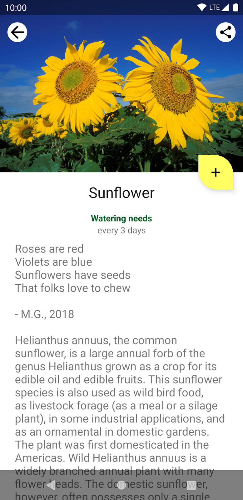
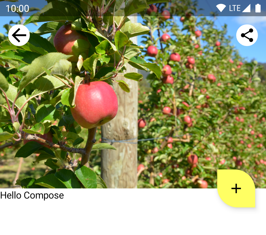
In the plant details screen, we'll migrate the description of the plant to Compose while leaving the overall structure of the screen intact.
Compose needs a host Activity or Fragment in order to render UI. In Sunflower, as all screens use fragments, you'll be using ComposeView: an Android View that can host Compose UI content using its setContent method.
Removing XML code
Let's start with the migration! Open fragment_plant_detail.xml and do the following:
- Switch to the Code view
- Remove the
ConstraintLayoutcode and 4 nestedTextViews inside theNestedScrollView(the codelab will compare and reference the XML code when migrating individual items, having the code commented out will be useful) - Add a
ComposeViewthat will host Compose code instead withcompose_viewas view id
fragment_plant_detail.xml
<androidx.core.widget.NestedScrollView
    android:id="@+id/plant_detail_scrollview"
    android:layout_width="match_parent"
    android:layout_height="match_parent"
    android:clipToPadding="false"
    android:paddingBottom="@dimen/fab_bottom_padding"
    app:layout_behavior="@string/appbar_scrolling_view_behavior">

    <!-- Step 2) Comment out ConstraintLayout and its children –->
    <androidx.constraintlayout.widget.ConstraintLayout
        android:layout_width="match_parent"
        android:layout_height="match_parent"
        android:layout_margin="@dimen/margin_normal">

        <TextView
            android:id="@+id/plant_detail_name"
        ...

    </androidx.constraintlayout.widget.ConstraintLayout>
    <!-- End Step 2) Comment out until here –->

    <!-- Step 3) Add a ComposeView to host Compose code –->
    <androidx.compose.ui.platform.ComposeView
        android:id="@+id/compose_view"
        android:layout_width="match_parent"
        android:layout_height="match_parent"/>

</androidx.core.widget.NestedScrollView>
Adding Compose code
At this point, you are ready to start migrating the plant details screen to Compose!
Throughout the codelab, you'll be adding Compose code to the PlantDetailDescription.kt file under the plantdetail folder. Open it and see how we have a placeholder "Hello Compose" text already available in the project.
PlantDetailDescription.kt
@Composable
fun PlantDetailDescription() {
    Surface {
        Text("Hello Compose")
    }
}
Let's display this on the screen by calling this composable from the ComposeView we added in the previous step. Open PlantDetailFragment.kt.
As the screen is using data binding, you can directly access the composeView and call setContent to display Compose code on the screen. Call the PlantDetailDescription composable inside MaterialTheme as Sunflower uses material design.
PlantDetailFragment.kt
class PlantDetailFragment : Fragment() {
    // ...
    override fun onCreateView(...): View? {
        val binding = DataBindingUtil.inflate<FragmentPlantDetailBinding>(
            inflater, R.layout.fragment_plant_detail, container, false
        ).apply {
            // ...
            composeView.setContent {
                // You're in Compose world!
                MaterialTheme {
                    PlantDetailDescription()
                }
            }
        }
        // ...
    }
}
If you run the app, you can see "Hello Compose" displayed on the screen.
6. Creating a Composable out of XML
Let's start by migrating the name of the plant. More exactly, the TextView with id @+id/plant_detail_name you removed in fragment_plant_detail.xml. Here's the XML code:
<TextView
    android:id="@+id/plant_detail_name"
    ...
    android:layout_marginStart="@dimen/margin_small"
    android:layout_marginEnd="@dimen/margin_small"
    android:gravity="center_horizontal"
    android:text="@{viewModel.plant.name}"
    android:textAppearance="?attr/textAppearanceHeadline5"
    ... />
See how it has a textAppearanceHeadline5 style, has a horizontal margin of 8.dp and it's centered horizontally on the screen. However, the title to be displayed is observed from a LiveData exposed by PlantDetailViewModel that comes from the repository layer.
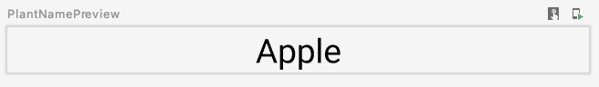
As observing a LiveData is covered later, let's assume we have the name available and is passed as a parameter to a new PlantName composable that we create in the PlantDetailDescription.kt file. This composable will be called from the PlantDetailDescription composable later.
PlantDetailDescription.kt
@Composable
private fun PlantName(name: String) {
Text(
text = name,
style = MaterialTheme.typography.headlineSmall,
modifier = Modifier
.fillMaxWidth()
.padding(horizontal = dimensionResource(R.dimen.margin_small))
.wrapContentWidth(Alignment.CenterHorizontally)
)
}
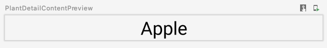
@Preview
@Composable
private fun PlantNamePreview() {
MaterialTheme {
PlantName("Apple")
}
}
With preview:
Where:
Text's style isMaterialTheme.typography.headlineSmallwhich is similar totextAppearanceHeadline5from the XML code.- The modifiers decorate the Text to make it look like the XML version:
- The
fillMaxWidthmodifier is used so that it occupies the maximum amount of width available. This modifier corresponds to thematch_parentvalue of thelayout_widthattribute in XML code. - The
paddingmodifier is used so that a horizontal padding value ofmargin_smallis applied. This corresponds to themarginStartandmarginEnddeclaration in XML. Themargin_smallvalue is also the existing dimension resource which is fetched using thedimensionResourcehelper function. - The
wrapContentWidthmodifier is used to align the text so that it is centered horizontally. This is similar to having agravityofcenter_horizontalin XML.
7. ViewModels and LiveData
Now, let's wire up the title to the screen. To do that, you'll need to load the data using the PlantDetailViewModel. For that, Compose comes with integrations for ViewModel and LiveData.
ViewModels
As an instance of the PlantDetailViewModel is used in the Fragment, we could pass it as a parameter to PlantDetailDescription and that'd be it.
Open the PlantDetailDescription.kt file and add the PlantDetailViewModel parameter to PlantDetailDescription:
PlantDetailDescription.kt
@Composable
fun PlantDetailDescription(plantDetailViewModel: PlantDetailViewModel) {
    //...
}
Now, pass the instance of the ViewModel when calling this composable from the fragment:
PlantDetailFragment.kt
class PlantDetailFragment : Fragment() {
    ...
    override fun onCreateView(...): View? {
        ...
        composeView.setContent {
            MaterialTheme {
                PlantDetailDescription(plantDetailViewModel)
            }
        }
    }
}
LiveData
With this, you already have access to the PlantDetailViewModel's LiveData<Plant> field to get the plant's name.
To observe LiveData from a composable, use the LiveData.observeAsState() function.
As values emitted by the LiveData can be null, you'd need to wrap its usage in a null check. Because of that, and for reusability, it's best to split the LiveData consumption and listening in different composables. So let's create a new composable called PlantDetailContent that will display Plant information.
With these updates, the PlantDetailDescription.kt file should now look like this:
PlantDetailDescription.kt
@Composable
fun PlantDetailDescription(plantDetailViewModel: PlantDetailViewModel) {
// Observes values coming from the VM's LiveData<Plant> field
val plant by plantDetailViewModel.plant.observeAsState()
// If plant is not null, display the content
plant?.let {
PlantDetailContent(it)
}
}
@Composable
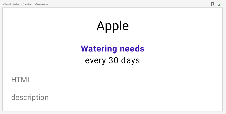
fun PlantDetailContent(plant: Plant) {
PlantName(plant.name)
}
@Preview
@Composable
private fun PlantDetailContentPreview() {
val plant = Plant("id", "Apple", "description", 3, 30, "")
MaterialTheme {
PlantDetailContent(plant)
}
}
PlantNamePreview should reflect our change without having to update it directly since PlantDetailContent just calls PlantName:
Now, you've wired up the ViewModel so that a plant name is displayed in Compose. In the next few sections, you'll build the rest of the composables and wire them up to the ViewModel in a similar way.
8. More XML code migration
Now, it's easier to complete what's missing in our UI: the watering info and plant description. Following a similar approach as before, you can already migrate the rest of the screen.
The watering info XML code you removed before from fragment_plant_detail.xml consists of two TextViews with ids plant_watering_header and plant_watering.
<TextView
    android:id="@+id/plant_watering_header"
    ...
    android:layout_marginStart="@dimen/margin_small"
    android:layout_marginTop="@dimen/margin_normal"
    android:layout_marginEnd="@dimen/margin_small"
    android:gravity="center_horizontal"
    android:text="@string/watering_needs_prefix"
    android:textColor="?attr/colorAccent"
    android:textStyle="bold"
    ... />

<TextView
    android:id="@+id/plant_watering"
    ...
    android:layout_marginStart="@dimen/margin_small"
    android:layout_marginEnd="@dimen/margin_small"
    android:gravity="center_horizontal"
    app:wateringText="@{viewModel.plant.wateringInterval}"
    .../>
Similar to what you did before, create a new composable called PlantWatering and add Text composables to display the watering information on the screen:
PlantDetailDescription.kt
@OptIn(ExperimentalComposeUiApi::class)
@Composable
private fun PlantWatering(wateringInterval: Int) {
Column(Modifier.fillMaxWidth()) {
// Same modifier used by both Texts
val centerWithPaddingModifier = Modifier
.padding(horizontal = dimensionResource(R.dimen.margin_small))
.align(Alignment.CenterHorizontally)
val normalPadding = dimensionResource(R.dimen.margin_normal)
Text(
text = stringResource(R.string.watering_needs_prefix),
color = MaterialTheme.colorScheme.primaryContainer,
fontWeight = FontWeight.Bold,
modifier = centerWithPaddingModifier.padding(top = normalPadding)
)
val wateringIntervalText = pluralStringResource(
R.plurals.watering_needs_suffix, wateringInterval, wateringInterval
)
Text(
text = wateringIntervalText,
modifier = centerWithPaddingModifier.padding(bottom = normalPadding)
)
}
}
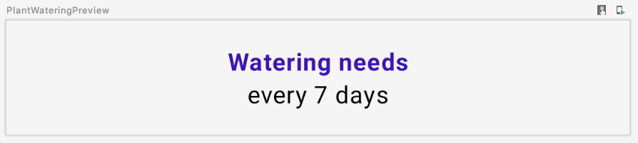
@Preview
@Composable
private fun PlantWateringPreview() {
MaterialTheme {
PlantWatering(7)
}
}
With preview:
Some things to notice:
- As the horizontal padding and align decoration is shared by the
Textcomposables, you can reuse the Modifier by assigning it to a local variable (i.e.centerWithPaddingModifier). Since modifiers are regular Kotlin objects, you can do that. - Compose's
MaterialThemedoesn't have an exact match to thecolorAccentused inplant_watering_header. For now, let's useMaterialTheme.colorScheme.primaryContainerthat you'll improve in the interop theming section. - In Compose 1. 2.1, using
pluralStringResourcerequires opting in toExperimentalComposeUiApi. In a future version of Compose this may no longer be needed.
Let's connect all the pieces together and call PlantWatering from the PlantDetailContent as well. The ConstraintLayout XML code we removed at the beginning had a margin of 16.dp that we need to include in our Compose code.
<androidx.constraintlayout.widget.ConstraintLayout
    android:layout_width="match_parent"
    android:layout_height="match_parent"
    android:layout_margin="@dimen/margin_normal">
In PlantDetailContent, create a Column to display the name and watering info together and have that as padding. Also, so that the background color and the text colors used are appropriate, add a Surface that will handle that.
PlantDetailDescription.kt
@Composable
fun PlantDetailContent(plant: Plant) {
    Surface {
        Column(Modifier.padding(dimensionResource(R.dimen.margin_normal))) {
            PlantName(plant.name)
            PlantWatering(plant.wateringInterval)
        }
    }
}
If you refresh the preview, you'll see this:
9. Views in Compose code
Now, let's migrate the plant description. The code in fragment_plant_detail.xml had a TextView with app:renderHtml="@{viewModel.plant.description}" to tell the XML what text to display on the screen. renderHtml is a binding adapter that you can find in the PlantDetailBindingAdapters.kt file. The implementation uses HtmlCompat.fromHtml to set the text on the TextView!
However, Compose doesn't have support for Spanned classes nor displaying HTML formatted text at the moment. Thus, we need to use a TextView from the View system in the Compose code to bypass this limitation.
As Compose is not able to render HTML code yet, you'll create a TextView programmatically to do exactly that using the AndroidView API.
AndroidView allows you to construct a View in its factory lambda. It also provides an update lambda which gets invoked when the View has been inflated and on subsequent recompositions.
Let's do this by creating a new PlantDescription composable. This composable calls AndroidView which constructs a TextView in its factory lambda. In the factory lambda, initialize a TextView that displays HTML formatted text followed by setting the movementMethod to an instance of LinkMovementMethod. Finally, in the update lambda set the text of the TextView to be htmlDescription.
PlantDetailDescription.kt
@Composable
private fun PlantDescription(description: String) {
// Remembers the HTML formatted description. Re-executes on a new description
val htmlDescription = remember(description) {
HtmlCompat.fromHtml(description, HtmlCompat.FROM_HTML_MODE_COMPACT)
}
// Displays the TextView on the screen and updates with the HTML description when inflated
// Updates to htmlDescription will make AndroidView recompose and update the text
AndroidView(
factory = { context ->
TextView(context).apply {
movementMethod = LinkMovementMethod.getInstance()
}
},
update = {
it.text = htmlDescription
}
)
}
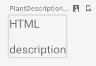
@Preview
@Composable
private fun PlantDescriptionPreview() {
MaterialTheme {
PlantDescription("HTML<br><br>description")
}
}
Preview:
Notice that htmlDescription remembers the HTML description for a given description passed as a parameter. If the description parameter changes, the htmlDescription code inside remember will execute again.
As a result, the AndroidView update callback will recompose if htmlDescription changes. Any state read inside the update lambda causes a recomposition.
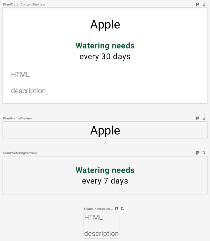
Let's add PlantDescription to the PlantDetailContent composable and change preview code to display a HTML description too:
PlantDetailDescription.kt
@Composable
fun PlantDetailContent(plant: Plant) {
Surface {
Column(Modifier.padding(dimensionResource(R.dimen.margin_normal))) {
PlantName(plant.name)
PlantWatering(plant.wateringInterval)
PlantDescription(plant.description)
}
}
}
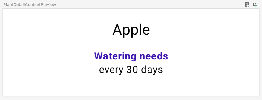
@Preview
@Composable
private fun PlantDetailContentPreview() {
val plant = Plant("id", "Apple", "HTML<br><br>description", 3, 30, "")
MaterialTheme {
PlantDetailContent(plant)
}
}
With preview:
At this point, you've migrated all the content inside the original ConstraintLayout to Compose. You can run the app to check that it's working as expected.
10. ViewCompositionStrategy
Compose disposes of the Composition whenever the ComposeView becomes detached from a window. This is undesirable when ComposeView is used in fragments for 2 reasons:
- The Composition must follow the fragment's view lifecycle for Compose UI
Viewtypes to save state. - When transitions happen, the underlying
ComposeViewwill be at a detached state. However, Compose UI elements will still be visible during these transitions.
To modify this behavior, call setViewCompositionStrategy with the appropriate ViewCompositionStrategy so it follows the fragment's view lifecycle instead. Specifically, you'll want to use the DisposeOnViewTreeLifecycleDestroyed strategy to dispose of the Composition when the LifecycleOwner of the fragment is destroyed.
As PlantDetailFragment has enter and exit transitions (check nav_garden.xml for more info), and we'll use View types inside Compose later, we need to make sure the ComposeView uses the DisposeOnViewTreeLifecycleDestroyed strategy. Nonetheless, it's best practice to always set this strategy when using ComposeView in fragments.
PlantDetailFragment.kt
import androidx.compose.ui.platform.ViewCompositionStrategy
...

class PlantDetailFragment : Fragment() {
    ...
    override fun onCreateView(...): View? {
        val binding = DataBindingUtil.inflate<FragmentPlantDetailBinding>(
            inflater, R.layout.fragment_plant_detail, container, false
        ).apply {
            ...
            composeView.apply {
                // Dispose the Composition when the view's LifecycleOwner
                // is destroyed
                setViewCompositionStrategy(
                    ViewCompositionStrategy.DisposeOnViewTreeLifecycleDestroyed
                )
                setContent {
                    MaterialTheme {
                        PlantDetailDescription(plantDetailViewModel)
                    }
                }
            }
        }
        ...
    }
}
11. Material theming
We have the text content of plant details migrated to Compose. However, you might have noticed that Compose is not using the right theme colors. It's using purple in the plant name when it should be using green.
To use the correct theme colors, you'll need to customize the MaterialTheme by defining your own theme and providing your theme's colors.
Customizing MaterialTheme
To create your own theme, open the Theme.kt file under the theme package. Theme.kt defines a composable called SunflowerTheme which accepts a content lambda and passes it down to a MaterialTheme.
It doesn't do anything interesting yet—you'll customize that next.
Theme.kt
import androidx.compose.material3.MaterialTheme
import androidx.compose.runtime.Composable

@Composable
fun SunflowerTheme(
    content: @Composable () -> Unit
) {
    MaterialTheme(content = content)
}
MaterialTheme allows you to customize its colors, typography and shapes. For now, go ahead and customize the colors by providing the same colors in the Sunflower View's theme. The SunflowerTheme can also accept a boolean parameter called darkTheme which will default to true if the system is in dark mode, otherwise, false. Using this parameter, we can pass the right color values to MaterialTheme to match the currently set system theme.
Theme.kt
@Composable
fun SunflowerTheme(
    darkTheme: Boolean = isSystemInDarkTheme(),
    content: @Composable () -> Unit
) {
    val lightColors  = lightColorScheme(
        primary = colorResource(id = R.color.sunflower_green_500),
        primaryContainer = colorResource(id = R.color.sunflower_green_700),
        secondary = colorResource(id = R.color.sunflower_yellow_500),
        background = colorResource(id = R.color.sunflower_green_500),
        onPrimary = colorResource(id = R.color.sunflower_black),
        onSecondary = colorResource(id = R.color.sunflower_black),
    )
    val darkColors  = darkColorScheme(
        primary = colorResource(id = R.color.sunflower_green_100),
        primaryContainer = colorResource(id = R.color.sunflower_green_200),
        secondary = colorResource(id = R.color.sunflower_yellow_300),
        onPrimary = colorResource(id = R.color.sunflower_black),
        onSecondary = colorResource(id = R.color.sunflower_black),
        onBackground = colorResource(id = R.color.sunflower_black),
        surface = colorResource(id = R.color.sunflower_green_100_8pc_over_surface),
        onSurface = colorResource(id = R.color.sunflower_white),
    )
    val colors = if (darkTheme) darkColors else lightColors
    MaterialTheme(
        colorScheme = colors,
        content = content
    )
}
To use this, replace MaterialTheme uses for SunflowerTheme. For example, in PlantDetailFragment:
PlantDetailFragment.kt
class PlantDetailFragment : Fragment() {
    ...
    composeView.apply {
        ...
        setContent {
            SunflowerTheme {
                PlantDetailDescription(plantDetailViewModel)
            }
        }
    }
}
And all the preview composables in the PlantDetailDescription.kt file:
PlantDetailDescription.kt
@Preview
@Composable
private fun PlantDetailContentPreview() {
    val plant = Plant("id", "Apple", "HTML<br><br>description", 3, 30, "")
    SunflowerTheme {
        PlantDetailContent(plant)
    }
}

@Preview
@Composable
private fun PlantNamePreview() {
    SunflowerTheme {
        PlantName("Apple")
    }
}

@Preview
@Composable
private fun PlantWateringPreview() {
    SunflowerTheme {
        PlantWatering(7)
    }
}

@Preview
@Composable
private fun PlantDescriptionPreview() {
    SunflowerTheme {
        PlantDescription("HTML<br><br>description")
    }
}
As you can see in the preview, the colors should now match the Sunflower theme's colors.
You can also preview the UI in dark theme by creating a new function and passing Configuration.UI_MODE_NIGHT_YES to the uiMode of the preview:
import android.content.res.Configuration
...

@Preview(uiMode = Configuration.UI_MODE_NIGHT_YES)
@Composable
private fun PlantDetailContentDarkPreview() {
    val plant = Plant("id", "Apple", "HTML<br><br>description", 3, 30, "")
    SunflowerTheme {
        PlantDetailContent(plant)
    }
}
With preview:
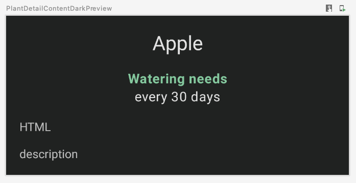
If you run the app, it behaves exactly the same as before the migration in both light and dark theme:
12. Testing
After migrating parts of the plant detail screen to Compose, testing is critical to make sure you haven't broken anything.
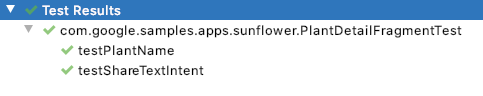
In Sunflower, PlantDetailFragmentTest located in the androidTest folder tests some functionality of the app. Open the file and take a look at the current code:
testPlantNamechecks for the name of the plant on the screentestShareTextIntentchecks that the right intent is triggered after tapping on the share button
When an activity or fragment uses compose, instead of using ActivityScenarioRule, you need to use createAndroidComposeRule that integrates ActivityScenarioRule with a ComposeTestRule that lets you test Compose code.
In PlantDetailFragmentTest, replace the usage ActivityScenarioRule with createAndroidComposeRule. When the activity rule is needed to configure the test, use the activityRule attribute from createAndroidComposeRule as follows:
@RunWith(AndroidJUnit4::class)
class PlantDetailFragmentTest {

    @Rule
    @JvmField
    val composeTestRule = createAndroidComposeRule<GardenActivity>()

    ...

    @Before
    fun jumpToPlantDetailFragment() {
        populateDatabase()

        composeTestRule.activityRule.scenario.onActivity { gardenActivity ->
            activity = gardenActivity

            val bundle = Bundle().apply { putString("plantId", "malus-pumila") }
            findNavController(activity, R.id.nav_host).navigate(R.id.plant_detail_fragment, bundle)
        }
    }

    ...
}
If you run the tests, testPlantName will fail! testPlantName checks for a TextView to be on the screen. However, you migrated that part of the UI to Compose. Thus, you need to use Compose assertions instead:
@Test
fun testPlantName() {
    composeTestRule.onNodeWithText("Apple").assertIsDisplayed()
}
If you run the tests, you'll see all of them pass.
13. Congratulations
Congratulations, you've successfully completed this codelab!
The compose branch of the original Sunflower github project completely migrates the plant details screen to Compose. Apart from what you've done in this codelab, it also simulates the behavior of the CollapsingToolbarLayout. This involves:
- Loading images with Compose
- Animations
- Better dimensions handling
- And more!
What's next?
Check out the other codelabs on the Compose pathway:
Further reading
- Jetpack Compose migration code-along
- Migrate existing View-based apps documentation page