1. Before you begin
In this codelab, you'll learn how to use the Android Studio Layout Editor with ConstraintLayout—a new, flexible, and efficient layout available in the Android Support repository. The Layout Editor uses ConstraintLayout to determine the position of a UI element. A constraint represents a connection or alignment to another view, the parent layout, or an invisible guideline.
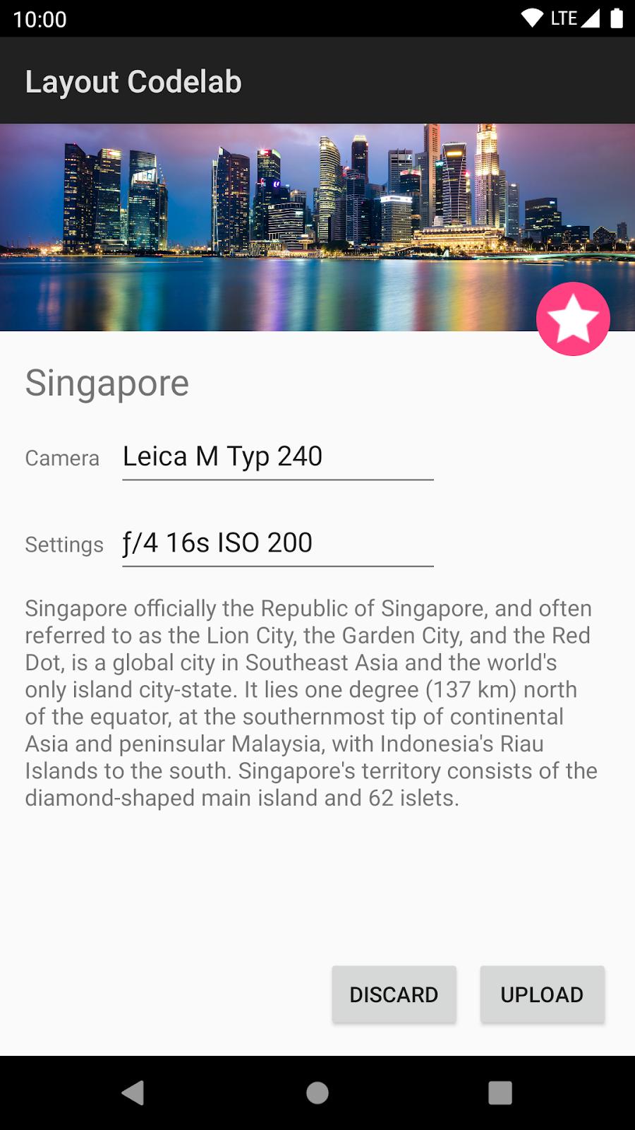
You will be working primarily with the Layout Editor for this codelab and will not directly be editing the XML or Java code. By the end of this codelab, you'll have enough experience with the Layout Editor in Android Studio to be able to build a complex layout such as the one shown below.
Prerequisites
- Some Android app development experience
- Experience with Android Studio
What you'll do
- Learn to automatically constrain UI elements to the layout.
- How to place and resize elements in the layout.
- How to add constraints in order to position and align elements to other elements.
- How to adjust an element's layout dimensions and margins.
- Learn to infer constraints for a layout automatically.
- Use barriers to align elements that dynamically vary in size.
- Use chains to position multiple elements.
What you'll need
- Android Studio Bumblebee (the codelab may work with earlier versions, but some things might be missing or look different).
- The sample app: constraint-layout-start
2. Get the sample app
To download the sample app, you can either:
... or clone the GitHub repository from the command line by using the following command:
$ git clone https://github.com/android/codelab-constraint-layout.git
Frequently asked questions
3. Run the sample app
First, let's see what the finished sample app looks like. Follow these instructions to open the sample app in Android Studio.
- If you downloaded the
constraint-layout-masterzip file, unzip the file. - Open the
constraint-layout-masterfolder to see theconstraint-layout-startfolder.
- Open the
constraint-layout-startproject in Android Studio. - Click the
 Run button, and either choose an emulator or connect your Android device, which must be capable of running Android Lollipop (the minimum SDK supported is 22). The constraint-layout screen should appear:
To use ConstraintLayout, the appropriate support library must be included in the build.gradle (Module: app) file in your project. The constraint-layout dependency is provided as a separate support library that works on all Android versions back to Android 2.3 (Gingerbread).
The starter app already includes the dependency in build.gradle. Android Studio templates also include this dependency for new projects.
When creating a new app project, always open build.gradle and check that the most recent version of the dependency is included. Android Studio highlights any dependency that is not the most recent version. If the dependency is highlighted, hover your pointer over the statement, and Android Studio suggests a newer version. Replace x.x.x with the suggested version number.
dependencies {
  ...
  compile 'com.android.support.constraint:constraint-layout:x.x.x'
}
4. The Layout Editor
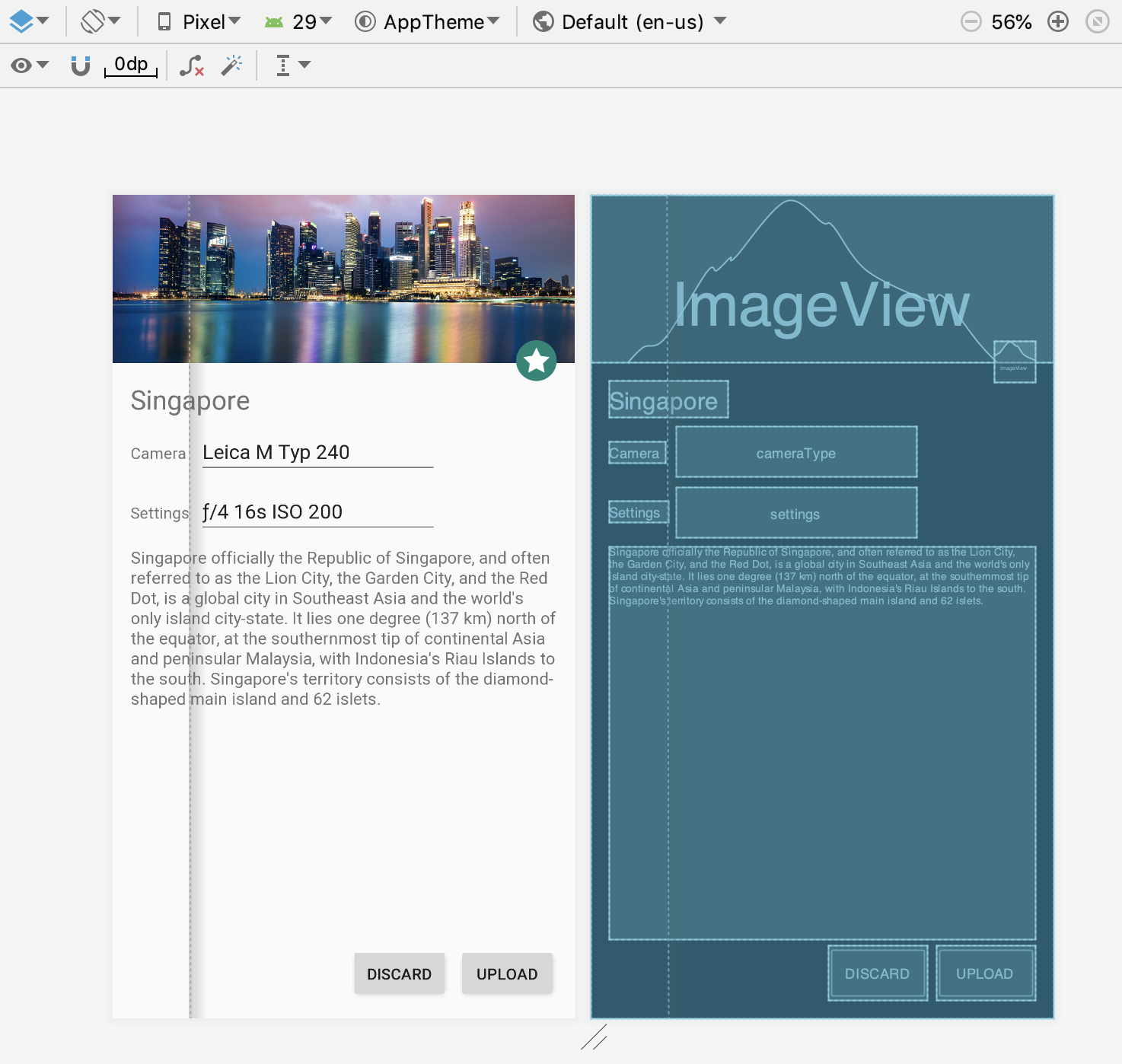
Android Studio provides the Layout Editor for building layouts fast. You can drag UI elements to a visual design and blueprint view, position the elements in the layout, add constraints, and set attributes. Let's take a look:
- Open
activity_main_done.xmlfrom the Project pane. This opens the Layout Editor. - The Design state
 should already be selected; if not, click the Design state in the top right of the editor window.

- If there is no blueprint, click the Show Blueprint icon
 in the toolbar.

Your Layout Editor pane should look like the one shown below.
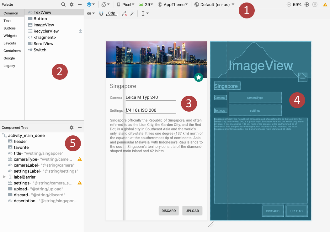
The above figure shows the Layout Editor's components:
- Toolbar
- Palette
- Design view
- Blueprint view
- Component Tree
Click the Device in Editor button in the toolbar (shown as  in the above figure) to select different devices and see what the layout looks like on different device screens.
To see the XML code of the layout, click the Text selection  next to the Design button
  . To see a split view of XML and the design surface, select the Split button
  . You can see the XML attributes for each element in the layout. For example, the following shows an
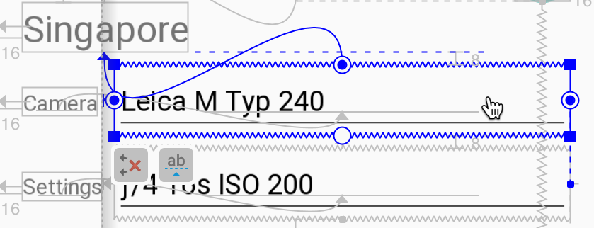
 EditText element with constraints in the design view, and XML constraint attributes for the same EditText element as shown by the Text tab.
EditText element in design view:
EditText element in XML showing only the constraint attributes:
<EditText
        android:layout_width="0dp"
        android:layout_height="wrap_content"
        ...
        app:layout_editor_absoluteX="73dp"
        app:layout_editor_absoluteY="176dp"
        app:layout_constraintLeft_creator="1"
        app:layout_constraintTop_creator="1"
        app:layout_constraintRight_creator="1"
        app:layout_constraintLeft_toLeftOf="@+id/settings"
        tools:layout_constraintLeft_creator="1"
        app:layout_constraintTop_toBottomOf="@+id/title"
        android:layout_marginTop="8dp"
        ...
/>
For example, the app:layout_constraintLeft_toLeftOf attribute in the above XML code positions the element's left side to the left of the settings element.
5. Create constraints automatically
The Layout Editor uses constraints to determine the position of a UI element within the layout. A constraint represents a connection or alignment to another view, the parent layout, or an invisible guideline. You can create the constraints manually, as we show later, or automatically using the Autoconnect tool.
Autoconnect can create two or more constraints for a UI element to the parent layout. After you drag the element to the layout, it creates constraints based on the element's position.
- Open
activity_main_autoconnect.xmlfrom the Project pane. The Design tab should already be selected; if not, click it. - Ensure that the Autoconnect tool,
 located in the toolbar, is enabled. It may be disabled by default.
 - In the blueprint or the preview, click, then drag the
ImageViewtowards the center of the layout until dotted guidelines appear. - Release the mouse button when you see guidelines running from top to bottom and also from left to right. You see that blue zig-zag lines that represent constraints connect the top, left, bottom and right edges of the view to the edges of the parent view, centering the
ImageViewin the layout as shown in the animated figure below:
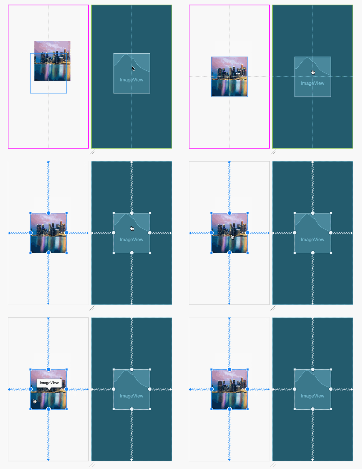
Constraints are automatically added to all four sides of the view because the view is close enough to the center for the Layout Editor to assume it should be centered in the layout.
In the blueprint or design views, notice these handles on the ImageView:
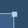 Resizing Handle: You can drag the square resizing handles to resize the element. While dragging, the handle changes to an angled corner.
 Constraint Handle: Click a constraint handle, shown as a circle on each side of an element, and then drag to another constraint handle or parent boundary to create a constraint. The constraint is represented by the zigzag line.
To align the ImageView to the top, select the ImageView, hover over the bottom constraint handle until the tooltip appears, and then Command (⌘ in MacOS) or Control (Ctrl in Windows) click the bottom constraint handle to delete it:
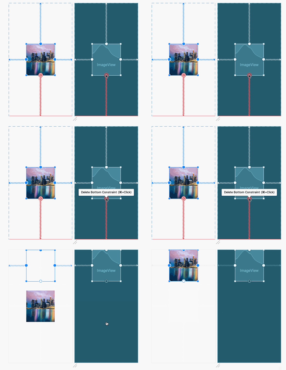
The view is now attached to the top of the layout, because there is only one vertical constraint (at the top). The horizontal constraints still position the view in the center.
With Autoconnect enabled, you can drag any element (such as a button) to any part of a layout to generate constraints against the parent layout. To show how this works:
- Drag a Button from the Widgets section of the Palette to any position in the layout and release the Button.
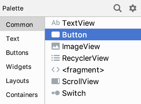
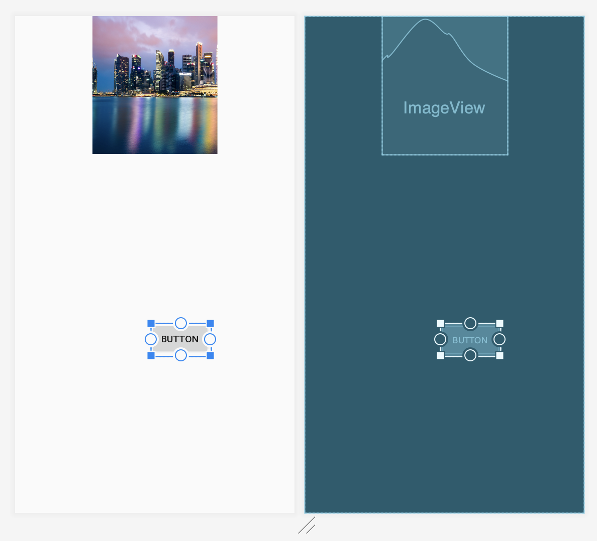
- Select the Button in the layout, and drag it to the lower right corner as shown below—until both the side and bottom margin guidelines appear. When you see the guidelines in both directions, release the Button. The Button snaps to the guidelines automatically.
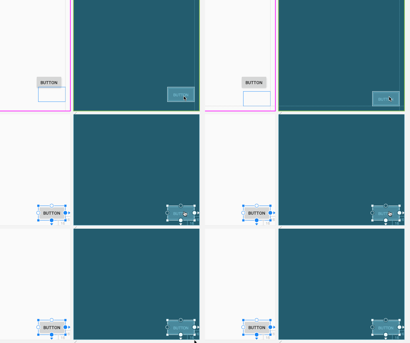
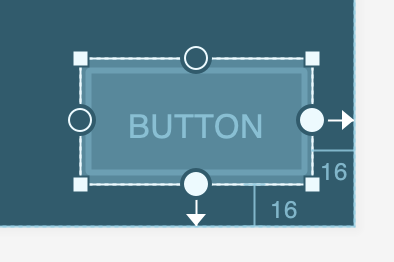
Autoconnect then generates the constraints against the parent layout. Two constraints are automatically added to position the button relative to the parent layout. Since you dragged the button to margin guidelines, the Layout Editor includes 16dp as right and bottom margins that match the default margin guidelines:
6. Add and resize UI elements
In this exercise you start a layout from scratch by adding and resizing an ImageView.
- Open
activity_main_start.xmlfrom the Project pane and click the Design tab. - Turn off the Autoconnect tool (click it once to show
 ), so that constraints don't appear automatically when adding a UI element.
Add an ImageView to the layout
- Find the
ImageViewin the Images section in the Palette and drag it anywhere in the layout.
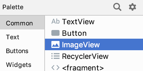
The Resources dialog appears. The constraint-layout-start sample already includes resources for the codelab.
- Choose the
@drawable/singaporeresource, and click OK.
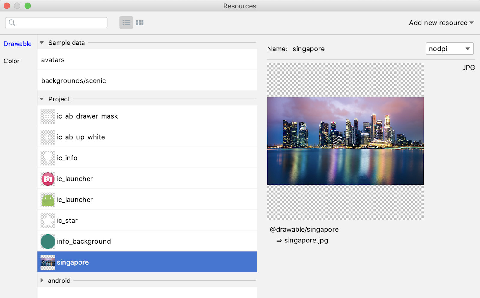
The ImageView appears in the layout.
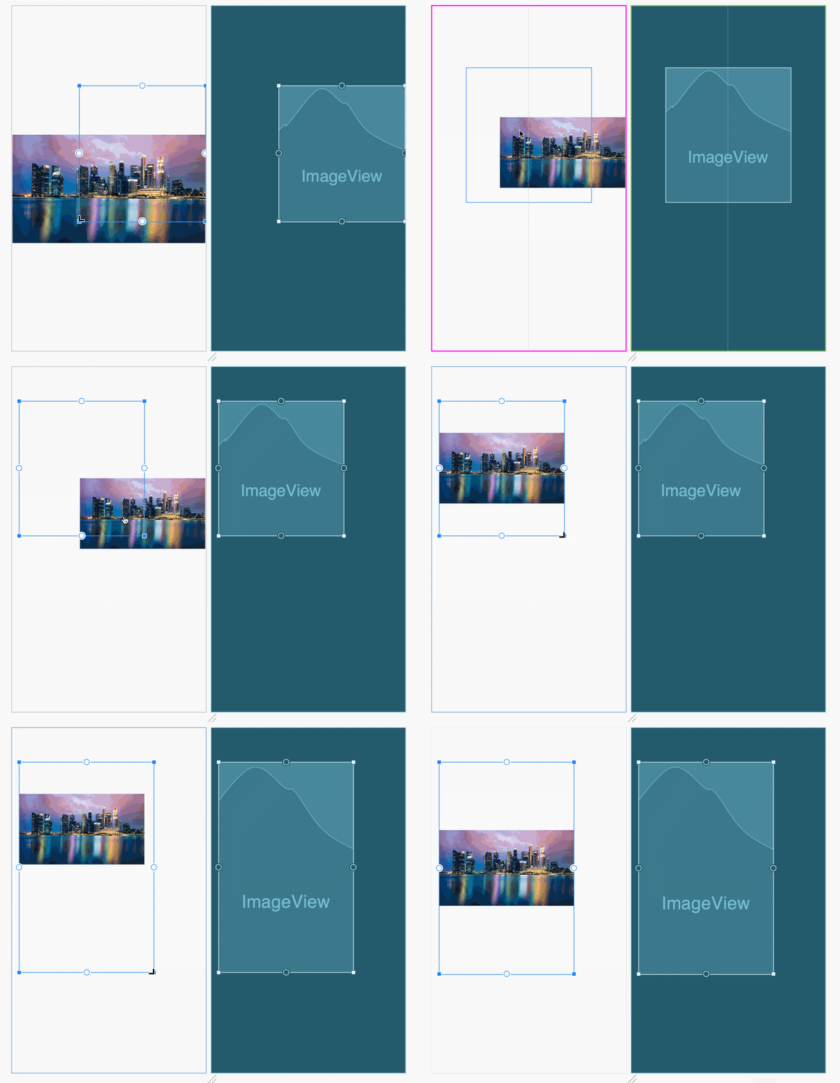
- Drag the element around the layout, and drag corners to resize the image. By resizing the image, the width and height are fixed to specific dimensions.
You'll see indicators in the Component Tree pane. Click the indicator to see more information. The warnings and errors include:
- Missing constraints, which you will add later in this section.
- Missing
contentDescriptionattribute for theImageView.
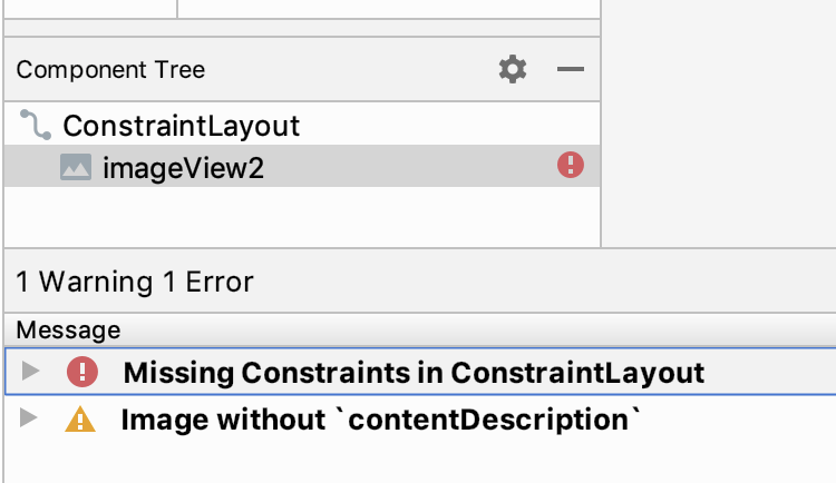
Content Description attributes are important for building accessible applications. You will use an already available resource @string/placeholder for the attribute.
Modify attributes
To add or change attribute values, use the Attributes pane that opens on the right side of the Layout Editor:
- Select the
ImageViewelement if it is not already selected. - Click the Attributes tab on the far right side of the toolbar:
The Attributes pane opens so that you can change the attributes of the selected UI element.
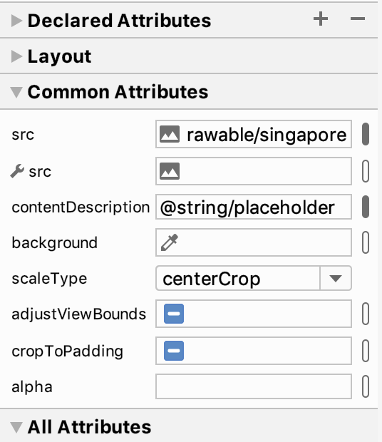
- Add
@string/placeholderinto thecontentDescriptionattribute. - In the Attributes pane, you can also see the other attributes for the
ImageView. ChoosecenterCropfrom thescaleTypedropdown menu to change thescaleTypeattribute.
Add constraints to the parent layout
The following animated figure demonstrates how to perform these steps:
- To add a constraint to the left edge of the
ImageView, click and hold the constraint handle and drag the line to the left edge of the parent layout. - To add the right edge constraint for the
ImageView, drag from the constraint handle to the right edge of the parent layout. - To add the top constraint for the
ImageView, drag from the constraint handle to the top of the parent layout. - To add the bottom constraint for the
ImageView, drag from the constraint handle to the bottom of the parent layout.
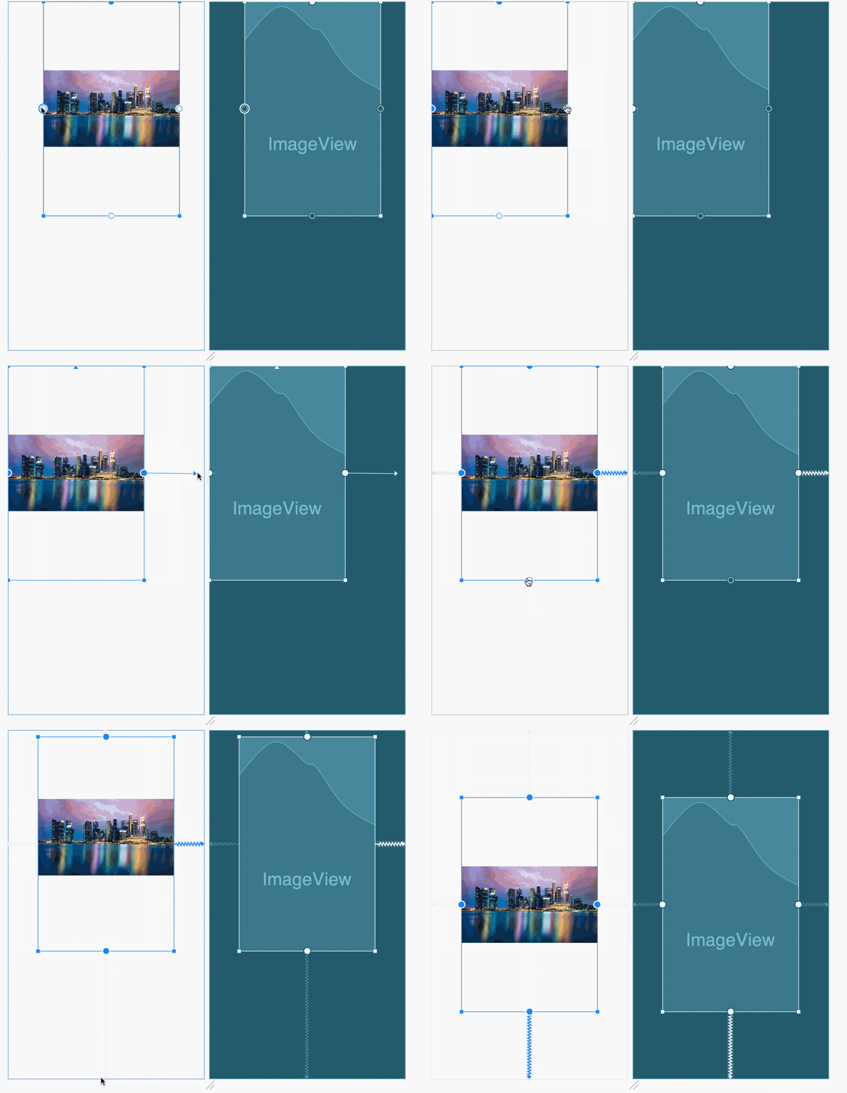
The Layout Editor automatically includes an 8dp margin around the ImageView by default. The size of the margin is shown above the constraint line:

You will work with margins in the next section.
7. The view inspector
In this exercise you continue with the layout from the previous exercise, in which you constrained an ImageView to all four sides of the layout. If it is not already open, open activity_main_start.xml from the Project pane and click the Design tab.
The Attributes pane shows the view inspector in a square block at the top, above the ImageView attributes for src and contentDescription. The view inspector shows the UI element's constraints and margins, and sliders for adjusting the position of the element along the horizontal and vertical axis.
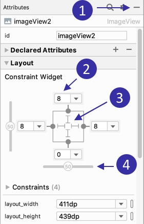
In the above figure:
- Use this button to close the Attributes pane.
- Margin values appear on all four sides. Change a margin by clicking the value and choosing a different value.
- Inner lines indicate the constrained width and length.
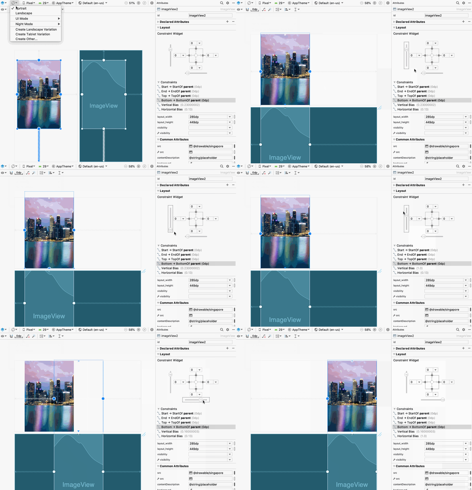
- Use sliders to change the horizontal and vertical constraint bias for elements with opposing constraints.
Position elements with constraint bias
In the previous exercise you constrained an ImageView to all four sides of the layout. As a result, the element is centered horizontally and vertically in the layout. The measure of space between the element and the layout's border is known as the constraint bias.
If the element is centered, its constraint bias is 50%, which means the element is halfway between the two borders. If the bias is changed to 30% for horizontal constraints, the element would be placed closer to the left border. If it is changed to 70%, the element would be placed closer to the right border. The same is true of vertical constraints: the bias controls how far the element is from the top and bottom borders.
After adding two opposing horizontal constraints—a left and a right constraint—a horizontal slider appears in the view inspector to adjust the bias of the element along the horizontal axis. If you add two opposing vertical constraints, a vertical slider appears to adjust the vertical bias.
Since the ImageView is positioned with both horizontal and vertical opposing constraints, use the horizontal and vertical sliders to adjust the bias, as shown in the following animated figure:
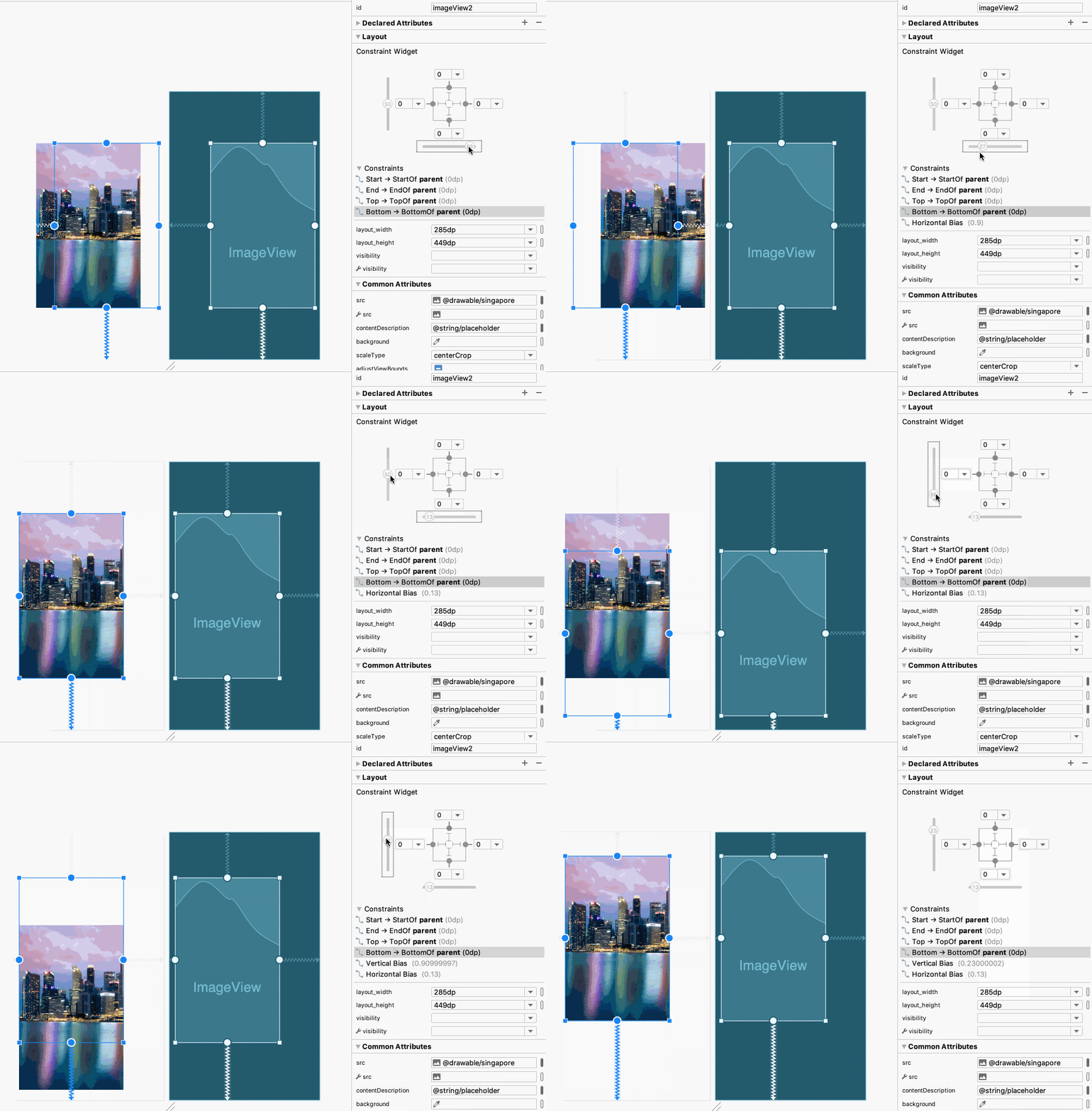
You can also click the orientation tool to change the orientation, and then adjust the positioning:
Change the element's layout width and height
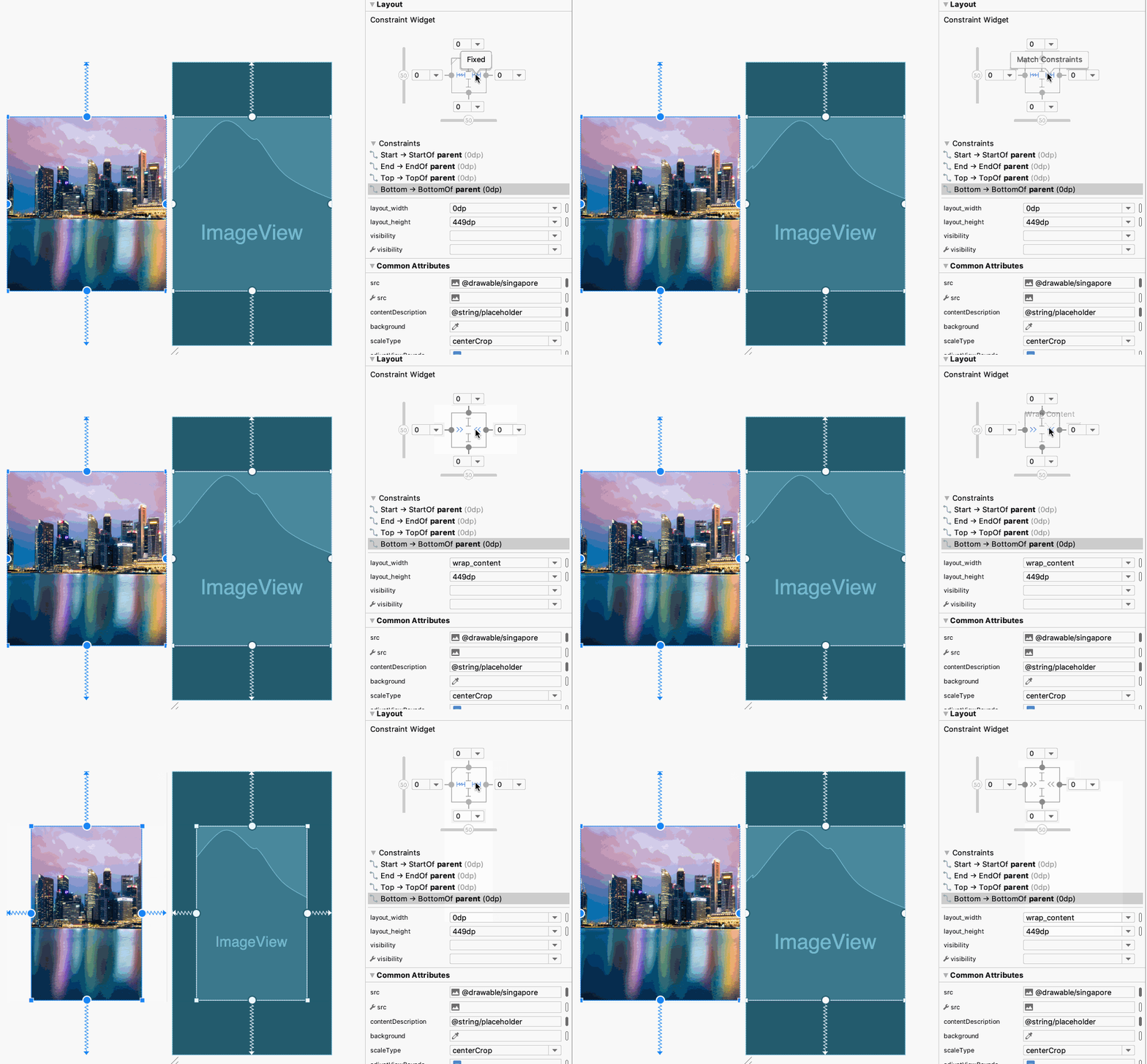
The inner lines within the view inspector let you change the UI element's layout_width and layout_height values relative to constraints. Clicking an inner line cycles through the following options for vertical and horizontal constraints:

Fixed: Specify the width/height of the element.

Match Constraints: Allow the element to occupy all available space to satisfy the constraint. (Note that this is not the same as the match_parent value for width or height, which sets the element to occupy all available space of the parent view. You shouldn't use match_parent for any view in a ConstraintLayout.) In the XML file, the value 0dp appears in the layout_width or layout_height attribute for Match Constraints.

Wrap Content: Expand the element as needed to fit its content.
Experiment with changing the layout_width and layout_height values. The following animated figure shows how to use the inner lines to change the element's layout_width values:
- From Fixed to Match Constraints, which sets the ImageView to occupy all layout space according to its constraints
- From Match Constraints to Wrap Content, which expands the ImageView to the layout borders in order to fit the entire picture.
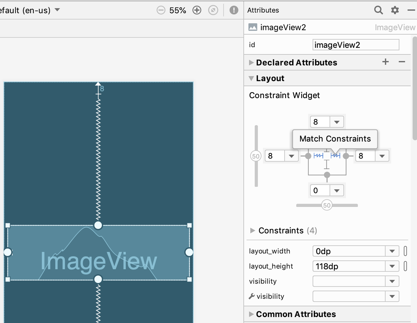
To use the skills you've learned, resize the ImageView to 118dp in height, and constrain it to the top and sides with a margin of 0, as shown in the figure below.
Hint: You can enter 118dp directly into the layout_height attribute.
8. Create constraints between elements
In this exercise you will add two Button elements and add a constraint from one to the other to position them together. You will also add two TextView elements, constrain one to the other to position them together, and use a baseline constraint to align them vertically.
Add two Button elements to the layout
First, add two Button elements to the layout from the previous exercise:
- Open
activity_main_start.xmlif it is not already open, and click the Design tab. - Drag a Button from the Palette to the lower right corner of the parent layout.
- Constrain the button to the right side and to the bottom of the parent layout.

Constrain one element to another
To create a constraint between UI elements within a layout, click on one element's constraint handle and drag it to the other element's constraint handle.
- Drag a second Button to any location in the layout.
- Drag a constraint from the right side of the second Button to the left side of the first, as shown in the following animated figure.

- Drag another constraint from the second Button to the bottom of the layout, as shown in the following animated figure. The Layout Editor automatically adds an 8dp margin, and as a result, the Buttons are aligned vertically.

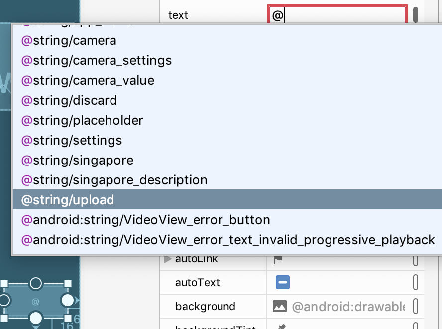
- Use the Attributes pane to add the text for each Button. As you enter the character s into the
textattribute field, a popup menu shows the string resources in the project so that you can select one.
You can also use the Attributes pane to assign IDs to elements. After selecting an element, such as the Upload Button, enter the ID into the ID field at the top of the Attributes pane:

Use a baseline constraint
By using a baseline constraint, you can vertically align elements that have text, such as a TextView, EditText, or Button, so that the text baselines are aligned. Use baseline constraints to align elements that use different text sizes. Baseline constraints are also useful for aligning the text baselines of elements of different sizes.
- Drag a
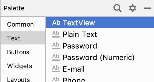
TextViewfrom the Palette to the layout. Assign the@string/camerastring resource to itstextattribute, and thecameraLabelID to theIDfield.
- Drag a
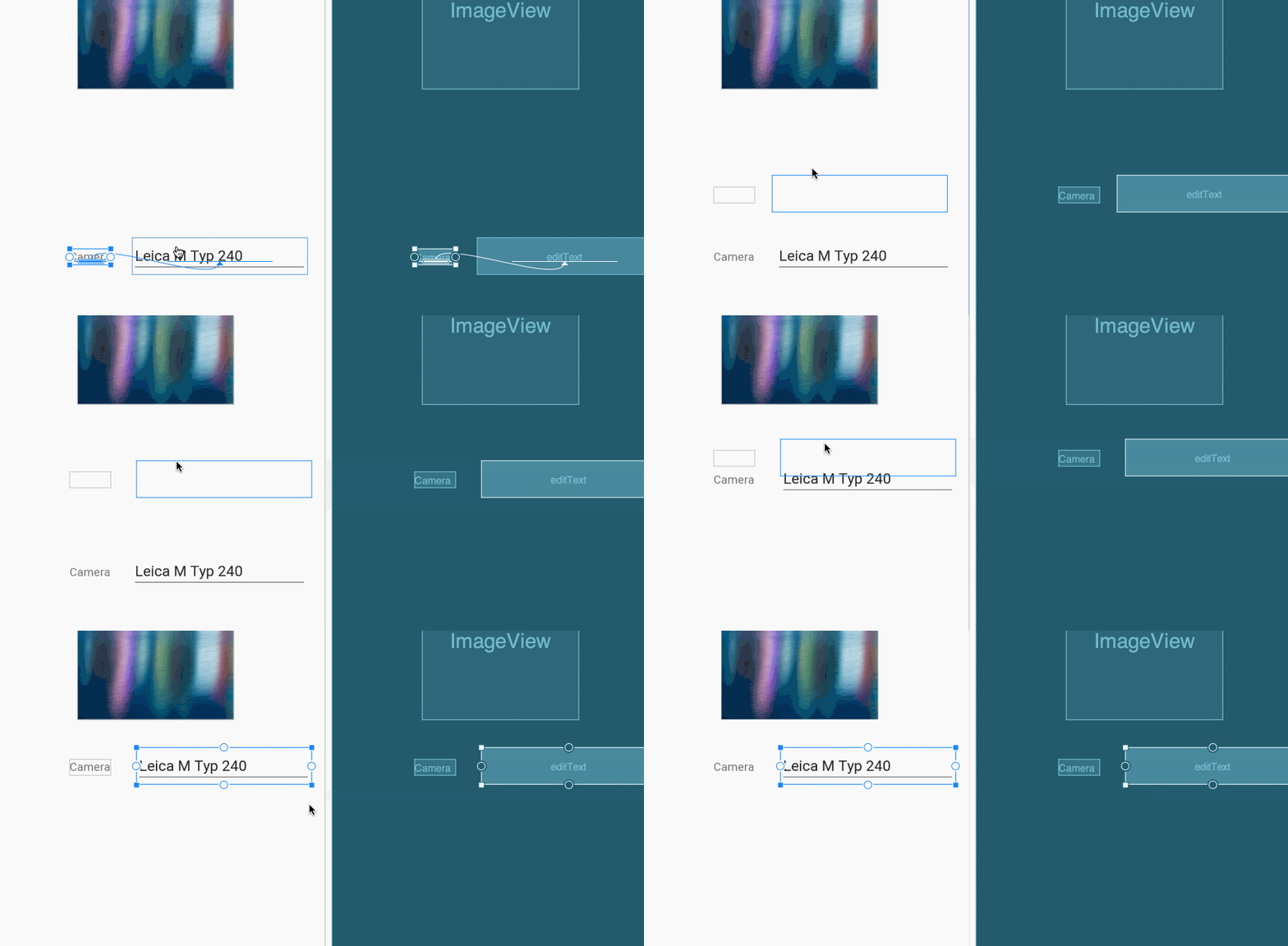
Plain Textelement from the Palette to the layout (aPlain Textelement is anEditTextview). Assign the@string/camera_valuestring resource to itstextattribute, and thecameraTypeID to theIDfield. Note that thePlain Textelement uses a larger text size which makes it wider and taller than the TextView. - Right click the TextView "Camera" element and select "Show baseline":

- Then click and drag from the TextView's baseline, which is blinking in green, to the baseline of the
Plain Textelement, as shown in the following animated figure:

- You can now add a constraint to bring the two elements closer to each other, and move them in the layout to another location—the elements move together and stay aligned:
- You can also use a baseline constraint to align the Button elements. Select the Discard button right click on it and choose "Show baseline", as shown in the following animated figure:
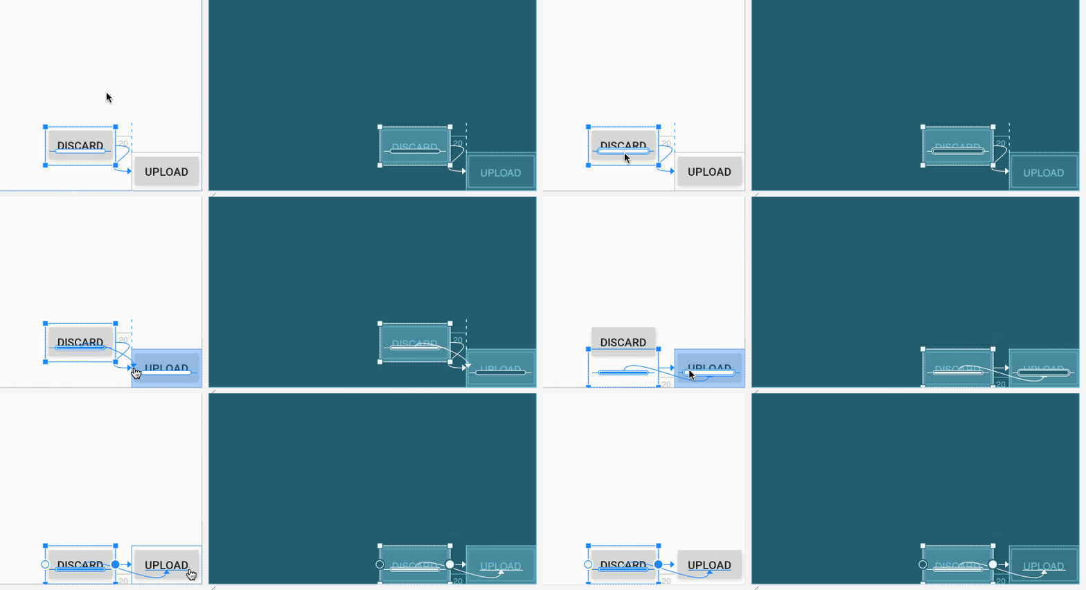
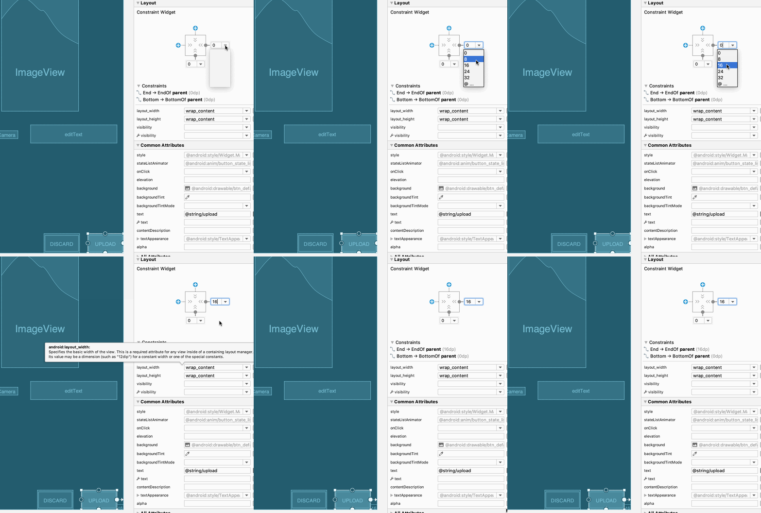
- After adding the baseline constraint, the bottom constraint of the Discard button is automatically removed. You can now change the margin for the Upload button, and the Discard button will still be aligned with it. Select the Upload button, and change the right and bottom margins to 16dp in the Attributes pane, as shown in the animated figure below.
9. Pack elements and infer constraints
In this exercise you learn how to expand an element horizontally and vertically using the Pack  tool, and how to use the Infer Constraints
  tool. Both tools are in the toolbar at the top of the Layout Editor.
For this exercise, open the activity_main_inference.xml layout and click the Design tab. Note the following:
- The layout includes the
headerImageView for the image of Singapore, thefavoriteImageView for a star, and the Upload and Discard buttons. - The
favoriteimage is constrained to have a vertical bias at 19%. To see the vertical bias, select the element and look at the view inspector's vertical slider (shown in the figure below). - The bottom handle of
headeris constrained to the bottom handle offavorite, with a margin of 16dp. - Text elements are provided but not constrained:
- The
textViewelement showing "Camera" is a label that uses the string resource@string/camera. - The
textView2element showing "Settings" is a label that uses the string resource@string/settings. - The
cameraEditelement showing "Leica M Typ 240" is an EditText that uses the string resource@string/camera_value. - The
settingsEditelement showing "f/4 16s ISO 200" is an EditText that uses the string resource@string/settings_value.
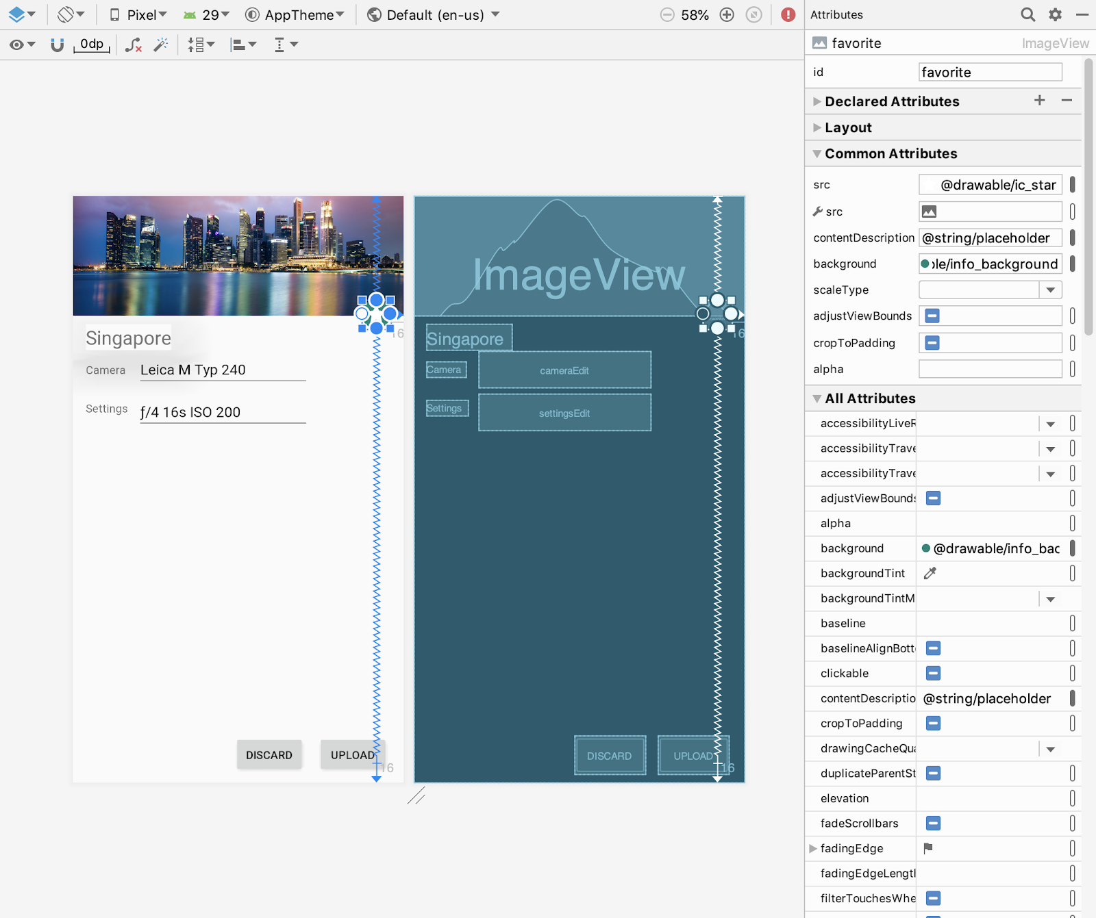
The Pack tool
In this exercise, you'll add a TextView for the description of the image, and expand it to fill available space.
- Drag a new TextView from the Palette and place it below the other text elements.
- With the new TextView selected, click the Expand Horizontally
 tool in the Pack tool to expand the view horizontally to fill available space, as shown in the following figure:
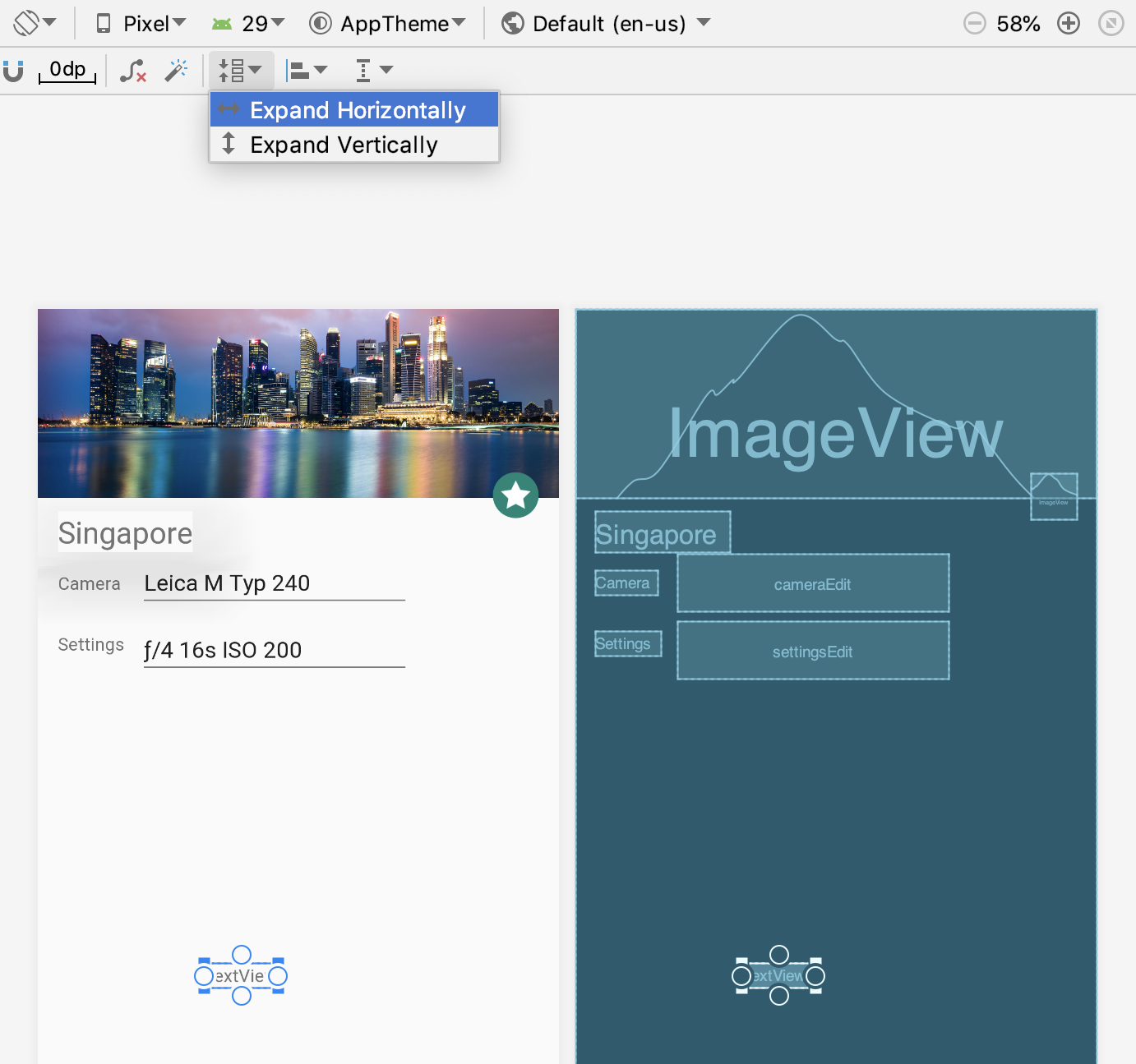
The result of expanding the text element horizontally:

- With the TextView selected, click the Expand Vertically
 tool to expand vertically to fill available vertical space.
The result of expanding the text element vertically:
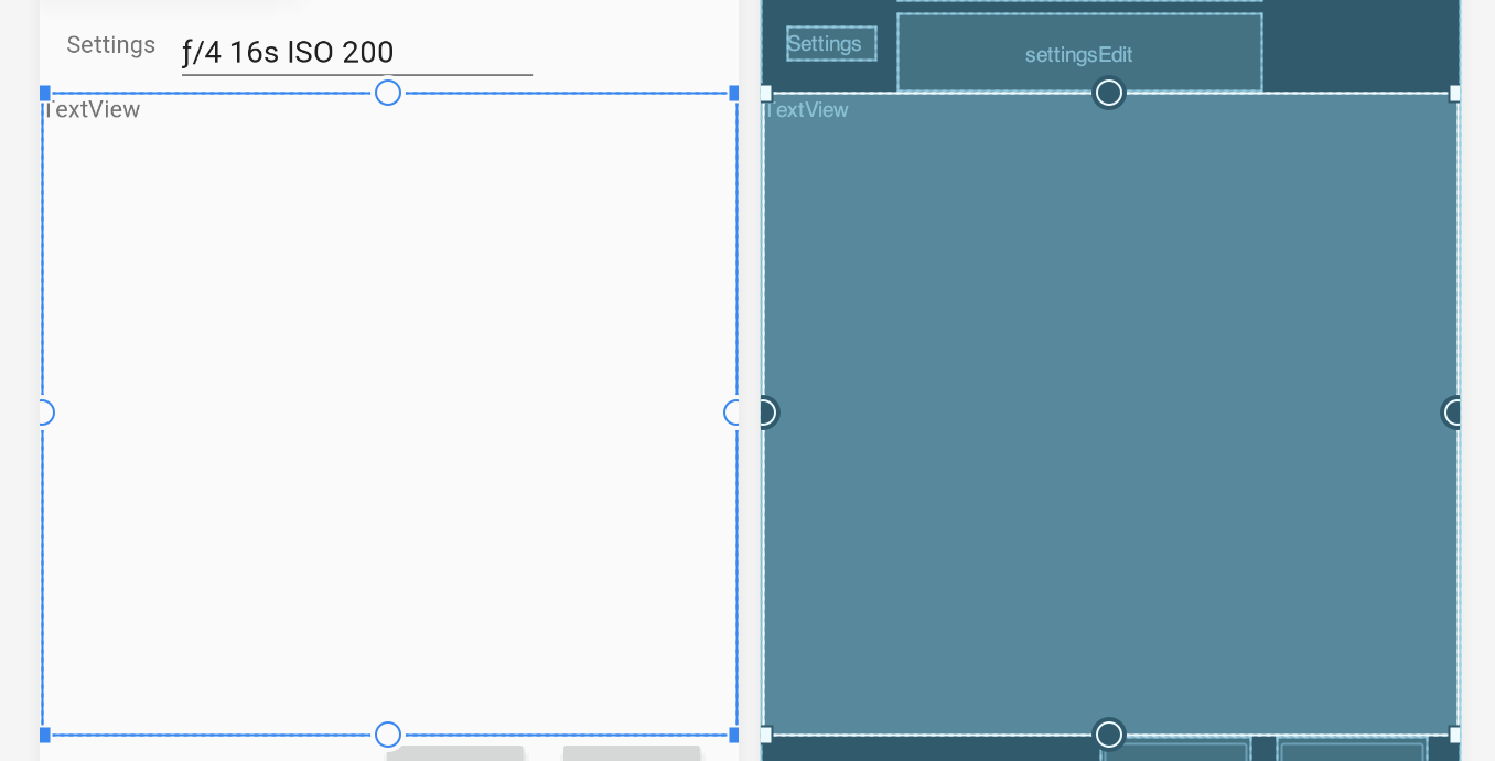
The TextView now fills the available space in the layout.
- With the TextView selected, set its text to
@string/singapore_descriptionin the Attributes pane.
The Infer Constraints tool
The Infer Constraints tool infers, or figures out, the constraints you need to match a rough layout of elements. It works by taking into account the positions and sizes of the elements. Drag elements to the layout in the positions you want them, and use the Infer Constraints tool to automatically create the constraint connections.
Click the Infer Constraints  tool. The Layout Editor adds constraints to all of the unconstrained elements in the layout. The resulting layout should look like the following:
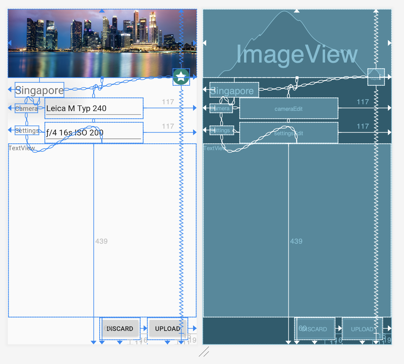
10. Use ratios to size elements
You can quickly resize elements by aspect ratio if at least one of the element's dimensions is set to match constraints.
For this exercise, open activity_main_ratio.xml and click the Design tab. Drag an ImageView from the Palette to the layout, and select singapore in the Resources dialog.
Select the ImageView and add constraints and dimensions, as shown in the figure below with the following callouts:
- Bottom constraint connected to the bottom of the layout with a 0 margin.
- Side constraint connected to the left side of the layout with a 0 margin.
- Top constraint connected to the top of the layout with a 0 margin.
- Side constraint connected to the right side of the layout with a 0 margin.
- The
layout_widthattribute set towrap_content, and thelayout_heighttomatch_constraint.
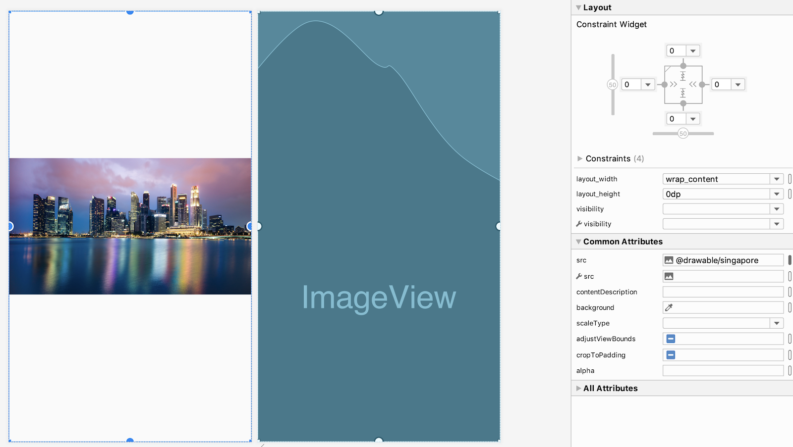
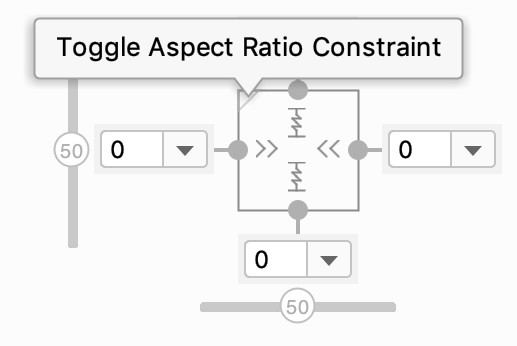
As soon as you constrain one dimension to be match_constraint, the Toggle Aspect Ratio Constraint option appears in the inspector view in the top left corner of the square.
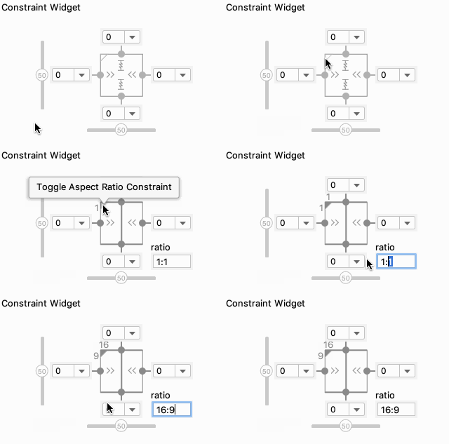
Click the Toggle Aspect Ratio Constraint option. The ratio entry box appears below the bottom right corner of the square:
To enable aspect ratio constraints and set your ImageView to have a 16:9 aspect ratio, enter 16:9 in the ratio field:
You can see the entire action and result in the following animated figure:
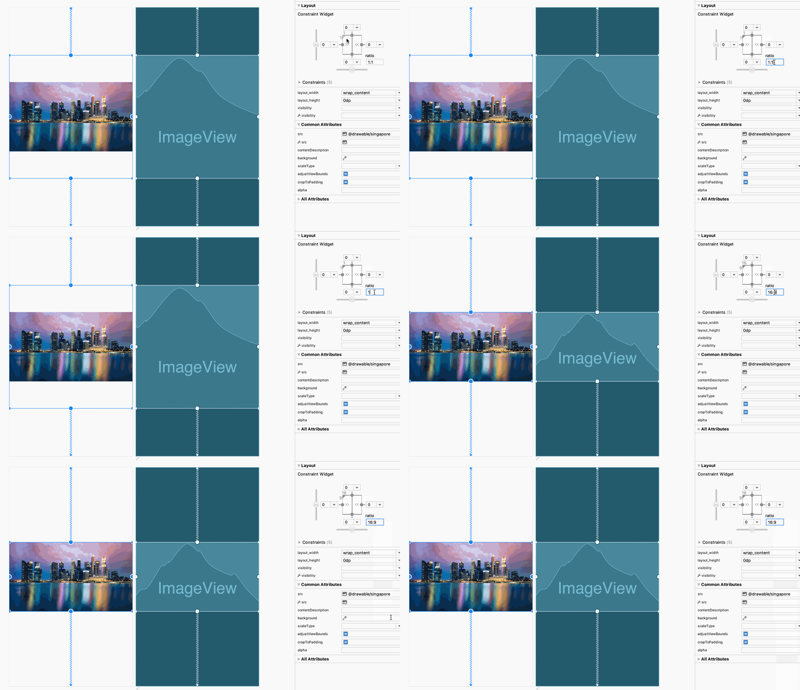
By using ratios you can ensure your designs stay perfect while allowing images to be resized on different device screens.
11. Use barriers to align elements that dynamically vary in size
Barriers allow you to specify a constraint based on multiple UI elements. You'll want to use barriers any time that multiple elements could dynamically change their size based on user input or language.
For example, if the user chooses German, the sample app shows the text in German. German words may be longer, and the text may overlap the next element. To see an example, open activity_main_barriers.xml and click the Design tab, and then choose German from the Language menu:

The following animated figure shows how the text elements may overlap when switching from English to German (and back to English):
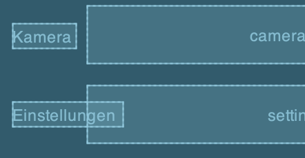
This exercise walks you through adding a barrier to this layout so that the label, which can vary in size depending on the language translation, doesn't overlap the entry field.
- Choose German from the Language menu if it has not already been chosen, so that the app's layout appears in German.
- Right click on
ConstraintLayoutin the blueprint or the Component Tree. You will see the Add Vertical barrier and Add Horizontal barrier options.
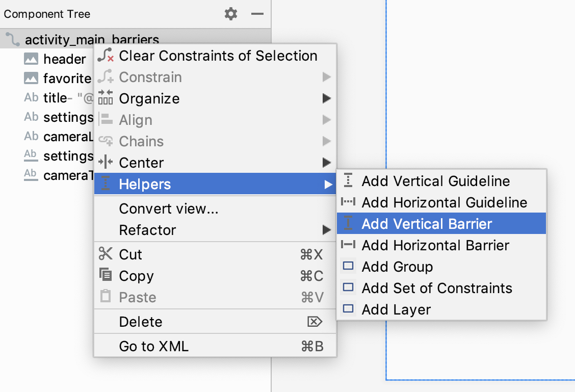
- To create a vertical line for the two TextView elements, select Add Vertical barrier to add a barrier. You want to create a vertical line for the two TextViews, as shown below with callout 1:
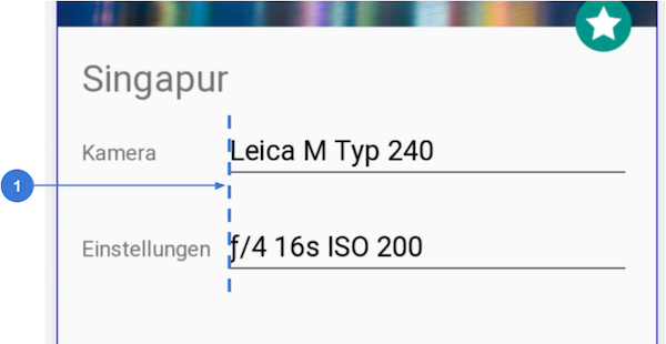
- Open Component Tree to view your new barrier. You won't find the barrier in Design or Blueprint view yet because it's flush with the start of the container. You can find Component Tree in the bottom left.
- Select both
cameraLabelandsettingsLabelin your Component Tree. Drag both onto your barrier in the Component Tree. When you do this you're specifying that the barrier should float based on the position of both labels.
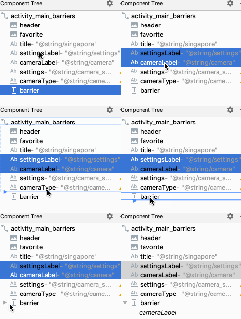
- Select
barrierin the Component Tree and open the Attributes pane to set the attributebarrierDirectionto end. ThebarrierDirectionis an attribute that controls how the barrier is positioned relative to the referenced views.
With the vertical barrier in place, you can constrain an element to the right side of the barrier:
- Delete the constraint from the left side of
cameraTypeto the right side ofcameraLabel("Kamera"), as shown in the following animation:

- Drag a constraint from the left side of
cameraTypeto the barrier:
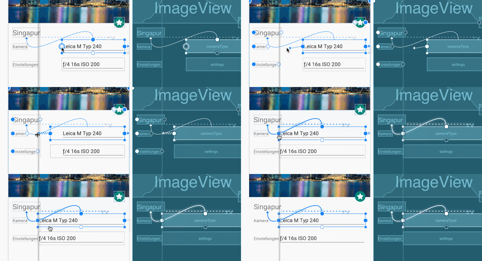
- You can now use the Language menu to switch from English to German and back, and see how the barrier aligns the elements so that they don't overlap.
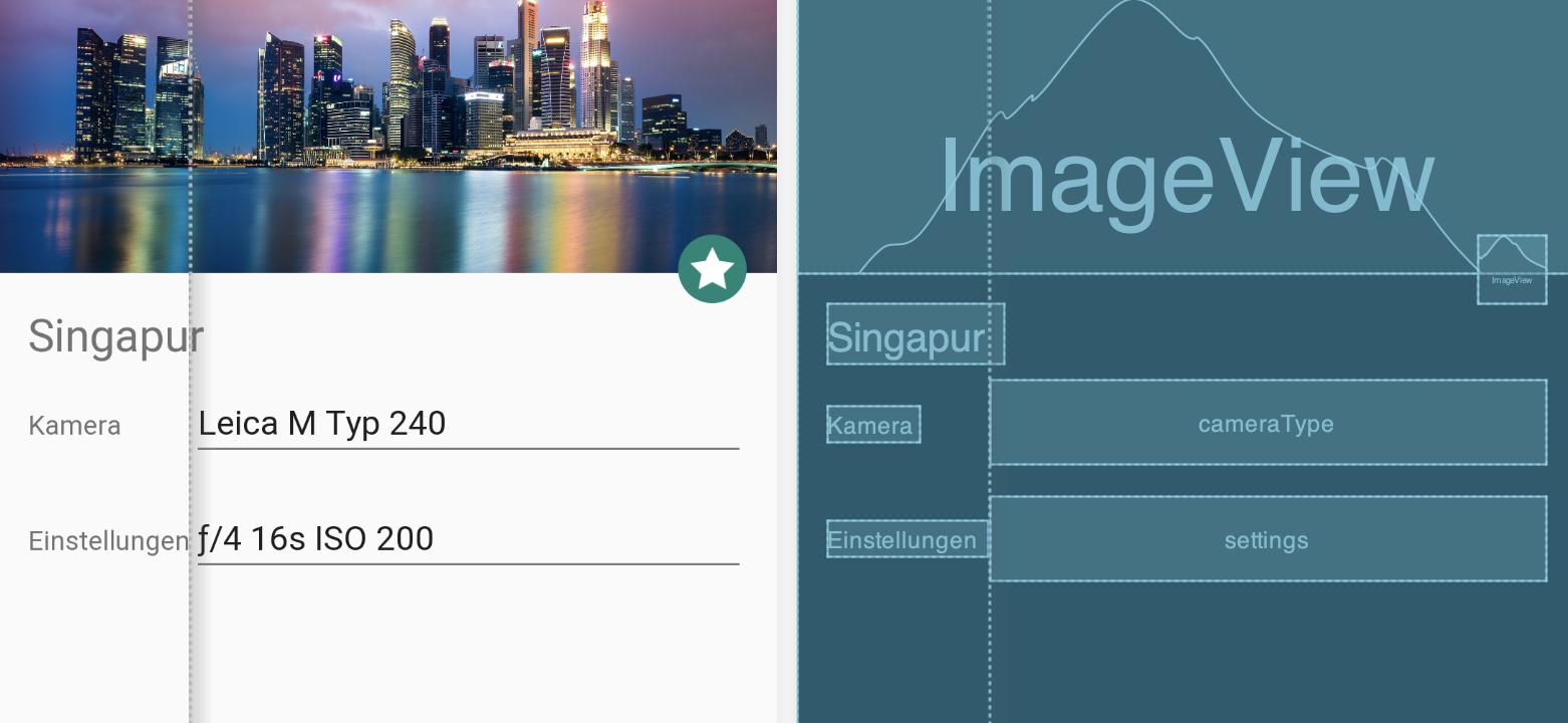
A constraint to a barrier is just like a constraint to another element. However, users don't see barriers, and barriers don't add a level to the app's view hierarchy, which means they don't affect performance.
12. Use chains to position multiple elements
You've already learned how to center a single UI element. In this exercise you will learn how to center multiple elements at once using a chain. A chain is a group of elements that are linked to each other with bi-directional position constraints.
The following shows two elements that are constrained to each other, creating a horizontal chain.
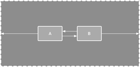
When you create a chain, you can position all of the elements as a group, and center all of your chained elements as if they were a single element.
For this exercise, open activity_main_chains.xml and click the Design tab.
- Select both
EditTextelements. - Right-click on the selected elements and choose Center Vertically from the menu. This will automatically create a chain as well as generate constraints to the top and bottom of the parent layout.
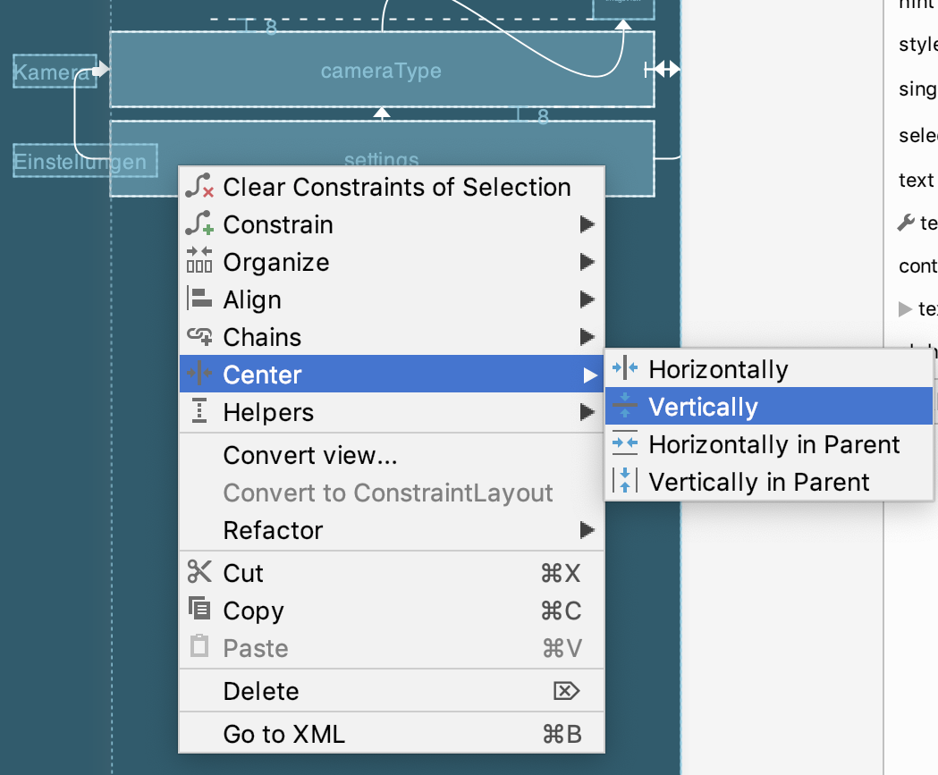
- Add a margin between the
EditTextelements by selectingcameraTypeand giving it a bottom margin of8dp. - Select either
EditTextelement, and drag the vertical bias slider to20. This will shift both elements towards the top without specifying a fixed constraint.
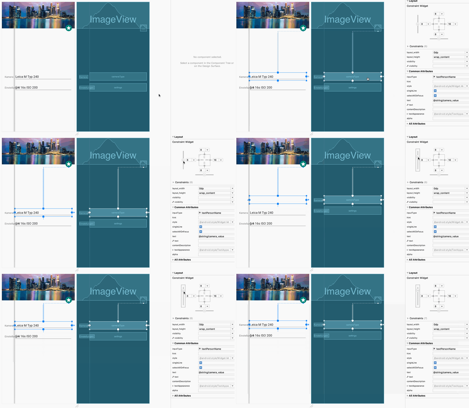
- Click the
 button and choose Switch to Landscape. You will see the elements maintain the 20% bias as the container changes size.
This exercise demonstrated the basics of using chains. To learn more about chains, you can read the Android guide on controlling linear groups with a chain.
13. Congratulations!
You learned how to create layouts with the ConstraintLayout viewgroup.
Learn more
To learn more about ConstraintLayout, see Build a Responsive UI with ConstraintLayout. For an overview of the Layout Editor, see Build a UI with Layout Editor. Thank you for giving ConstraintLayout a try, and we hoped you enjoyed this codelab!

