
1. Before you begin
This codelab provides practical instruction on the fundamentals of implementing drag-and-drop operation for Compose. You will learn how to enable views to be dragged and dropped both within your app and across different apps. You'll learn how to implement drag-and-drop operation within your app and even across different apps.
Prerequisites
To complete this codelab, you need:
- Experience building Android apps
- Experience with Jetpack Compose and Modifiers
What you'll do
Create a simple app that:
- Configuring the composable to be draggable using dragAndDropSource modifier
- Configuring the composable to be drop target using dragAndDropTarget modifier
What you'll need
- Android Studio Jellyfish or higher
- Android device or emulator
2. A drag and drop event
A drag-and-drop operation can be viewed as the 4 staged event, stages being
- Started : System starts the drag-and-drop operation in response to the user's drag gesture.
- Continuing : User continues to drag.
- Ended : User releases the drag in drop target composable
- Existed : System sends the signal to end the drag-and-drop operation.
System sends the drag event in the DragEvent object. DragEvent object can contain following data
ActionType: Action value of the event based on the lifecycle event of the drag and drop event.e.g.ACTION_DRAG_STARTED,ACTION_DROPetc.ClipData: Data being dragged, encapsulated in ClipData objectClipDescription: Meta information about the ClipData objectResult: Result of the drag-and-drop operationX: x-coordinate of the dragged object's current locationY: y-coordinate of the dragged object's current location
3. Set up
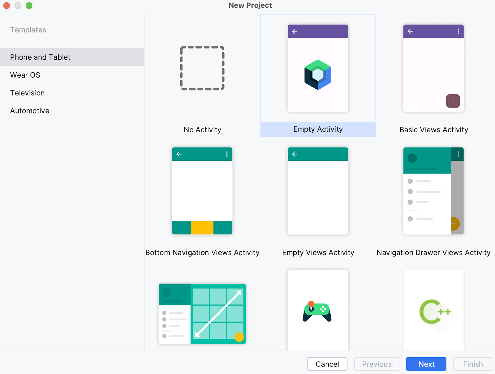
Create a new project and select the "Empty Activity" template:
Leave all the parameters as their default.
In this codelab we will be using the ImageView to demonstrate drag-and-drop functionality. Let's add a gradle dependency for the glide library for compose and sync the project.
implementation("com.github.bumptech.glide:compose:1.0.0-beta01")
Now in MainActivity.kt , create a composable for Image which will act as drag source for our purpose
@Composable
fun DragImage(url: String) {
   GlideImage(model = url, contentDescription = "Dragged Image")
}
Similarly create the Drop target image.
@Composable
fun DropTargetImage(url: String) {
   val urlState = remember {mutableStateOf(url)}
   GlideImage(model = urlState.value, contentDescription = "Dropped Image")
}
Add a column composable to your composable to include these two images.
Column {
   DragImage(url = getString(R.string.source_url))
   DropTargetImage(url = getString(R.string.target_url))
}
At this stage we have MainActivity which displays two images in vertical fashion. You should be able to see this screen.

4. Configuring Drag source
Let's add a modifier for Drag and Drop source for our DragImage composable
modifier = Modifier.dragAndDropSource {
   detectTapGestures(
       onLongPress = {
           startTransfer(
               DragAndDropTransferData(
                   ClipData.newPlainText("image uri", url)
               )
           )
       }
   )
}
Here we have added a dragAndDropSource modifier. The dragAndDropSource modifier enables drag-and-drop functionality for any element it is applied to. It visually represents the dragged element as a drag shadow.
dragAndDropSource modifier provides the PointerInputScope to detect the drag gesture. We have used the detectTapGesture PointerInputScope to detect longPress which is our drag gesture.
onLongPress method we are initiating the transfer of the data which is being dragged.
startTransfer starts a drag-and-drop session with transferData as the data to be transferred on gesture completion. It takes data encapsulated in DragAndDropTransferData which has 3 fields
Clipdata:actual data to be transferredflags: flags to control drag and drop operationlocalState: local state of the session when dragging in the same activity
ClipData is a complex object which contains items of different types including text, markup, audio, video etc. For the purpose of this codelab we are using imageurl as an item in ClipData.
Great, now our view can be dragged !

5. Configure for Drop
For view to accept the dropped item, it should add dragAndDropTarget modifier
Modifier.dragAndDropTarget(
   shouldStartDragAndDrop = {
       // condition to accept dragged item
   },
   target = // DragAndDropTarget
   )
)
dragAndDropTarget is the modifier which allows data to be dragged in the composable. This modifier has two parameters
shouldStartDragAndDrop: Allows the Composable to decide if it wants to receive from a given drag and drop session by inspecting the DragAndDropEvent that started the session.target: The DragAndDropTarget that will receive events for a given drag and drop session.
Let's add a condition when we want to pass a drag event to the DragAndDropTarget.
shouldStartDragAndDrop = { event ->
   event.mimeTypes()
       .contains(ClipDescription.MIMETYPE_TEXT_PLAIN)
}
The condition added here is to only allow a drop action when at least one of the items being dragged is plain text. The drop target won't be activated if none of the items are plain text.
For target parameters lets create an object of DragAndDropTarget which handles the drop session.
val dndTarget = remember{
   object : DragAndDropTarget{
       // handle Drag event
   }
}
DragAndDropTarget has a callback to be overridden for every stage in the drag and drop session.
onDrop: An item has been dropped inside this DragAndDropTarget, returns true to indicate that the DragAndDropEvent was consumed; false indicates it was rejectedonStarted: A drag and drop session has just been started and this DragAndDropTarget is eligible to receive it. This gives an opportunity to set the state for a DragAndDropTarget in preparation for consuming a drag and drop session.onEntered: An item being dropped has entered into the bounds of this DragAndDropTarget.onMoved: An item being dropped has moved within the bounds of this DragAndDropTarget.onExited: An item being dropped has moved outside the bounds of this DragAndDropTarget.onChanged: An event in the current drag and drop session has changed within the DragAndDropTarget bounds. Perhaps a modifier key has been pressed or releasedonEnded: The drag and drop session has been completed. All DragAndDropTarget instances in the hierarchy that previously received an onStarted event will receive this event. This gives an opportunity to reset the state for a DragAndDropTarget.
Let's define what happens when an item is dropped in target composable.
override fun onDrop(event: DragAndDropEvent): Boolean {
   val draggedData = event.toAndroidDragEvent().clipData.getItemAt(0).text
   urlState.value = draggedData.toString()
   return true
}
In the onDrop function we are extracting the ClipData item and assigning to the image url, also returning true to signify the drop has been handled correctly.
Let us no plug assign this DragAndDropTarget instance to the target parameter of dragAndDropTarget modifier
Modifier.dragAndDropTarget(
   shouldStartDragAndDrop = { event ->
       event.mimeTypes()
           .contains(ClipDescription.MIMETYPE_TEXT_PLAIN)
   },
   target = dndTarget
)
Excellent, we can successfully perform the drag-and-drop operation now!

Though we have added the drag-and-drop functionality, visually it is difficult to understand what's happening. Let's change that.
For drop target composable let's apply a ColorFilter to our image
var tintColor by remember {
   mutableStateOf(Color(0xffE5E4E2))
}
After defining the tint color, let's add ColorFilter to our image
GlideImage(
   colorFilter = ColorFilter.tint(color = backgroundColor,
       blendMode = BlendMode.Modulate),
   // other params
)
We want to apply tint to color to image when a dragged item enters the Drop target area. For this we can override onEntered callback
override fun onEntered(event: DragAndDropEvent) {
   super.onEntered(event)
   tintColor = Color(0xff00ff00)
}
Also when the user drags out of the target area, we should fallback to the original color filter. For this we have to override onExited callback
override fun onExited(event: DragAndDropEvent) {
   super.onEntered(event)
   tintColor = Color(0xffE5E4E2)
}
On successful completion of drag-and-drop, we can revert back to original ColorFilter as well
override fun onEnded(event: DragAndDropEvent) {
   super.onEntered(event)
   tintColor = Color(0xffE5E4E2)
}
Finally our drop composable looks like this
@Composable
fun DropTargetImage(url: String) {
   val urlState = remember {
       mutableStateOf(url)
   }
   var tintColor by remember {
       mutableStateOf(Color(0xffE5E4E2))
   }
   val dndTarget = remember {
       object : DragAndDropTarget {
           override fun onDrop(event: DragAndDropEvent): Boolean {
               val draggedData = event.toAndroidDragEvent()
                   .clipData.getItemAt(0).text
               urlState.value = draggedData.toString()
               return true
           }

           override fun onEntered(event: DragAndDropEvent) {
               super.onEntered(event)
               tintColor = Color(0xff00ff00)
           }
           override fun onEnded(event: DragAndDropEvent) {
               super.onEntered(event)
               tintColor = Color(0xffE5E4E2)
           }
           override fun onExited(event: DragAndDropEvent) {
               super.onEntered(event)
               tintColor = Color(0xffE5E4E2)
           }

       }
   }
   GlideImage(
       model = urlState.value,
       contentDescription = "Dropped Image",
       colorFilter = ColorFilter.tint(color = tintColor,
           blendMode = BlendMode.Modulate),
       modifier = Modifier
           .dragAndDropTarget(
               shouldStartDragAndDrop = { event ->
                   event
                       .mimeTypes()
                       .contains(ClipDescription.MIMETYPE_TEXT_PLAIN)
               },
               target = dndTarget
           )
   )
}
Great, we are able to add visual cues for drag-and-drop operation!

6. Congratulations!
Compose for Drag and Drop provides an easy interface to implement the drag-and-drop functionality in Compose using modifiers for the view.
In Summary you have learned to implement drag-and-drop using compose. Please explore the documentation further.